An effective email marketing report template helps enterprise marketing leaders answer one question fast: is email driving measurable business value, or just generating activity? For CMOs, lifecycle leaders, operations directors, and analytics teams, the monthly executive dashboard must do more than list opens and clicks. It needs to connect campaign performance, audience health, deliverability, and revenue impact in a format leadership can scan in minutes and act on immediately.
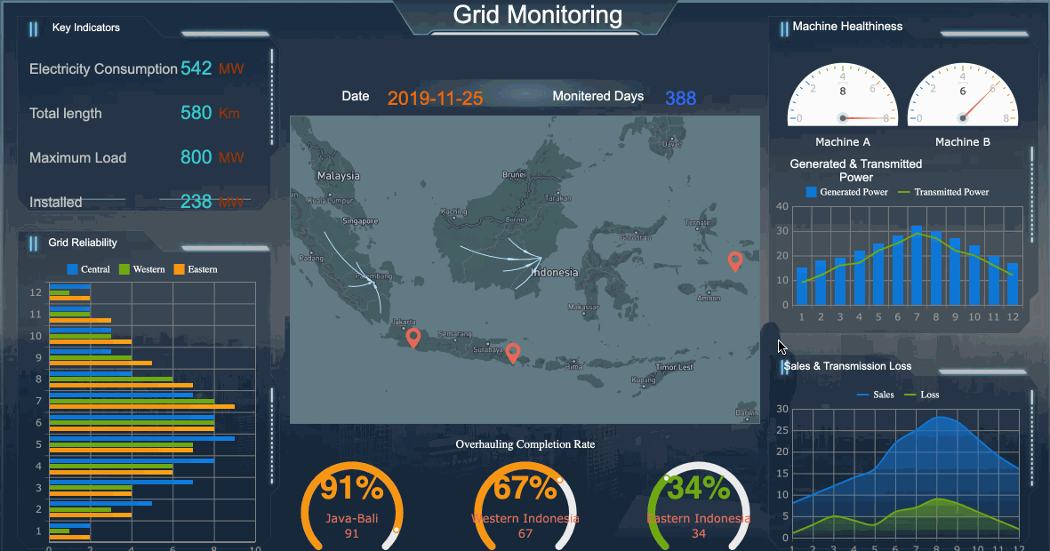
All reports in this article are built with FineReport
What an Email Marketing Report Template Should Help Enterprise Teams Answer
A monthly executive dashboard exists to support decisions, not just summarize channel data. Enterprise teams typically manage multiple campaigns, regions, product lines, and stakeholders. Without a clear reporting structure, leadership gets buried in disconnected metrics while real issues—such as declining audience quality or deliverability risk—go unnoticed.
A strong email marketing report template should help teams answer the following executive questions:
Is email contributing to pipeline, revenue, retention, or other strategic business outcomes?
Which campaign types are improving performance, and which are underperforming?
Is audience engagement healthy, stable, or deteriorating?
Are deliverability issues affecting results behind the scenes?
Which business units, markets, or customer segments are responding best?
What decisions should leadership make this month based on the data?
For enterprise reporting, the biggest mistake is blending strategic insight with operational noise. Executives need a top-layer view of business impact, while channel specialists need detailed performance cuts underneath. Your template should support both, but in the right order.
Key Metrics (KPIs)
Below are the core KPIs an executive-level email dashboard should include. Keep the list disciplined and define each metric clearly.
Emails Sent: Total volume delivered into market during the reporting period.
Delivery Rate: Percentage of emails accepted by recipient servers.
Open Rate: Directional signal of subject line effectiveness and audience interest; should be interpreted carefully depending on tracking limitations.
Click-Through Rate (CTR): Percentage of recipients who clicked a link in the email.
Click-to-Open Rate (CTOR): Measures content and CTA effectiveness among those who opened.
Conversion Rate: Percentage of recipients who completed the desired action.
Email-Attributed Revenue: Revenue influenced or generated by email, based on your attribution model.
Pipeline Contribution: Value of opportunities sourced or influenced by email activity.
List Growth Rate: Net growth of subscribers over the reporting period.
Unsubscribe Rate: Percentage of recipients who opted out after receiving an email.
Spam Complaint Rate: Percentage of recipients marking emails as spam.
Bounce Rate: Share of emails that could not be delivered, including hard and soft bounces.
Inbox Placement Indicator: Signal of whether messages reached the inbox instead of spam or promotions-heavy filtering.
Engaged Audience Rate: Share of active subscribers who opened, clicked, or converted within a defined timeframe.
Revenue per Email / Revenue per Subscriber: Efficiency metrics that tie send volume to business outcome.
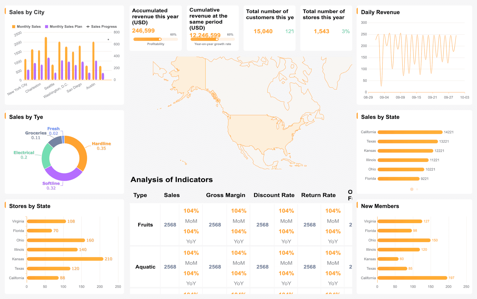
Core Sections Every Monthly Executive Dashboard Should Include
An executive dashboard should feel predictable month after month. That consistency builds trust, speeds interpretation, and makes anomalies stand out faster.
Executive summary and key takeaways
The first section should summarize the month in plain business language. Executives should not need to read the entire dashboard to understand what changed.
Include:
Top wins from the month
Major risks or declines
Significant changes from the prior month
Immediate actions or decisions required
A strong executive summary usually answers three things:
This section should highlight only the handful of metrics leaders truly need to act on. If click rate fell but revenue increased due to better segmentation, say that clearly. If engagement looks stable but inbox placement dropped, call out the risk before it impacts next month’s results.
Campaign performance overview
This is where your email marketing report template moves from summary to controlled detail. The goal is not to show every campaign equally. It is to reveal which campaign groups are driving outcomes.
A useful enterprise dashboard shows performance comparatively, not in isolation. A campaign with lower open rate but higher conversion efficiency may be more valuable than a campaign that generated vanity engagement.
Audience growth, engagement, and deliverability
Enterprise teams often focus too heavily on campaign output and ignore audience quality. That is risky. Subscriber file health and deliverability are leading indicators of future performance.
This section helps answer whether changes in results are driven by strategy, targeting, send frequency, or technical issues. For example:
Falling clicks plus rising unsubscribes may suggest poor targeting or over-emailing
Falling opens plus stable clicks may suggest tracking shifts rather than audience decay
Rising soft bounces may point to temporary domain or infrastructure issues
Rising spam complaints may indicate content mismatch or list-quality problems
ROI, attribution, and business impact
This is the section executives care about most. Email should not be presented as a siloed engagement channel. It should be tied to the metrics the business uses to allocate budget.
Attribution logic must be explained simply. Executives need to know whether the dashboard is reporting:
Direct last-click conversions
Multi-touch influenced revenue
First-touch pipeline generation
Post-send engagement within a fixed lookback window
If you do not define attribution rules, reported business impact will quickly lose credibility across teams.
How to Analyze Campaigns Without Overloading the Dashboard
A common enterprise reporting failure is trying to make one dashboard do everything. When that happens, the report becomes too dense for executives and too shallow for analysts. The solution is disciplined analysis.
Focus on trends instead of isolated metrics
Single-month values rarely tell the full story. A better email marketing report template shows context through trend comparisons.
Use:
Month-over-month comparisons
Quarter-over-quarter comparisons
Rolling 3-month averages
Benchmark comparisons against internal historical performance
This approach helps leadership understand whether a change is noise or a pattern. A one-month drop in opens may not matter. A three-month decline in engaged audience rate probably does.
Only surface changes that affect:
Strategic direction
Budget allocation
Resource prioritization
Message frequency
Audience strategy
Technical remediation
Segment insights that explain performance shifts
When results move, executives want to know why. Segmentation is where explanation happens.
Break down performance by dimensions such as:
Lifecycle stage
Geography
Product line
Customer tier
Industry vertical
New vs. returning customers
Account size or deal tier
The value of segmentation is not in showing more data. It is in showing where the average hides meaningful differences. For example, overall click rate may appear flat while enterprise accounts in EMEA outperform, and SMB customers in North America decline due to over-frequency.
Turn findings into recommendations
A dashboard without recommendations is incomplete. Enterprise leaders need each major finding translated into a next step.
For every significant insight, include:
The finding
The likely cause
The recommended action
The owner
The timeline or next test
Examples:
Finding: Lifecycle nurture CTR declined 18% MoM Action: Refresh CTA hierarchy and test shorter copy in next sequence
Finding: Complaint rate increased in one region Action: Audit acquisition source quality and adjust frequency caps
Finding: High-value customer tier drove above-average revenue per send Action: Expand personalized content strategy for premium segments
How to Design a Dashboard Executives Will Actually Use
The best data model still fails if the dashboard is hard to scan. Executive adoption depends on clarity, consistency, and confidence in the numbers.
Avoid clutter. Too many chart types create cognitive friction. Executives should be able to identify status in seconds.
Balance detail with accessibility
Your executive dashboard should not try to replace specialist reporting. It should summarize clearly while allowing deeper analysis elsewhere.
Best practice:
Provide top-line summaries for leadership
Link to drill-down tabs or appendices for channel teams
Use plain language for metric definitions
Annotate anomalies directly on charts
Standardize business rules and terminology
This matters especially in enterprise environments where different teams may interpret the same metric differently. If “conversion” means a lead in one business unit and a sale in another, define it explicitly.
This reduces month-end chaos and lowers the risk of conflicting numbers in executive reviews. It also helps enterprise teams scale reporting across regions and business units without reinventing the process every cycle.
Useful Template Variations and Free Resources to Explore
Not every stakeholder needs the same reporting format. A smart reporting strategy often uses multiple template variations built from a shared data foundation.
Monthly dashboard formats for different teams
Different audiences need different levels of detail:
Executive dashboard: Focused on business impact, trends, risk, and decisions
Campaign manager dashboard: Includes operational metrics, tests, audience breakdowns, and execution insights
Agency-style report: Presentation-ready layout with commentary, highlights, and client-facing narrative
A spreadsheet template can work when:
The team is small
The KPI set is limited
Reporting complexity is low
Visualization needs are minimal
A presentation-ready or BI dashboard format is better when:
Multiple stakeholders review monthly results
Attribution and segmentation matter
Executive readability is critical
Governance and version control are required
What to look for in free downloadable templates
Free templates can save time, but many are too basic for enterprise use. Evaluate them against practical requirements.
Prioritize templates that offer:
Editable KPI structure
Clear data organization
Flexible chart options
Space for commentary and executive summary
Segmentation support
Attribution fields
Deliverability reporting
Governance-friendly structure
If a template only tracks opens, clicks, and unsubscribes, it may be useful for a small team—but not for enterprise reporting tied to revenue and executive decision-making.
How to customize a template for your organization
The best template is standardized but not rigid. Customize around your operating model while preserving month-to-month consistency.
Adapt these elements carefully:
KPI definitions
Business unit views
Brand formatting
Executive commentary style
Internal benchmarks
Attribution model
Regional filters
Access permissions
The key is to avoid redesigning the report every month. Flexibility should exist inside a stable reporting framework.
Common Reporting Mistakes Enterprise Teams Should Avoid
Even experienced teams weaken dashboard credibility by making a few recurring mistakes.
Avoid these issues:
Reporting too many vanity metrics without explaining business impact
Mixing inconsistent date ranges across sections
Using different attribution rules in different reports
Comparing performance against unclear or outdated benchmarks
Presenting segment cuts with no strategic explanation
Ending the report without decisions, owners, or next actions
A monthly dashboard should move the organization forward. If it does not inform decisions, it is only documentation.
Build the Email Marketing Report Template Faster With FineReport
Building this manually is complex; use FineReport to utilize ready-made templates and automate this entire workflow.
For enterprise teams, the challenge is not just designing a good-looking dashboard. It is integrating campaign data, maintaining metric consistency, handling segmentation, applying attribution logic, and producing executive-ready reporting on a reliable schedule. That is exactly where FineReport becomes a practical advantage.
Connect multiple data sources into one reporting layer
Automate monthly refreshes and recurring distribution
Create drill-down views for marketers and summary views for executives
Maintain governance, role-based access, and version control
Use presentation-ready templates without rebuilding reports from scratch
Instead of stitching together spreadsheets, presentation slides, and manual exports every month, teams can create a repeatable reporting system that leadership trusts. That means less time formatting reports and more time improving campaign performance.
If your current email marketing report template is too manual, too fragmented, or too shallow for executive use, this is the right time to upgrade the workflow. FineReport helps enterprise teams turn email data into clear, automated, decision-ready dashboards.
It should include a short executive summary, campaign performance trends, audience health, deliverability metrics, and business impact such as revenue or pipeline contribution. The goal is to help leaders see what changed, why it changed, and what action to take next.
The most important KPIs usually include delivery rate, click-through rate, conversion rate, unsubscribe rate, bounce rate, list growth, and email-attributed revenue. Enterprise teams should prioritize metrics that connect email activity to business outcomes, not just engagement volume.
Most executive dashboards should be updated monthly so leadership can track trends and make timely decisions. Some teams also maintain weekly operational views underneath the monthly summary for deeper optimization.
Tie campaign results to conversions, pipeline influence, retention, or revenue using a clear attribution model. Showing efficiency metrics like revenue per email or revenue per subscriber also helps prove impact beyond opens and clicks.
Poor deliverability or declining list quality can hurt performance even when campaign content is strong. Tracking bounce rate, spam complaints, unsubscribe rate, inbox placement, and engaged audience rate helps teams catch risk before revenue drops.
Product Trial
FineReport
Pixel-perfect reports · Interactive dashboards · Easy data entry · Digital twins