An engineering dashboard is a centralized digital workspace that visualizes key metrics, system health, and workflow data for engineering teams. This tool helps you track progress, identify issues, and make informed decisions quickly. A software engineering dashboard brings your most critical information together, making it easier to manage projects and align your team with business objectives.
Many teams struggle with scattered data and a lack of visibility. Common pain points include:
- Engineering system friction that pulls developers away from coding.
- Inefficient processes and constant context-switching.
- Difficulty understanding team productivity.
Dashboards address these issues by improving transparency, productivity, and decision-making. Real-time data from an engineering dashboard allows you to spot risks, track project delivery, and foster accountability. The table below shows how dashboards enhance visibility and risk management:
| Benefit | Evidence |
|---|---|
| Visibility | 47% of organizations lack visibility into their own structure, affecting planning and reporting. |
| Faster decision-making | Dashboards enable spotting risks or bottlenecks before they escalate, using shared evidence. |
| Risk management | 42% of organizations face data silos that fragment their risk approach, which dashboards help integrate. |
Reflect on your team’s unique needs and what success means for a high-performing software engineering team. The right engineering dashboard or software engineering dashboard can transform your workflows and help you achieve your goals.
Define Engineering Dashboard Goals
Align with Team Objectives
You need to clarify the purpose of your dev team dashboard before you start collecting data. Begin by identifying the main objectives for your engineering metrics program. Successful teams treat engineering insights as a product, making sure every metric serves a clear purpose. Your dev team dashboard should align software development activities with specific business outcomes. Use sprint KPIs to gauge developer capacity and monitor delivery metrics like cycle time and throughput. These steps help you keep stakeholders updated and avoid delays.
A dev team dashboard works best when you involve stakeholders from different departments. Collaborative goals create shared ownership and cross-functional alignment. Everyone understands their role, and efforts move in the same direction. For example, launching a new feature update by a set date with a high customer satisfaction rate is a collaborative goal. Regular cross-functional meetings enhance understanding between business and IT teams. Establishing key metrics provides a clear picture of progress and performance. Optimizing resource allocation maximizes efficiency and reduces waste.
Tip: Let KPI insights speak for themselves. Keep communication clear and avoid micromanaging by focusing on actionable metrics.
Set Success Criteria
Set clear criteria to measure the success of your engineering metrics program. Your dev team dashboard should track progress and drive team engagement. Metrics must support specific goals and help achieve objectives. Focus on quantitative measures of engineering team performance, such as cycle time, PR reviews, and build success for developers. Engineering managers may look at velocity, defects, and satisfaction. Leadership often prefers deployment frequency, customer satisfaction, and costs.
| Stakeholder | Key focus | Preferred metrics |
|---|---|---|
| Developers | Daily workflow | Cycle time, PR reviews, build success |
| Engineering managers | Team health | Velocity, defects, satisfaction |
| Leadership | Business impact | Deployment frequency, CSAT, costs |
Tailor your dev team dashboard for different stakeholders. Metrics should be actionable, not just vanity numbers. Collaboration across departments ensures objectives and strategies stay aligned. Without shared goals, teams may optimize for their own success, leading to disjointed work. Collaborative goals create a framework for synergy and coordinated efforts. Your project dashboard should support building an effective improvement strategy and help you achieve business outcomes through your engineering metrics program.
Select Engineering Dashboard Metrics

Choosing the right engineering productivity metrics is essential for building a developer productivity dashboard that truly drives team success. You need to focus on actionable metrics that reflect real progress, quality, and system health. Many teams struggle with selecting the right metrics because software development is complex and traditional metrics can be misleading. You can overcome these challenges by using automated tools, aligning metrics with strategic goals, and fostering a culture of continuous improvement.
| Challenge | Solution |
|---|---|
| Complexity of Software Development | Use Automated Tools |
| Misleading Traditional Metrics | Align Metrics with Strategic Goals |
| Expensive Solutions | Build a Culture of Continuous Improvement |
FineBI helps you handle diverse engineering productivity metrics by connecting to multiple data sources, including code repositories, CI/CD pipelines, and project management tools. You can bring all your data together in one place, making your developer productivity dashboard a single source of truth for your team.
Key Metrics for Developer Productivity Dashboard
A developer productivity dashboard should track key metrics that give you a clear view of your team's performance. You want to measure both speed and quality, so you can identify bottlenecks and improve your workflow. The most effective developer productivity dashboards use frameworks like DORA metrics, the SPACE framework, and flow metrics.
- DORA metrics:
- Deployment Frequency: How often your team deploys new code to production.
- Lead Time for Changes: The time it takes for a commit to reach production.
- Change Failure Rate: The percentage of deployments that cause issues.
- Mean Time to Restore (MTTR): How quickly your team recovers from failures.
- SPACE framework metrics:
- Satisfaction & Well-Being: Measures developer happiness and burnout.
- Performance: Looks at overall team output.
- Activity: Tracks commits, pull requests, reviews, and deployments.
- Communication & Collaboration: Evaluates how well your team works together.
- Efficiency & Flow: Measures interruptions and context switching.
- Flow metrics:
- Flow Time: Time from starting work to completion.
- Flow Load: Number of tasks being handled at once.
- Flow Efficiency: Ratio of active work to waiting time.
- Flow Distribution: Balance between features, bugs, chores, and technical debt.
- Quality metrics:
- Bug escape rate: How often bugs reach production.
- Defect density: Number of defects per unit of code.
- Time to detect defects: How quickly your team finds bugs.
- Stability after deployment: How reliable your software is after release.
You can use FineBI to visualize these key metrics in your developer productivity dashboard. The platform supports real-time updates, so you always have the latest data for monitoring and decision-making.
| Metric | Description | Importance |
|---|---|---|
| Cycle Time | The time from code commit to successful deployment. | Shorter cycle times indicate faster and more efficient delivery, enhancing productivity. |
| Deployment Frequency | The number of deployments in a specific timeframe. | Higher frequency showcases delivery speed and agility, crucial for adapting to business needs. |
Tracking cycle time and deployment frequency in your developer productivity dashboard helps you spot trends and make improvements. These metrics show how quickly your team delivers value and how well you adapt to changing requirements.
Quality and Delivery Metrics
Quality and delivery metrics are vital for any developer productivity dashboard. They help you measure the effectiveness of your development process and the reliability of your software. Monitoring these metrics gives you insight into where your team can improve and how you can deliver better products.
- Tracking defect density helps you find problem areas in your codebase. This leads to higher code quality and fewer issues in production.
- Quality metrics evaluate how efficient and effective your development process is. They provide insights that help you improve team performance.
- Defect density measures the number of defects per unit of code. Lower defect density means better code quality, which boosts your team's performance.
- Code review coverage ensures that most of your codebase is checked by other developers. This helps you catch issues early and maintain high standards.
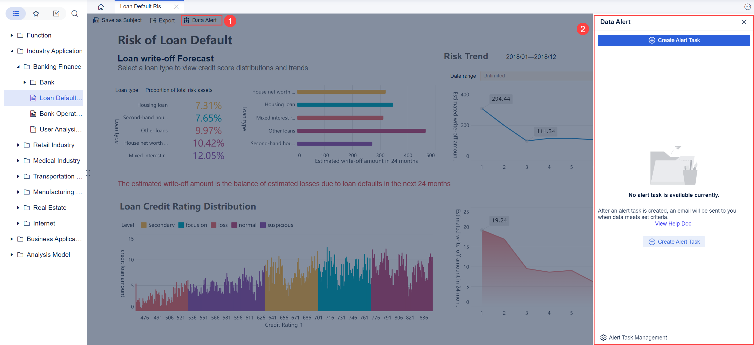
You can use FineBI to monitor quality and collaboration metrics across your projects. The platform allows you to set up alerts for critical thresholds, so you can act quickly when problems arise. By visualizing these metrics in your developer productivity dashboard, you make it easier for everyone to see where improvements are needed.
System Health Indicators
System health indicators are essential for monitoring the reliability and performance of your engineering infrastructure. A developer productivity dashboard should include these indicators to give you a complete view of your systems.
| Indicator | Description |
|---|---|
| Latency | Measures the time it takes for a system to respond to a request, indicating performance levels. |
| Traffic | Refers to the volume of requests hitting a system, helping to track load handling capabilities. |
| Errors | Represents the rate of failed requests, providing visibility into system failures. |
| Saturation | Measures how close a system is to its full capacity, indicating potential performance risks. |
Monitoring these indicators in your developer productivity dashboard helps you catch issues before they impact users. You can use FineBI to set up real-time monitoring and alerts, so your team can respond quickly to incidents. This proactive approach keeps your systems healthy and your users happy.
When you select engineering productivity metrics for your developer productivity dashboard, you create a foundation for continuous improvement. FineBI makes it easy to integrate data from different sources, visualize key metrics, and automate monitoring. By focusing on actionable metrics, you empower your team to deliver high-quality software faster and more reliably.
Integrate Engineering Dashboard Data Sources with FineBI
A successful software delivery management dashboard depends on unified, accurate, and timely data. You need to connect all your engineering tools to create a single source of truth. This integration gives you real-time visibility into your workflows and helps you make better decisions. When you bring together data from code repositories, project management tools, and CI/CD pipelines, you can track progress, spot issues, and improve your engineering process.
Connecting Engineering Team Tools
You likely use many tools in your engineering workflow. These may include Jira for project tracking, GitHub or GitLab for code management, Jenkins or CircleCI for continuous integration, and cloud databases for storing logs and metrics. To build an effective software delivery management dashboard, you must connect these tools and centralize their data.
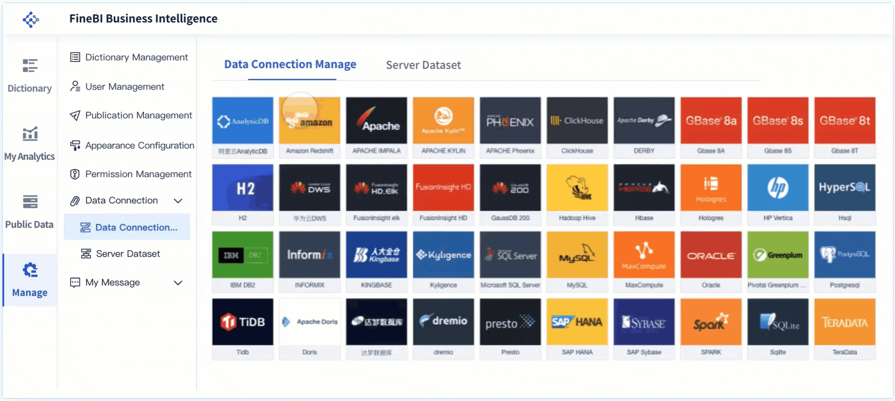
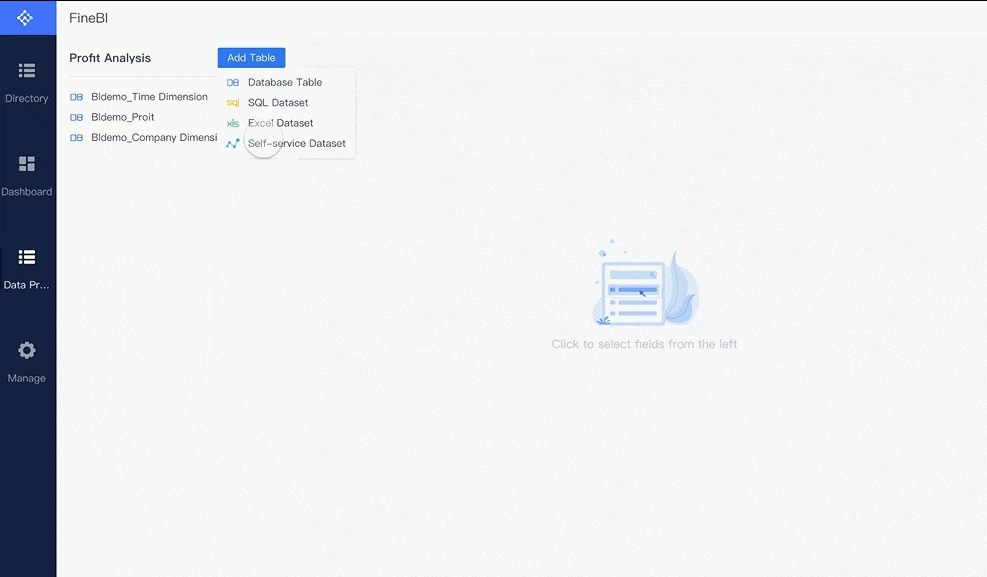
FineBI makes this process simple. You can connect to over 60 types of data sources, including:
- Relational databases like MySQL, PostgreSQL, SQL Server, and Oracle.
- Cloud data warehouses such as Snowflake, Amazon Redshift, and Google BigQuery.
- Big data platforms like Hadoop and Spark.
- File uploads, including Excel and CSV files.
- REST APIs for real-time data from external systems.
- Engineering tools such as Jira, GitHub, and CI/CD platforms.
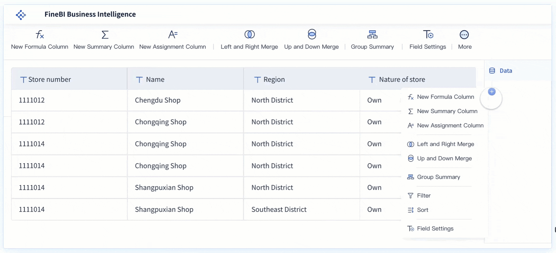
You do not need to write code to connect these sources. FineBI provides a drag-and-drop interface, so you can quickly link your engineering tools and start building your software delivery management dashboard. This approach saves time and reduces errors. You can also schedule automatic data updates, ensuring your dashboard always reflects the latest information.
When you centralize your data, you gain real-time visibility into your engineering process. You can monitor deployments, track code changes, and measure team performance in one place. This unified view helps you identify trends and make informed decisions.
Ensuring Data Accuracy
Accurate data is the foundation of any software delivery management dashboard. If your data is inconsistent or outdated, your insights will be unreliable. You need to follow a clear process to ensure data accuracy and consistency.
Tip: Always define your data requirements before connecting sources. This step helps you avoid confusion and ensures your dashboard meets your team's needs.
To maintain high data quality, follow these steps:
- Define data requirements. Identify the KPIs, metrics, and data quality standards you need for your dashboard.
- Validate data sources. Check that each source is credible and compatible with your dashboard.
- Implement data pipelines. Automate data collection and processing to reduce manual errors and keep your data fresh.
- Document data definitions. Clearly explain what each metric means and where it comes from.
- Monitor data quality. Regularly review your data quality metrics and address any issues or feedback from users.
FineBI supports these best practices by offering robust data integration and management features. You can automate data pipelines, document your metrics, and set up alerts for data quality issues. FineBI also enables pinpointing bottlenecks with data segmentation, so you can quickly identify where problems occur in your workflow.
FineBI stands out for its real-time updates and strong data governance. The platform uses advanced engines and tools to ensure your dashboard is always accurate and compliant. The table below summarizes these features:
| Feature | Description |
|---|---|
| BI-Direct Engine | Enables direct connections to big data platforms for real-time data queries without data extraction. |
| BI-distributed Engine | Utilizes a distributed architecture for efficient handling of massive data, supporting fast analysis. |
| Data Governance Tools | Provides tools for effective data management and processing, ensuring data governance compliance. |
With FineBI, you can build a software delivery management dashboard that delivers real-time updates and reliable insights. You can trust your data, respond quickly to changes, and drive continuous improvement across your engineering team.
By integrating all your engineering data sources and ensuring data accuracy, you create a strong foundation for your dashboard. This approach empowers you to make data-driven decisions and improve your software delivery process.
Build and Design Your Engineering Dashboard

Choosing the Right Platform
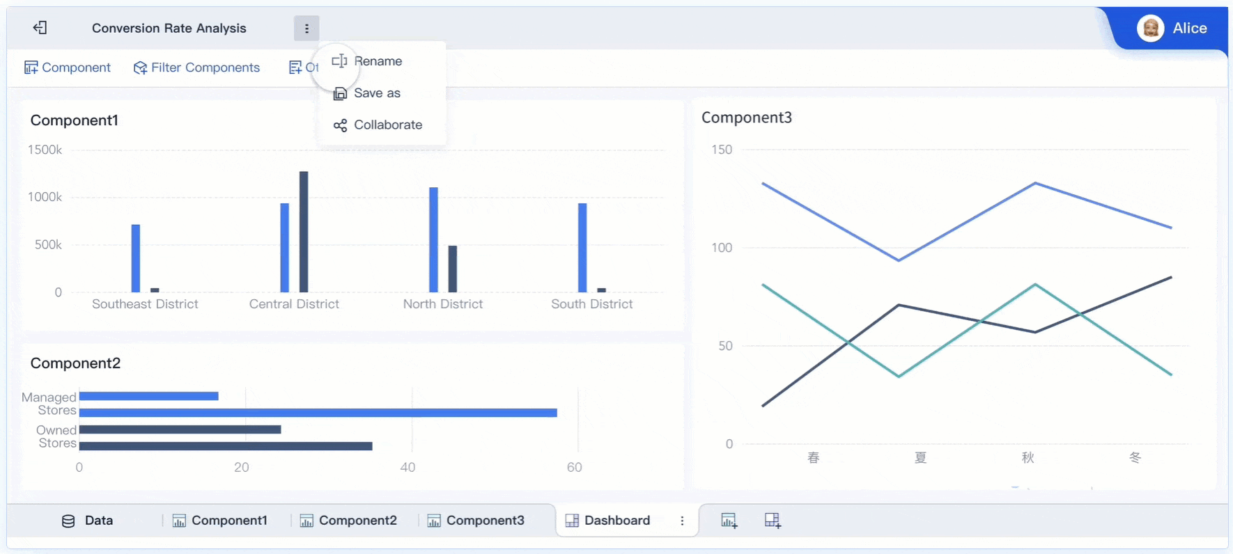
Selecting the right platform is the first step in building an effective engineering team dashboard. You want a solution that empowers your team to create, modify, and share dashboards without relying on IT support. FineBI stands out because it offers self-service, drag-and-drop dashboard creation. This approach lets you build a visual dashboard quickly and adjust it as your needs change. FineBI supports a wide range of custom visual components, so you can tailor your dashboard to your team’s unique requirements. The platform also provides mobile access, making it easy to check reports on any device.
| Feature | Description |
|---|---|
| Customizable Visual Components | Create dashboards with charts and filters tailored to your needs. |
| Decision-making Platform | Use tools for system management and user monitoring to support better decisions. |
| Mobile Access | Access dashboards on mobile devices for fast, smooth interactions. |
A user-friendly interface and real-time data access help your team gain insights without waiting for IT. Custom dashboards also encourage higher adoption and faster time-to-value.
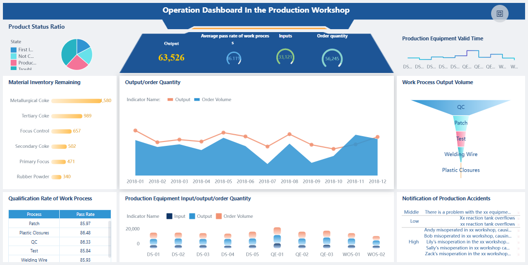
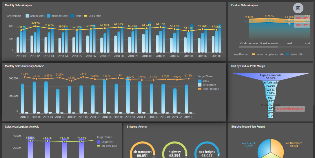
Visualizing Engineering Productivity Metrics
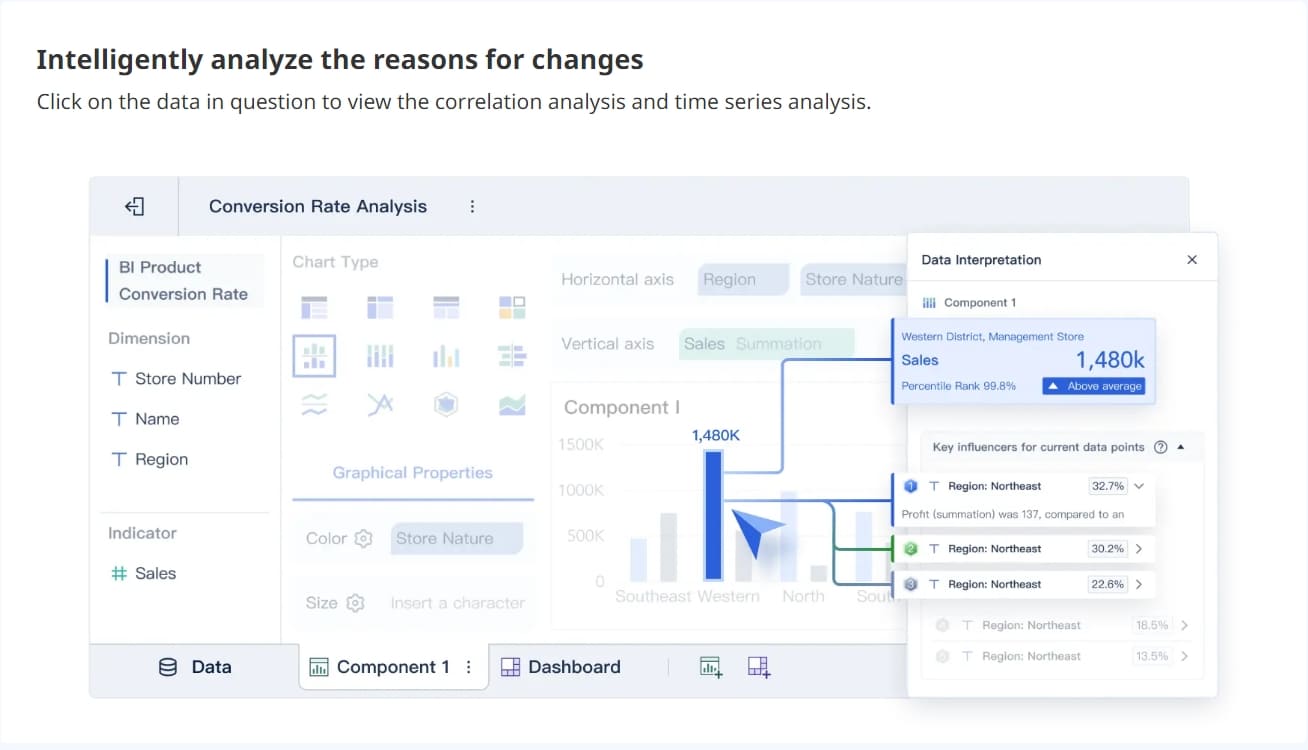
Effective visualization of engineering productivity metrics helps your team spot trends and make informed decisions. Use a mix of bar charts, line graphs, and scatter plots to display key metrics like cycle time, deployment frequency, and error rates. Bar charts work well for comparing categories, while line graphs show changes over time. Scatter plots reveal relationships between variables. You can also use histograms to understand data distributions.
When you design your custom dashboard, focus on clarity and simplicity. Establish a clear visual hierarchy to guide attention to the most important data. Keep design elements consistent and minimize cognitive load by showing only essential information. Choose the right visualization for each metric to ensure your team can interpret the data quickly.
Tip: Visual dashboards help you identify patterns in pull request reviews and system metrics, making it easier to balance workloads and track productivity.

Automating Updates and Sharing
Automating dashboard updates and sharing enhances collaboration across your engineering team. FineBI allows you to schedule automatic data refreshes, so your dashboard always displays the latest information. Real-time data visualization gives your team immediate access to key metrics, supporting quick decision-making.
Collaboration features let team members share insights, comment on findings, and break down silos. This inclusive approach integrates multiple perspectives and encourages open discussion. You can set up custom alerts for critical changes, ensuring everyone stays informed.
| Evidence Type | Explanation |
|---|---|
| Real-time data visualization | Immediate access to data for timely decisions. |
| Collaboration functions | Share insights and foster team discussions. |
| Breaking down silos | Integrate perspectives for better decision-making. |
By following these best practices, you create a custom engineering team dashboard that drives productivity and supports your team’s goals.
Iterate and Enhance Developer Experience Dashboard
Gathering Team Feedback
Rolling out your developer experience dashboard is only the beginning. You need to collect feedback from your team to make sure the dashboard meets their needs and drives improvement opportunities. Use structured forms and surveys within your internal developer portal to gather insights on satisfaction and usability. Visualize these responses over time to spot trends and connect feedback with performance metrics. This approach helps you identify areas where your dashboard supports daily work and where it needs refinement.
FineBI’s collaborative features make it easy for your team to share feedback directly on dashboards. Team members can comment, annotate, and discuss metrics in real time. This open communication encourages everyone to participate in reporting on improvement opportunities. When you involve your team in selecting and reviewing metrics, you create a dashboard that feels helpful rather than imposed.
| Process/Practice | Description |
|---|---|
| Leadership Review Cycles | Review diagnostic metrics regularly to promote cross-team learning. |
| Documenting Patterns | Record successful and failed approaches to guide future improvements. |
| Improvement Metrics | Focus on 2-3 actionable metrics relevant to daily decisions. |
| Team Involvement | Let teams help choose metrics for greater relevance and buy-in. |
| Continuous Feedback | Reference metrics in daily decisions to spark ongoing discussions. |
Continuous Improvement
You should treat your developer experience dashboard as a living tool. Focus on continuous improvement by updating metrics and visualizations based on team feedback and changing goals. Avoid tracking metrics that create competition among developers, such as lines of code or individual commits. Instead, measure process-related questions like cycle time, deployment frequency, and recovery time. Limit your dashboard to 5-7 key metrics to reduce noise and highlight significant improvement opportunities.
- Focus on metrics that enhance team and system performance.
- Avoid metrics that encourage competition among individuals.
- Measure process efficiency to identify improvement opportunities.
- Keep the number of metrics manageable for clarity.
- Tailor dashboard views for different roles to maximize relevance.
FineBI supports continuous improvement with real-time analytics and flexible dashboard customization. You can update metrics, automate data refreshes, and share new insights instantly. This agility helps you respond quickly to feedback and maintain a dashboard that evolves with your team’s needs.
By gathering feedback and focusing on improvement opportunities, you ensure your developer experience dashboard remains valuable and effective. Regular reporting on improvement opportunities keeps your team engaged and drives ongoing success.
Aligning your engineering dashboard with team goals creates a direct link between daily work and business outcomes. You improve resource allocation and optimize metrics. This approach builds stronger relationships across departments and ensures every technical decision supports business success.
You can build an effective engineering dashboard by choosing the right visualization tools, using clear layouts, and designing engaging dashboards. FineBI helps you create scalable dashboards that drive decision-making. Start your FineBI trial or share your dashboard success stories to inspire others.

Continue Reading About Engineering Dashboard
Best Dashboard Apps for Business Insights
What is a Call Center Dashboard and Why Does It Matter
What is a Reporting Dashboard and How Does it Work
What is An Interactive Dashboard and How Does It Work
What is a Call Center Metrics Dashboard and How Does It Work


FAQ

The Author
Lewis
Senior Data Analyst at FanRuan
Related Articles

How to Build an Investment Portfolio Reporting Dashboard for Executives: KPIs, Benchmarks, and Drill-Down Views
Investment portfolio reporting for executives is not about showing every holding, transaction, and chart your investment team can produce. It is about giving CEOs, CFOs, CIOs, boards, and investment committees a fast, re
Yida YIn
Jun 25, 2026

12 KPI Reporting Examples for Executive Dashboards: What to Show in Weekly, Monthly, and Quarterly Reviews
Executive leaders do not need more data. They need decision ready $1 examples that match how often they review the business and what actions they are expected to take. A weekly $1 should surface fast moving risks and per
Yida YIn
Jun 25, 2026

How to Build a Digital Marketing Reports Dashboard: Executive Examples, KPIs, and Templates
A $1 is the control layer that helps executives and marketing leaders turn scattered channel data into fast, confident decisions. If you are a CEO, CMO, operations director, or marketing analytics lead, the real problem
Yida Yin
May 07, 2026