How to create a custom savings dashboard in Excel means building a unique tool to track your personal savings progress, visualize your goals, and manage your finances more clearly. You set up dynamic tables, charts, and filters that display your income, expenses, and savings in real time. This approach helps you understand your personal financial habits and spot trends easily.
A savings dashboard brings your numbers to life. You only need to enter your data once, which reduces mistakes and saves time. Customizing templates lets you tailor reports to fit your personal style, and you can filter information to see exactly what matters most to you.
| Benefit Description |
|---|
| Data only needs to be entered once, saving time and reducing errors. |
| Templates are easy to customize, allowing for tailored and branded reports. |
| Dashboards can be easily filtered to show exactly the data needed for specific users. |
If you want even more advanced features, like mobile access or 3D visualizations, FineReport offers a powerful alternative for building interactive dashboards.
Set Savings Goals and Prepare Data For Savings Dashboard

Define Your Savings Objectives
Before you start building your savings dashboard, you need to get clear about your goals. Ask yourself what you want to achieve. Are you saving for an emergency fund, a vacation, or a new laptop? Setting specific goals helps you stay motivated and track your progress. Try using the SMART framework:
- Specific: Decide exactly what you want to save for, like $1,500 for an emergency fund.
- Measurable: Set monthly savings targets so you can see your progress.
- Achievable: Make sure your goal fits your current financial situation.
- Realistic: Consider your regular expenses and obligations.
- Time-bound: Pick a deadline to reach your goal.
You can also break big goals into smaller milestones. This makes the process less overwhelming and helps you celebrate small wins along the way.
Tip: Write down your reason for saving. It keeps you motivated when you see your progress in your excel dashboard.
Organize Income, Expenses, and Savings Data
Now, gather all the data you need for budget tracking. Start by listing your sources of income, such as your job or side gigs. Next, record your fixed expenses like rent and insurance, and variable expenses like groceries or entertainment. Don’t forget to include debt payments and your savings goals.
Here’s a simple way to organize your data in Excel:
- Download a personal budget template or create your own.
- Enter your income in one section.
- Add your savings goals in another.
- List your expenses by category.
- Check the summary to see your leftover funds after expenses and savings.
Using Excel tables makes this process easier. Tables let you filter, sort, and analyze your data quickly. You can also use what-if analysis to see how changes in spending or income affect your savings.
| Feature | Benefit |
|---|---|
| What-If Analysis | Explore different scenarios by changing input values. |
| Data Table | Test various outcomes by adjusting variables. |
| Visualization | Compare risks and opportunities side by side. |
Choose Key Metrics to Track
To make your dashboard useful, pick the right metrics. Some important ones for personal budget management include:
- Total income
- Fixed and variable expenses
- Savings goals and progress
- Debt payments
- Spending categories
- Planned vs. actual amounts
- Balance or leftover funds
Tracking these metrics in your savings dashboard gives you a clear picture of your finances. You can spot trends, adjust your budget, and make smarter decisions. If you want to take your excel dashboard to the next level, you can later explore advanced tools that import Excel data for even more powerful analysis.
Build Your Savings Dashboard in Excel
You’re ready to bring your savings dashboard to life. This is where you turn your budget data into a powerful tool for personal budget management. Let’s walk through each step so you can create a dashboard that’s both functional and easy to use.
Create Dynamic Tables
Start by building dynamic tables in Excel. These tables form the backbone of your dashboard and make updating your budget a breeze. Here’s how you can set them up:
- Figure out what you need. Think about the information you want to see in your savings dashboard. Sketch a quick mock-up and decide which data sources you’ll use.
- Clean and set up your data. Use Excel’s Power Query to organize your budget data in a clear, tabular format. Make sure your columns have clear headers and your data is free from extra formatting.
- Calculate your key metrics. Load your cleaned data into Excel tables. Use formulas to track your income, expenses, and savings goals.
- Make your tables interactive. Add drop-down lists and conditional formatting to highlight important numbers. This helps you spot trends and keep your budget organized.
- Bring everything together. Move your tables to a new sheet. Arrange them neatly and format them for easy reading.
Dynamic tables have big advantages over static ones. Check out the table below to see why they’re a smart choice for your savings dashboard:
| Advantage | Description |
|---|---|
| Time-saving | Dynamic tables update automatically, so you spend less time on manual changes. |
| Flexibility | They work for both big and small tasks, making your budget process smoother. |
| Automatic adjustments | Tables grow or shrink as you add or remove data, so your formulas always stay accurate. |
| Improved organization | Built-in sorting and filtering keep your budget data tidy and easy to navigate. |
| Meaningful references | Structured references make your data easier to understand and manage. |
| Integration with dashboards | Dynamic tables connect seamlessly to PivotTables and charts, keeping your dashboard up to date. |
| Enhanced data analysis | Features like drop-downs and conditional formatting help you spot trends and validate data. |
Tip: Always use clear column headers and avoid merging cells. This keeps your tables flexible and ready for analysis.
Use PivotTables for Summaries
PivotTables are your best friend when you want to summarize your budget data. They help you see the big picture without getting lost in the details. Here’s what makes PivotTables so useful:
| Feature | Description |
|---|---|
| Data Summarization | Quickly adds up your income, expenses, and savings with built-in functions like sum and average. |
| Data Grouping | Groups your budget by month, category, or type, so you can spot patterns easily. |
| Filtering and Sorting | Lets you filter for specific months or categories and sort to find your biggest expenses. |
| Drill Down Feature | Double-click to see the details behind any summary number. |
| Visual Representation | Connects to PivotCharts for instant chart visualizations. |
| Data Source Flexibility | Pulls data from your tables or even other files if you need. |
| Custom Calculations | Lets you add your own formulas for special budget needs. |
| Comprehensive Reporting | Rearranges data for clear, concise reports that help with decision-making. |
When you create a dashboard with PivotTables, you need to avoid common mistakes:
- Set up your data structure properly. Keep your data in a rectangular format with clear headers.
- Refresh your PivotTable after updating your source data. This keeps your summaries accurate.
- Watch out for active filters. They can change your results and lead to confusion.
- Don’t overload your PivotTable with too many fields. Keep it simple for easy reading.
Add PivotCharts for Visualization
Now, it’s time to make your savings dashboard visually engaging. PivotCharts turn your numbers into stories. They help you and anyone else using your dashboard quickly spot trends, patterns, and outliers in your budget.
PivotCharts are dynamic. When you update your data or use filters like Slicers and Timelines, your charts update instantly. This makes it easy to explore your budget from different angles. You can use bar charts to compare monthly income and expenses, pie charts to break down spending by category, and line graphs to track your savings progress over time.
Note: Interactive features like Slicers let you filter your charts by month or category with just a click. This makes your excel dashboard much more user-friendly.
Monthly Tracking and Category Breakdown
Monthly tracking is key for personal budget management. You want to see how your income, expenses, and savings change each month. Breaking down your budget by category helps you understand where your money goes.
Here are some best practices for this part of your dashboard:
| Chart Type | Purpose |
|---|---|
| Pie Chart | Shows how much you spend in each category |
| Bar Chart | Compares your income and expenses month by month |
| Line Graph | Tracks your savings or spending trends over time |
Excel makes this easy with built-in templates and automatic calculations. You can set up your dashboard to calculate totals for each month, highlight important data with conditional formatting, and use data validation to keep your entries accurate.
| Feature | Description |
|---|---|
| Templates | Enter your income, expenses, and savings goals quickly. |
| Automatic Calculations | Totals update as you add new data, so you always see the latest numbers. |
| Visual Representations | Charts help you analyze your spending and savings trends at a glance. |
| Conditional Formatting | Highlights key numbers, like when you hit a savings goal. |
| Pivot Tables | Summarize and reorganize your budget for deeper analysis. |
| Data Validation | Ensures your entries are correct, reducing errors in your tracking. |
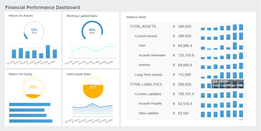
If you want to create a dashboard with even more advanced features, FineReport can help. FineReport lets you create a dashboard with drag-and-drop design, advanced chart visualizations, and mobile access. You can import your Excel data and build interactive dashboards that go beyond what Excel offers. This is perfect if you want to scale up your personal or business budget tracking in the future.
Creating a savings dashboard in Excel gives you control over your finances. You can see your progress, adjust your budget, and make smarter decisions every month.

Enhance and Customize Your Savings Dashboard
Add Interactive Elements
You can take your savings dashboard to the next level by adding interactive features in Excel. Slicers and filters make it easy to focus on the budget details that matter most to you. Slicers give you a simple, visual way to filter your data. With just one click, you can see only the information you want. This saves time and helps you analyze your personal budget without digging through menus. Slicers also let you filter multiple PivotTables at once, which makes your dashboard more efficient and user-friendly. When you add interactive charts, you can explore your budget from different angles and spot trends quickly.
Design for Clarity and Usability
A clear and easy-to-use dashboard helps you manage your personal budget better. You want your dashboard to be simple, organized, and visually appealing. Here are some design principles to follow:
| Principle | Description |
|---|---|
| Rounding Numbers | Round off numbers to make them easier to read and understand. |
| Size and Location | Place important data where you can see it first. Use size to show what matters most. |
| Consistency | Use the same colors, fonts, and layout throughout your dashboard for a smooth experience. |
| Doubling Margins | Add extra space around charts and tables to keep things clear and uncluttered. |
| Data Precision | Label your data clearly and check for accuracy to build trust in your dashboard. |
You can also improve clarity by removing unnecessary elements, using clean fonts, and keeping your dashboard updated with live data. Customizing your dashboard lets you focus on your personal goals, which makes it more engaging and useful.
FineReport for Advanced Dashboards
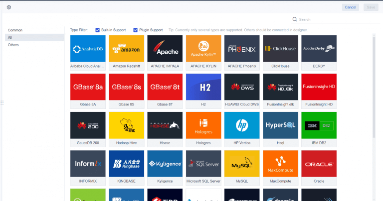
If you want more advanced features than Excel offers, FineReport is a great choice. FineReport supports mobile dashboards, so you can check your budget and savings progress anywhere. The platform also gives you dynamic 2D and 3D visualizations, making it easier to see trends in your personal finances. FineReport connects to multiple data sources, which means you can manage all your financial information in one place. With these tools, you get real-time updates and can customize your dashboard to fit your personal budget management needs. This level of customization keeps you engaged and helps you reach your financial goals.
A custom savings dashboard gives you a clear view of your budget and helps you make smarter choices with your money. You can track your progress, spot trends, and adjust your budget as life changes. Excel makes it easy to build a dashboard for quick analysis and basic reporting. If you want more advanced features or need to manage your budget on the go, FineReport offers scalable and mobile-friendly options. Ready to take control of your personal budget? Start building your dashboard today and see the difference.

Continue Reading About Savings Dashboard
Best Dashboard Apps for Business Insights
What is a Call Center Dashboard and Why Does It Matter
What is a Reporting Dashboard and How Does it Work
What is An Interactive Dashboard and How Does It Work
What is a Call Center Metrics Dashboard and How Does It Work


FAQ

The Author
Lewis
Senior Data Analyst at FanRuan
Related Articles

How to Build an Investment Portfolio Reporting Dashboard for Executives: KPIs, Benchmarks, and Drill-Down Views
Investment portfolio reporting for executives is not about showing every holding, transaction, and chart your investment team can produce. It is about giving CEOs, CFOs, CIOs, boards, and investment committees a fast, re
Yida YIn
Jun 25, 2026

12 KPI Reporting Examples for Executive Dashboards: What to Show in Weekly, Monthly, and Quarterly Reviews
Executive leaders do not need more data. They need decision ready $1 examples that match how often they review the business and what actions they are expected to take. A weekly $1 should surface fast moving risks and per
Yida YIn
Jun 25, 2026

How to Build a Digital Marketing Reports Dashboard: Executive Examples, KPIs, and Templates
A $1 is the control layer that helps executives and marketing leaders turn scattered channel data into fast, confident decisions. If you are a CEO, CMO, operations director, or marketing analytics lead, the real problem
Yida Yin
May 07, 2026