A strong recruitment analytics dashboard does more than visualize hiring activity. It helps recruiting leaders make faster decisions, reduce delays, allocate capacity, and explain hiring performance in business terms.
The problem is simple: most teams try to use one dashboard for everyone. That rarely works.
A recruiter managing 40 open roles needs operational visibility. A talent leader scaling headcount needs early-warning signals. An executive needs a concise view of risk, plan attainment, and cost efficiency. These are different jobs, so they require different dashboard structures.
In this guide, you will see three proven dashboard setups designed for common recruiting scenarios:
You will also learn how to choose the right metrics, organize data sources, and turn dashboard examples into a repeatable recruiting analytics process.
Why recruitment analytics dashboards matter for different hiring models
Not all recruiting environments operate the same way. A startup doubling headcount, a retail business hiring at scale, and a leadership team reviewing quarterly talent risks are solving very different problems.
That is why one generic recruitment analytics dashboard usually underperforms. It may contain useful metrics, but it does not reflect the cadence, audience, or decision logic of the people using it.
A practical dashboard should answer three questions:
A well-designed dashboard does not just display hiring numbers. It creates shared visibility across recruiting, hiring managers, HR, and leadership. That visibility matters because delays in the funnel can quickly become business delays: missed launches, overloaded teams, lost revenue opportunities, or service gaps.
By the end of this guide, you should be able to identify which setup matches your hiring model, which metrics belong in each view, and how to structure a dashboard that supports action rather than passive reporting.
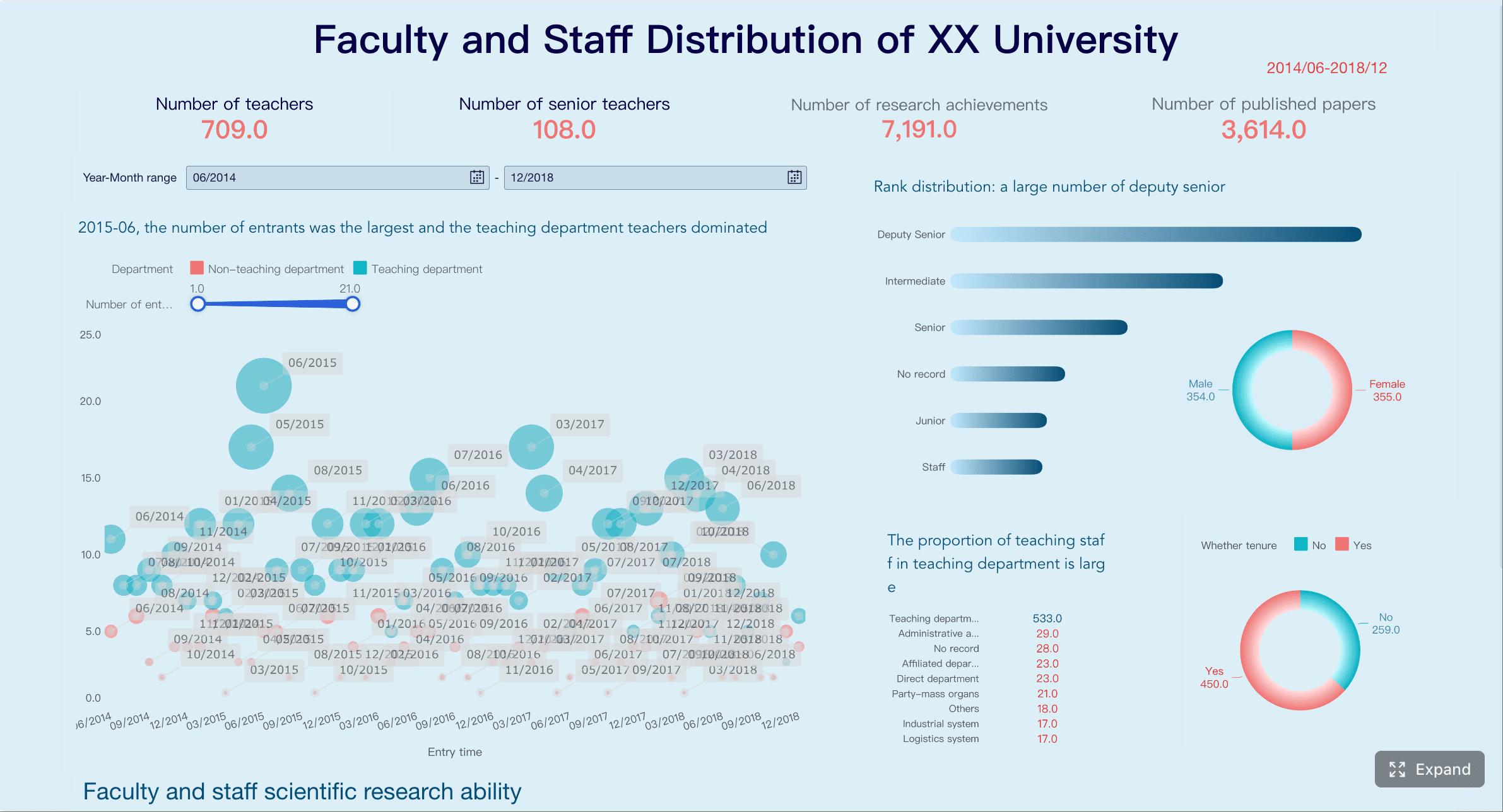
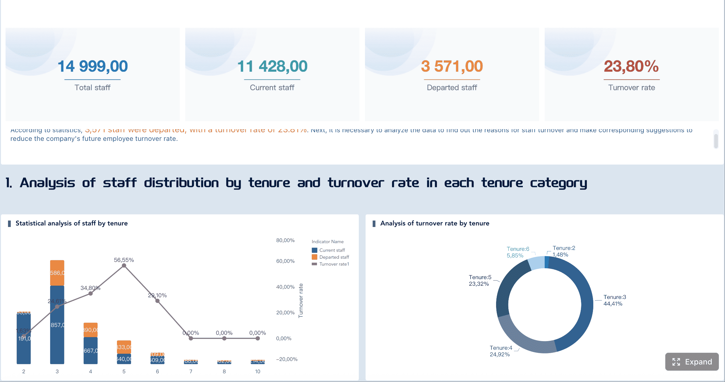
All dashboard examples in this article were created by FineBI.
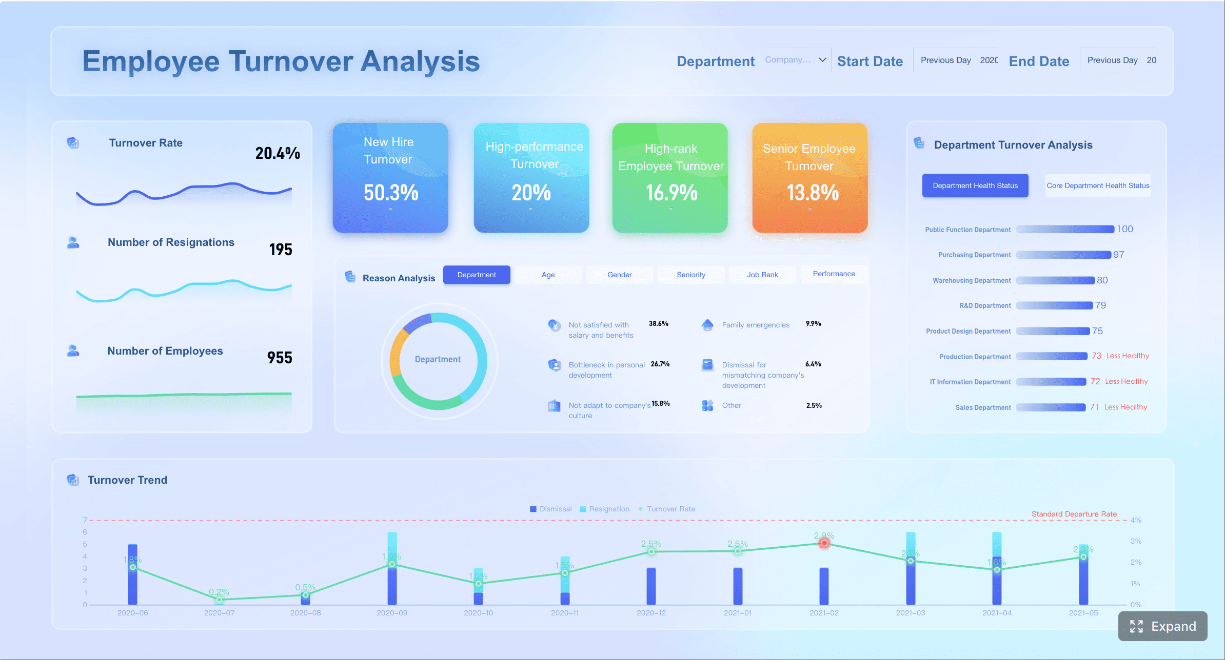
Setup 1: A recruitment analytics dashboard for scaling teams
When a company is growing fast, recruiting complexity rises faster than headcount. More roles open across more departments. Hiring manager responsiveness becomes uneven. Recruiter bandwidth gets stretched. Priority roles change quarter to quarter.
In this environment, the best recruitment analytics dashboard is built for pipeline visibility, recruiter capacity, and bottleneck detection.
The objective is not only to measure hiring speed. It is to help talent leaders spot delays before they affect growth plans.
A scaling-team dashboard should answer questions like:
Which role families are moving too slowly?
Where are candidates getting stuck in the funnel?
Which recruiters are overloaded?
Which hiring managers are slowing interview feedback or offer decisions?
Which requisitions are aging beyond target?
The key is to organize the dashboard around decisions, not just metrics. A useful structure often includes:
Top summary layer
Open roles, hires completed, time to fill trend, aging requisitions, offer acceptance rate.
Pipeline health layer
Candidates by stage, conversion rates by stage, stage aging, interview load.
Capacity and accountability layer
Recruiter workload, req ownership, hiring manager responsiveness, role priority flags.
This setup helps growing teams shift from reactive hiring to active pipeline management.
Recommended metrics to include
Time to fill by role family
This is one of the most useful metrics for scaling organizations because it shows where demand is outpacing recruiting capacity or market supply.
Role-family segmentation matters because averages across all roles can hide real hiring risks. If engineering hiring is trending up by 20 days while other functions are stable, talent leaders need to know early.
Stage-by-stage conversion rates
Conversion rates reveal where the funnel is weakening. For scaling teams, this is critical because a high application count can mask poor movement deeper in the process.
Track conversion between major stages such as:
Application to recruiter screen
Screen to hiring manager interview
Interview to final stage
Final stage to offer
Offer to acceptance
Low conversion at one stage can signal poor sourcing quality, misaligned screening criteria, or inconsistent interview calibration.
Recruiter workload and req aging
Recruiting capacity becomes a structural constraint during growth. If recruiter workload is uneven, high-priority roles may stall while lower-impact roles consume time.
Useful workload views include:
Open reqs per recruiter
Active candidates per recruiter
Interviews coordinated per recruiter
Reqs aging beyond SLA
Priority reqs with no movement in 7 or 14 days
Aging data is especially powerful when paired with role criticality. Not every old requisition is a business risk. A dashboard should help leaders separate normal delay from strategic exposure.
Interview volume and offer acceptance rate
Interview volume acts as a leading indicator of upcoming offer activity. Offer acceptance rate shows whether the company is converting late-stage effort into hires efficiently.
Combined, these metrics can help answer:
Are teams interviewing enough candidates for future hiring goals?
Are offers being lost because of compensation, timing, or candidate experience?
Are certain departments weaker at closing candidates?
When this setup works best
This dashboard setup is most effective when the organization faces rapid hiring change and limited recruiting capacity.
It is especially useful for:
Rapid headcount growth across multiple departments
Lean recruiting teams that need to allocate effort carefully
Hiring plans that change frequently quarter to quarter
In these cases, the dashboard should be reviewed weekly by recruiting leaders and discussed with hiring stakeholders. The value comes from identifying action points early, such as re-prioritizing roles, escalating slow feedback loops, or rebalancing recruiter assignments.
Setup 2: A dashboard built for high-volume hiring
High-volume hiring is a different operating model. The challenge is less about bespoke pipeline management and more about speed, throughput, source efficiency, and operational consistency.
This applies in sectors such as retail, logistics, customer support, hospitality, healthcare operations, and field services, where many similar roles must be filled continuously across locations, shifts, or campaigns.
A high-volume recruitment analytics dashboard should help teams process large applicant pools without losing quality control. That means it must be simple, fast to interpret, and segmented by operational realities like site, region, role type, or shift.
The best setups usually include separate views for:
Frontline recruiters: daily funnel throughput and stage aging
Recruiting operations: process health, bottlenecks, source performance
Location-level hiring managers: local hiring progress, conversion, and start readiness
The operating principle is clear: track only the metrics that improve daily execution.
Recommended metrics to include
Application-to-screen and screen-to-interview conversion
In high-volume hiring, top-of-funnel volume can become noise if conversion rates are weak. These two metrics quickly show whether candidate quality and screening discipline are aligned.
Use them to compare:
Locations
Campaigns
Job ads
Recruiters
Role categories
A drop in application-to-screen conversion may indicate poor applicant quality or overly broad sourcing. A drop in screen-to-interview conversion may suggest misaligned screening standards or limited manager availability.
Time in stage for high-volume roles
Stage speed matters more than almost any other metric in high-volume environments. Candidates often drop out quickly if the process is slow, fragmented, or unresponsive.
Track median time in stage for roles such as:
Warehouse associates
Store managers
Call center agents
Drivers
Seasonal staff
Instead of one total cycle-time number, break the process into operational handoffs. This makes it easier to see exactly where candidates are waiting.
Offer-to-start rate
This metric is often overlooked, yet it is highly valuable in high-volume recruiting. Offers accepted do not always translate into starts. In frontline hiring, no-shows, drop-offs, and pre-start attrition can materially disrupt staffing plans.
Offer-to-start rate helps teams identify:
Weak onboarding transitions
Site-specific candidate attrition
Compensation or scheduling issues
Delays between offer and start date
Source performance by location or campaign
Not all sources work equally well in every geography or labor market. High-volume teams need local insight, not only global source rankings.
Track source performance by:
Cost
Applicant volume
Qualified candidate yield
Interview conversion
Offer conversion
Start conversion
This helps recruiting operations shift budget toward the channels that actually produce hires, not just clicks or applications.
Common mistakes to avoid
High-volume dashboards fail when they become too complicated or too generic. The most common mistakes include:
Tracking too many metrics that slow decision-making
If a frontline recruiting team must scan 30 KPIs to understand what happened today, the dashboard is not helping. Focus on a small number of operational metrics tied to immediate actions.
Ignoring location or shift-level differences
Averages can hide major differences between sites, labor pools, and shifts. Segment the dashboard where hiring conditions differ materially.
Measuring volume without monitoring candidate drop-off
Application count is not enough. If candidate drop-off rises after screening or offer stages, throughput metrics alone create a false sense of performance.
A high-volume dashboard should be fast, focused, and operationally grounded. It is less about broad storytelling and more about managing flow.
Setup 3: An executive reporting dashboard for leadership updates
Executives do not need a recruiter’s working view. They need a business view.
An executive recruitment analytics dashboard should translate hiring activity into outcomes leaders can assess quickly. That means fewer operational details and more emphasis on forecast accuracy, hiring progress against plan, cost efficiency, and strategic risk.
Where are we likely to miss business-critical targets?
Is hiring efficiency improving or worsening?
Which functions or regions are at risk?
Where does leadership intervention matter now?
The design should support monthly and quarterly reporting, with clean trend lines, targets, and plain-language summaries.
A practical structure often includes:
Business outcome summary
Hiring plan attainment, critical role progress, cost per hire, key risks.
Trend analysis
Time to hire, acceptance rate, diversity movement, fill-rate trends.
Risk and action section
Problem areas, root causes, recommended intervention.
Recommended metrics to include
Hiring plan attainment
This tells executives whether the organization is delivering the agreed workforce plan. It is one of the clearest bridges between recruiting activity and business execution.
Track attainment by:
Business unit
Geography
Role criticality
Quarter
Functional leader
This should be shown against target, not in isolation.
Time to hire trends
Executives do not need every stage-level detail, but they do need trend visibility. Rising time to hire can indicate process friction, weak market competitiveness, or insufficient recruiting capacity.
Trend views should show:
Current period vs prior period
Trend by critical functions
Target vs actual
Variance commentary
Cost per hire
This metric matters most when paired with volume and role mix. Executives want to know whether recruiting spend is supporting plan attainment efficiently.
Useful segmentations include:
Function
Region
Internal vs agency-supported hiring
High-volume vs specialized hiring
Cost per hire should not drive decisions alone, but it provides important context for talent investment efficiency.
Diversity pipeline movement
Leadership increasingly expects visibility into diversity progress, but the reporting must be precise and responsibly structured. The most useful view is not a static snapshot. It is pipeline movement across stages.
This helps leaders see whether representation changes at application, shortlist, interview, offer, or acceptance stages. That visibility supports better governance and more targeted intervention.
Critical role fill rate
Some roles matter more than others. An executive dashboard should isolate business-critical positions and report fill progress separately from general hiring volume.
This metric is highly effective for:
Revenue-generating roles
Leadership positions
Customer-facing roles tied to service delivery
Hard-to-fill technical positions
How to make executive reports easier to act on
The biggest failure in executive recruiting reports is overloading leaders with operational detail. An executive dashboard should drive decision-making, not force interpretation.
To make reports easier to act on:
Summarize what changed, why it changed, and where intervention is needed
Every monthly or quarterly report should answer these three points directly. This turns a dashboard into a management tool.
Use benchmarks, targets, and trend lines instead of isolated numbers
A number without context is weak. A trend against target is actionable.
Separate strategic indicators from operational detail
Executives should see strategic outcomes first. If they need more detail, provide a drill-down path rather than crowding the primary report.
This structure improves board-level readability and gives recruiting leaders a clearer narrative when discussing hiring performance with senior stakeholders.
How to choose the right dashboard structure, metrics, and data sources
A useful recruitment analytics dashboard starts with the business problem, not the chart type.
Too many teams begin by pulling every available ATS metric into one report. That approach usually creates clutter, confusion, and weak adoption. A better approach is to align dashboard design to three factors:
Business problem
Stakeholder audience
Decision frequency
For example, if the main issue is missed headcount targets in engineering, the dashboard should emphasize priority req aging, manager responsiveness, and pipeline conversion for technical roles. If the issue is frontline labor shortage by location, the dashboard should prioritize throughput, source efficiency, and time in stage.
It is also important to distinguish between leading indicators and outcome measures.
ATS for pipeline stages, requisitions, candidate movement, offers
HRIS for headcount plans, starts, organizational structure
Sourcing tools for channel performance and campaign data
Interview platforms for scheduling volume, interview timing, feedback completion
Finance or procurement systems for agency spend and recruiting costs
Data quality matters as much as visualization. If stage definitions vary by team, or if requisition ownership is inconsistently maintained, even a polished dashboard will produce low trust.
Questions to ask before building
Before building or redesigning a dashboard, ask the following:
Who will use the dashboard every week?
Weekly users determine the real operating design. If recruiters are daily users, optimize for speed and clarity. If leadership is the main audience, prioritize concise strategic summaries.
Which decisions should it support?
A dashboard without a decision path becomes a reporting artifact. Define the decisions first: reprioritize roles, escalate manager delays, shift sourcing spend, adjust hiring targets, or allocate recruiter capacity.
What data definitions need standardization first?
Common definitions that often require standardization include:
Which metrics require filters by team, role, location, or hiring manager?
If users cannot segment the data in ways that match the business, the dashboard will not support action. Filters should reflect how hiring decisions are actually made.
How to turn dashboard examples into a working recruiting analytics process
A dashboard is not the process. It is the interface for the process.
To generate real value, recruiting teams must connect dashboard insight to recurring reviews, decisions, and follow-up actions.
Start small. Pick one use case and a limited set of metrics tied to specific decisions. For example:
Review compensation competitiveness for low acceptance-rate positions
This is how a dashboard becomes part of a working recruiting operating model.
As hiring goals, team structures, and reporting expectations evolve, the dashboard should evolve too. Metrics that were useful during a growth phase may become less relevant during a cost-control period. A mature recruiting analytics process includes periodic review of dashboard usefulness, data quality, and stakeholder adoption.
In practice, many organizations reach a point where spreadsheets and static ATS reports are no longer enough. That is when a modern BI platform becomes valuable. Tools like FineBI can help recruiting and HR teams unify ATS, HRIS, sourcing, and interview data into one governed analytics layer, while still giving different stakeholders the tailored views they need. For example, recruiters can monitor operational funnel metrics, talent leaders can analyze bottlenecks and forecasting risk, and executives can review plan attainment and strategic hiring indicators in a concise visual format.
Build different dashboard views for different stakeholders
Enable drill-down from executive summaries into operational detail
Standardize metric definitions across departments or regions
Combine multiple recruiting data sources without heavy manual reporting
Refresh dashboards more frequently for faster decision-making
Get Ready-to-Use Dashboard Templates in Fine Gallery
The right recruitment analytics dashboard should help your organization hire with more speed, clarity, and control. But the bigger win is not the dashboard itself. It is the discipline it creates: shared definitions, regular review, faster intervention, and better hiring outcomes. If that is the goal, start with the setup that matches your hiring model, keep the metrics decision-focused, and build from there.
A recruitment analytics dashboard helps recruiters, talent leaders, and executives track hiring performance in one place. It turns recruiting data into clear insights for decisions about speed, capacity, bottlenecks, and hiring progress.
Start with the audience, decisions, and review cadence. Scaling teams usually need pipeline and capacity views, high-volume hiring teams need throughput and source efficiency, and executives need a concise summary of risk, cost, and progress versus plan.
The most useful metrics usually include time to fill, time to hire, stage conversion rates, requisition aging, recruiter workload, source performance, and offer acceptance rate. The right mix depends on whether the dashboard supports daily operations or leadership reporting.
A single dashboard often mixes operational detail with executive reporting, which makes it less useful for everyone. Different users need different levels of detail, different KPIs, and different update frequencies to take action.
It depends on the hiring model and the user. High-volume recruiting dashboards may need daily updates, scaling-team dashboards are often reviewed weekly, and executive dashboards are typically refreshed monthly or quarterly.
Product Trial
FineReport
Pixel-perfect reports · Interactive dashboards · Easy data entry · Digital twins