Hiring leaders rarely struggle because they lack data. They struggle because the data is fragmented, inconsistent, and too slow to guide action. A well-designed recruitment metrics dashboard fixes that. It turns recruiting activity into operational visibility, leadership clarity, and better hiring outcomes.
For talent acquisition teams, the right dashboard is not just a reporting layer. It is a decision system. It helps recruiters prioritize, hiring managers respond faster, and executives understand whether hiring investments are improving business performance.
In this guide, you will find 8 practical recruitment metrics dashboard templates organized around four outcomes that matter most to modern hiring teams:
Speed
Quality
Cost
Diversity
These templates are useful whether you run hiring from an ATS, a spreadsheet, or a business intelligence platform. More importantly, they help you move from passive reporting to active hiring management.
Why a recruitment metrics dashboard matters for modern hiring
A strong recruitment metrics dashboard gives every stakeholder a shared view of pipeline health, recruiter execution, and hiring outcomes. Instead of asking for manual updates, teams can quickly see where roles are stuck, which channels perform best, and what changes will create measurable improvement.
Dashboard templates are especially valuable because they standardize how teams review hiring performance. That makes it easier to:
Spot bottlenecks by role, department, or hiring stage
Compare recruiter and hiring manager performance fairly
Identify delays before they become missed headcount targets
Link recruiting inputs to downstream business outcomes
Make faster decisions with less debate over definitions
The four hiring goals covered in this guide are the most common executive priorities:
Are we building a fairer and more inclusive funnel?
Representation, pass-through rates, outcomes
A common question is whether to build one shared recruitment metrics dashboard or separate dashboards for each goal.
Use one shared dashboard when:
Leadership needs a concise executive overview
Hiring volume is moderate
Teams want one source of truth for weekly reviews
Use separate dashboards when:
Different stakeholders need different decisions and detail levels
Hiring is large-scale or highly segmented by function
You need deeper operational views for speed, cost, or diversity analysis
In practice, most mature teams use both: one executive summary dashboard, plus focused dashboards by hiring goal.
All dashboard examples in this article were created by FineBI.
The 8 recruitment metrics dashboard templates by hiring goal
1) Hiring speed dashboard
The hiring speed dashboard is the most direct way to diagnose delays across the recruiting lifecycle. It is designed for teams that need to reduce open vacancy days, improve candidate flow, and hit hiring targets faster.
This template helps answer two critical questions:
Where are candidates stalling?
Which roles need process changes first?
For example, if time to hire looks acceptable overall but interview feedback lag is high for engineering roles, the issue is not sourcing. It is likely interviewer capacity or decision discipline. That distinction matters because the solution is different.
This dashboard is best reviewed weekly by recruiting operations, recruiters, and hiring managers with active roles.
2) Pipeline velocity dashboard
If the hiring speed dashboard focuses on end-to-end timing, the pipeline velocity dashboard focuses on operational flow. It reveals whether enough candidates are entering the funnel, moving through it efficiently, and receiving timely decisions.
Core metrics include:
Application volume
Screening throughput
Interview scheduling lag
Offer turnaround time
Candidate backlog by stage
Weekly movement between stages
Recruiter screening capacity
This template is especially useful when hiring teams say they are “busy” but roles still move slowly. Activity alone is not performance. Velocity dashboards show whether work is translating into candidate progression.
Common patterns this dashboard can reveal:
High application volume, low screening throughput
Good screening throughput, but long scheduling lag
Strong interview volume, but slow offer turnaround
Healthy top-of-funnel, weak conversion into finalist stages
These patterns help separate capacity issues from process issues. That is essential for leaders deciding whether to add headcount, automate workflows, or tighten service-level agreements.
3) Quality of hire dashboard
Many recruiting teams measure speed well but struggle to prove quality. A quality of hire dashboard closes that gap by connecting recruiting activity with post-hire results.
This dashboard typically combines:
New hire performance
Retention at 30, 90, and 180 days
Hiring manager satisfaction
Source quality
Ramp-to-productivity indicators
Early attrition by role or source
Offer-to-performance correlation where available
This is one of the most strategically important dashboard templates because it reframes talent acquisition as a business outcome function, not just a process function.
Which channels produce hires who perform well and stay?
Which hiring teams consistently select stronger talent?
Are we filling roles quickly at the expense of fit?
Which job families show the highest early attrition risk?
A useful best practice is to avoid relying on a single quality measure. Quality of hire is multidimensional. It should blend performance, retention, and stakeholder satisfaction rather than reducing everything to one score.
Quality dimension
Example metric
What it reveals
Performance
90-day manager rating
Early effectiveness
Retention
6-month retention rate
Fit and staying power
Satisfaction
Hiring manager satisfaction score
Perceived hiring quality
Source quality
Performance by source
Channel effectiveness beyond volume
This dashboard is usually reviewed monthly or quarterly, because post-hire outcomes need time to stabilize.
4) Candidate experience and offer acceptance dashboard
A poor candidate experience damages both speed and quality. It increases drop-off, weakens employer brand, and reduces close rates for strong finalists. This dashboard template helps teams measure the parts of recruiting candidates feel most directly.
This dashboard reveals hidden friction. For example:
Candidates may drop after screening because role expectations are unclear
Candidates may decline offers because compensation alignment happened too late
Satisfaction may be strong overall but weak for one function or location
Offer acceptance may drop when decision timelines stretch too long
The best use of this dashboard is not only to report the problem, but to redesign the process. If decline reasons consistently cite compensation, remote flexibility, or slow communication, those are not isolated anecdotes. They are system signals.
5) Recruitment cost dashboard
The recruitment cost dashboard gives finance, HR, and TA leaders visibility into hiring efficiency. In uncertain markets, this dashboard becomes even more important because hiring teams are expected to control spending without reducing output.
The goal is not simply to cut cost. It is to improve cost effectiveness. A low-cost channel that produces poor-fit hires is not efficient. A higher-cost source that delivers strong, retained performers may be a better investment.
A practical way to structure this dashboard is to compare cost against outcomes:
This template supports better conversations with finance because it turns hiring cost into a portfolio view rather than a line-item debate.
6) Recruiting team productivity dashboard
Recruiting leaders need more than funnel visibility. They also need to understand how work is distributed across the team and whether recruiter effort aligns with business priorities.
This template is useful for coaching, workload balancing, and capacity planning. It helps leaders identify whether performance differences are caused by skill, assignment mix, or structural overload.
One important caution: recruiter comparisons must be normalized. A recruiter handling five niche executive searches should not be judged the same way as a recruiter filling high-volume operational roles.
Best practice is to segment by:
Role complexity
Hiring volume
Seniority level
Geography
Hiring manager responsiveness
With those controls in place, this dashboard becomes a powerful operational tool for improving team efficiency without unfair evaluation.
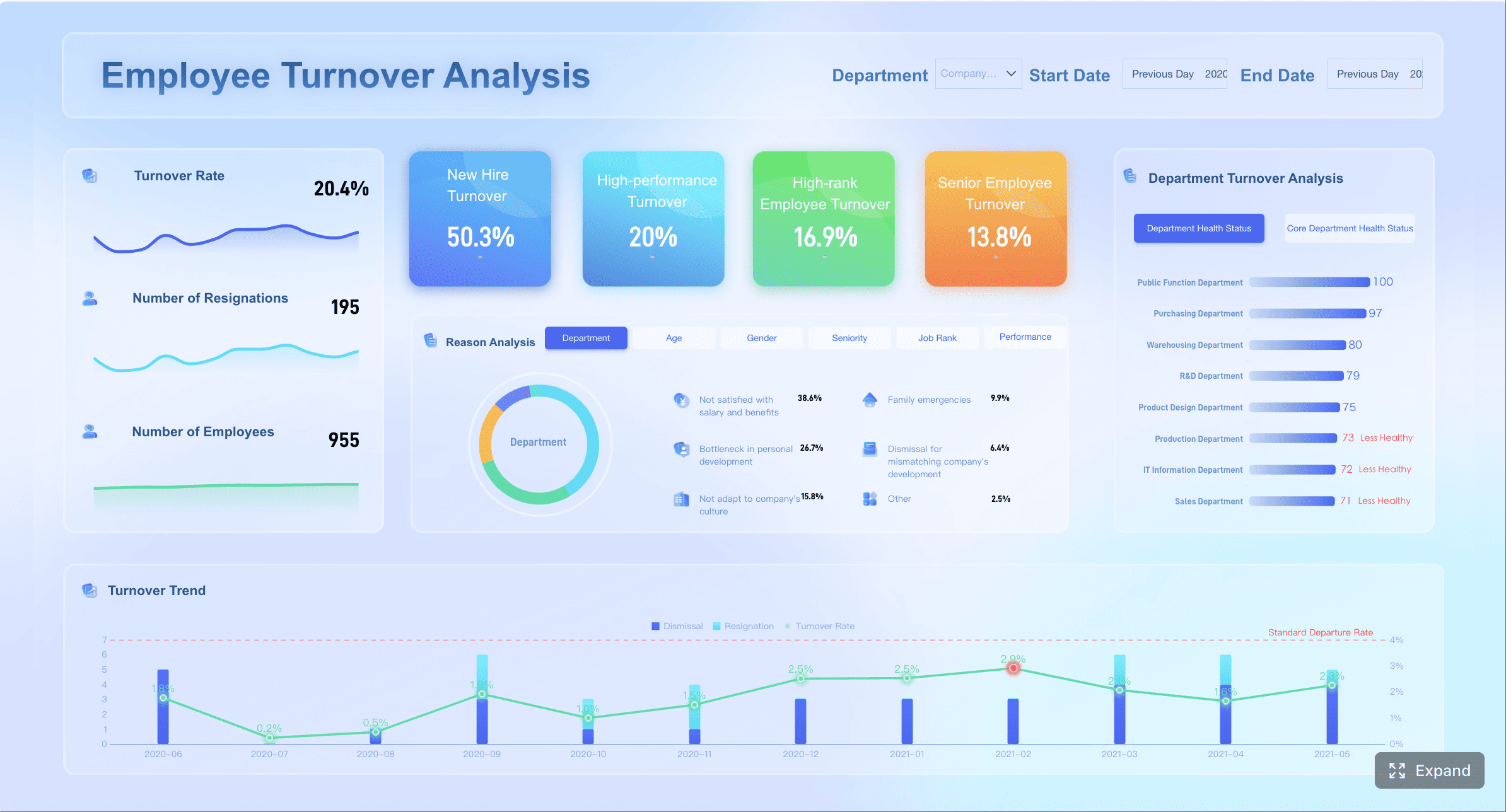
7) Diversity funnel dashboard
The diversity funnel dashboard is essential for organizations that want to improve representation through process accountability, not just year-end reporting. It helps teams see where underrepresented talent enters the funnel, where it advances, and where it exits.
Track representation at each stage:
Application
Screen
Interview
Offer
Hire
Additional useful views include:
Pass-through rates by demographic group
Time in stage by demographic group
Interview panel participation
Decline reasons by segment where appropriate and compliant
This dashboard matters because representation goals often stall in the middle of the process, not the top. Many organizations attract diverse applicants but lose momentum during screening, interviews, or offers.
A diversity funnel dashboard helps uncover patterns such as:
Similar offer rates, but lower acceptance in certain markets
Representation gains in one role family, decline in another
Used correctly, this dashboard drives process improvement. It should inform job design, sourcing strategy, interviewer training, and calibration practices.
8) Inclusive hiring outcomes dashboard
The diversity funnel dashboard shows where representation changes. The inclusive hiring outcomes dashboard shows whether the overall process is becoming fairer and more sustainable over time.
Key metrics include:
Diversity by source
Panel composition
Pass-through rates
Hiring outcomes over time
Selection consistency by role family
Offer acceptance by segment
Promotion of structured interviewing adoption
Trend view of representation gains by quarter
This template is especially useful for talent leaders, DEI leaders, and executives who need to monitor whether inclusive hiring efforts are producing durable results.
A mature inclusive outcomes dashboard should connect process behavior to outcomes. For example:
Are structured panels used more consistently?
Does panel composition correlate with better pass-through equity?
Which sources bring both diverse and high-quality talent?
Are improvements temporary, or sustained over multiple quarters?
This is where diversity analytics become strategic rather than symbolic.
How to choose the right recruitment metrics dashboard template for your hiring goal
Choosing the best recruitment metrics dashboard starts with one discipline: focus. If the dashboard tries to answer every question for every stakeholder, it will likely drive no action at all.
Match the dashboard to your biggest constraint
Start with the business problem that hurts hiring performance most.
Choose speed templates when:
Requisitions stay open too long
Candidates sit in stage without movement
Hiring managers respond slowly
The business is missing headcount timelines
Choose quality templates when:
New hires fail to ramp quickly
Early attrition is rising
Hiring managers lack confidence in candidate quality
A useful rule: pick the dashboard that matches the biggest operational bottleneck, not the loudest internal opinion.
Pick metrics your team can actually act on
Good dashboards do not only contain important metrics. They contain actionable metrics.
That means each metric should have:
A clear owner
A review cadence
A threshold or target
A decision linked to it
A known intervention if performance declines
For example, “candidate satisfaction” is useful only if someone reviews it, identifies root causes, and adjusts communication, scheduling, or interviewer behavior.
Avoid crowded dashboards that mix executive KPIs with recruiter-level workflow data. That creates noise. Executives need trend clarity. Recruiters need stage detail. Hiring managers need role-specific accountability.
How to build a recruitment metrics dashboard that your team will use
A dashboard only adds value if people trust it, review it, and act on it consistently. Adoption depends less on design polish than on operational discipline.
Start with clean definitions and data sources
Before building any recruitment metrics dashboard, align definitions across recruiting, HR, and finance.
Without this step, dashboards trigger argument instead of action. Teams end up debating whether a metric is “wrong” rather than discussing what to do next.
The best design principle is simple: keep each dashboard focused on the decisions that audience must make next.
Common mistakes to avoid when using a recruitment metrics dashboard
Even strong dashboards can fail if teams use them poorly. These are the most common mistakes to avoid.
Tracking too many metrics without linking them to hiring decisions
More metrics do not create more insight. They often create confusion. If a KPI does not support a specific hiring decision, remove it or move it to a secondary report.
Comparing teams or roles without normalizing for hiring volume or difficulty
A fair comparison requires context. Role complexity, labor market conditions, geography, and hiring manager behavior all affect outcomes. Normalize before ranking performance.
Treating diversity metrics as standalone reporting instead of process improvement inputs
Diversity reporting is not enough. The real value comes from using funnel and outcome data to redesign sourcing, screening, interview structure, and decision practices.
Failing to update templates as hiring goals, headcount plans, and market conditions change
A dashboard should evolve with the business. High-growth hiring needs different visibility than efficiency-focused hiring. Review dashboard relevance every quarter.
Build a smarter recruitment metrics dashboard strategy with FineBI
If your recruiting data lives across ATS, HRIS, spreadsheets, finance systems, and survey tools, the real challenge is not choosing metrics. It is bringing everything together into a trusted, usable decision layer. That is where FineBI becomes highly practical.
For teams building a scalable recruitment metrics dashboard, FineBI helps turn fragmented hiring data into interactive, role-based dashboards that business users can actually use. Instead of relying on static exports or manually stitched reports, talent teams can create live views for speed, quality, cost, and diversity with better consistency and governance.
Why this matters for hiring leaders:
Connect multiple data sources to unify recruiting, HR, and finance metrics
Build role-specific dashboards for recruiters, managers, and executives
Drill from KPI to root cause without waiting for manual reporting support
Standardize definitions and templates across departments or regions
Refresh dashboards efficiently so review meetings focus on action, not reconciliation
For example, a TA operations team could use FineBI to combine ATS stage data, HRIS retention data, and finance spend data into one hiring performance environment. That makes it possible to answer more strategic questions, such as:
Which sources deliver hires who stay and perform?
Which departments create the biggest interview delays?
Where is diversity loss happening in the funnel?
Which recruiting investments improve outcomes most efficiently?
For organizations serious about operational rigor and executive trust, that level of visibility is a major advantage.
If your next step is to move from isolated recruiting reports to a governed, decision-ready analytics framework, FineBI is a strong platform to consider.
A modern recruitment metrics dashboard should do more than visualize hiring data. It should help your team make better decisions, faster, with confidence. Start with the dashboard template that matches your biggest hiring constraint, keep the metrics actionable, and build a review rhythm that turns insight into improvement.
A recruitment metrics dashboard is a visual view of hiring data that helps teams track pipeline performance, spot bottlenecks, and make faster decisions. It brings key metrics like time to fill, source performance, cost per hire, and diversity outcomes into one place.
The best metrics depend on your hiring goal, but common choices include time to fill, time to hire, stage conversion rates, cost per hire, offer acceptance rate, quality of hire, and diversity pass-through rates. Start with a small set tied directly to speed, quality, cost, or inclusion outcomes.
Most hiring teams review operational dashboards weekly to catch delays early and keep open roles moving. Executive summary dashboards are often reviewed monthly or during regular business updates.
Time to fill measures the full period from opening a role to getting it filled. Time to hire focuses on how long it takes a candidate to move from entering the pipeline to accepting an offer or being hired.
One shared dashboard works well for leadership visibility and a single source of truth, especially in smaller or mid-sized hiring teams. Larger or more mature organizations often benefit from separate dashboards for speed, quality, cost, and diversity analysis.
Product Trial
FineReport
Pixel-perfect reports · Interactive dashboards · Easy data entry · Digital twins