What is a content marketing dashboard? You use it to track, measure, and visualize your content marketing efforts in one place. This tool gives you easy access to key data, helping you see what works and what needs improvement. When you want to boost your content marketing performance, a dashboard brings everything together for quick analysis.
Most marketers rely on dashboards to monitor their results. In fact, 84% of marketers use analytics tools for this purpose. A content marketing dashboard helps you see the big picture, stay accountable, and make better decisions. You get real-time insights, clear goals, and the ability to optimize your strategy fast.
| Benefit | Description |
|---|---|
| Measure content success | Track metrics like engagement time and conversion paths to spot high-performing content. |
| Understand your audience | Build profiles and learn what keeps your readers engaged. |
| Prove content ROI | Show how your content supports business outcomes. |
| Improve user experience | Find out where users drop off and adjust your approach. |
| Data-driven decision-making | Use concrete data to guide your next steps. |
If you want to start building dashboards from scratch, you need the right tool and a clear plan. FineReport makes this process simple, giving you the flexibility to customize, automate, and access your dashboard on any device.
Set Goals for Your Content Marketing Dashboard
What is a content marketing dashboard? This tool helps you organize, measure, and visualize your content marketing efforts. You use it to see how your content performs, spot trends, and make smart decisions. A content marketing dashboard brings all your data together so you can track progress and improve your strategy.
Before you build your content marketing dashboard, you need to define your goals. This step sets the direction for your project and makes sure you focus on what matters most.
Define Content Marketing Objectives
Start by asking yourself what you want your content marketing to achieve. Do you want to build brand awareness, generate leads, or support customer retention? When you define your goals, you give your dashboard a clear purpose. Here are some ways to set strong objectives:
- Decide what success looks like for your content marketing.
- Make your objectives specific and measurable.
- Link your content goals to your company’s bigger business objectives.
If you know your objectives, you can build a content marketing metrics dashboard that actually helps you reach them.
Choose Key Metrics
Now, choose your metrics. The right metrics help you track content marketing KPIs and see how well your strategy works. A content marketing metrics dashboard should focus on numbers that matter. Here are five key metrics you can use:
- Pageviews show how many times people load your content.
- Unique visitors tell you how many different people see your content.
- Traffic sources reveal where your audience comes from.
- Impressions measure how often your content appears.
- Clicks count how many times users interact with your content.
When you choose the metrics that matter, you get a clear picture of your content marketing performance.
Align Metrics with Business Goals
Your content marketing metrics dashboard should connect your metrics to your business goals. This alignment helps you prove the value of your content marketing. Here’s a simple way to match metrics with goals:
| Business Goal | Metric(s) | Tactics |
|---|---|---|
| Generate trial users | Trial sign ups from blog, organic search | Call to action, retargeting, case study |
| Grow email subscriptions | Email subscribers, weekly growth | Content upgrades, opt-in pop-ups |
| Increase organic traffic | Organic search traffic, keyword ranking | Link-building, evergreen content |
When you align your metrics, your content marketing dashboard becomes a powerful tool for tracking results and driving growth.
Select Tools and Integrate Data Sources

Why Choose FineReport for Dashboards
When you start building your content marketing dashboard, you need to select a dashboard tool that fits your needs. The right tool makes it easy to track, visualize, and analyze your marketing data. You want a solution that brings all your metrics together, so you can see the big picture and make smart decisions.
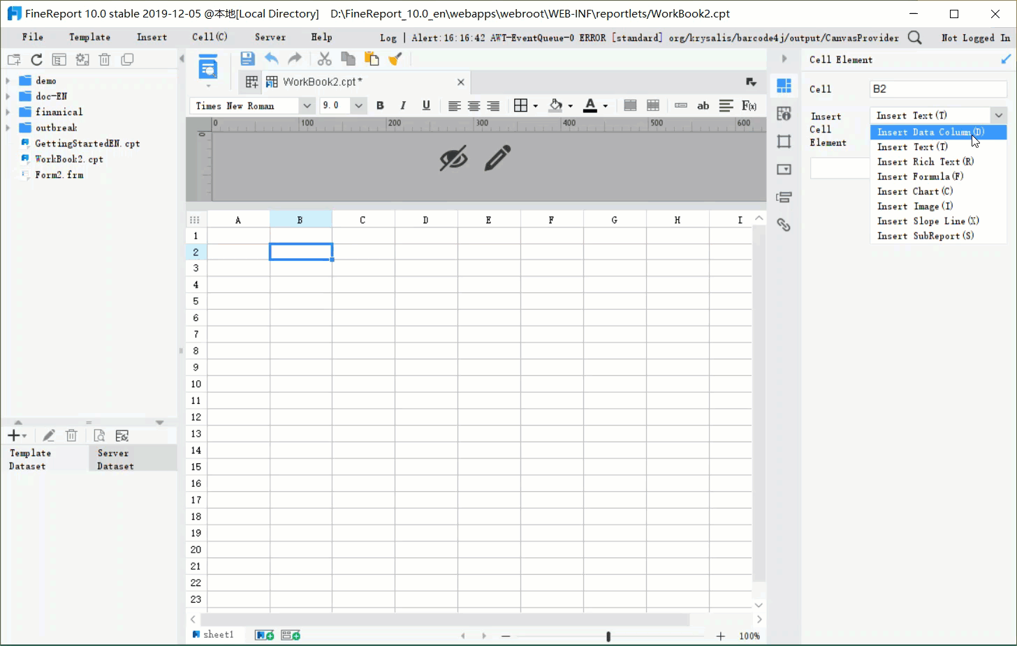
FineReport stands out as a top choice for marketers. Unlike many BI tools, FineReport offers a drag-and-drop interface that feels intuitive, even if you’re new to dashboards. You can create custom layouts, add interactive charts, and access your dashboard from any device, including your phone or tablet. FineReport also supports multi-source integration, so you can combine data from different platforms without hassle. This flexibility helps you monitor performance in real time and share insights with your team.
Connect Multiple Data Sources
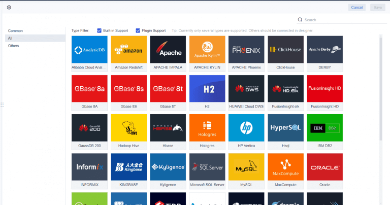
To get the most value from your content marketing dashboard, you need to connect your data sources. Most marketers start simple by linking essential platforms like Google Analytics and their main advertising accounts. You can expand your dashboard by adding sources such as Facebook Ads, HubSpot, LinkedIn Ads, Mailchimp, Shopify, and Salesforce CRM. FineReport lets you connect databases, files, and cloud services, so you can organize your dashboard with high-level metrics at the top and detailed breakdowns below.
Here’s how integrating multiple sources benefits you:
| Benefit | Description |
|---|---|
| Holistic Analysis | You see all your channels and tactics in one place, so your analysis isn’t siloed. |
| Efficiency | You save time by avoiding constant switching between tools and platforms. |
| Accuracy | Reliable data from trusted sources helps you avoid mistakes and wasted ad spend. |
Ensure Data Accuracy and Consistency
Bringing data together from different sources means you need to keep everything accurate and consistent. Integrated marketing data lets you track customer journeys and campaign performance without delays from manual work. You should validate and standardize your sources, use data profiling and cleansing, and set up quality rules. Regular audits and automated checks help you spot duplicates or anomalies before they affect your insights. Standardizing formats, units, and labels prevents conflicts. Test and monitor your integration process with sampling and reconciliation, and keep an eye on data health to maintain quality.
Tip: Choose integration methods like data blending or warehousing based on your needs. Consider data quality, structure, and security when you set up your dashboard.
Build and Customize Your Content Marketing Dashboard

What is a content marketing dashboard? This tool helps you track, measure, and visualize your content marketing activities in one place. You use it to monitor performance, spot trends, and make informed decisions. A content marketing dashboard brings together all your key metrics, making it easier to see what works and where you need to improve.
When you build a content marketing dashboard, you create a central hub for your reporting. You can design and visualize your data, customize and refine your layout, and automate updates. This section walks you through the process step by step, so you can create a dashboard that fits your needs as a content marketing manager.
Dashboard Layout and Design
You want your content marketing dashboard to be clear and easy to use. Start by thinking about who will use the dashboard. Create user personas for different types of users, such as executives, analysts, or team members. This helps you decide what data to show and how to organize it.
Structure your dashboard for clarity. Group related data points together. Use logical grouping to create a narrative that flows from top-level metrics to detailed insights. Place the most important KPIs at the top, so users see critical information first. Progressive disclosure works well—show high-level summaries and let users drill down for more details.
Here’s a table of layout design principles that work best for content marketing dashboards:
| Design Principle | Description |
|---|---|
| Create User Personas | Define dashboard users and their needs. |
| Organize Data for Clarity | Structure data logically to reduce confusion. |
| Logical Grouping | Group related metrics for a coherent story. |
| Progressive Disclosure | Start with summaries, reveal details as needed. |
| Use Hierarchical Design | Place key metrics at the top, secondary data below. |
| Highlight Key Metrics | Use visual cues to draw attention to important numbers. |
| Select High-Impact KPIs | Focus on metrics that drive business goals. |
| Use Appropriate Data Visualizations | Match chart types to your data for easy interpretation. |
| Incorporate Accessibility Standards | Make dashboards usable for everyone. |
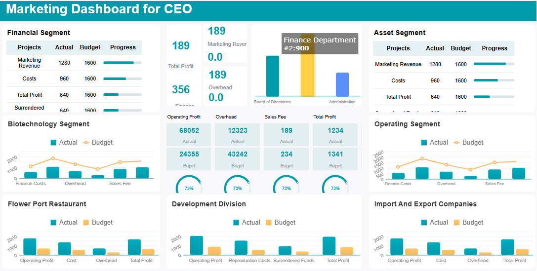
FineReport makes layout design simple. You can use drag-and-drop to arrange charts, tables, and widgets. Try multi-report layouts to display several tables or charts on one page. This helps you compare different aspects of your content marketing performance side by side. If you need an executive content marketing dashboard, use hierarchical design to highlight strategic KPIs at the top.
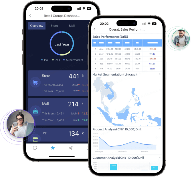
Want to go mobile? FineReport supports mobile dashboards, so you can access your reporting on any device. You can design dashboards with tiled, vertical, or full-screen layouts. This flexibility lets you create dashboards that look great on both desktop and mobile.
Tip: Keep your dashboard clean. Avoid clutter by limiting the number of metrics and visual elements. Focus on what matters most for your content marketing goals.
Add Visualizations and Widgets
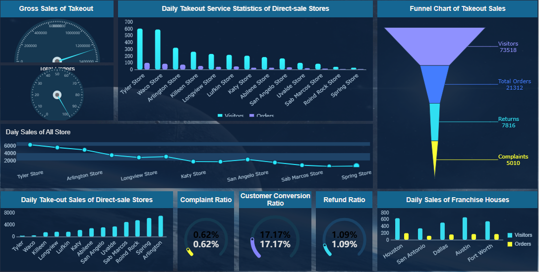
Visualizations turn raw data into insights. When you design your content marketing dashboard, choose chart types that match your data and make trends easy to spot. Line charts show changes over time, bar charts compare categories, and pie charts highlight ratios. Use histograms for frequency distribution and bubble charts for volume and correlation. Geo charts display location-based data, while stream graphs and sunburst charts reveal changes and hierarchy.
Here’s a table of visualization types you can use for content marketing reporting:
| Visualization Type | Description |
|---|---|
| Line chart | Shows trends over time. |
| Bar chart | Compares categories. |
| Histogram | Displays frequency distribution. |
| Pie chart | Highlights ratios or percentages. |
| Bubble chart | Compares volumes and correlations. |
| Geo chart | Maps geographical data. |
| Stream graph | Tracks changes in categories. |
| Sunburst chart | Shows data hierarchy. |
| Infographics | Combines visuals and text for stories. |
You can also add widgets to make your dashboard interactive. FineReport offers a range of widgets, such as video players, carousels, scrolling messages, flip counters, and digital clocks. You can display pictures, add rich text, and use 3D card animations for a dynamic look. These widgets help you engage users and present your content marketing data in creative ways.
Here are some useful widgets for your dashboard:
| Widget Name | Functionality Description |
|---|---|
| Video player widget | Plays local or online videos. |
| Carousel widgets | Rotates tabs or images for visual interest. |
| Scrolling message widget | Shows moving messages for updates. |
| 3D flip counter widget | Adds dynamic flip effects to numbers. |
| Digital clock widget | Displays current time. |
| Picture widget | Shows images in gauges or charts. |
| Rich text widget | Adds formatted text for explanations. |
Want to show progress toward goals? Use bullet graphs. Need to visualize campaign timelines? Try Gantt charts. Heat maps and highlight tables use color to make data stand out. Scatter plots help you spot correlations between metrics.
Note: Choose visualizations that match your audience’s needs. Avoid complex charts that make data hard to read. Stick to simple, high-impact visuals for your content marketing manager dashboard.

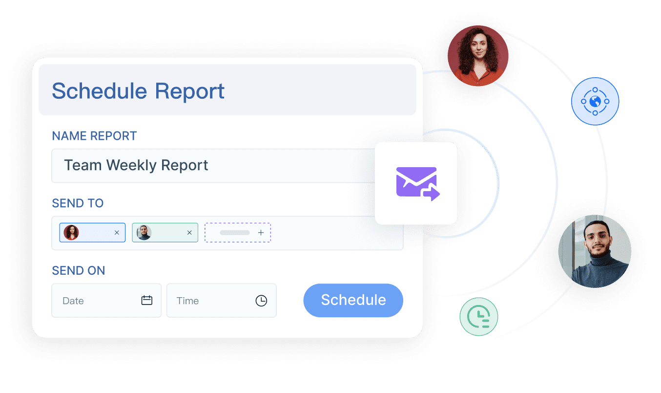
Automate Reporting and Scheduling
Manual reporting takes time and can lead to errors. Automating your reporting with FineReport saves you effort and keeps your content marketing dashboard up to date. You can schedule reports to run daily, weekly, or monthly. This way, your team always sees the latest data without manual updates.
Here’s how you automate report generation and scheduling in FineReport:
- Select the object type. Choose whether you want to schedule a single report template or multiple templates.
- Set parameters. Configure the settings that affect your report results. You can use default values or match parameters to your datasets.
- Choose the execution method. Decide if you want to preview, enter data, or analyze results.
- Schedule the task. Set the timing for your report and make sure the template path is correct.
Automated reporting improves efficiency. AI agents can transform large amounts of content marketing data into clear, actionable insights. You get real-time updates from multiple platforms, so your dashboard always reflects the latest performance. Automation also helps you personalize reporting for different users, making your dashboard more useful for everyone.
Tip: Automate your reporting to save time and reduce errors. Regular updates keep your content marketing dashboard relevant and help you make faster decisions.
When you build your content marketing dashboard with FineReport, you combine powerful layout design, interactive visualizations, and automated reporting. You can customize and refine your dashboard to fit your goals, whether you need a high-level executive dashboard or a detailed content marketing manager dashboard. Use best practices when building your content marketing metrics dashboard to ensure clarity, usability, and actionable insights.
Optimize Your Content Marketing Dashboard
What is a content marketing analytics dashboard? This tool helps you track, measure, and visualize your content marketing efforts in one place. You use it to monitor performance, spot trends, and make smart decisions. A content marketing analytics dashboard brings together all your key metrics, making it easier to see what works and where you need to improve.
You want your dashboard to stay useful as your business grows. Regular optimization ensures your content marketing analytics dashboard delivers accurate insights and supports better decisions. Let’s look at how you can keep your dashboard sharp and relevant.
Review and Refine Metrics
You need to review your metrics often to keep your dashboard effective. Set up a manageable process to decide how often you collect data. Some teams check their dashboards daily, while others prefer weekly or monthly reviews. Consistent engagement helps you make timely decisions and monitor performance. Use tools like Google Analytics for critical reports. Organize your information so it’s easy to report and share with stakeholders. Turn your data into actionable insights that show what your metrics mean for content performance.
- Schedule regular review sessions.
- Use analytics tools for deeper insights.
- Organize data for easy reporting.
- Focus on metrics that drive action.
Gather Feedback from Stakeholders
Your dashboard should evolve with your strategy and the needs of your team. Ask stakeholders which reports they find most valuable. Solicit feedback from daily users like content marketers and SEO specialists. Tailor communication to match their preferred channels. Include only the most relevant figures to avoid clutter. Use surveys, interviews, or in-app feedback tools to gather insights. Analyze feedback and prioritize changes that have the biggest impact.
- Involve stakeholders early.
- Conduct interviews to learn expectations.
- Establish a feedback loop before making changes.
- Use surveys for usability and satisfaction.
Keep Your Dashboard Relevant
Business needs change, so your dashboard must adapt. Define your goals and choose KPIs that measure progress. Customize your dashboard for different users. Streamline content production and distribution based on performance metrics. Refresh underperforming content and focus on metrics that drive meaningful outcomes. Track metrics that influence strategy, not just vanity numbers.
Track metrics that influence strategy, not vanity numbers that look impressive but don’t guide action. This focus keeps your dashboard relevant as priorities evolve.
Regular optimization gives you real-time insights and helps you monitor performance. You can make proactive adjustments and improve your content marketing results.
You now have a clear path to build your content marketing dashboard. Start by tracking the right metrics, like pageviews, leads, and revenue. Here’s a quick reference:
| Metric | Purpose |
|---|---|
| Total pageviews | Measures reach |
| Total leads | Tracks engagement |
| Wins (paying customers) | Shows business value |
When you align these metrics with your business goals, you show the real impact of your content. FineReport makes this process efficient and flexible. Begin building and refining your dashboard today for better marketing insights.

Continue Reading About Content Marketing Dashboard
Best Dashboard Apps for Business Insights
What is a Call Center Dashboard and Why Does It Matter
What is a Reporting Dashboard and How Does it Work
What is An Interactive Dashboard and How Does It Work
What is a Call Center Metrics Dashboard and How Does It Work


FAQ

The Author
Lewis
Senior Data Analyst at FanRuan
Related Articles

How to Build an Investment Portfolio Reporting Dashboard for Executives: KPIs, Benchmarks, and Drill-Down Views
Investment portfolio reporting for executives is not about showing every holding, transaction, and chart your investment team can produce. It is about giving CEOs, CFOs, CIOs, boards, and investment committees a fast, re
Yida YIn
Jun 25, 2026

12 KPI Reporting Examples for Executive Dashboards: What to Show in Weekly, Monthly, and Quarterly Reviews
Executive leaders do not need more data. They need decision ready $1 examples that match how often they review the business and what actions they are expected to take. A weekly $1 should surface fast moving risks and per
Yida YIn
Jun 25, 2026

How to Build a Digital Marketing Reports Dashboard: Executive Examples, KPIs, and Templates
A $1 is the control layer that helps executives and marketing leaders turn scattered channel data into fast, confident decisions. If you are a CEO, CMO, operations director, or marketing analytics lead, the real problem
Yida Yin
May 07, 2026