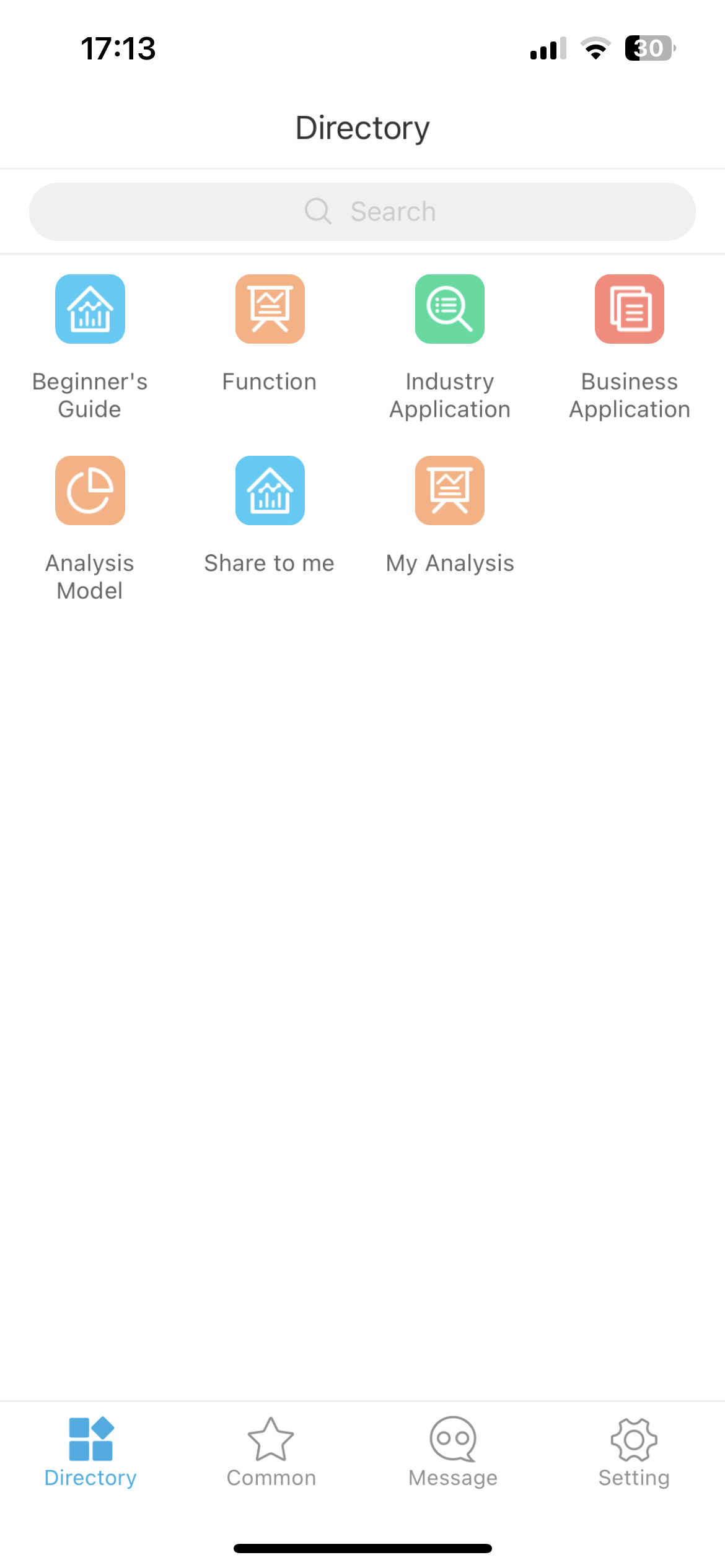
A database dashboard is a visual tool that displays key data from one or more databases in real time. You use it to monitor, analyze, and share important information, such as sales trends, inventory levels, or marketing performance, in one unified view. This tool helps you spot patterns and make informed decisions quickly.
To create a dashboard from scratch, you start by clarifying what you want to achieve and who will use the dashboard. Many organizations rely on dashboards for business decision-making—77% of B2B marketers track metrics this way. FineBIlets you build dashboards without writing code, so you can focus on analysis instead of technical hurdles.
You may encounter challenges, such as cluttered designs or making data easy to understand. Here are some common issues:
Challenge
Description
Cluttered Designs
Too much information can make a dashboard hard to read.
Clear Data Presentation
Presenting data clearly is crucial for usability.
User-Friendliness
Dashboards need to be user-friendly and visually engaging to be effective.
By understanding your goals and user needs, you set a strong foundation for an effective database dashboard.
Define Database Dashboard Goals
Settingclear goals is the first step when you create a dashboard. You need to know what you want to achieve and how you will measure success. A well-defined database dashboard helps you track progress, spot trends, and make decisions with confidence.
Identify Key Metrics
You should select metrics that align with your business objectives. Start by asking what questions you want the dashboard to answer. For example, do you want to monitor sales growth, customer retention, or inventory levels? Choose key performance indicators (KPIs) that reflect your goals and challenges. Organizations often identify these metrics by considering business priorities, audience needs, and operational requirements. This approach ensures your dashboard provides relevant and actionable insights.
Tip: Focus on clarity and simplicity. Users should understand their progress at a glance. Use familiar visuals like progress bars or gauges to show results. Define the time frame for each metric, such as daily, weekly, or monthly. Interactive features, like filters, allow you to explore data in more detail. Real-time updates keep your dashboard current and useful.
FineBI'sEnterprise Data Analysis Dashboard - Click To Engage
You must know who will use the dashboard and how they will interact with it. Start by identifying stakeholders and their goals. Take a questions-first approach to uncover what users want to learn. Observe how end users work with data and which KPIs matter most to them. Collaborate with users to design the dashboard layout before you build it. Choose the right type of dashboard for your audience, such as operational, analytical, or strategic. Repurpose existing data when possible to save time and ensure consistency.
According to dashboard design experts, every dashboard should tell a story. Work with your team to define a common goal, then select metrics that support that story. This process keeps your dashboard focused and effective.
By defining your goals and understanding user needs, you lay the groundwork for a successful database dashboard.
Database Dashboard: Select Tools and Connect Data
Choosing the right tools is a crucial step when building a database dashboard. You want a solution that connects to your data sources, supports your business needs, and grows with your organization. Before you start, review the main criteria for selecting a dashboard tool:
Aggregates data from various sources, often requiring a data warehouse and specialists.
Design Flexibility
Offers different visualizations, but may need training for effective dashboards.
Sharing Features
Accessibility depends on the number of user licenses.
Need for Specialists
Setup and maintenance may require database engineers and data scientists.
Budget Considerations
Costs can increase with more features and users.
Choose Database Type
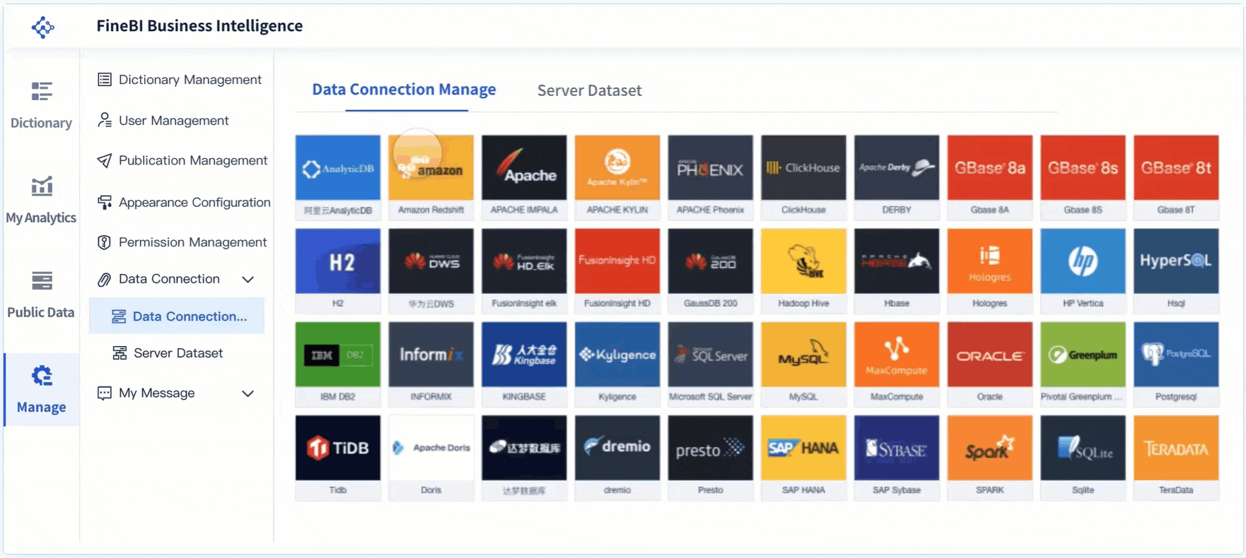
You need to decide which database types your dashboard will connect to. FineBI supports a wide range of platforms, making it easy to build a real-time sql dashboard. You can connect to big data platforms, various sql data sources, and even Excel datasets. FineBIalso enables access to multi-dimensional databases and program datasets through FineReport Designer. This flexibility ensures you can integrate data from different departments and systems.
Database Platforms
Description
Big Data Platforms
Connects with over 30 big data platforms
SQL Data Sources
Supports various sql data sources
Excel Datasets
Allows for integration with Excel datasets
FineReport Designer
Accesses multi-dimensional and program data
FineBI's Real Time Multi Source Data Integration Feature
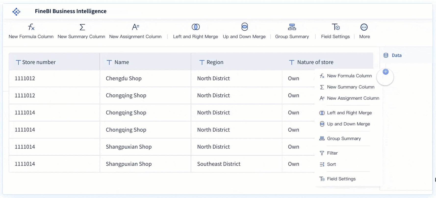
FineBI makes it simple to connect to your chosen databases. You can use built-in connectors for relational, cloud, and big data platforms. FineBI also supports file uploads and API integrations, so you can bring in data from almost any source. If you have unique requirements, FineBIoffers custom connections using JDBC or ODBC drivers. You can even use SDKs for advanced integration. This approach lets you create a robust database dashboard without writing complex sql code.
Integrate Multiple Sources
To get a complete view, you often need to combine data from multiple sources. Follow these best practices:
Identify key performance indicators that match your business goals and review them regularly.
Update your dashboards often to provide current insights.
Involve stakeholders in the process to ensure the dashboard meets their needs.
FineBI helps you merge data from different sql databases, files, and APIs into a single dashboard. This unified approach supports better decision-making and enables you to build a real-time sql dashboard that delivers actionable insights.
Before you build a database dashboard, you need to prepare your data for analysis. Clean, well-structured data ensures your dashboard delivers accurate insights and supports effective decision-making.
Clean and Transform Data
You often face several challenges during data preparation. These include missing or incomplete data, invalid values, inconsistent records across systems, and the need for standardization. You must address these issues to ensure your sql queries return reliable results. Common techniques for cleaning and transforming data include:
Identifying and handling outliers to maintain accuracy.
Normalizing different data formats for consistency.
Dealing with typos and spelling errors to improve data quality.
Understanding the data context and documenting your cleaning steps.
Using automation tools and validating results regularly.
FineBI provides self-service tools that help you clean, standardize, and transform your data without writing sql code. You can preview changes and validate your work before moving forward.
Build Data Sets in FineBI
You can connect FineBI to a variety of data sources, including relational databases, big data platforms, and cloud services. FineBIlets you configure connections, install custom drivers, and integrate JDBC drivers for advanced sql compatibility. You can create data portals to organize and manage your dashboard projects efficiently. This flexibility allows you to extract the tables and fields you need, join them using sql logic, and build reusable data sets for your database dashboard.
Merge and Refine Sources
When you need to combine data from multiple sources, follow a structured approach:
Identify your business questions and relevant data sources.
Acquire and extract the necessary data.
Clean and prepare the data for analysis.
Define relationships and join tables using sql.
Perform transformations and calculations as needed.
Validate and ensure data quality.
Preview your dashboard to check for accuracy and usability.
You should always start with a clear objective, understand your data’s granularity, and document your blending logic. Automate repetitive tasks and optimize for performance where possible. FineBI’s preview and validation features let you test your dashboard before final deployment, ensuring your sql-based analysis is both accurate and efficient.
Tip: Always validate your data and preview your dashboard on different devices to ensure a seamless user experience.
You have prepared your data and are ready to build your database dashboard. This stage transforms your cleaned data into a powerful tool for insight and decision-making. FineBI’s drag-and-drop editor makes the process accessible, even if you do not have a technical background. You can create areal-time sql dashboardthat updates automatically as your data changes.
Add Visual Components
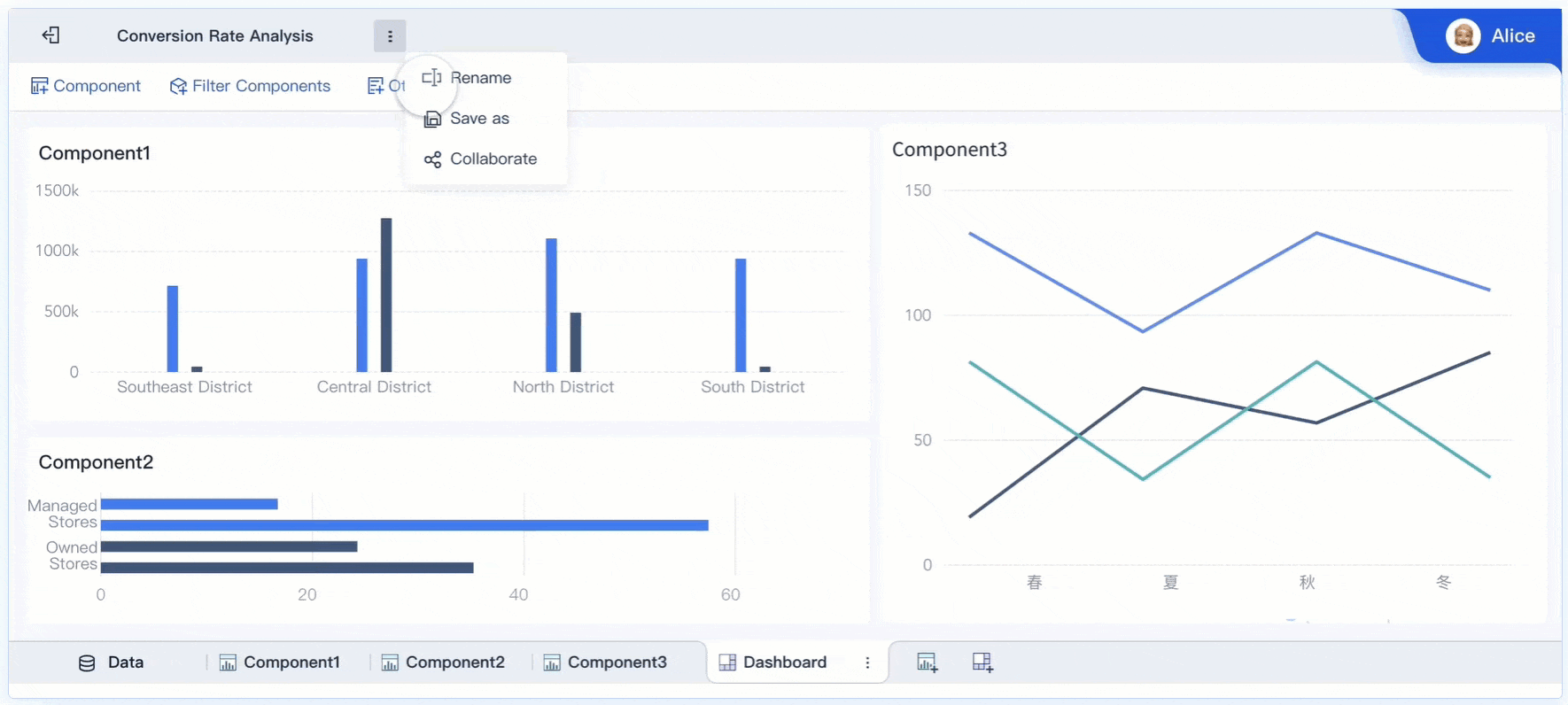
Start by selecting the right visual components for your dashboard. Data visualization helps you turn raw numbers into clear stories. You can choose from a wide range of charts and tables in FineBI. Each component serves a different purpose:
Bar charts show comparisons between categories.
Line charts display trends over time.
Pie charts illustrate proportions.
Pivot tables summarize large datasets.
Geographic maps reveal spatial patterns.
A variety of charting options lets you customize your dashboard for your audience. Effective layouts help users quickly spot trends and issues. When you build a real-time sql dashboard, you should focus on visuals that answer your key business questions. Avoid adding unnecessary or overly complex visuals. Too many colors or fancy effects can distract from your message. Instead, use clear, simple visuals that highlight the most important data.
Tip: Always round your numbers and avoid decimals unless they are essential. This makes your dashboard easier to read.
FineBI'sMultiple Built-in Charts For Visualization
A well-designed layout improves usability and keeps users engaged. You should plan your dashboard layout before adding components. FineBI allows you to arrange charts, tables, and filters using a flexible grid. You can resize and move elements to create a logical flow.
Consider these design principles:
Design Principle
Impact on Usability and Engagement
Identifying primary users
Helps prioritize key information based on user needs, enhancing clarity and relevance.
Tailoring features to user goals
Ensures the dashboard meets specific user objectives, increasing engagement and satisfaction.
Using hierarchy to highlight information
Draws attention to critical data, making it easier for users to focus on essential metrics.
Avoiding information overload
Reduces cognitive load, making the dashboard easier to navigate and understand, thus improving overall usability.
Maintaining consistency
Reduces confusion and improves user experience by creating familiar patterns in navigation and data presentation.
You can use FineBI’s dashboard style settings to apply consistent colors, fonts, and spacing. Establish a clear visual hierarchy by making key metrics larger or more prominent. Group related components together. Avoid clutter by leaving enough white space between elements. Consistency in design helps users find information quickly and reduces confusion.
Modern trends in database dashboard design focus on simplicity and clarity. Many dashboards now use flat user interfaces and colorblocking to highlight important insights. A mobile-first approach ensures your dashboard looks good on any device. FineBIdashboards are responsive, so users can access them from desktops, tablets, or smartphones.
Filters and interactivity make your real-time sql dashboard more powerful. They let users explore data from different angles without changing the underlying sql queries. FineBI supports real-time filtering, so users see updated results instantly.
Follow these best practices for filters and interactivity:
Understand your data to determine which filters are most useful.
Identify the main questions users want to answer.
Tailor filters to match your audience’s technical skills.
Balance the number of filters to avoid overwhelming users.
Test different filter combinations to ensure they work well.
Use filters sparingly to maintain a clean design.
Label filters clearly and place them where users can find them easily.
Consider using a dedicated panel for filters.
Allow users to save and reset filter settings.
You can add global filters in FineBI to control multiple components at once. This makes it easy to switch perspectives across your database dashboard. Interactive features like drill-downs, tooltips, and clickable elements help users dig deeper into the data. Micro interactivity, such as hovering to reveal more details, enhances engagement.
Note: Do not overload your dashboard with too many filters or animation features. Keep the experience simple and focused on actionable insights.
When you build a real-time sql dashboard, always test your design on different devices. Preview your dashboard to ensure that filters, charts, and tables work as expected. FineBI’s responsive design and real-time updates help you deliver a seamless experience.
By following these steps, you can create a database dashboard that is clear, interactive, and tailored to your users’ needs. FineBI’s drag-and-drop tools, advanced visualization options, and responsive design make it easy to build dashboards that drive better business decisions.
Sharing and maintaining your database dashboard is essential for long-term success. You need to protect sensitive data, enable collaboration, and keep your dashboard relevant. Fine-tuning these steps ensures your database dashboard remains secure and useful.
Set Permissions
You must control who can view and edit your database dashboard. Role-based access control (RBAC) helps you restrict access to sensitive information. Only authorized users can see or change data. You can use row-level security to limit data visibility based on user roles. Object-level security lets you restrict access to entire tables or columns. Multi-factor authentication adds another layer of protection, especially for remote users. Data masking hides confidential details from unauthorized viewers. Data encryption during storage and transmission keeps your information safe. Audit logs track user activity and help you maintain accountability. Regular access reviews ensure permissions match team roles.
Publish and Collaborate
Publishing your database dashboard allows your team to access insights in real time. You should manage permissions carefully to share sensitive data only with the right people. Schedule regular data refreshes to keep your dashboard accurate. Encourage feedback from users to improve your dashboard over time. You can share dashboards from your workspace or use mobile apps for access on the go. Collaborative features let you add dashboards to team channels, making teamwork easier. Integration with tools like Slack and Microsoft Teams helps new members gain access quickly and removes former employees promptly.
Update and Monitor
Updating your database dashboard keeps your data accurate and relevant. Quick daily checks help you spot issues with critical KPIs. Weekly reviews let you dive deeper into data sources and trends. Monthly audits ensure historical data and integration processes remain correct. Track model accuracy to avoid prediction errors. Adapt your dashboard as business priorities change. Monitor usage with metrics such as unique users, number of recent accesses, average session duration, and user retention rate. These metrics show how well your dashboard serves its audience.
FineBI supports secure sharing and collaboration for your database dashboard. You can use role-based access control, audit logs, and flexible sharing features. FineBI makes it easy to publish dashboards, manage permissions, and monitor performance, helping you maintain a reliable and effective database dashboard.
You have learned how to create a database dashboard step by step. FineBIempowers you to analyze data independently, collaborate with your team, and optimize your workflow. Regular updates and feedback collection help you improve dashboard quality and align technology with business goals.
Benefit Description
Impact on Users
Self-service analytics
Faster insights and decisions
Independent dashboard creation
Reduced bottlenecks
Streamlined workflows
Better resource allocation
Organizations that use data-driven decisions report faster market response and improved collaboration. Your database dashboard can drive innovation and help your team achieve better results.
Access a wealth of case studies, industry insights, and solution guides to accelerate digital transformation.
FAQ
How do you connect FineBI to your data sources?
You can connect FineBI to databases, files, and APIs using built-in connectors. FineBI supports relational databases, cloud data warehouses, and big data platforms. You can also upload Excel or CSV files for analysis.
Can you build a database dashboard without coding skills?
Yes, you can build a database dashboard in FineBI without writing code. The drag-and-drop interface lets you create charts, tables, and filters easily. You do not need to know sql or programming.
How does FineBI handle real-time data updates?
FineBI supports scheduled and real-time data updates. You can set up automatic refreshes to keep your database dashboard current. This ensures you always see the latest information.
What types of visualizations can you add to your dashboard?
You can add bar charts, line charts, pie charts, pivot tables, and geographic maps. FineBI offers over 60 chart types and many styles. You can choose the best visuals for your data.
How do you share your database dashboard with others?
You can share your database dashboard using role-based permissions. FineBI lets you publish dashboards securely and control who can view or edit them. You can also collaborate with your team in real time.