A risk dashboard is a digital tool that displays key risk indicators and trends in a visual format. You use it to monitor, analyze, and respond to potential threats in your business. Companies choose risk dashboards because they help with decision-making, simplify risk identification, save costs, improve compliance, and increase transparency. FineBI stands out as a leading solution for building and managing risk dashboards, allowing you to turn complex data into clear, actionable insights.

A risk dashboard gives you a clear view of your organization’s risk landscape. You use it to track important risk metrics and spot trends that could affect your business. The risk dashboard acts as a centralized platform, helping you uncover hidden risks and make better decisions. You see key performance indicators, such as risk exposure levels and compliance rates, displayed in charts, graphs, and tables. This visual approach makes complex information easy to understand and share with others.
You design a risk dashboard by first defining its purpose. You select the most relevant risk metrics, integrate data from different sources, and focus on usability. The dashboard helps you improve accountability and respond quickly to changes. Below is a table that highlights the main components of a risk dashboard:
| Component/Feature | Description |
|---|---|
| Centralized Platform | Visually displays critical risk metrics for decision-makers. |
| Purpose | Uncovers hidden risks, provides data-driven insights, and improves accountability. |
| Key Performance Indicators (KPIs) | Includes metrics like risk exposure levels and compliance adherence rates to prioritize risks. |
| Design Considerations | Involves defining purpose, selecting KPIs, integrating data, and ensuring usability. |
| Visualization | Presents data through charts, graphs, and tables for better understanding and communication. |
You can choose from several types of risk dashboards, each designed for a specific area of risk management. The main categories include:
Each type of risk dashboard addresses unique challenges. For example, you may find it difficult to quantify risk accurately because of complex threats. Sometimes, you lack enough data to estimate the impact of specific events. You might also struggle to show results to leadership, which can make it hard to justify budgets and resources. Understanding these categories and challenges helps you select the right risk dashboard for your needs.
A real-time risk dashboard gives you the power to monitor and respond to risk as it happens. You see changes in your risk environment instantly, which helps you make better decisions and protect your business. This section explains how you can build and manage a real-time risk dashboard using FineBI, focusing on three main steps: data integration and processing, visual exploration and dashboard creation, and publishing with governance.
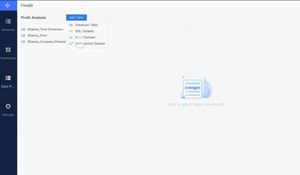
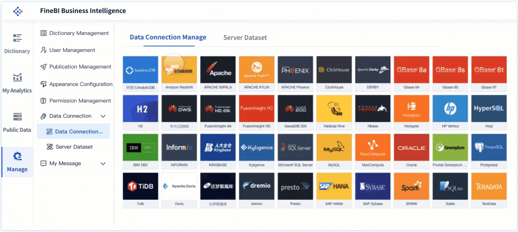
You start by connecting your data sources. FineBI lets you bring together information from databases, spreadsheets, APIs, and big data platforms. You can link data from finance, operations, compliance, and other departments. This unified approach helps you see the full picture of risk across your organization.
FineBI supports real-time data synchronization. When new risk data appears, your dashboard updates automatically. You do not need to refresh or reload manually. You can schedule incremental updates, so your real-time risk dashboard always shows the latest information.
After connecting your data, you process it to make it useful. You select the fields that matter most for risk analysis. You join tables to enrich your data and add calculated fields for custom risk metrics. You apply filters to focus on specific risk events or time periods. FineBI’s tools help you clean and refine your data, removing duplicates and handling missing values. This ensures your real-time risk dashboard displays accurate and reliable risk information.
Tip: Clean data leads to better risk insights. Spend time preparing your data before building your dashboard.
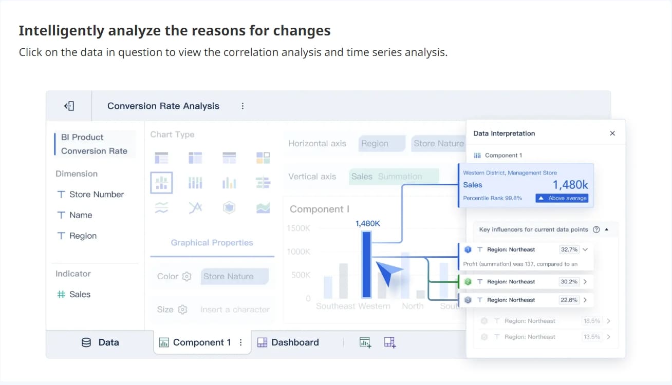
Once your data is ready, you move to visual exploration. FineBI offers a wide variety of chart types for risk dashboard creation. You can use pie charts to show proportions of risk categories, bar graphs to compare risk levels across departments, and line graphs to track risk trends over time. Heatmaps help you spot patterns in large risk datasets, while interactive graphs let you drill down for deeper analysis.
| Chart Type | Description |
|---|---|
| Pie Charts | Useful for showing proportions of a whole. |
| Bar Graphs | Effective for comparing quantities across different categories. |
| Line Graphs | Ideal for displaying trends over time. |
| Heatmaps | Great for visualizing data density and patterns in large datasets. |
| Interactive Graphs | Allows users to engage with the data for deeper insights. |
You can customize colors, sizes, tooltips, and labels to make your risk dashboard clear and easy to understand. FineBI lets you adjust granularity, so you can analyze risk at the company, department, or project level. You use a drag-and-drop interface to build your dashboard, which means you do not need coding skills. You can save templates and reuse them for different risk scenarios.
A real-time risk dashboard helps you spot risk trends and anomalies quickly. You can apply filters and slicers to focus on specific risk types or time frames. The dashboard updates instantly when you change filters, giving you dynamic risk analysis.

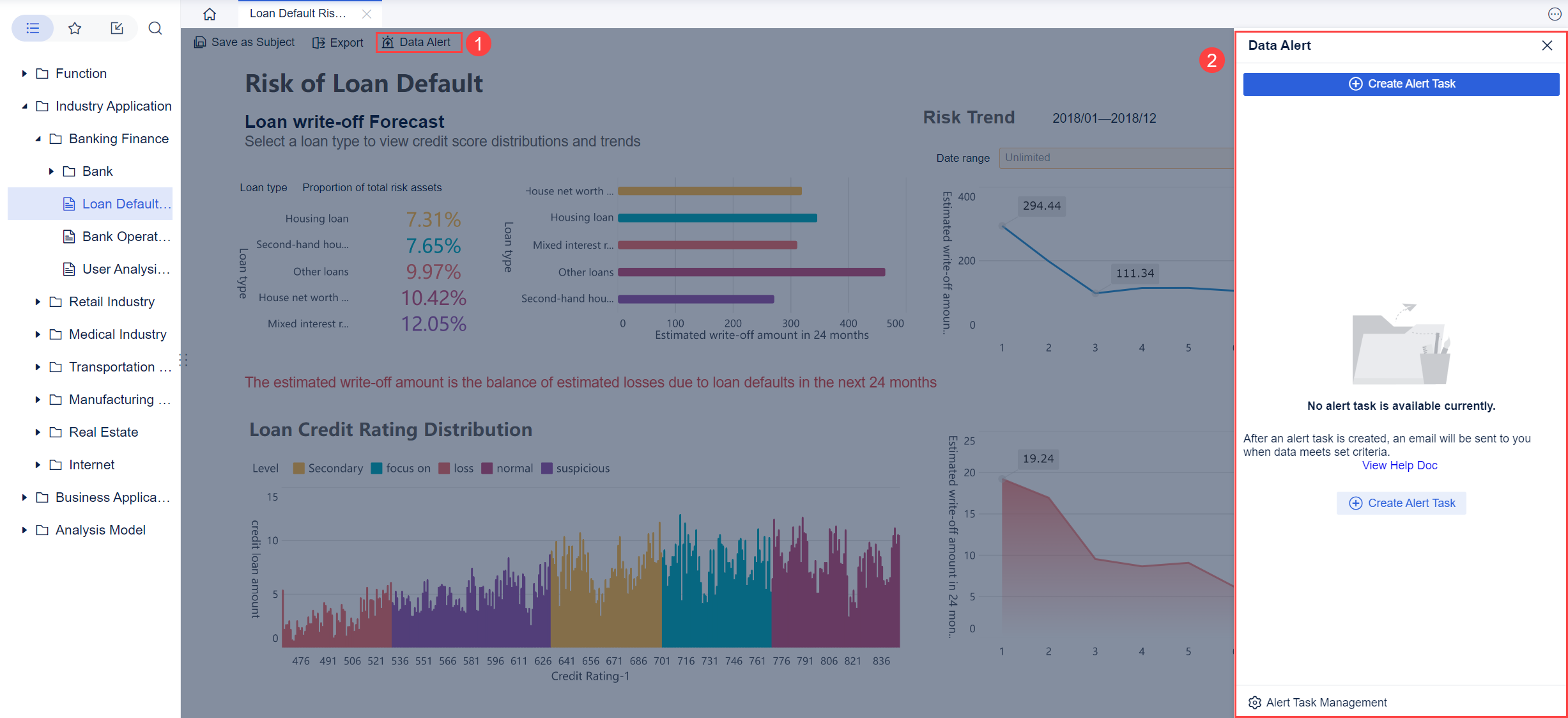
After creating your real-time risk dashboard, you need to share it securely. FineBI provides strong governance features to help you control access and protect sensitive risk data. You can set expiration dates for public links, so shared dashboards are only available for a limited time. When you publish a dashboard, you specify its location and add notes about the reason for publishing. This process may require admin approval, which adds another layer of security.
| Governance Feature | Description |
|---|---|
| Expiration Dates for Public Links | Set expiration dates to ensure secure access to shared dashboards. |
| Location and Notes for Publishing | Specify location and add reasons when publishing dashboards, with admin approval if needed. |
| Enhanced Data Permissions Configuration | Configure independent component data permissions for specific table data in dashboards. |
FineBI allows you to configure data permissions at a detailed level. You decide who can view, edit, or share each part of your risk dashboard. You can set permissions for individual tables, charts, or even rows and columns. This helps you keep sensitive risk information safe and ensures only authorized users can access it.
FineBI supports user authentication and role-based access control. You assign different access levels to team members based on their roles. For example, executives may see high-level risk summaries, while analysts can explore detailed risk data. This structure helps you collaborate across teams without compromising security.
A real-time risk dashboard in FineBI supports automated reporting. You can generate reports based on real-time risk data and share them with stakeholders. The dashboard updates automatically, so everyone sees the most current risk information.
Note: Secure sharing and strong governance are essential for effective risk management. Always review permissions before publishing your dashboard.
A real-time risk dashboard gives you the tools to integrate data, visualize risk, and share insights securely. FineBI makes each step simple and efficient, helping you stay ahead of risk and make informed decisions.
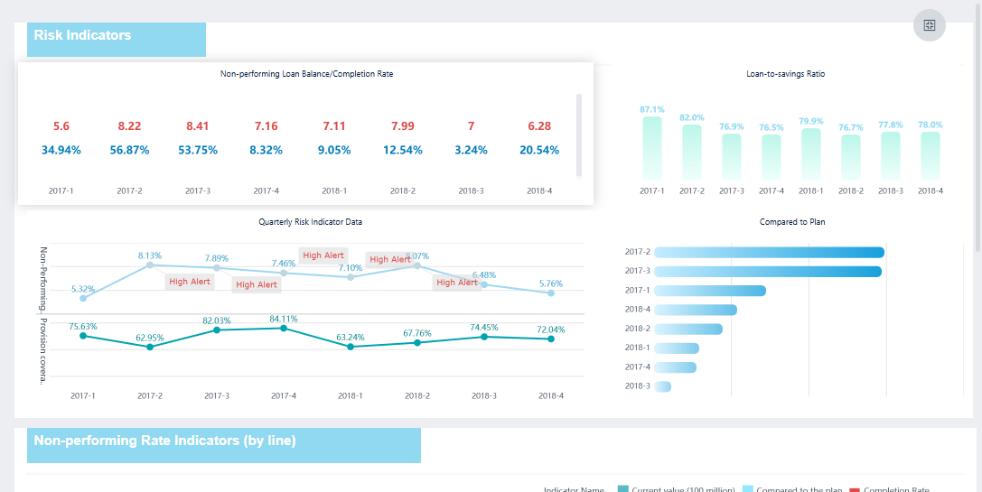
A risk management dashboard gives you powerful visualization tools to help you understand risk quickly. You see heat maps that highlight high-priority risks using color coding. Bar charts let you compare risk levels across different categories. Line graphs show how risk changes over time, helping you anticipate future challenges. Scatter plots reveal relationships between risk factors, while pie charts provide a quick overview of risk proportions. The dashboard layout organizes information logically, guiding you through risk insights. Logical grouping and hierarchy of importance make it easy to find critical data. Consistent color coding and clear labeling ensure you interpret risk levels correctly.
Interactivity is essential in a risk management dashboard. You can adjust risk parameters and instantly see how changes affect your exposure. Interactive risk assessment tools help you visualize threats across business units. Leadership can make decisions using the latest insights. You explore specific risk factors in depth and refine strategies as new data appears. Dashboards highlight vulnerabilities, enabling you to take proactive measures.
| Visualization Type | Purpose |
|---|---|
| Heat maps | Identify high-priority risks using color-coding based on severity and importance. |
| Bar charts | Compare risk levels across categories, providing a clear visual representation of risks. |
| Line graphs | Display trends over time, helping to identify changes in risk levels and anticipate future risks. |
| Scatter plots | Explore relationships between risk factors, revealing correlations and potential risk drivers. |
| Pie charts | Show relative proportions of risks across categories, giving a quick overview of the risk landscape. |
A risk management dashboard supports real-time monitoring. You receive continuous risk intelligence through dynamic indicators. Automation keeps risks visible at all times. AI-powered detection identifies issues as they arise. Instant alerts notify you and your team when problems occur. Early signals help you anticipate events instead of reacting to them. Real-time alerts reduce response times and improve coordination. You gain immediate visibility into impacts, allowing you to allocate resources efficiently. The right technology prioritizes actionable alerts, helping you respond faster and avoid alert fatigue.
FineBI enhances your risk management dashboard with robust access control and collaboration features. You manage permissions at the row and column level, ensuring only authorized users see sensitive risk data. Data security prevents leakage and protects your organization. Personalized display lets different users view tailored content in the same report. Efficient permission management simplifies allocation and maintenance, saving time. FineBI enables cross-departmental collaboration, allowing teams to track progress and share insights through a unified interface. This minimizes communication costs and improves teamwork.
| Feature | Description |
|---|---|
| Row and Column Level Control | FineBI allows for detailed permission control at both row and column levels of data tables. |
| Data Security | Ensures data security and prevents data leakage. |
| Personalized Display | Different users can see tailored content in the same analysis report based on their permissions. |
| Efficient Permission Management | Simplifies the allocation and maintenance of data permissions, reducing maintenance time. |
A risk management dashboard with FineBI gives you the tools to visualize, monitor, and collaborate on risk effectively.
A risk management dashboard gives you a clear advantage in risk management. When you design a risk management dashboard, you create a tool that helps you see risk in real time and make better decisions. You use a risk management dashboard to track risk indicators, monitor trends, and respond quickly to changes. This section explains how a risk management dashboard improves your business and why FineBI is the best choice for building one.
You need accurate information to make smart decisions. A risk management dashboard collects data from different sources and shows you the most important risk metrics. When you design a risk management dashboard, you can focus on the risks that matter most. You see patterns and trends that help you predict future problems. For example, BOE used a risk management dashboard to reduce inventory costs and improve efficiency. You can use similar dashboards to compare performance across departments and spot risks early.
Tip: Use a risk management dashboard to support your decisions with real data. You avoid guesswork and base your actions on facts.
A risk management dashboard gives you a complete view of your risk landscape. You see all risk factors in one place. When you design a risk management dashboard, you can highlight high-priority risks and track changes over time. You use charts and graphs to make complex data easy to understand. In finance and manufacturing, companies use risk management dashboards to monitor compliance, credit risk, and asset quality. You gain better control over risk and improve your ability to respond.
| Benefit | Description |
|---|---|
| Centralized Monitoring | View all risk factors in one dashboard |
| Trend Analysis | Track changes and spot emerging risks |
| Compliance Tracking | Monitor regulatory and legal risks |
You save time and resources when you use a risk management dashboard. You automate data collection and reporting. When you design a risk management dashboard with FineBI, you scale your solution as your business grows. FineBI supports large datasets and many users. You share dashboards across teams and departments. In finance and manufacturing, companies use risk management dashboards to improve asset management and reduce losses. You increase efficiency and support business growth.
Note: FineBI helps you design a risk management dashboard that meets your needs. You get a flexible, scalable solution for risk management.
A risk dashboard helps you visualize and manage threats across your organization. You gain clear insights, make informed decisions, and respond quickly to changes. FineBI empowers you to build dashboards that support real-time monitoring and secure collaboration. The table below shows how different dashboard types strengthen risk management strategies:
| Dashboard Type | Impact on Risk Management Strategies |
|---|---|
| Insight Workbenches | Enhance informed decision-making and proactive risk strategies, strengthening corporate governance. |
| Metrics Insight Workbench | Visualizes trends and metrics, enabling proactive risk management and strategic decision-making. |
| ERM Progress Insight Workbench | Quantifies identified risks and tracks mitigation efforts, allowing for effective resource allocation and strategy adaptation. |
| Assessment Progress Insight Workbench | Evaluates the effectiveness of risk management processes, facilitating targeted interventions and strategy refinement. |
| Root Cause Insight Workbench | Prioritizes risk mitigation efforts by analyzing underlying issues, aiding in fortifying the organization against risks. |
| Resources Insight Workbench | Analyzes risk-reward tradeoffs of resources, optimizing risk management strategies and enhancing resource efficiency. |
You can expect future dashboards to use AI, blockchain, IoT, and automation for smarter, faster risk management.
FineBI gives you the tools to stay ahead and make data-driven decisions with confidence.

Best Dashboard Apps for Business Insights
What is a Call Center Dashboard and Why Does It Matter
What is a Reporting Dashboard and How Does it Work
What is An Interactive Dashboard and How Does It Work
What is a Call Center Metrics Dashboard and How Does It Work

The Author
Lewis
Senior Data Analyst at FanRuan
Related Articles
Payment Analytics Dashboard: 12 KPIs Every Operations Leader Should Track to Cut Revenue Leakage
Losing revenue to declines? Discover 12 essential KPIs to track in your payment analytics dashboard to stop leakage and manage disputes.
Lewis Chou
May 05, 2026
SOC Dashboard Explained: 12 Essential KPIs, Views, and Workflows Security Teams Use
Learn about SOC dashboards, the 12 essential KPIs for security teams, and how they centralize alerts and workflows for faster threat detection and response.
Lewis Chou
May 05, 2026

EMR Dashboard Guide: 12 Metrics to Track for Faster Clinical and Operational Decisions
Learn the 12 essential EMR dashboard metrics to track for faster clinical and operational decisions, improving patient flow and revenue cycle management.
Lewis Chou
May 05, 2026


