You can build a 3d dashboard for business intelligence by using advanced data visualization tools that make complex data easy to understand. A 3d dashboard turns raw numbers into interactive graphics, letting you explore trends and patterns quickly. FineReport stands out for its ability to deliver clear data presentation and powerful dashboards. With this tool, you create engaging dashboards that provide real-time insights and support smarter decisions.
Select 3D Dashboard Tools

Why Choose FineReport for 3D Dashboards
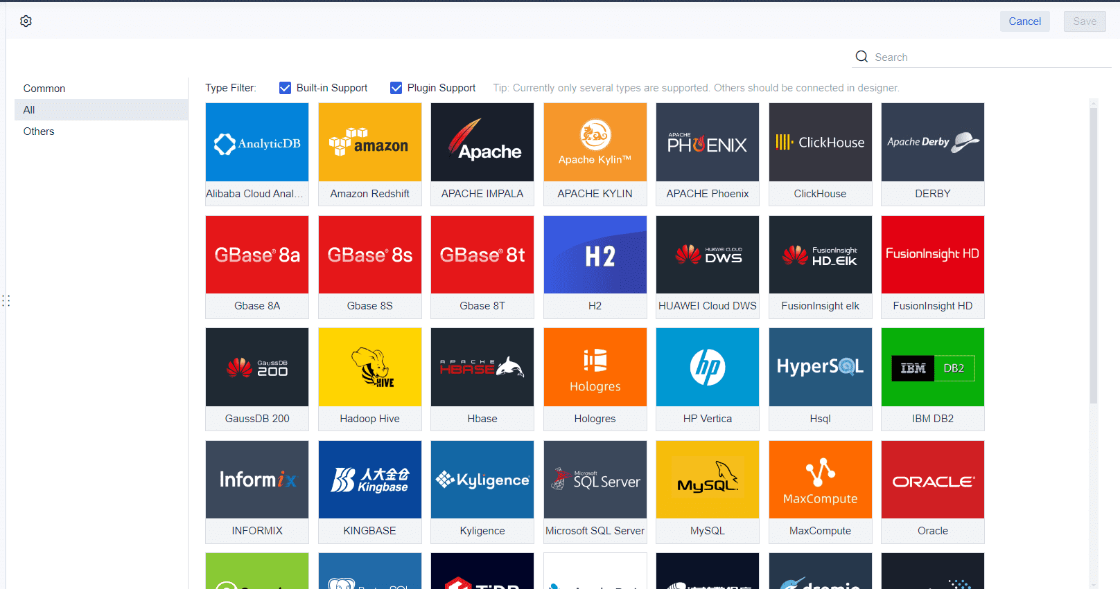
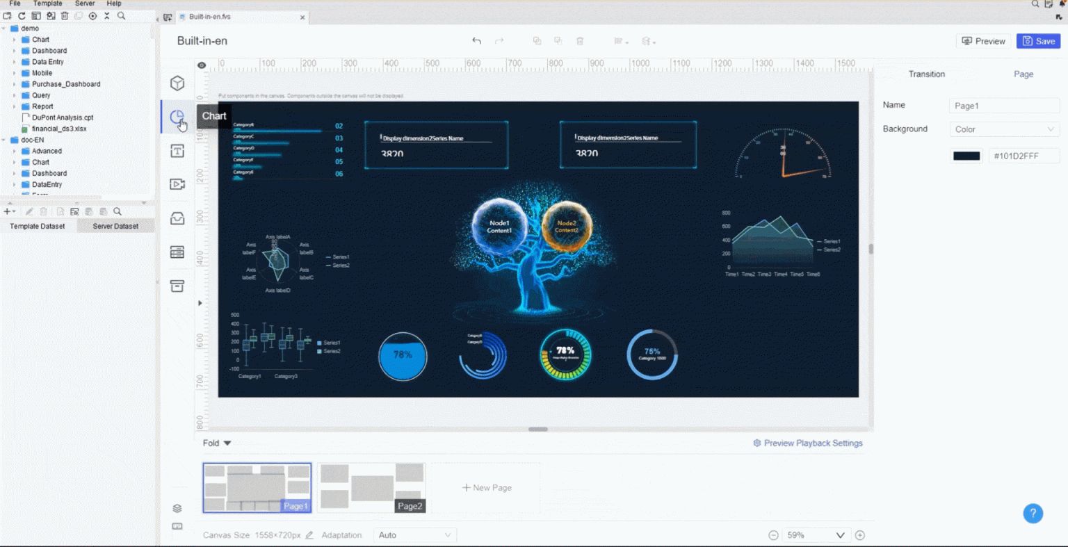
When you start building a 3d dashboard for your business, tool selection matters. FineReport stands out as a top choice for anyone who wants to create a business intelligence dashboard that is both powerful and easy to use. You get an intuitive drag-and-drop interface that lets you design dashboards without coding. FineReport connects to many data sources with just one click, so you can bring together information from different systems. The 3d scene designer gives you the ability to add interactive charts, diagrams, and tables that make your data come alive.
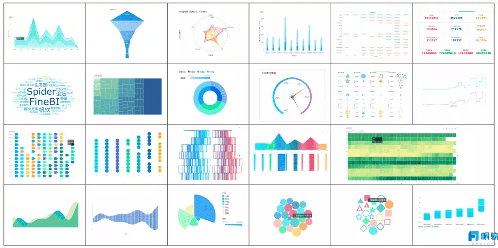
FineReport’s 3d scene designer offers more than 19 categories and 50 styles of pre-built HTML5 charts. You can use cool 3D and dynamic effects to make your dashboard engaging. The stream-to-TV feature helps you track KPIs on large screens, which is perfect for team meetings or control rooms. With a dedicated mobile app built on ReactNative technology, you can access your dashboards anywhere, anytime.
Here is a quick comparison of what you should look for in a 3d dashboard tool for BI:
| Criteria | Description |
|---|---|
| Data Visualization | Includes charts, diagrams, and tables with interactive features. |
| Interaction | Lets you create drill-downs and selections for deeper analysis. |
| Performance | Loads quickly and responds fast to keep users engaged. |
| Ease of Use | Features are accessible for all skill levels. |
| Device-Independence | Works on different devices and platforms. |
| Automation | Supports scheduled data refreshes and alerts for KPIs. |
| Data Security | Protects sensitive business information. |
FineReport checks all these boxes. The 3d scene designer makes it easy to build dashboards that are both interactive and visually appealing. You can quickly connect to mainstream databases and use the drag-and-drop interface to create reports and dashboards in minutes.

Key Features for Business Intelligence
A business intelligence dashboard must do more than just display numbers. FineReport’s 3d scene designer gives you tools to analyze data, track indicators, and manage your business chain with advanced technology. The user-friendly interface helps you get started fast, even if you are new to BI. You can monitor key performance indicators and review performance with ease.
Here is how FineReport’s features enhance your BI dashboards:
| Feature | Benefit |
|---|---|
| User-friendly interface | Makes it easy for you to learn and use the tool. |
| Data analysis capabilities | Helps you analyze data for better decisions. |
| Indicator tracking | Lets you monitor KPIs and improve performance reviews. |
| Big data technology | Supports complex business management solutions. |
| Cost reduction | Lowers management costs and increases the value of your business data. |
You can use the 3d scene designer to create dashboards that work on any device. The mobile app ensures you stay connected to your BI dashboards wherever you go. FineReport’s automation features let you schedule data refreshes and alerts, so you never miss important updates. With strong data security, you can trust your sensitive information stays safe.

FineReport gives you everything you need to build a 3d dashboard that supports smart, data-driven decisions in your business.
Design Your Business Intelligence Dashboard

Dashboard Layout and Structure
You want your 3d dashboard to deliver clear insights and support fast decision-making. Start with a strong dashboard design. FineReport gives you flexible layout options, such as tiled, full-screen, and multi-page views. These options help you organize your BI data for maximum clarity and engagement.
A well-structured dashboard guides users’ eyes to the most important information first. Many BI experts recommend using a Z-pattern layout. This approach places key metrics where users naturally look, making it easier to spot trends and take action. You can also use vertical or single-column layouts for smooth scrolling, especially on mobile devices. Minimalist design keeps your dashboard clean and reduces distractions, so users focus on the data.
Tip: Understanding your audience’s needs is crucial. A clean, intuitive dashboard design helps users stay engaged and reduces cognitive overload.
Here is a table that summarizes effective dashboard layout strategies for BI:
| Strategy Type | Description |
|---|---|
| Vertical Layout | Aligns with natural scrolling behaviors, making it easy to move through BI data. |
| Single-Column Layout | Presents information in a simple vertical sequence, ideal for mobile and linear BI narratives. |
| Z-Pattern Layout | Places important information in a zig-zag pattern, guiding users through the dashboard efficiently. |
| Single Page Design | Keeps all information on one page, simplifying the user experience and prioritizing key BI elements. |
| Minimalist Design | Uses white space and avoids clutter, helping users focus on the most important BI data. |
When you use FineReport, you can choose the dashboard layout that best fits your BI goals. The drag-and-drop interface lets you arrange components like charts, graphs, and tables exactly where you want them. You can create multi-page dashboards for complex BI projects or use a full-screen layout for presentations and control rooms.
A study with over 500 participants showed that the structure of a dashboard affects how quickly and accurately users make decisions. When you design your BI dashboard with clear formats and complete information, you help users process data faster and with more confidence.
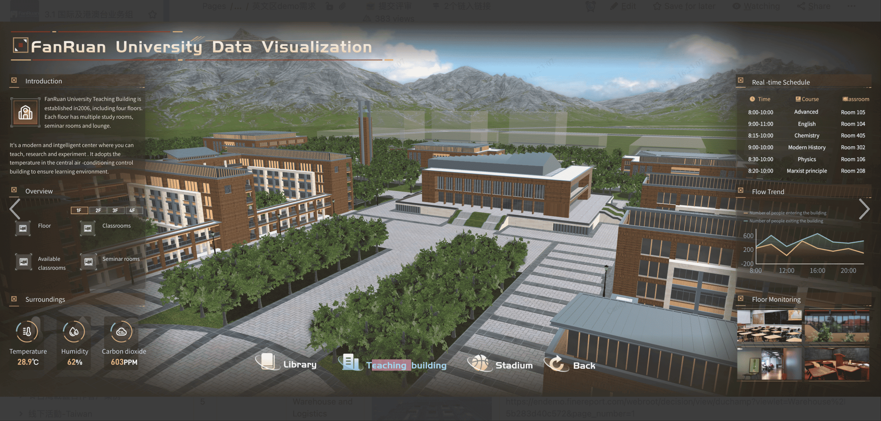
Add 3D Data Visualizations
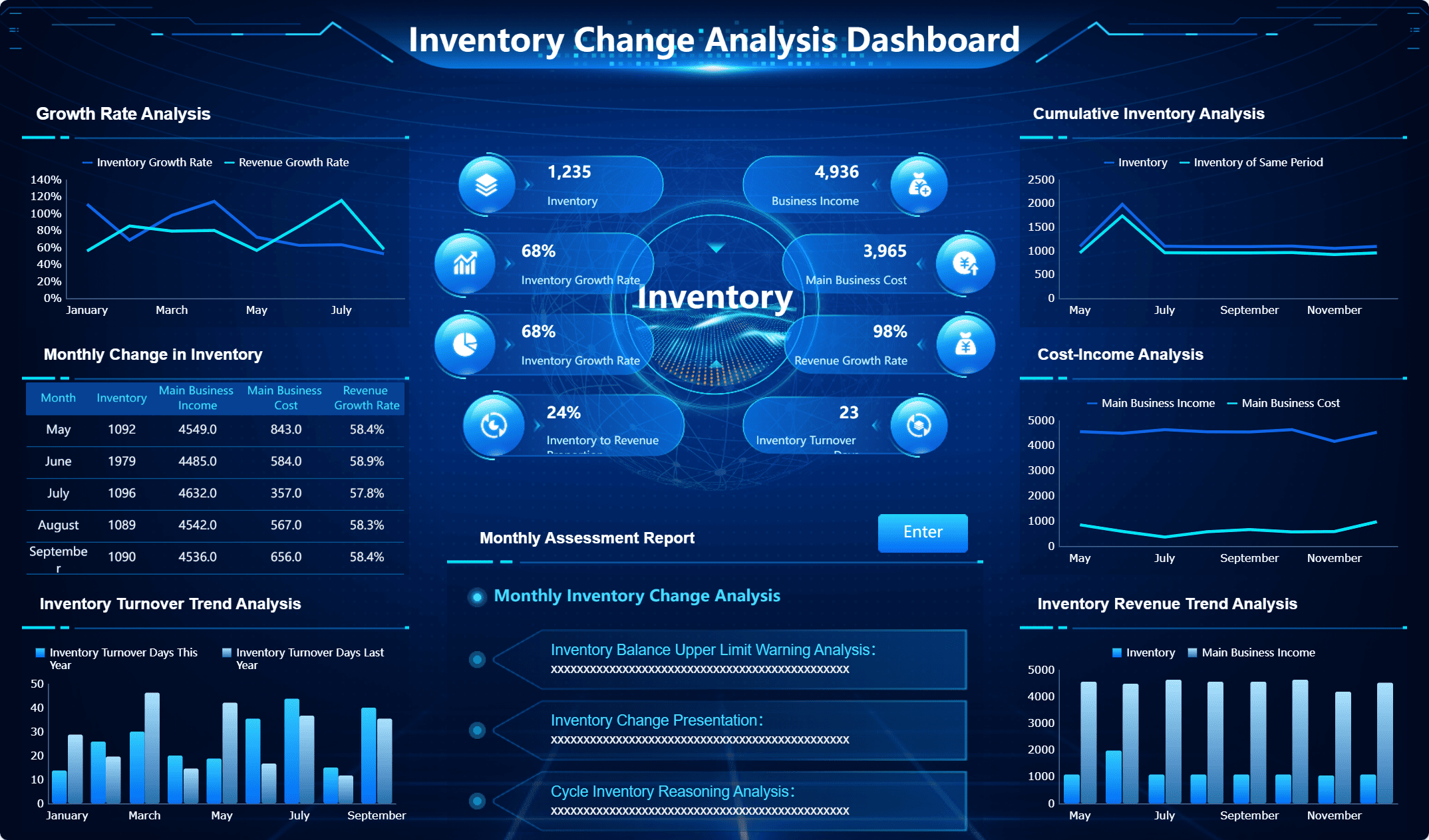
Adding 3d data visualizations to your dashboard takes your BI to the next level. FineReport offers a wide range of built-in components, including 3d charts, graphs, and interactive elements. These components help you turn raw BI data into engaging visuals that are easy to explore.
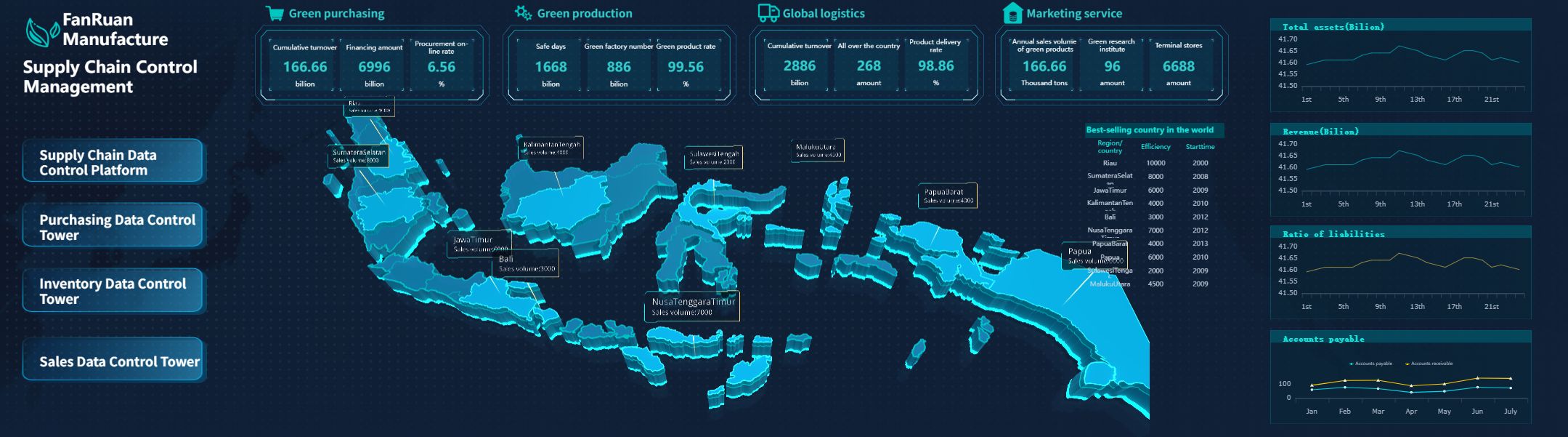
You can use 3d data visualizations to show complex relationships and patterns that might be hard to see in 2D. For example, you might use a 3d bar chart to compare sales across different regions, or a 3d scatter plot to analyze production data in a smart factory dashboard. These examples of 3d data visualizations give you a new perspective and make your BI insights more powerful.
Here are some common use cases for 3d data visualizations in BI dashboards:
- Depicting sales against geographical locations in sales dashboards
- Displaying product configurations in product launch dashboards
- Visualizing production data in factory management dashboards
You can also use 3d data visualizations for VR or AR environments, collaborative data analysis, and public storytelling. These components provide a different perspective, enhance clarity, and support robust decision-making in BI.
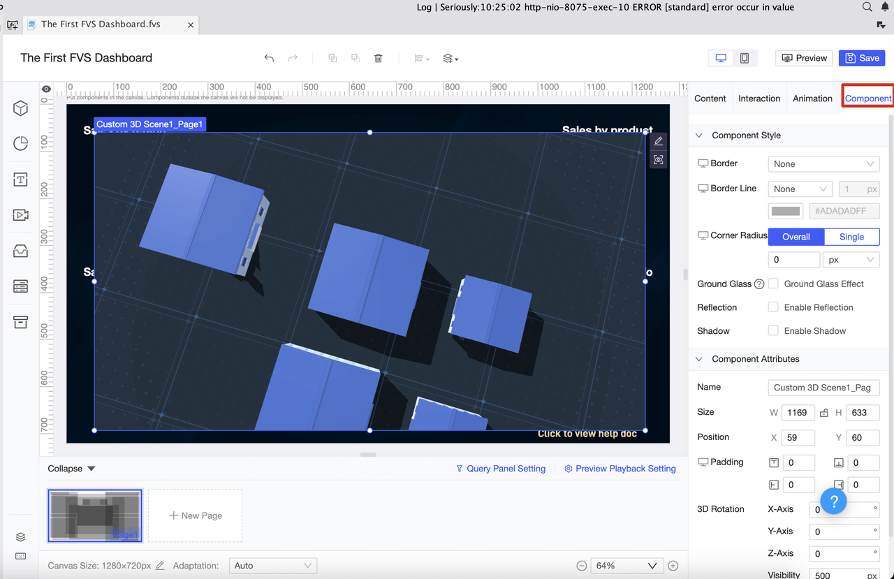
FineReport’s dashboard design tools let you customize each component. You can adjust colors, labels, and animation effects to match your BI needs. The drag-and-drop editor makes it easy to add or remove charts and graphs. You can also link components together, so users can drill down into specific BI data points for deeper analysis.
Note: Minimizing cognitive overload and keeping your dashboard intuitive will help users get the most out of your BI solution.
When you combine strong dashboard design with advanced 3d data visualizations, you create a BI dashboard that is both informative and engaging. You help your team make faster, more accurate decisions and unlock the full value of your business data.
Connect and Visualize Data

Integrate Multiple Data Sources
You need a strong setup to power your 3d dashboard for bi. FineReport gives you flexible data connectors that link to databases, files, and cloud sources. You can connect to SQL Server, Oracle, MySQL, Excel, JSON, and many more. This setup lets you bring all your business data into one dashboard. You do not need to worry about data silos or missing information.
To build a reliable bi dashboard, start by identifying the key performance indicators that matter most to your business. Review these KPIs often to keep your dashboard aligned with your goals. Set up data governance rules to make sure your data stays accurate and consistent. Involve your team in the setup process. When you include stakeholders, your dashboard will meet their needs and see better adoption.
Tip: Regularly update your dashboard to show the latest insights. This keeps your bi team informed and ready to act.
Create 3D Data Visualizations
Once you finish your data connections, you can create 3d data visualizations that bring your bi dashboard to life. FineReport makes this process simple. Use the drag-and-drop editor to map your data to 3d data visualizations. Choose from a wide range of 3d charts, graphs, and interactive models. You can create 3d data visualizations for sales, production, logistics, or any bi scenario.
You can set up your dashboard to display live data. This means your 3d data visualizations update in real time as new information comes in. You can monitor trends, spot issues, and make decisions quickly. FineReport supports live data feeds from multiple sources, so your bi dashboard always shows the most current numbers.
Here is a quick checklist for your 3d dashboard setup:
- Connect all relevant data sources to your dashboard.
- Map your data fields to the right 3d data visualizations.
- Enable live data updates for real-time bi insights.
- Review your dashboard layout and make changes as your business grows.
You can use 3d data visualizations to compare regions, track inventory, or analyze customer behavior. These visuals help you see patterns that plain tables might miss. With FineReport, you can create 3d data visualizations that work on any device, from desktop to mobile. This flexibility ensures your bi dashboard supports your team wherever they work.
Note: A well-designed 3d dashboard with live data and interactive 3d data visualizations gives your business a clear advantage in decision-making.
Enhance Interactivity and User Experience
Interactive Controls and Filters
You can transform your 3d dashboard into a powerful tool for bi by adding interactive controls and filters. These features let you explore 3d data visualizations in real time and focus on the insights that matter most. When you use filters, you can narrow down large datasets and see only the information that is relevant to your goals. Drill-down options allow you to click on a chart or graph and instantly reveal deeper layers of data without leaving the dashboard.
Here are some ways to boost user experience and interactivity in your bi dashboard:
- Add contextual filters to show only the most relevant options and reduce clutter.
- Use drill-down charts to let users explore data hierarchies directly within the dashboard.
- Provide customizable views so each user can personalize their dashboard experience.
- Include in-app notifications to highlight updates and new features.
- Design intuitive navigation and clear visual hierarchy to guide users through key metrics and alerts.
Users often prefer dashboards they can personalize and interact with. Companies using interactive dashboards are 28% more likely to find timely insights compared to those using static reports.
| Feature | Benefit |
|---|---|
| Filter widgets | Focus on relevant data |
| Drill-down charts | Explore data hierarchies easily |
| Customizable views | Personalize dashboard experience |
| AI-driven queries | Get instant answers to business questions |
Mobile and Cross-Device Access
You need access to your bi dashboard wherever you go. FineReport’s mobile dashboard features make this possible. You can view 3d data visualizations and key insights on your phone or tablet, ensuring you never miss important updates. Real-time access to data helps you make quick decisions, even when you are away from your desk.

Mobile bi dashboards offer several advantages:
- Instant access to critical data for fast decision-making.
- Enhanced productivity by analyzing insights on the go.
- Improved collaboration as teams can discuss reports from anywhere.
| Feature | Description |
|---|---|
| Real-Time Access | Make decisions with up-to-the-minute data |
| Interactive Visualizations | Understand trends quickly with 3d data visualizations |
| Personalized Dashboards | See the most relevant data for your role |
| Offline Capabilities | Access data even without a network connection |
Mobile and cross-device access ensures your 3d dashboard remains a central part of your bi workflow. You can collaborate with your team, respond to market changes, and keep your business moving forward—all while enjoying a seamless user experience.
Best Practices for 3D Dashboards
Optimize Performance and Clarity
You want your 3d dashboard to deliver insights quickly and clearly. Start by defining the main objective for your dashboard. Select only the most relevant KPIs for your bi needs. When you design 3d data visualizations, keep them simple and choose the right type for your data. Place each visualization where users can find it easily. Always provide context, such as labels or brief explanations, so users understand what they see.
Tip: Eliminate clutter from your dashboard. A clean layout helps users focus on the most important information.
Follow these best practices for 3d data visualizations to improve clarity and user satisfaction:
- Use a single, clean font family for all text.
- Apply a consistent color palette to group related data and highlight key points.
- Limit the number of 3d data visualizations on each page to avoid overwhelming users.
- Test your dashboard with real users and gather feedback.
- Review and update your dashboard regularly to keep it effective.
Fast load times matter. Complex charts or large images can slow down your dashboard. Simplify your 3d data visualizations and filter data at the source to boost speed. Caching strategies can also help your dashboard respond faster. Users trust dashboards that load quickly and work smoothly.
Troubleshooting and Support
Sometimes, you may face technical issues with your 3d dashboard or 3d data visualizations. FineReport provides several resources to help you solve problems:
- Access professional technical support during business hours.
- Visit the FineReport Community for advice and shared experiences.
- Use comprehensive documentation to guide you through features and troubleshooting steps.
- Explore training materials and attend events to deepen your knowledge.
If your dashboard loads slowly, check for unnecessary joins or scripts. Reduce the number of 3d data visualizations if needed. Always test changes before sharing your dashboard with others. By following these best practices for 3d data visualizations, you ensure your bi dashboards remain reliable, clear, and actionable.
You have learned the main steps to build a 3d dashboard for business intelligence using FineReport. This approach helps you turn complex data into clear visuals for better decision-making. You can try features like one-click 3D city generation, custom model importing, and Unity model integration to enhance your dashboard. For more learning, check out these resources:
| Resource Type | Link |
|---|---|
| Dashboard Introduction | Dashboard Introduction |
| Training Videos | Training |
| Learning Path | Learning path |
Keep exploring new features and best practices to get the most from your dashboard.
Continue Reading About dashboard
Mastering Client Dashboards: A Complete Guide to Transform Data into Actionable Business Insights
Top Client Reporting Tools for Agencies in 2025
Master the Square Dashboard in Easy Steps


FAQ

The Author
Lewis
Senior Data Analyst at FanRuan
Related Articles

How to Build an Investment Portfolio Reporting Dashboard for Executives: KPIs, Benchmarks, and Drill-Down Views
Investment portfolio reporting for executives is not about showing every holding, transaction, and chart your investment team can produce. It is about giving CEOs, CFOs, CIOs, boards, and investment committees a fast, re
Yida YIn
Jun 25, 2026

12 KPI Reporting Examples for Executive Dashboards: What to Show in Weekly, Monthly, and Quarterly Reviews
Executive leaders do not need more data. They need decision ready $1 examples that match how often they review the business and what actions they are expected to take. A weekly $1 should surface fast moving risks and per
Yida YIn
Jun 25, 2026

How to Build a Digital Marketing Reports Dashboard: Executive Examples, KPIs, and Templates
A $1 is the control layer that helps executives and marketing leaders turn scattered channel data into fast, confident decisions. If you are a CEO, CMO, operations director, or marketing analytics lead, the real problem
Yida Yin
May 07, 2026