A revenue dashboard is a visual tool that helps you track, analyze, and understand your organization’s income streams by displaying real-time data, trends, and key performance indicators in one place. You gain quick access to critical metrics and spot trends easily with dashboards. These tools promote a data-driven culture, support real-time monitoring, and enable you to make informed decisions.
When you use a revenue dashboard, you improve sales forecasting, detect revenue leakage, and boost team performance. Consider how you can adapt these dashboards, including FineReport, to fit your unique business needs.
A revenue dashboard is a visual tool that lets you track, analyze, and understand your company’s income streams by displaying real-time data, trends, and sales KPIs in one place. You can use it to monitor performance, spot trends, and make informed decisions quickly.
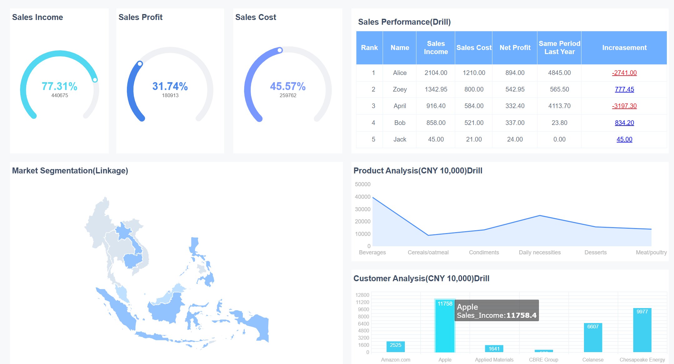
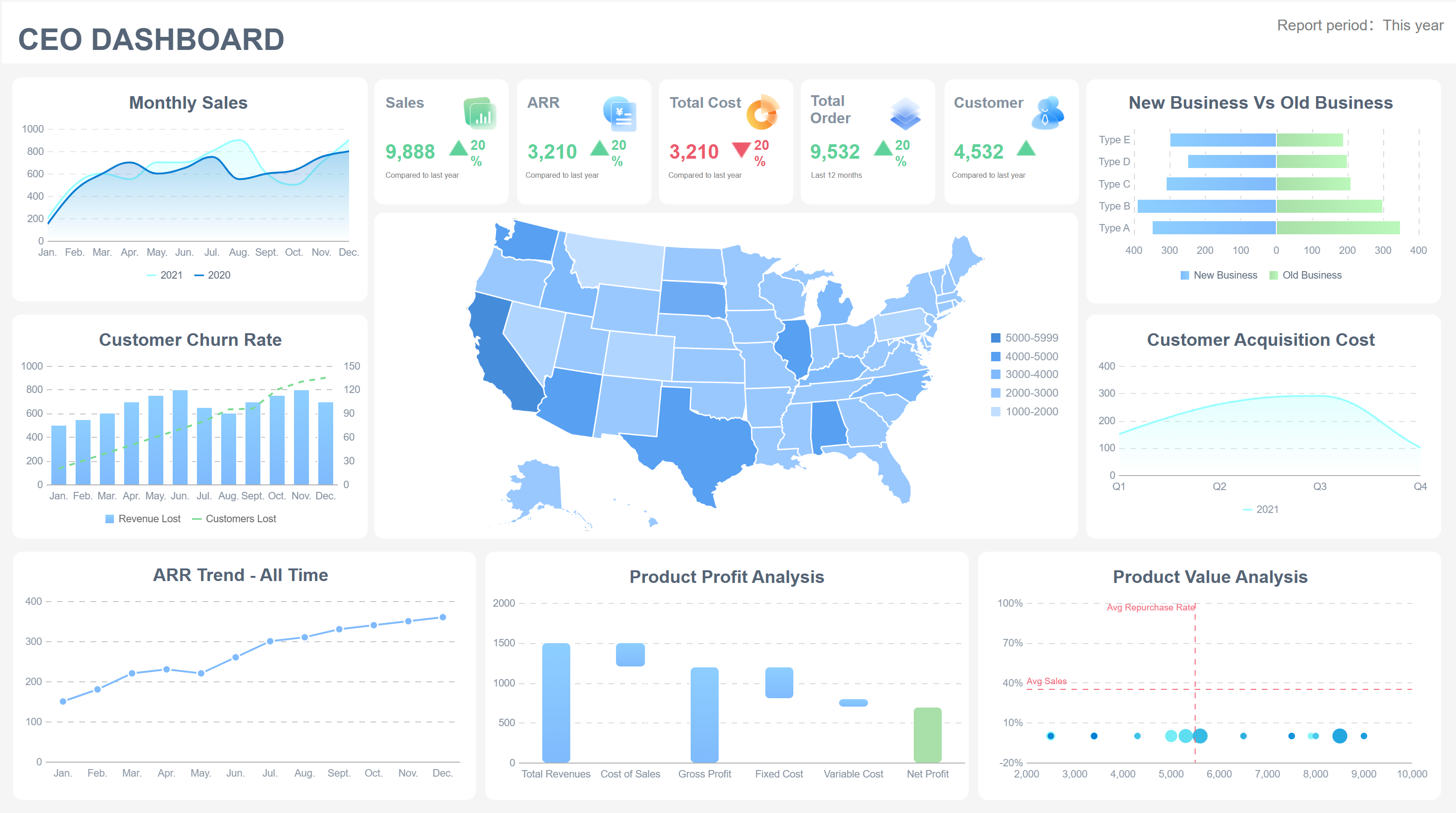
Sales performance dashboards give you a clear view of your most important sales KPIs. You can track total sales revenue, sales conversion rate, and average deal size. These dashboards also show you metrics like quarterly sales growth, year-over-year growth, and repeat customer rate. You can monitor pipeline coverage, win rate, quota attainment, and the number of meetings booked. A sales dashboard example might include a leaderboard for top sales reps, a sales pipeline dashboard for tracking deals, and a sales growth dashboard for measuring progress over time.
You can use FineReport’s Common Dashboard to monitor these KPIs in real time. The dashboard brings together actionable sales data from multiple sources, so you always have the latest information. With dynamic visualizations, you can see how your team performs against targets and identify areas for improvement.
Sales teams rely on sales dashboards to drive revenue growth and improve performance. You can use a sales performance dashboard to get real-time analytics, which means you do not have to wait for reports. This helps you make quick decisions and adjust your strategy as needed. Sales dashboard examples show how teams use dashboards to track sales activities, monitor conversion rates, and analyze sales pipeline health.
You can share dashboards with your team to keep everyone aligned and accountable. Sales analytics dashboards reveal high-impact KPIs, helping you focus on what matters most. You can spot trends, identify bottlenecks, and take action before small issues become big problems. FineReport’s sales dashboard makes it easy to manage your sales pipeline, track sales growth dashboard metrics, and boost revenue outcomes.
Tip: Use sales dashboard examples to inspire your own dashboard design. Choose the KPIs that match your business goals and customize your dashboard for maximum impact.
You need to track the right revenue metrics to understand your subscription business. Dashboard templates help you monitor these metrics in real time and spot trends quickly. The most important revenue metrics for subscription models include:
MRR shows you how much predictable revenue you generate each month. ARR gives you a yearly view by multiplying MRR by 12. Churn Rate tells you what percentage of customers cancel their subscriptions. A low churn rate means you keep more customers, which is key for growth.
You can use dashboard templates to visualize these revenue metrics and compare them over time. Templates let you set up alerts for sudden changes in churn or MRR. This helps you react fast and protect your recurring revenue.
Here is a quick overview of the key metrics you can track with dashboard templates:
| Metric | What It Measures | Healthy Range | Focus Area |
|---|---|---|---|
| MRR | Predictable monthly revenue | +5–15% MoM growth | Growth stability |
| ARR | Annualized recurring revenue | +15–30% YoY | Investor confidence |
| Churn Rate | % of customers lost | <5% monthly | Retention |
| LTV | Lifetime revenue per customer | 3× CAC | Profitability |
| CAC | Cost per acquisition | Varies | Efficiency |
| LTV to CAC Ratio | Revenue-to-cost balance | ~3:1 | Growth sustainability |
| ARPU | Avg. monthly revenue per customer | Growing | Monetization |
| NRR/GRR | Revenue retention quality | NRR >100% | Expansion revenue |
| Activation Rate | Onboarding success | >70% | User experience |
| MRR Growth Rate | Revenue momentum | Consistent positive | Market traction |
If you run a SaaS or service business, dashboard templates help you manage recurring revenue with ease. You can use templates to segment customers, track retention, and measure customer lifetime value. Templates also help you identify high-value customers and focus your resources where they matter most.
With dashboard templates, you can:
FineReport’s dashboard templates give you flexibility. You can connect to multiple data sources and customize each template to fit your business. Templates let you automate reporting, set up alerts, and share dashboards with your team. This makes it easy to keep everyone focused on the right revenue metrics.
Tip: Use dashboard templates to monitor churn and retention. Quick action on these metrics can boost your recurring revenue and help your business grow.
A revenue dashboard is a visual tool that gives you a clear, real-time overview of your company’s income, trends, and key performance indicators, helping you make faster and smarter business decisions.
You need a dashboard that gives you a strategic view of your business. Executive revenue dashboards focus on high-level KPIs, not just operational details. These dashboards help you see the big picture and track revenue progress at a glance. You can use them to monitor trends, compare performance over time, and spot market shifts quickly.
Here are the main characteristics of an effective executive dashboard:
| Characteristic | Description |
|---|---|
| Visual and Intuitive | Clear data visualizations make complex data easy to understand. |
| High-Level and Strategic | Focuses on strategic KPIs for leadership decisions. |
| Real-Time Data | Shows up-to-date information about your business. |
| Customizable | Tailors to your specific needs and priorities. |
| Interactive | Lets you drill down for more details when needed. |
Executive dashboards give you a consistent view of key metrics. You can analyze historical data, identify patterns, and make accurate forecasts. This helps you plan for the future with confidence.
You want to make decisions based on facts, not guesses. Executive dashboards simplify complex data and put all critical information in one place. This makes it easier for you to assess financial health, track project status, and monitor key performance indicators.
FineReport’s Decision-Making Platform supports executive dashboards by providing:
With these dashboards, you can align departmental goals with your overall business objectives. You get a clear view of revenue progress and can adjust strategies quickly. Dashboards also foster a culture of adaptability and continuous improvement, helping you stay ahead in a changing market.
Tip: Use executive dashboards to turn raw data into visual stories. This makes it easier to communicate results and strategies with your team.

A revenue dashboard is a visual tool that gives you real-time data on your sales, income streams, and business performance, helping you make smarter decisions and optimize results.
You need real-time data to stay ahead in e-commerce. A revenue dashboard gives you instant access to sales numbers, order volume, and customer behavior. You can track every sale as it happens, monitor inventory, and adjust your marketing strategies on the fly. This real-time visibility helps you respond quickly to trends and sales events.
Here are common features you will find in e-commerce dashboards for real-time sales tracking:
| Feature | Description |
|---|---|
| Real-Time Data | See up-to-the-minute sales and revenue for fast decision-making during campaigns. |
| Smarter Decision-Making | Use immediate data to adjust marketing and manage inventory. |
| Customer Behavior Insights | Track cart abandonment and average order value to understand what drives your customers. |
| Multi-Store Management | View all your sales channels in one dashboard for easier management. |
| Sales Forecasting | Analyze past data to predict future sales and demand. |
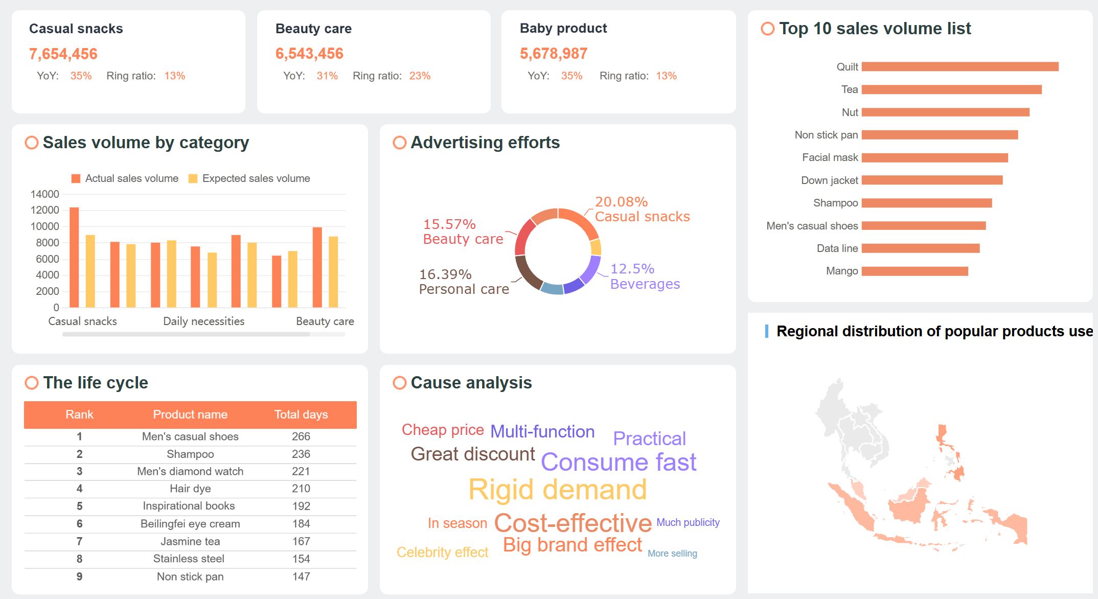
FineReport’s mobile dashboard supports all your devices, so you can check real-time data from your phone, tablet, or computer. You never miss a sales update, even when you are on the go. This flexibility keeps you connected and ready to act.
You want to know which marketing channels drive the most revenue. E-commerce dashboards let you compare performance across platforms like Shopify, Meta, and Google Ads. You get real-time visibility into key metrics such as customer acquisition cost (CAC), return on ad spend (ROAS), average order value (AOV), and lifetime value (LTV). You can track ROI daily and link campaigns to revenue, making it easy to adjust your budget for the best results.
The real foundation of any high-impact web analytics dashboard is selecting the right Key Performance Indicators (KPIs). Avoid tracking vanity metrics that do not connect to real business outcomes.
Dashboards also help you analyze conversion rates and channel performance. You can use different report types to get deeper insights:
| Report Type | Insights |
|---|---|
| Traffic Source Conversion Performance | See how each channel converts visitors into sales and track user behavior. |
| Monthly Performance Report | Spot trends in conversions from different sources over time. |
| Landing Page Performance Dashboard | Monitor which pages drive the most conversions and where users drop off. |
| Keyword Performance Dashboard | Track which keywords bring in the most sales and identify threats to conversion. |
| Top Performing Pages Identification | Find your highest-converting pages and focus your optimization efforts. |
With FineReport’s mobile dashboard, you get real-time data and real-time visibility into every channel and campaign. You can share dashboards with your team, reduce manual work, and focus on interpreting trends. This approach ensures everyone stays aligned and ready to act on the latest sales insights.

A revenue dashboard is a visual tool that brings together your most important income data, helping you track sales, monitor trends, and make better business decisions by displaying real-time metrics in one place.
You can use power bi dashboard examples to turn complex revenue data into clear, actionable insights. Power bi offers a wide range of data visualization techniques that help you understand your sales performance and financial health. You might use bar charts to compare sales across different products or regions. Line charts show you how revenue changes over time, making it easy to spot trends or seasonal patterns. Area charts highlight the volume of sales growth, while tables and matrices let you examine detailed numbers for each sales channel or time period.
Here is a quick reference for common visualization techniques in power bi dashboard examples:
| Visualization Technique | Description | Use Case |
|---|---|---|
| Bar Charts | Compare data across categories | Track sales by product or region |
| Line Charts | Show changes over time | Monitor monthly or yearly revenue trends |
| Area Charts | Highlight volume of trends | Visualize sales growth |
| Tables | Display data for quantitative comparisons | Review sales by channel or salesperson |
| Matrices | Aggregate and summarize data | Analyze revenue by year and region |
| Donut/Pie Charts | Show proportions within a whole | See sales mix by product category |
Power bi dashboard examples often include combo graphs for analyzing income and expenses together. You can use these dashboards to evaluate financial performance and track progress toward your goals. FineReport also provides advanced data visualization features, including interactive 3D dashboards and mobile-friendly layouts, giving you flexibility for any device.
Power bi dashboard examples adapt to many industries. In hospitality, you can track occupancy rates, room prices, and revenue per available room in real time. In finance, dashboards automate reporting and reduce manual errors, freeing up time for deeper analysis. For manufacturing, dashboards support lean production by integrating data from production, quality, and cost modules. You can monitor equipment status, production schedules, and quality metrics, helping you optimize operations and reduce costs.
For example, a fractional CFO consultancy used power bi dashboard examples to automate client reports. They connected directly to accounting systems, saving hours each month and improving accuracy. In manufacturing, FineReport’s lean production solution provides a control tower view, combining real-time data from multiple sources. You can track key performance indicators, spot bottlenecks, and drive continuous improvement.

Power bi templates make it easy to start building dashboards for your industry. You can customize these templates to fit your unique needs, whether you focus on sales, finance, or operations. FineReport also offers customizable templates and advanced integration options, supporting your business as it grows.
Tip: Choose the right dashboard template for your industry to get the most value from your revenue dashboard.
A revenue dashboard is a visual tool that helps you track and analyze income by region, giving you clear insights into sales performance and market trends for smarter business decisions.
You can use a regional revenue dashboard to break down sales and revenue by geographic area. This approach helps you understand which regions drive the most business and where you need to focus your efforts. To segment revenue by region, follow these steps:
Maps make it easy to see which regions perform best. You can compare growth, analyze market share, and tailor your marketing to local preferences. FineReport’s dashboard offers mapping and drill-down features, so you can click on a region to see detailed sales data. This helps you assess resources, optimize logistics, and respond to local trends.
Tip: Use region-specific feedback and consider local regulations to improve your strategy.
A regional revenue dashboard lets you spot growth opportunities in different markets. You can see financial performance across regions and analyze trends for each area. This helps you find regions with strong sales and identify places with potential for expansion.
FineReport’s dashboard allows you to drill down into specific regions and uncover hidden opportunities. You can use these insights to guide your sales strategy and allocate resources more effectively.
| Region | Sales Growth | Market Share | Opportunity Level |
|---|---|---|---|
| North | High | 35% | Strong |
| South | Moderate | 25% | Emerging |
| East | Low | 15% | Needs Focus |
| West | High | 25% | Strong |
Note: Regularly review your dashboard to stay ahead of market changes and maximize your revenue.
A revenue dashboard is a tool that lets you track, analyze, and visualize your company’s income and sales data in real time, helping you make better business decisions.
You can create custom kpi dashboard templates in FineReport with ease. The drag-and-drop designer gives you full control over every template. You can adjust layouts, add or remove charts, and set up custom sales metrics. FineReport lets you connect to many data sources, so your dashboard always shows the latest numbers.
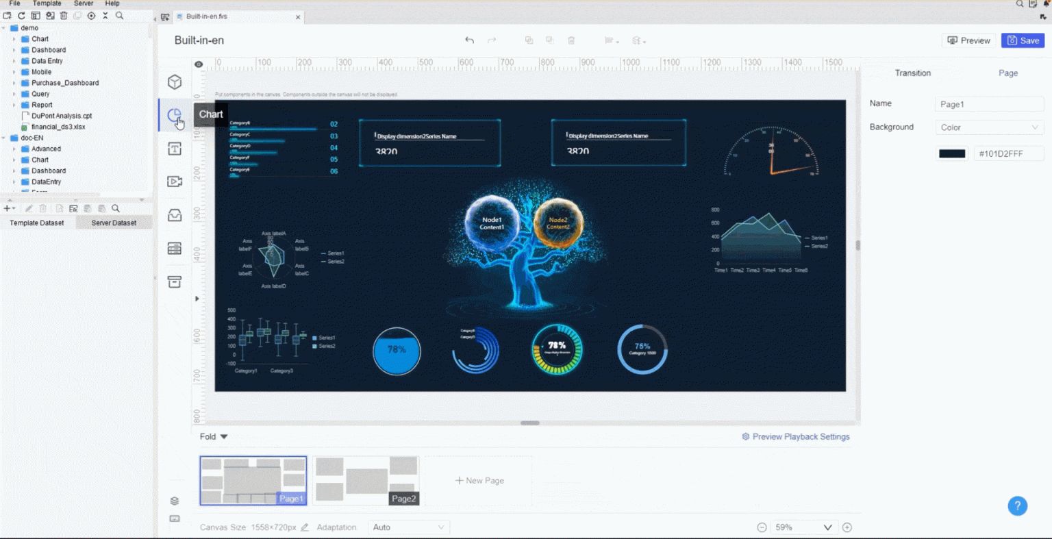
You can personalize each template by changing the title of any hyperlink sub-template in the form attribute. Use the Component Settings in the property panel to do this. When you preview your dashboard on a PC, the form attribute title appears at the top.
FineReport supports custom chart styles for your dashboard templates. You can change the background color, set word cloud colors, and adjust the legend. You can even use 3D dynamic rotation and other 3D properties to make your sales data stand out. This flexibility helps you build templates that match your brand and business needs.
You should choose custom kpi dashboard templates when your sales process or revenue tracking needs are unique. Custom templates let you focus on the exact metrics that matter most to your business. If you need to track special sales KPIs or want a dashboard that matches your workflow, customization is the best choice.
Pre-built dashboard templates work well when you want to get started quickly. These templates cover common sales and revenue scenarios. You can use them as a starting point and then adjust them as your needs grow.
UnionPay Data Services used FineReport to build a unified data visualization platform. They customized templates to analyze credit card revenue and sales, which helped them improve customer targeting and boost revenue. Their story shows how custom templates can drive real results.
Tip: Start with pre-built dashboard templates if you are new to dashboards. Move to custom templates as your business grows and your sales tracking needs become more complex.
A revenue dashboard is a tool that displays your most important sales and revenue data in one place, helping you track performance and make informed decisions.
You need to choose a dashboard that fits your business goals, supports your team, and grows with your company. The right template will help you focus on the sales metrics and kpis that matter most, making your data easy to understand and act on.
Start by matching dashboard features to your business goals. You want a template that aligns with your sales process and tracks the right kpis. Use the table below to guide your assessment:
| Criteria | Description |
|---|---|
| Scalability | The template should handle more data and users as your business grows. |
| Ease of Use | The dashboard must be simple for everyone, including non-technical users. |
| Alignment with Business Goals | The kpis in your template should connect directly to your main objectives. |
| Actionable Metrics | Focus on 5-10 key sales metrics that drive action, not clutter. |
Look for templates that let you customize kpis and sales data. FineReport offers templates that connect to many data sources and support real-time updates. This flexibility helps you adapt as your business changes.
You want your dashboard to deliver value from day one. Follow these best practices for a smooth rollout:
You may face challenges like data silos or resistance to new tools. Solve these by setting up strong data governance and involving users early. Avoid dashboard clutter by using templates with clear executive summaries and links to detailed sales views.
Tip: Start with a simple template, then add more features as your team gets comfortable. This approach helps you get quick wins and build momentum.
A revenue dashboard is a tool that shows your sales and income data in real time. Choosing the right dashboard helps you make faster decisions, respond quickly to changes, and improve teamwork. The right template connects your sales outcomes with pipeline behavior and conversion patterns. You can use these templates to turn your sales data into clear, actionable stories. Explore FineReport templates or build your own to track sales, monitor trends, and support better decisions. Start by turning your Excel sales data into a decision-ready dashboard and keep improving your templates as your business grows.
What is Sales Analytics and Why It Matters in 2025
What Is Sales Revenue and Why Is It Important for Businesses
Sales Dashboard Software Comparison for Businesses
Top 10 Sales Dashboard Examples to Elevate Your Team in 2026

The Author
Lewis
Senior Data Analyst at FanRuan
Related Articles
Payment Analytics Dashboard: 12 KPIs Every Operations Leader Should Track to Cut Revenue Leakage
Losing revenue to declines? Discover 12 essential KPIs to track in your payment analytics dashboard to stop leakage and manage disputes.
Lewis Chou
May 05, 2026

SOC Dashboard Explained: 12 Essential KPIs, Views, and Workflows Security Teams Use
Learn about SOC dashboards, the 12 essential KPIs for security teams, and how they centralize alerts and workflows for faster threat detection and response.
Lewis Chou
May 05, 2026

EMR Dashboard Guide: 12 Metrics to Track for Faster Clinical and Operational Decisions
Learn the 12 essential EMR dashboard metrics to track for faster clinical and operational decisions, improving patient flow and revenue cycle management.
Lewis Chou
May 05, 2026


