Analytics Tools
Power BI Dashboard Examples: 12 Real Use Cases for Sales, Finance, HR, Operations, and More
Lewis Chow
Jun 11, 2026
If you’re searching for power bi dashboard examples, you’re likely trying to answer one of three questions: what a good dashboard looks like, which metrics different teams should track, and how to turn examples into something useful for your own business. That is the right approach. A dashboard should not just look polished. It should help users spot trends, detect exceptions, and decide what to do next.
For data analysts, BI managers, operations leaders, finance teams, and department heads, the most valuable Power BI dashboard examples are the ones that show how metrics, layout, and interactivity support real decisions.
Key Elements of a Good BI Dashboard
- Clear business goal: The dashboard should support a specific decision, such as improving pipeline conversion or controlling operating expenses.
- Relevant KPIs: Show only the numbers users need to monitor performance and take action.
- Clean visual hierarchy: Put the most important metrics at the top, then add trends and breakdowns below.
- Interactive filtering: Let users analyze by region, product, department, channel, or time period.
- Reliable data source: A dashboard is only useful if the underlying data is trusted and updated consistently.
- Actionable insight: The best dashboards highlight variance, outliers, risk areas, and opportunities.
Power BI Dashboard Examples: What Makes a Great Real-World Dashboard
A strong real-world dashboard helps users understand performance at a glance. In practice, that means showing three things clearly:
- Trends: What is improving, declining, or staying flat over time
- Exceptions: What is off target, delayed, overspent, or underperforming
- Next actions: Where managers should investigate, escalate, or intervene
Many teams confuse dashboards with reports or scorecards, but they serve different purposes.
Dashboard vs. report vs. scorecard
A dashboard is a visual monitoring layer. It gives a quick summary of key metrics and usually supports filters, drill-down, and alerts.
A report is more detailed. It often contains multiple pages, deeper analysis, and supporting views for analysts or managers who need context.
A scorecard is typically more target-oriented. It focuses on KPI status, goal tracking, and progress against plan.
In practical business use:
- Executives often want a dashboard for fast review
- Analysts may use reports for deeper investigation
- Functional leaders use scorecards to manage accountability
What strong Power BI dashboard examples usually include
The best examples tend to share a few design principles:
- Clear KPI cards for top-line metrics
- Simple page structure with logical grouping
- Filters and slicers that are useful, not excessive
- Drill-through paths from summary to detail
- Mobile-friendly layouts for users who review data on the go
- Variance indicators that show actual vs. target or period-over-period change
A dashboard with beautiful charts but weak business meaning is still a weak dashboard. The right way to evaluate power bi dashboard examples is by asking:
- What decision does this dashboard support?
- Are the KPIs connected to that decision?
- Can a user quickly spot issues and drill deeper?
- Is the layout helping or distracting?
- Would a manager know what to do after seeing it?
12 Power BI Dashboard Examples by Use Case
Below are 12 practical dashboard scenarios that appear across industries. Use them as inspiration for KPI selection, layout planning, and stakeholder discussions.
Sales performance dashboard
A sales dashboard is one of the most common Power BI use cases because it helps revenue teams monitor progress in real time.
Typical metrics include:
- Revenue
- Pipeline value
- Win rate
- Average deal size
- Sales by region
- Sales by rep
- Target attainment
- Stage conversion
A strong sales dashboard often starts with an executive summary row: total revenue, quota attainment, open pipeline, and forecast coverage. Below that, trend charts show month-to-date and quarter-to-date movement. Regional maps or ranked bars help leaders compare territories or account managers.
What makes this dashboard effective is the ability to move from high-level tracking into account-level detail. If one region is behind target, drill-through should help users inspect opportunities, rep performance, or deal aging.
Finance dashboard
A finance dashboard should help teams monitor financial health without forcing executives to read full statements every day.
Common KPIs include:
- Budget vs. actuals
- Cash flow
- Gross margin
- Operating expenses
- EBITDA or operating profit
- Forecast accuracy
- Revenue growth
- Cost trends
Good finance dashboards surface both month-over-month and year-over-year changes. This allows faster review of short-term shifts and longer-term trends. Conditional formatting is especially useful here because it highlights overspending, margin compression, or unusual variance.
Finance teams also benefit from exception-focused design. Instead of only showing totals, the dashboard should identify where spend is above plan, where collections are lagging, or where forecast accuracy is deteriorating.
HR and people analytics dashboard
HR dashboards are useful when leaders need a balanced view of workforce health, hiring progress, and retention risk.
Common metrics include:
- Headcount
- Open roles
- Hiring funnel conversion
- Time to fill
- Turnover rate
- Absenteeism
- Diversity metrics
- Employee tenure
A practical HR dashboard compares department-level performance so leaders can see where hiring is slow, attrition is rising, or absenteeism is concentrated. Trend analysis is important because many workforce issues are only visible over time.
Privacy-aware design matters in HR dashboards. Senior leaders may need department summaries, while HR analysts may need more detailed but access-controlled views.
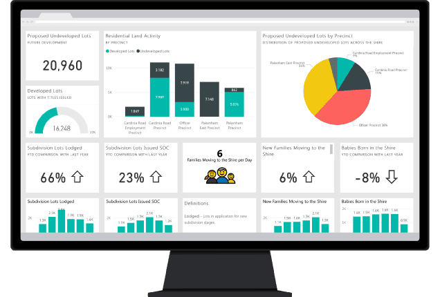
Operations dashboard
An operations dashboard should help managers react quickly to bottlenecks and service issues.
Typical metrics include:
- Throughput
- Cycle time
- Downtime
- Order status
- Inventory health
- Fill rate
- SLA performance
- On-time completion
The most effective operations dashboards combine real-time monitoring with historical trend context. A plant manager or operations lead may need to know today’s downtime events, but they also need to understand whether downtime is improving over the last 30 or 90 days.
Conditional formatting, stage-based breakdowns, and threshold alerts make bottlenecks easier to spot. If one stage of a process is consistently delayed, the dashboard should make that obvious.
[Insert Dashboard Demo Here: Operations dashboard with throughput, downtime, cycle time, order status, and process-stage bottlenecks]
Marketing dashboard
Marketing teams use dashboards to connect spend, pipeline, and campaign outcomes.
Useful KPIs include:
- Campaign performance
- Lead sources
- Cost per acquisition
- Conversion rate
- Marketing qualified leads
- Pipeline influenced
- Channel ROI
- Email and social engagement
A good marketing dashboard compares paid, organic, email, and social performance in one place. It should also separate vanity metrics from outcome metrics. Traffic and clicks matter, but decision-makers usually care more about lead quality, conversion efficiency, and revenue impact.
Customer service dashboard
Customer service dashboards help teams maintain response quality while managing workload.
Typical metrics include:
- Ticket volume
- Resolution time
- First-contact resolution
- Backlog
- CSAT
- SLA compliance
- Escalation rate
- Peak demand periods
This dashboard is strongest when it helps managers identify service gaps early. For example, if ticket volume spikes on certain days or channels, staffing and routing decisions can be adjusted. Trend lines and queue segmentation are especially useful here.
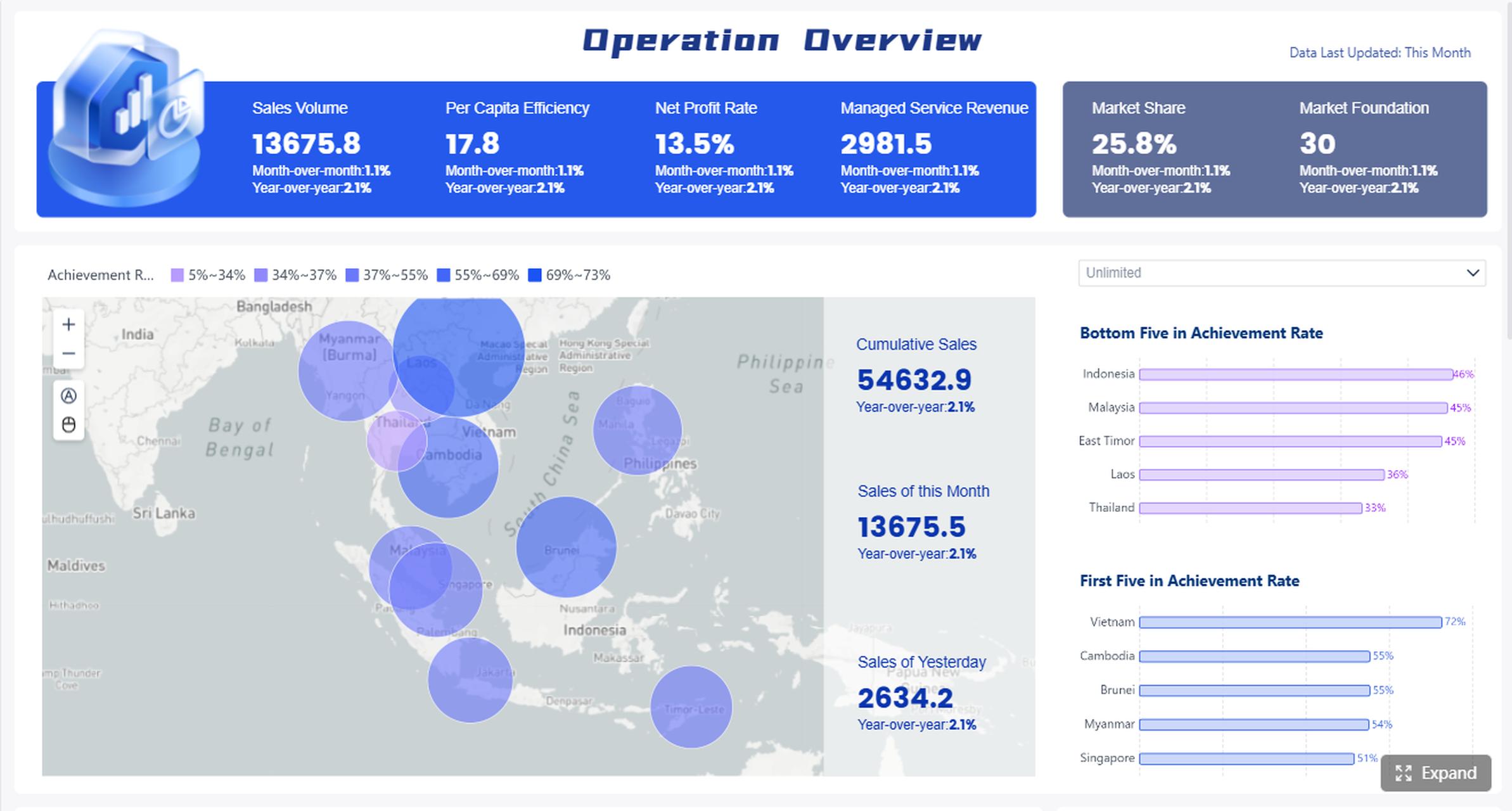
Executive KPI dashboard
An executive KPI dashboard gives leadership a concise cross-functional view of company performance.
It often includes metrics from:
- Sales
- Finance
- Operations
- Customer outcomes
- Workforce metrics
The key design challenge is restraint. Executive dashboards should not become mini reports. They need clear targets, variance indicators, and enough drill-through to investigate issues without overwhelming senior users.
Project management dashboard
Project dashboards help PMOs, delivery managers, and department heads monitor execution risk.
Key metrics may include:
- Milestone status
- Task completion
- Resource utilization
- Budget consumption
- Delivery risk
- Timeline variance
- Issues by severity
- Project health score
A useful project dashboard supports weekly status reviews and allows drill-through to project-level or team-level detail. It should highlight late milestones, overloaded teams, and budget pressure before they become major problems.
Inventory dashboard
Inventory dashboards are essential for retail, manufacturing, distribution, and supply chain teams.
Useful KPIs include:
- Stock on hand
- Inventory turnover
- Days of inventory
- Stockout rate
- Excess inventory
- Reorder risk
- Demand by SKU
- Warehouse performance
A strong example balances summary KPIs with operational detail. It should quickly show which products are overstocked, understocked, or moving slower than expected.
Procurement dashboard
Procurement teams use dashboards to improve spending visibility and supplier performance.
Common metrics include:
- Spend by supplier
- Spend by category
- Purchase order cycle time
- Savings achieved
- Contract utilization
- Supplier quality issues
- On-time delivery
- Maverick spend
This type of dashboard is especially useful when it helps procurement leaders connect spend trends with compliance and supplier risk.
Retail performance dashboard
Retail dashboards combine commercial and operational metrics.
They may include:
- Sales by store
- Footfall
- Average basket size
- Conversion rate
- Promotion performance
- Return rate
- Store profitability
- Inventory availability
A good retail dashboard should help leaders compare locations, product categories, and time periods without losing the operational context behind the numbers.
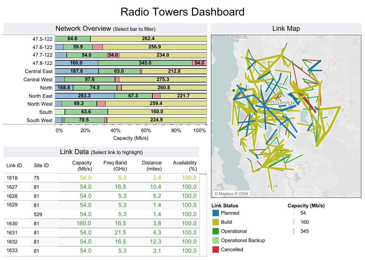
Supply chain dashboard
Supply chain dashboards are designed to support visibility across planning, fulfillment, and logistics.
Key metrics may include:
- On-time shipment
- Lead time
- Order fulfillment
- Supplier reliability
- Transportation cost
- Warehouse cycle time
- Backorder rate
- Demand variability
The best supply chain dashboards help teams detect disruptions early and understand where delays are happening across the network.
More Power BI Dashboard Examples Across Teams
The most useful power bi dashboard examples are not limited to one function. They show how the same dashboard design principles apply across departments.
Marketing dashboard
Marketing dashboards work best when they connect campaign activity to business outcomes rather than only reporting channel metrics. Include acquisition cost, conversion, influenced pipeline, and channel ROI so stakeholders can judge effectiveness, not just visibility.
Customer service dashboard
Customer service dashboards should help teams improve both speed and quality. When backlog, response time, and CSAT are shown together, managers can see whether service pressure is harming customer experience.
Executive KPI dashboard
Executive dashboards need to be highly scannable. A leadership team should be able to review the page in minutes, spot red flags, and decide where to ask deeper questions.
Project management dashboard
Project dashboards should support both governance and action. If delivery risk is rising, the dashboard should make the cause visible, such as under-resourcing, dependency delays, or budget overrun.
[Insert Dashboard Demo Here: Cross-functional Power BI dashboard examples for marketing, customer service, executive KPI, and project management]
Where to Find Samples, Templates, and Inspiration
Looking at finished dashboards can speed up design work, but only if you use examples the right way.
What are Power BI samples and when should you use them?
Power BI samples are ready-made datasets, reports, templates, or workbook-based examples that help users learn the product and explore dashboard design patterns.
They are useful for:
- Learning how pages, filters, and visuals are structured
- Demonstrating dashboard concepts to stakeholders
- Testing proof-of-concept ideas before connecting real data
- Exploring different data models and KPI layouts
Sample files can come in formats like full report files, templates, or spreadsheet-based data sources. For business teams, they are helpful in the early stages of dashboard planning because they provide a faster way to visualize what is possible.
Templates and sample dashboards worth exploring
There is a difference between a prebuilt template and a custom dashboard.
- A template gives you a starting structure
- A custom dashboard is built around your actual KPIs, workflows, users, and definitions
Templates are useful for inspiration, especially for layout, navigation, and filtering patterns. But they should not be copied blindly. A dashboard that works for a SaaS revenue team may not work for a manufacturing operations team.
When reviewing examples, pay attention to:
- Whether the KPIs are business-relevant
- How clearly the page is organized
- Whether the interactions are intuitive
- Whether the drill-down paths are useful
- Whether the data model appears logically structured
Free examples and community inspiration
There are many free dashboard galleries, vendor showcases, and community-curated examples online. These are useful when you need ideas for page structure, storytelling, or functional use cases.
Still, not every polished dashboard is a strong operational dashboard. Evaluate each example for:
- Data quality assumptions
- Usability
- KPI clarity
- Business relevance
- Real-world decision support
The best inspiration comes from dashboards that solve actual business questions, not just those with the most elaborate visuals.
How to Build a Better Dashboard from These Examples
Examples are most helpful when you use them to clarify your own dashboard requirements.
Start with the business question, not the chart type
This is the most common dashboard design mistake. Teams often start by discussing charts before they define the decision they need to support.
Begin with questions like:
- Who is the audience?
- What decisions should this dashboard support?
- How often should data update?
- Which KPIs matter most?
- What follow-up analysis will users need?
For example, “build a sales dashboard” is too broad. A better objective is: “help regional sales managers identify pipeline shortfalls and rep-level conversion issues every week.”
 Regional Sales Dashboard created with FineBI
Design for clarity and action
A dashboard should be easy to scan. Group related metrics together. Keep color use intentional. Use visual contrast to direct attention toward the most important insights.
Useful design practices include:
- Put summary KPIs first
- Use trends to provide context
- Group charts by topic
- Limit slicers to high-value filters
- Use tooltips only when they add meaning
- Add drill-through where users truly need deeper detail
The goal is not to include every possible view. It is to help the user act faster.
Avoid common mistakes in Power BI dashboard design
Many dashboards become harder to use as more stakeholders request “just one more chart.” That leads to clutter and weak decision support.
Common mistakes include:
- Overcrowded visuals
- Inconsistent KPI definitions
- Low-trust data
- Too many slicers
- Decorative charts with little analytical value
- Weak mobile design
- No clear drill path from summary to detail
The strongest dashboards simplify choices. They reduce noise and direct attention toward decisions.
How to Choose the Right Power BI Dashboard Example for Your Needs
Not every example is relevant to every team. The right one depends on your function, data maturity, and reporting objective.
Here is a practical way to choose:
- Match by function: Sales teams should start with pipeline and quota dashboards, while finance teams should start with variance and cash flow dashboards.
- Match by maturity: If your data is still fragmented, begin with a simpler executive or functional overview. If your data model is mature, you can support deeper drill-through and role-based analysis.
- Match by reporting goal: Decide whether you need an executive overview, an operational monitor, or an analyst-friendly deep dive.
- Match by user behavior: Consider whether users want mobile review, daily alerts, weekly review packs, or highly interactive self-service analysis.
Checklist: turn inspiration into a practical dashboard plan
Use this checklist before building your dashboard:
- Define the primary audience
- List the top 5 to 10 KPIs
- Clarify metric definitions and targets
- Identify the key filters users need
- Decide what should be visible on the first screen
- Plan drill-through paths to supporting detail
- Confirm update frequency and data ownership
- Test whether each visual supports a decision
Practical Recommendations for Teams Evaluating Dashboard Examples
If you want to move from inspiration to implementation, focus on these actions:
- Choose examples by decision type, not industry alone. A finance variance dashboard may be more relevant to your team than a visually similar dashboard in your own sector.
- Reduce KPIs before you add visuals. Most weak dashboards track too much. Start with the few metrics that change decisions.
- Prototype with stakeholders early. Use sample dashboards to discuss layout, filters, and drill paths before development gets too deep.
- Evaluate usability with real users. Ask whether managers can find answers in under a minute.
- Treat dashboards as iterative products. The best BI teams improve dashboards over time based on usage and business change.
Beyond Power BI Examples: When Teams Also Consider FineBI
Tools like Power BI are widely used in the BI market, especially for organizations already aligned with Microsoft 365, Teams, Azure, SharePoint, and the broader Microsoft data stack. Power BI is well known for interactive dashboards, Power Query for data preparation, and DAX for advanced analytical modeling.
At the same time, some teams evaluating power bi dashboard examples are not only looking for visual inspiration. They are also looking for a platform that business users can adopt more easily for self-service analysis and dashboard iteration.
That is where FineBI can be relevant.
FineBI is positioned as a self-service BI platform for business users. It is designed to make dashboard creation, analysis, and data exploration more accessible in practical enterprise workflows. Depending on the use case, teams may consider FineBI when they need:
- Business-user-friendly self-service analytics
- Drag-and-drop dashboard creation
- Interactive filtering and drill-down
- Department KPI monitoring
- Shared themed dashboards with linked analysis
- Enterprise data governance support
- Data alerts, analysis reports, and broader data application workflows

In other words, if your priority is not only building a dashboard but also making analytics easier to use across business teams, FineBI may be worth evaluating alongside more established BI platforms.

Get Ready-to-Use Dashboard Templates in Fine Gallery
One practical difference for some enterprises is workflow. Power BI is commonly used as an analysis and visualization tool, while FineBI is often considered by teams that want analytics to fit more closely into business decision-making and follow-up actions. FineBI also supports dashboard sharing, linked interactions, and data application features such as alerts and portal-style delivery scenarios, which can matter when dashboards need to become part of operational routines rather than one-time reviews.
This does not mean one tool fits every scenario. Power BI remains a strong option for Microsoft-centered environments, especially where DAX depth and Microsoft ecosystem integration are important. FineBI is more relevant when ease of adoption, self-service analysis, and practical enterprise-wide dashboard usage are the priority.
Conclusion of Power BI Dashboard Examples
The best power bi dashboard examples do more than display metrics. They help users understand what is happening, why it matters, and what to do next. Whether you are building for sales, finance, HR, operations, service, or executive leadership, the strongest dashboards share the same foundation: clear KPIs, thoughtful layout, useful interactions, and a strong connection to business decisions.
Examples should inspire your design, not dictate it. Use them to shape requirements, align stakeholders, and test what matters most. If your team is also evaluating BI platforms for broader self-service analytics and dashboard adoption, it can be worth comparing Power BI with tools like FineBI based on your users, workflows, and governance needs.
FAQs
A strong example supports a clear business decision, shows only relevant KPIs, and makes trends, exceptions, and next steps easy to spot. The best dashboards also include useful filters, drill-down paths, and trusted data sources.
A dashboard is a high-level monitoring view built for quick review and fast action. A report is usually more detailed and is used for deeper analysis across multiple pages.
Include KPIs that directly match the decision the user needs to make, such as revenue and win rate for sales or budget variance and cash flow for finance. Avoid adding extra metrics that look interesting but do not drive action.
You can explore built-in Microsoft sample datasets, downloadable PBIX files, and public template galleries to study layouts, visuals, and KPI choices. Use them as inspiration, but adapt the design to your own data and business goals.
Start by defining the decision the dashboard should support, then choose the few metrics that best reflect that goal. After that, organize the layout for quick scanning and add filters or drill-through only where they help users investigate issues.


The Author
Lewis Chow
Senior Data Analyst at FanRuan
Related Articles

Tableau vs Power BI for Business Teams: Which BI Tool Best Fits Your Reporting Workflow in 2026?
Compare Tableau vs Power BI for reporting workflows in 2026. See which BI tool fits your team's data needs, skill mix, and analytics governance best.
Lewis Chow
Jun 10, 2026
What Is a Tableau Dashboard? Beginner’s Guide to Views, Filters, and Interactive Analysis
Learn what a Tableau dashboard is, how to combine views, and use filters for interactive data analysis in this beginner's guide.
Lewis Chow
Jun 10, 2026