An employee performance dashboard is a digital tool that helps you visualize and monitor employee performance data in real time. In 2026, 54% of organizations have adopted dashboards as a core observability capability, making them essential for tracking and improving employee outcomes. FineReport leads the way in helping you create effective dashboards that boost engagement and productivity.
When you use a performance dashboard, you gain access to advanced analytics that track AI adoption, improve engagement, and speed up project completion by highlighting top performers and workforce trends.
| Benefit | Description |
|---|---|
| Advanced Analytics | Dashboards help you optimize employee performance using insightful analytics. |
| Engagement | Employees engage more with clear performance metrics. |
| Project Completion | Teams finish projects faster by tracking performance on dashboards. |
Employee Performance Dashboard Features
An employee performance dashboard is a digital tool that helps you track, visualize, and analyze employee performance metrics in real time.
A great dashboard in 2026 gives you instant access to core metrics, advanced visualizations, and seamless integration with multiple data sources. FineReport empowers you to create dashboards that work on any device, so you can monitor employee performance wherever you are. You see trends, spot issues, and make decisions faster with interactive charts and mobile-friendly layouts.
Key Metrics for 2026
You need to focus on core metrics that matter most for employee performance. These metrics help you understand how your team is doing and where you can improve.
- Employee engagement scores
- Retention rates
- Turnover rates
- Performance reviews
- Job satisfaction
- Career advancement opportunities
- Employee satisfaction
- Promotions
- Salary increases
- Percentage of A Players
After trending up in recent years, employee engagement in the U.S. saw its first annual decline in a decade -- dropping from 36% engaged employees in 2020 to 34% in 2021. This pattern continued into 2022, as 32% of full- and part-time employees working for organizations are now engaged, while 18% are actively disengaged.
Tracking the percentage of A Players on your dashboard can drive improvement. One company increased their A Player percentage from 50% to 70% by focusing on this core metric.
Essential Dashboard Functions
Your employee performance dashboard should include functions that make tracking and analysis easy.
| Essential Function | Description |
|---|---|
| Productivity Reports | Visual representations of how time is allocated by employees. |
| Workload Balance | Identifies employees who are either overworked or underutilized. |
| Risk Alerts | Notifies about unusual activities that may indicate disengagement or security concerns. |
Dashboards with real-time data and KPI tracking give you instant visibility. You see all critical metrics in one place, which helps you respond quickly to issues. Visual representations turn complex data into easy-to-understand charts and graphs.
- Real-time visibility lets you act fast.
- Consolidated information saves you time.
- Visual representations help you understand patterns.
You get clear actionable insights, improved alignment with goals, and higher productivity. FineReport makes it simple to automate data collection and focus on analysis.
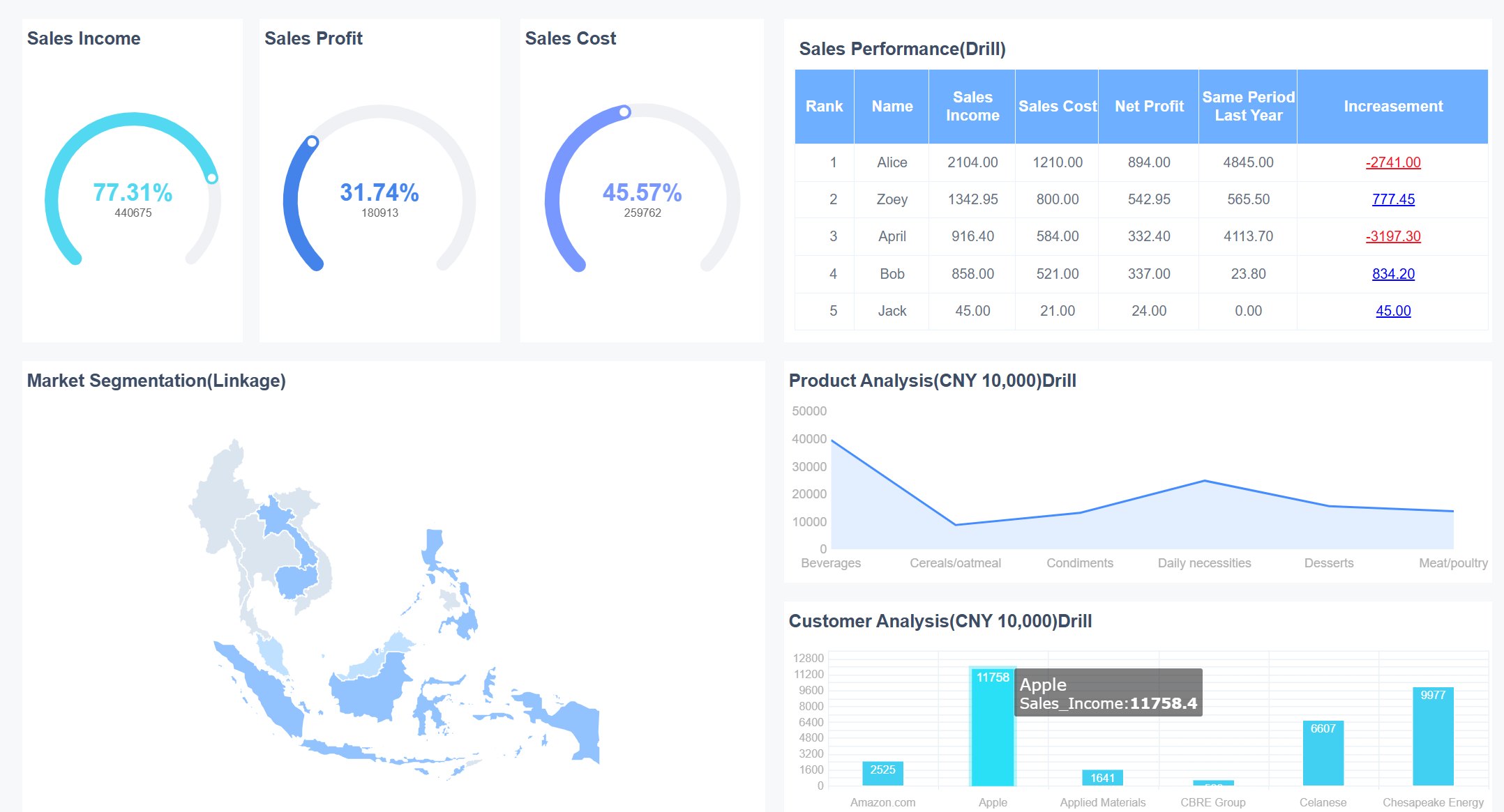
FineReport Employee Performance Dashboard Example
An employee performance dashboard is a digital tool that lets you track, analyze, and visualize employee performance data in real time, helping you make better decisions and improve results.
FineReport gives you the power to build a performance dashboard that fits your needs. You can use its drag-and-drop designer to create dashboards quickly, even if you do not have coding experience. FineReport connects to many data sources, so you can see all your employee data in one place. You can also access your dashboards on any device, which means you can monitor employee performance wherever you are.
Real-Time Productivity Tracking
You need to see how your employees perform as it happens. FineReport’s real-time productivity tracking dashboard helps you do this with features that keep you informed and ready to act.
| Feature | Description |
|---|---|
| Management cockpit | Gives you tools to monitor and analyze employee data in real time. |
| Multi-terminal display | Lets you check key performance indicators on your phone, tablet, or computer anytime, anywhere. |
| Monitor refreshing | Keeps your dashboard updated with the latest data, so you always see the current state of performance. |
With these features, you can spot trends, identify issues, and respond quickly. For example, if you notice a drop in productivity, you can investigate and take action before it affects your team’s results. The dashboard makes it easy to compare different employees or teams, so you can see who needs support and who deserves recognition.
FineReport’s drag-and-drop designer makes it simple to build these dashboards. You do not need to write code. Just select the data and charts you want, and arrange them on your dashboard. You can connect to different databases, so you always have the most up-to-date information. This seamless integration means you spend less time gathering data and more time making decisions.
Goal Achievement Monitoring
Tracking goals is key to employee success. FineReport helps you set, monitor, and measure progress toward goals with clear visualizations and real-time updates. You can create a performance tracking system that shows each employee’s progress on their goals. This helps you see who is on track and who may need extra help.
With FineReport, you can:
- Set up dashboards that show goal completion rates for individuals and teams.
- Use charts and graphs to highlight top performers and areas for improvement.
- Get alerts when employees reach milestones or fall behind on targets.
- Compare current performance with past results to spot trends.
You can access your employee success dashboard on your phone or computer. This flexibility lets you check progress during meetings, while traveling, or from your office. FineReport’s dashboards help you keep everyone focused on what matters most—achieving goals and driving performance.
FineReport’s multi-source integration lets you pull data from HR systems, project management tools, and more. This gives you a complete view of employee performance. You can use real-time data to make decisions that improve productivity and engagement.
Tip: Use FineReport’s mobile dashboard feature to stay connected to your team’s performance, even when you are away from your desk.
A strong employee performance dashboard helps you build a culture of accountability and success. You can celebrate achievements, address challenges early, and keep your team motivated. FineReport gives you the tools to create dashboards that support your business goals and help every employee succeed.
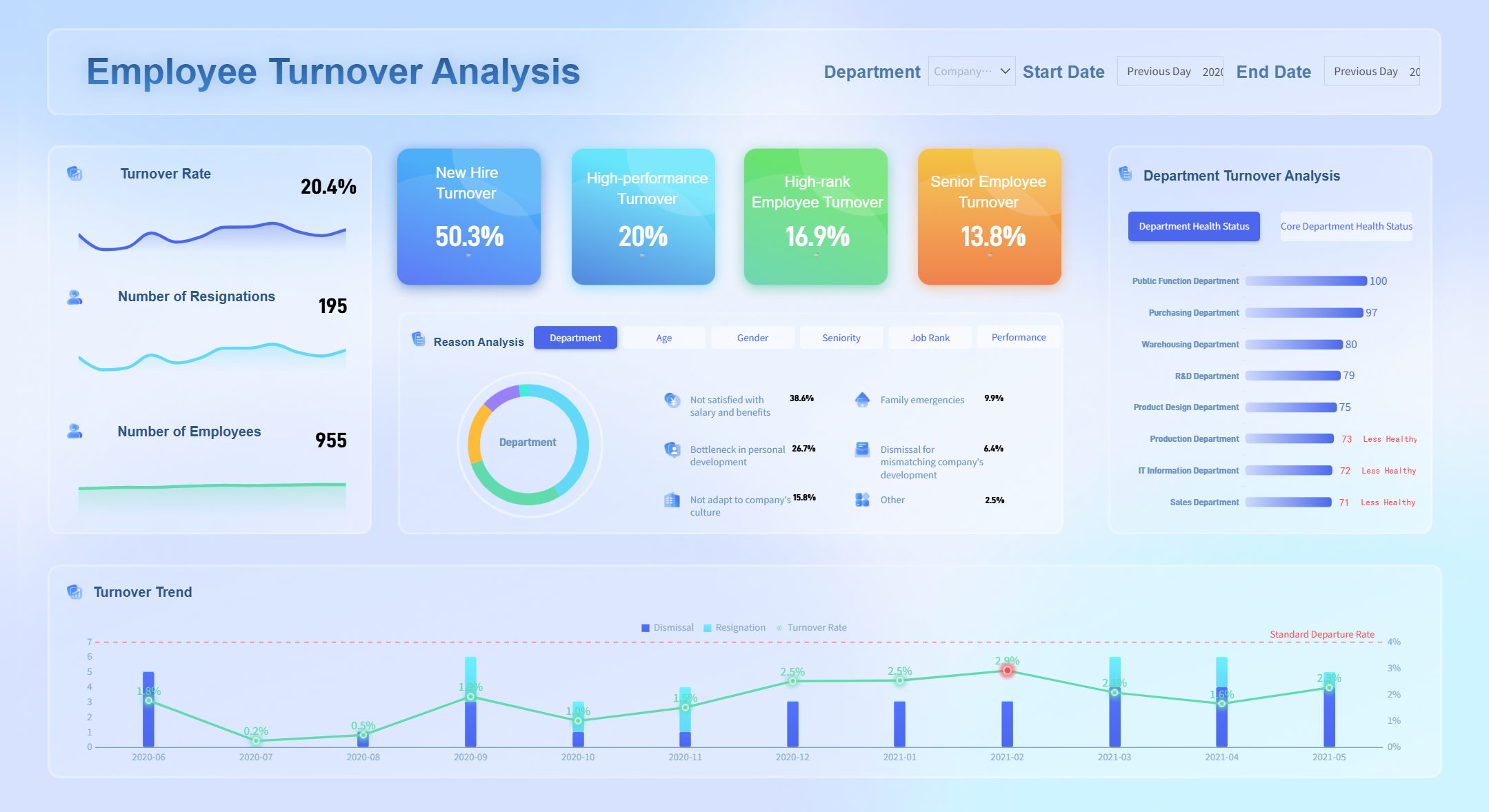
Performance Management Dashboard for HR
An employee performance dashboard is a digital tool that lets you track, visualize, and analyze employee performance data in real time. In 2026, you can use a performance management dashboard to monitor engagement, satisfaction, turnover, and retention, helping your HR team make smarter decisions and improve workforce outcomes.
Engagement and Satisfaction Metrics
You need to understand how your employees feel about their work. A performance management dashboard for HR gives you a clear view of engagement and satisfaction using core metrics. FineReport helps you build an employee engagement dashboard that tracks these important indicators:
| Metric | Description |
|---|---|
| Employee Net Promoter Score (eNPS) | Measures how likely employees are to recommend your company as a great place to work. |
| Employee Satisfaction Index (ESI) | Gauges overall satisfaction with roles and the workplace. |
| Absenteeism Rate | Monitors unplanned absences, signaling burnout or low morale. |
| Retention Rate | Shows the percentage of employees who stay with your company over time. |
| Employee Turnover Rate | Tracks the percentage of employees who leave during a specific period. |
You can display these core metrics on your hr metrics dashboard or employee engagement dashboard. FineReport’s integration with HR data sources ensures your dashboard always shows the latest information. Automated reporting means you spend less time compiling data and more time acting on insights.
Turnover and Retention Analysis
A performance management dashboard helps you spot trends in turnover and retention. You can use an employee retention dashboard to see which teams have high attrition rates or where turnover costs are rising. FineReport connects to your HR systems, so your hr metrics dashboard updates automatically.
- Track turnover and retention rates with real-time data.
- Analyze turnover cost per person to understand the financial impact.
- Compare retention rates across departments using your human resources dashboard.
Automated reporting in FineReport lets you set up recurring updates for your hr analytics dashboard. You receive regular reports on headcount changes, turnover, and other core metrics without manual effort. This approach keeps your performance dashboard accurate and actionable.
A strong hr metrics dashboard gives you the tools to improve employee engagement, reduce turnover, and build a more satisfied workforce. FineReport’s performance management dashboard empowers you to make data-driven decisions that support your HR goals.
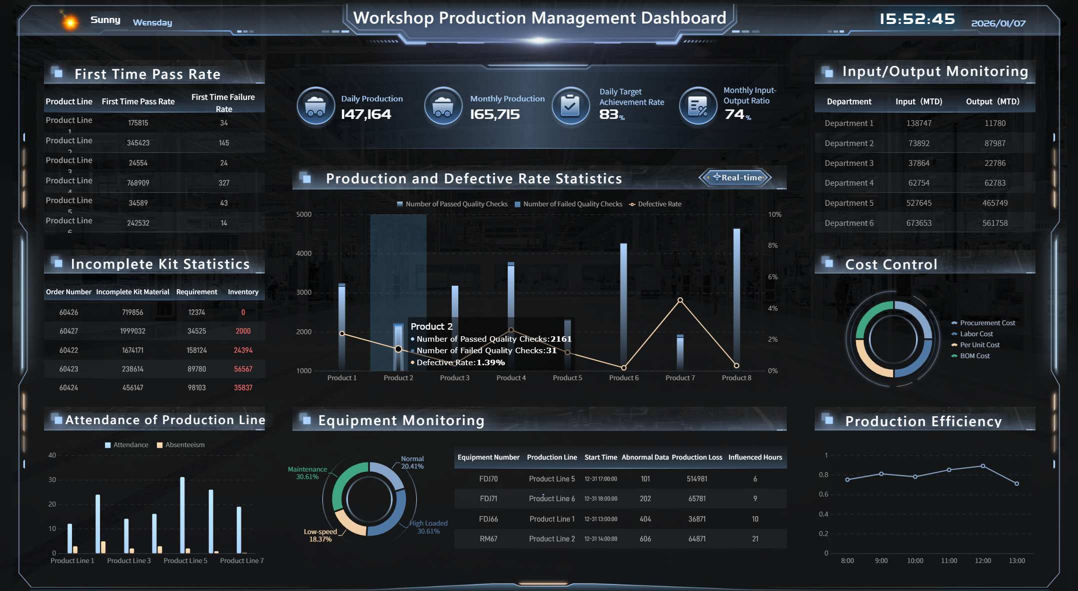
Employee Performance Management Dashboard for Manufacturing
An employee performance dashboard is a digital tool that helps you track, analyze, and visualize employee performance metrics in real time.
In manufacturing, an employee performance management dashboard gives you a clear view of production efficiency, quality, and cost control. You can use this dashboard to monitor key performance indicators, identify bottlenecks, and improve your team’s output. FineReport’s agile manufacturing and lean production dashboards help you turn raw data into actionable insights. You see where your employees excel and where you need to make changes. This approach leads to better resource allocation, higher quality, and lower costs.
Production Efficiency KPIs
You need to measure how well your production lines perform. The employee performance management dashboard displays core metrics that show the true state of your operations. These key performance indicators help you spot trends and make quick decisions.
| KPI | Description | Calculation Formula |
|---|---|---|
| Production Volume | Measures the number of units manufactured within a determined time frame. | Total count of products manufactured during a specified time |
| Production Downtime | Measures the total time a shop floor’s production lines are idle. | Sum of total downtime during a time frame |
| Unscheduled Downtime | Measures the total time spent on idle due to reliability or breakage issues. | Sum of total unplanned downtime during a time frame |
| Overall Equipment Effectiveness (OEE) | Monitors and improves the effectiveness of a production process. | Availability x Performance x Quality |
| Throughput Rate | Measures the volume of production completed during a time frame. | Total number of good units produced / Flow Time |
When you use these core metrics, you gain a real-time understanding of your production floor. For example, tracking OEE helps you see how equipment, employees, and processes work together. If you notice high unscheduled downtime, you can investigate and fix problems before they affect your output. FineReport’s dashboard lets you compare shifts, teams, or machines, so you always know where to focus your efforts.
Quality and Cost Control Metrics
Quality and cost control are essential for manufacturing success. The employee performance management dashboard brings together the most important metrics, so you can maintain high standards and control expenses.
| Metric | Calculation |
|---|---|
| Overall Equipment Effectiveness (OEE) | Availability x Performance x Quality |
| Mean Time Between Failure (MTBF) | Total operating time / # Equipment failures |
| Cost of Poor Quality (COPQ) | Internal failure costs + External failure costs + Appraisal costs + Prevention costs |
| Supplier Defect Rate | (# Defective units / Total units) x 100 |
| Non-Conformance Rate | (# Non-conforming items / Total items inspected) x 100 |
You can use these core metrics to find areas where quality issues lead to higher costs. For example, tracking COPQ shows you how much poor quality affects your bottom line. When you see a high supplier defect rate, you can work with your vendors to improve incoming materials. FineReport’s dashboard helps you set up alerts for spikes in non-conformance rates, so you can act fast and prevent bigger problems.
Integrating a quality application within your ERP system lets you track these metrics automatically. This reduces errors and improves production efficiency. You get a complete view of employee performance metrics, making it easier to maintain high quality and keep costs down.
FineReport’s manufacturing dashboards support real-time data integration from multiple sources. You can monitor employee performance, production trends, and cost drivers all in one place. This approach helps you make better decisions, improve performance, and achieve your manufacturing goals.
Tip: Use FineReport’s dashboard to automate reporting and share insights with your team. This keeps everyone aligned and focused on continuous improvement.
Performance Dashboard for Remote Teams

An employee performance dashboard is a digital tool that helps you track, visualize, and analyze employee performance metrics in real time, even when your team works remotely.
FineReport gives you the flexibility to monitor your remote and hybrid teams from anywhere. You can use its mobile and cloud dashboard features to keep up with employee performance on your phone, tablet, or computer. This means you always have access to the latest data, no matter where your team works.
Hybrid Team Productivity
You need to see how your hybrid team performs each day. FineReport’s dashboard lets you track core metrics like attendance, task completion, and project progress in real time. You can set up customizable KPI tracking to focus on what matters most for your team. For example, you might monitor:
- Daily task completion rates
- Average response times
- Number of projects finished on schedule
- Employee engagement scores
With real-time monitoring, you spot trends quickly. If you see a drop in productivity, you can act fast to support your team. The dashboard helps you compare performance across remote and in-office employees, so you can identify best practices and areas for improvement.
Collaboration and Communication Metrics
Strong collaboration keeps remote teams connected. FineReport’s dashboard helps you track communication patterns and core metrics that show how well your team works together. By analyzing these metrics, you can uncover issues that slow down teamwork and make changes to improve interaction.
- You can track message volume trends to find communication bottlenecks.
- Identifying peak communication times helps you optimize team meetings.
- Understanding which channels employees use for different tasks streamlines collaboration.
- Monitoring collaboration metrics reveals workflow inefficiencies, so you can adjust tools and processes.
- Linking metrics to actions lets you address issues like low trust scores, which often come from poor communication.
Over time, you see how changes—like new tools or processes—affect collaboration scores. This helps you build a stronger, more connected team. FineReport’s dashboard gives you a clear view of employee performance, making it easier to support your remote workforce and reach your goals.

Customizable Employee Performance Dashboard Templates
An employee performance dashboard is a digital tool that displays key metrics and trends about your workforce in real time. You use it to track, analyze, and improve employee outcomes with clear, actionable insights.
FineReport gives you access to a wide range of customizable dashboard templates. You can quickly adapt these templates to fit your business needs, saving time and effort. The drag-and-drop interface lets you design dashboards without coding. You connect to multiple data sources, so your dashboards always show the latest information. FineReport’s templates scale easily as your organization grows.
KPI Dashboard Design
You can design KPI dashboards that highlight the most important metrics for your team. FineReport’s templates help you focus on what matters most, such as productivity, attendance, and engagement. You choose which performance metrics to display and how to visualize them. This flexibility ensures your dashboard matches your goals.
The gallery’s core value lies in its authenticity and diversity, offering dashboards for virtually any industry or function.
A well-designed KPI dashboard makes it easy to spot trends and take action. You see which employees meet targets and where you need to provide support. FineReport’s templates use intuitive layouts, so you understand your data at a glance.
Industry-Specific Solutions
Every industry has unique performance tracking needs. FineReport offers industry-specific dashboard templates that address these differences. You find templates for sales, marketing, manufacturing, and more. These dashboards include tailored metrics and critical KPIs that align with your business goals.
| Feature | Description |
|---|---|
| Tailored Metrics | Industry-specific dashboards provide metrics that align with unique business goals. |
| Intuitive Layouts | Clean and easy-to-understand layouts ensure quick comprehension of data insights. |
| Critical KPIs | Templates highlight key performance indicators essential for tracking industry-specific performance. |
You can use dashboards for sales performance monitoring, templates for tracking PPC campaigns, and tools for assessing team productivity. FineReport’s solutions help you bridge daily activities with strategic goals, making your dashboards a foundation for best practices.
Tip: Start with an industry-specific template to accelerate your dashboard setup and ensure you track the right metrics from day one.
Advanced Performance Dashboard Visualization
An employee performance dashboard is a digital tool that displays key data about how employees work and achieve goals.
You use this dashboard to see important trends, spot problems early, and make better decisions for your team. FineReport gives you advanced ways to visualize your data, making it easier to understand and act on performance metrics.
3D and Interactive Charts
You can bring your data to life with FineReport’s 3D and interactive charts. These tools help you see patterns and relationships that might be hard to spot in regular charts.
Some of the advanced chart types you can use include:
- Scene Map
- 3D Column on Globe
- 3D Scatter on Globe
- 3D Line on Globe
- Carousel GIS Point Map
- Carousel 3D Combination Map
- Carousel Luminous Gauge
- Liquid-Fill Chart
- Pixel Chart
- Carousel KPI Card
- Particle Counter
- Time Gear
- Arc Column Chart
- Special Column Chart
- Carousel Catalog Gear
- Fancy Tree
A 3D scatter plot lets you view data points in three dimensions. You can see how different variables interact. Dense clusters show strong relationships, while scattered points mean weaker connections. The 3D dynamic word cloud plugin adds visual interest and helps you spot important words or trends quickly.
Drill-Down and Data Exploration
You can explore your data in depth with FineReport’s drill-down features. This means you start with a big picture and then click to see more details.
Drill-down and data exploration help you:
- Gain detailed insights into labor use, peak demand, and staffing needs.
- Identify areas where labor costs are too high or schedules are not efficient.
- Monitor compliance with labor rules and overtime limits.
- Evaluate employee performance against set goals.
- Adjust resources based on business demand.
These features help you make smarter decisions. You can quickly find the root of a problem and take action. FineReport’s dashboards make it easy to explore data and improve your team’s results.
Employee Performance Dashboard Business Value
An employee performance dashboard is a digital tool that gives you a real-time view of workforce metrics, helping you make smarter choices and improve business results.
Decision-Making and ROI
You need to make quick, informed choices in HR. FineReport dashboards give you real-time data visualization, so you always see the latest numbers. You can use a custom hr metrics dashboard to bring all your key performance indicators together. This central view helps you understand trends and spot issues fast. When you use an hr metrics dashboard, you get dynamic updates that reflect the most current insights. You can respond quickly to changes in employee performance or engagement.
FineReport dashboards support cross-team collaboration. You can share your hr metrics dashboard with managers and HR leaders, making it easier to align on goals. Automated dashboards save you time by reducing manual data gathering. You can compare data across teams or time periods, which helps you identify areas for improvement. This approach supports data-driven decisions and boosts your return on investment.
The BOE customer story shows the impact of a unified dashboard. BOE used FineReport to standardize metrics and create a single source of truth. Their hr metrics dashboard helped reduce inventory costs by 5% and increased operational efficiency by 50%. You can achieve similar results by using a centralized employee insights dashboard.

Operational Efficiency Gains
You want your HR team to work smarter, not harder. FineReport’s hr metrics dashboard helps you track progress on key metrics, making employee reviews and feedback more effective. You can use the dashboard to spot gaps in team performance, which supports better hiring decisions. Employees feel more engaged when they see clear expectations and results on the hr metrics dashboard.
You can use the hr metrics dashboard to identify bottlenecks that slow down your team. The dashboard gives you a live snapshot, so you do not waste time on repetitive reports. You can focus on solving problems and improving processes. FineReport dashboards help you save time, improve engagement, and support continuous improvement. You can use the hr metrics dashboard to drive operational efficiency and support your business goals.
Tip: Use your hr metrics dashboard to monitor trends, share insights, and keep your team focused on what matters most. This approach leads to better data-driven decisions and long-term success.
An employee performance dashboard is a digital tool that lets you track, analyze, and improve workforce outcomes in real time. In 2026, you gain a competitive edge by adopting advanced dashboards like FineReport. You access mobile-friendly, predictive analytics that help you respond quickly to workforce changes. Many HR professionals report better decision-making and higher efficiency with real-time data integration. To get started:
- Assess your company’s needs and budget.
- Integrate dashboards with current systems.
- Prioritize security and user experience.
- Engage stakeholders and provide training.
- Roll out dashboards in phases for feedback and improvement.
Organizations using dashboards and analytics see up to 250% ROI through improved productivity and retention.
Continue Reading About Employee Performance Dashboard
Top 10 HR Dashboard Software Platforms Compared and Reviewed
What is an HR dashboard and how does it work
What is an HR Analytics Dashboard


FAQ

The Author
Lewis
Senior Data Analyst at FanRuan
Related Articles

How to Build an Investment Portfolio Reporting Dashboard for Executives: KPIs, Benchmarks, and Drill-Down Views
Investment portfolio reporting for executives is not about showing every holding, transaction, and chart your investment team can produce. It is about giving CEOs, CFOs, CIOs, boards, and investment committees a fast, re
Yida YIn
Jun 25, 2026

12 KPI Reporting Examples for Executive Dashboards: What to Show in Weekly, Monthly, and Quarterly Reviews
Executive leaders do not need more data. They need decision ready $1 examples that match how often they review the business and what actions they are expected to take. A weekly $1 should surface fast moving risks and per
Yida YIn
Jun 25, 2026

How to Build a Digital Marketing Reports Dashboard: Executive Examples, KPIs, and Templates
A $1 is the control layer that helps executives and marketing leaders turn scattered channel data into fast, confident decisions. If you are a CEO, CMO, operations director, or marketing analytics lead, the real problem
Yida Yin
May 07, 2026