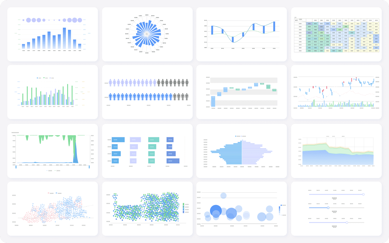
Data analysis and visualization tools help you turn raw data into clear, actionable insights. These tools let you explore information, spot trends, and create interactive visuals that make complex data easy to understand. With the global data visualization market expected to exceed $10 billion by 2025, finding the best data visualization tools has never been more important.
You want tools that are user-friendly, intuitive, and designed for both business intelligence and data analytics. Here are 10 data analysis and visualization tools you should try this year: Microsoft Power BI, Tableau, FineBI, Google Looker Studio, Qlik Sense, SAS Visual Analytics, IBM Cognos Analytics, Zoho Analytics, Apache Superset, and Sisense. Each one stands out for its ability to connect to various data sources, support excel files, and deliver a user-friendly interface with interactive visuals and prebuilt templates.
Every tool offers something different, whether you need advanced analytics, compatibility with other platforms, or real-time data insights. As you look for the right fit, think about your decision-making needs and how you want to use data to drive better outcomes.

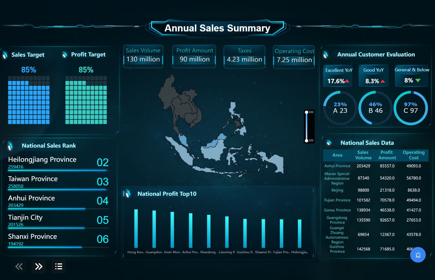
You want a data analysis tool that makes working with data easy and efficient. FineBI stands out among data analysis and visualization tools because it puts self-service analytics in your hands. You can connect to more than sixty data sources, including excel, cloud databases, and big data platforms. FineBI lets you build dashboards with drag-and-drop simplicity, so you don’t need coding skills. You get real-time analysis and interactive dashboards that help you spot trends and make decisions fast. FineBI’s zero-code interface means you can explore data independently and share insights across your organization.
FineBI offers a rich set of features that set it apart from other data analytics tools. Here’s a quick look at what makes FineBI unique:
| Feature | Description |
|---|---|
| Self-Service Analytics | You can explore data on your own, without waiting for IT support. |
| Robust Data Modeling | FineBI makes it easy to model data based on relationships in your data warehouse. |
| User-Friendly Visualization | The tool simplifies the visualization process, so you can create clear visuals quickly. |
| Data Management | FineBI helps you integrate, classify, and store data, making your analysis more reliable. |
| Collaboration and Sharing | You can work with your team, share dashboards, and collaborate on insights. |
| Advanced Functions | FineBI supports both basic and advanced calculations for deeper analytics. |
| Dashboard Functionality | You can merge analytic data into unified dashboards for easy monitoring. |
| Data Cleaning | FineBI includes strong data preprocessing tools to keep your data quality high. |
You get enterprise-grade governance with role-based access control, so your data stays secure. FineBI’s high-performance engine supports thousands of users and massive datasets, making it ideal for large organizations.
Tip: FineBI’s AI-driven dashboards and conversational analytics let you ask questions in plain language and get instant answers, making data analysis even more accessible.
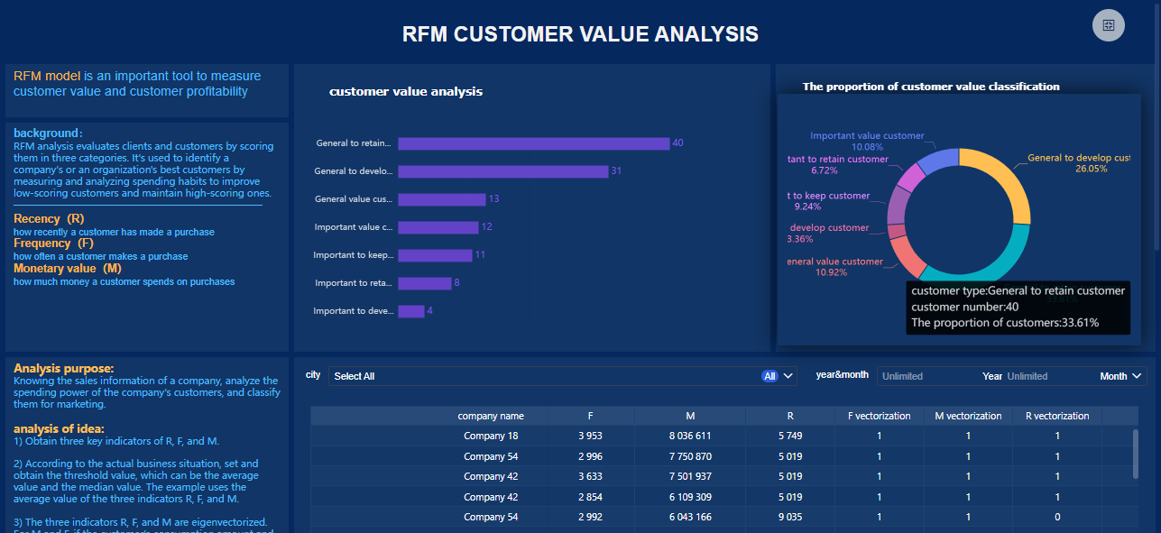
FineBI helps you solve real business challenges. For example, BOE Technology Group used FineBI to unify fragmented data, standardize metrics, and create a single analysis framework. This led to a 5% reduction in inventory costs and a 50% boost in operational efficiency. You can use FineBI to track KPIs, benchmark performance, and drive digital transformation in industries like manufacturing, banking, and healthcare. FineBI’s data analysis tools let you connect to excel files, visualize trends, and share insights with your team. Whether you need to monitor sales, analyze financials, or improve operations, FineBI gives you the flexibility and power to turn data into actionable insights.

You want a data analytics tool that makes working with data easy and powerful. Microsoft Power BI stands out as one of the best data visualization tools for business intelligence. You can connect to hundreds of data sources, including excel files, cloud databases, and on-premises systems. Power BI lets you build interactive dashboards and reports with drag-and-drop simplicity. You get real-time updates, so your insights stay fresh.
Here’s a quick look at some of the latest innovations in Power BI:
| Innovation | Description |
|---|---|
| Standalone Copilot | Ask anything and get instant answers with AI. |
| Enhanced connectors | Improved support for Spark and Impala. |
| Advanced visualizations | Features like auto-expanding matrix columns and new Card visuals. |
| Richer Microsoft 365 integration | Seamless workflows across your favorite apps. |
| Reporting through PBIRS and SQL Server 2025 | New ways to collaborate and share reports. |
| Azure Maps visual | More customization for geographic data. |
You can also use Power BI’s Copilot to get smarter insights and automate tasks. The platform supports image visuals, OneLake Catalog, and translytical task flows, making automation easier.
Power BI gives you flexibility and speed, but you should know its strengths and limitations.
Pros:
Cons:
You can use Power BI for many scenarios. If you need to create dashboards that track sales, marketing, or operations, Power BI delivers fast results. It works well for organizations that want to unify data from multiple sources and share insights across teams. You can visualize trends, monitor KPIs, and make data-driven decisions in real time. Power BI is a top choice for companies looking for the best data visualization tools to support business intelligence, reporting, and analytics.
Tableau stands out as one of the best data visualization tools for anyone who wants to turn data into clear, interactive visuals. You can connect Tableau to a wide range of sources, including excel, databases, and cloud platforms. The drag-and-drop interface makes it easy to build dashboards, even if you have little experience with data analytics tools. Tableau gives you the freedom to explore your data, ask questions, and uncover insights quickly.
You will find a strong focus on analytical freedom and flexible visualization. Tableau supports advanced chart types, mapping, and real-time data updates. The platform also encourages data storytelling, so you can share your findings in a way that makes sense to everyone on your team.
Tableau’s community is huge. Over 50,000 companies use Tableau worldwide, and the platform holds a 12.24% market share in the data visualization software industry. Many data analysts and visualization experts choose Tableau because it lets them dive deep into analytics and share advanced techniques.
Tableau has earned many awards for its innovation in data visualization. Here are some recent recognitions:
| Award Name | Winner(s) |
|---|---|
| The Kelly Martin Best Designer Award | Ellen Blackburn |
| The Jock Mackinlay Data Storyteller Extraordinaire Award | Shangruff Raina, Ann Pregler |
| The Elissa Fink "Tableau Can Do That?!" Award | Seun Adeyemo, Ant Pulley |
| Best Content Creator Award | Nisar Ahmed |
| Forum Fanatic Award | Chris McClellan |
You will appreciate Tableau’s strengths:
Some users find Tableau’s pricing higher than other data analytics tools. You may also notice a learning curve if you want to master all the advanced features.
Tableau works well for anyone who needs the best data visualization software for business intelligence, reporting, or analytics. If you want to create interactive dashboards, explore large datasets, or present insights to stakeholders, Tableau gives you the tools you need. Many companies use Tableau for sales analysis, marketing performance, and operational reporting. The platform’s flexibility makes it a favorite for data analysts who want to go beyond basic charts and build compelling stories with their data.
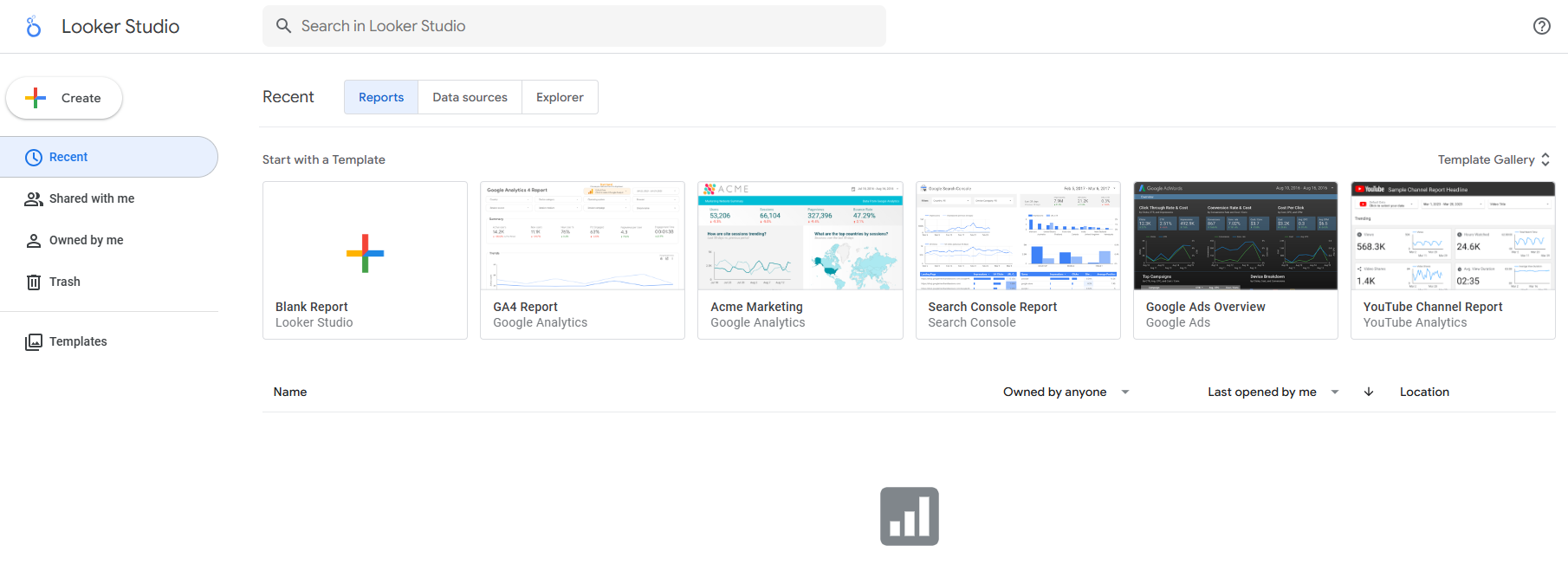
If you want a free way to turn your data into clear visuals, Google Looker Studio gives you a strong starting point. You can connect to many sources, including Google Sheets, Google Analytics, and even excel files. The platform offers customizable templates, so you can build dashboards that fit your needs. You get interactive charts and graphs, which help you explore your data and find insights quickly. Looker Studio also integrates well with other Google products, making it easy to pull in data from your existing workflow.
Here’s a quick comparison of Looker Studio with other popular data visualization tools:
| Tool | Pricing | Key Features | Pros | Cons |
|---|---|---|---|---|
| Looker Studio | Free (basic), Pro from $9/user/month | Data connectors, customizable templates, interactive dashboards | Free option, seamless Google integration | Performance issues with large datasets, limited advanced features in free version, steep learning curve |
| Power BI | Free (basic), from $10.99/user/month | Data connectors, interactive dashboards, natural language queries | Good Microsoft integration, strong modeling | Can be complex, limited customization |
| Tableau | From $70/user/month | Advanced visualization, data blending, predictive analytics | Powerful analysis, data storytelling | Less flexible, limited visualization options |
You get a lot for free with Looker Studio, but you should know where it shines and where it falls short.
Pros:
Cons:
You should try Google Looker Studio if you want to build dashboards for marketing, website analytics, or business reporting without spending money. It works well for small businesses, students, or anyone who needs to visualize data from Google sources or excel. If you want to share insights with your team or clients, Looker Studio makes collaboration simple. While it may not have all the advanced analytics of paid platforms, it gives you the essential tools to turn your data into clear, interactive visualization and make better decisions.
Qlik Sense stands out among data analytics tools because it gives you the freedom to explore your data in new ways. You can connect to many sources, including excel, and build interactive dashboards that update as your data changes. Qlik Sense uses an associative data model, so you can move through your data without following a set path. This means you can find connections and patterns you might miss with other data visualization tools.
Here’s a quick look at what makes Qlik Sense unique:
| Feature | Description |
|---|---|
| Associative Data Model | Lets you explore data freely, not limited by predefined queries. |
| Self-Service Analytics | Offers AI-driven insights and strong data integration for user-driven analysis. |
| Collaboration Features | Real-time sharing, storytelling, annotations, and snapshots for guided analytics. |
| Mobile Responsiveness | Access and share dashboards on mobile devices with full functionality. |
| Centralized Governance | Secure and consistent content sharing across users and devices. |
You can create dynamic dashboards that respond instantly to your selections. The platform also supports mobile access, so you can view and share your dashboards anywhere.
Qlik Sense gives you flexibility and power, but you should know where it shines and where it might not fit every need.
Pros:
Cons:
You should try Qlik Sense if you want to dig deep into your data and uncover hidden insights. It works well for businesses that need to connect multiple data sources and create dashboards that update in real time. If your team values collaboration, Qlik Sense makes it easy to share findings and build guided analytics stories. You can use it for sales tracking, financial analysis, or any project where you want to turn raw data into clear visualization. Qlik Sense is a great choice if you want to move beyond basic charts and create interactive dashboards that help you make smarter decisions.
You want a platform that handles complex data and delivers clear insights. SAS Visual Analytics stands out among enterprise data analytics tools. You can connect to many sources, including excel, cloud databases, and big data platforms. The drag-and-drop interface lets you build dashboards and visualizations without coding. SAS Visual Analytics processes large volumes of data quickly, so you get real-time results. You can use advanced analytics like predictive modeling and scenario analysis to dig deeper into your data. The platform also supports natural language processing, which helps you analyze text and sentiment for richer insights.
Here’s a look at some unique capabilities you get with SAS Visual Analytics:
| Unique Capabilities | Description |
|---|---|
| Advanced Analytics | Predictive modeling, scenario analysis, and automated forecasting with machine learning. |
| In-Memory Architecture | Rapid processing of large data sets for real-time exploration and analysis. |
| Drag-and-Drop Interface | Create sophisticated visualizations without coding. |
| Natural Language Processing | Text analytics and sentiment analysis for deeper data interpretation. |
SAS Visual Analytics gives you powerful tools for enterprise-level analysis. You get speed, flexibility, and advanced features.
Pros:
Cons:
You should try SAS Visual Analytics if you need to analyze large volumes of data and deliver insights across your organization. The platform works well for enterprises that want to build interactive dashboards, run predictive analytics, and explore data in real time. You can use it for financial forecasting, customer sentiment analysis, or operational reporting. SAS Visual Analytics helps you turn raw data into actionable insights, making it a top choice for companies that need robust data analytics tools and advanced visualization.
IBM Cognos Analytics gives you a powerful way to work with data. You can create dashboards and visualizations without needing coding skills. The platform helps you explore data, find patterns, and share insights with your team. You get a wide range of visualization options, so you can present your data in the way that makes the most sense. The tool uses machine learning to deliver predictive analytics, which helps you make smarter decisions faster. You can automate reports and dashboards, making sure everyone gets the latest information without extra effort. Security and governance features keep your data safe and control who can see sensitive information.
Here’s a quick look at what IBM Cognos Analytics offers:
| Feature | Description |
|---|---|
| Self-Service Analytics | Build dashboards and visualizations easily, no IT support needed. |
| Data Exploration & Visualization | Advanced filtering and visualization options to uncover trends. |
| Predictive Insights & AI | Machine learning for predictive analytics and faster decisions. |
| Automated Reporting & Dashboarding | Automated reports and dashboards for timely access to key metrics. |
| Security & Governance | Strong controls for data access and user management. |
You want to know what makes IBM Cognos Analytics stand out and where it might not fit every need.
Pros:
Cons:
IBM Cognos Analytics works best for businesses that need to manage large amounts of data and deliver insights across departments. You can use it to track sales, monitor operations, or analyze customer trends. The platform helps you build dashboards that update automatically, so your team always has the latest information. If you want to improve decision-making with predictive analytics and keep your data secure, this tool is a strong choice. You will find it especially useful if your organization values automated reporting and needs to control access to sensitive data.
You want a tool that makes working with data simple and affordable. Zoho Analytics stands out among data analytics tools because it offers a wide range of features at a price that fits most budgets. You can connect to over 300 data sources, including spreadsheets, cloud services, and databases. The platform gives you AI-powered insights, advanced forecasting, and anomaly detection. You can blend data from different sources and automate your analytics workflows. Zoho Analytics makes it easy to build dashboards and create clear visualization, even if you are new to data analysis.
Here’s a quick look at the pricing options:
| Plan Type | Features | User Capacity |
|---|---|---|
| Free Plan | Basic needs, limited user capacity | Limited |
| Standard Plan | More features, supports up to 200 users | Up to 200 users |
| Professional Plan | Advanced features for complex operations | Mid-sized businesses |
| Additional Features | Advanced reporting, anomaly detection, trend analysis | N/A |
You get cost-effective pricing, so you can scale your analytics as your business grows.
Zoho Analytics gives you a lot of value for your money. You get a user-friendly interface that makes it easy to explore data and build dashboards. The platform supports AI insights and automation, which help you find trends and spot issues quickly.
Pros:
Cons:
Zoho Analytics works well if you want to create dashboards and visualization without spending a lot. You can use it to track sales, monitor website traffic, or analyze customer data. The platform is a good fit for small businesses, startups, and teams that need powerful analytics but have a limited budget. You can blend data from different sources, automate reports, and share insights with your team. Zoho Analytics makes it easy to turn raw data into actionable insights, helping you make smarter decisions every day.
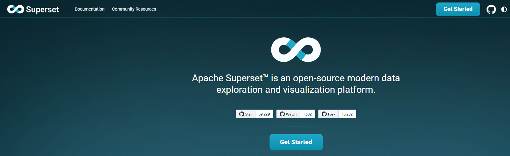
Apache Superset gives you a flexible way to explore and visualize your data. You can connect Superset to almost any SQL database, making it easy to unify data from different sources. The platform supports cloud-native environments, so you can scale your analytics as your organization grows. Superset lets you build interactive dashboards with a no-code interface, which means you don’t need programming skills to create powerful visualizations. You can customize dashboards to fit your business needs and share them with your team for better collaboration.
Here’s a quick look at the benefits Superset brings to your data analysis and visualization tools:
| Benefit | Description |
|---|---|
| Scalability | Superset grows with your organization, handling more data and users as needed. |
| Data Source Integration | Connects to nearly any SQL database or data engine. |
| Cloud-native Support | Works well with cloud databases and large-scale environments. |
| Enhanced Data Visualization | Combines visualization with data management for actionable insights. |
| Improved Data Governance | Tracks relationships and identifies data owners. |
| Customizable Dashboards | Lets you tailor dashboards for specific business needs. |
| Faster Decision-making | Uses real-time data to speed up your analytics. |
Superset stands out among open source data visualization tools, but you should know its strengths and limitations.
Pros:
Cons:
You should consider Superset if you want to build interactive dashboards and explore data from different sources. Superset works well for organizations that need scalable analytics and real-time insights. Many companies, such as AirBnB, Lyft, Wise, Rakuten Viki, Nielsen, Udemy, and Dropbox, use Superset for large-scale data visualization. If you want to automate routine tasks and focus on analysis, Superset helps you transform raw data into actionable insights. The platform is a strong choice for teams that need to collaborate, customize dashboards, and make faster decisions using unified data.

Sisense gives you a powerful way to work with data as a team. You can connect to many sources and build dashboards that help everyone see the same information. The platform makes it easy to manage connections and share credentials securely. You get a centralized connection manager, which acts as a hub for your team’s data access. Sisense also lets you co-author dashboards in real time. Multiple users can edit, update, and manage versions together. This makes collaboration smooth and keeps your data projects moving forward.
| Feature | Description |
|---|---|
| Centralized Connection Manager | A hub for managing and sharing connection credentials, enhancing security and streamlining data access. |
| Dashboard Co-authoring | Enables real-time collaboration on dashboards, allowing multiple users to edit and manage versions easily. |
You can use Sisense to blend data from different sources, automate analytics workflows, and create interactive visualization. The platform supports advanced analytics, so you can dig deeper into your data and uncover insights that matter.
Sisense stands out among data visualization tools for teams. You get strong collaboration features and secure data management. The platform ranks highest in customer satisfaction compared to other team-focused tools.
| Tool | Customer Satisfaction Ranking |
|---|---|
| Sisense | Highest |
| Power BI | Lower than Sisense |
| Qlik | Lower than Sisense |
| MicroStrategy | Lower than Sisense |
| ThoughtSpot | Lower than Sisense |
Tip: Sisense makes it easy for teams to work together, share dashboards, and keep data secure.
Some users may need time to learn all the features. You might find advanced customization requires extra training. However, the benefits for team-based analytics and visualization are clear.
You should try Sisense if your team needs to collaborate on data projects and build dashboards together. The platform works well for organizations that want to blend data from multiple sources and automate analytics. You can use Sisense for sales tracking, financial reporting, or operational analysis. If you want to share insights quickly and keep everyone on the same page, Sisense gives you the tools to do it. The platform’s real-time collaboration and secure data management make it a top choice for teams looking to turn data into actionable insights.
When you start looking for data analysis and visualization tools, you need to think about your goals and requirements. Ask yourself what kind of data you work with and how you want to use it. Do you need to combine data from multiple sources? Will you create dashboards for different departments? Consider if your team needs real-time data insights or if you want to track trends over time.
Tip: Make a list of your must-have features before you compare options. This helps you focus on tools that match your business intelligence needs.
Here are some factors to consider:
Your team’s technical skills play a big role in choosing the right data analysis and visualization tools. If your team prefers a user-friendly interface and intuitive features, look for platforms that offer drag-and-drop dashboards and easy setup. Larger teams may need tools that support collaboration and role-based access. Smaller teams or individuals might want something more intuitive and user-friendly.
Note: Tools with intuitive workflows help everyone get started quickly, even if they have limited experience with analytics or business intelligence.
Think about your business goals and how data analysis can help you reach them. Many organizations use data visualization tools to make data accessible, support data-driven decision-making, and improve communication. Your budget matters too. Some platforms offer free versions, while others require a subscription. Compare the cost of deployment, data processing capacity, and adaptability. Make sure the tool fits your budget and supports your data-driven decisions.
| Goal | How Data Analysis and Visualization Tools Help |
|---|---|
| Making data accessible | Simplifies complex data for everyone |
| Supporting decision-making | Provides clear data insights for better choices |
| Improving communication | Helps share trends and insights with stakeholders |
Before you commit, test a few data analysis and visualization tools. Most platforms offer free trials or demo versions. Try building dashboards and exploring data insights to see if the tool feels intuitive and user-friendly. Read user reviews to learn about support and training resources. Compare features, pricing, and customer service. Choose a tool that matches your technical skills, team size, and business intelligence goals.
Tip: Testing helps you find a tool that fits your workflow and makes data analysis easy and intuitive.
You have plenty of options like FineBI when it comes to data analysis and visualization tools. Each tool offers unique strengths, so you can find one that matches your needs. Try a few free trials and read user reviews to see which platform fits your workflow. Focus on how each tool handles data, supports collaboration, and delivers visualization that helps you make decisions. Remember to match features to your business or personal goals. If you want to learn more, explore online resources and tutorials for deeper insights.

How to Do Retention Analysis for Business Success
What is Pareto Chart and How Does it Work
How DuPont Analysis Helps You Understand Your Business

The Author
Lewis
Senior Data Analyst at FanRuan
Related Articles
Data Analyst Dashboard: A Scenario-Based Guide to KPI Views That Drive Better Business Decisions
Learn how data analyst dashboards turn raw data into actionable KPI views for operational, analytical, and strategic decisions. Drive better business outcomes.
Lewis Chou
May 03, 2026

Self-Service Analytics Defined and Why You Need It
Self-service analytics lets you analyze data without IT help, empowering faster, data-driven decisions and boosting agility for your business.
Lewis
Jan 04, 2026
Best Self-Service Tools for Analytics You Should Know
See which self-service tools for analytics let business users access data, build dashboards, and make decisions faster—no IT help needed.
Lewis
Dec 29, 2025


