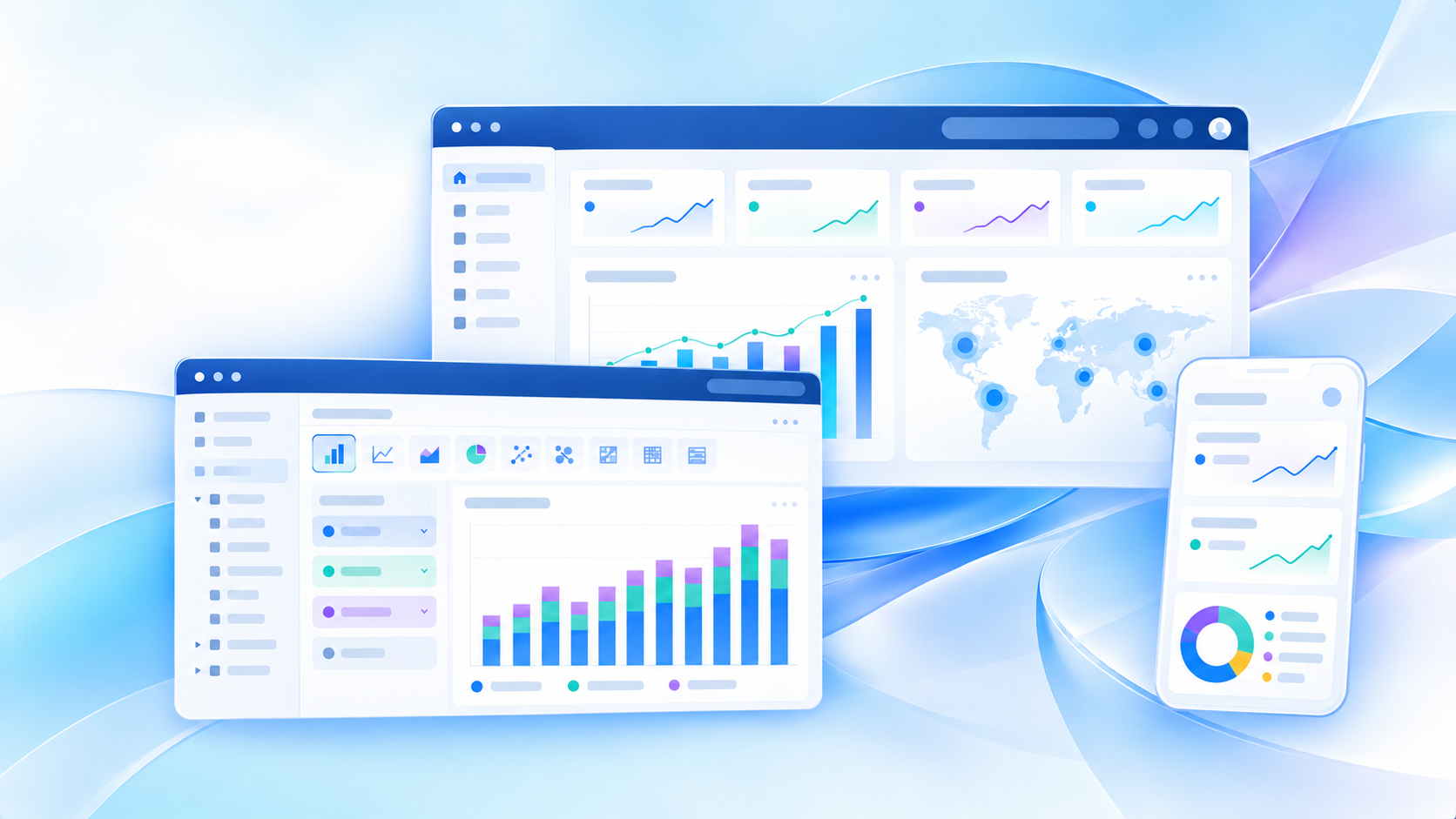
Tableau Pulse is Tableau’s metric-focused experience for monitoring business performance without forcing users to open full dashboards every time they need an update. Instead of starting with complex visual analysis, Tableau Pulse starts with the numbers people care about most, then delivers personalized insights, summaries, and alerts through familiar channels like email, Slack, and Tableau Cloud.
If you are an executive tracking company KPIs, a sales manager watching pipeline movement, a marketer following conversion trends, or an analyst supporting stakeholders, Tableau Pulse is meant to make metric monitoring more proactive and easier to consume. In this guide, you will learn what Tableau Pulse is, how it works, its core features, where it fits best, what changed in 2026, and when teams may want to consider alternatives depending on their BI and AI goals.
What Is Tableau Pulse and Why It Matters in 2026
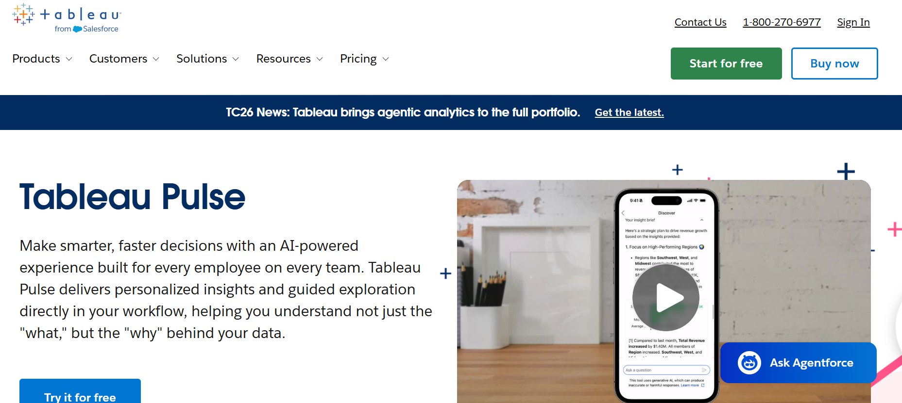
Tableau Pulse matters because many organizations have plenty of dashboards but still struggle to get timely action from them. Traditional BI often depends on users opening reports, choosing filters, interpreting charts, and spotting issues on their own. Tableau Pulse shifts that experience toward metric monitoring first.
In simple terms, Tableau Pulse helps users:
- Follow important KPIs
- Receive updates automatically
- Understand when numbers change
- Explore likely drivers behind those changes
- Stay informed without constant manual dashboard checking
This is especially relevant in 2026 because BI expectations have changed. Business users increasingly want analytics that are:
- Easier to consume
- Embedded into daily workflows
- Personalized to their responsibilities
- Supported by AI-based explanations
For many organizations, the real value of Tableau Pulse is not replacing dashboards, but reducing the effort required to stay on top of business performance between deeper analysis sessions.
Quick Answer: What Does Tableau Pulse Do?
| Area | What Tableau Pulse Does |
|---|---|
| Primary purpose | Helps users monitor and understand business metrics |
| Main experience | Personalized metric feeds, digests, and guided insights |
| Best for | Executives, managers, analysts, and business users who want proactive updates |
| Delivery channels | Tableau Cloud, email digests, Slack, mobile experiences |
| Analysis style | Metric-centered, guided exploration rather than full dashboard authoring |
| Data dependency | Requires trusted Tableau data sources and clear metric definitions |
| AI role | Supports summaries, question-answering, and insight exploration |
| Deployment context | Available in Tableau Cloud environments |
For readers evaluating tableau pulse, the most important thing to understand is that it is designed for monitoring and follow-up, not as a standalone replacement for all reporting and dashboard workflows.
Core Features of Tableau Pulse
Metrics and personalized monitoring
At the center of Tableau Pulse are metrics. A metric is built from a defined business measure and scoped by dimensions, filters, and time settings. Users can then follow the specific metrics that matter to them.
This personalized monitoring model is useful because different users care about different slices of the same business data. For example:
- A regional sales director may follow revenue by territory
- A marketing lead may follow lead-to-opportunity conversion by channel
- A support manager may follow case backlog by queue
- A finance leader may follow cash flow or margin trends over time
Instead of asking every user to find the right dashboard tab and filter combination, Tableau Pulse lets them follow relevant KPI views directly. That keeps attention on a manageable set of business numbers rather than an overwhelming reporting library.
A strong benefit here is focus. When teams reduce dashboard sprawl and identify a smaller set of shared metrics, decision-making usually becomes faster and more consistent.
Digests, summaries, and proactive insights
One of the main reasons people search for tableau pulse is to understand how it differs from ordinary Tableau reporting. The biggest difference is its proactive delivery model.
Users can receive regular metric digests through email or Slack, helping them stay updated in their normal flow of work. These updates can highlight:
- Recent metric movement
- Favorable or unfavorable trends
- Threshold or goal status
- Contextual summaries
- Signals worth investigating further
That means users do not always need to remember to log in and inspect a dashboard manually. In practice, this can improve adoption among business stakeholders who are less likely to spend time navigating BI content every day.
For organizations trying to make analytics more habitual, this digest-based model is one of Tableau Pulse’s strongest practical advantages.
AI-powered explanations and decision support
Tableau Pulse also includes AI-supported exploration features that help users understand why a metric changed. Rather than just showing that a KPI moved up or down, the experience can surface summaries and guided explanations grounded in pre-calculated insights.
This matters because many business users do not struggle with seeing the number. They struggle with interpreting it.
AI-powered support in Tableau Pulse is intended to help with questions like:
- Why did sales decline this week?
- Which segment is contributing most to churn?
- What changed in my conversion rate?
- Which metrics in this group appear most unusual?
In 2026, Tableau has continued developing this experience through Tableau AI and Tableau Agent in Pulse, making question-answering and metric exploration more natural. Still, the quality of these outputs depends heavily on the quality of the underlying data, metric design, and semantic consistency.
How Tableau Pulse Works in Practice
A beginner-friendly workflow
For a new user, the Tableau Pulse experience is fairly straightforward.
- A site administrator enables Tableau Pulse in Tableau Cloud.
- Creators or authorized users define metrics based on trusted published data sources.
- Business users follow relevant metrics for their role, team, or region.
- Digests and alerts are delivered through configured channels such as email or Slack.
- Users open a metric page when they want to inspect trends or explore contributing factors.
- Guided and AI-supported analysis helps them understand what may be driving the change.
- Action happens outside or alongside BI, such as contacting a manager, adjusting campaign spend, or reviewing operations.
This workflow makes Tableau Pulse easier to adopt than a full dashboard authoring experience, especially for non-analyst audiences.
Common use cases across teams
Tableau Pulse is most useful where teams need regular awareness of KPI movement rather than broad ad hoc analysis.
Sales performance
Sales teams can follow metrics such as:
- Revenue by region
- Pipeline coverage
- Win rate
- Average deal size
- Forecast attainment
A sales leader does not always need a full dashboard to know whether the quarter is on track. A digest showing a material change in win rate or territory performance can prompt a faster review.
Marketing funnel tracking
Marketing teams often care about performance shifts across funnel stages. Tableau Pulse can support monitoring of:
- Website conversion rate
- MQL volume
- Cost per lead
- Channel contribution
- Campaign response trends
This is useful when teams need quick signal detection before opening more detailed campaign dashboards.
Customer support trends
Support organizations can use metric monitoring for:
- Ticket backlog
- First response time
- Resolution SLA attainment
- Escalation rate
- Customer satisfaction trends
In these scenarios, automated alerts and summaries can help supervisors identify service degradation sooner.
Executive reporting
Executives and department heads often want concise KPI summaries, not deep dashboard interaction every day. Tableau Pulse can help centralize important metric updates in a way that is easier to consume than a full reporting portal.
This makes it a reasonable fit for leadership reporting cultures that prioritize a curated KPI layer.
What makes it different from traditional dashboards
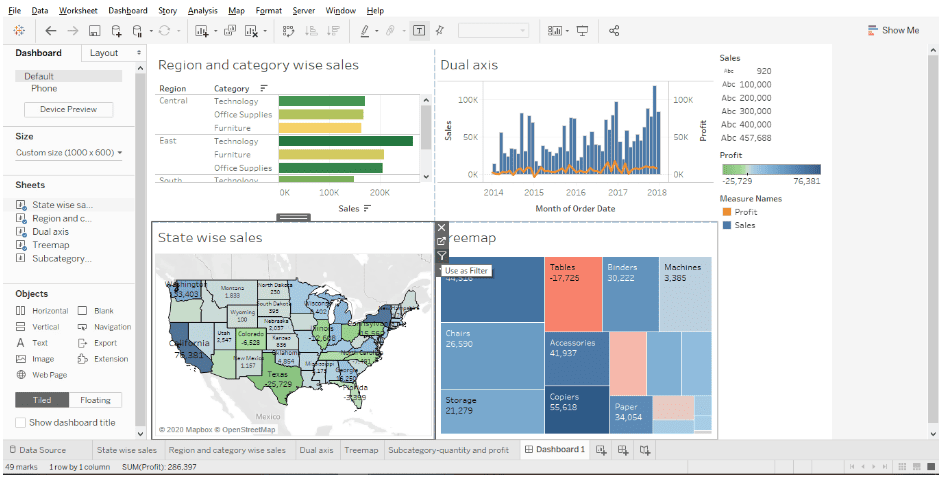
Traditional dashboards are usually pull-based. Users open them when they need information. Tableau Pulse is more push-oriented and metric-centered.
Here is the practical difference:
| Traditional Dashboard | Tableau Pulse |
|---|---|
| User opens report manually | User receives updates proactively |
| Designed for broad analysis | Designed for focused KPI monitoring |
| Often contains many charts | Usually starts from prioritized metrics |
| Requires navigation and filtering | Reduces effort for routine status checks |
| Best for exploration and reporting | Best for awareness, follow-up, and guided insight |
This does not mean Tableau Pulse replaces dashboards. It works better as a complement to them. Dashboards still matter for broad context, custom analysis, and storytelling. Tableau Pulse helps close the gap between dashboard creation and day-to-day business attention.
Setting Up Tableau Pulse for Success
Preparing your site and data foundations
The success of Tableau Pulse depends less on the front-end feature set and more on the underlying data environment.
Before rollout, organizations should make sure they have:
- Published data sources that users can access
- Clear metric definitions with agreed business logic
- Reliable refresh schedules
- Consistent dimensions and naming
- Appropriate permissions and governance
- Embedded credentials, SSO, or supported access methods where needed
Tableau Pulse runs on top of trusted data foundations. If revenue, margin, leads, or service metrics are defined inconsistently across teams, the delivery experience may still be polished, but trust will break down quickly.
A few setup realities matter here:
- Tableau Pulse is associated with Tableau Cloud
- Site settings and permissions affect access to Pulse and AI features
- Different roles can create metric definitions versus simply view and follow metrics
- Row-level security on the underlying data source still matters for what users see
For many BI teams, this means Tableau Pulse deployment should be treated as a governance project as much as a product feature rollout.
Adoption tips for teams and stakeholders
Even well-designed BI features fail when users do not understand what they are looking at. To improve adoption, teams should approach Tableau Pulse with a metric operating model.
Practical rollout tips include:
Establish clear naming conventions
Use metric names that business users instantly understand. Avoid technical field labels and ambiguous abbreviations.
Assign metric ownership
Every important metric should have a clear owner who can answer questions about definition changes, targets, and interpretation.
Start with a small set of high-value KPIs
Do not launch with too many metrics. A smaller curated list helps users build confidence and avoid alert fatigue.
Align digests with data refresh timing
If data refreshes overnight, digest scheduling should account for that so users are not reading stale numbers.
Train users on interpretation, not just navigation
The most important enablement topic is often, “What action should I take when this moves?” not “Where do I click?”
These practices matter whether you are using Tableau Pulse or any metric-monitoring layer in enterprise BI.
Top New Tableau Pulse Releases to Know in 2026
Notable product improvements and enhancements
Several Tableau Pulse updates in 2026 are especially relevant for users evaluating maturity and usability.
Improved Tableau Agent in Pulse answers
Tableau has upgraded the AI experience in Pulse to support more accurate and capable question-answering for metric exploration. This is important for teams that want a more natural-language path into insight discovery.
Group-based AI trial and access controls
Administrators can now trial certain AI capabilities more easily on existing Tableau sites and limit access to specific user groups. This supports staged adoption and governance.
Point-in-time metrics
A useful 2026 enhancement is the ability to define metrics using a latest point in time setting, not only cumulative over-time logic. This is valuable for snapshot-style measures such as:
- Inventory on hand
- Open pipeline as of a date
- Headcount at the latest period
- Current backlog
This improves accuracy for metric types that do not make sense as cumulative totals.
Streamlined email digests
A more compact digest layout helps users review more metrics at a glance. For busy executives and managers, digest usability is often more important than advanced features.
Home screen and mobile visibility improvements
Widget-style monitoring and easier mobile access improve day-to-day visibility, especially for users who want lightweight KPI tracking outside a full desktop workflow.
Better dashboard integration
Pulse metrics can be surfaced alongside dashboards, and certain filtering behaviors have improved. This helps bridge the metric layer and the broader visual analytics layer.
Governance transparency improvements
Features like a Last Modified By label on metric definitions make it easier to understand ownership and change history, which supports enterprise trust.
How Tableau AI is reshaping the experience
AI is changing Tableau Pulse from a metric notification tool into a more guided decision-support experience.
In practical terms, Tableau AI helps Pulse users:
- Ask questions in natural language
- Review summarized explanations
- Explore grouped metrics more efficiently
- Get contextual insight briefs
- Move faster from signal to interpretation
That said, the reshaping is not just about the model. It is about the workflow. The better the semantic consistency, definitions, and data quality behind the experience, the more useful AI becomes.
Organizations should avoid treating AI as a shortcut around weak data governance. In Tableau Pulse, AI is most valuable when the metric layer is already credible.
Practical Recommendations Before You Adopt Tableau Pulse
If you are evaluating Tableau Pulse in 2026, these are the most important practical steps to take first.
-
Audit your KPI definitions before rollout.
Make sure business users agree on how core metrics are calculated and filtered. -
Choose use cases where proactive monitoring matters.
Tableau Pulse is strongest for recurring KPI awareness, not every analytics scenario. -
Pilot with one or two stakeholder groups.
Sales leaders, executive teams, and operations managers are often good starting audiences. -
Measure adoption beyond logins.
Track whether users actually follow metrics, read digests, and take action from insights. -
Evaluate AI and governance together.
If you enable AI-powered exploration, review access controls, trust expectations, and how users will validate outputs.
For BI leaders, the key is to compare tools based on how people actually consume data, not only on dashboard design capabilities.
When Teams May Also Consider FineBI + Dora
Tools like Tableau and Power BI are widely used in the BI market, but teams that need a more business-user-friendly, self-service BI platform may also consider FineBI.
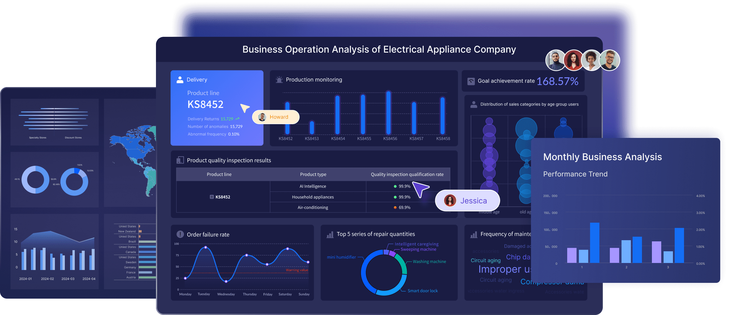
FineBI is designed for interactive self-service analytics, helping business teams create dashboards, explore data, drill down into metrics, and share insights across the organization. For companies that want broader dashboard adoption beyond specialist analyst users, that can be an important advantage.
Where Tableau Pulse is focused on personalized metric monitoring inside the Tableau ecosystem, FineBI is often relevant when teams need:
- Self-service dashboard creation for business users
- Drag-and-drop analysis
- Faster exploration across departments
- Interactive filters and drill-down workflows
- Enterprise dashboard sharing
- A stronger balance between governed reporting and day-to-day business analysis
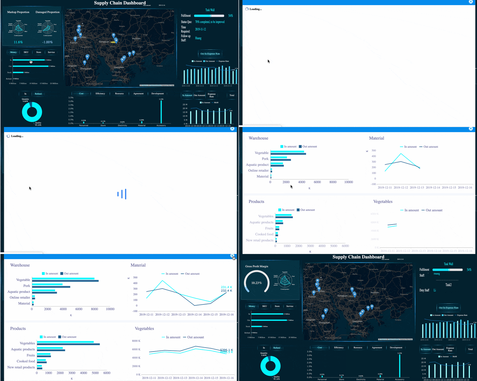 FineBI's Drill-down Capability
Dora adds another layer to this picture. Dora is FanRuan’s enterprise Data Agent platform, built as an AI assistant and AI digital employee layer on top of FineBI and existing enterprise data assets.
Together, FineBI + Dora supports a more agentic workflow:

- Users ask in natural language
- FineBI provides the trusted dashboard, metric, and semantic foundation
- Dora executes a governed AI workflow
- The result can include answers, charts, summaries, actions, alerts, and follow-up
This is useful for enterprises that want to move beyond passive dashboard consumption and toward Agentic BI, where AI helps users ask, analyze, generate, push, alert, and follow up.
Depending on the scenario, Dora can support roles such as:
- Data Analyst digital employee
- Report Researcher
- Daily Briefing Secretary
- Risk Alert Officer
The important positioning point is that Dora is not a replacement for FineBI. FineBI provides the governed analytics foundation, while Dora turns that foundation into a scenario-specific enterprise Data Agent experience.
For organizations exploring the future of metric consumption, this is a different path from a metric digest product alone. It may be worth considering if your BI roadmap includes both self-service analytics and governed AI assistance.
 Get Ready-to-Use Dashboard Templates in Fine Gallery
Final Thoughts on Tableau Pulse
Tableau Pulse is a meaningful evolution in how BI reaches business users. It helps people monitor metrics more proactively, receive digest-based updates, and investigate changes with less friction than traditional dashboard-first workflows.
Its biggest strengths are clear:
- KPI-focused monitoring
- Personalized metric following
- Digest delivery through familiar channels
- Guided insight exploration
- Increasing AI support in 2026
- Better support for users who do not want to live inside full dashboards
Its limitations are also worth keeping in mind:
- It depends on strong metric governance
- It is not a replacement for full dashboarding and analysis
- It fits Tableau Cloud deployment contexts
- Its value is highest when teams already have trusted published data sources and consistent definitions
For some organizations, Tableau Pulse will be a strong fit for executive reporting, sales monitoring, operations oversight, and lightweight business follow-up. For others, the bigger need may be broader self-service BI, cross-team dashboard creation, or a governed AI assistant layer that works beyond metric digests alone.
The right choice depends on your reporting culture, data maturity, and how your teams prefer to make decisions. If your users need proactive KPI visibility, Tableau Pulse deserves serious consideration. If they also need flexible self-service analysis and enterprise-ready AI assistance, FineBI + Dora may be worth evaluating alongside it.
FAQs
Tableau Pulse is used to monitor important business metrics and deliver personalized updates without requiring users to open full dashboards. It helps teams track KPI changes, understand trends, and respond faster.