
What Is an Executive Dashboard?
Executive Dashboard vs. KPI Dashboard
An executive dashboard and a KPI dashboard are closely related, but they serve different purposes.
A KPI dashboard tracks performance indicators against defined goals for one team or function. A sales manager uses one to monitor pipeline value, win rate, and quota attainment. An operations leader uses one to track on-time delivery and production efficiency.
An executive dashboard sits one level higher. It connects the most important metrics across departments so leaders can see how the business is moving as a whole — and understand the relationship between financial outcomes, operational drivers, customer behavior, and strategic priorities.
KPI Dashboard
Primary audience
Functional managers and teams
Main purpose
Monitor KPI progress
Scope
One function, team, or process
Typical view
Metrics, targets, trends, and alerts
Decision cycle
Daily, weekly, or monthly
Executive Dashboard
Primary audience
CEOs, CFOs, COOs, and business unit leaders
Main purpose
Guide leadership decisions
Scope
Cross-functional business performance
Typical view
Strategy, outcomes, exceptions, and risks
Decision cycle
Weekly, monthly, quarterly, or board-level
Think of a dashboard as the visual surface, a KPI dashboard as a performance tracking tool, and an executive dashboard as the decision layer that connects performance to strategy.
Don't just collect data. Visualize what matters.
Download the KPI Dashboard Guide to strengthen your executive dashboard foundation:
- How to turn strategic goals into a focused KPI dashboard
- How to choose charts that make leadership reviews easier to read
- 15 dashboard templates you can adapt for executive reporting

Executive Dashboard Benefits
Leadership teams rarely suffer from a lack of data. The real problem is scattered data, inconsistent definitions, delayed reporting, and meetings where everyone arrives with a different version of the truth.
A well-designed executive dashboard solves this by giving leaders one place to align around the business narrative. Done well, it supports five practical outcomes:
- A shared business scorecard: Everyone sees the same revenue, margin, pipeline, customer, and operations signals. Debates about whose spreadsheet is correct disappear.
- Faster exception handling: Leaders can spot where performance is off plan and drill into the driver, instead of waiting for another report.
- Better meeting discipline: Weekly and monthly reviews shift from status updates to decisions, because the key metrics and variance signals are already visible.
- Clearer accountability: Each metric can have an owner, target, update cadence, and action path, making follow-up more concrete.
- Stronger strategic focus: Not every number belongs on the first screen. A good executive dashboard separates important signals from background noise.
This is also where an executive dashboard differs from a standard performance dashboard. A performance dashboard shows how a team or process is doing. An executive dashboard shows whether the whole business is moving toward its strategic objectives.
Executive Dashboard Metrics
The hardest part of building an executive dashboard is not finding metrics. It is deciding what not to include.
A useful executive dashboard combines lagging indicators, leading indicators, and risk signals. Lagging indicators show what already happened. Leading indicators point to what may come next. Risk signals help leaders understand where the plan could break before it does.
Common executive dashboard metrics include:
- Financial health: Revenue, gross margin, operating margin, EBITDA, cash balance, cash conversion cycle, budget variance, accounts receivable aging, and forecast accuracy.
- Growth and customer signals: Pipeline value, win rate, conversion rate, customer acquisition cost, customer lifetime value, churn, retention, expansion revenue, NPS, and customer complaints.
- Operations and delivery: On-time delivery, order fulfillment, production output, quality rate, capacity utilization, inventory turnover, SLA attainment, and cycle time.
- People and organization: Headcount, hiring progress, regretted attrition, turnover rate, engagement score, training completion, and workforce cost.
- Risk and governance: Compliance status, open incidents, overdue controls, high-risk vendors, data quality warnings, and unresolved executive actions.
The right metric set depends on company stage and leadership priorities. A startup executive dashboard may emphasize burn rate, runway, pipeline, and retention. A manufacturing executive dashboard may focus on production, quality, labor cost, and inventory risk. A financial services dashboard may center on portfolio performance, liquidity, compliance, and customer risk.
If a metric does not support a decision, diagnose a risk, or explain a strategic outcome, keep it off the first screen. It can still live in a drill-down view, a financial report, a sales report, or a functional dashboard.
Examples and Templates
The best way to understand an executive dashboard is to study examples across different leadership contexts.
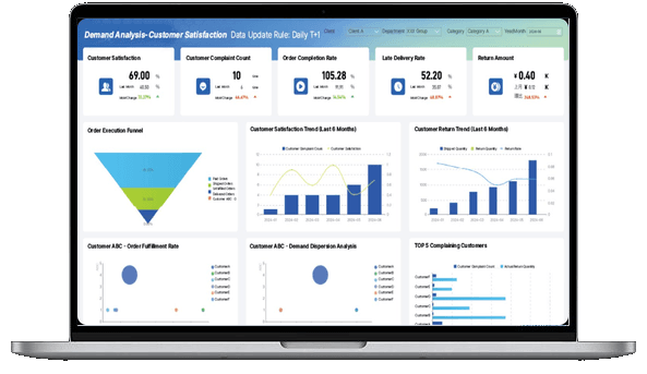
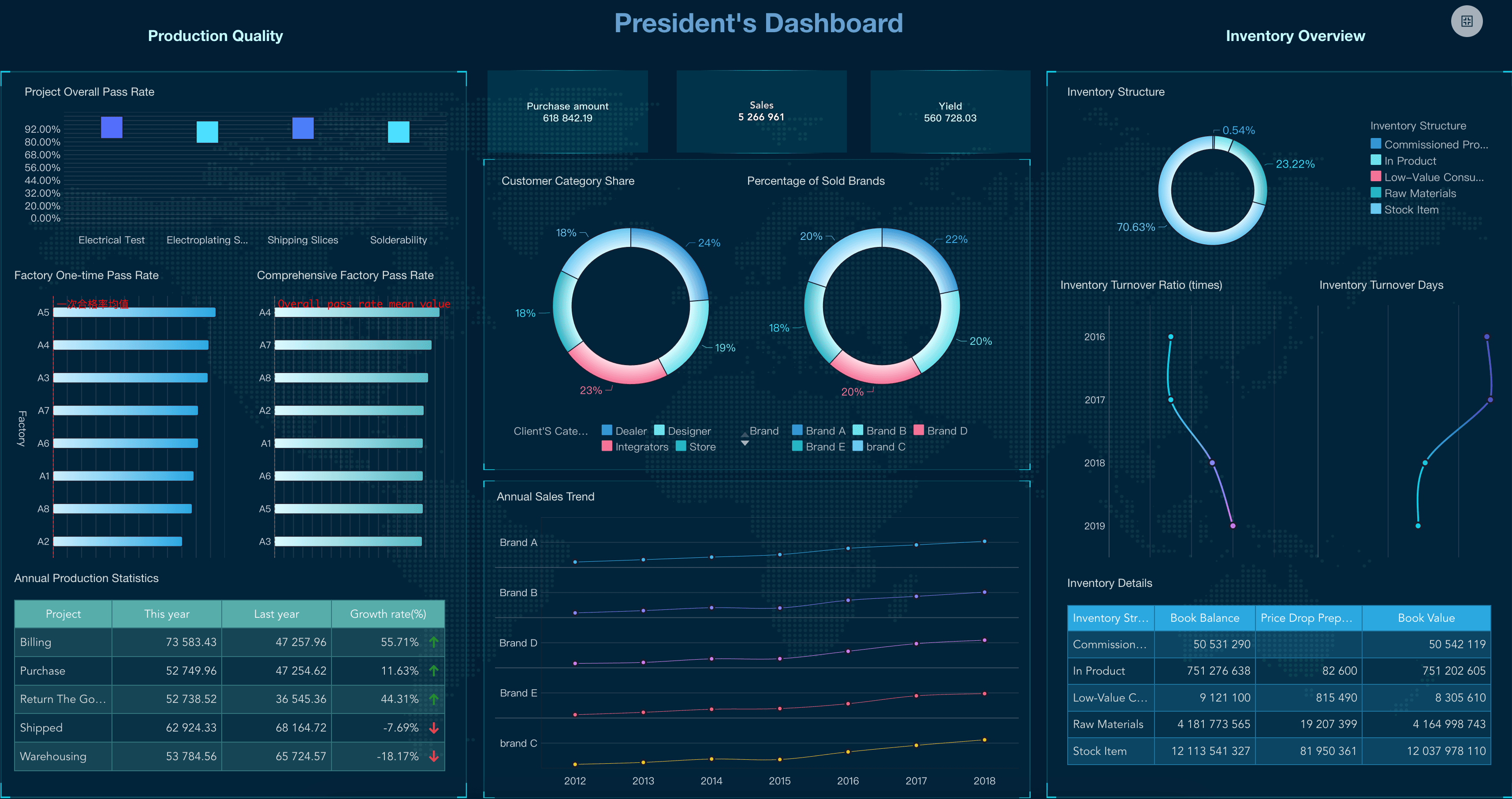
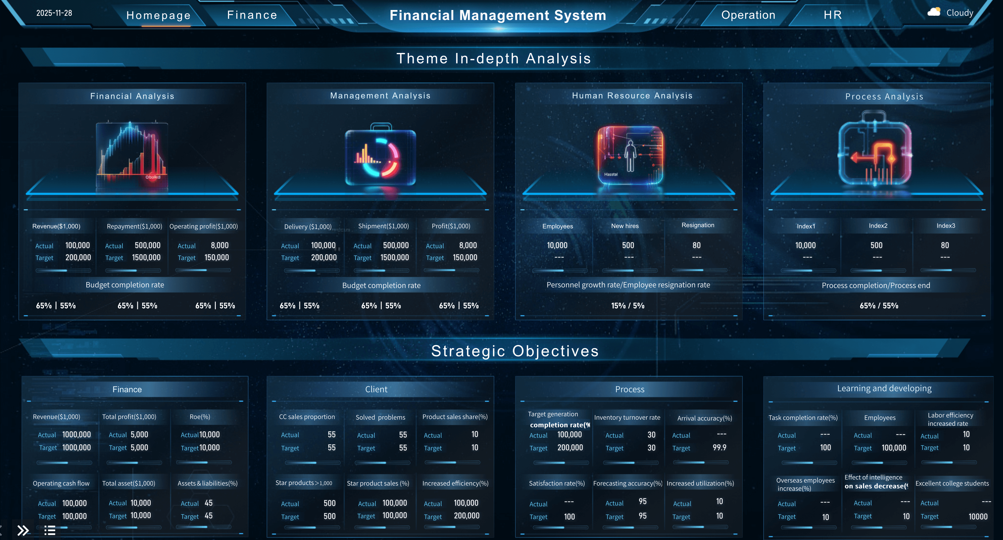
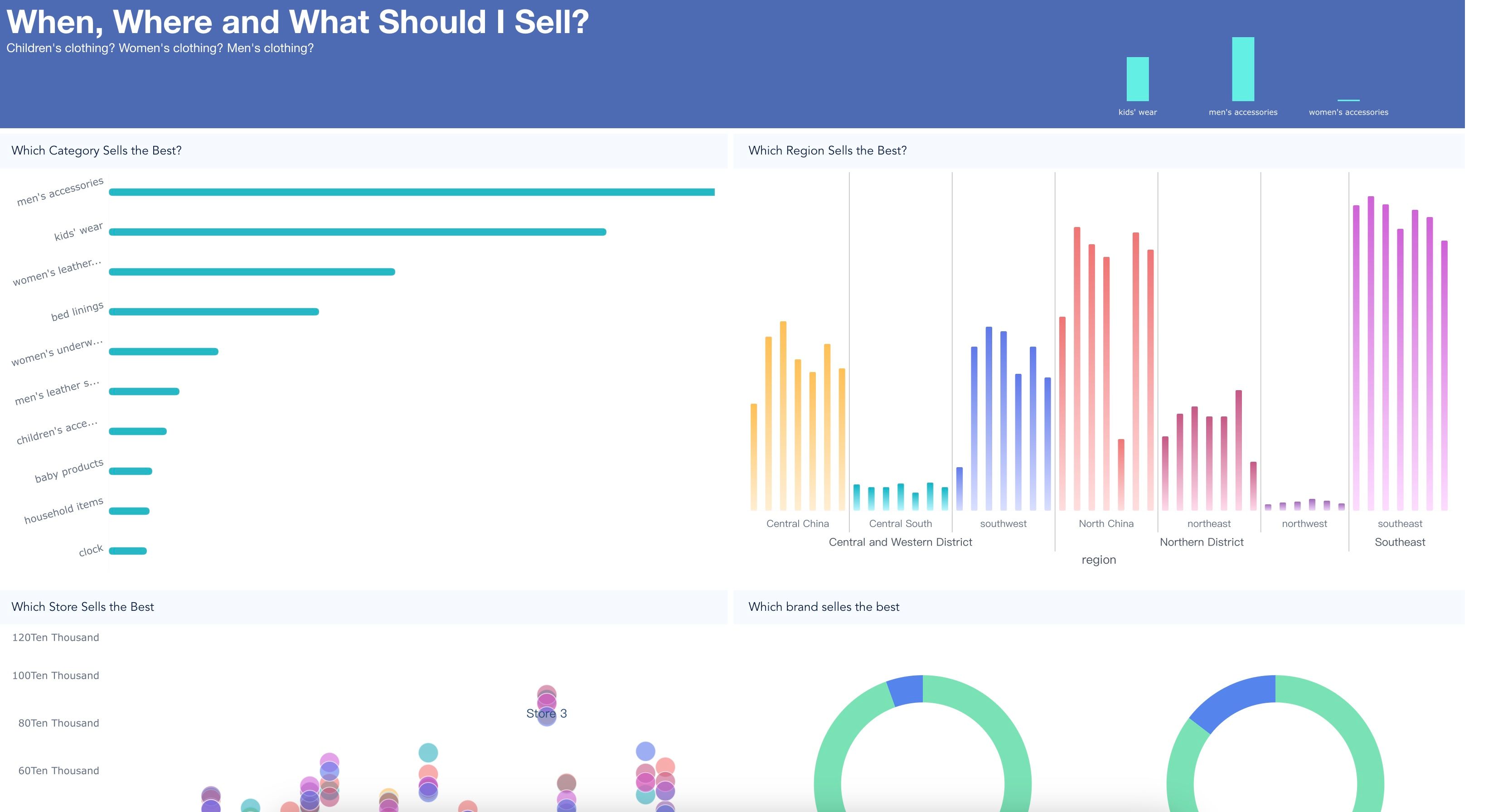
Strategic executive dashboard examples
Use this view when leaders need to understand overall business health, initiative progress, and cross-functional risk.
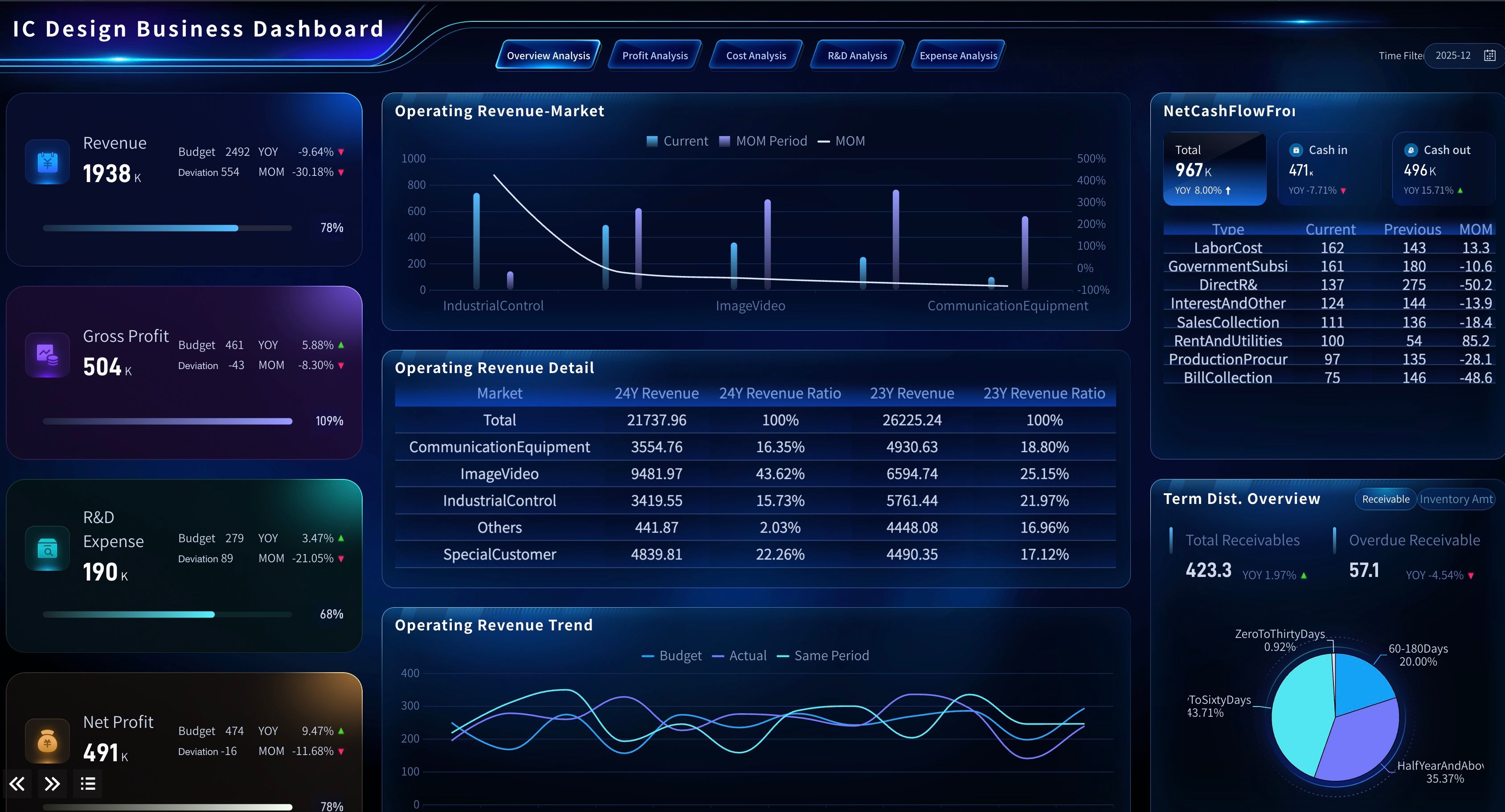
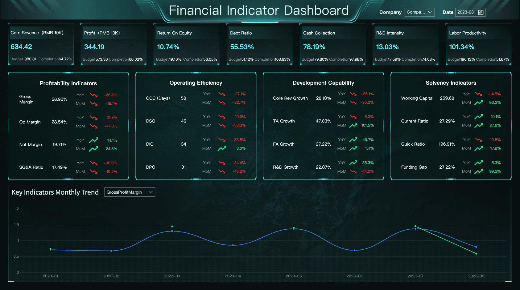
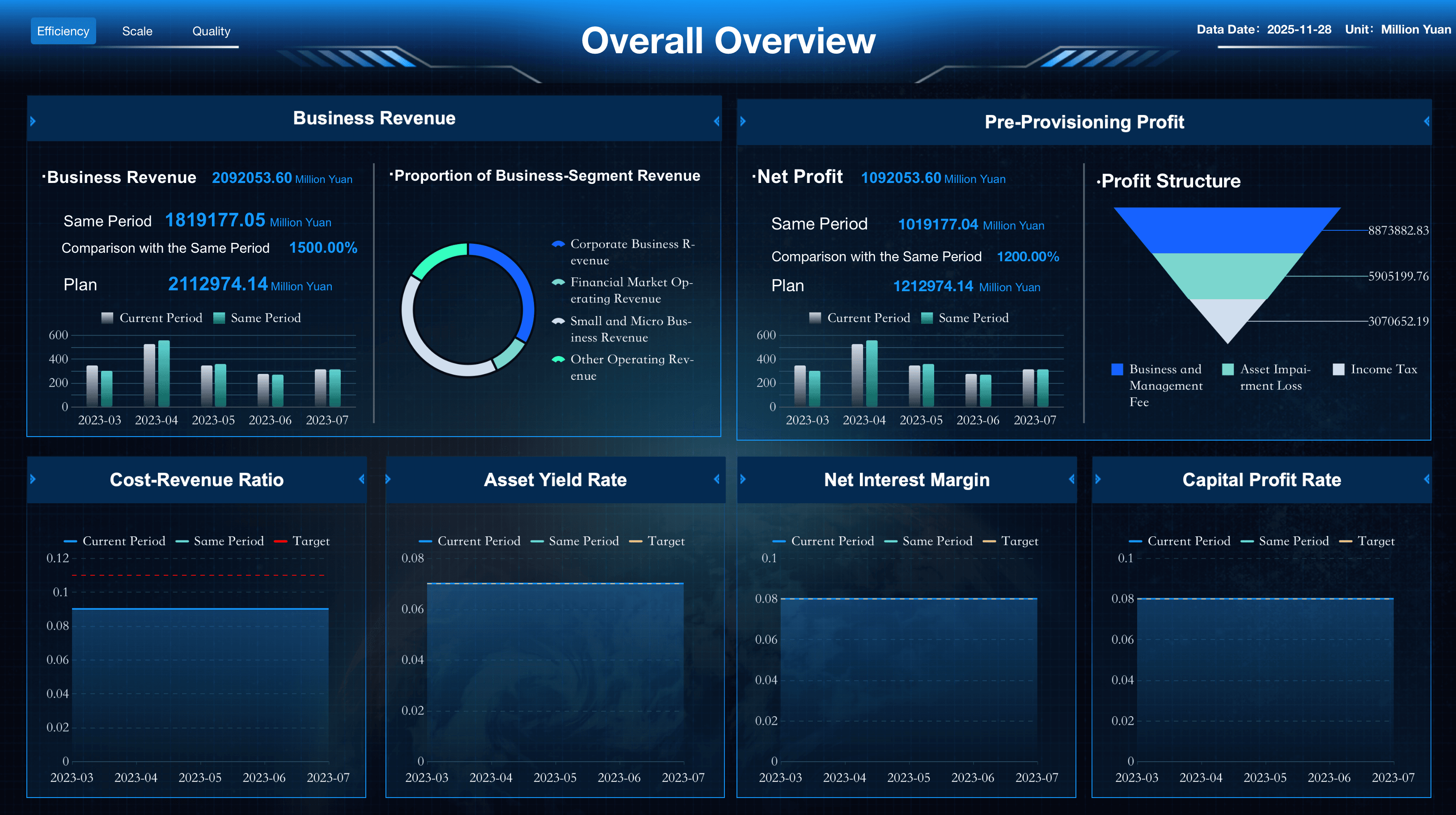
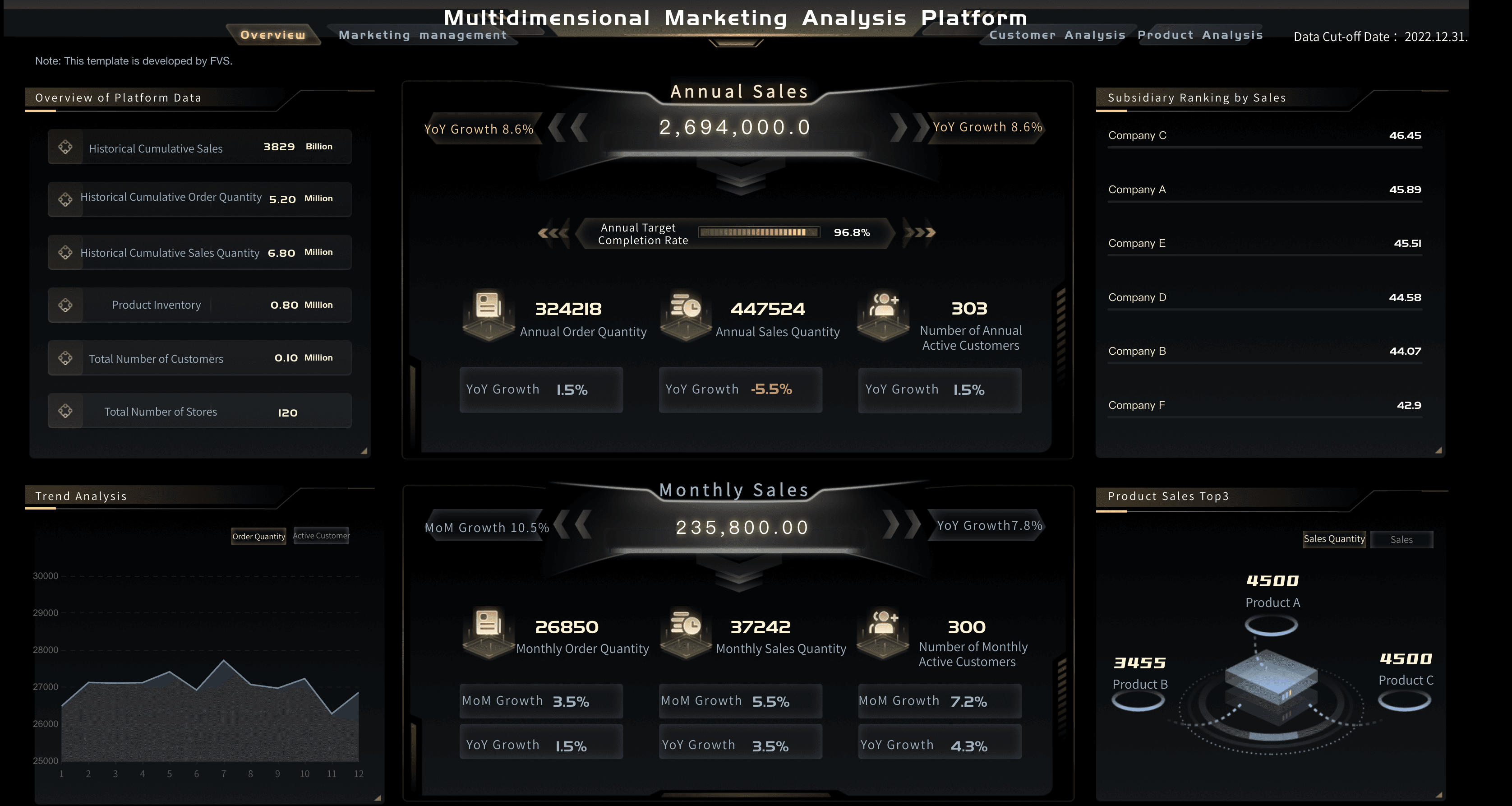
Financial executive dashboard examples
Finance is often the anchor of an executive dashboard because it connects operational choices to business outcomes. A financial dashboard shows revenue, cost, cash, budget variance, and profitability in a form leaders can discuss without opening a spreadsheet.
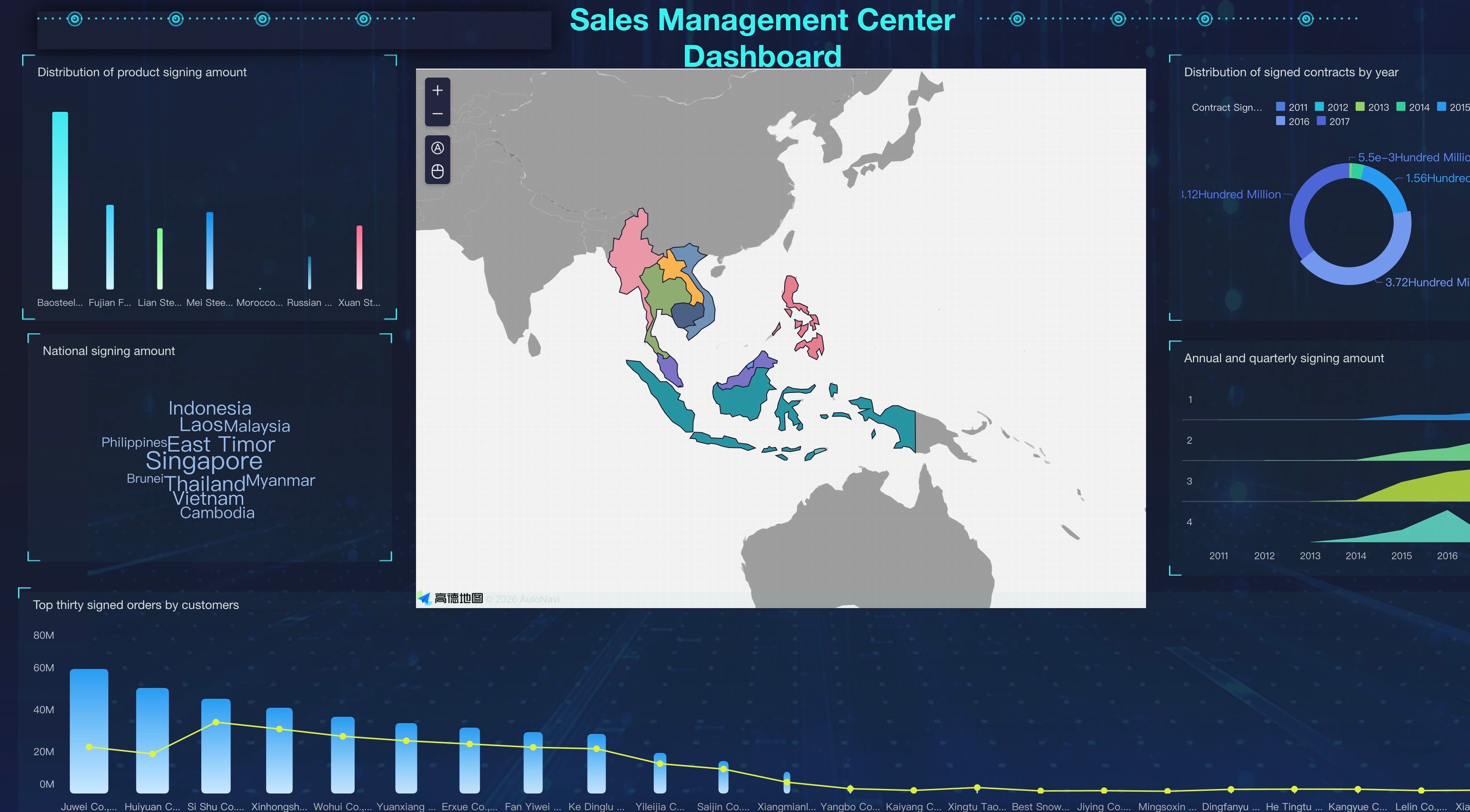
Revenue executive dashboard examples
Revenue leaders need to connect sales execution, marketing performance, and margin. A good executive dashboard does not simply show that revenue changed — it helps leaders understand whether the change came from pipeline quality, conversion, pricing, churn, or demand shifts.
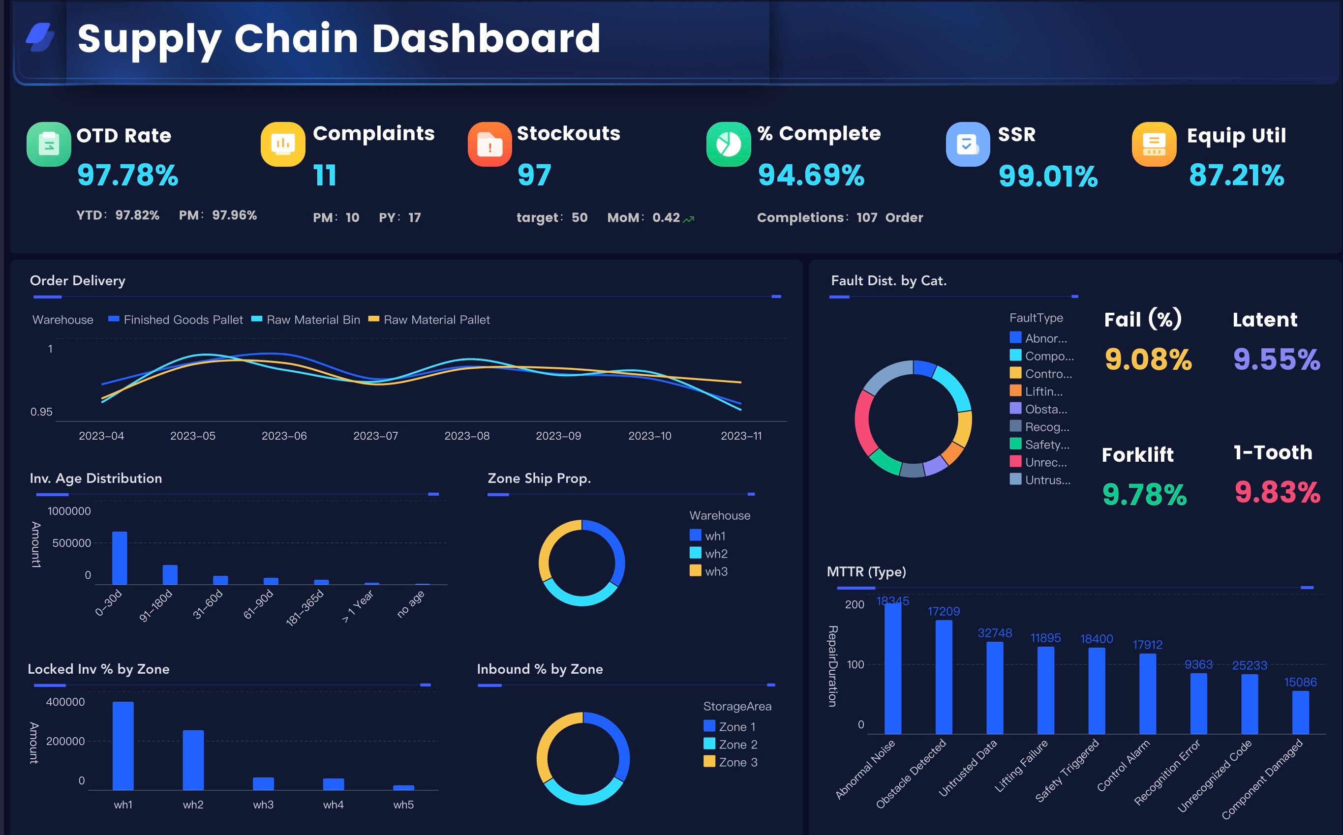
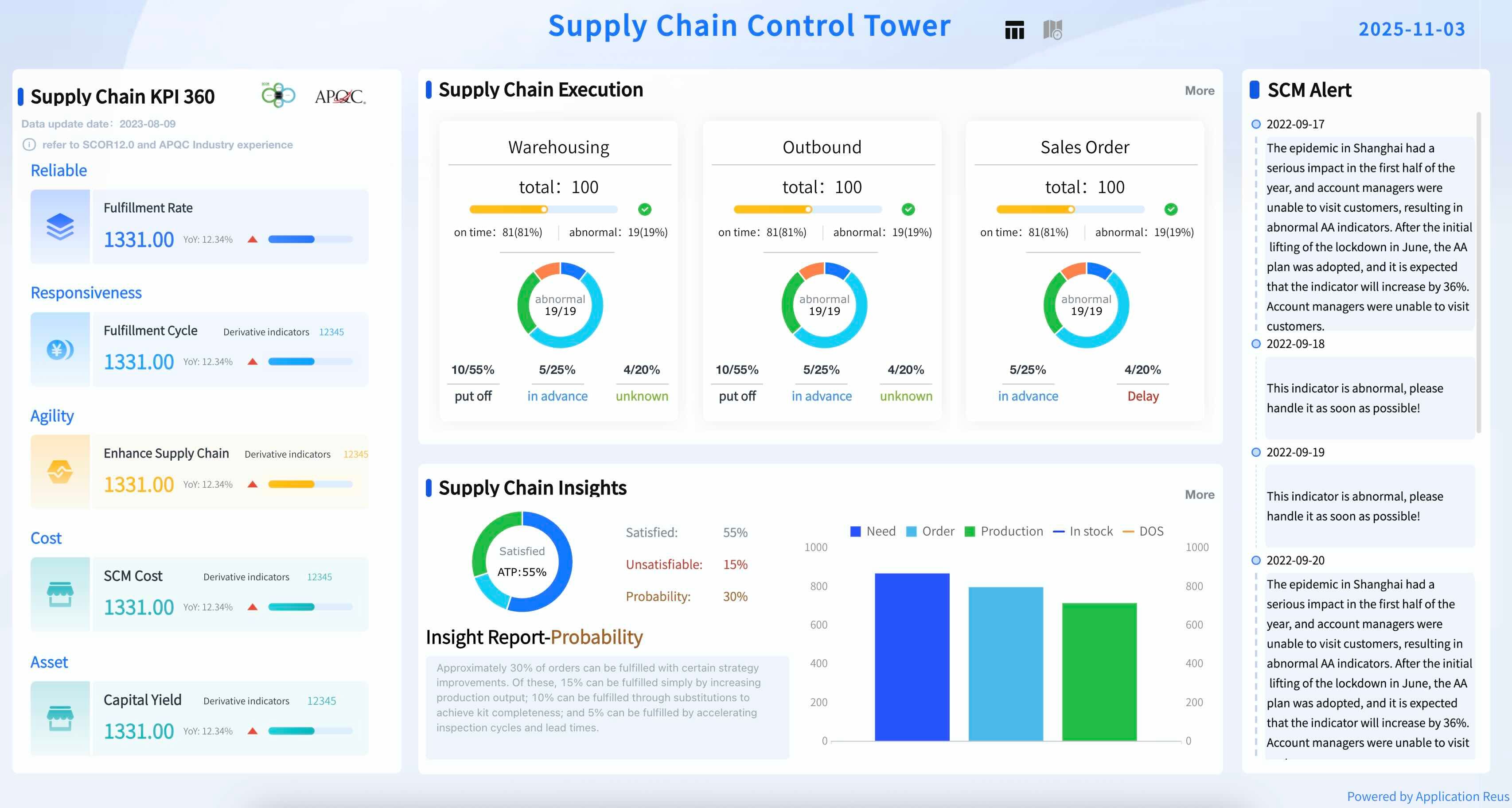
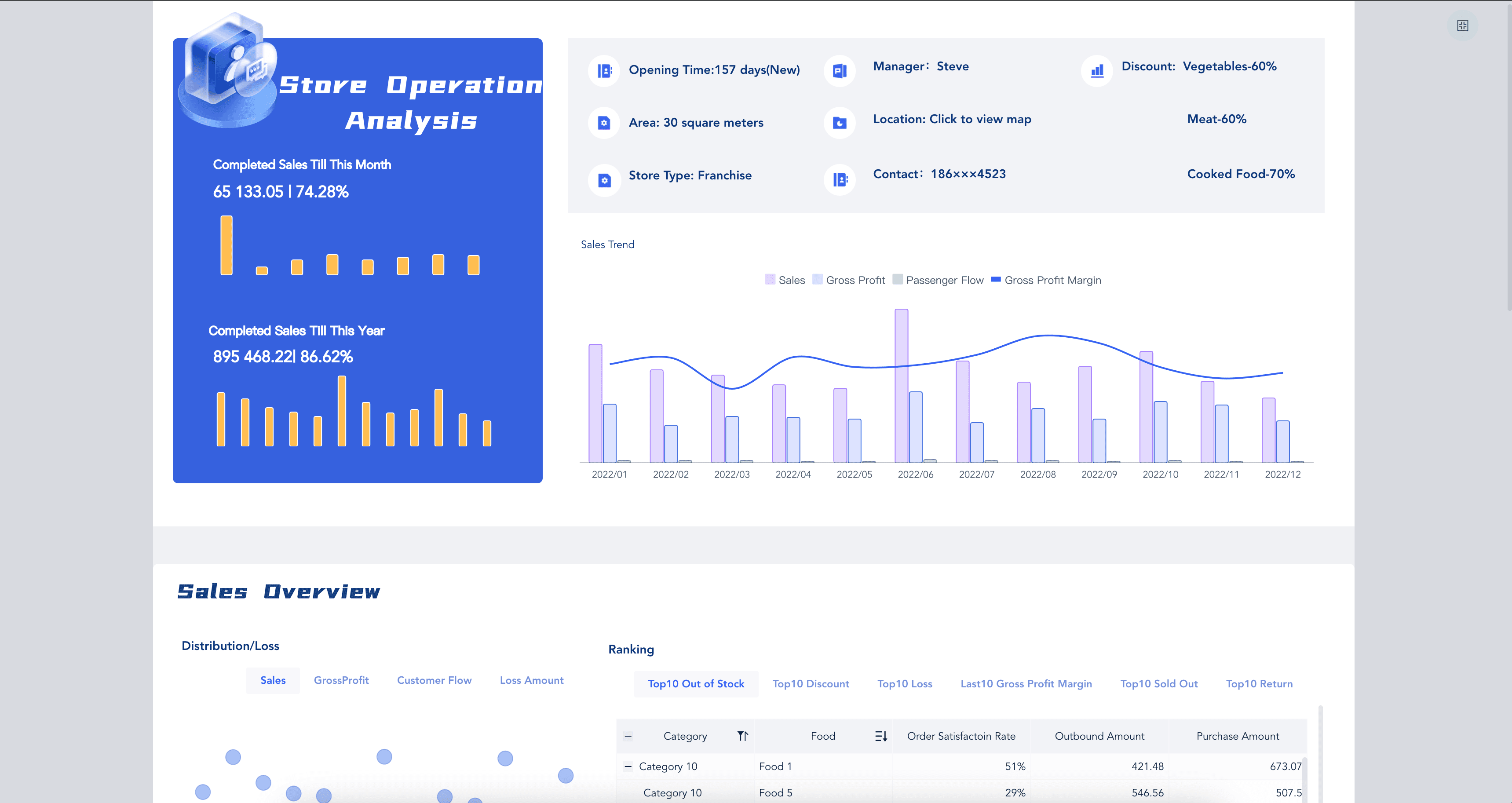
Operations and people executive dashboard examples
For COOs, plant leaders, HR leaders, and regional managers, the executive dashboard needs to connect capacity, cost, quality, delivery, and people risk. A strong view makes bottlenecks visible before they show up in financial results.
Design Best Practices
An executive dashboard is not a place to display every chart the data team can build. It is a decision interface. The design should help a busy leader answer three questions in seconds:
- Are we on track?
- What changed?
- What should we investigate or decide next?
Use these dashboard design principles when planning the layout:
- Start with the leadership question: Before choosing charts, write the question the dashboard must answer. For example: "Are we on track to hit quarterly revenue while protecting margin and service quality?"
- Put outcomes before drivers: Place top-level business outcomes at the top, then show the drivers underneath. Revenue, margin, cash, and risk should not be buried below operational detail.
- Use targets and variance: A number without a target is hard to interpret. Show actual, target, variance, and trend where possible.
- Limit first-screen metrics: Most executive dashboards work better with 8 to 15 top-level indicators, supported by drill-down views.
- Use color sparingly: Red, amber, and green status indicators help, but too many colored elements create visual noise. Reserve strong colors for exceptions.
- Explain exceptions in plain language: Add short annotations for major changes, unusual data, or known business events.
- Design for meetings: Leadership teams often view dashboards on conference screens. Use readable labels, enough spacing, and chart choices that work from a distance.
- Create drill-down paths: Executives need the summary first, but analysts and department owners need detail. Link top-level signals to supporting views.
For broader layout inspiration, explore several dashboard examples before committing to a design. The best executive dashboard layout is usually simple, consistent, and easy to explain in a room.
Data Model and Ownership
A dashboard is only trusted if leaders believe the data behind it. That means the data model matters as much as the visual design.
A reliable executive dashboard should define:
- Data sources: ERP, CRM, finance systems, HRIS, marketing platforms, supply chain systems, product analytics, and any spreadsheets that still hold critical business logic.
- Metric definitions: Each KPI should have a written formula, owner, business meaning, and allowed filter logic.
- Refresh cadence: Revenue may refresh daily, cash weekly, and board-level strategic metrics monthly. Not everything needs to be real time.
- Data latency: Show when data was last updated so leaders know whether a number reflects today, yesterday, or the last closed accounting period.
- Access rules: Executives may see aggregated views, while department owners need region, product, or customer-level detail.
- Quality checks: Build warnings for missing values, stale feeds, duplicate records, and source-system changes.
- Drill-down granularity: Decide how far users can move from executive summary to department, region, product, account, or transaction detail.
This is where an executive dashboard becomes part of a broader business intelligence dashboard system. The front-end view may look simple. The back-end logic should be governed enough that leaders can act on it without second-guessing the numbers.
How to Build an Executive Dashboard
The fastest way to build an executive dashboard is to start with decisions, not data sources.
- Interview the leadership team. Ask each leader what decisions they make weekly, monthly, and quarterly. Capture the questions they ask most often before reviews.
- Define the business narrative. Decide which story the dashboard should tell: growth, profitability, operational resilience, customer health, transformation progress, or risk control.
- Choose the first-screen metrics. Select a small set of outcome metrics and driver metrics. Make sure every metric has a target and an owner.
- Map supporting dashboards. Link executive-level signals to functional views such as a sales dashboard, marketing dashboard, or hr dashboard.
- Sketch the layout before building. Use a simple wireframe to decide hierarchy, grouping, filters, and drill-down paths.
- Prototype with trusted data. Start with a small number of clean data sources. A narrow but trusted dashboard beats a broad one that leaders question.
- Test it in a real review meeting. Watch where leaders pause, ask questions, or ignore sections. Those moments show what to improve.
- Set a governance rhythm. Review metric definitions, owners, and dashboard usage each quarter. Executive dashboards should evolve as strategy changes.
The most common mistake is treating the dashboard as finished once it is built. In practice, it should mature with the business. Strategy changes, organizations restructure, and new risks emerge. The dashboard should keep pace.
Executive Dashboard With FineBI + Dora
Once the executive dashboard logic is clear, the right tools help teams move from concept to repeatable practice.
FineBI supports the visual and analytical layer: connecting data, modeling metrics, creating interactive views, managing permissions, and giving business users a way to explore performance without waiting for IT. It works well when leaders need both a clean summary view and the ability to drill into what is driving a change.
Dora supports the question and analysis layer. As a data agent, Dora helps teams ask better follow-up questions, interpret metric changes, and move from "what happened?" to "what should we look at next?" Used alongside a governed FineBI dashboard, Dora makes the executive dashboard feel less like a static screen and more like a guided analysis workflow.
A practical learning path:
- Week 1: Define the executive questions. List what leadership needs to know before every review.
- Week 2: Build the KPI dictionary. Write metric definitions, owners, targets, and refresh rules, starting with what already appears in leadership reviews.
- Week 3: Prototype the first executive dashboard in FineBI with first-screen view and supporting drill-downs.
- Week 4: Use Dora for follow-up analysis. Ask plain-language questions about variance and exceptions. Capture which questions lead to useful decisions.
- Week 5: Refine. Remove unused metrics, clarify labels, add annotations, strengthen data quality checks.
The goal is not a more complex dashboard. The goal is one that is easier for leaders to learn from.
If your team is exploring AI-assisted analytics more broadly, related paths include enterprise AI agents, AI assistant for business, and AI agent workflow.
Executive Dashboard Hub
This guide works best as part of a broader dashboard learning hub. Use these pages when you want to go deeper:
- Dashboard for a broader view of definitions, use cases, and categories.
- Dashboard examples for visual inspiration before building.
- Dashboard design to refine layout, chart choices, and visual hierarchy.
- KPI dashboard when defining goals, targets, and performance indicators.
- Sales dashboard, marketing dashboard, and hr dashboard for deeper functional views beneath the executive layer.
Other useful companion topics include dashboard software, Excel dashboard, data dashboard, BI dashboard, digital dashboard, project dashboard, analytics dashboard, and executive dashboard software.
FAQs
An executive dashboard is a visual business overview designed for senior leaders. It combines high-level metrics, targets, trends, risks, and exceptions so executives can understand company performance and make faster decisions. Unlike a detailed operational report, it focuses on the signals that matter most to strategy.
It should include financial outcomes, growth indicators, operational drivers, customer signals, people metrics, risk alerts, targets, variance, and trend context. The best test: if leaders would not use a metric to make or explain a decision, it probably does not belong on the first screen.
A KPI dashboard tracks specific indicators for one department or process. An executive dashboard connects selected KPIs across the business so leaders can see how financial results, operations, customers, and people metrics influence one another.
Most executive dashboards work best with 8 to 15 first-screen KPIs. Supporting detail can live in drill-down views, department dashboards, or reports.
The refresh cadence should match the decision cycle. Sales pipeline and operational alerts may refresh daily. Financial results may refresh after accounting close. Strategic initiatives may refresh weekly or monthly. Always show when the data was last updated.
Ownership is usually shared. The executive sponsor defines the decision needs, finance and operations teams validate business logic, data teams manage sources and quality, and dashboard owners maintain the design and usage rhythm. Every major metric should have a named business owner.
Yes, an Excel dashboard works well as a starting prototype. But as data sources, permissions, and refresh needs grow, most teams move to dedicated BI tools so the dashboard stays consistent, secure, and easier to maintain.
