
What is a Dashboard?
Dashboard Meaning vs Report Meaning
While dashboards and reports are both essential data delivery tools, they serve different purposes. Here’s a quick explanation:
- Dashboards are dynamic, visual interfaces designed to track your most critical KPIs and metrics at a glance. Dashboards support real-time decision-making and help your teams instantly spot trends or anomalies. An example of a dashboard is a “live sales performance screen” monitoring daily revenue against quarterly goals.
- Reports provide a detailed, historical analysis of business activities over a specific period. While they offer deep data exploration, they are typically static and used for periodic reviews rather than immediate action. Some examples include an “end-of-month financial statement” or a “weekly inventory spreadsheet”.
More resources:
- Dive deeper on the question, "What is a kpi dashboard?"
- Download interactive dashboard templates
Don’t just collect data. Visualize what matters.
Download the Dashboard Design Guide to learn:
- 10 essential steps to build effective dashboards
- How to choose the right charts and avoid visual clutter
- 15 top-notch dashboard templates for 2026

Why Are Dashboards Important?
Dashboards are an essential tool to ensure your teams can access, understand, and act on their data quickly. Here are some of the biggest reasons why your organization needs business dashboards:
- Break down data silos: Whether merging marketing metrics or financial records, dashboards centralize information into a single source of truth, keeping all departments aligned and moving in the same direction.
- Provide instant visibility: Dashboards give you a real-time, visual health check of your organization. By transforming complex datasets into intuitive charts, they make it easy for anyone to understand performance at a glance.
- Drive faster decisions: Interactive dashboards help you clearly spot trends, anomalies, and opportunities instantly. Instead of waiting for end-of-month reports, you can make immediate adjustments to do more of what's working.
- Boost workflow efficiency: Automate data collection and reporting with self-service dashboards. This empowers employees to track their own progress and find answers independently, saving your IT and data teams countless hours.
Types of Dashboards
Business dashboards come in many flavors. While some are used to monitor daily operations in real-time, others have a longer-term focus. The one thing all effective dashboards have in common is that they are tied to strategic goals and make complex data actionable. Here's an overview of some of the most common types of dashboards.
- Strategic: These big-picture dashboards monitor long-term organizational goals. Executives typically look to one or two strategic dashboards to find out how the entire organization is doing at any given time. Examples include visual summaries of return on investment, enterprise-wide revenue, and market share growth.
- Operational: These dashboards typically measure performance in a shorter time frame, and are focused on tracking daily organizational processes and efficiencies. Frontline managers use them to spot issues immediately. Some examples include real-time sales by region, daily supply chain logistics, and live web traffic monitoring.
- Functional Unit: Many business dashboards are specifically tied to functions, such as finance or IT. While an IT dashboard might visualize average server uptime or ticket resolution rates, finance dashboards track gross profit margins or return on assets. These functional dashboards can also be classified as strategic or operational.
- Analytical: Regardless of the type of dashboard you build, you should know the difference between simply monitoring data and deeply exploring it. While operational dashboards track what is happening right now, analytical dashboards allow analysts to drill down into vast amounts of historical data to uncover hidden trends. Organizations use a mix of all these types to ensure they're tracking what's most important.
How to Build a Dashboard
With so much data, it can be tempting to display everything—or at least the charts that are easiest to build. However, you need to be sure you’re including only the data points that will help you reach your business goals. The strategic focus is one of the most important aspects of dashboard design. Here are some best practices for building the right dashboards.
- Define how the dashboard will be used: Talk to the people who will be using the dashboard to find out what they want to achieve and how they’ll interact with it. This will help you design dashboards that are relevant and genuinely valuable to business users.
- Tie it to strategic goals: If your dashboard doesn’t relate to what you’re trying to achieve in your business, you’re wasting screen space. While a dashboard may be tailored to a specific business function like HR or marketing, every visualization on it should tie directly back to your overall business goals.
- Choose the right visualizations: The most effective dashboards follow proven design principles. Make sure your charts are clear, accurate, context-rich, and easy to interpret. For example, use line charts to show revenue trends over time, or bar charts to compare regional sales, rather than forcing data into confusing formats.
- Keep it clear-cut: Everyone in the organization should understand your dashboard at a glance so they can act on it. This is why a clean layout and data literacy are so important. When people understand how to read the visual data, they can make decisions that will move the needle in the right direction.
- Plan to iterate: As your business and customers change, you may need to revise your dashboards. Perhaps certain metrics are no longer relevant, or you need to adjust the layout based on user feedback. Be sure you have a plan in place to evaluate and make changes to your dashboards when necessary.
- Avoid visual overload: Modern business intelligence has given organizations access to mounds of data, making it easy to plot anything and everything on a single screen. Keep in mind that a true dashboard highlights only the most important targets. Steer clear of visual overload and clutter by focusing strictly on the most impactful measures.
3 Steps to a Stronger Dashboard Strategy
If your business dashboards aren't delivering the actionable insights you expect, it's time to adjust your strategy. Here are three things you can do to ensure that people across the organization know how to read your dashboards, and how to use them to make data-driven decisions that impact your business.
- Display metrics that matter most: To be sure you're highlighting what matters, you should include a balance of high-level overviews and detailed drill-downs. High-level charts help you understand overall performance at a glance, such as total sales over the last 30 days. Detailed drill-downs allow analysts to explore the underlying data, helping you uncover root causes and make adjustments to improve outcomes.
- Create a data-driven culture: Dashboards don't mean much if people don't understand how to interpret the visualizations or navigate the interface. Increase data literacy in your organization so everyone works toward strategic targets. Educate employees, grant them access to relevant dashboards, and use a best-in-class BI platform to keep everyone making decisions that move your business forward.
- Iterate: Keep your dashboards current by revising their layouts and data sources based on market, customer, and organizational changes. Meet regularly with end-users to review them, take a close look at user adoption to see if visual adjustments need to be made, and publish any updates clearly so teams are always working with the latest information.
Dashboard Examples & Templates
Every business unit has unique data visualization needs to help them track progress. Many organizations use interactive dashboards to help them visualize, review, and analyze their performance metrics all in one place. Here are a few essential dashboard examples by department, designed to inspire your next project.
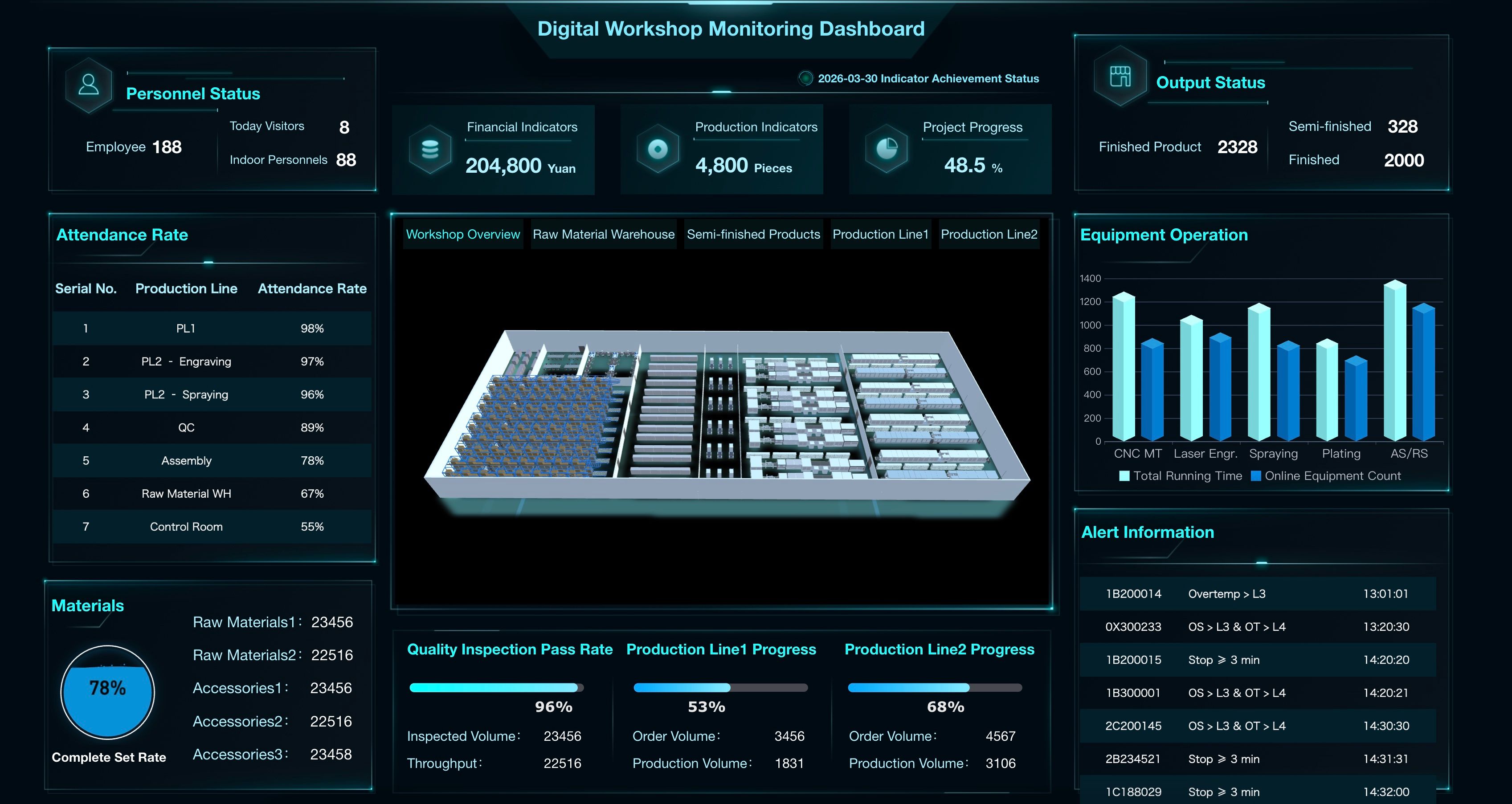
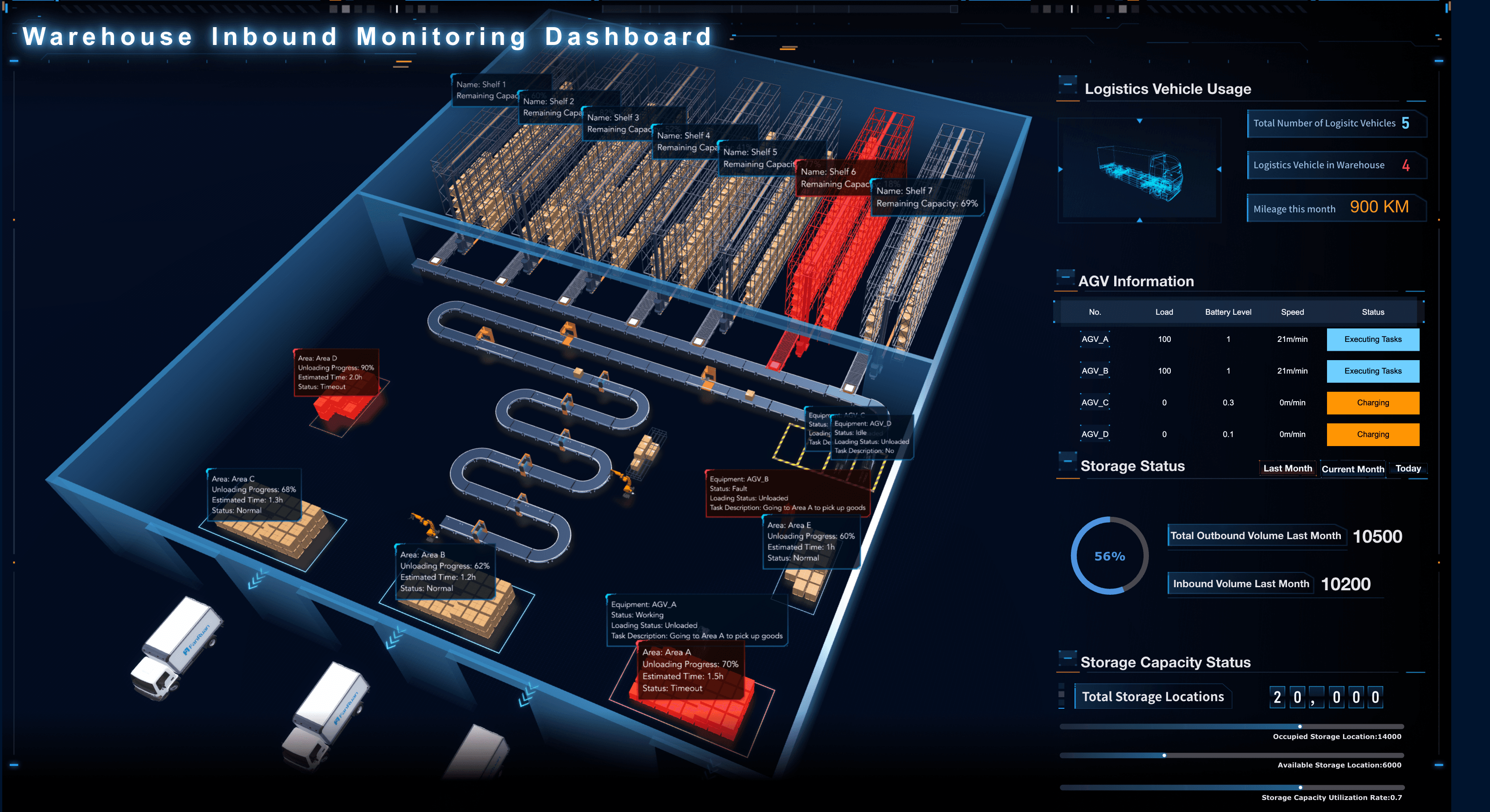
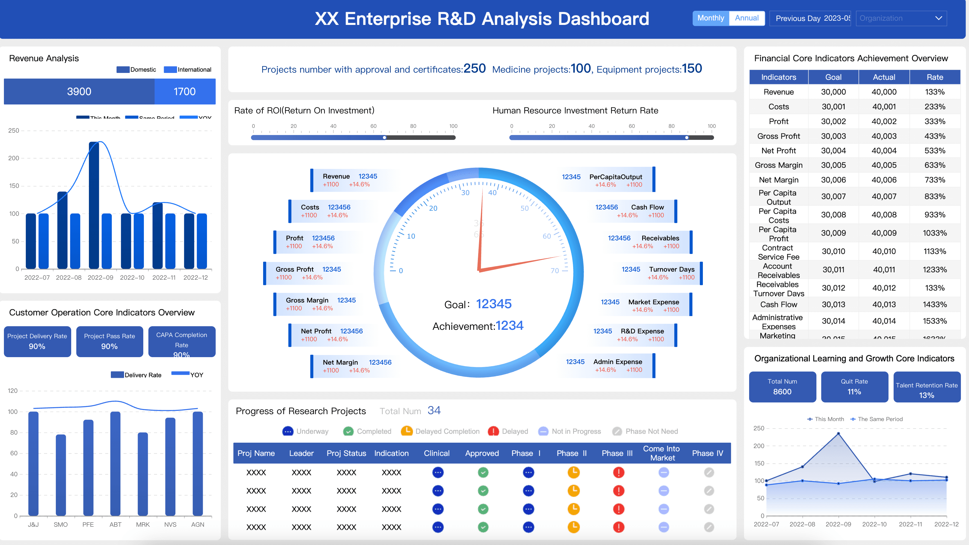
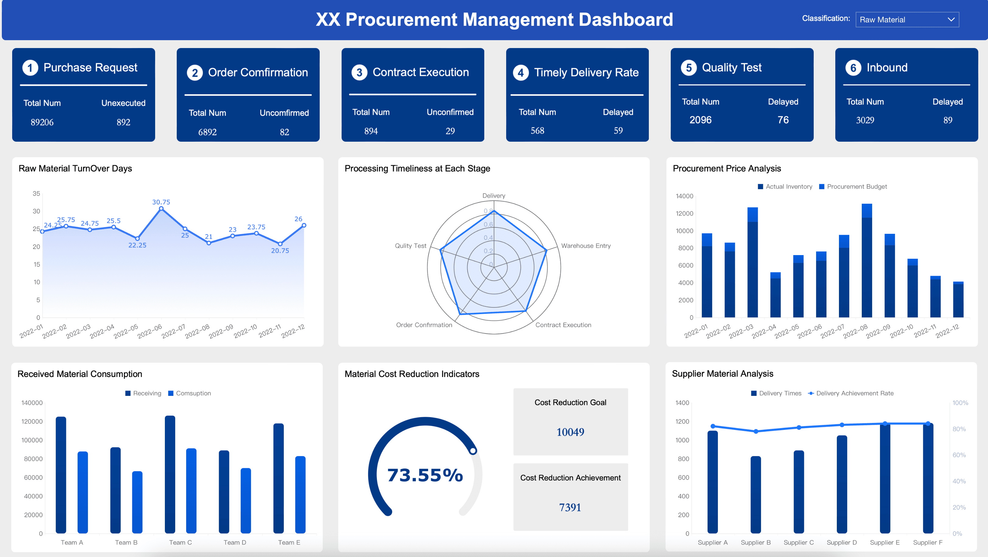
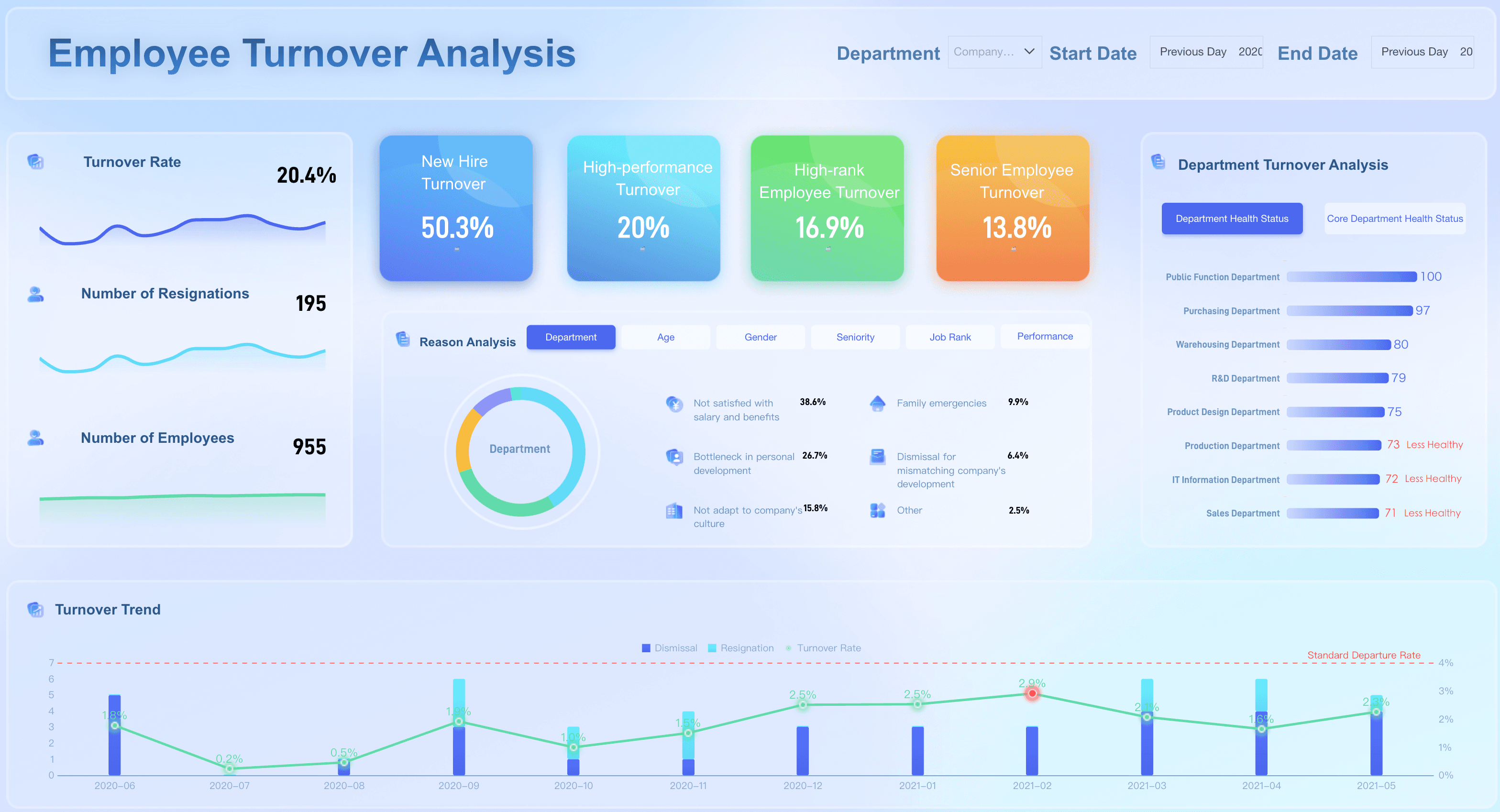
Manufacturing
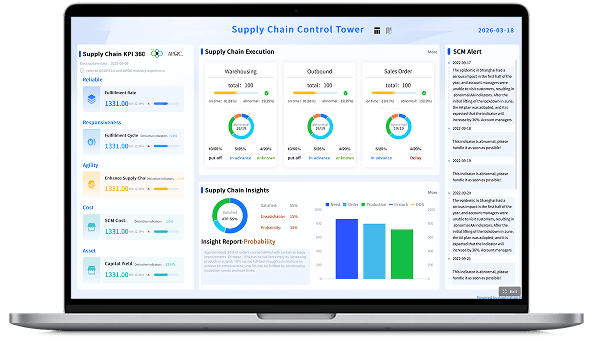
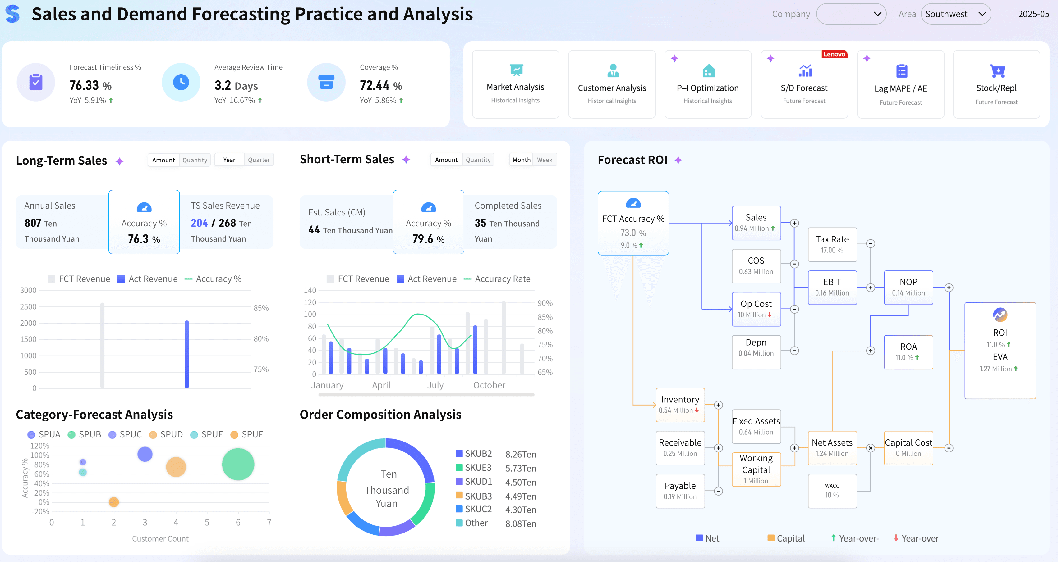
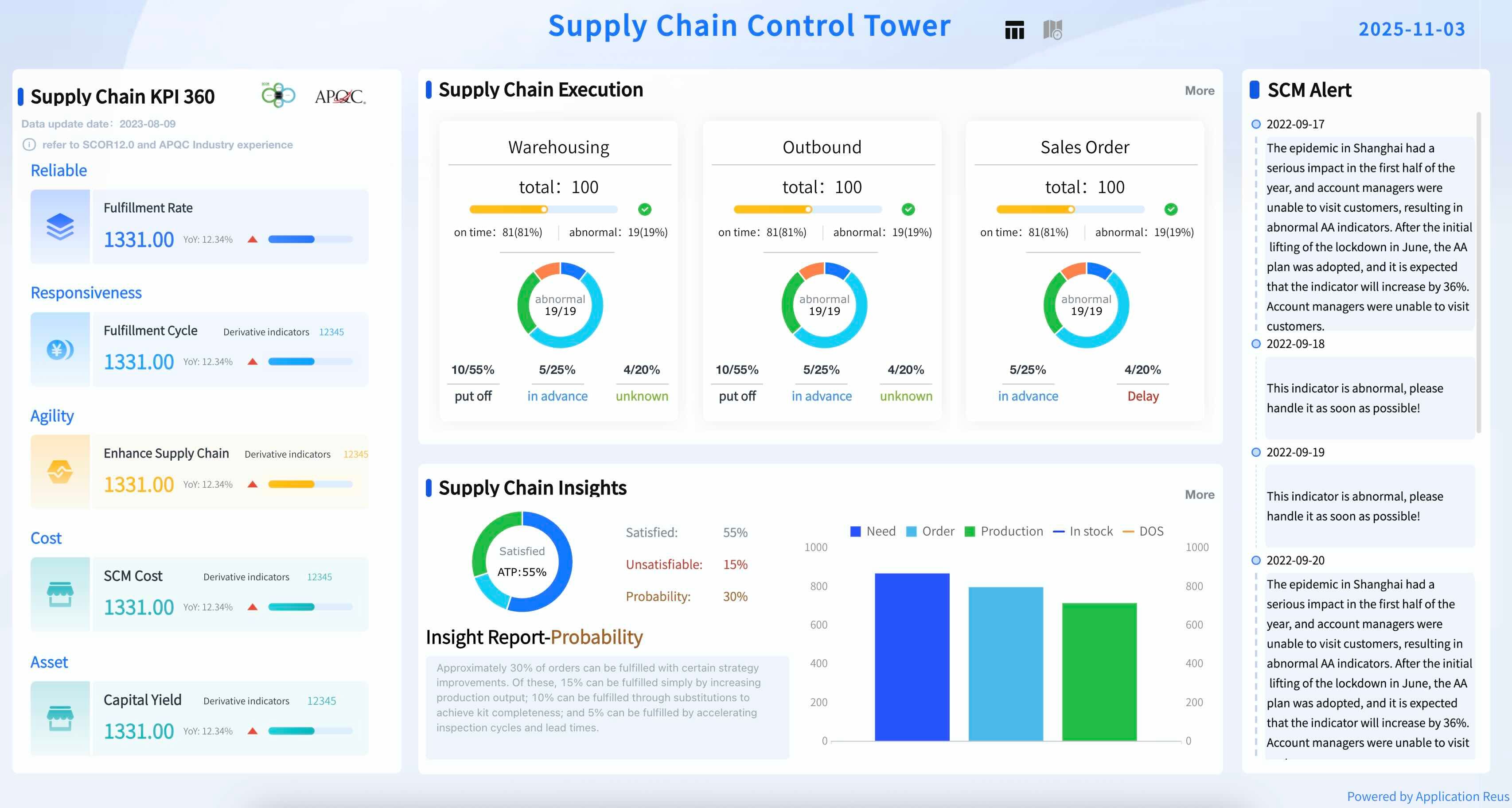
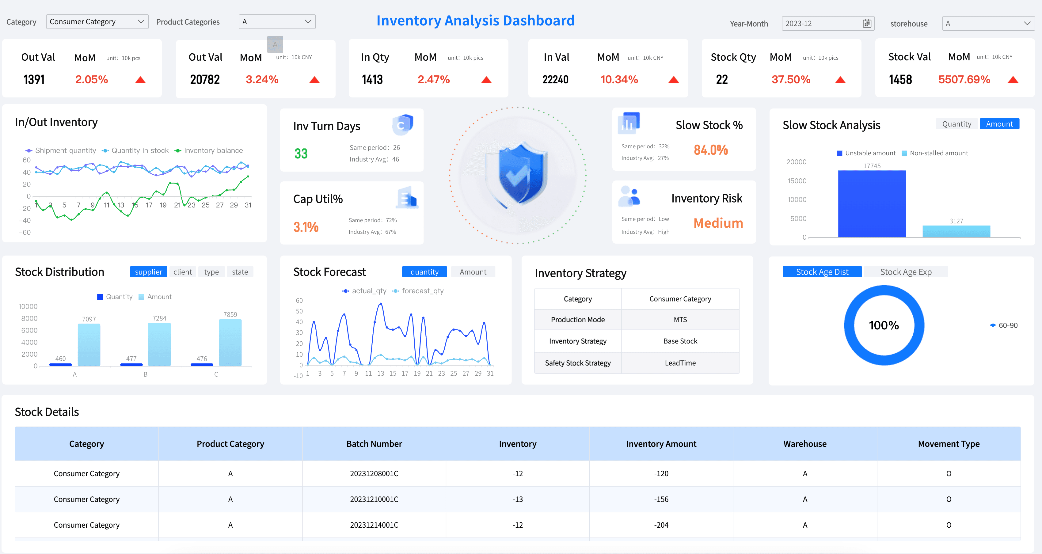
From equipment performance and production yield to quality control and inventory management, manufacturing leaders have lots of choices when it comes to tracking operational progress. Here are a few examples to consider as you design your own dashboards.
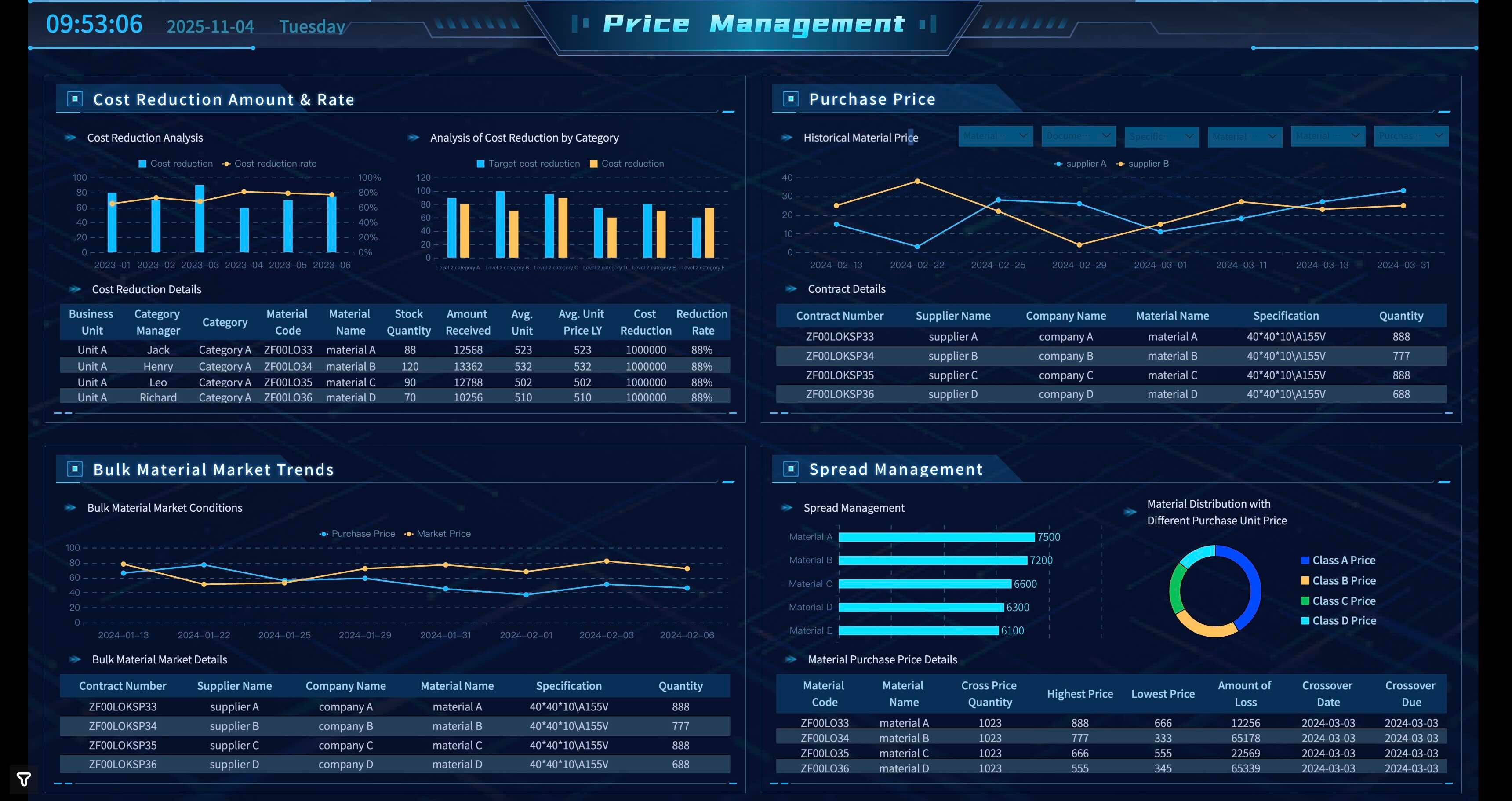
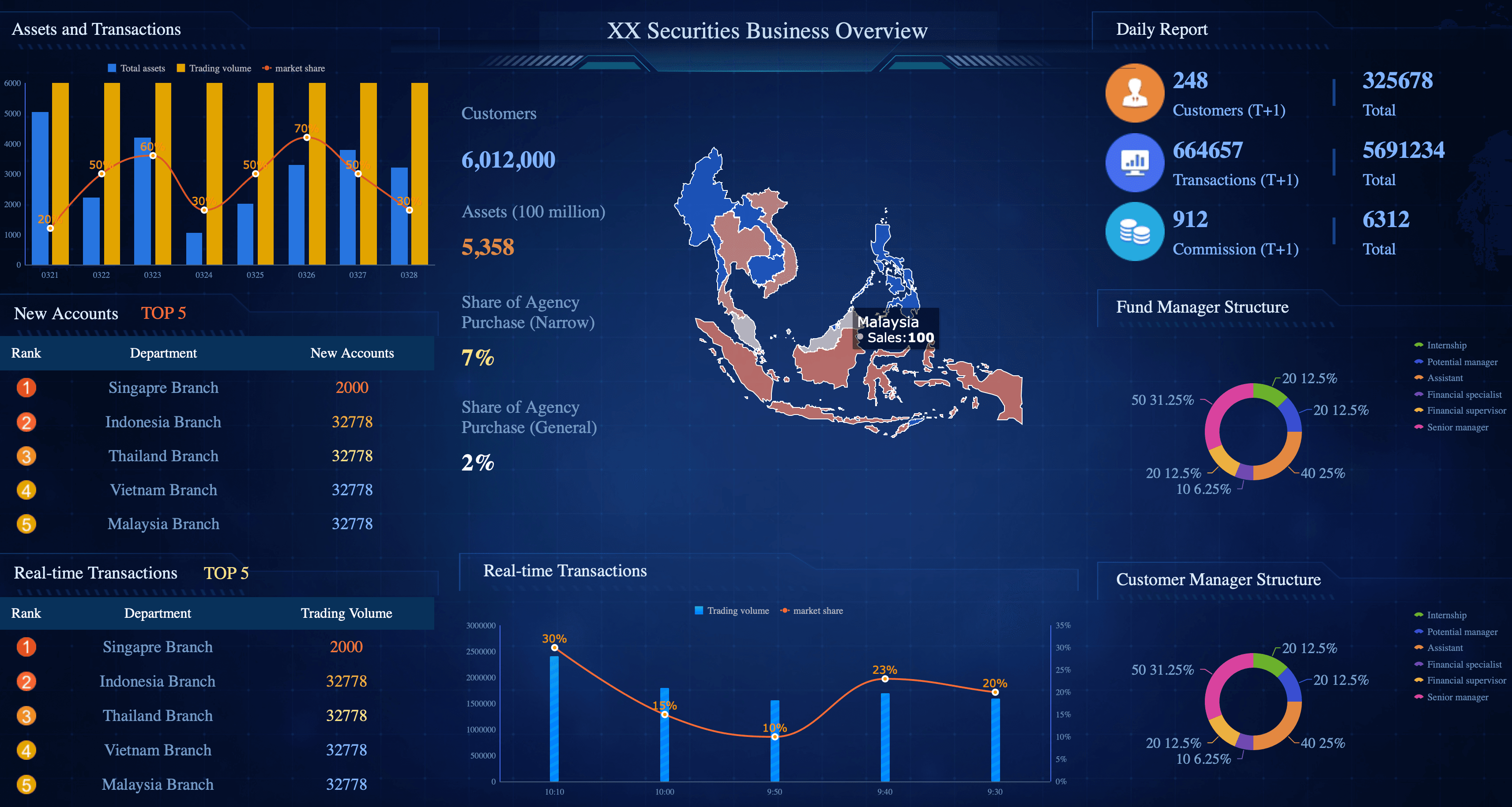
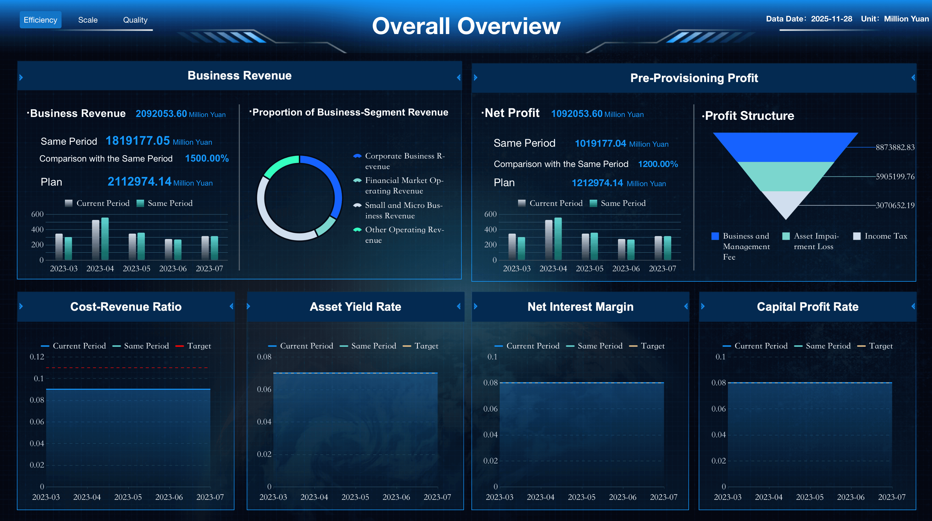
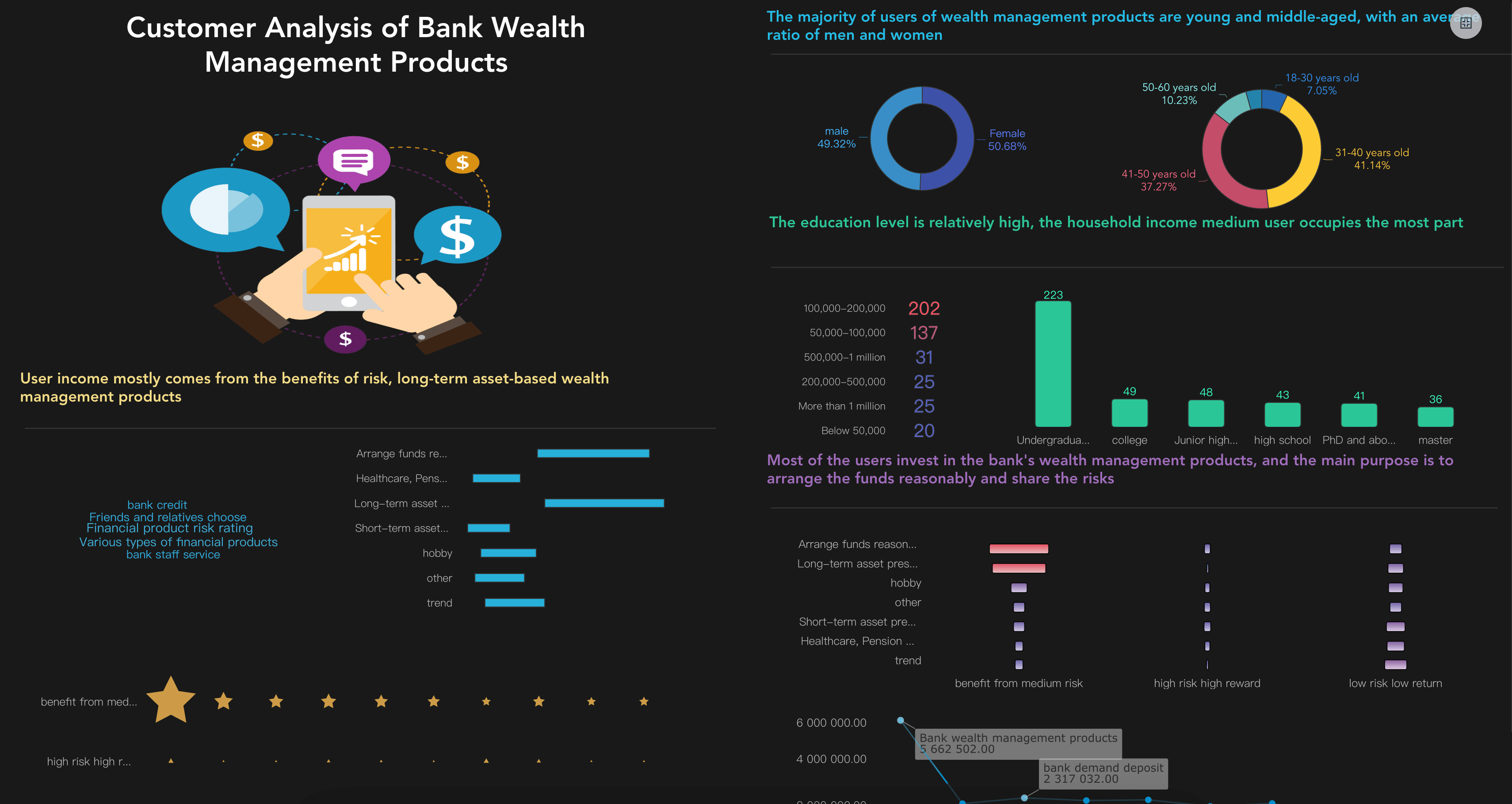
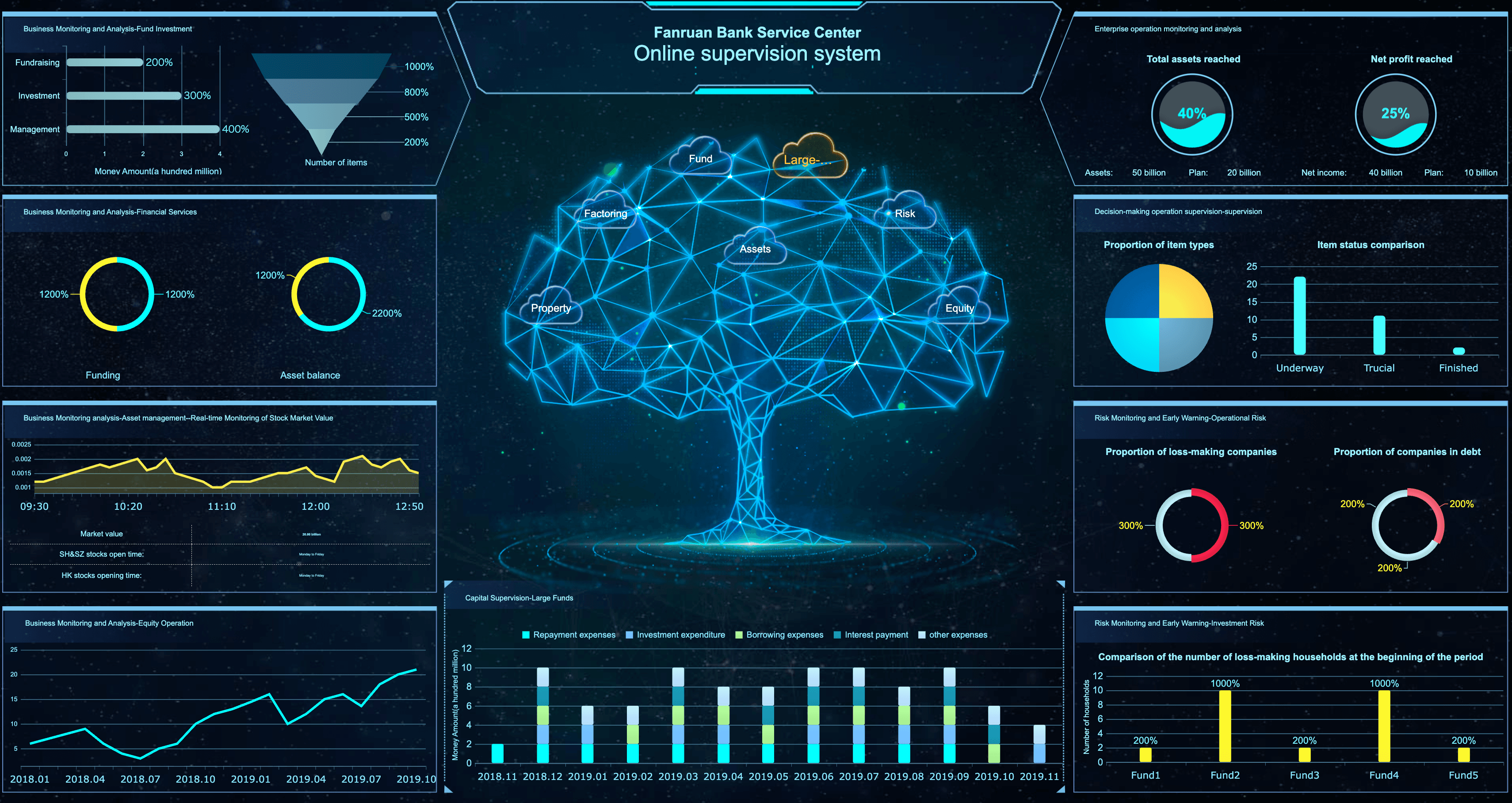
Financial Services
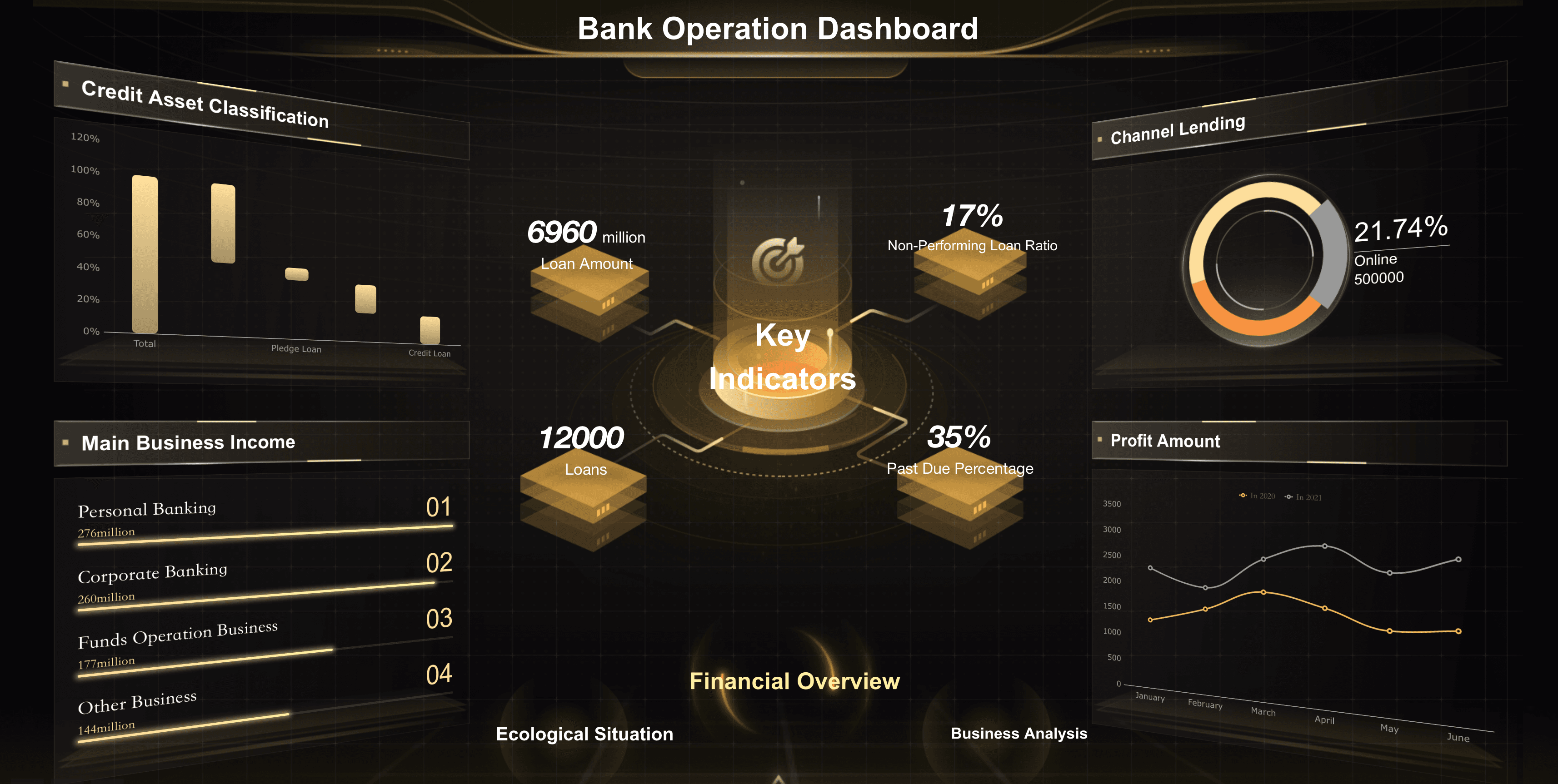
Ensure your banking and wealth management teams maximize portfolio growth and institutional profitability by tracking and regularly reviewing financial services key performance indicators, including those for assets under management, loan origination, and client retention. Here are some examples of KPIs for financial services teams:
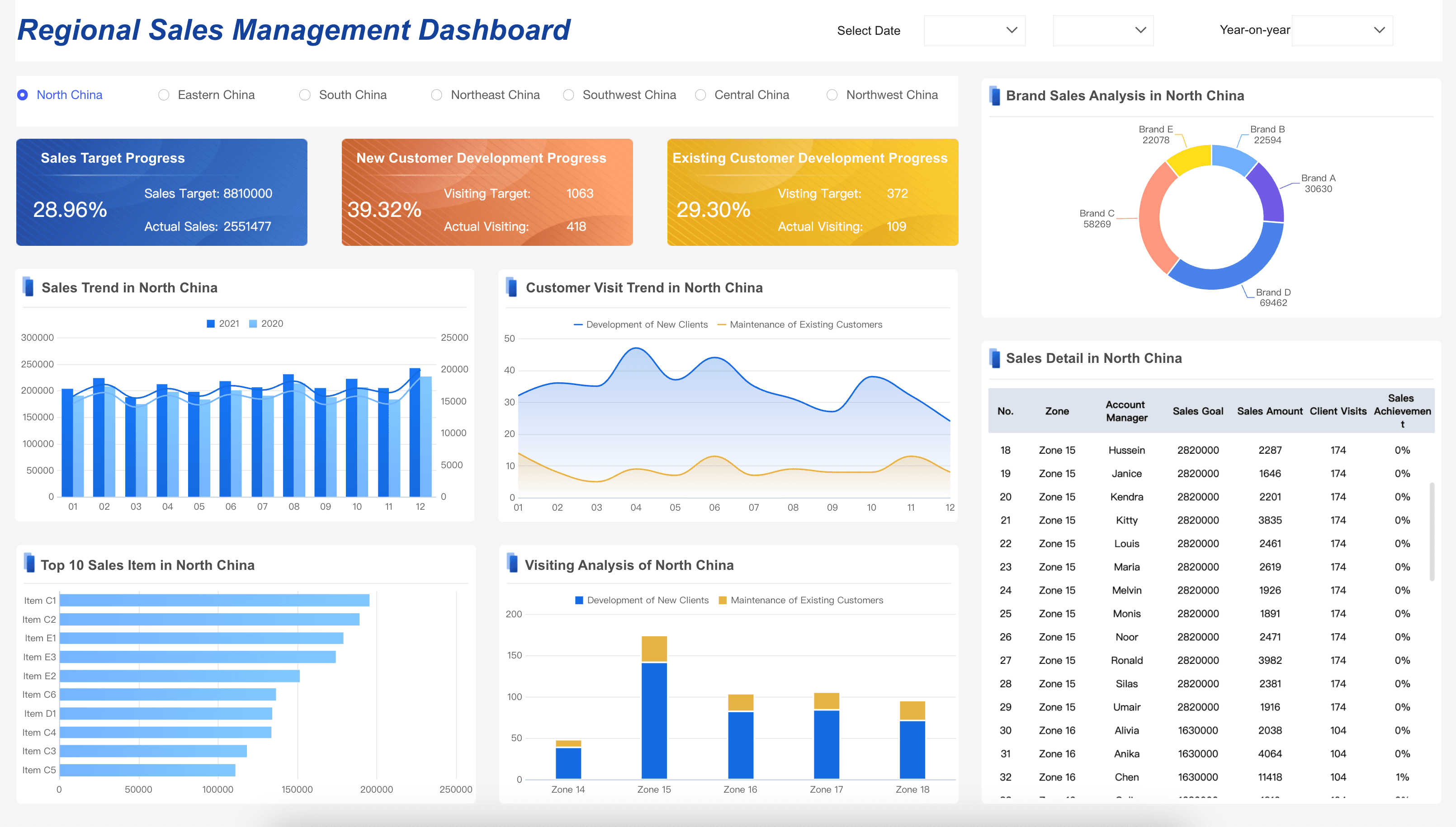
Retail
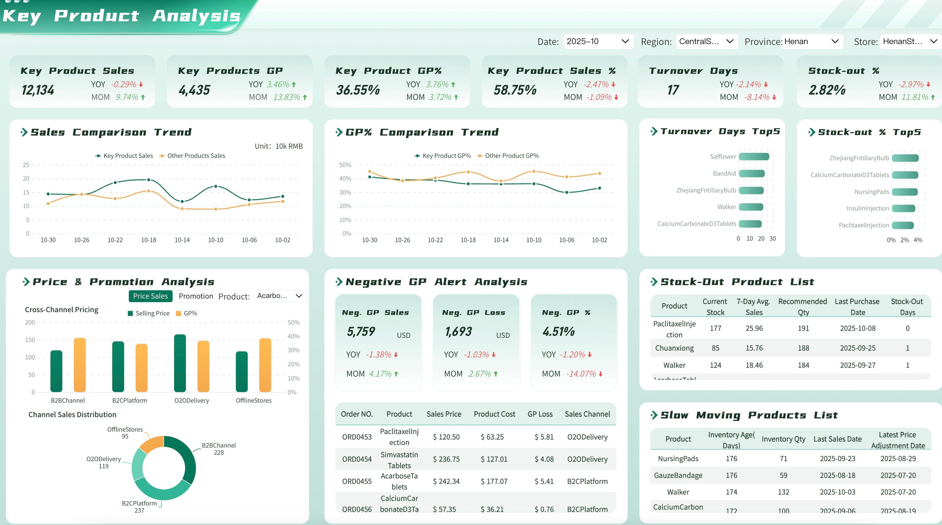
Ensure your store managers and retail teams are maximizing profitability by tracking and regularly reviewing retail performance metrics, including those for inventory turnover, foot traffic, and store sales. Here are some examples of key metrics for retail dashboards:
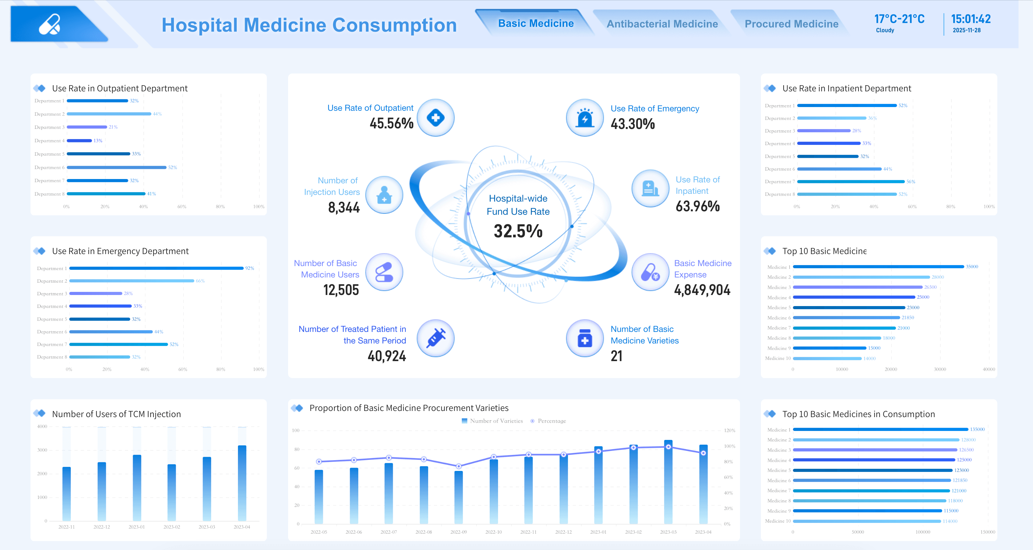
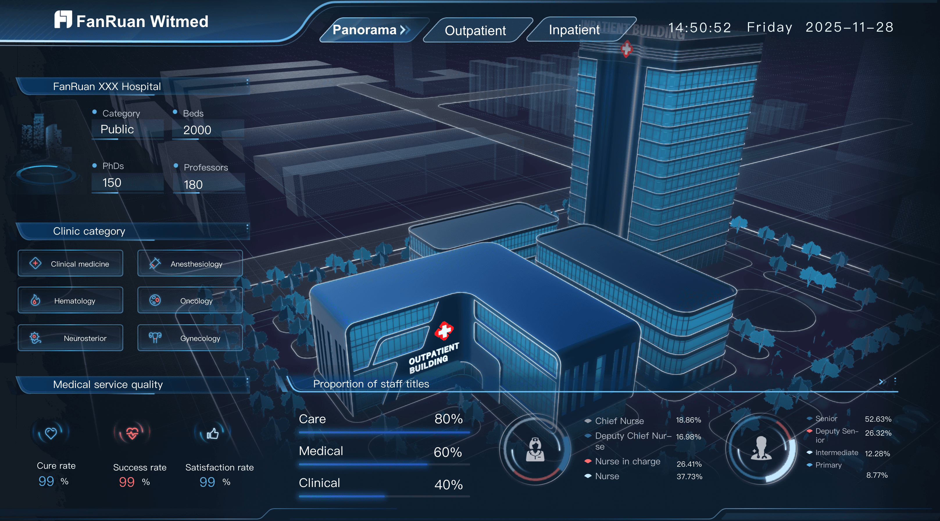
Healthcare
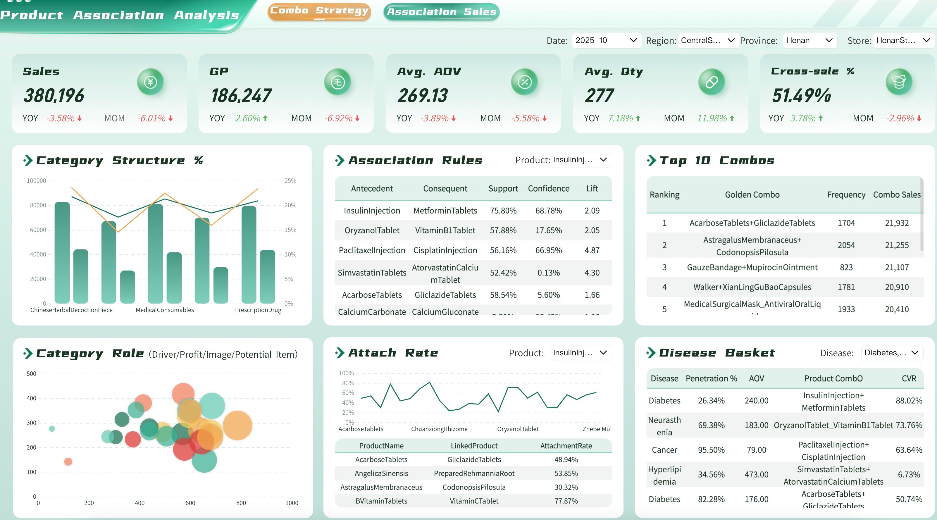
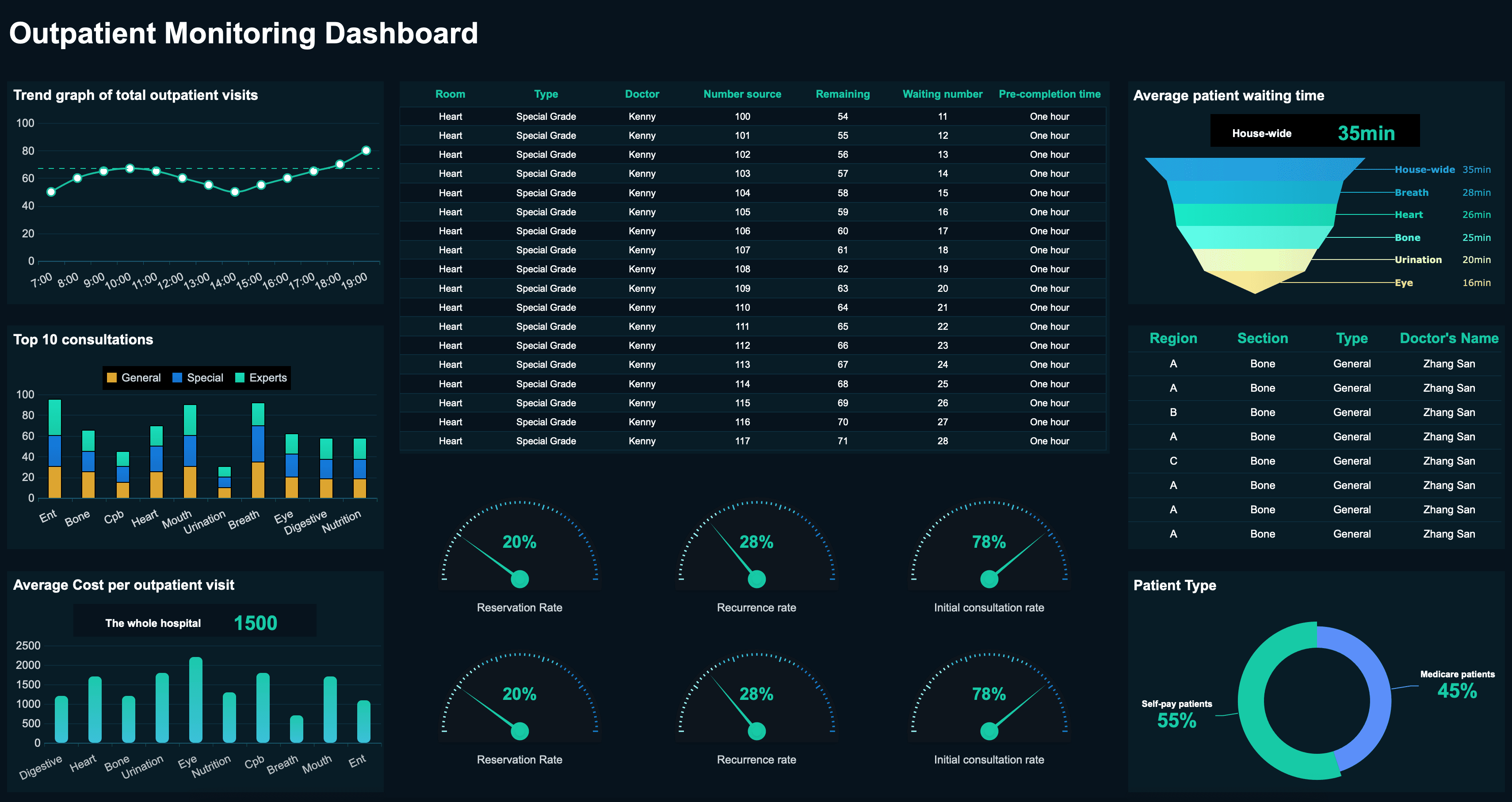
Ensure your hospital administrators and clinical leaders are optimizing patient care and facility operations by tracking and regularly reviewing healthcare key performance indicators, including those for patient wait times, bed occupancy, and treatment costs. Here are some examples of KPIs for healthcare teams:
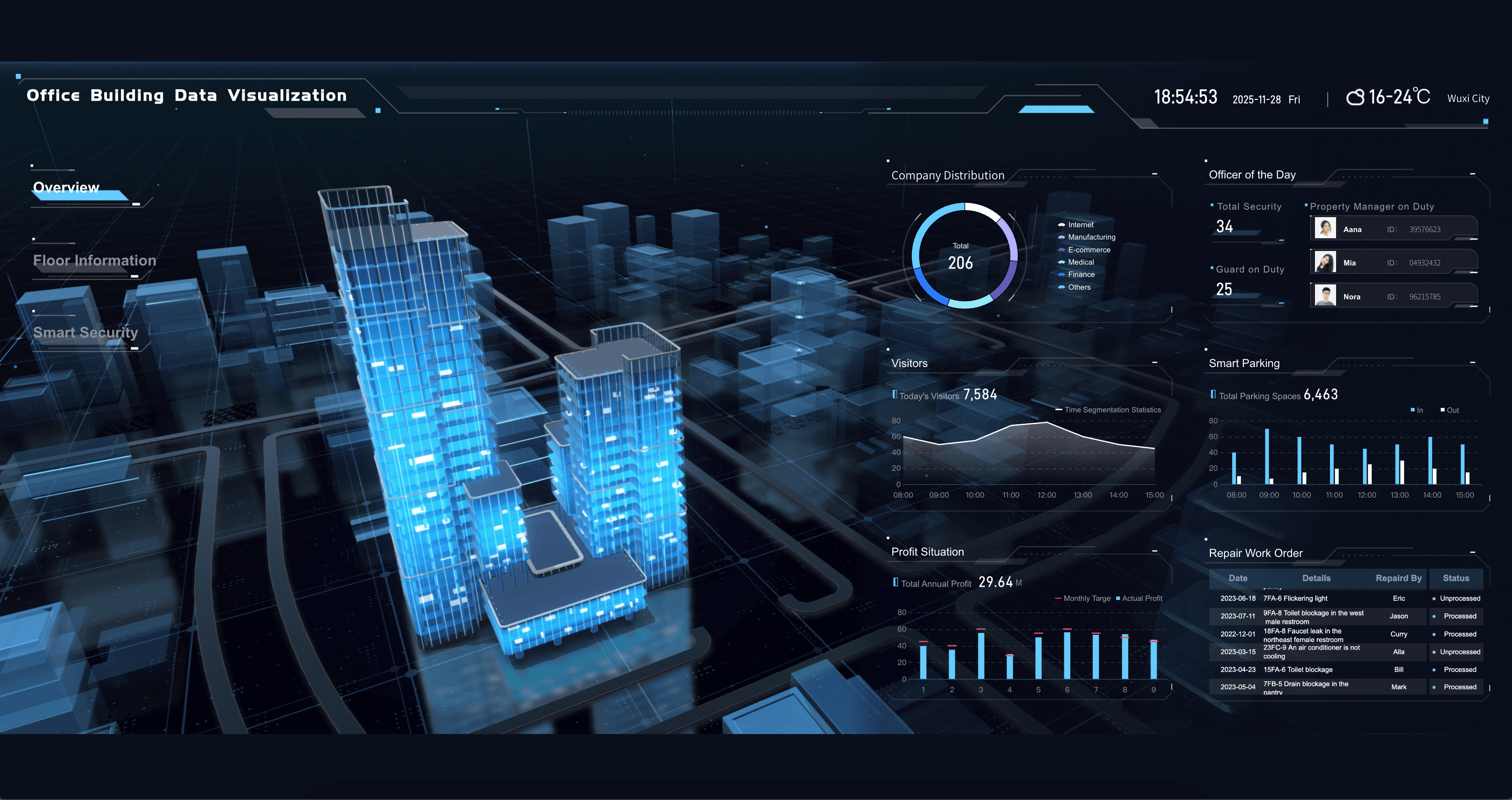
Real Estate
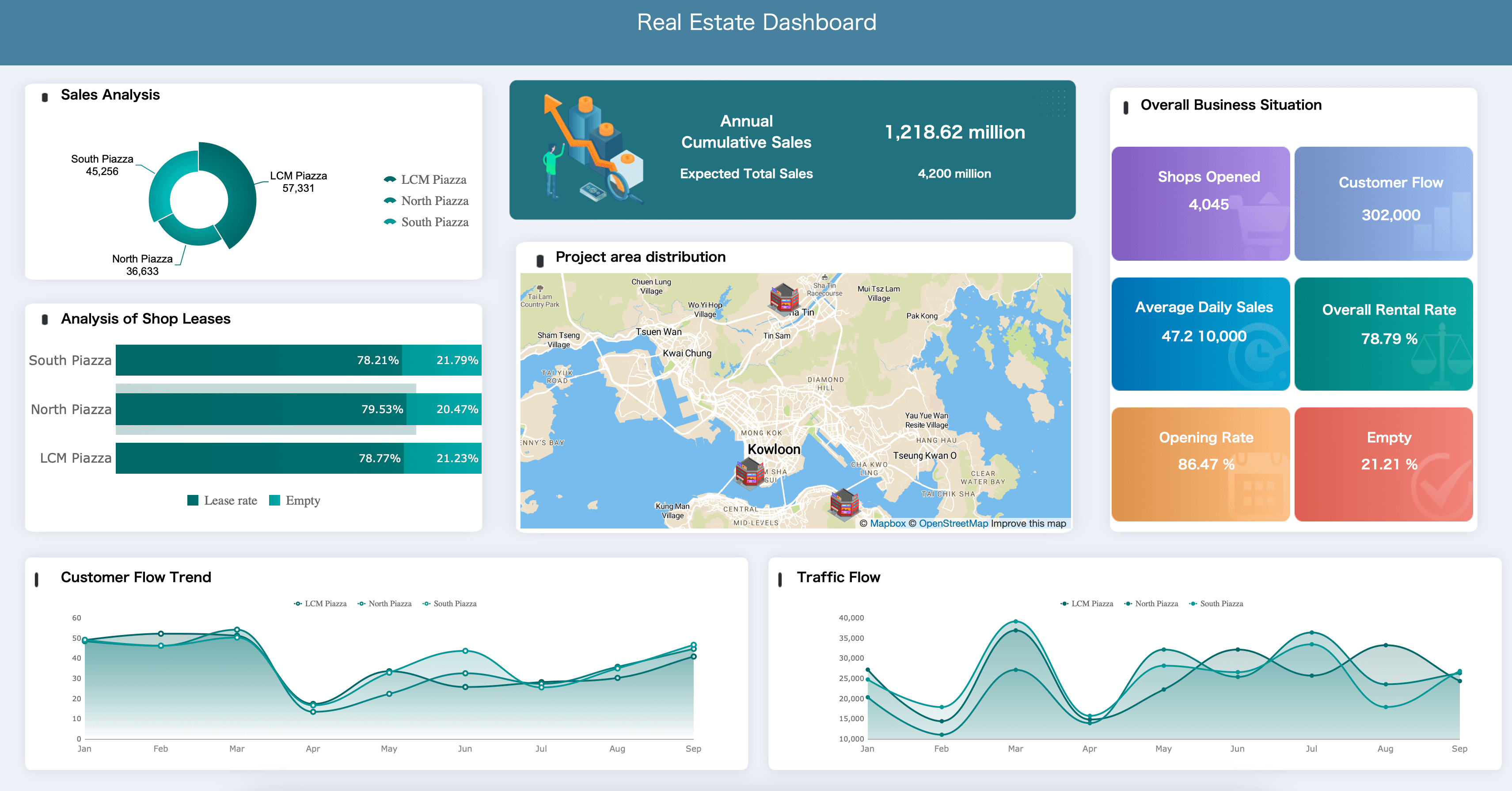
Ensure your property managers and real estate agents are maximizing portfolio value by tracking and regularly reviewing property performance metrics, including those for occupancy rates, rental yields, and operating costs. Here are some examples of key metrics for real estate dashboards:
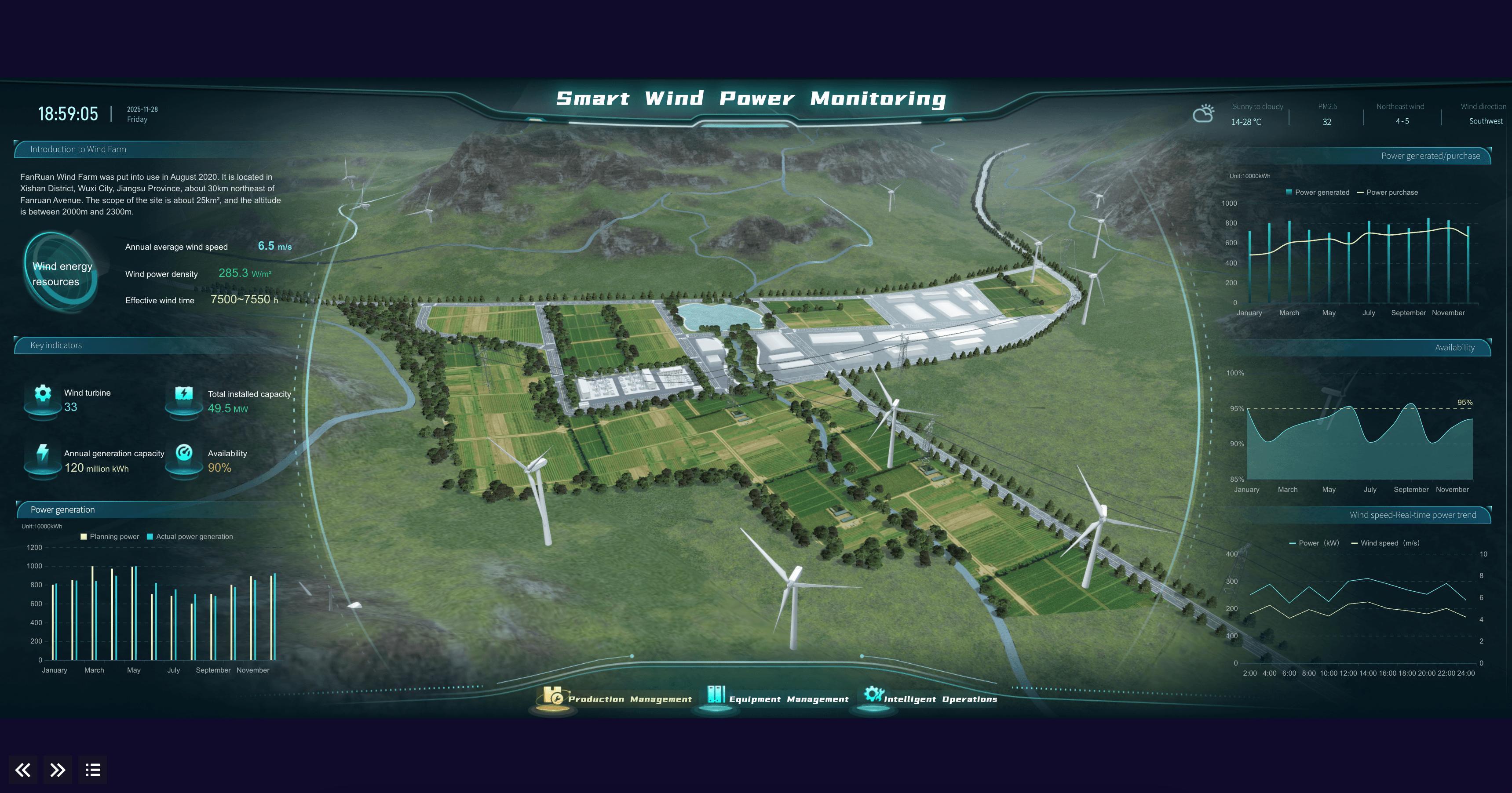
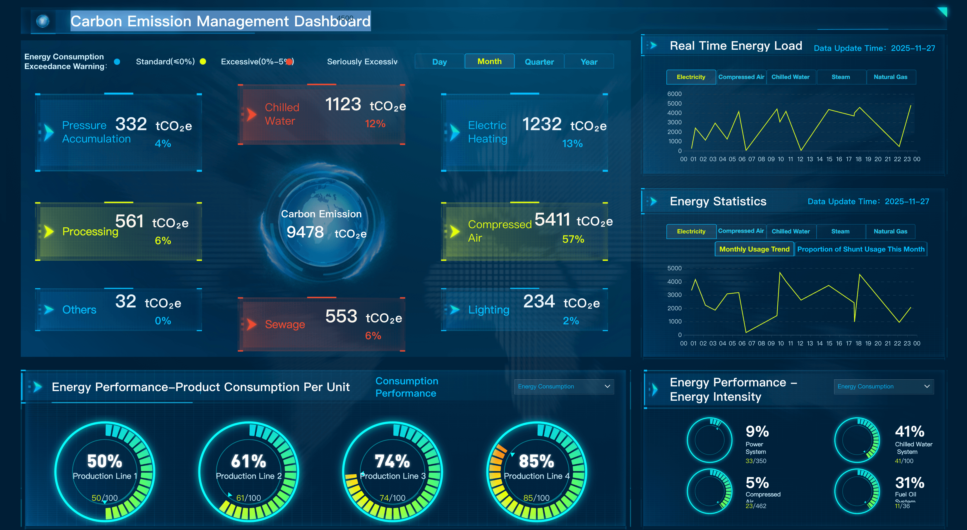
Energy & Utilities
Ensure your plant operators and grid managers are optimizing energy distribution and asset reliability by tracking and regularly reviewing utility key performance indicators, including those for power generation, grid stability, and outage response. Here are some examples of KPIs for energy and utilities teams:

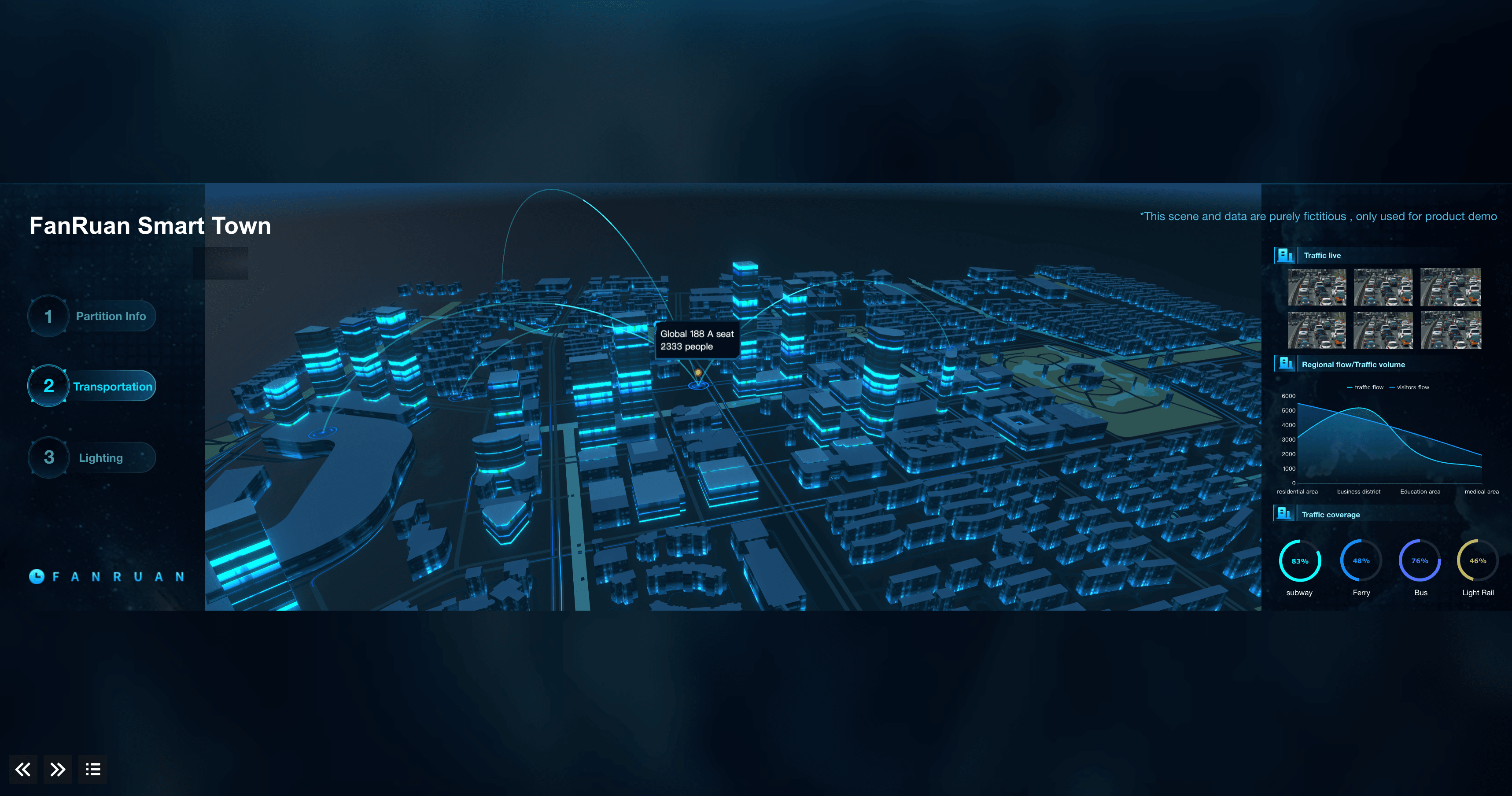
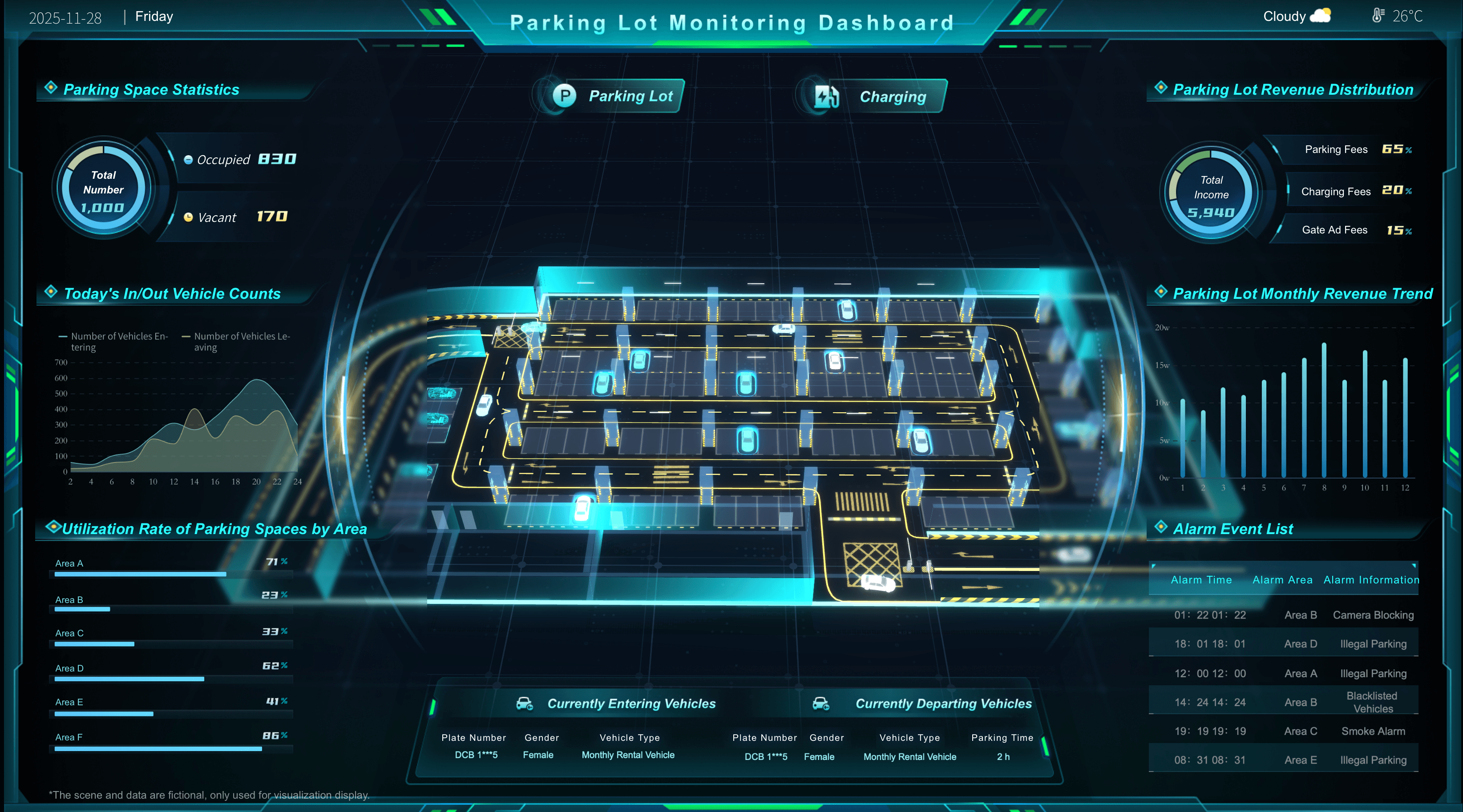
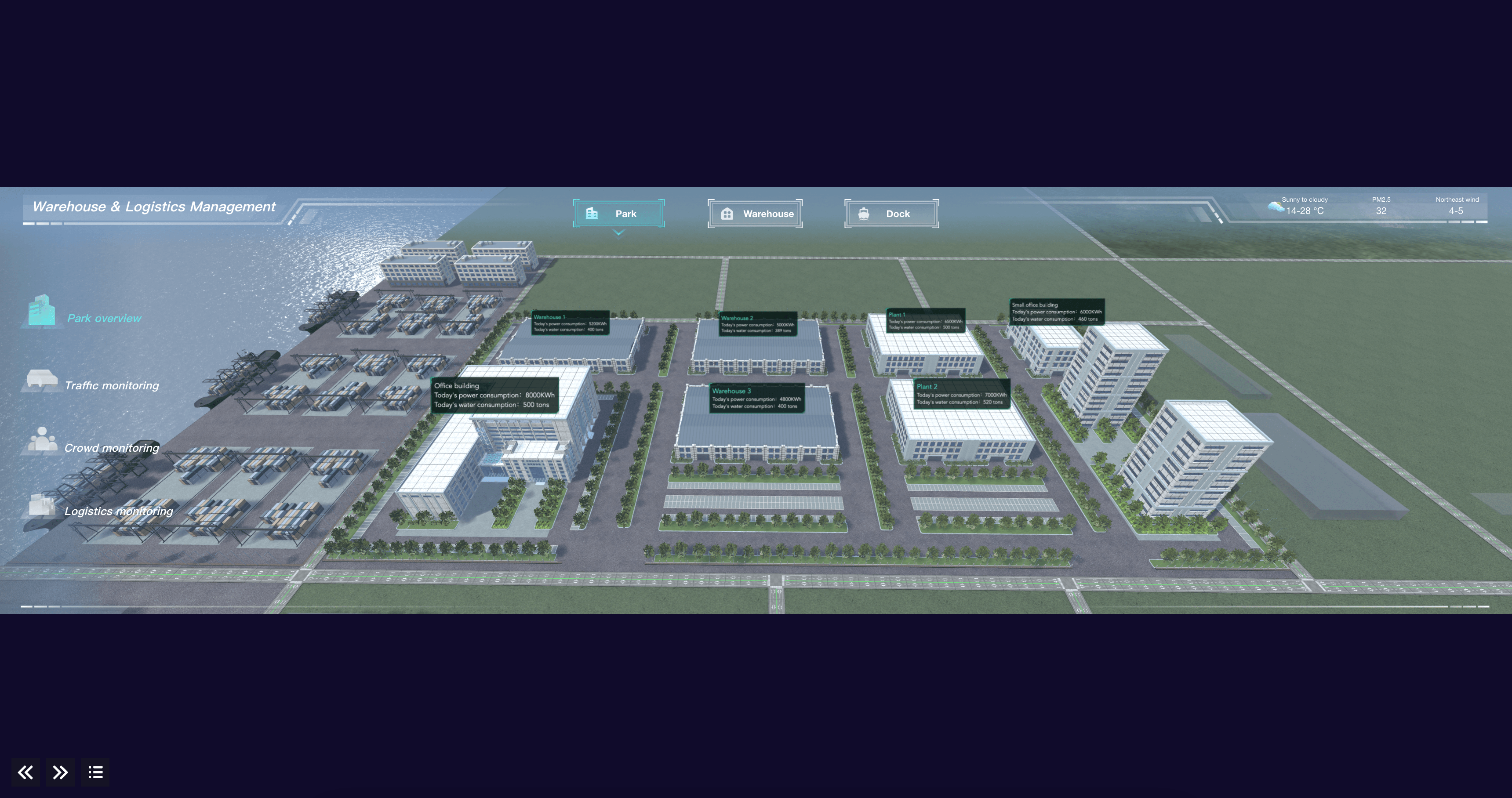
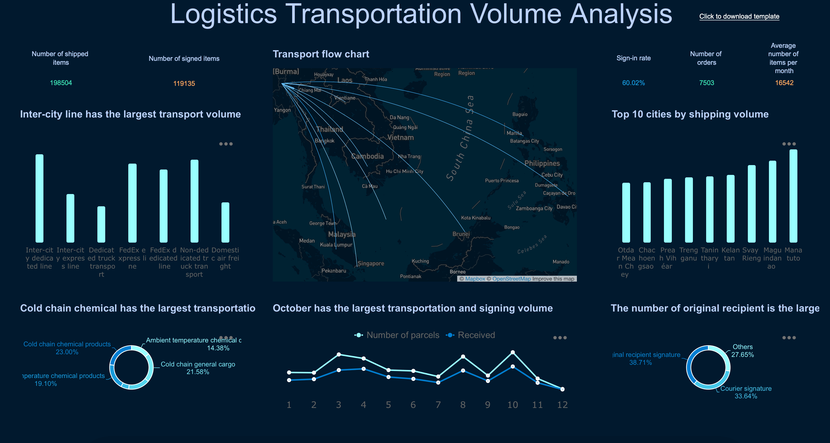
Transportation & Logistics
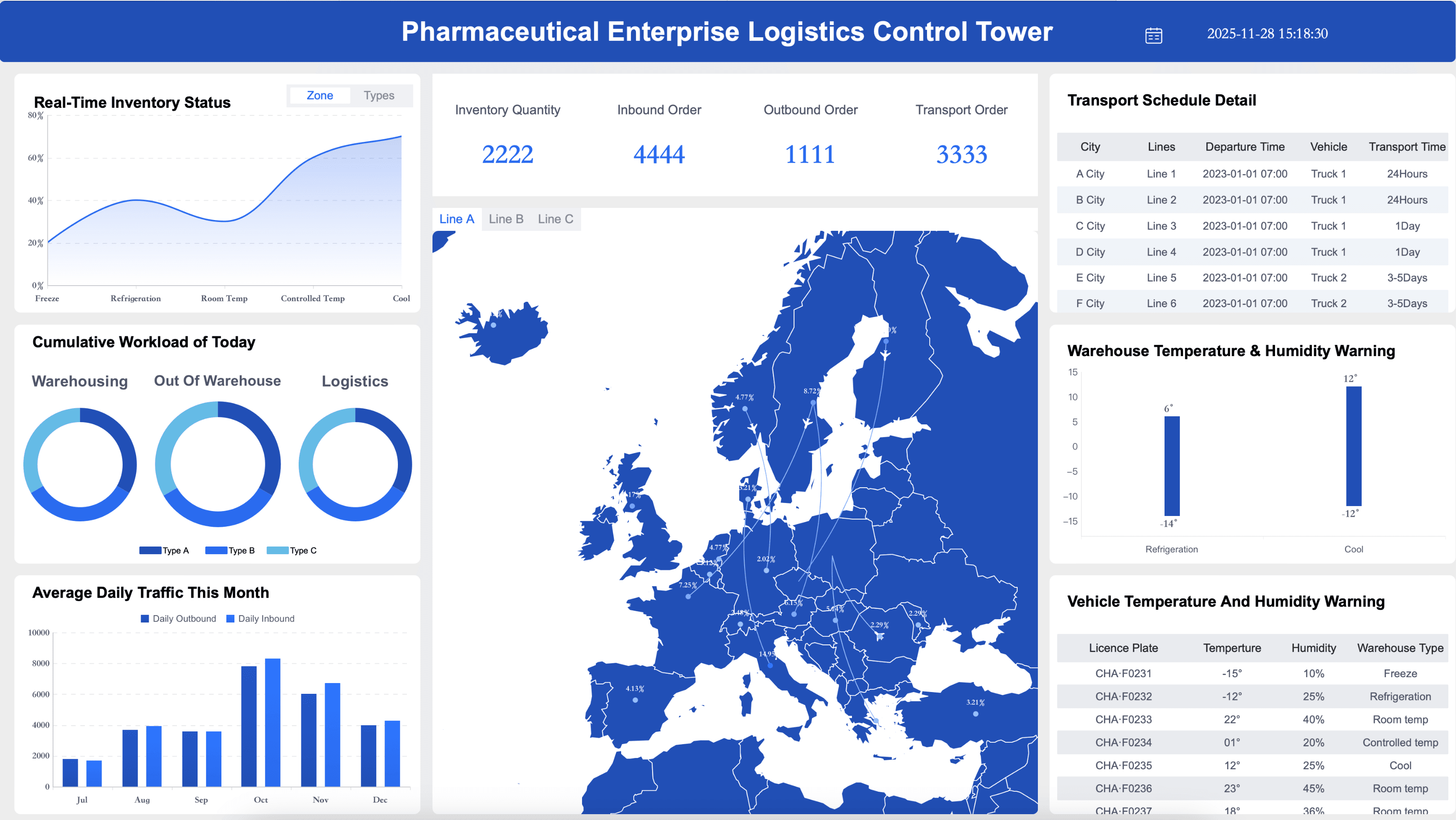
Ensure your fleet managers and supply chain teams are maximizing delivery efficiency by tracking and regularly reviewing logistics key performance indicators, including those for transit times, freight costs, and vehicle maintenance. Here are some examples of KPIs for transportation and logistics teams:
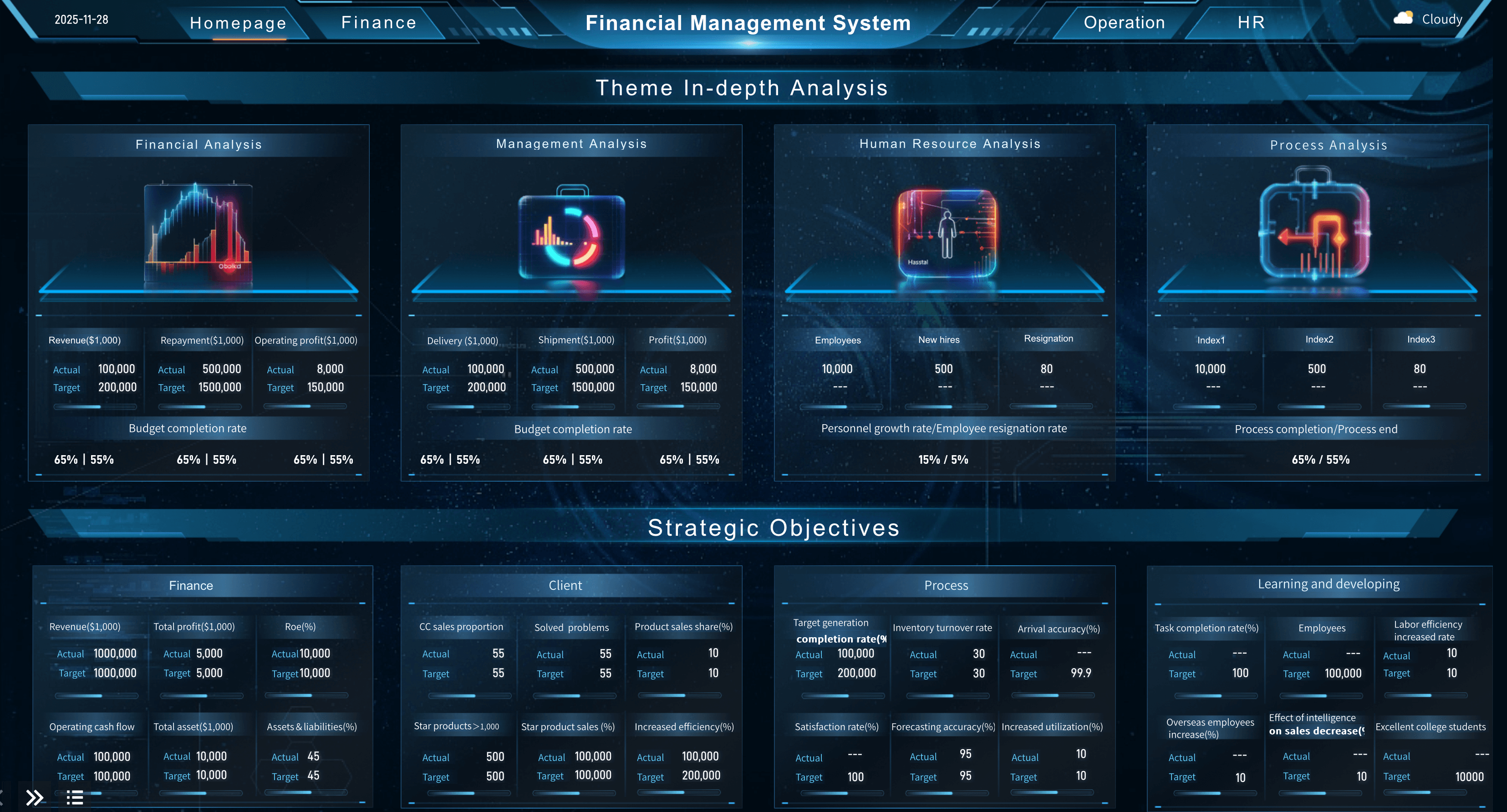
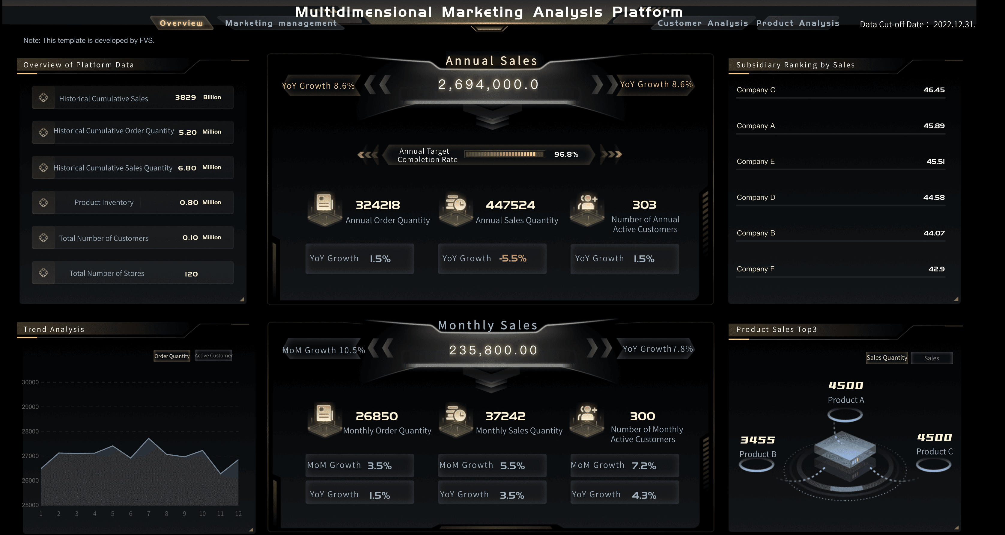
General Business
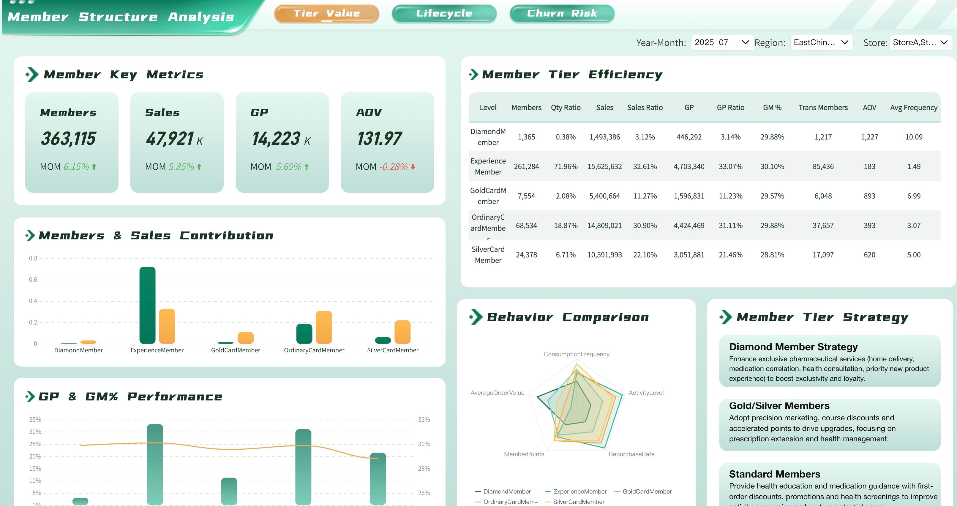
Ensure your executive leaders and department heads are driving sustainable growth by tracking and regularly reviewing general business key performance indicators, including those for overall profitability, operational efficiency, and customer satisfaction. Here are some examples of KPIs for general business management:

FAQs
A business dashboard is a visual information management tool used to track, analyze, and display key performance indicators (KPIs) and metrics in real-time.
Dashboards can be either strategic, operational, or analytical, and apply to specific business units. For example, finance visualizes revenue growth and net profit margins, sales monitors pipeline and sales by region, customer service tracks customer effort scores and average resolution time, and marketing might display traffic-to-lead ratios and campaign ROI. Operational dashboards could include daily order fulfillment and live server uptime.
There are many factors to consider as you develop your business dashboards. Here are some to keep in mind: Define how they will be used by the end-user, tie them to strategic goals, choose the right visualizations (clear, accurate, and context-rich), make them understandable, adjust the layout as needed, and take care to avoid visual overload by displaying only the most important metrics.
While every organization is different, there are a few ways to create high-performing dashboards: include a balance of high-level overviews and detailed drill-downs, create a data-driven culture by increasing data literacy, and regularly review and adjust your visualizations as your users, market, and business goals change.
