
What is Data Analytics?
Data Analytics vs. Data analysis
People often use data analytics and data analysis as if they mean the same thing. They overlap, but they are not identical.
Data analysis is usually the act of examining data to answer a specific question. A sales analyst may analyze why revenue fell in one region. A finance team may analyze margin variance. A marketing manager may analyze conversion by landing page.
Data analytics is broader. It includes the data model, metric definitions, dashboards, workflows, analysis methods, tools, governance, and action process that make those investigations repeatable. A single analysis answers one question. Data analytics helps the organization keep asking better questions.
For a deeper comparison, use data analysis vs data analytics as a supporting read. The distinction matters because many teams try to solve an analytics problem with a one-off analysis. That works once. It does not create shared definitions, scheduled review, access control, or a learning loop.
Benefits of Data Analytics
Most companies already have data. They have CRM exports, ERP tables, campaign dashboards, warehouse logs, spreadsheets, finance reports, support tickets, product events, and leadership decks. The hard part is connecting those signals in a way that people trust.
Good data analytics helps teams reduce repeated debates about numbers. It gives people a shared place to check the metric, inspect the driver, see the context, and decide what to do next.
Common benefits include:
- Faster performance review. Teams can see whether revenue, margin, service level, conversion, delivery, quality, or workforce metrics are moving in the right direction.
- Better root-cause diagnosis. Users can drill from a headline KPI into region, product, channel, customer, supplier, plant, owner, or time period.
- Clearer metric ownership. A governed metric dictionary reduces arguments about how a KPI is calculated.
- Better planning. Forecasts, scenario views, and trend analysis help teams test assumptions before they commit resources.
- Stronger cross functional alignment. Sales, marketing, finance, operations, and IT can use the same definitions instead of bringing separate exports to the same meeting.
- Less manual reporting work. Recurring dashboards and scheduled reports reduce screenshot collection, spreadsheet stitching, and last-minute commentary.
- More useful meetings. A meeting improves when the screen can answer what changed, why it matters, who owns the follow-up, and what will be reviewed next.
The practical value is not "more data." The value is fewer unresolved questions after a review. If nobody knows why the KPI moved or who should act, the analytics workflow is not finished.
Don't just collect data. Visualize what matters.
Download the KPI Dashboard Guide to strengthen your data analytics foundation:
- 10 essential steps to build effective KPI dashboards
- How to choose the right charts and avoid visual clutter
- 15 top-notch dashboard templates for 2026

Types of Data Analytics
Data analytics is often explained through four types. The model is useful, but it should not become a checklist that teams rush through. Most organizations need a trusted descriptive layer before predictive or prescriptive work can be useful.
Descriptive analytics
Descriptive analytics explains what happened. It is the foundation for most dashboards and reports.
Examples include:
- Revenue by month, region, product, and channel
- Gross margin, expense, cash flow, and budget variance
- Leads, conversion, campaign spend, and pipeline contribution
- Inventory turnover, on-time delivery, supplier performance, and order cycle time
- Production output, yield, downtime, defect rate, and throughput
- Headcount, turnover, hiring progress, attendance, and labor cost
- Customer retention, churn, purchase frequency, satisfaction, and support backlog
Descriptive analytics becomes more useful when users can move from a top-level metric to the detail behind it. A revenue chart should lead to product, region, customer, channel, owner, and time breakdowns.
Diagnostic analytics
Diagnostic analytics explains why something changed. It connects a KPI to its drivers.
Use it when you need to know:
- Why did revenue rise while margin fell?
- Why did qualified leads drop even though traffic increased?
- Why did delivery performance decline in one region?
- Why did one plant miss the production plan?
- Why did customer churn increase after onboarding?
- Why did labor cost rise faster than headcount?
Diagnostic analytics depends on context. A chart can show that churn increased. It may not explain whether the cause was product fit, onboarding delay, support quality, pricing, contract timing, or a data definition change.
Predictive analytics
Predictive analytics estimates what may happen next. It can support sales forecasting, churn prediction, demand planning, inventory risk, maintenance planning, capacity review, and budget pacing.
If your team is exploring this layer, predictive analytics tools can help with modeling, but the tool is not the whole answer. A prediction needs a business owner, a known data source, a review process, and a decision path.
Prescriptive analytics
Prescriptive analytics suggests possible next actions. It may recommend changing inventory allocation, adjusting campaign spend, reviewing a risk account, prioritizing a service case, updating production priority, or assigning a follow-up owner.
This layer needs governance. A recommendation can affect customers, operations, budgets, and people. The output should show evidence, assumptions, constraints, permission boundaries, and human review points.
For larger datasets and more complex processing, teams may also explore big data analytics tools or big data analytics solutions. These are useful when volume, variety, or speed exceeds what a simple BI workflow can handle.
Metrics of Data Analytics
Data analytics metrics should start with the decision, not with the available chart types. A CFO, sales director, campaign manager, plant manager, HR leader, and customer success lead should not start from the same screen.
Use the smallest metric set that can explain performance, diagnose movement, and guide follow-up.
Executive Performance
- Example metrics: Revenue, profit, margin, cost, growth, target achievement, risk exposure
- What it helps answer: Is the organization on track?
Finance
- Example metrics: Budget variance, cash flow, expense ratio, gross margin, working capital, receivables aging
- What it helps answer: Where is financial performance changing?
Sales
- Example metrics: Pipeline, win rate, sales cycle, average deal size, quota attainment, forecast accuracy
- What it helps answer: Which deals, regions, or teams need attention?
Marketing
- Example metrics: Spend, traffic, leads, conversion, CAC, ROAS, pipeline contribution, campaign ROI
- What it helps answer: Which channels and campaigns create useful demand?
Operations
- Example metrics: Throughput, cycle time, backlog, SLA attainment, utilization, process exceptions
- What it helps answer: Where is work slowing down?
Supply Chain
- Example metrics: Inventory turnover, stockout risk, on-time delivery, fill rate, supplier lead time, freight cost
- What it helps answer: Can the business meet customer demand at the right cost?
Manufacturing
- Example metrics: Output, yield, downtime, OEE, defect rate, plan attainment, WIP aging
- What it helps answer: Can production meet plan with acceptable quality?
HR
- Example metrics: Headcount, turnover, hiring progress, absence, retention, labor cost, performance distribution
- What it helps answer: Is the workforce plan healthy?
Customer & CRM
- Example metrics: Retention, churn, customer lifetime value, account health, support response, renewal, expansion
- What it helps answer: Which customers need attention, and why?
Data Quality
- Example metrics: Missing values, duplicate records, stale data, refresh delay, owner coverage, definition conflicts
- What it helps answer: Can users trust the analysis?
Most data analytics systems work better with three metric layers:
- Outcome metrics: revenue, profit, retention, service level, quality, risk, or strategic target.
- Driver metrics: traffic, conversion, spend, capacity, inventory, utilization, quality, cycle time, support response, or owner activity.
- Diagnostic fields: date, region, product, customer, account, supplier, campaign, order, plant, employee group, channel, owner, status, and reason code.
Do not put every metric on the first screen. If a number does not change a decision, move it to a drill-down view, an appendix, or a dataset for analysts. A focused data analytics dashboard is easier to use than a crowded page that treats every number as equally important.
Data sources
Data analytics depends on connected, understood, and governed data. Many projects fail because the visual layer looks finished while the data layer remains fragmented.
Common data sources include:
ERP
- Example data: Orders, inventory, procurement, finance, production, master data
- Common analytics use: Cross-functional performance, cost, and operational analysis
CRM
- Example data: Leads, accounts, opportunities, pipeline, owners, activities
- Common analytics use: Sales, customer, account, and forecast analysis
Marketing Platforms
- Example data: Campaigns, spend, clicks, conversions, email, attribution
- Common analytics use: Demand generation, channel performance, funnel diagnosis
Finance Systems
- Example data: Budget, actuals, expenses, invoices, cash flow, margin
- Common analytics use: Financial review, variance analysis, management reporting
WMS & TMS
- Example data: Warehouse movement, shipments, carrier, route, freight cost
- Common analytics use: Inventory, logistics, delivery, and service analysis
MES & IoT
- Example data: Production orders, machine status, downtime, sensor data, quality checks
- Common analytics use: Manufacturing output, quality, asset, and maintenance analysis
HRIS
- Example data: Headcount, hiring, attendance, payroll, turnover, performance
- Common analytics use: Workforce planning, retention, compliance, and labor cost analysis
Customer Support
- Example data: Tickets, SLA, response, resolution, satisfaction, escalation
- Common analytics use: Service quality, churn risk, and customer experience analysis
Product or App Analytics
- Example data: Usage events, feature adoption, sessions, activation, retention
- Common analytics use: Product behavior, lifecycle, and engagement analysis
Spreadsheets
- Example data: Targets, manual plans, local adjustments, notes, exception lists
- Common analytics use: Transitional reporting, planning context, and business assumptions
External Data
- Example data: Market demand, weather, public data, commodity prices, competitor signals
- Common analytics use: Scenario analysis, risk context, and planning assumptions
Before building charts, define the business terms. "Revenue," "active customer," "qualified lead," "available inventory," "on-time delivery," "churn," "gross margin," and "headcount" can mean different things in different systems.
This is where a data analytics strategy becomes practical. The strategy should cover source ownership, refresh frequency, metric definitions, permission rules, data quality checks, and the decision workflow that uses the output.
Examples and Templates
Examples make data analytics easier to plan because they turn broad ideas into concrete decision spaces. The demo cards below come from the Gallery demo file and match common data analytics topics: governed BI operations, KPI summary, drill-down exploration, marketing performance, customer insight, finance, inventory, supply chain, workforce, and forecasting.
Use these examples as learning material. Before copying a layout, ask: Who will use this view? What decision should it support? Which metric definitions must stay consistent across teams?
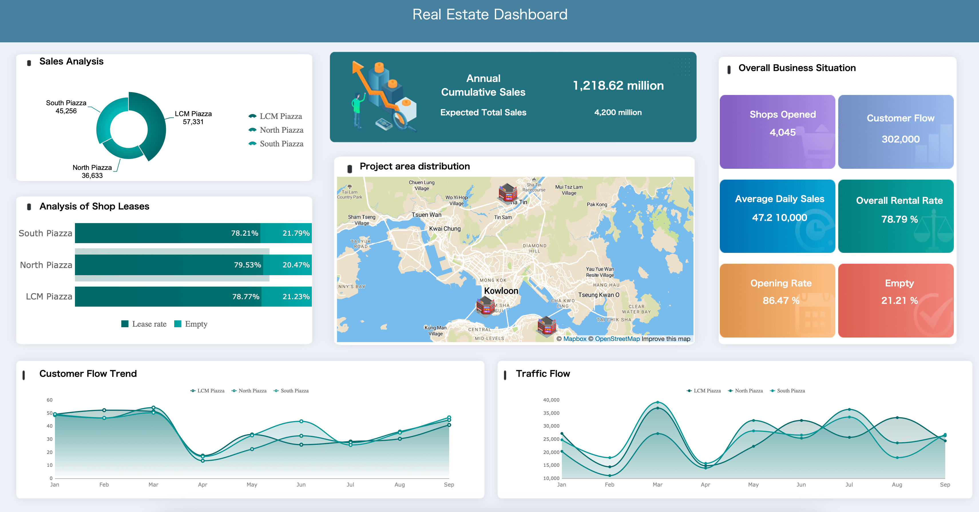
Real Estate Analysis
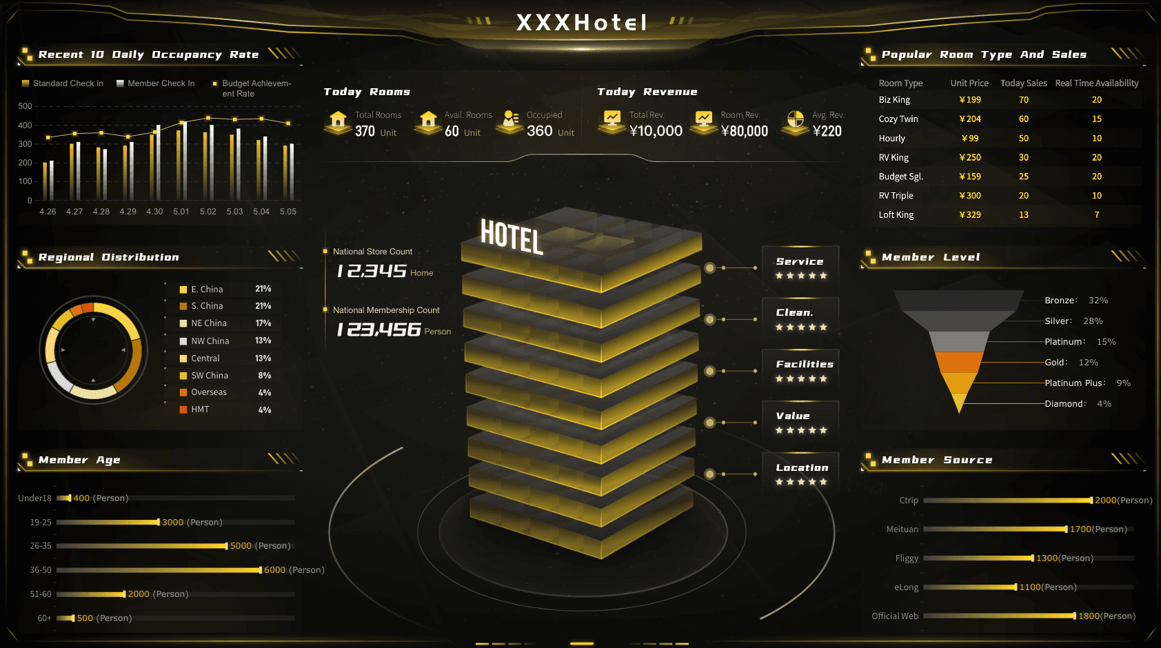
Hotel Operations Dashboard
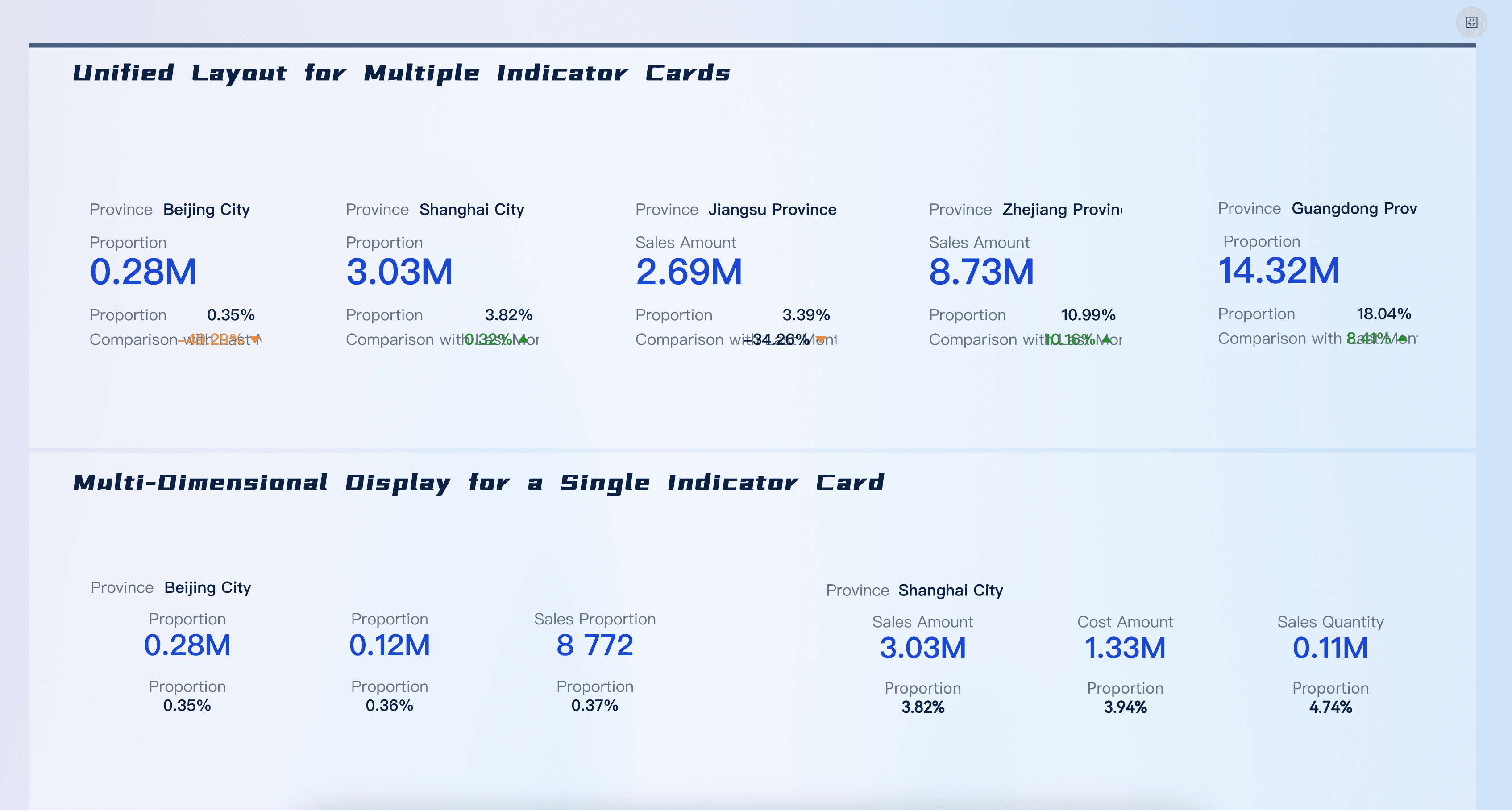
KPI Card
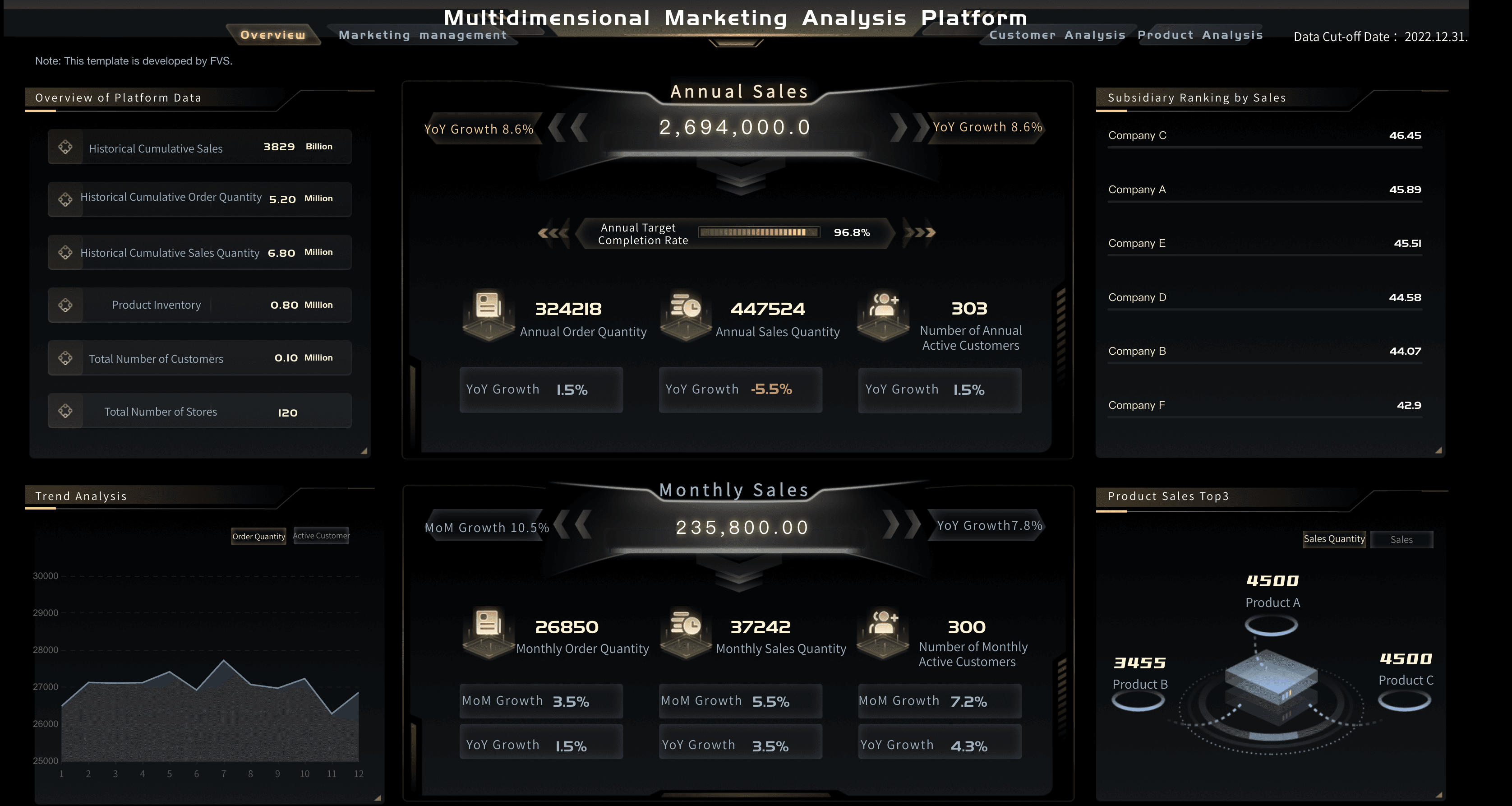
Marketing Analytics Platform
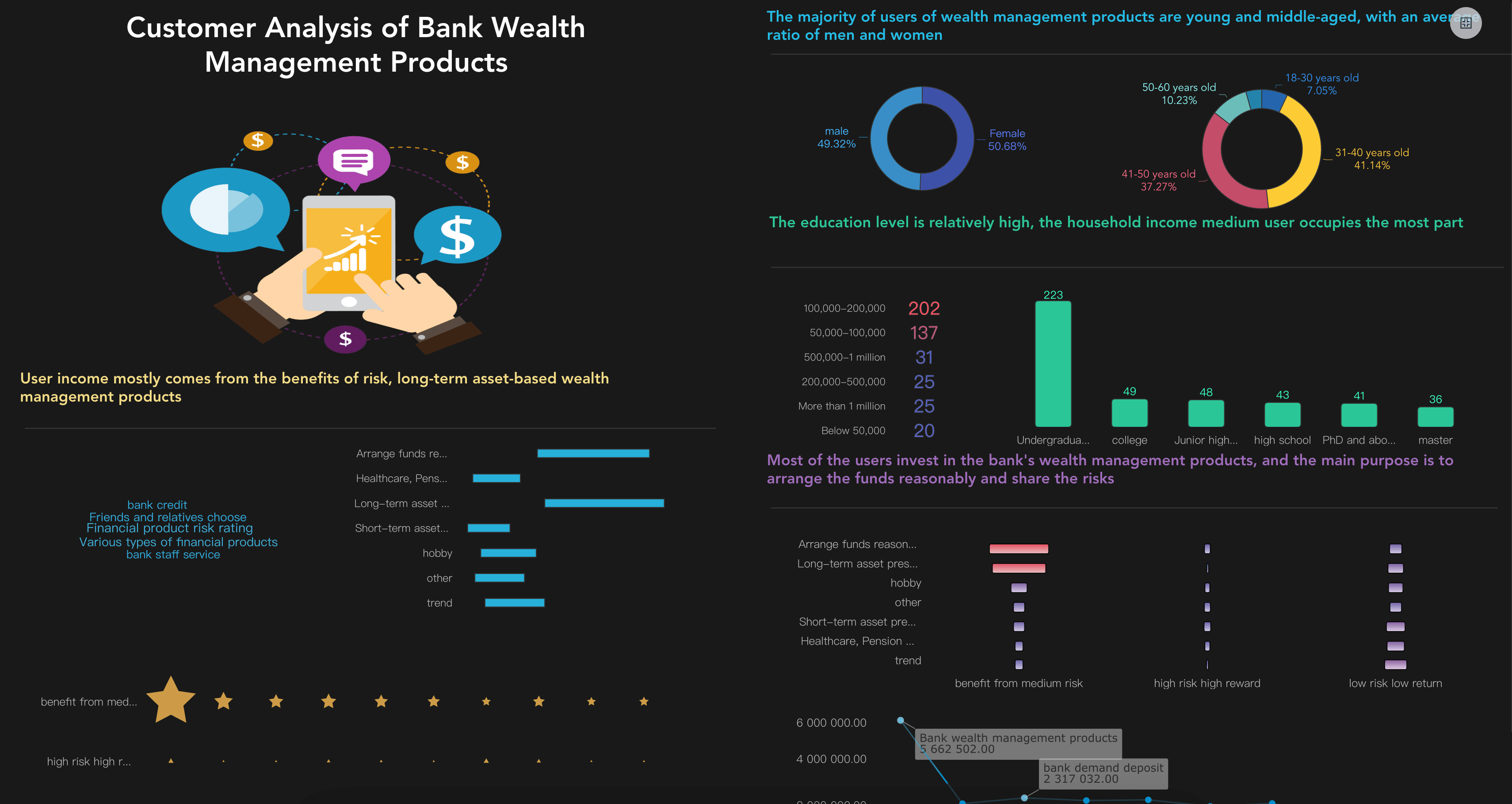
Customer Analytics Dashboard
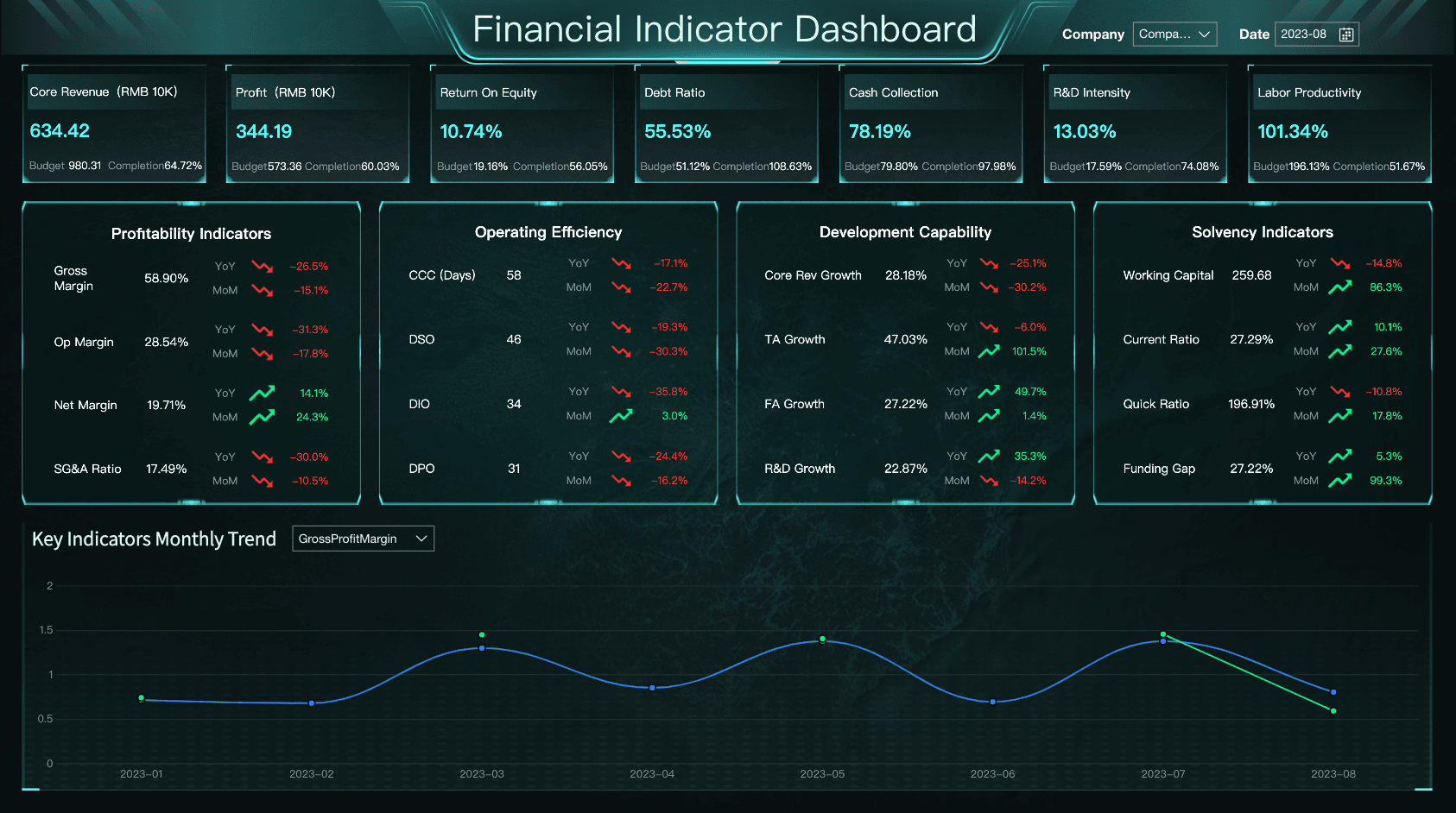
Financial Metrics Dashboard
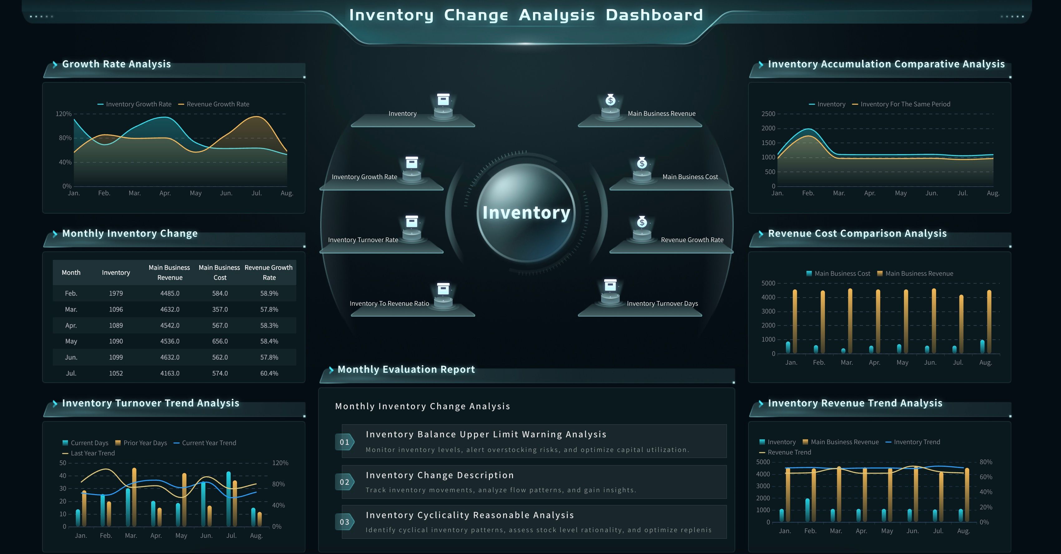
Inventory Movement Analysis Dashboard
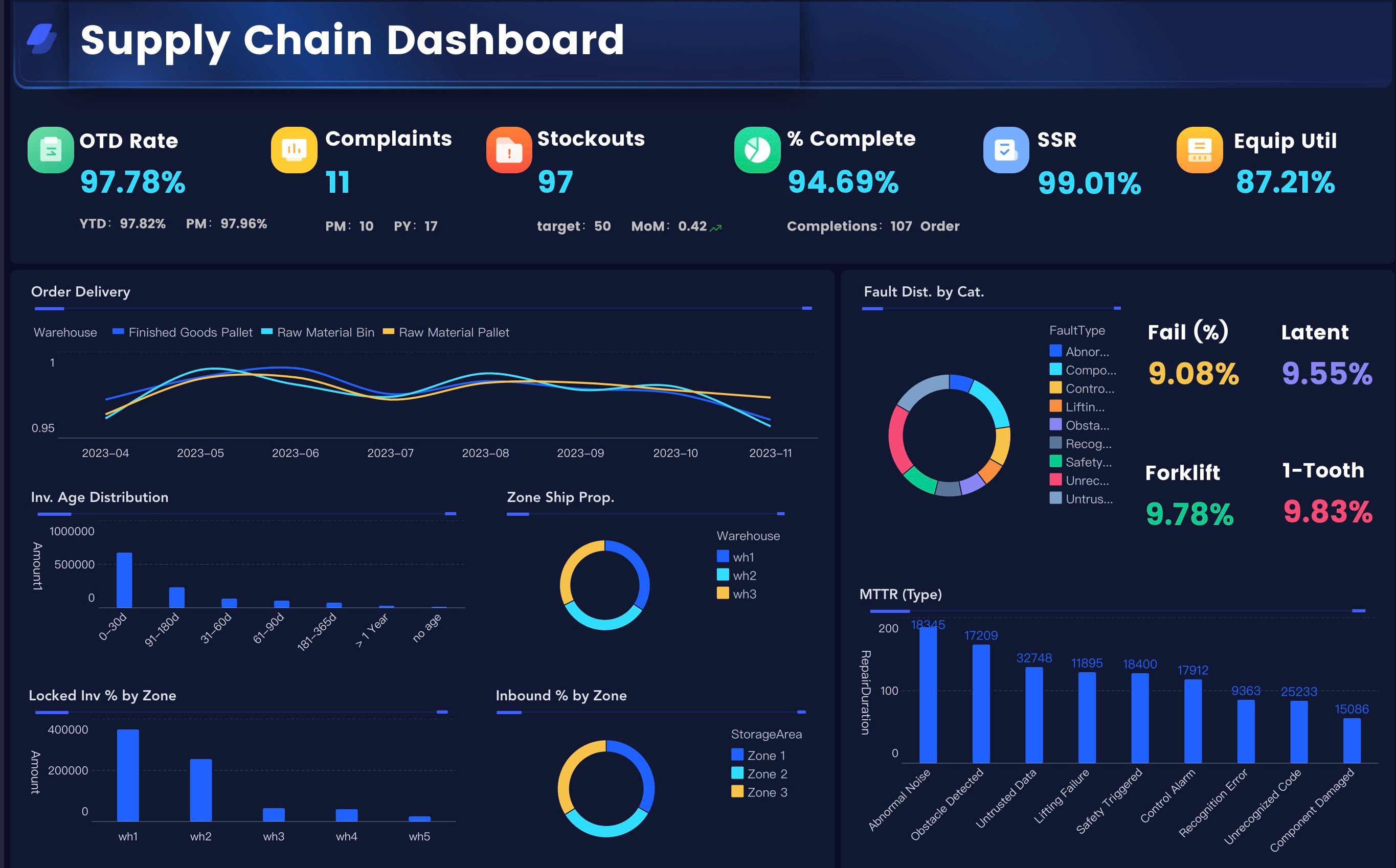
Manufacturing Supply Chain Executive Dashboard
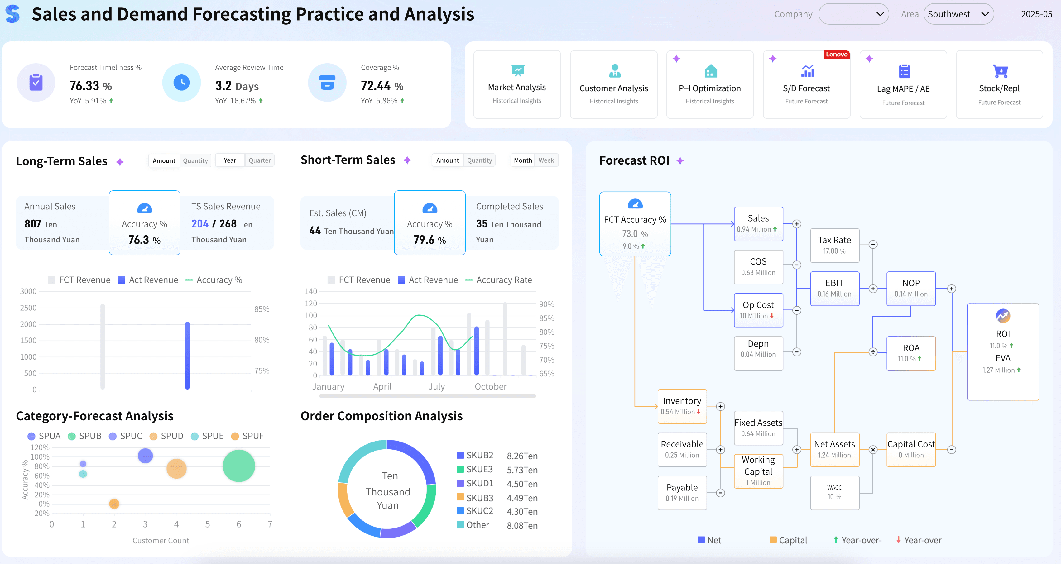
Sales Demand Forecasting With AI
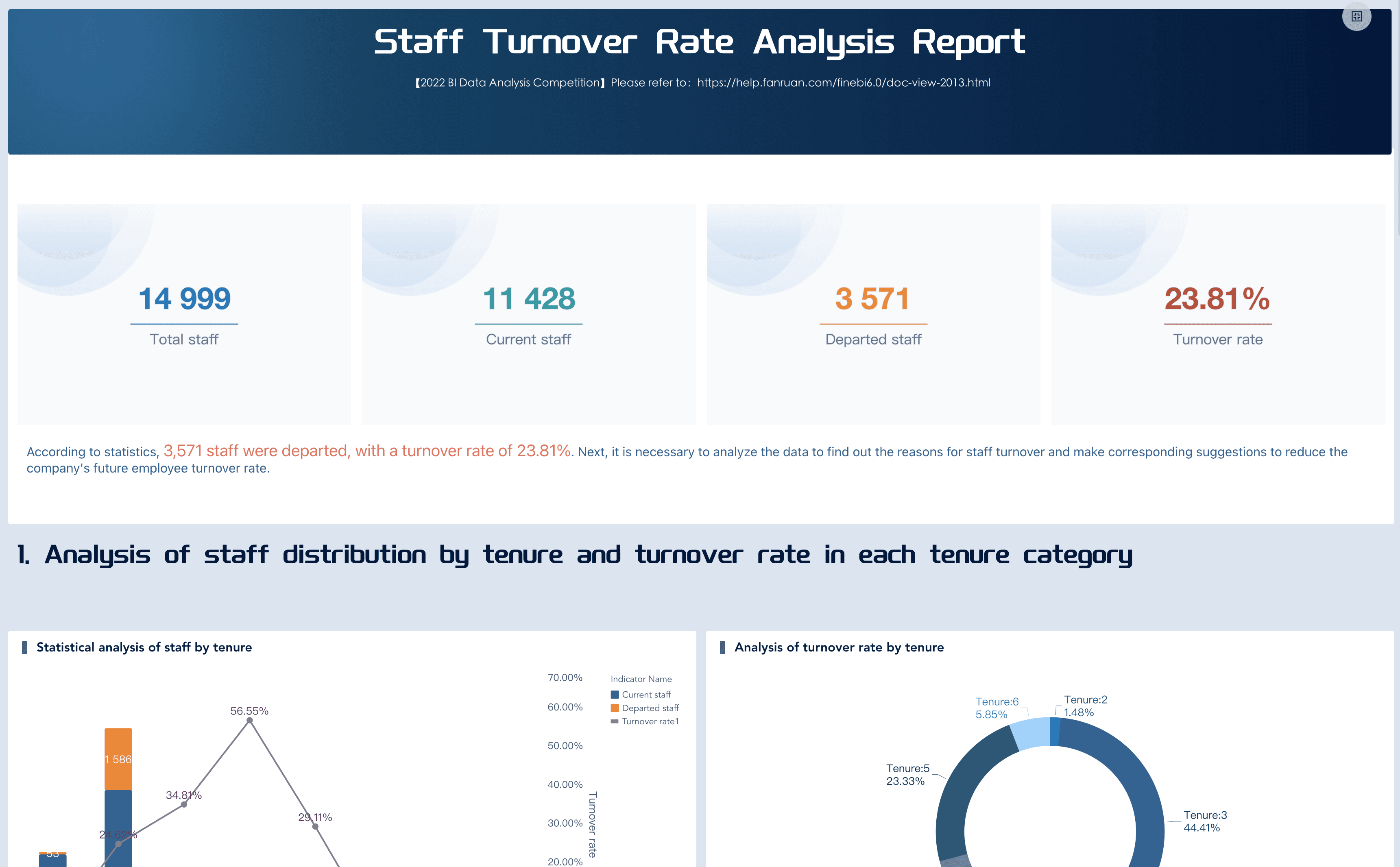
Employee Turnover Dashboard
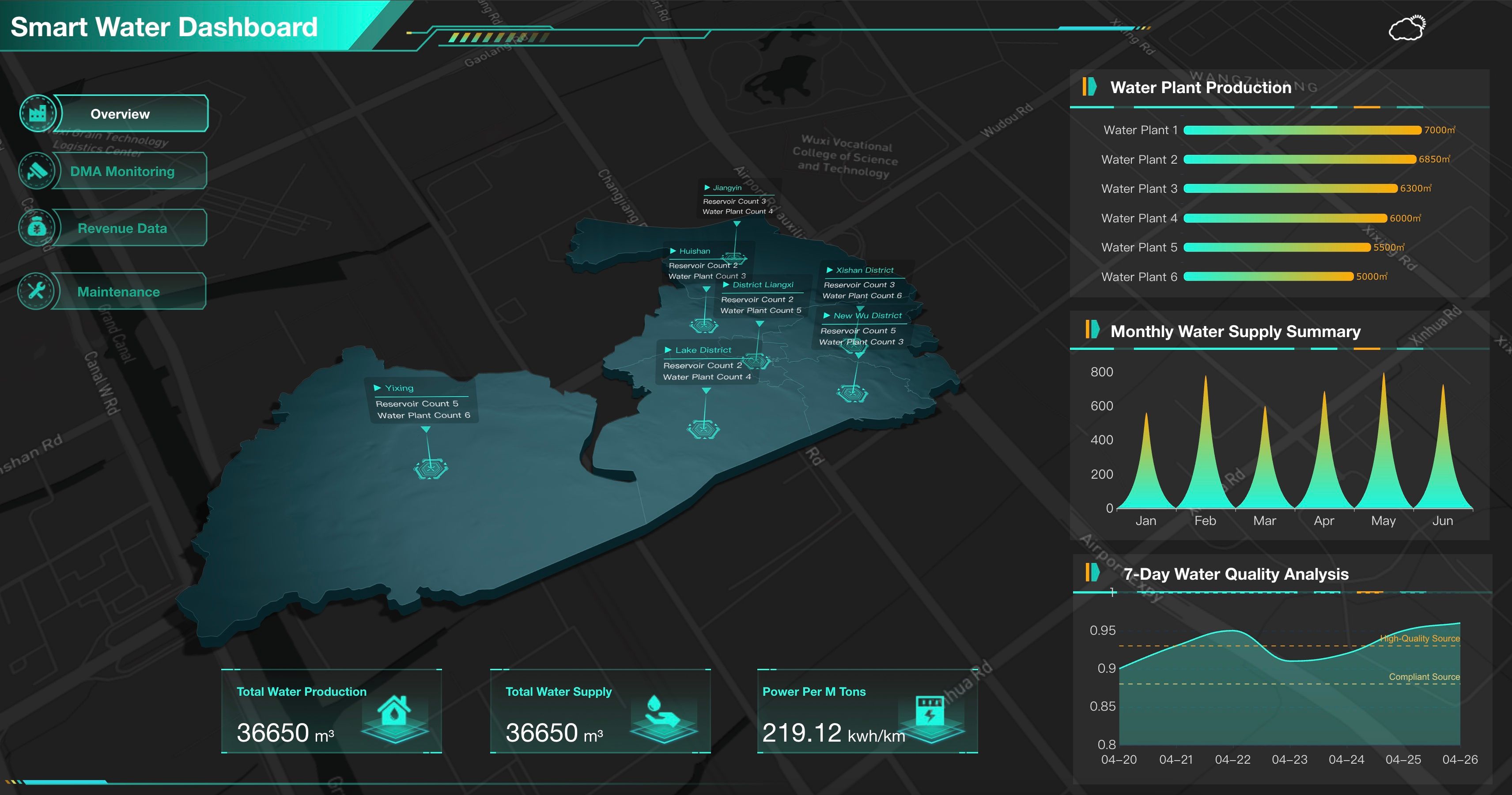
Smart Water Dashboard
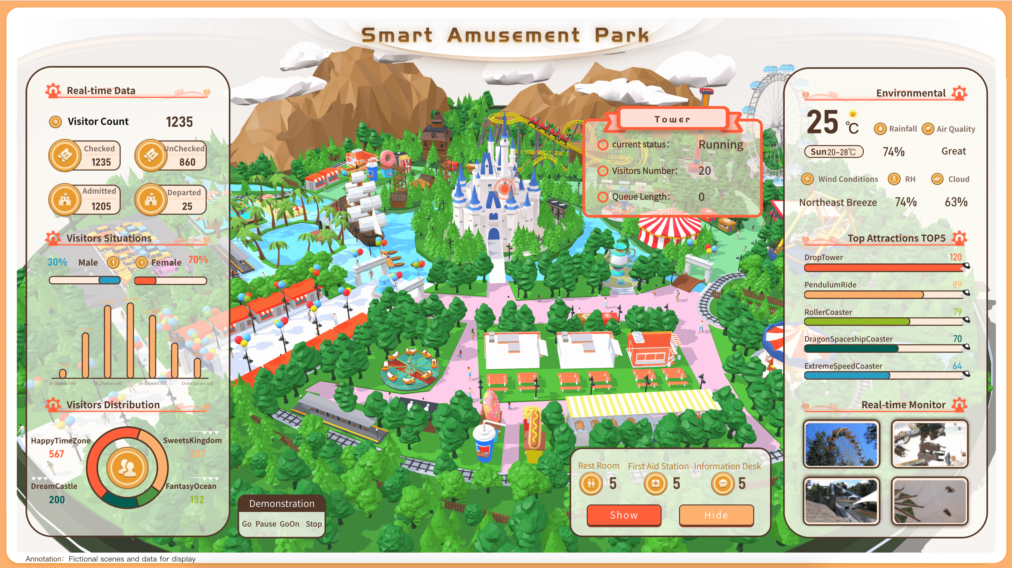
Theme Park Management
Data Analytics Workflow
Data analytics becomes useful when the workflow repeats. A team does not need to solve every use case on day one. It should solve one recurring decision well, then expand.
Use this build path:
- Choose one decision. Start with a question such as "Why did margin fall this month?" or "Which customer segments need follow-up this week?"
- Define the audience. Decide whether the output is for executives, department leaders, analysts, frontline managers, IT, or a mixed review group.
- Map the data sources. List systems, fields, owners, refresh frequency, known gaps, and permission needs.
- Standardize KPI definitions. Write the formulas, filters, time windows, exclusions, and business rules.
- Build the first visual view. Use a small set of charts that match the question.
- Add diagnostic paths. Let users drill into product, customer, region, owner, process, supplier, campaign, or time period.
- Add commentary. Explain what changed, why it matters, what may have caused it, and what should be checked next.
- Assign follow-up. A useful insight should have an owner, status, and review date.
- Improve the next cycle. Remove unused charts, refine definitions, capture feedback, and update the workflow.
A data analytics framework or data analysis framework can help teams avoid jumping straight to charts. For tool selection, compare data analysis and reporting tools and data analysis and visualization tools against the workflow above.
Small teams may start with spreadsheets, BI views, and periodic summaries. Larger teams usually need governed metrics, reusable dashboards, scheduled reports, permissions, semantic definitions, data quality checks, and owner workflows.
Challenges
Data analytics often fails for operational reasons before it fails for technical reasons. The dashboard may look polished, but if people do not trust the definitions, the meeting becomes a debate about the numbers.
Common problems include:
- Fragmented sources. Different systems store different versions of customer, product, order, campaign, employee, and financial data.
- Inconsistent definitions. Teams calculate revenue, margin, churn, conversion, active user, available inventory, and on-time delivery differently.
- Weak data quality. Missing fields, duplicate records, stale refreshes, manual edits, tracking gaps, and broken joins can distort the analysis.
- Too many metrics. A crowded dashboard makes the signal harder to find.
- No owner workflow. Insights fade when the report does not assign responsibility, status, or review timing.
- Poor context. A metric can change because of a promotion, seasonality, policy update, system migration, pricing change, or definition change.
- Overconfident automation. AI summaries can mislead users if they are not grounded in governed metrics, source traceability, permissions, and human review.
The answer is not always another chart. Most teams need a stronger operating model: clear data ownership, shared KPI definitions, useful dashboard hierarchy, scheduled review, data quality notes, and a follow-up process.
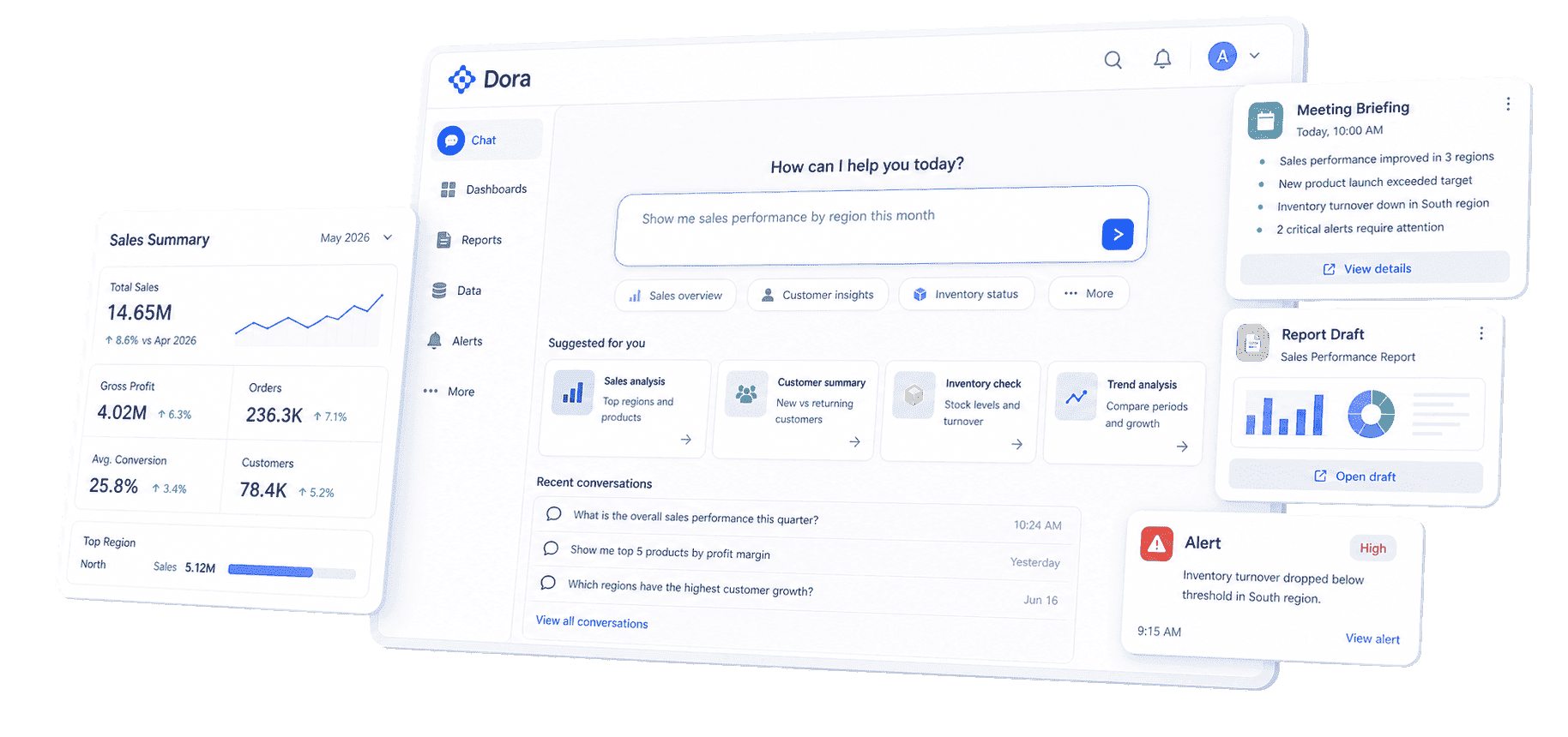
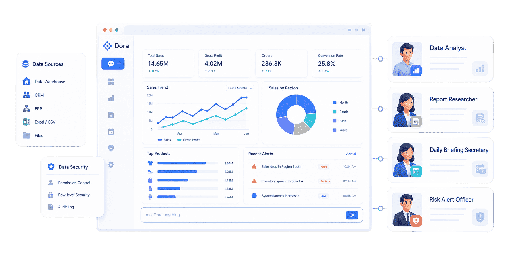
Data Analytics with FineBI + Dora
After the data analytics structure is clear, FineBI + Dora can help teams move from manual exploration to a more guided workflow.
FineBI provides the self-service BI layer. Teams can connect data, model metrics, build dashboards, explore dimensions, drill into details, and create reusable analysis views. This matters because data analytics depends on trusted definitions. If every dashboard calculates revenue, churn, conversion, inventory, or headcount differently, people will not trust the answer.
Dora adds the AI Data Agent layer above trusted BI assets. It should not be treated as a generic chatbot that guesses from disconnected tables. Dora is stronger when it works through configured FineBI assets, metric definitions, business terms, filters, permissions, knowledge libraries, and reusable Skills.
In a data analytics workflow, Dora can help users:
- Ask natural-language questions over governed BI assets.
- Search existing dashboards and analysis views instead of starting from scratch.
- Generate chart-based answers and structured briefing notes from configured data assets.
- Explain metric movement with preliminary attribution and follow-up questions.
- Schedule daily, weekly, or monthly summaries for different roles.
- Detect abnormal changes and push the right section to the right owner.
- Keep outputs inside permission boundaries so users only see data they are allowed to access.
- Preserve source traceability so people know which BI asset, metric, and rule supported the answer.
This is the useful FineBI + Dora story for data analytics: FineBI creates the trusted analytical workspace. Dora helps more people consume that workspace through questions, briefings, alerts, recommendations, and follow-up.
Useful Dora digital employees for data analytics
Different data analytics scenarios need different AI roles. Four Dora digital employees are especially relevant:
Data Analyst
Best use
- Ad hoc questions
- Drill-down analysis
- Chart generation
- KPI explanation
Example output A chart-based answer explaining why revenue changed by region and product.
Daily Briefing Secretary
Best use
- Scheduled summaries before operating meetings
Example output A weekly performance briefing for each department owner.
Report Researcher
Best use
- Structured report generation from existing BI assets
Example output A monthly management report with charts, commentary, and data quality notes.
Risk Alert Officer
Best use
- Exception detection
- Abnormal movement
- Owner push
- Follow-up tracking
Example output A shortage, churn, quality, or budget risk alert with suggested review steps.
 Dora's Role-based Digital Employees
For business users, the value is timely answers without waiting for a specialist to rebuild the same analysis. For IT and data teams, the value is different: they spend less time producing every recurring report manually and more time maintaining data connections, semantic definitions, permission rules, and reusable Skills. For executives, the value is a clearer path from signal to review: what changed, why it matters, who owns the follow-up, and what will be checked next.
Chat-style prompts for data analytics
The best prompts are tied to a governed data asset and a real decision. Examples:
- "Show this month's revenue performance by region, product, and customer segment. Compare it with target and last month."
- "Explain why gross margin fell this week. Check price changes, product mix, discount rate, and cost movement."
- "Create a dashboard-style view of campaign spend, qualified leads, pipeline, and conversion by channel."
- "List inventory shortage risks for the next two weeks. Include material, affected orders, responsible department, and suggested review action."
- "Generate a weekly customer retention briefing for account owners. Include high-risk customers, likely drivers, and follow-up questions."
- "Find the latest HR turnover view and summarize which departments need retention review."
These prompts work best when Dora can map natural language to trusted metrics and business terms. If the semantic layer is weak, AI output becomes harder to trust.
 Natural-language Query
A closed-loop FineBI + Dora data analytics workflow
A practical workflow could look like this:
- Retrieve trusted data. Dora reads configured FineBI dashboards, datasets, KPI definitions, filters, permission rules, and scenario knowledge.
- Detect meaningful movement. It compares current performance with target, prior period, forecast, or threshold.
- Explain likely drivers. It checks dimensions such as region, product, customer, campaign, supplier, process, owner, and time.
- Generate the briefing. It creates charts, commentary, data quality notes, and follow-up questions.
- Push to owners. It sends the relevant section to the person or team responsible for review.
- Track review feedback. Owners confirm, correct, or add context.
- Improve the next cycle. The team refines metric definitions, thresholds, Skills, and dashboard structure.
The point is not to let AI make business decisions alone. Dora can detect, explain, suggest, push, and follow up. Humans still review the evidence and choose the action.
What to prepare before using Dora for data analytics
AI becomes useful when it can operate on trusted business context. Before asking Dora to explain data analytics results, prepare the foundation:
- Metric dictionary. Define revenue, margin, churn, active customer, qualified lead, inventory availability, OEE, turnover, and any other KPI that will appear in answers.
- Business terms and synonyms. Map everyday user language to governed fields. For example, "lost customer," "churned account," and "inactive customer" may need separate rules.
- Data assets. Decide which FineBI dashboards, datasets, subject areas, and analysis views Dora can use for each scenario.
- Filters and default logic. Set time windows, regions, products, departments, customer segments, currency rules, and exclusions.
- Permission rules. Make sure Dora respects user, role, agent, and BI data permissions.
- Source traceability. Let users see which dashboard, dataset, metric definition, and rule supported an AI-generated answer.
- Skill templates. Use reusable Skills for weekly briefings, variance analysis, risk alerts, report drafts, and owner follow-up.
- Human review rules. Decide which recommendations need manager approval before they affect customers, spend, inventory, staffing, or production.
This preparation may sound basic, but it is where many AI analytics projects succeed or fail. Without definitions and permissions, AI answers become fast but hard to trust. With governed assets, the same natural-language request can return a repeatable answer.
FineBI + Dora patterns by data analytics scenario
FineBI + Dora works best when the scenario is narrow enough to land. Start with a recurring workflow, then expand after people trust the loop.
Weekly Revenue Review
FineBI assets Revenue dashboards by region, product, channel, customer, and owner.
Dora action Generates a briefing, explains variance, and sends owner-specific follow-up questions.
Inventory Shortage Risk
FineBI assets Inventory, inbound, production plan, and order commitment views.
Dora action Flags shortage risk, lists affected orders, and pushes review notes to planning or procurement.
Customer Churn Review
FineBI assets Customer segment, activity, support, satisfaction, and renewal views.
Dora action Summarizes high-risk customers and drafts account owner follow-up prompts.
Campaign Performance Diagnosis
FineBI assets Spend, traffic, conversion, CRM, pipeline, and revenue views.
Dora action Explains channel movement and prepares a campaign review summary.
Workforce Turnover Review
FineBI assets Headcount, attrition, tenure, department, role, and manager views.
Dora action Identifies turnover concentration and prepares HR review notes.
Monthly Management Report
FineBI assets Governed dashboards and report templates.
Dora action Pulls charts, drafts commentary, adds data quality notes, and prepares a review-ready outline.
The common pattern is simple: FineBI holds the trusted analytical view. Dora makes the view easier to question, explain, summarize, and act on. The output still needs business review, especially when the recommendation affects budget, staffing, customers, suppliers, or operations.
Data Analytics Hub
This page should work as the hub for a broader data analytics topic cluster. Data analytics explains the shared method: connect data, define metrics, build trusted views, analyze drivers, guide decisions, and close the loop with owners.
Related learning resources can also help:
- Use business data analytics when the question is how analytics supports everyday business decisions.
- Read data analytics consulting if the team needs help with roadmap, governance, use case selection, or implementation.
- Compare free data analysis tools when the team is still testing methods.
- Review reporting software when recurring reports, permission control, and scheduled delivery become important.
- Use self service business intelligence when business teams need more direct access to governed analysis.
FAQs
Data analytics is the practice of collecting, connecting, analyzing, visualizing, and explaining data so teams can understand performance, diagnose change, compare options, and decide what to review next. It turns raw data into a repeatable decision workflow.
The four common types are descriptive analytics, diagnostic analytics, predictive analytics, and prescriptive analytics. Descriptive explains what happened. Diagnostic explains why. Predictive estimates what may happen next. Prescriptive suggests possible actions for human review.
Data analysis usually answers a specific question using a dataset or report. Data analytics is broader. It includes the systems, metrics, dashboards, governance, workflows, and follow-up process that make analysis repeatable across the organization.
A data analytics dashboard should include the metrics needed for a specific decision. Common sections include headline KPIs, trends, target comparison, breakdowns, driver analysis, data quality notes, exception lists, commentary, and owner follow-up.
The best metrics depend on the decision. Useful metrics usually include an outcome metric, driver metrics, and diagnostic fields. For example, a revenue view may include revenue, margin, target achievement, product mix, region, customer segment, channel, and owner.
FineBI can help teams connect data, model metrics, build dashboards, explore dimensions, and create trusted self-service analysis views. Dora can act as the AI Data Agent layer that answers follow-up questions, generates scheduled briefings, explains abnormal movement, pushes owner-specific notes, and supports review workflows based on governed FineBI assets.
Start with one recurring decision. Define the audience, data sources, KPI formulas, permission rules, dashboard structure, commentary format, and follow-up owner. After the first workflow is trusted, expand to adjacent scenarios such as supply chain analytics, manufacturing analytics, marketing analytics, HR analytics, customer analytics, or CRM analytics.
