An executive report turns raw business data into a concise decision tool for senior leaders. If you are an operations director, finance leader, BI manager, or department head, the challenge is familiar: too much data, too little time, and constant pressure to explain performance clearly. A strong executive report helps leaders quickly understand what changed, why it matters, where risk is building, and what action should come next. That is its business value: faster alignment, better decisions, and less time wasted interpreting dashboards, spreadsheets, and disconnected updates.
All reports in this article are built with FineReport.
An executive report is a short, structured summary of business performance designed for decision-makers. Unlike a deep analytical report, which may explore methods, dimensions, calculations, and data caveats in detail, an executive report focuses on the essentials: performance, exceptions, implications, and recommended actions.
Senior leaders rarely need to inspect every row of data. They need a clear view of the business question, the reporting period, and the likely decision. That means the report should answer questions such as:
Are we on target or off target?
What changed materially this period?
What are the biggest risks and opportunities?
What decision or action is required now?
This is why executive reporting matters. It compresses complexity into a format that executives, board members, department heads, and stakeholders can absorb in minutes. When done well, it improves governance, speeds decision cycles, and reduces the back-and-forth often caused by unclear reporting.
A detailed analytical report, by contrast, is built for analysts, managers, or technical teams who need to investigate the drivers behind results. It may include full methodology, segmentation logic, statistical detail, and supporting appendices. Both reports are important, but they serve different jobs. The executive report is the top layer: concise, directional, and action-oriented.
Who the Executive Report Is For
The audience shapes everything. A CFO, COO, CEO, board member, and regional GM do not all need the same level of detail. But they do share common needs:
Executives: Need business performance summarized against strategic objectives
Board members: Need governance-level visibility into trends, risks, and material issues
Department heads: Need cross-functional context and accountability signals
Stakeholders: Need confidence that decisions are backed by reliable, relevant data
The best executive report respects executive attention. It avoids data dumps, surfaces exceptions quickly, and provides just enough context to support action.
How to Structure an Executive Report for Fast Decision-Making
A high-performing executive report is not just shorter. It is organized for speed. The structure should make it obvious what decision is being informed and what the data is saying.
Start with three anchors:
The business question
The reporting period
The intended decision or outcome
For example: Should we increase marketing spend next quarter based on pipeline quality and CAC trends from Q2? That framing immediately tells the reader what the report is about and what matters.
Then present information in this order:
Headline findings first
Supporting evidence second
Business implications third
Recommended action last
This order matters because executives read for conclusions, not suspense. If the most important finding is buried on page four, the report is already underperforming.
A Practical Structure for an Executive Report
A repeatable structure keeps reporting cycles consistent and easier to scale across teams.
Consistency is critical. When leaders know where to look for KPIs, commentary, risks, and decisions, they process the report faster and trust it more.
How to Write a Strong Executive Summary
The executive summary is often the most important part of the entire executive report. In many cases, it is the only section some leaders read in full. That means it must stand on its own.
A strong executive summary should include:
The headline insight
The most important KPI changes
The business implication
The recommended next step
Keep it short, but not empty. This is not a slogan. It is a compressed decision brief.
A useful format is:
What happened
Why it matters
What should happen next
For example:
Revenue grew 8% quarter over quarter, but gross margin fell 2.3 points due to discounting in enterprise deals.
This suggests top-line growth is improving, but profitability quality is weakening.
Recommend revising pricing approval thresholds and reviewing discount exceptions by region within 30 days.
Keep context tight. Include only the information required to make sense of the finding. Do not load the summary with methodology notes, every contributing factor, or extra charts. If details are needed, they belong in the supporting sections.
Choosing the Right KPIs for an Executive Report
The quality of an executive report depends heavily on KPI selection. If you choose too many metrics, leaders lose focus. If you choose vanity metrics, the report becomes informative but not useful. The right KPIs connect directly to strategic goals and help leaders decide where to act.
An executive report should usually prioritize KPIs tied to:
Financial performance
Strategic growth
Customer outcomes
Operational efficiency
Risk exposure
The report should also balance lagging indicators and leading indicators.
Lagging indicators show what has already happened, such as revenue, profit margin, churn, and on-time delivery rate.
Leading indicators help predict future outcomes, such as pipeline growth, sales cycle velocity, product adoption, backlog growth, and customer support volume.
This combination gives leadership both a rearview mirror and a windshield.
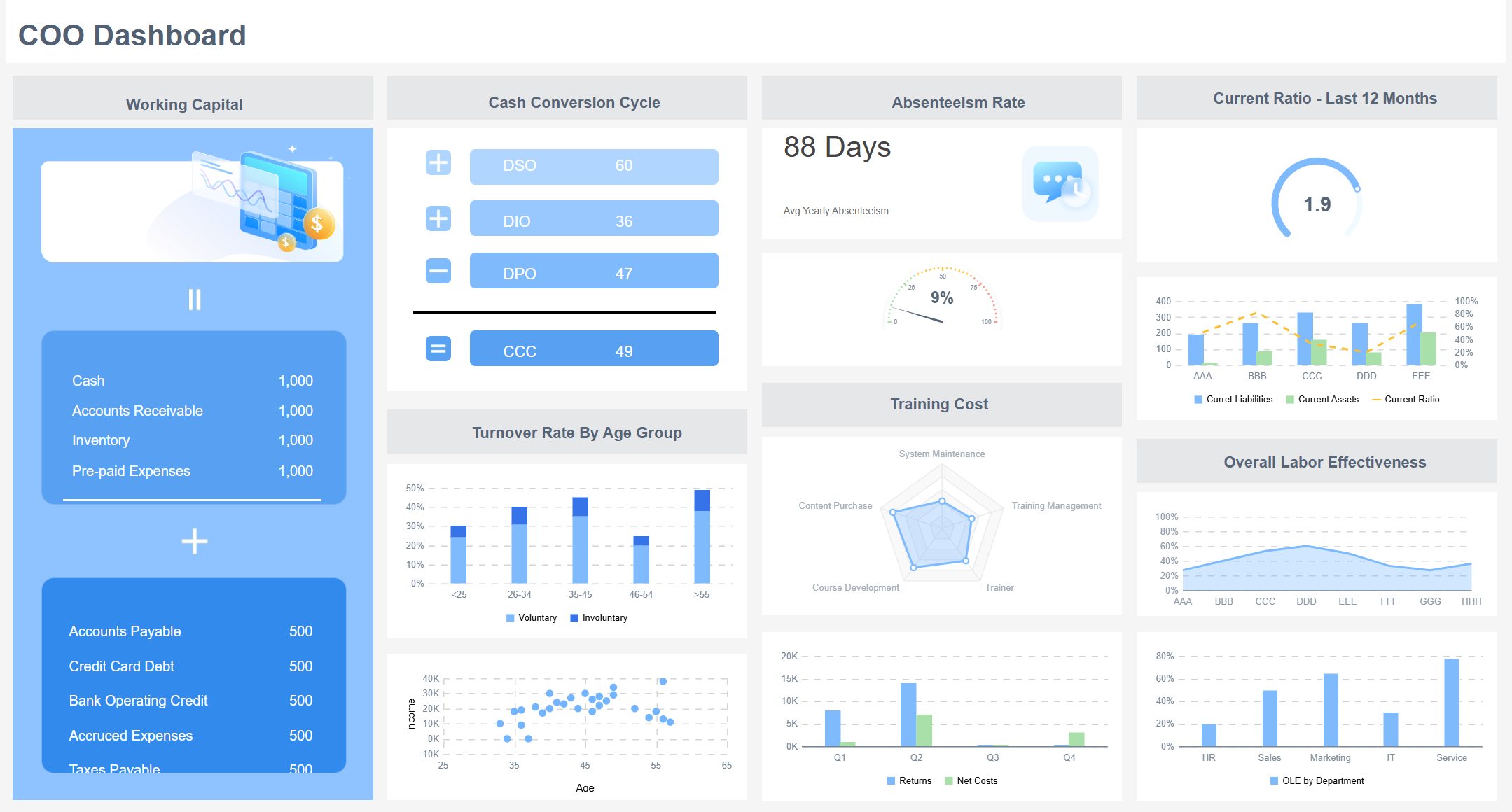
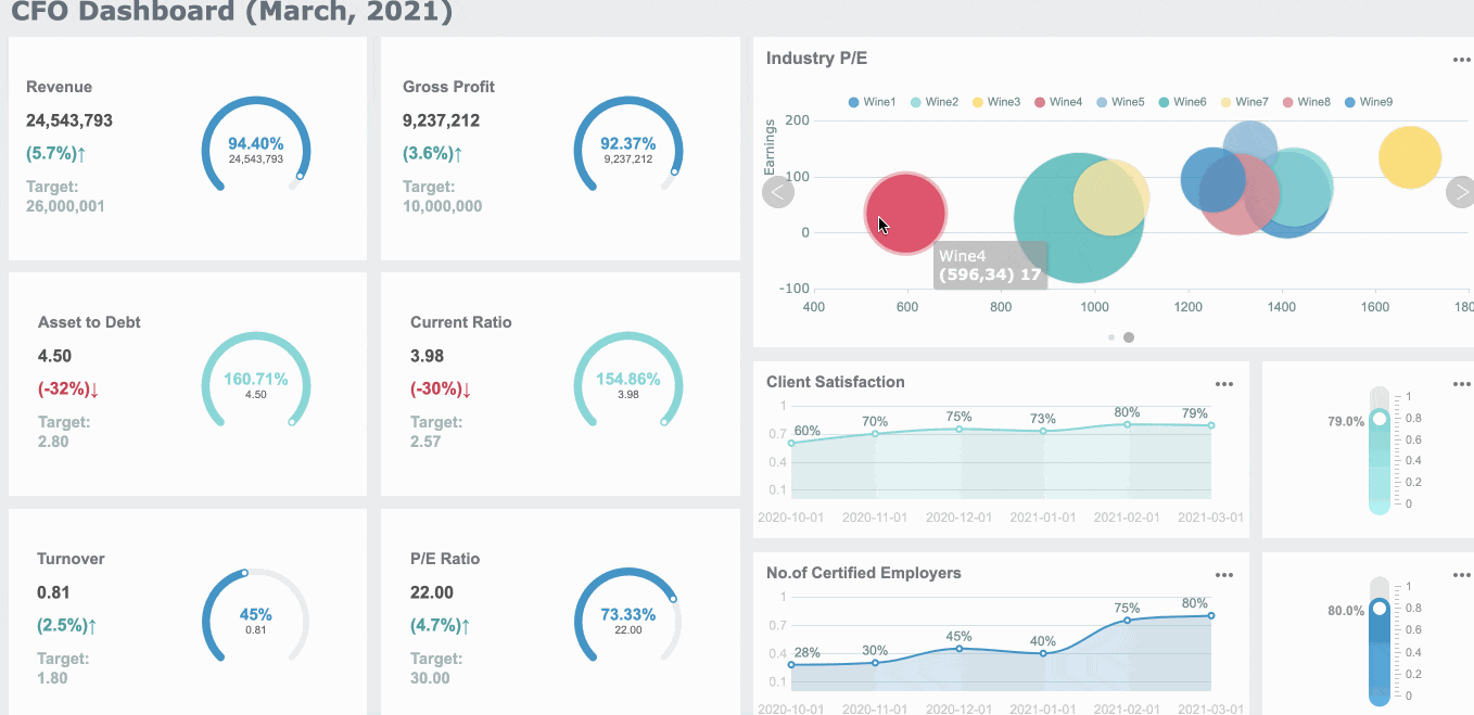
Key Metrics (KPIs)
Below is a practical KPI framework for an executive report. Not every report needs all of them, but every metric included should support a business decision.
Revenue
Total sales generated during the reporting period; shows top-line performance.
Gross Margin
Revenue minus cost of goods sold as a percentage; measures profitability quality.
Operating Expense Ratio
Operating costs relative to revenue; indicates cost discipline and efficiency.
Net Profit or EBITDA
Bottom-line performance after costs; helps assess financial sustainability.
Forecast Accuracy
Difference between projected and actual results; reveals planning reliability.
Customer Acquisition Cost (CAC)
Cost to acquire one new customer; indicates growth efficiency.
Customer Lifetime Value (CLV or LTV)
Expected long-term revenue from a customer; helps assess customer economics.
Churn Rate
Percentage of customers or revenue lost; signals retention risk.
Pipeline Coverage
Value of pipeline compared with sales targets; shows future revenue readiness.
Conversion Rate
Share of leads or opportunities progressing to the next stage; indicates funnel health.
On-Time Delivery
Percentage of orders or projects delivered as scheduled; tracks operational reliability.
Cycle Time
Time needed to complete a process, order, or task; highlights operational speed.
Inventory Turnover
Rate at which inventory is sold and replenished; indicates supply chain efficiency.
Utilization Rate
Share of available capacity being actively used; useful in services and operations.
Customer Satisfaction or NPS
Customer sentiment metric; helps connect operations to loyalty and growth.
Incident Rate or Risk Events
Number of material operational, compliance, or service incidents; highlights exposure.
How to Prioritize KPIs That Support Decisions
Good KPI selection is less about quantity and more about decision relevance. To prioritize well, ask four questions:
Does this KPI align with a strategic objective?
Does it show movement against a target or benchmark?
Does it help explain business impact?
Would a leader act differently if this KPI changed materially?
If the answer is no, that metric likely does not belong in the executive report.
Use these prioritization rules:
Focus on measures that show progress
Show variance from target
Add trend lines to reveal direction over time
Include benchmarks for context
Flag exceptions and anomalies that require attention
A KPI without context creates work for the reader. A KPI with target, trend, and commentary creates clarity.
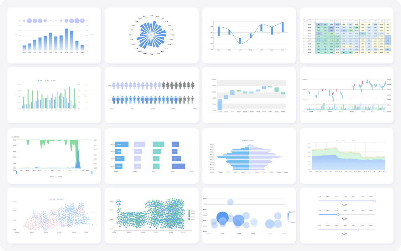
Selecting Charts and Visuals of Your Executive Report That Make Data Easy to Act On
In an executive report, visuals should reduce effort, not add decoration. The best chart is the one that makes the takeaway obvious in seconds.
Choose charts based on the message you need to deliver:
Trends: Line charts
Comparisons: Bar charts
Composition: Stacked bars or waterfall charts
Distribution: Histograms or box plots when needed
Outliers and exceptions: Scatter plots or highlighted tables
Do not pick a visual because it looks impressive. Pick it because it answers the business question quickly.
Remove unnecessary gridlines, shadows, and visual noise
The goal is immediate comprehension.
Common Visual Mistakes to Avoid
Many executive reports become less useful because the visuals are doing too much. Common mistakes include:
Overloaded dashboards with too many charts competing for attention
Misleading axes that exaggerate minor changes
Decorative visuals that look modern but communicate poorly
Inconsistent colors across similar KPIs
Dense legends that force readers to decode rather than understand
Charts with no clear implication or recommendation
If one clean chart can answer the main question, do not use three. Executive reporting rewards restraint.
Turning Findings into Recommendations and Decision-Ready Insights in Your Executive Report
Data alone does not create executive value. Interpretation does. An executive report must move from observation to implication to action.
That means translating findings into clear business meaning:
What changed?
Why does it matter?
What should happen next?
For example, saying support tickets increased 22% is only descriptive. Saying support tickets increased 22%, driven by onboarding issues in the new enterprise segment, which may raise churn risk and require staffing changes is decision-ready.
This is where many reports fall short. They present facts, but stop before recommendations.
To produce decision-ready insights, rank recommendations based on:
Urgency
Expected impact
Cost
Feasibility
Dependency on other teams or systems
A useful approach is to classify actions into:
Immediate actions: Must happen now to reduce risk or capture value
Near-term actions: Require planning but should begin this cycle
Monitor-only items: No immediate intervention, but continued tracking is needed
A Simple Template for Final Recommendations
Every recommendation in an executive report should be concrete enough to act on. Use a simple structure like this:
Evidence: CAC increased 18% in enterprise campaigns while mid-market conversion improved 11%.
Expected Outcome: Lower blended CAC and stronger pipeline efficiency next quarter.
Owner: VP of Marketing.
Timing: Implement within 2 weeks.
Resources: Media budget reallocation and campaign analyst support.
Success Measure: 10% CAC reduction and stable pipeline volume in the next reporting cycle.
The report should end with a direct decision request when appropriate, such as:
Approve budget shift
Confirm hiring plan
Prioritize system rollout
Review policy change
Escalate risk response
That final prompt helps leaders move from review to action.
Best Practices for Writing Executive Report That Get Read
If your executive report is technically correct but hard to absorb, it will still fail. Readability is not cosmetic. It is operational.
Here are practical best practices I recommend in enterprise reporting environments.
1. Start With the Decision, Not the Data
Before writing the report, identify the decision it should support. This avoids the common trap of collecting too much information and hoping the conclusion will appear later.
Step-by-step:
Define the business question.
Clarify the reporting audience.
Select only the KPIs that support that question.
Build the story around implications and actions.
2. Standardize the Report Format Across Cycles
Executives should not have to relearn the report every month or quarter. Use a fixed structure for summaries, KPIs, visuals, and recommendations.
Best practice:
Keep KPI order consistent
Use the same colors for status categories
Reuse chart logic where possible
Keep commentary style standardized
This improves trust and speeds review time.
3. Write Commentary That Explains Movement, Not Just Numbers
A good executive report does more than restate the chart. It explains the business meaning behind the movement.
Instead of writing:
Revenue increased 6%.
Write:
Revenue increased 6%, primarily due to stronger renewals in the enterprise segment, partially offset by slower new-logo conversion in APAC.
This gives leaders a basis for action.
4. Escalate Exceptions and Material Changes Clearly
Do not make leaders search for what matters. Highlight major variances, anomalies, and risks.
Use:
Exception flags
Variance thresholds
Red-amber-green logic
Short action notes beside critical KPIs
5. Build the Report Into an Automated Workflow
Manual reporting creates delay, inconsistency, and version-control risk. If your team is still exporting spreadsheets, copying charts into slides, and rewriting commentary each cycle, you are spending time on mechanics instead of insight.
The mature approach is to automate data refresh, standardize templates, and enable governed self-service for business teams.
Final Quality Check Before You Send the Executive Report
Before sending any executive report, run this final review:
Does the executive summary match the underlying findings?
Does every KPI connect to the business objective?
Does each chart support a decision, not just describe data?
Are targets, trends, and benchmarks included where needed?
Are anomalies and risks clearly flagged?
Are recommendations specific, owned, and time-bound?
Can a senior leader understand the report in minutes?
If the answer to any of these is no, revise before distribution.
Build a Better Executive Report with FineReport
Building an executive report manually is complex. You need clean data integration, standardized KPI logic, consistent visuals, repeatable templates, role-based access, and reliable refresh schedules. Add multiple departments, reporting cycles, and stakeholder versions, and the process becomes difficult to scale.
That is why many enterprises move from manual reporting to a dedicated platform.
Building this manually is complex; use FineReport to utilize ready-made templates and automate this entire workflow.
FineReport helps teams create a high-quality executive report faster by enabling:
For enterprise teams, this matters because reporting is not just a design problem. It is a workflow problem. FineReport makes it easier to standardize your executive reporting process, reduce manual effort, and deliver decision-ready insights consistently.
If your current process relies on fragmented dashboards, spreadsheet assembly, and last-minute PowerPoint edits, this is the right time to modernize the workflow.
An executive report should include an executive summary, key KPIs, the main findings, business implications, and a clear recommendation. Its job is to help leaders understand performance quickly and decide what to do next.
An executive report highlights the most important results, risks, and actions for senior decision-makers. An analytical report goes deeper into methods, detailed data, and root-cause investigation for managers or analysts.
An executive summary should be short enough to read in a few minutes while still covering the main point, the key KPI changes, and the recommended action. In most cases, it is a compact section rather than a detailed explanation.
Use KPIs that directly reflect strategic goals, such as revenue, margin, churn, forecast accuracy, cost, or operational efficiency. The right mix depends on the audience and the decision the report is meant to support.
A strong executive report is concise, structured, and action-oriented. It puts headline findings first, explains why they matter, and ends with a recommendation leaders can act on immediately.
Product Trial
FineReport
Pixel-perfect reports · Interactive dashboards · Easy data entry · Digital twins