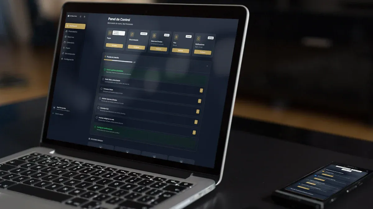
If your team is debating dashboard vs report, the real issue is not format preference. It is decision design. Enterprise teams lose time and trust when operations leaders expect instant KPI visibility but receive a static document, or when executives need documented analysis and get a visual summary with no supporting detail. Choosing the right output directly affects decision speed, governance, accountability, and whether teams act on data at all.
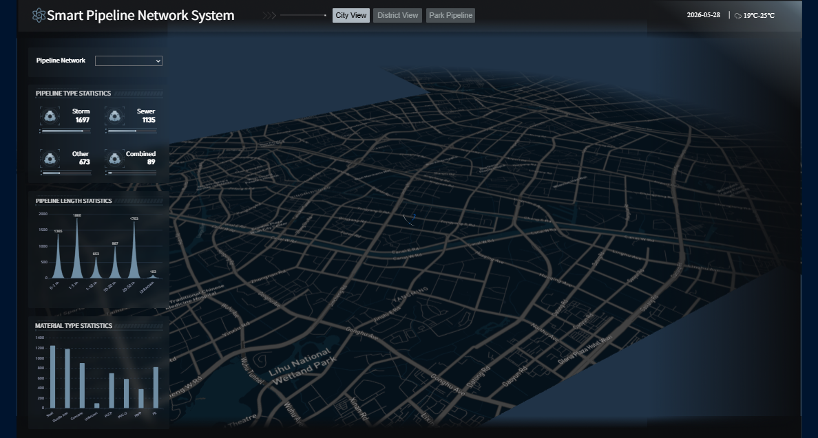 Click To Try The Dashboard
All reports in this article are built with FineReport
Dashboard vs Report: a quick definition for enterprise teams
A dashboard is a visual, at-a-glance interface built to monitor business performance quickly. It typically highlights KPIs, trends, alerts, and exceptions in a way that helps managers and executives spot what needs attention now.
A report is a structured presentation of data designed for explanation and documentation. It usually includes detailed tables, historical comparisons, segmented analysis, notes, and commentary that help stakeholders understand what happened, why it happened, and what to do next.
Enterprise teams often confuse dashboards and reports because both present data, both may include charts and tables, and both can support business decisions. But they solve different problems. A dashboard helps you monitor and react. A report helps you analyze, explain, and document.
The simplest rule of thumb is this:
- Choose a dashboard when the decision must happen fast
- Choose a report when the audience needs full context and evidence
- Use both when leadership needs a live overview supported by detailed follow-up
Key Metrics (KPIs) to decide between a dashboard and a report
When evaluating dashboard vs report for an enterprise workflow, use these core decision criteria:
- Decision speed: How quickly a user must interpret information and act
- Detail level: Whether the audience needs summaries or full supporting data
- Audience type: Executives, managers, analysts, auditors, or cross-functional teams
- Refresh cadence: Real-time, daily, weekly, monthly, or quarterly updates
- Interactivity: Need for filtering, drill-down, or simple read-only review
- Governance requirement: Whether the output must serve as an auditable record
- Narrative need: Whether the data requires definitions, assumptions, and commentary
- Actionability: Whether the goal is immediate intervention or retrospective analysis
1) Purpose: monitoring metrics vs analyzing details
The most important difference in dashboard vs report comes down to purpose. One is built for visibility. The other is built for understanding.
When a dashboard is the better fit
A dashboard is the better choice when teams need continuous monitoring of performance and fast interpretation of change. This is especially true in operations, sales management, manufacturing, customer service, and IT environments where delays create business risk.
Dashboards work best for:
- Real-time or frequent KPI monitoring
- Trend tracking across teams or business units
- Alerting on threshold breaches
- Daily management reviews
- Fast performance checks during meetings
A strong enterprise dashboard highlights what changed, what is off target, and where action is needed. It minimizes friction between seeing a problem and responding to it.
For example, an operations director may need to track order cycle time, backlog, fulfillment rate, and regional exceptions on a single screen. In that context, a report is too slow and too dense. A dashboard surfaces the signal immediately.
When a report is the better fit
A report is the better fit when stakeholders need structure, completeness, and a stable record. It is the preferred format for historical analysis, audits, financial review packs, board preparation, and root-cause investigations.
Reports work best for:
- Periodic business reviews
- Historical trend analysis
- Audit and compliance documentation
- Formal recommendations and findings
- Detailed variance analysis
A well-designed enterprise report adds definitions, methodology, assumptions, and commentary that dashboards usually omit. That context matters when decisions carry budget, policy, or risk implications.
2) Data depth: summary views vs drill-down information
Another critical factor in dashboard vs report is data depth. Both can present the same subject area, but they do so at very different levels of abstraction.
How dashboards present information
Dashboards prioritize signal over completeness. Their job is to show the most important performance indicators in a format users can scan in seconds.
Common dashboard characteristics include:
- High-level visuals such as line charts, bar charts, gauges, and KPI cards
- Limited text and concise labeling
- Exception-focused formatting
- Summary metrics with optional drill-down paths
- Strong visual hierarchy
This format is ideal when attention is limited and the audience needs to grasp performance quickly. Executives do not want 12 pages of detail in a weekly operating meeting. They want the five metrics that define business health, plus fast access to the underlying issue if something is off.
How reports present information
Reports are designed to go deeper. They usually include detailed tables, segmented views, supporting notes, and multi-period comparisons that allow users to validate conclusions and investigate root causes.
Common report characteristics include:
- Transaction-level or detailed aggregated tables
- Breakdowns by region, product, customer, or department
- Methodology notes and business definitions
- Historical period comparisons
- Commentary, interpretation, and recommendations
This makes reports far more useful when the question is not “What is happening?” but “Why did this happen, how significant is it, and what should we document?”
3) Interactivity and update cadence
The next distinction in dashboard vs report is how users consume the information over time.
Dashboard experience
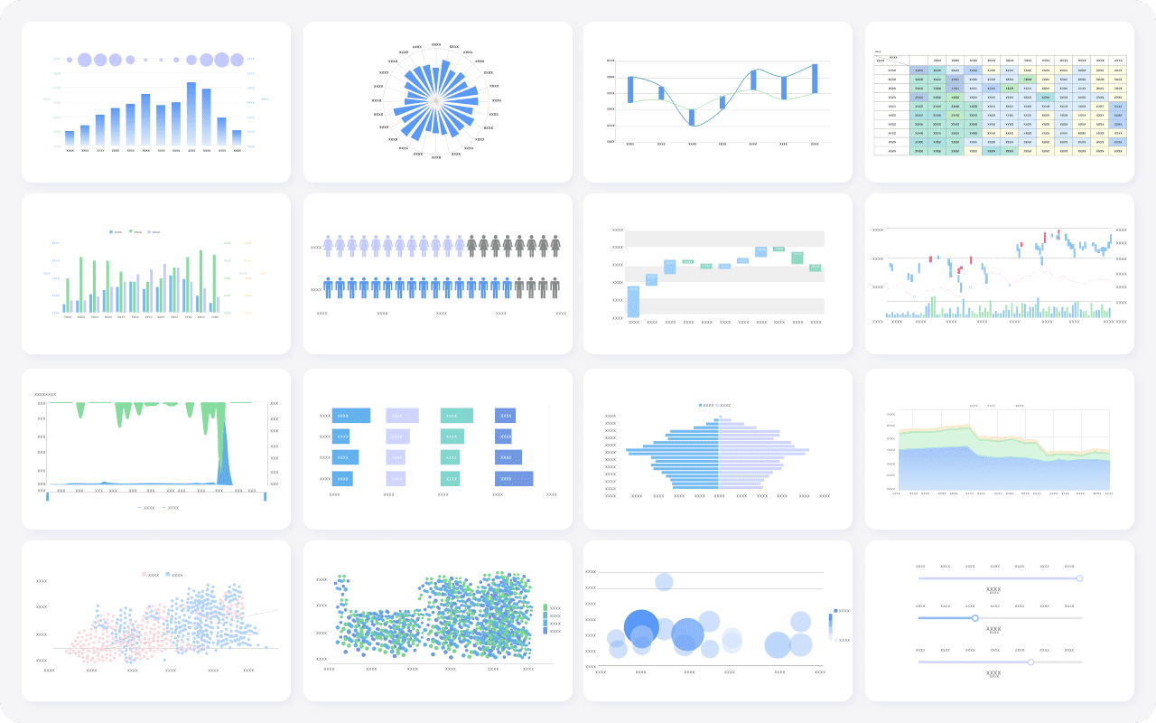
Dashboards are typically refreshed more frequently and designed for repeated use throughout the day, week, or meeting cycle. They often allow filtering by business unit, geography, time period, or product category, helping users move from overview to action quickly.
In enterprise settings, dashboard advantages often include:
- Frequent or near real-time refresh
- Interactive filters and drill-down
- Quick access to exception paths
- Broad visibility across teams
- Faster operational response
A service manager checking open incidents every hour needs a current view, not last week’s PDF. A commercial leader reviewing pipeline movement before a forecast call needs fresh numbers and rapid filtering.
Report experience
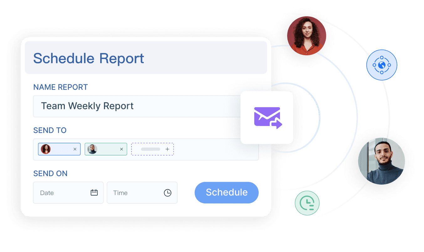
Reports usually follow a scheduled distribution cycle such as weekly, monthly, or quarterly. Their strength is stability. The numbers are captured at a point in time and used as a common reference for review and alignment.
Reports support:
- Scheduled delivery and distribution
- Historical snapshots for record keeping
- Consistent review packs
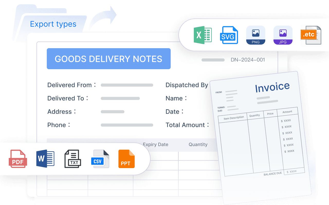
- Compliance and audit readiness
- Formal stakeholder communication
That stable format is valuable in finance, regulatory review, procurement governance, and executive planning. When people need to reference the same numbers later, a report provides the official version of record.
4) Audience and decision context
The best answer to dashboard vs report depends heavily on who will use it and under what decision conditions.
Who benefits most from dashboards
Dashboards are most effective for users who need a shared snapshot of current performance with minimal interpretation overhead.
Typical dashboard audiences include:
- Operations teams monitoring live workflow performance
- Department managers tracking team output and service levels
- Executives reviewing strategic KPI status
- Cross-functional leaders aligning around shared metrics
- Sales and customer success leaders watching daily movement
These users care about visibility, speed, and alignment. They want to identify changes fast and discuss action, not review every calculation.
Who benefits most from reports
Reports are better suited for stakeholders who require explanation, traceability, and full context before making or approving decisions.
Typical report audiences include:
- Analysts conducting deeper investigation
- Finance leaders reviewing variance and forecast assumptions
- Compliance teams requiring documented evidence
- Board or committee stakeholders needing formal materials
- Strategy leaders comparing scenarios and investment options
These groups are not just consuming data. They are validating it, interpreting it, and often preserving it for future reference.
5) Executive use cases: when leaders need one or both
At the leadership level, the dashboard vs report debate is rarely either-or. Most executive teams need both, but for different stages of the decision process.
Dashboards for executive visibility
Dashboards give executives fast visibility into strategic performance. In leadership meetings, they reduce time spent assembling updates and increase time spent on decisions.
Executive dashboards are most useful for:
- Tracking enterprise KPIs in one view
- Monitoring revenue, margin, cash, pipeline, and risk indicators
- Identifying trends and exceptions before review meetings
- Supporting faster status reviews and cross-functional alignment
A CEO or COO often wants an immediate answer to questions like: Are we on plan? Where are we slipping? Which region or business unit is driving the variance?
Reports for executive decisions
Reports become essential when leaders move from visibility to commitment. Large investments, policy changes, restructuring, or board recommendations require a documented rationale.
Executive reports support:
- Business case reviews
- Benchmark and assumption documentation
- Scenario comparison
- Formal recommendations
- Board and committee decision packages
In other words, dashboards help leaders see the issue. Reports help them approve the response.
6) How to choose the right format in practice
Most enterprise teams do not struggle because they lack tools. They struggle because they apply the wrong format to the wrong decision workflow. Here is the practical selection framework I recommend.
A simple selection checklist
Choose a dashboard if the goal is:
- Continuous monitoring
- Fast action
- Broad visibility
- Frequent updates
- Shared alignment around current KPIs
Choose a report if the goal is:
- Explanation
- Documentation
- Deeper analysis
- Periodic review
- Governance and auditability
Use both when leaders need:
- A live summary for rapid visibility
- Detailed follow-up for root cause and documentation
- A clear path from KPI exception to evidence-backed action
Common mistakes enterprise teams should avoid
The most common execution problems I see are not technical. They are design mistakes.
Avoid these pitfalls:
-
Replacing analysis with visuals that lack context
A colorful dashboard is not a substitute for explanation when decisions are high stakes. -
Turning reports into overloaded dashboards
When everything is shown at once, nothing stands out. The result is slower interpretation and lower adoption. -
Ignoring audience needs
An analyst may want flexible tables. A VP may want five headline KPIs. One format rarely satisfies both equally well. -
Underestimating governance requirements
If the output must be reviewed later, cited in a meeting, or archived for audit, treat it like a report. -
Mismatching refresh expectations
Teams lose confidence quickly when a dashboard looks live but updates weekly, or when a report changes after circulation.
Best practices for implementing dashboards and reports in enterprise environments
If you want your analytics workflow to perform well at scale, follow these consultant-level best practices:
-
Start with the decision, not the visualization
Define the exact action the user should take after seeing the data. This prevents dashboard sprawl and unnecessary reporting complexity. -
Separate monitoring from explanation
Build dashboards for signal detection and reports for narrative depth. Do not force one asset to do both jobs poorly. -
Standardize KPI definitions and ownership
Every metric should have a business definition, owner, calculation logic, and refresh expectation. This is foundational for enterprise trust. -
Design by audience layer
Create executive, manager, and analyst views intentionally. Different roles need different density, context, and interaction patterns. -
Connect summary to detail
The strongest architecture links dashboards to drill-down analysis or detailed reports, so teams can move from issue detection to root cause without rebuilding the workflow.
Build the workflow faster with FineReport
Building this manually is complex; use FineReport to utilize ready-made templates and automate this entire workflow.
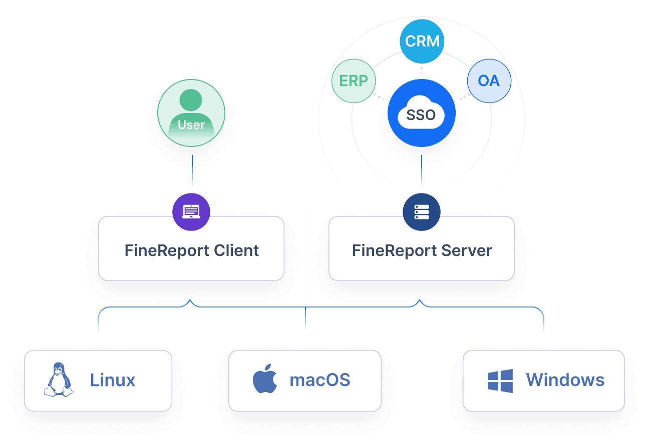
For enterprise teams comparing dashboard vs report, FineReport makes the decision operational rather than theoretical. You can build real-time monitoring dashboards for managers, structured analytical reports for finance and compliance, and connected executive views that move from KPI summary to detailed evidence without switching platforms or rebuilding logic.
That matters because the real challenge is not creating a chart or exporting a table. It is governing metrics consistently, supporting different audiences, automating refresh cycles, and scaling delivery across departments.
With FineReport, enterprise teams can:
- Build dashboards and reports on one governed platform
- Automate scheduled reporting and distribution
- Create drill-down paths from executive summary to detailed analysis
- Reuse templates to accelerate delivery
- Support operations, finance, sales, and leadership with role-specific views
Get Ready-to-Use Dashboard Templates in Fine Gallery
If your organization wants faster monitoring, stronger governance, and better executive decision support, the winning model is usually not dashboard or report. It is dashboard plus report, designed intentionally for each stage of the decision journey.
FAQs
A dashboard is built for fast monitoring of key metrics, while a report is built for deeper analysis, explanation, and documentation. The best choice depends on whether users need to react quickly or review full context.