A BI tool comparison is not just a side-by-side feature list. For most teams, it is a structured way to decide which analytics platform best fits their users, data environment, governance needs, and operating model. If you are comparing Power BI, Tableau, Looker, and Qlik, the real challenge is not finding enough features to review. It is avoiding feature overload and choosing based on what will actually work in your organization.
Many buying teams make the same mistake: they start with vendor demos, collect long requirement lists, and end up rewarding whichever tool looks strongest in a two-hour presentation. A better approach is to define your decision criteria first, then apply the same scoring logic across tools.
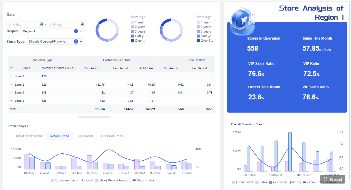 Click To Try The Dashboard
Quick Comparison Table
| Criteria | Power BI | Tableau | Looker | Qlik |
|---|---|---|---|---|
| Best for | Organizations aligned with Microsoft tools and broad business adoption | Teams that prioritize visual analysis and dashboard storytelling | Companies that want governed metrics and semantic consistency | Teams that value associative exploration and flexible data discovery |
| Ease of use | Accessible for many business users, especially Microsoft-oriented teams | Strong for visual authors, but can require more skill for broader platform setup | Easier for governed consumption than for initial modeling setup | Powerful exploration, but can require training for full value |
| Dashboard design | Strong dashboarding and interactive reporting | Highly regarded for visual flexibility and polished analytics | Good for governed dashboards and embedded analytics workflows | Interactive and discovery-oriented dashboards |
| Data preparation | Integrated capabilities available within the platform ecosystem | Often paired with additional prep workflows depending on environment | Relies heavily on modeled data and warehouse-centric workflows | Strong data combination and associative analysis capabilities |
| Enterprise reporting | Suitable for broad organizational reporting | Strong analytics and presentation, with enterprise deployment options | Strong for centralized metric definitions and governed access | Suitable for enterprise analytics with governed exploration |
| Collaboration | Good sharing options in Microsoft environments | Widely used for collaborative dashboard consumption | Strong when teams align around shared models and reusable definitions | Supports shared analytics and guided exploration |
| Deployment | Cloud and enterprise deployment options | Cloud and enterprise deployment options | Commonly aligned with cloud data platform strategies | Cloud and enterprise deployment options |
| Learning curve | Moderate; can rise with advanced modeling and calculations | Moderate to high depending on authoring depth | Higher for modeling teams, lower for governed end users | Moderate; exploration model may need onboarding |
| Recommended users | BI managers, analysts, business teams in Microsoft ecosystems | Analysts, dashboard designers, and data storytelling teams | Data teams and organizations prioritizing governed definitions | Analysts and business teams needing exploratory analysis |
A practical BI tool comparison framework for faster shortlisting
The fastest way to shortlist BI vendors is to stop asking, “Which platform has more features?” and start asking, “Which platform will help our teams make better decisions with the least friction over time?”
A practical business intelligence tools comparison should focus on three things:
- Business fit: Does the platform support your actual decision-making workflows?
- Operating model: Can your data team, analysts, and business users work effectively within it?
- Long-term usability: Will the tool still be manageable after onboarding, scaling, governance, and handoff across teams?
Define the decision you actually need to make before reviewing vendors
Before reviewing Power BI, Tableau, Looker, or Qlik, clarify whether you are deciding between:
- A self-service BI platform for broad business use
- A governed analytics environment for consistent metrics
- A visually advanced dashboarding tool
- A platform for embedded analytics or external-facing delivery
- A standard enterprise reporting environment
These are different decisions. If your buying committee mixes them together, every vendor will seem partially right and none will seem clearly suitable.
Compare tools by business fit, operating model, and long-term usability instead of feature volume
Feature-heavy evaluations often hide practical risks. A platform may score well on raw capabilities but still be a weak fit if:
- Business users cannot build or modify content easily
- IT must control every change request
- Governance becomes difficult at scale
- Semantic consistency is weak
- Maintenance effort grows faster than adoption
That is why a useful BI tool comparison framework looks beyond dashboard screenshots and evaluates how the platform works day to day.
Use the same scoring logic across Power BI, Tableau, Looker, and Qlik to avoid biased evaluation
Different vendors present strengths in different ways. Power BI may emphasize ecosystem productivity, Tableau may lead with visualization quality, Looker may stress semantic governance, and Qlik may highlight associative exploration. If you let each vendor define the evaluation criteria, your process becomes biased.
Use one scoring model, one shortlist template, and one proof-of-concept design for all vendors.
Start with your organization’s analytics requirements
A strong BI comparison starts internally, not with vendor materials. You need to define the analytics environment you are trying to support.
Clarify users, use cases, and decision frequency
The first step is to identify who needs insights and how often those insights affect decisions.
Separate these use cases clearly:
- Executive dashboards: High-level KPI monitoring and trend review
- Self-service analysis: Business users exploring data independently
- Embedded analytics: Analytics delivered inside another application or workflow
- Governed reporting: Standardized reports with controlled definitions and access
Also define:
- Who builds dashboards and reports
- Who only consumes them
- Who needs ad hoc exploration
- How often decisions are made: daily, weekly, monthly, or in real time
A tool that works well for executive visibility may not be ideal for broad self-service. A platform that excels at governed metrics may feel restrictive for exploratory teams.
Map data complexity and governance expectations
Your data environment often matters more than your preferred interface.
Document:
- Core data sources
- Cloud and on-premises systems
- Refresh frequency needs
- Whether live queries are required
- Transformation complexity
- Semantic modeling expectations
- Security and access control requirements
Also note governance requirements early, including:
- Row-level access
- Auditability
- Compliance expectations
- Approval workflows
- Metric standardization needs
If you skip this step, teams tend to overvalue ease of dashboard creation and undervalue the work required to keep data trusted.
Compare Power BI, Tableau, Looker, and Qlik by evaluation criteria that matter
Once your requirements are clear, compare tools using a manageable set of criteria tied to actual business impact.
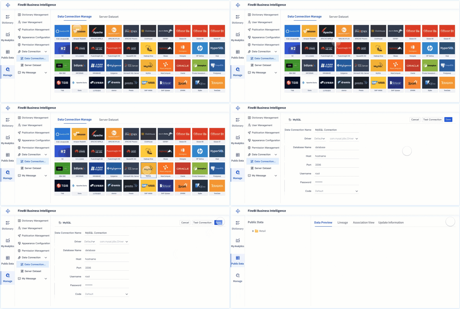
Data connectivity, modeling, and transformation
This category determines how easily the platform can work with your existing data stack.
Assess each platform based on:
- Support for your key data sources
- Live query versus extract options
- Data transformation workflows
- Reusable semantic logic
- Performance implications of your preferred architecture
At a high level:
- Power BI is commonly favored by organizations already invested in Microsoft technologies and often works well across broad reporting and analysis scenarios.
- Tableau is widely used for visual analytics and can connect to many enterprise data environments, though data prep and modeling workflows may depend on surrounding tools and team capability.
- Looker is often chosen when centralized metric definitions and semantic consistency are top priorities, especially in modern cloud data environments.
- Qlik is known for flexible data discovery and an associative approach that can help users explore relationships across data more freely.
The right choice depends less on theoretical connectivity breadth and more on how your team will model, govern, and maintain analytics.
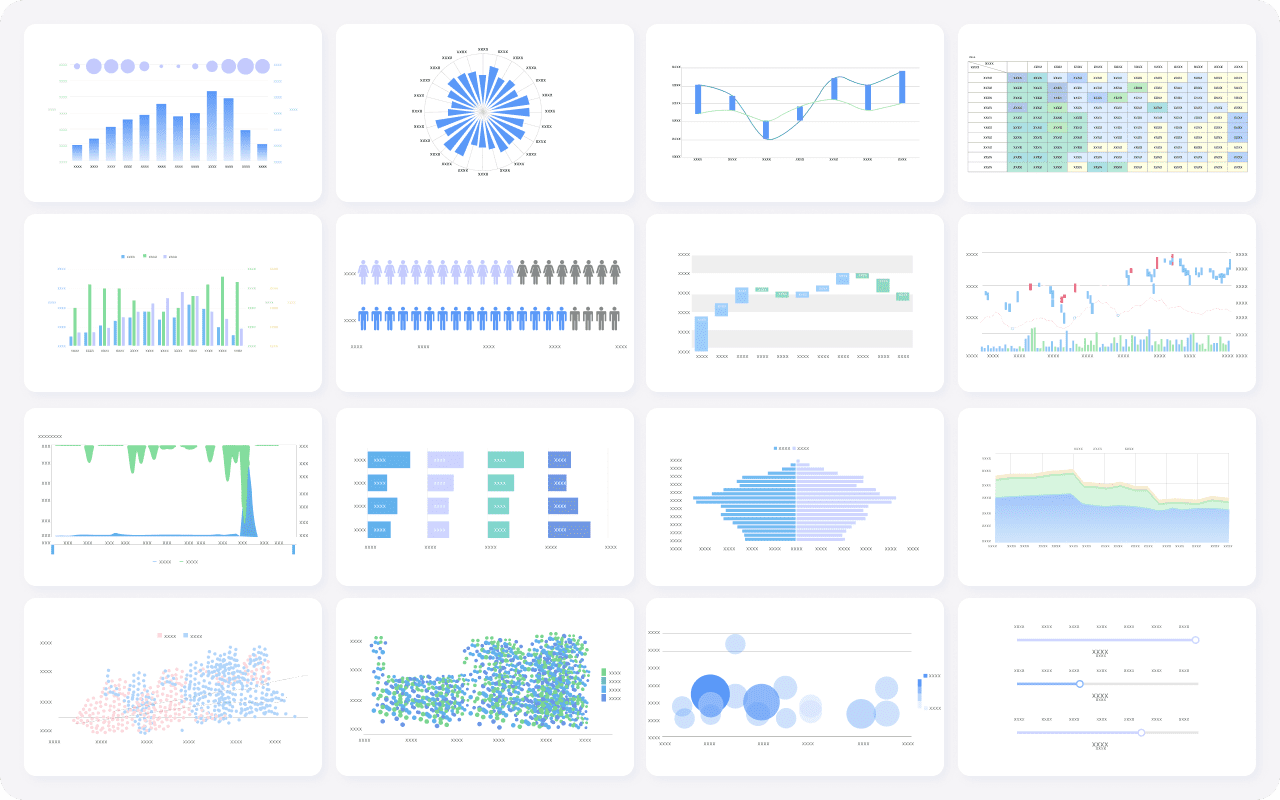
Dashboard creation, interactivity, and visualization depth
This is where many evaluations become too subjective. A dashboard should not be judged only by how impressive it looks in a demo. It should be judged by how quickly your team can build useful outputs and how effectively end users can interact with them.
Review:
- Authoring experience
- Drag-and-drop usability
- Drill-down and filtering
- Dashboard responsiveness
- Visual flexibility
- Ability to support both guided and exploratory analysis
General fit patterns often look like this:
- Tableau is commonly associated with strong visual expression and data storytelling.
- Power BI is often appreciated for approachable dashboard creation across a wide business audience.
- Looker tends to prioritize governed exploration over highly customized visual freedom.
- Qlik supports interactive exploration with its own distinctive analytical experience.
A polished dashboard matters, but adoption usually depends more on whether users can answer business questions quickly.
Governance, administration, and scalability
A BI platform can succeed in a pilot and fail in production if governance is weak or administration becomes too complex.
Compare:
- Role-based access controls
- Permission granularity
- Content certification or promotion workflows
- Multi-team deployment support
- Reusability of definitions
- Administration burden
- Scalability across departments and regions
This is especially important for organizations that need:
- Controlled KPI definitions
- Consistent publishing standards
- Enterprise access policies
- Long-term lifecycle management
Looker is often part of conversations around governed semantic consistency. Power BI is often evaluated for enterprise rollout strength in Microsoft-centered environments. Tableau and Qlik can also serve enterprise analytics well, but your governance model and internal skill mix will heavily influence success.
Total cost, skills required, and time to value
This is where many BI selections become more realistic.
Do not limit cost evaluation to licenses. Include:
- Implementation effort
- Data modeling work
- Training needs
- Admin overhead
- Support requirements
- Ongoing dashboard maintenance
- Potential need for additional tools
Also assess skill dependence:
- Do business users need substantial training?
- Do analysts need advanced modeling expertise?
- Does the platform require strong developer involvement?
- Can your current team support it without long ramp-up times?
A platform with lower entry cost may still be expensive if it increases dependency on scarce technical resources. A platform with broad functionality may still delay time to value if adoption is slow.
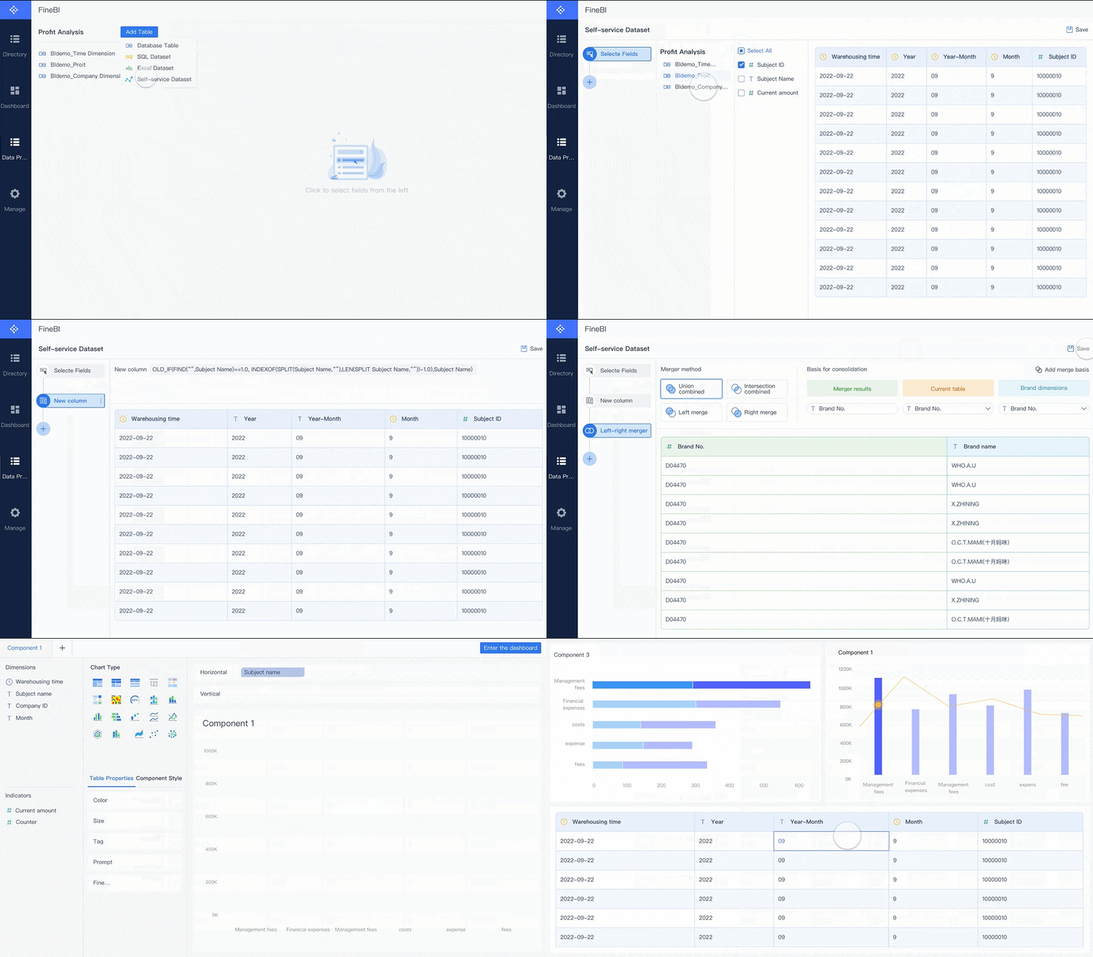
Build a weighted comparison matrix instead of a feature checklist
A feature checklist makes every vendor look capable. A weighted comparison matrix helps you identify which one fits your priorities best.
Create a scoring model for your buying committee
Your buying committee should assign weights to a short list of criteria based on business priorities. Typical categories include:
- Usability
- Governance
- Integration
- Performance
- Cost
- Scalability
- Self-service enablement
For example, a business-led analytics program may assign higher weight to usability and time to value. A regulated enterprise may prioritize governance and auditability.
Use two filters:
-
Must-have criteria
These are non-negotiables, such as row-level security, deployment constraints, or required connectors. -
Weighted preferences
These differentiate good fits from best fits.
Red flags should also be explicit. If a tool introduces major operational risk or depends on skills you do not have, that should count against it early.
Turn findings into a business intelligence tools comparison chart
Once scoring is complete, create a concise business intelligence tools comparison chart that stakeholders can review quickly.
A useful chart should summarize:
- Total weighted score
- Best-fit scenarios
- Key trade-offs
- Risks to adoption
- Implementation complexity
- Governance fit
- Expected time to value
This avoids long, unread vendor evaluation decks and makes executive decisions easier.
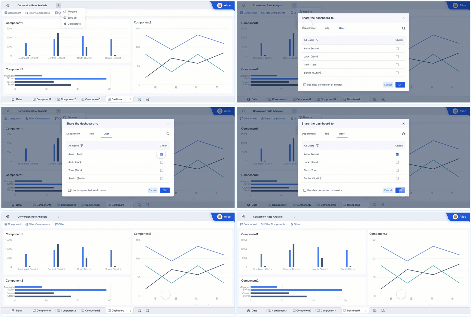
Recognize where each BI platform tends to fit best
No BI platform is the right fit for every organization. The goal is to understand common fit patterns without turning them into rigid rules.
When Power BI is often the strongest fit
Power BI is often a strong fit when:
- Your organization is already aligned with the Microsoft ecosystem
- Broad departmental adoption is a priority
- Cost sensitivity matters
- Analysts and business users need a familiar path into self-service analytics
- You want one platform that can support many common reporting and dashboard scenarios
Its appeal is often strongest where Microsoft tools are already part of the daily operating environment.
When Tableau, Looker, or Qlik may be the better choice
These tools can be better fits depending on your analytics strategy.
- Tableau may fit best when visual analysis, dashboard polish, and data storytelling are central priorities.
- Looker may fit best when semantic consistency, centralized metric logic, and warehouse-aligned governance are essential.
- Qlik may fit best when teams benefit from associative exploration and flexible discovery across complex datasets.
It is also important to watch for adoption risks:
- A visually powerful platform may still struggle if governance is fragmented.
- A highly governed platform may slow adoption if business users feel constrained.
- A discovery-focused platform may require stronger enablement to scale consistently.
- A broadly accessible platform may still need strong data modeling discipline behind the scenes.
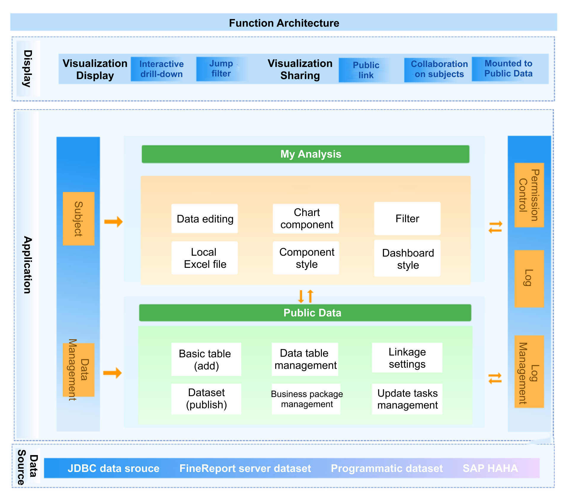
Make the final selection without getting lost in feature lists
The final selection should be based on evidence from real work, not just vendor demonstrations.
Run a focused proof of concept using:
- Real datasets
- Real user roles
- Real dashboard or report requirements
- Real governance needs
- Real performance expectations
Then validate:
- How quickly teams can build useful outputs
- Whether business users can navigate confidently
- Whether security and governance hold up
- Whether performance is acceptable at realistic scale
- How much technical intervention is required
Document why the chosen platform is the best fit for both current needs and future growth. This matters for procurement, change management, and long-term platform governance.
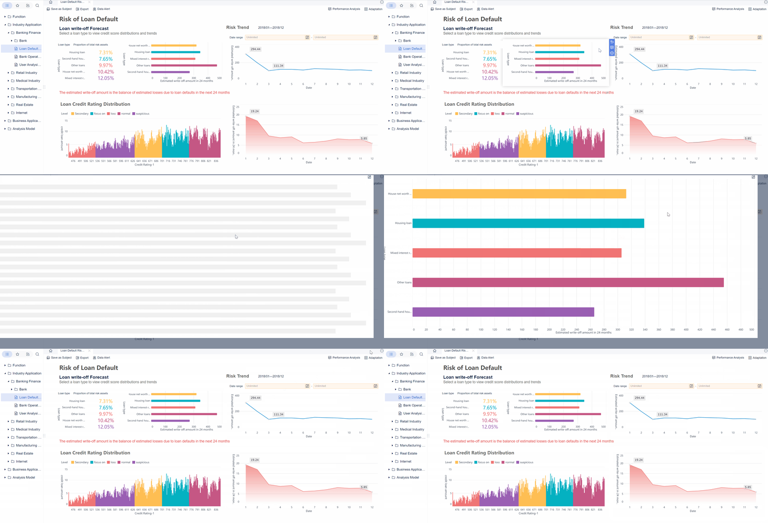
Practical recommendations for a better BI tool comparison
If you want your BI tool comparison to lead to a better buying decision, keep these recommendations in mind:
-
Start with business decisions, not vendor categories
Identify the decisions users need to make and the workflows analytics must support. -
Weight criteria before demos begin
This prevents vendors from reshaping your priorities during the evaluation process. -
Test both creators and consumers
A platform should work for dashboard authors, governed data teams, and end users. -
Include operating cost and skill dependency
The right tool is not just affordable to buy. It must be sustainable to run. -
Use a short, realistic proof of concept
A focused pilot reveals more than a long feature checklist ever will.
Where FineBI fits in a modern BI tool comparison
Tools like Tableau and Power BI are widely used in the BI market, but teams that need a more business-user-friendly, self-service BI platform may also consider FineBI.
FineBI is positioned around practical self-service analytics for business teams while still supporting enterprise reporting and governed data use. For organizations evaluating BI platforms, it can be relevant when the main requirement is not just advanced visualization or strict semantic control, but a balance of:
- Self-service BI for business users
- Drag-and-drop dashboard creation
- Interactive analysis and drill-down
- Enterprise data connectivity
- Faster dashboard iteration across departments
- Shared analytics and operational reporting
This makes FineBI especially relevant for teams that want to expand analytics adoption beyond a small analyst group.
Why FineBI may be a practical option for shortlisting
In many BI evaluations, buyers discover that the hardest part is not finding a tool with enough features. It is finding one that business teams can actually use without excessive dependence on specialists.
FineBI is worth shortlisting if your organization wants:
- Easier self-service dashboard building for business departments
- Interactive dashboards that support exploration, not just static viewing
- Broad data access with manageable business-user adoption
- Faster report and dashboard iteration cycles
- A BI environment that helps bridge technical teams and operational users
That does not mean FineBI replaces every specialized use case. It means it can be a strong fit where usability, cross-department adoption, and practical dashboard delivery matter most.
Get Ready-to-Use Dashboard Templates in Fine Gallery
Final thoughts on choosing the right BI platform
A successful bi tool comparison should reduce noise, not create more of it. If you compare Power BI, Tableau, Looker, and Qlik using the same business-driven criteria, you will get a clearer answer faster.
The best platform for your organization is usually the one that balances:
- User adoption
- Governance
- Data fit
- Operational sustainability
- Time to value
If you also want to evaluate a practical self-service BI option built for broader business use, FineBI is worth including in your shortlist.
FAQs
Start by defining your actual decision criteria, such as business fit, governance needs, ease of use, and long-term maintenance. Then score every platform against the same framework so vendor demos do not shape the outcome.