If you are exploring dashboard local for the first time, the main value is simple: it helps you stop losing track of people after meetings, referrals, networking events, and early sales conversations. For solo operators, small teams, and relationship-driven professionals, the biggest problem is rarely meeting new contacts. It is remembering context, following up on time, and turning scattered conversations into real opportunities. A dashboard local workflow brings contacts, notes, reminders, and outreach steps into one system so relationship-building becomes repeatable instead of reactive.
What Is Dashboard Local and Who Is It For?
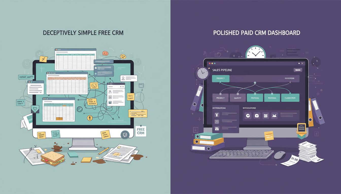
For beginners, dashboard local can be understood as a relationship and follow-up system designed to help you manage local networking, outreach, and contact activity in one place. Instead of relying on memory, spreadsheets, sticky notes, or an overflowing inbox, you use a dashboard to see who you met, what was discussed, and what should happen next.
This matters because most networking effort is wasted in the gap between first contact and consistent follow-up. A dashboard local setup gives structure to that gap. It helps users log conversations, assign tags, schedule reminders, and monitor progress across prospects, referral partners, clients, and community relationships.
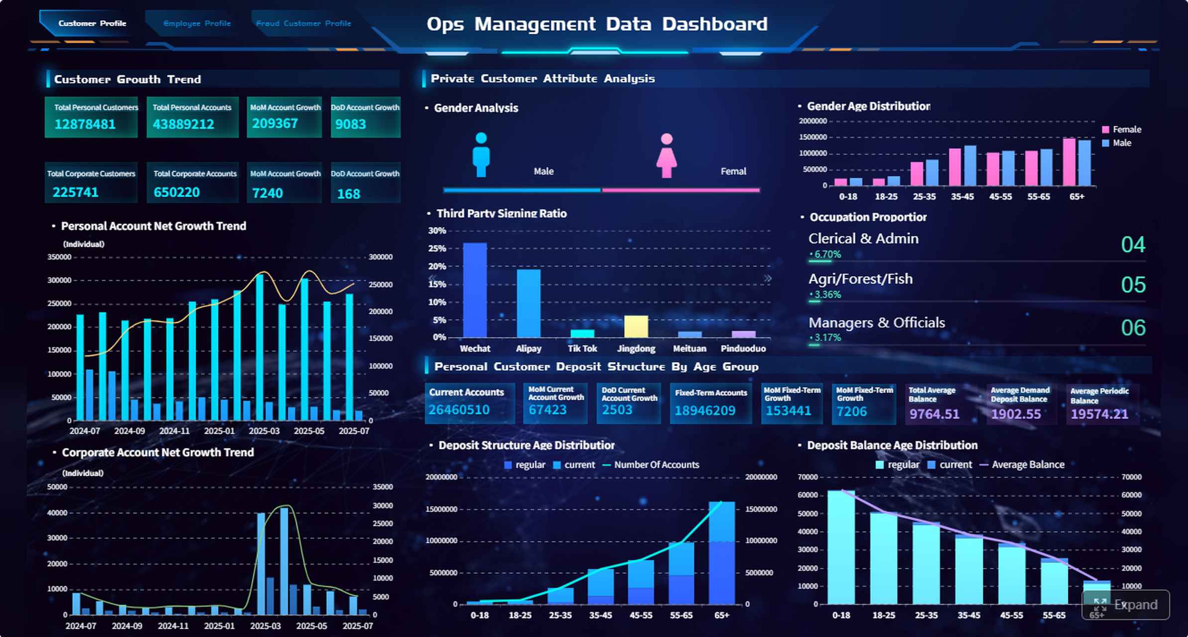
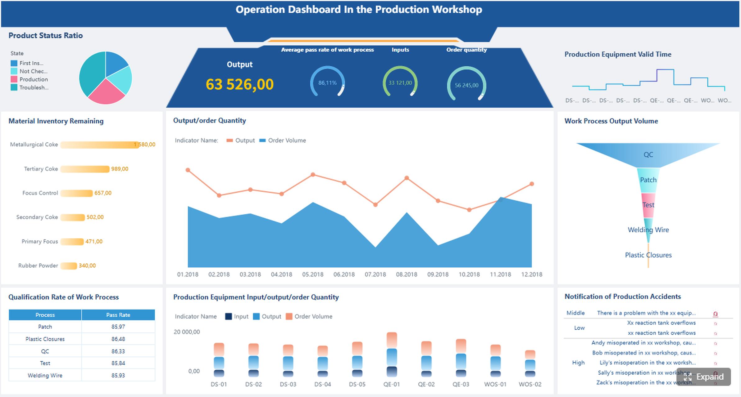
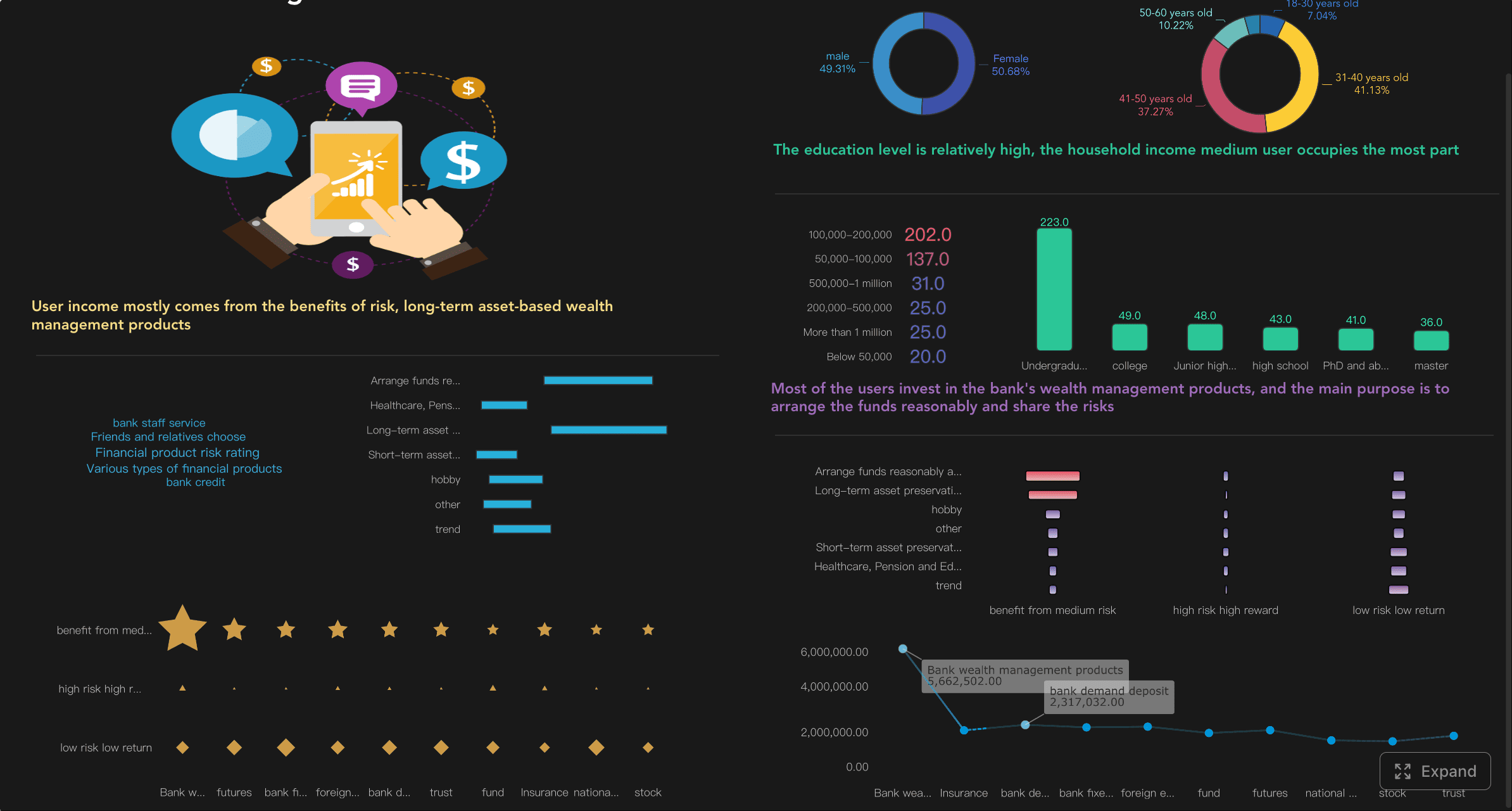
All dashboards in this article are built with FineBI.
In practice, dashboard local supports:
Relationship tracking by storing contact details, conversation notes, and interaction history
Networking follow-through by making next steps visible and time-bound
Organized outreach through reminders, templates, and simple automation
Opportunity management by moving contacts from introduction to meeting to referral or sale
Team consistency when multiple people need visibility into the same pipeline
Professionals and groups that benefit most include:
Consultants and freelancers managing prospects and referrals
Local businesses needing consistent outreach after events or inquiries
Real estate, insurance, and service providers who depend on timely follow-up
Community leaders and event organizers tracking partnerships and introductions
Small sales or business development teams standardizing outreach habits
Membership groups and local associations maintaining engagement after meetings
Key Metrics (KPIs) for a Dashboard Local Workflow
To make dashboard local useful, you need a small set of metrics that show relationship health and follow-up discipline.
New Contacts Added: Number of new people entered into the system over a period
Follow-Ups Due: Contacts requiring outreach today or this week
Follow-Up Completion Rate: Percentage of scheduled follow-ups completed on time
Days Since Last Contact: How long it has been since the last meaningful interaction
Next Step Coverage: Percentage of active contacts with a defined next action
Lead Stage Distribution: Count of contacts by stage, such as new lead, active conversation, meeting booked, referral partner, or closed
Response Rate: Percentage of contacts who reply to outreach
Meeting Conversion Rate: Share of initial contacts that turn into calls, meetings, or 1:1s
Referral Source Performance: Which events, people, or channels produce the strongest opportunities
Dropped Contact Count: Contacts with no activity after a defined number of days
For enterprise-minded users or team leaders, these KPIs matter because they translate relationship activity into measurable operating discipline.
Core CRM Features That Help Your Dashboard Local Stay Organized
A strong dashboard local setup behaves like a lightweight CRM with visibility built for action. For beginners, the goal is not complexity. The goal is clarity.
Contact and relationship management
At the foundation of dashboard local is a contact database that stores more than names and phone numbers. It should capture:
contact information
where you met
business type or role
notes from conversations
tags or categories
referral relationships
last interaction date
next follow-up action
This kind of centralized contact and relationship management is what keeps outreach relevant. Before you reach out, you can quickly review context: where you met, what they needed, who introduced you, and what was promised.
For beginners, this visibility is critical. It reduces awkward outreach and helps you avoid generic “just checking in” messages that weaken trust. Good relationship management lets you pick up the conversation where it actually left off.
Pipeline and follow-up tracking
Once contacts are stored, the next priority is movement. Dashboard local should help you monitor where each relationship stands and what needs to happen next.
Common stages may include:
New contact
Follow-up needed
Conversation started
Meeting scheduled
Referral opportunity
Proposal or offer discussed
Ongoing relationship
Inactive or closed
A pipeline view gives you a snapshot of active opportunities instead of a pile of disconnected names. Even simple stage tracking creates momentum because it tells you which relationships need immediate action and which are progressing well.
Reminders are especially important here. Missed timing is one of the most common reasons warm leads go cold. With follow-up tracking, reminders can prompt you to reconnect after an event, send a resource after a meeting, or check in after a proposal.
Daily workflow and visibility
Beginners often fail not because the tool is weak, but because the daily workflow is unclear. Dashboard local works best when the home screen answers three questions fast:
Who needs attention today?
What follow-ups are overdue?
Which relationships are moving forward?
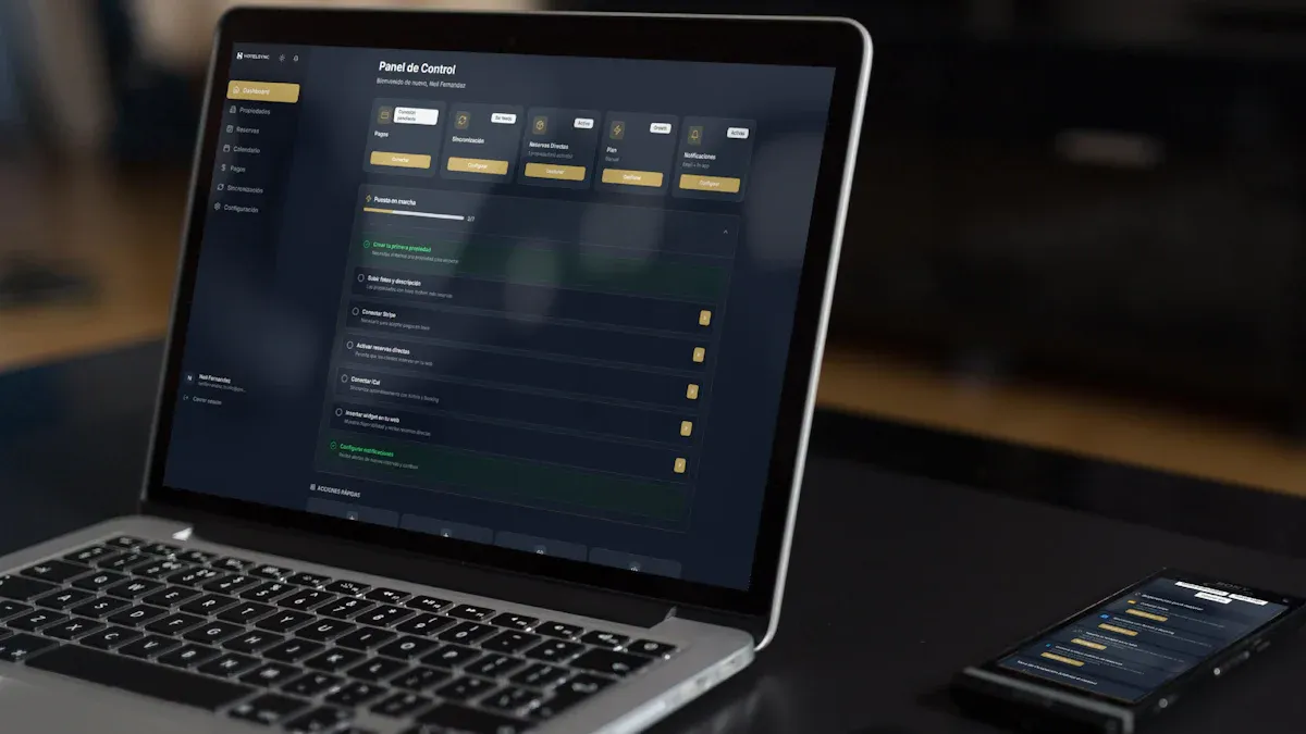
That is why task lists, dashboard cards, filters, and status views matter. Instead of opening multiple apps, you can see pending calls, message reminders, recent contact activity, and stage changes in one place.
For first-time users, centralized visibility reduces mental load. It turns follow-up from something you “should remember” into something the system helps you execute.
How Follow-Up Automation Works in Practical Dashboard Local
Automation is where dashboard local starts delivering real operational value. But for beginners, automation should be practical, not flashy. The purpose is to reduce inconsistency, not replace genuine relationship-building.
Automated reminders and sequences
The simplest form of automation is the reminder. After adding a contact, you can schedule a follow-up for a specific day based on the context of the interaction. That alone prevents many missed opportunities.
The next level is a sequence: a planned series of outreach steps spaced over time. For example:
Day 1: Send a nice-to-meet-you message
Day 3: Share a relevant resource
Day 7: Invite them to a call or coffee meeting
Day 21: Check in with a personalized update
Templates and timing rules make this manageable. Instead of rebuilding every message from scratch, you create a repeatable framework and personalize key details as needed.
This is especially useful for:
post-event follow-up
referral introductions
sales inquiry follow-up
reactivation of dormant contacts
partnership outreach
Automation supports consistency, which is often the hardest part of networking-based business development.
Personalization without losing efficiency
One of the biggest fears around automation is sounding robotic. That concern is valid. A good dashboard local process keeps efficiency high without sacrificing relevance.
The best approach is to automate the structure, not the relationship. In other words:
automate reminders
automate sequence timing
automate task creation
use message templates
personalize the opening line, context, and next step
This balance is what separates effective systems from spammy ones. A message can be quick and still feel human if it references a recent event, mutual connection, business need, or prior conversation.
For example, instead of sending a generic follow-up, you might use a structured template that includes:
where you met
one detail from the conversation
one relevant offer or resource
one clear next step
From a consulting perspective, this is the sweet spot: standardized execution with tailored messaging.
Common beginner mistakes to avoid
Most early dashboard local users do not fail because of poor intent. They fail because they either overcomplicate the setup or automate too aggressively.
Avoid these common mistakes:
Over-automation: Sending too many messages without reviewing engagement
Generic messaging: Using templates that ignore conversation context
Poor timing: Following up too late, too often, or at irrelevant intervals
No stage definitions: Tracking contacts without clear progress markers
Missing next steps: Ending interactions without assigning a concrete action
Ignoring responses: Letting active replies sit because the workflow is one-way
Tracking too much too early: Building an overly complex CRM before basic habits are stable
The fix is straightforward: review responses weekly, refine message timing, simplify stages, and make sure every active contact has a next action.
Real Use Cases of Dashboard Local for Networking, Outreach, and Relationship Building
The best way to evaluate dashboard local is to look at real-world operating scenarios. The tool becomes valuable when it helps teams and individuals reduce dropped conversations and improve consistency.
Independent professionals and service providers
For consultants, freelancers, coaches, and local service businesses, relationship management is often the growth engine. New business may come from referrals, repeat clients, event conversations, and warm introductions. Without a dashboard local process, these opportunities get trapped in texts, email threads, and memory.
Typical use cases include:
tracking prospects from networking groups
following up after discovery calls
managing referral partners
scheduling regular check-ins with past clients
organizing outreach by service category or industry
A freelance consultant, for example, might log everyone met at a local chamber event, tag them by industry, and create a 14-day follow-up sequence for each promising lead. That turns a single event into a manageable opportunity pipeline.
Community builders and event-based networking
Community organizers, membership leaders, and event hosts often meet many people in short bursts. The challenge is not volume alone. It is preserving context after the event ends.
Dashboard local can support this by tracking:
where introductions happened
who requested a follow-up
which people should be connected to each other
potential sponsors or partners
post-event outreach and engagement
This use case is especially powerful when you want to turn one-time event attendance into ongoing community relationships. A strong dashboard keeps introductions warm and helps organizers build a repeatable partnership engine.
Small teams improving consistency
For small business development or customer-facing teams, inconsistency is expensive. One team member follows up quickly, another forgets. One logs notes, another keeps everything private in email. As a result, leads get dropped and reporting becomes unreliable.
A shared dashboard local process solves this by standardizing:
lead capture fields
contact ownership
follow-up timing
stage definitions
note-taking expectations
reminder rules
basic performance reporting
When teams share visibility, managers can quickly see where leads stall, where outreach lags, and which channels generate real results. This is where BI-style dashboards become especially useful for operational oversight.
How to Evaluate Dashboard Local as a Beginner
Choosing a dashboard local solution is less about finding the most feature-rich platform and more about selecting one that fits your current process without creating friction.
Questions to ask before getting started
Before you commit, ask practical questions tied to your real workflow:
How easy is it to add and update contacts?
How long does initial setup take?
Can reminders and follow-up sequences be configured without technical help?
Does the dashboard clearly show overdue and upcoming actions?
Can notes, tags, and activity history be reviewed quickly before outreach?
Is reporting strong enough to show follow-up completion and pipeline movement?
Will this support solo use today and team visibility later?
Does it align with how you already network, sell, or manage referrals?
For decision-makers, the right tool is one people will actually use every day. Usability beats feature depth if adoption is the main risk.
Comparing Dashboard Local with other dashboard tools
This is an important distinction for beginners: not every product labeled “dashboard” serves the same purpose.
In many organizations, the strongest setup combines CRM-style workflow with BI visibility. That is where a platform like FineBI can help teams turn contact, task, and pipeline data into dashboards that are easy to monitor and improve.
Actionable Best Practices for Implementing Dashboard Local
If I were advising a beginner team or solo operator, I would recommend starting lean and building discipline before complexity.
1. Start with one contact structure and one pipeline
Do not create dozens of tags or stages. Begin with a clean structure:
contact name
source
tags
last interaction
next step
owner
stage
Then create a simple pipeline with 4 to 6 stages. This keeps reporting readable and onboarding easy.
2. Define follow-up rules before loading data
Set practical timing rules early. For example:
event contact: follow up within 24 to 48 hours
warm referral: same day or next business day
meeting completed: send recap within 24 hours
inactive lead: re-engage after 30 days
These rules create consistency and make automation meaningful.
3. Use templates, but require a personal detail
Every follow-up template should include one mandatory personalization point, such as where you met, a business challenge discussed, or a mutual connection. This protects message quality while preserving speed.
4. Review dashboard performance weekly
A dashboard local system only improves if someone checks the signals. Review:
overdue follow-ups
response rates
stage bottlenecks
inactive contacts
best-performing referral sources
That weekly review is what turns raw activity into process improvement.
5. Build reporting for accountability, not vanity
Do not overfocus on how many contacts you added. Focus on whether the right actions happened on time and whether conversations progressed. Good reporting should support coaching, prioritization, and better decisions.
Next Steps for Trying It Out
If you are new to dashboard local, the best next step is to test it with a small, real workflow rather than a full rollout.
Start with:
20 to 50 active contacts
1 simple pipeline
2 or 3 tags
1 follow-up reminder rule
1 short outreach sequence
3 success metrics, such as follow-up completion, response rate, and meetings booked
Then spend one to two weeks using it consistently. Add notes after conversations. Review the dashboard each morning. Adjust your timing rules based on responses. This hands-on testing will tell you more than any feature list.
For teams, onboarding matters just as much as software selection. Make sure account creation, user permissions, setup steps, and reporting views are simple enough for daily use. The right platform should reduce friction from day one and give you enough visibility to improve over time.
A well-designed dashboard local process does not just organize contacts. It protects revenue opportunities, improves relationship quality, and helps small teams operate with much greater consistency. If you want a scalable way to visualize follow-up performance, monitor pipeline activity, and build decision-ready CRM dashboards, FineBI is a strong option to evaluate.
Dashboard local is used to organize contacts, conversation notes, follow-up reminders, and relationship stages in one place. It helps individuals and small teams stay consistent after networking events, referrals, and early sales conversations.
Consultants, freelancers, local businesses, real estate professionals, insurance agents, and small sales teams often benefit the most. It is especially useful for anyone who depends on timely follow-up and relationship-based growth.
It captures who you met, what you discussed, and what action should happen next. With reminders and simple automation, it reduces missed follow-ups and keeps conversations moving forward.
Beginners should focus on contact management, notes, tags, follow-up reminders, pipeline stages, and basic automation. The best setup is simple enough to use daily without adding extra complexity.
Yes, it can function like a lightweight CRM by centralizing contacts, tracking relationship history, and showing upcoming actions. This gives small teams shared visibility without needing a more complicated enterprise system.
Product Trial
FineReport
Pixel-perfect reports · Interactive dashboards · Easy data entry · Digital twins