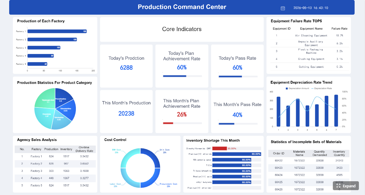
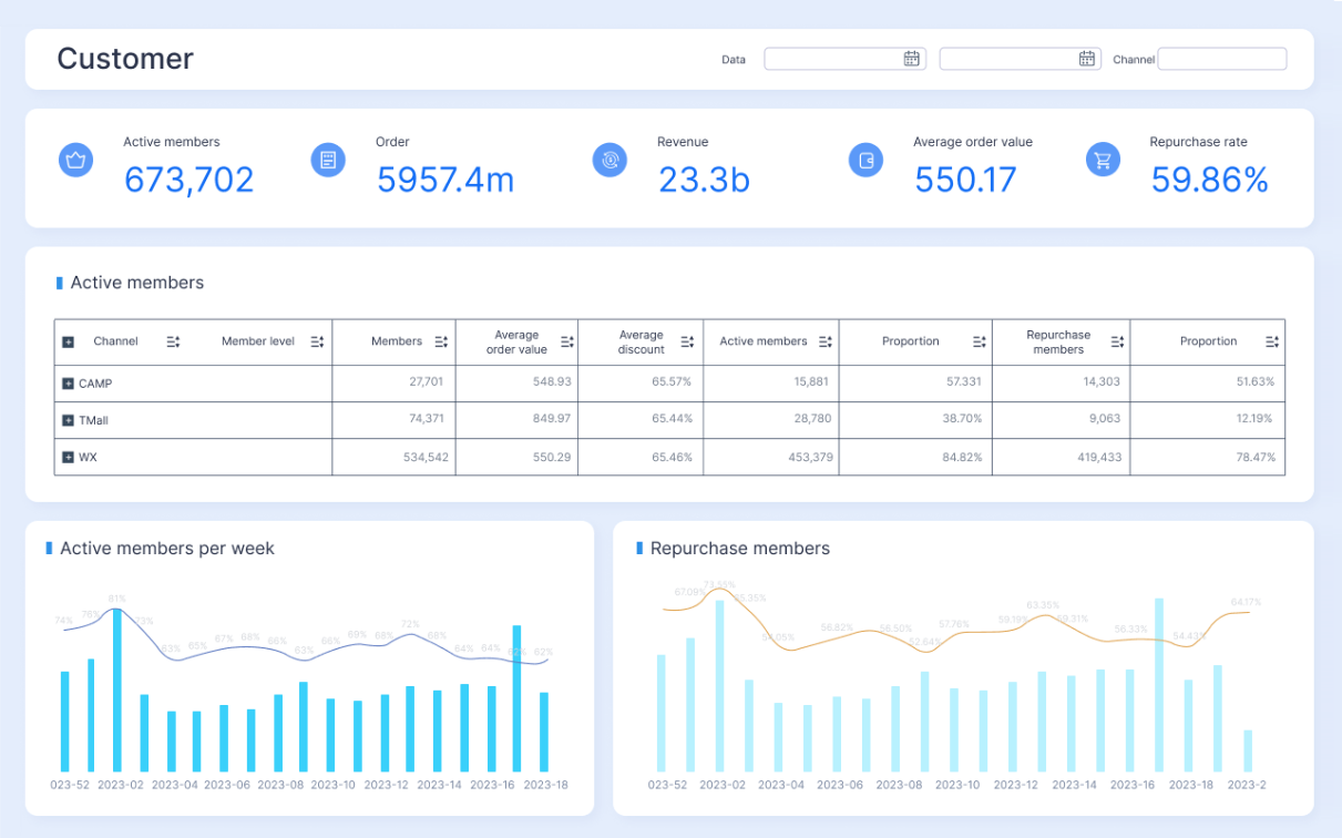
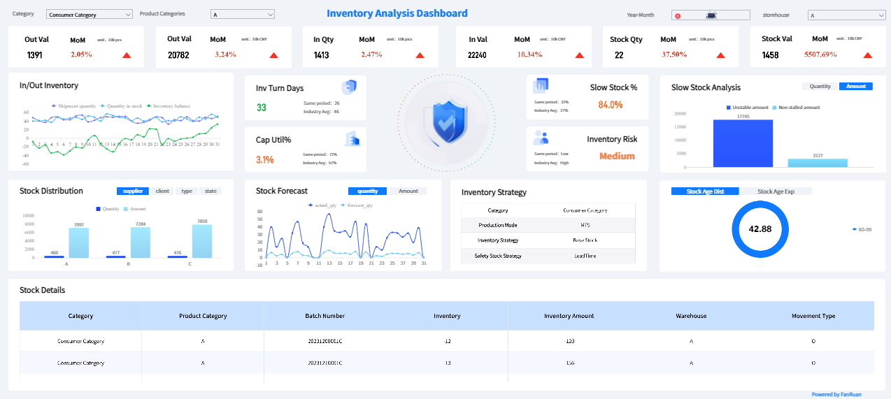
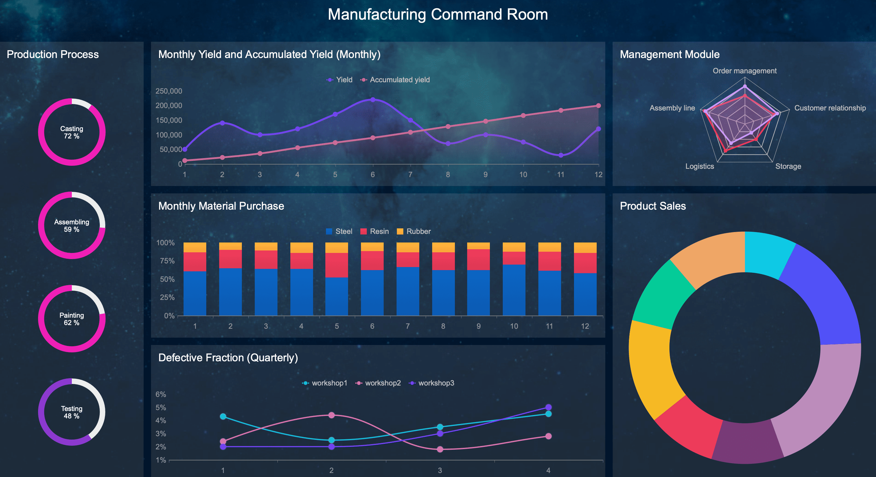
A manufacturing production report dashboard should help plant managers run the floor, not just explain results after the fact. If supervisors still rely on whiteboards, spreadsheets, and verbal updates after your dashboard launch, the problem is rarely the data alone. It is usually because the report was designed for hindsight instead of action. For plant managers, the real business value of a production dashboard is simple: spot risk early, assign ownership fast, and keep output, quality, and delivery on plan shift by shift.
Click To Try The Dashboard
All reports in this article are built with FineReport
Why a manufacturing production report dashboard often fails on the plant floor
Many dashboards fail because they look impressive in a conference room but break down in daily operations. Plant managers do not need a dense analytics portal. They need a manufacturing production report they can read in seconds during a shift handoff, a production meeting, or a floor walk.
Common reasons plant managers stop using dashboards after the rollout
The most common failure pattern is overdesign. Teams cram too many KPIs, charts, and filters into one screen. As a result, users cannot tell what matters now.
Other common issues include:
Metrics that are too high-level to support line decisions
Delayed data that arrives after the shift problem has already grown
Conflicting numbers across ERP, MES, spreadsheets, and manual logs
Dashboards with no clear owner for updates or follow-up actions
Interfaces that are unreadable on large production screens or mobile devices
Color overload that turns every issue into an emergency
When this happens, the dashboard becomes a passive report. People may still open it for meetings, but they stop trusting it as an operating tool.
The difference between a report built for executives and one built for daily operations
An executive dashboard answers broad performance questions: Are we improving? Are margins protected? Are plants meeting strategic targets?
A plant-floor manufacturing production report answers operational questions: Which line is behind? Why did schedule attainment drop this shift? What issue needs escalation before customer delivery is impacted?
That distinction matters. Executives want aggregated summaries and trends over time. Plant managers need immediate variance visibility, drill-down by line or work center, and issue context tied to action.
How to focus the dashboard on decisions, actions, and accountability
The strongest dashboards are built backward from decisions. Before selecting a single chart, define what the manager must decide when the report turns red.
A practical framework is:
Decision: What choice does the manager need to make?
Trigger: What metric or threshold signals action?
Owner: Who responds first?
Time window: Must it be handled now, today, or this week?
Escalation path: When does it move beyond the shift team?
If your manufacturing production report cannot answer those five elements, it is informative but not operational.
Start with the decisions your manufacturing production report must support
A good dashboard begins with the core questions plant managers ask every shift. That is what makes the report usable. Not the chart style. Not the software. The logic.
Define the core questions plant managers need answered every shift
Every shift review should make it easy to answer the following questions:
Are we on plan, behind, or at risk?
Which lines, products, or shifts are driving the gap?
What issues need escalation now versus later review?
Those questions sound basic, but many dashboards fail because they answer them only partially. For example, they may show total output but not identify whether the shortfall came from downtime, changeover loss, labor shortage, or quality fallout.
Large-screen readability for daily production meetings
Mobile or tablet access for supervisors on the move
Fast load times on plant networks
Clear timestamps showing last refresh
Shift, line, product, and work-center filters
Minimal scrolling on the primary operating view
If supervisors cannot use the report during an active shift, they will revert to informal workarounds.
Connect data sources and automate production reporting where possible
You can design the perfect dashboard and still fail if the data foundation is weak. In manufacturing, trust in the numbers is everything.
Pull data from the systems teams already use
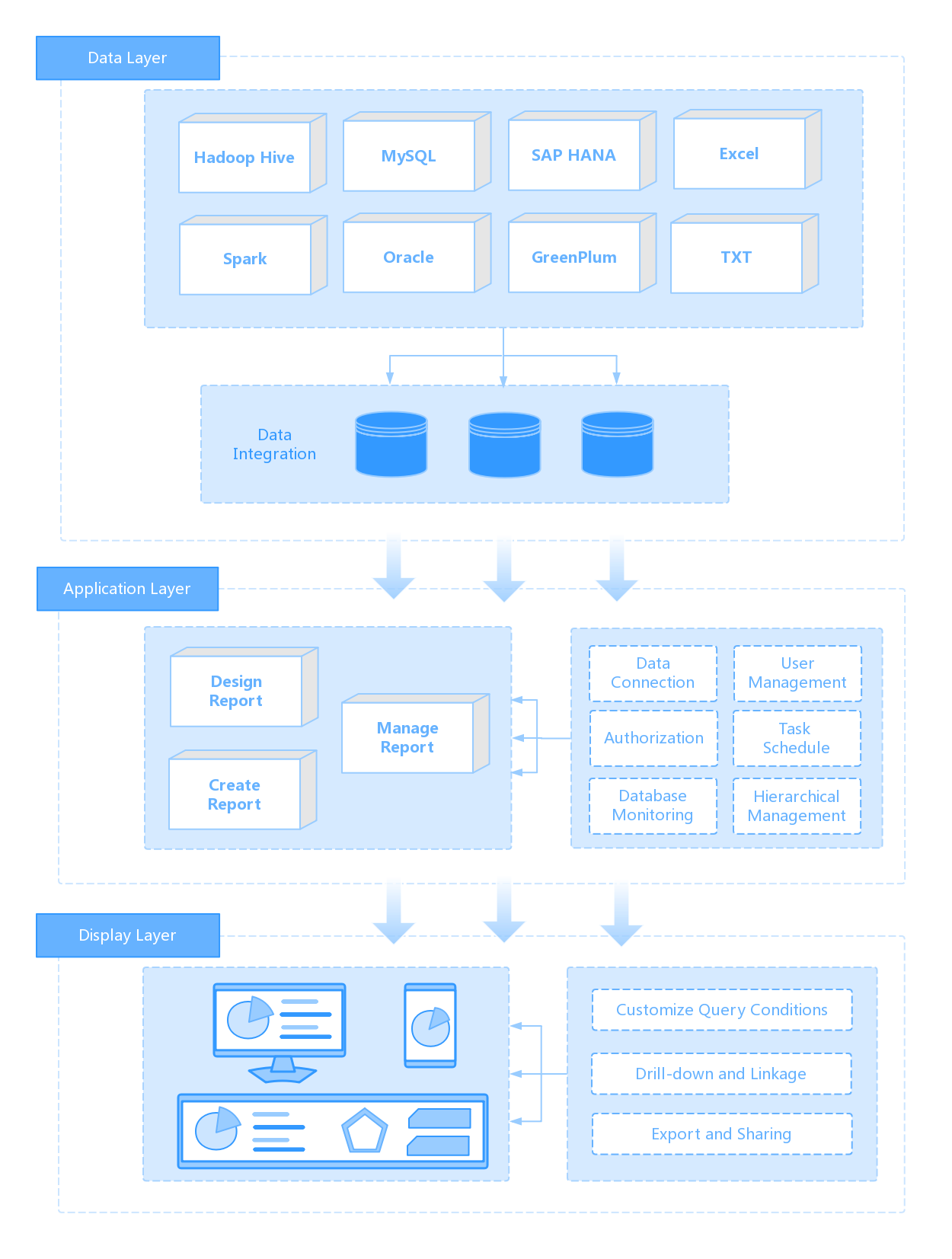
Most production reporting environments pull from multiple systems:
ERP
MES
Quality systems
Maintenance logs
Spreadsheets
Manual inputs from operators or supervisors
The goal is not to eliminate every manual process overnight. It is to reduce duplicate entry and establish one version of the truth for critical metrics.
As a consultant, I usually advise teams to map each KPI to its authoritative source before building the dashboard. For example:
Output from MES or confirmed production transactions
Schedule from ERP or APS
Scrap from quality records
Downtime from machine states plus validated operator reasons
Labor efficiency from time reporting and routing standards
This prevents endless debate later about whose number is correct.
Improve data quality before expanding the dashboard
Do not scale a bad metric. Standardize definitions first.
At minimum, define:
What counts as downtime
What qualifies as scrap versus rework
How throughput is measured
When a unit is considered completed
Which time bucket governs shift attribution
Then add validation checks such as:
Missing shift records
Late transaction posting
Negative or impossible quantities
Duplicate event entries
Mismatched timestamps across systems
Without these controls, a larger dashboard only spreads confusion faster.
Show the benefits of automated production reporting
Automation changes production reporting from a lagging summary into an operating system.
Benefits include:
Faster updates during the shift
Fewer manual reporting errors
Less time spent compiling spreadsheets
More time spent solving root causes
Better consistency across plants and lines
Easier comparison across time periods
Stronger confidence in escalation decisions
For multi-site manufacturers, automation also enables governance. Everyone can review the same definitions, the same cadence, and the same performance structure.
Turn weekly and daily reporting into action, not just visibility
The dashboard is not the finish line. The review process is where value gets captured.
Structure reviews around what changed and why
A daily shift review should focus on immediate control. A weekly manufacturing production report should focus on patterns, priorities, and improvement ownership.
Build the manufacturing production report faster with FineReport
Building this manually is complex; use FineReport to utilize ready-made templates and automate this entire workflow. For manufacturers, that means you can connect ERP, MES, quality, maintenance, and spreadsheet inputs into a single reporting framework without forcing plant teams to manage reporting logic by hand.
Build plant-level and enterprise-level production dashboards
Standardize KPI definitions across lines or sites
Automate scheduled and real-time reporting
Enable drill-down from summary to shift, line, or machine detail
Deliver dashboards for large screens, desktop, and mobile use
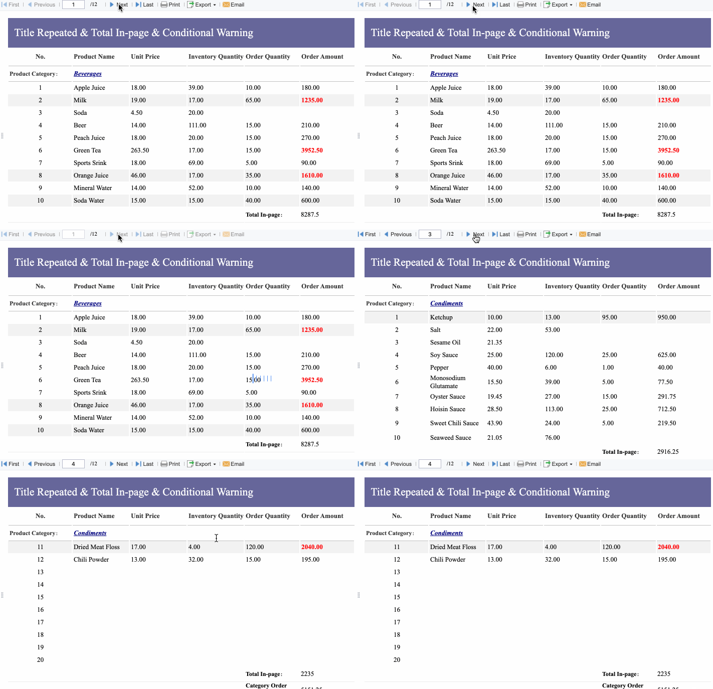
Reduce spreadsheet dependency in daily and weekly reporting
Get Ready-to-Use Dashboard Templates in Fine Gallery
Instead of spending months stitching together manual extracts, inconsistent calculations, and one-off chart logic, teams can deploy a more reliable manufacturing production report framework with faster time to value.
The biggest advantage is not just dashboard creation. It is operational adoption. When reports are easier to trust, easier to access, and easier to act on, plant managers actually use them.
If your goal is to build a manufacturing production report dashboard that supports shift control, weekly accountability, and continuous improvement, start with the decision process, simplify the design, clean the data, and automate wherever possible. Then use FineReport to scale it.
A practical dashboard should show output versus plan, downtime, scrap or rework, schedule attainment, and clear shift or line-level exceptions. It should also show who owns the issue and how fresh the data is.
Managers usually abandon dashboards when they are too cluttered, too delayed, or too high-level to support line decisions. If the screen does not help them act during the shift, it becomes just another meeting report.
It should update often enough to support in-shift action, ideally in near real time or at least several times during the shift. If data arrives after the problem has already spread, the report loses operational value.
The most useful KPIs usually include output, schedule attainment, downtime, scrap rate, rework, labor efficiency, and capacity. The exact mix depends on the process, but each metric should point to a decision or action.
Keep the layout simple, highlight exceptions first, and organize views by shift, line, or work center. Large text, limited colors, and fast drill-downs make the dashboard easier to read during handoffs, meetings, and floor walks.
Product Trial
FineReport
Pixel-perfect reports · Interactive dashboards · Easy data entry · Digital twins