A strong network performance report helps IT managers answer four questions fast: Is the network healthy, where are users being impacted, what risks are growing, and what should the team prioritize next. If your current report is just a dump of device statistics, it is not doing its job. IT managers need a reporting format that connects technical signals to service quality, operational risk, and business decisions such as capacity upgrades, budget requests, and vendor escalations.
Click To Try The Dashboard
All reports in this article are built with FineReport
What a network performance report should help IT managers answer
A recurring network performance report is not just for the NOC. It is a management tool that gives IT leaders a reliable operating picture of service health across sites, links, devices, and critical applications. The value is practical: better prioritization, faster stakeholder alignment, and fewer surprises during outages, audits, or planning cycles.
At minimum, the report should help IT managers answer:
Is the network meeting service expectations? Show availability, response quality, and major SLA exceptions.
Where is user experience degrading? Surface latency, jitter, packet loss, and application-impact signals by location or service.
What is changing over time? Compare current performance against prior periods and historical baselines.
What needs action now? Highlight top incidents, recurring faults, and capacity constraints with owners and deadlines.
What decisions are required? Point to budget, staffing, upgrade, or vendor management implications.
The audience matters. IT managers need enough technical depth to act, but not so much raw telemetry that the report loses its executive narrative. A good report sits between engineering detail and business summary. It should give operational teams drill-down paths while still allowing leadership to scan the first page and understand the story.
Also distinguish a recurring operations report from a one-time troubleshooting summary:
A recurring operations report tracks health, trends, exceptions, and actions over a defined cadence.
A troubleshooting summary focuses on a specific outage, root cause, timeline, impact, and remediation.
That difference is important. Operations reporting supports planning, budgeting, vendor reviews, and cross-functional communication. Troubleshooting documentation supports incident closure and postmortems. Many teams mix them together and end up with a report that satisfies neither purpose.
Core KPIs to include in a network performance report
The best network reports are KPI-driven, not tool-driven. That means you select metrics based on service impact and management decisions, not because a monitoring platform happens to collect them.
Key Metrics (KPIs)
Availability / Uptime
Percentage of time a site, circuit, device group, or service remained operational.
Core use: SLA tracking and service reliability reporting.
Latency
Time taken for data to travel across the network.
Core use: Identifying user experience degradation, especially for cloud and real-time apps.
Jitter
Variation in packet delay over time.
Core use: Voice, video, and collaboration quality assessment.
Packet Loss
Percentage of packets lost in transit.
Core use: Detecting quality issues that affect applications and session stability.
Bandwidth Utilization
Percentage of available bandwidth being consumed.
Core use: Capacity planning and congestion detection.
Peak Usage Windows
Specific times when traffic demand reaches its highest level.
Core use: Scheduling upgrades, traffic shaping, and maintenance planning.
Capacity Headroom
Remaining usable capacity before performance risk increases.
Core use: Forecasting expansion needs before saturation occurs.
Interface Error Rate
Frequency of CRC errors, discards, drops, or other interface anomalies.
Core use: Revealing physical or configuration-related instability.
Device / Interface Health
Operational status of routers, switches, WAN links, and key interfaces.
In most environments, availability, latency, packet loss, utilization, and incident trends should form the backbone of the report. Then add environment-specific KPIs based on what matters most: branch connectivity, VoIP quality, cloud access, SD-WAN path performance, or data center resilience.
How to choose KPI thresholds that reflect business impact
Thresholds should not be arbitrary. If every chart is red, nothing is actionable. If everything is green, the report becomes theater.
Use a threshold model that combines three inputs:
SLA commitments to customers, business units, or internal service owners
Historical baselines for normal behavior by site, service, and time window
Business criticality of the application, circuit, or location
A practical way to structure thresholds:
Green: Within expected operating range, no immediate action needed
Yellow: Early warning, monitor closely or schedule preventive action
Red: Escalation threshold, user impact likely or already occurring
Do not use the same thresholds everywhere. A branch handling finance operations should not be judged the same way as a low-priority guest network. Separate early-warning thresholds from escalation thresholds so teams can intervene before service quality drops visibly.
Avoid vanity metrics. A chart may look impressive but still fail the management test. If a metric does not support a decision, an escalation, or a preventive action, remove it from the executive layer.
What is network performance monitoring?
Network performance monitoring is the continuous observation of devices, links, traffic, and service quality to maintain visibility into how the network is performing. In practice, it means collecting telemetry across infrastructure and turning it into signals that show whether users and applications are getting the service they need.
Monitoring becomes valuable when it feeds reporting outcomes such as:
Trend analysis to reveal whether service quality is improving or degrading
Root-cause signals to narrow fault domains faster
Accountability through recurring KPI tracking and ownership
Planning inputs for capacity, architecture, and budget decisions
Without disciplined reporting, monitoring data stays operationally noisy. With a well-designed network performance report, it becomes management intelligence.
Recommended report layout for clarity and actionability
A report layout should reflect how decision-makers read. Most IT managers scan for status first, then exceptions, then trend context, then actions.
The recommended structure is straightforward:
Executive summary
Health overview
KPI trends
Incident review
Capacity analysis
Recommendations and action tracker
Start with an executive summary that answers three things in one page: current status, major changes since the last period, and decisions or escalations needed. This is the section executives and senior IT leaders are most likely to read in full.
Then group the body into logical sections:
Health overview
This section gives a broad picture of current service condition across sites, circuits, device groups, or critical services. Use a small set of status indicators and one or two summary visuals. The goal is quick orientation, not analysis overload.
Recommended components:
Overall status by service or region
SLA attainment snapshot
Count of affected sites, circuits, or users
Major risk areas flagged for review
KPI trends
Trend sections show whether network performance is stable, improving, or deteriorating. Use consistent time ranges across metrics so the reader does not have to mentally normalize the visuals.
Recommended components:
7-day, 30-day, or monthly trends
Comparison against baseline or prior period
Threshold bands for context
Noted deviations tied to incidents, maintenance, or traffic events
Incidents
Incident reporting should summarize operational impact, not just list tickets. Show what happened, how often, how long it lasted, and whether it points to a recurring pattern.
Recommended components:
Incident counts by severity
Top recurring fault categories
MTTR trend
Links between incidents and affected services or locations
Capacity
Capacity sections connect today’s utilization with tomorrow’s risk. This is where IT managers prepare budget requests and upgrade plans.
Recommended components:
Top congested circuits or interfaces
Peak usage windows
Growth trends by site or application path
Capacity headroom by critical link
Recommendations and action tracker
This final body section turns reporting into operational control.
Recommended fields:
Issue
Business impact
Recommended action
Owner
Deadline
Expected outcome
Status
Viewing a summary network performance report
A summary network performance report should put the highest-value information first. If a manager has only three minutes before a steering call, the report still needs to work.
Keep this summary to one page if possible. Then provide deeper technical sections afterward. This structure helps IT managers move from overview to evidence without overwhelming the initial readout.
A strong summary report also makes drill-down needs obvious. It tells the reader where further investigation is required without forcing them into device-level detail immediately.
Charts, tables, and annotations that improve readability
Different visuals serve different decisions. Use the right format for the right question.
Trend lines for latency, packet loss, utilization, and uptime over time
Bar charts for top affected sites, top incidents, or top congested links
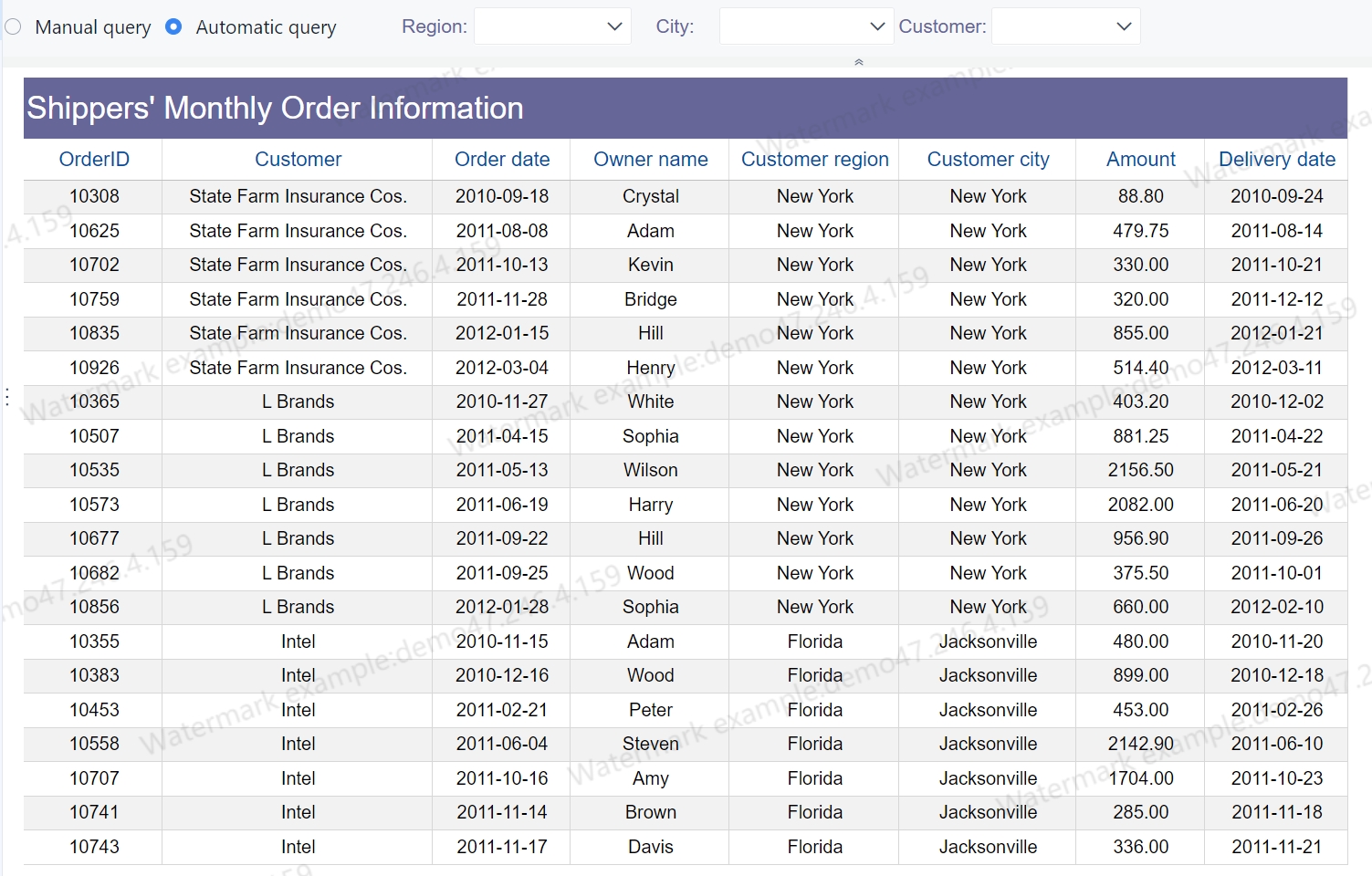
Tables for SLA exceptions, inventory, recurring fault lists, and action tracking
Heatmaps for multi-site comparisons across time periods
Status cards / gauges for high-level KPI summaries
Annotations matter more than many teams realize. Add notes directly onto charts for:
Major incidents
Maintenance windows
Traffic spikes
Circuit cutovers
Policy or routing changes
This makes charts interpretable at a glance. Otherwise, stakeholders are forced to guess why the line moved.
Keep visual density low. If a non-specialist cannot understand the chart in ten seconds, simplify it. Clarity beats dashboard ornamentation every time.
How to create executive readouts from technical data
Executive readouts are where many network reports fail. The data is often accurate, but the message is weak. Leaders do not need raw telemetry first. They need a concise explanation of business effect, trend direction, and recommended decision.
Translate technical metrics into business outcomes such as:
User complaints or ticket volume
Downtime exposure
Productivity loss risk
Branch disruption
Collaboration quality degradation
Revenue or service delivery risk
A useful executive readout format is simple:
What changed since the last period
Why it changed
What the business impact is
What decision or action is needed
For example, instead of saying, “Packet loss increased on three WAN links,” say, “Packet loss rose above threshold on three branch WAN links during peak hours, increasing voice call instability and likely contributing to the spike in user complaints from sales teams.”
That is what leadership can act on.
Also include:
Top 3 risks
Top 3 wins
Next steps
This creates balance. Decision-makers want to know where risk is rising, but they also need confidence that improvement work is paying off.
Tailoring the message for IT leaders and business stakeholders
One report can serve both audiences if the narrative is layered correctly.
For IT leadership, include more operational context:
Recurring fault domains
Capacity pressure trends
Service dependencies
Vendor performance concerns
Escalation backlog and remediation progress
For executives and business stakeholders, keep the language outcome-focused:
Service availability trend
User impact level
Budget implications
Staffing or vendor support needs
Business continuity risk
The facts must remain consistent across both views. What changes is the framing and depth. A CIO may need a short summary about growing WAN saturation risk, while the infrastructure manager needs the exact sites, links, and trend data behind it.
Common mistakes in executive reporting
Most weak executive reporting falls into a few predictable traps:
Leading with device-level detail
This buries the headline before the reader understands the business context.
Mixing unrelated time periods
Comparing daily latency with monthly uptime distorts trend interpretation.
Reporting metrics without interpretation
Numbers alone do not tell stakeholders what changed or why it matters.
Ignoring ownership
A report without named owners and due dates is not an action tool.
Overloading the first page
Too many widgets reduce signal and increase confusion.
To avoid these mistakes, write the summary last. Once you know the real story in the data, the executive layer becomes much sharper.
Tools, trends, and examples to strengthen reporting
A manual reporting process may work for a small environment, but it usually breaks down as networks become more distributed and service expectations increase. Hybrid infrastructure, cloud traffic paths, SD-WAN policies, and rising stakeholder demands all make spreadsheet-heavy reporting slow and error-prone.
That is why more teams are shifting from manual exports to dashboard-driven workflows and scheduled report delivery.
Can it consolidate data from devices, circuits, applications, and service layers reliably?
Visualization flexibility
Can you build executive summaries and technical drill-downs from the same data model?
Threshold and alert logic
Can thresholds be tuned by service, site, and business criticality?
Scheduling and distribution
Can reports be automated by cadence, audience, and approval workflow?
Stakeholder-friendly summaries
Can non-technical readers understand the output without interpretation from an engineer?
Using benchmark and trend references effectively
Industry trend material can help validate reporting priorities. For example, a Network Performance Monitoring Trends Report 2024 can offer useful context on which metrics, review cadences, and observability practices are gaining traction.
Use that kind of input carefully:
Treat industry trends as context
Treat your internal baselines as decision criteria
Treat service objectives as the final authority
External trends should not replace local reality. If your business depends heavily on real-time collaboration, jitter may deserve more attention than generic benchmark reports suggest. If branch uptime is the top business issue, keep that front and center.
Building a repeatable network performance reporting process
The strongest reporting programs are standardized. They do not depend on one analyst pulling data manually at month end.
To build a repeatable process, follow these best practices:
Identify where uptime, interface health, traffic, incident, and service quality data will come from.
Reconcile metric definitions early so teams are not debating formulas later.
Set a clear reporting cadence and approval flow
Weekly for operations, monthly for management, quarterly for planning is a common model.
Define who reviews drafts, who approves final versions, and who receives each audience-specific output.
Standardize naming, KPI formulas, and threshold logic
Keep site names, device groups, service labels, and time windows consistent.
This is essential if you want valid comparisons over time.
Create an action-oriented output format
Every exception should lead to an owner, due date, or escalation path.
Reporting without follow-through becomes passive documentation.
Review the report quarterly
Networks evolve. So should your report.
Remove stale metrics, add new service views, and refine executive summaries based on stakeholder feedback.
After your process is stable, automation becomes the force multiplier. You reduce manual effort, improve consistency, and make reporting far more scalable.
Building this manually is complex; use FineReport to utilize ready-made templates and automate this entire workflow.
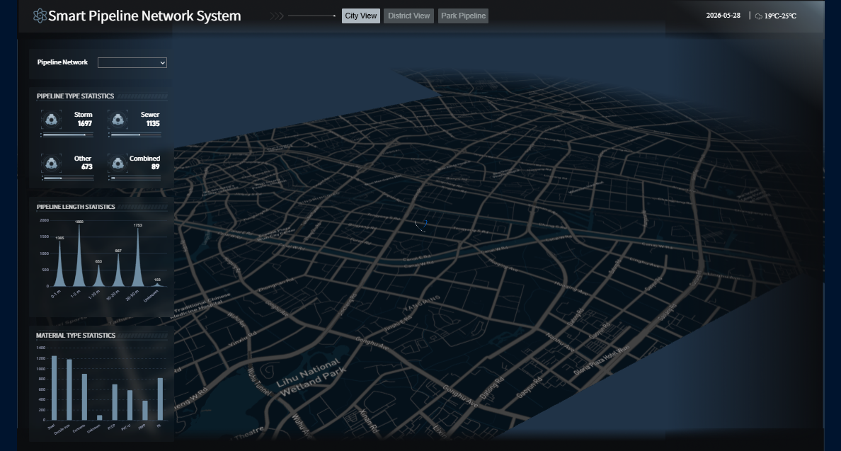
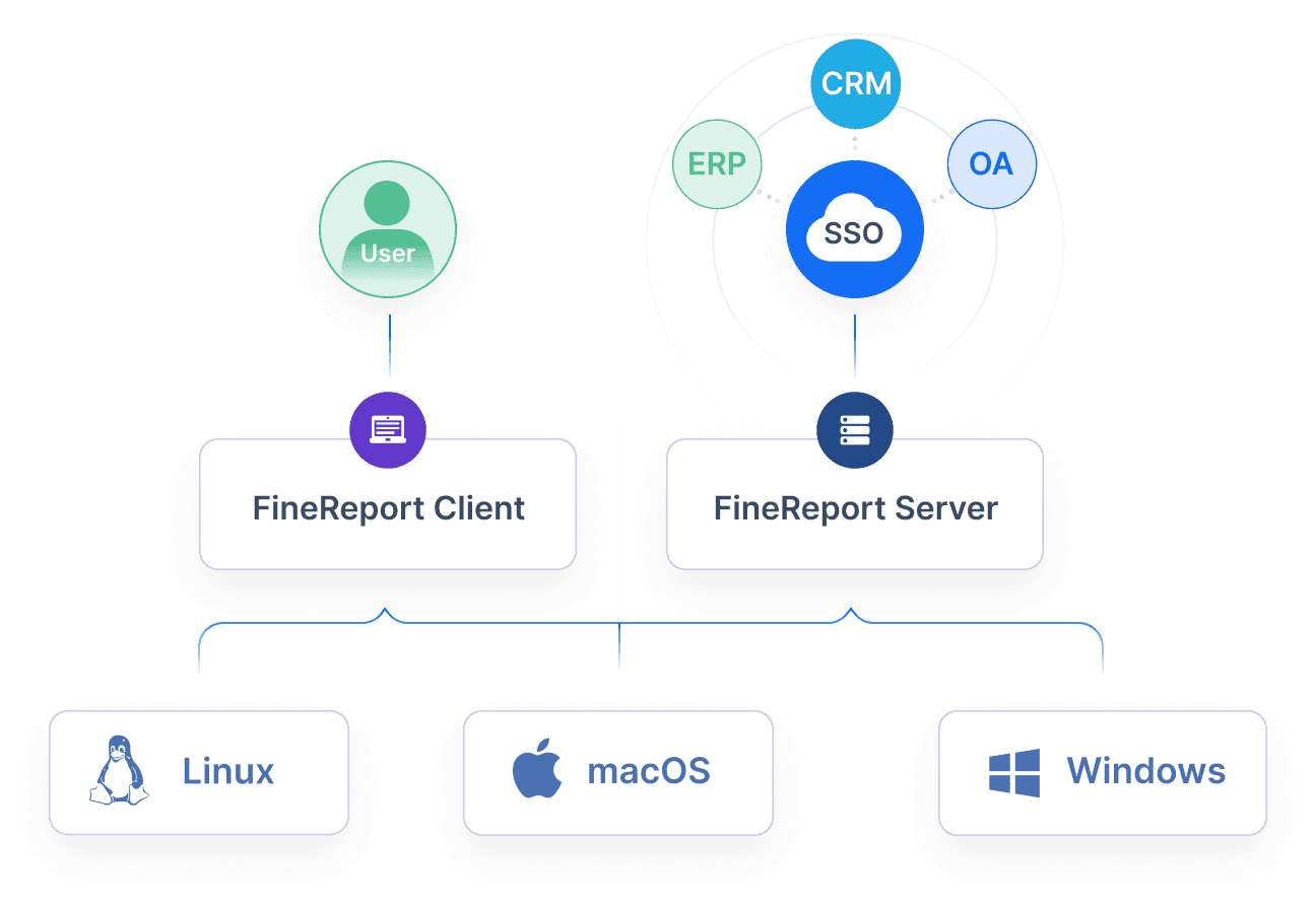
FineReport helps IT teams turn fragmented monitoring data into an executive-ready network performance report without rebuilding layouts in spreadsheets every reporting cycle. Instead of manually collecting exports, formatting charts, and rewriting summaries, teams can centralize data, standardize KPI logic, and generate stakeholder-specific dashboards and scheduled outputs from one platform.
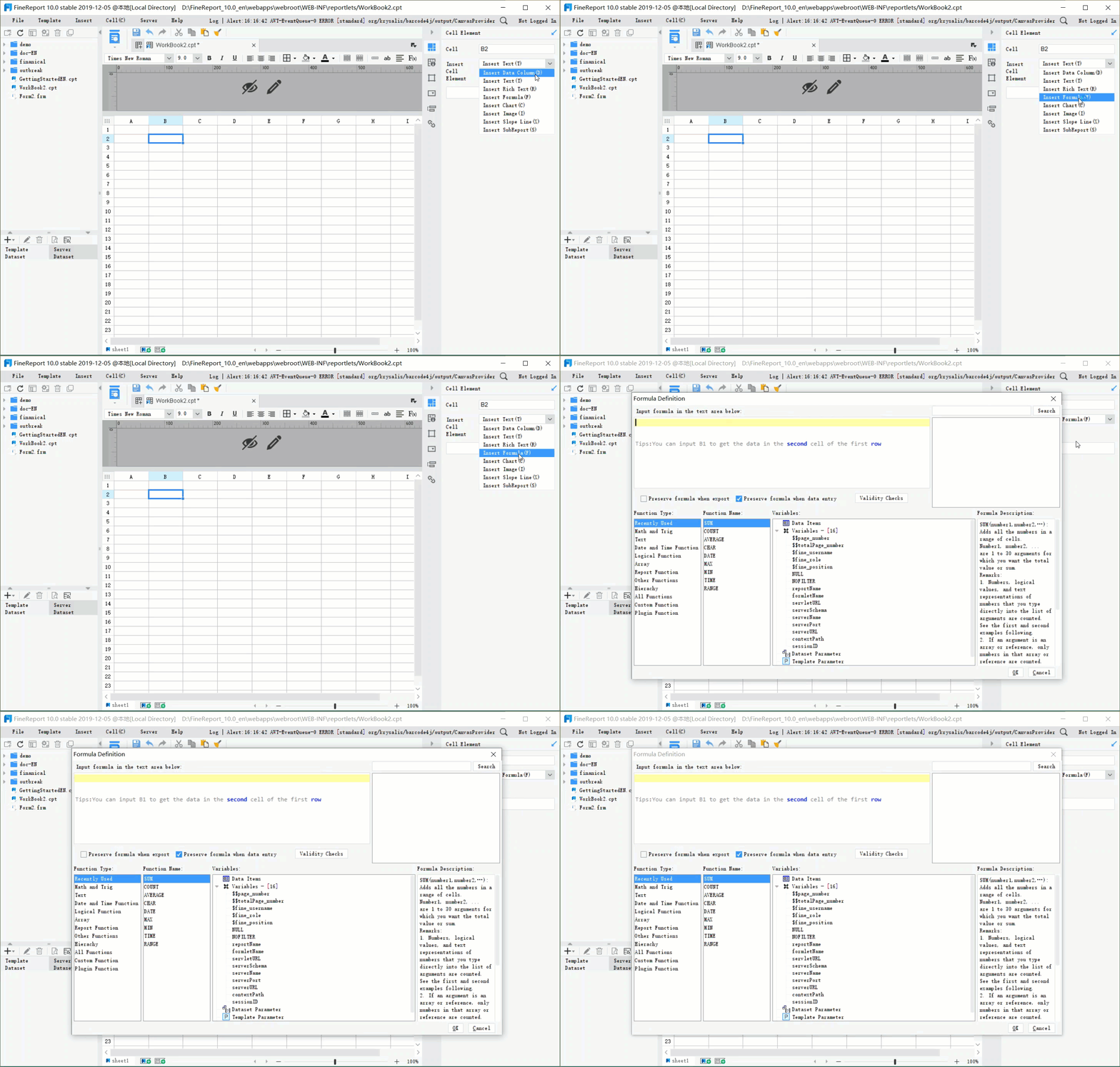
Add annotations, thresholds, and exception logic visually
Reuse dashboard templates to shorten deployment time
Get Ready-to-Use Dashboard Templates in Fine Gallery
For enterprise teams, the advantage is not just prettier dashboards. It is governance, repeatability, and speed. You can create a reporting framework that scales across departments and reporting cycles while keeping the story consistent for IT managers, executives, and operations teams.
If your current network performance report is taking too long to build, lacks narrative clarity, or fails to drive action, that is usually a tooling and process problem, not just a design problem. FineReport helps solve both.
It should include core KPIs like uptime, latency, packet loss, bandwidth utilization, incident trends, and MTTR, plus a short executive summary and clear next actions. The goal is to connect technical performance with service impact and decisions.
In most cases, the most important KPIs are availability, latency, packet loss, bandwidth utilization, and incident volume over time. These metrics show whether the network is reliable, where users may be affected, and whether capacity or support issues are growing.
Most teams review them weekly for operations and monthly for management and planning. The right cadence depends on network complexity, business criticality, and how quickly performance risks change.
Use thresholds based on SLA targets, historical baselines, and actual business impact instead of arbitrary red-yellow-green values. This makes alerts more actionable and helps managers focus on issues that truly affect users and services.
A network performance report is a recurring management view that tracks health, trends, exceptions, and priorities over time. A troubleshooting report is focused on a specific incident, covering root cause, impact, timeline, and remediation.
Product Trial
FineReport
Pixel-perfect reports · Interactive dashboards · Easy data entry · Digital twins