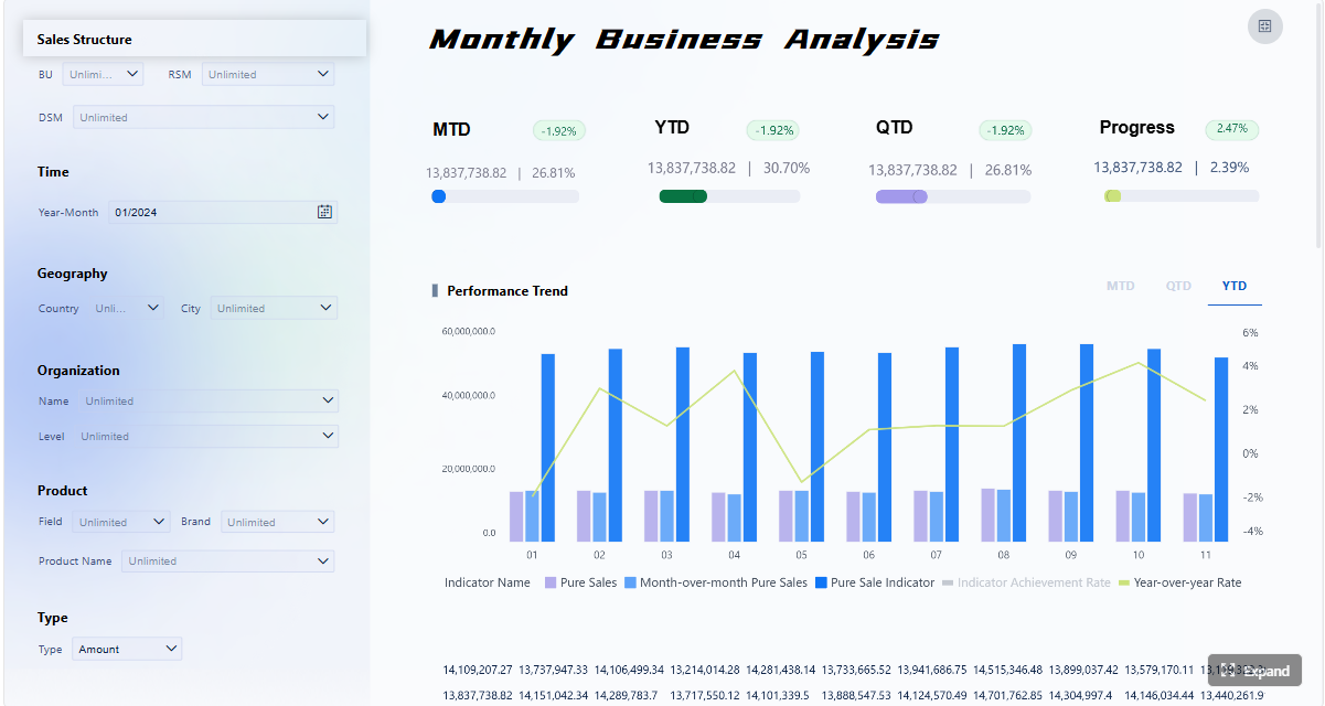
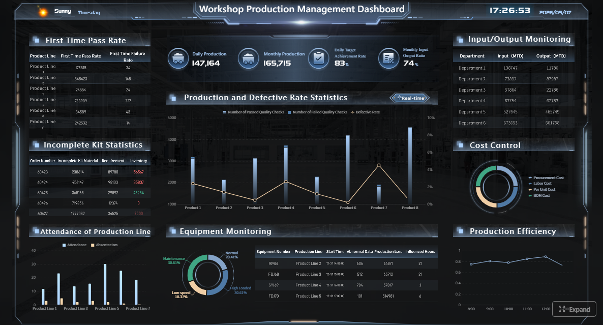
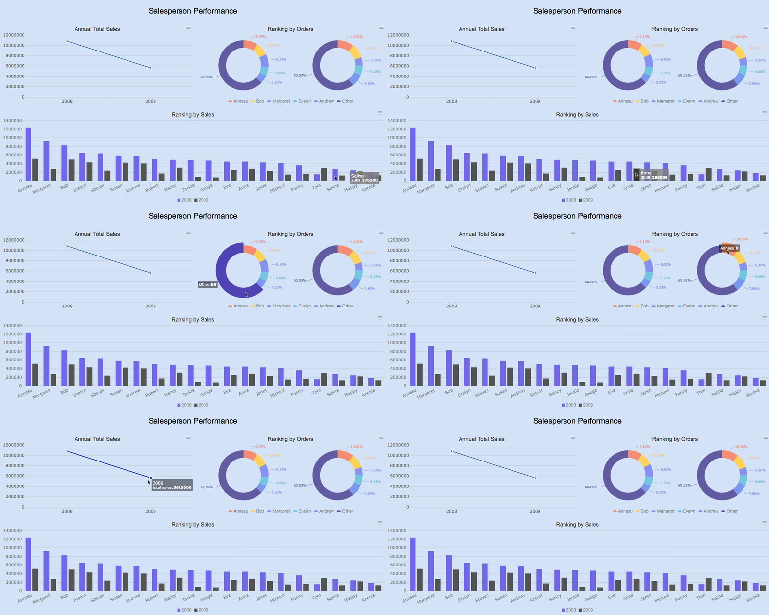
A monthly sales report for executives is not a spreadsheet recap. It is a decision tool built to answer three questions fast: Are we on track, where is risk increasing, and what action should leadership take this month? For CROs, sales directors, finance leaders, and operations managers, the pain point is rarely lack of data. It is fragmented metrics, inconsistent definitions, and dashboards that bury strategic signals under rep-level noise. A strong executive dashboard fixes that by turning monthly sales performance into a compact, high-confidence view of revenue, pipeline health, forecast reliability, and customer risk.
Click To Try The Dashboard
All reports in this article are built with FineReport
What a monthly sales report dashboard should help executives decide
An executive-facing monthly sales report should support decisions, not just display numbers. Its purpose is to surface business performance, explain what changed, and point leaders toward intervention, investment, or acceleration. If the dashboard cannot help an executive decide whether to adjust targets, rebalance territories, focus coaching, or revise forecast assumptions, it is not doing its job.
Clarify the dashboard’s purpose: fast visibility into revenue performance, risk areas, and next-step decisions
Executives do not need every activity metric. They need a short path from signal to action. Your monthly sales report should quickly show:
Whether revenue landed above, below, or in line with plan
Which drivers contributed most to the result
Where the pipeline is healthy or weakening
Whether the forecast can be trusted
What customer or retention risks could affect next quarter
This is why a dashboard should combine performance metrics, trend context, and decision triggers in one view.
Define the difference between an operational sales view and an executive summary view
This distinction is where many teams go wrong.
An operational sales dashboard is designed for frontline management. It often includes call activity, rep tasks, daily funnel movement, and detailed stage management. That is useful for sales managers, but too granular for executive review.
If the monthly sales report includes too much rep-level detail, executives waste time scanning and miss strategic issues.
Set the reporting period, business scope, and audience expectations before choosing metrics
Before you design any view, define three things:
Reporting period
Confirm the exact monthly close window, comparison periods, and whether the report includes booked revenue only or bookings plus forecast.
Business scope
Decide if the dashboard covers the full company, a region, a business unit, a product line, or a channel.
Audience expectations
A CFO may prioritize forecast accuracy and margin-adjacent signals. A CRO may focus more on pipeline coverage, conversion, and team execution. Your monthly sales report must reflect the real decision makers in the room.
Core KPIs to include in a monthly sales report
The best executive dashboards do not try to show everything. They select a controlled set of KPIs that explain current performance and future risk. For a monthly sales report, those KPIs usually fall into three groups: revenue and growth, pipeline and conversion, and forecast and retention signals.
Those four tell the basic story: how much you sold, whether momentum is improving, whether seasonality is affecting interpretation, and whether the business hit plan.
You should also add driver metrics such as:
Average deal size
Sales by product line
Sales by region or segment
These explain whether growth came from broad demand, a few large deals, one product family, or one market cluster. That distinction matters because executives need to know if performance is scalable or fragile.
A monthly sales report should not only explain the month that closed. It should show whether next month and next quarter are likely to hold.
The most useful pipeline and conversion metrics are:
Qualified pipeline value
Win rate
Sales cycle length
Stage conversion rates
Lead-to-opportunity rate
Opportunity-to-close rate
Together, these KPIs reveal whether demand creation is healthy, whether pipeline quality is slipping, and where deals are stalling.
For example:
A strong pipeline with falling stage conversion suggests execution or qualification problems.
Stable win rate with longer cycle length may point to procurement delays or pricing friction.
Rising top-of-funnel volume with weak lead-to-opportunity conversion often signals poor lead quality.
Forecast and retention signals
Executives care about outcomes, but they also care about confidence. That is why a monthly sales report should include forward-looking indicators.
The most important are:
Forecast accuracy
Renewals
Churn risk
Repeat purchase rate
Customer lifetime indicators
Exception metrics
Forecast accuracy tells leadership whether the sales organization can be trusted to predict near-term revenue. Renewal and churn metrics show whether new sales are being offset by customer erosion. Repeat purchase and customer lifetime indicators help executives understand revenue quality, not just revenue volume.
Exception metrics are especially valuable because they catch hidden issues early, such as:
One region contributing too much of total revenue
A sudden drop in conversion at one funnel stage
Unusual deal concentration in the final week of the month
A spike in at-risk renewals among top accounts
How to structure the dashboard layout for fast executive reading
Executive dashboards succeed or fail on layout. Even the right metrics lose value when they are scattered, duplicated, or visually noisy. The layout should support a fast reading pattern: headline first, explanation second, detail only when needed.
Place the most important information above the fold
The top section of the dashboard should answer the executive’s first scan in under 10 seconds.
Put these elements above the fold:
Headline KPIs: total sales, MoM growth, YoY growth, target attainment
This structure keeps the monthly sales report aligned to real review conversations.
For example:
Revenue section explains what happened
Pipeline section shows what is coming
Team performance highlights where execution is strong or weak
Customer health reveals whether growth is durable
Design for clarity, not decoration
A dashboard built for executive monthly review must survive multiple formats: live review, shared link, PDF export, and presentation screenshot. That means clarity matters more than visual flair.
Best design rules include:
Use direct labels, not jargon-heavy chart titles
Limit color to status, variance, and exception highlighting
Remove nonessential gridlines and chart effects
Show comparisons clearly and consistently
Use the same time logic across visuals
Keep annotation short and useful
If a chart needs a long verbal explanation, redesign it.
Decision triggers executives should build into the dashboard
A monthly sales report becomes valuable when it tells leaders not just what happened, but when to act. Decision triggers convert passive reporting into management discipline.
Every key metric should have a defined action threshold. A simple red-yellow-green system works well when the logic is explicit.
Examples:
Missed target attainment
Green: 95% to 105% of target
Yellow: 90% to 94%
Red: below 90%
Declining win rate
Green: within normal range
Yellow: down 3 to 5 points from baseline
Red: down more than 5 points
Delayed deals
Green: sales cycle within benchmark
Yellow: cycle extended 10% to 15%
Red: cycle extended beyond 15%
Churn risk
Green: low-risk book
Yellow: moderate-risk concentration in renewals
Red: high-risk exposure in strategic accounts
Most importantly, every threshold should map to:
A follow-up action
A named owner
A review timing
That makes the monthly sales report operationally useful.
Questions leaders should be able to answer quickly
An executive dashboard should allow fast answers to the most important leadership questions:
What changed this month?
Why did it change?
Is the shift temporary or structural?
Which teams, products, or regions need intervention?
Where should we invest more?
Do targets need to be revised?
How much confidence should we place in the forecast?
If your monthly sales report cannot support these questions, it is likely over-indexed on reporting mechanics and underbuilt for decision-making.
Escalation and review workflow
A dashboard should include a light workflow layer. This can be as simple as a notes area, action tags, or exception comments.
Include:
Short notes for context and assumptions
Recommended actions
Review owner
Escalation status
Next review date
This helps leadership teams move from observation to action in the same meeting.
How to build, maintain, and improve the reporting process over time
A high-quality monthly sales report is not a one-time dashboard project. It is a governed reporting process. The organizations that get the most value from executive reporting standardize data definitions, lock reporting cadence, and refine the report as decision needs evolve.
Data sources and reporting workflow
Before publishing any KPI, standardize definitions across source systems.
At minimum, align data across:
CRM
Finance or ERP
Marketing automation
Customer success or subscription systems
Common items that require definition alignment include:
Even experienced teams make predictable dashboard mistakes. The most damaging are:
Overloading the dashboard with vanity metrics
Mixing executive KPIs with rep-level detail
Using inconsistent metric definitions
Showing too many visuals on one page
Hiding exceptions inside static tables
Failing to connect metrics with action thresholds
A monthly sales report should simplify strategic review, not recreate every operational report in miniature.
Useful templates and examples for faster setup
Templates accelerate dashboard design because they force consistency. They also reduce debate over structure and formatting.
Useful starting points include:
One-page executive sales summary
Monthly revenue and forecast dashboard
Printable board-level sales snapshot
Multi-section monthly sales report with notes and actions
As reporting maturity increases, many teams evolve from a simple summary into a more advanced dashboard that includes automated alerts, drill-down capability, and trend commentary.
Best practices to implement an executive monthly sales report dashboard
If you are building or upgrading this dashboard, use the following consultant-tested approach.
1. Start with decisions, not charts
List the top 5 to 7 executive decisions the dashboard must support. Then map metrics to those decisions. This prevents the common mistake of adding charts because data happens to be available.
2. Limit the KPI set to strategic signals
Keep the executive layer focused. Most monthly sales report dashboards perform best with a controlled KPI set and optional drill-downs for detail. If everything is important, nothing is visible.
3. Build a metric dictionary before launch
Write down the business definition, formula, source system, owner, and refresh cadence for every KPI. This avoids endless review meeting debates over whose number is correct.
4. Add commentary fields for context
A short narrative panel can explain unusual changes such as seasonality, delayed enterprise deals, pricing changes, or campaign effects. Context improves trust and reduces follow-up noise.
5. Review and refine the dashboard quarterly
Executive information needs change. Review whether the monthly sales report still reflects current business priorities, go-to-market structure, and forecast requirements.
Build the monthly sales report faster with FineReport
Building this manually is complex; use FineReport to utilize ready-made templates and automate this entire workflow. For most organizations, the hard part is not creating a chart. It is integrating CRM, finance, marketing, and customer data into one trusted monthly sales report, then maintaining consistent logic every month without manual rework.
FineReport helps teams solve that at scale by enabling:
Flexible KPI cards, trend charts, funnels, and exception alerts
Export-ready and presentation-ready reports
Drill-down from executive summary into underlying business drivers
That means your team can spend less time collecting and reconciling data, and more time interpreting performance and making decisions.
Get Ready-to-Use Dashboard Templates in Fine Gallery
If your current monthly sales report lives across spreadsheets, slides, and manual exports, this is usually the right point to modernize the process. Executives need a single source of truth that is visual, reliable, and designed for decisions.
It should highlight revenue performance, target attainment, pipeline health, forecast accuracy, and major retention or churn risks. The goal is to give leaders a fast view of what changed and what action is needed this month.
An executive dashboard focuses on strategic outcomes such as revenue trends, forecast confidence, regional performance, and business risks. An operational report goes deeper into rep activity, daily pipeline movement, and frontline management details.
The most important KPIs usually include total sales, MoM and YoY growth, target attainment, qualified pipeline value, win rate, sales cycle length, forecast accuracy, and renewal or churn indicators. These metrics show both current results and forward-looking risk.
A strong dashboard combines headline KPIs, trend context, and clear decision triggers in one place. This helps executives quickly decide whether to adjust targets, rebalance resources, or intervene in weak regions, products, or accounts.
The biggest mistakes are showing too many low-level metrics, using inconsistent KPI definitions, and presenting data without context. Executives need a concise view that explains performance shifts and points to specific next steps.
Product Trial
FineReport
Pixel-perfect reports · Interactive dashboards · Easy data entry · Digital twins