An automated reporting tool helps teams collect data, refresh metrics, generate recurring reports, and deliver updates to stakeholders without rebuilding everything by hand each week or month. If you are comparing options in 2026, you are likely trying to solve one of three problems: reducing manual reporting work, standardizing recurring reports, or improving how insights get distributed across the business.
For BI teams, the challenge is often not just dashboard creation. It is turning raw data into a repeatable workflow that covers data integration, transformation, report design, scheduling, permissions, and stakeholder delivery. For operations, finance, agencies, and enterprise reporting teams, automation also needs to support structured outputs such as printable reports, parameterized queries, scheduled distribution, and sometimes form-based workflows.
This table is meant as a fast shortlist, not a universal ranking. Some tools are strongest at analytics and dashboards, while others are better for structured recurring reporting or delivery automation. The right choice depends on whether your bottleneck is data modeling, report production, or distribution.
What to look for in an automated reporting tool in 2026
An automated reporting tool should do more than send dashboard screenshots by email. In practice, teams need a platform that reduces manual effort across the full reporting lifecycle.
Define the core jobs first: data collection, transformation, dashboarding, scheduled report generation, and stakeholder delivery
Before comparing vendors, define what you actually need to automate:
Data collection: Pulling data from cloud apps, databases, warehouses, spreadsheets, or APIs
Transformation: Cleaning, joining, validating, and standardizing data
Dashboarding: Monitoring KPIs and trends interactively
Stakeholder delivery: Sending the right output to the right audience on schedule
A common buying mistake is choosing a tool that is excellent at one layer but weak at the rest. For example, a BI platform may be strong for exploration but less suited for pixel-perfect monthly reports. A delivery tool may distribute reports well, but it will not fix poor upstream data preparation.
Compare deployment fit for BI teams, operations teams, agencies, and multi-client reporting workflows
Different teams define automation differently:
BI teams often prioritize governed metrics, reusable models, and ad hoc exploration
Operations teams care about repeatable, filterable, printable reports tied to business workflows
Agencies need branded, multi-client, recurring reporting with efficient template reuse
Enterprise application teams may need embedded reporting, parameter queries, permissions, and scheduling at scale
If your use case spans several of these groups, look for a platform that can support both dashboards and formal report outputs.
Evaluate ease of setup, template flexibility, data source coverage, permissions, and collaboration features
A good automated reporting tool should make recurring work easier, not introduce a new reporting bottleneck. Important evaluation criteria include:
Breadth of connectors and data source compatibility
Reusable templates for reports and dashboards
Role-based access and permission controls
Support for collaboration and handoff between analysts and business users
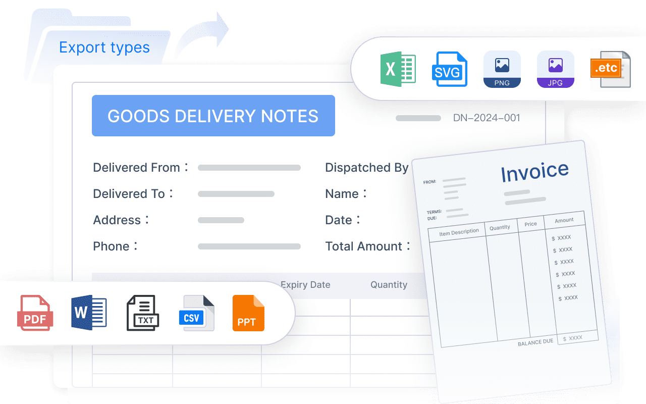
Flexibility in output formats such as PDF, Excel, HTML, slides, or web reports
For enterprise reporting, also consider whether the platform supports parameter queries, scheduled tasks, approval workflows, and departmental standardization.
Check pricing model, scalability, and total cost as reporting volume and user count grow
Pricing can look manageable at pilot stage but become expensive when:
More users need access
More reports must be scheduled
More departments join the platform
Embedded or external sharing is required
Higher refresh frequency is needed
Think about total cost beyond licenses. Implementation effort, maintenance burden, template management, and training all affect long-term ROI.
10 best automated reporting tools for 2026 at a glance
Below is a practical list of tools across three categories: BI platforms, report builders, and delivery automation tools.
Quick comparison table of use cases, standout strengths, pricing approach, and best-fit team size
Best for report distribution automation: Rollstack, Power BI subscriptions, FineReport scheduling
Shortlist guidance for buyers who need a fast recommendation before reading full reviews
If you need a fast recommendation:
Choose Power BI if you are deeply invested in Microsoft
Choose Tableau if interactive analytics is your top priority
Choose Looker if governed metrics and semantic consistency matter most
Choose Databox if you need easy recurring KPI reporting
Choose Rollstack if dashboards already exist and your real pain is deck delivery
Choose FineReport if you need automated reporting with structured reports, dashboards, scheduling, printable layouts, and operational workflows in one platform
How modern BI platforms turn automated reporting into a repeatable workflow
Automation works best when reporting is treated as a process, not a one-time output.
Data integration and modeling
The first layer of automation is reliable data flow.
How connectors, warehouse support, and semantic layers reduce manual reporting work
Modern platforms reduce manual effort by connecting directly to operational systems, databases, warehouses, and business apps. Some also provide semantic modeling so teams can define shared business logic once and reuse it across dashboards and reports.
That matters because repeated metric disputes often come from inconsistent definitions, not weak visualization.
Why data quality checks and transformation options matter for reliable recurring reports
Automated reports are only useful when stakeholders trust them. Look for capabilities such as:
Scheduled refresh
Data transformation or preparation support
Validation checks
Consistent calculated metrics
Error handling when upstream sources fail
If your reporting process still depends on spreadsheet cleanup before each send, the tool is not truly automating the workflow.
Once data is ready, the next question is how efficiently the team can build recurring outputs.
Compare drag-and-drop builders, reusable templates, KPI scorecards, and dashboard-to-report workflows
Different tools emphasize different output styles:
BI-first platforms focus on dashboards, charts, filters, and exploration
Report-first tools focus on templates, print-ready layouts, and repeatable report sections
Hybrid platforms combine dashboards with detailed tabular reports and drill-through pages
For recurring reporting, reusable templates are especially valuable. They help teams standardize branding, layout, and KPI presentation across departments.
Assess export formats, white-label options, and presentation quality for different audiences
Presentation quality matters more than many teams expect. A dashboard that works for analysts may not work for executives, clients, or frontline managers. Evaluate:
PDF and Excel export quality
Print layout control
White-label or branding support
Ability to combine charts and tabular detail
Support for multi-page or paginated reporting
This is one of the biggest differences between traditional BI dashboards and enterprise reporting tools.
Scheduling, alerts, and delivery automation
The final step is making sure the report reaches the right people consistently.
Review email scheduling, Slack or Teams delivery, conditional alerts, burst reporting, and approval flows
Strong automation features may include:
Scheduled email delivery
Channel-based delivery through collaboration tools
Threshold alerts
Conditional notifications
Burst distribution by region, manager, or customer
Approval steps before wider distribution
These become important when one report must be personalized for many recipients.
Explain how distribution automation helps teams send the right report to the right audience at the right time
Distribution is often the least mature part of the stack. Teams may have accurate dashboards but still rely on analysts to:
Export screenshots
Build slide decks
Rename files
Attach PDFs
Send stakeholder-specific updates manually
That is where delivery automation or enterprise scheduling can create immediate efficiency gains.
Output polish and scale requirements should be evaluated carefully
Delivery automation tools for scheduled distribution
These tools are best for organizations that already have dashboards but need better scheduling, routing, and stakeholder delivery.
Rollstack
Best fit: BI teams that already use Tableau, Power BI, Looker, or similar tools and need recurring slides or presentation outputs
Pros
Focused on report and deck delivery automation
Useful for executive and client reporting workflows
Helps reduce manual copy-paste from BI tools into presentation formats
Cons
Not a replacement for upstream BI, modeling, or reporting design
Value depends on already having a reliable source reporting layer
Best automated reporting tools for BI teams: detailed reviews
If you are buying specifically for a BI team, the decision often comes down to how much of the reporting stack you want one platform to cover.
Top picks by team need
Best overall for growing companies
Power BI is often a practical choice for growing organizations that want broad BI capability, especially if Microsoft tools are already in place. It covers dashboarding, self-service analysis, and recurring reporting reasonably well for many teams.
Best for enterprise governance and scale
Looker and Power BI are often strong candidates where governance, shared definitions, and enterprise rollout matter. Tableau also remains a strong option where analytics depth and broad adoption are priorities.
Best for agencies and multi-client reporting
Databox and Rollstack are often worth shortlisting for recurring client communication. Databox is easier for KPI-centric workflows, while Rollstack is relevant when the delivery format is slides or presentations.
Best for teams that prioritize report scheduling and delivery automation
If scheduling and structured delivery are the main pain points, FineReport and Rollstack deserve attention, but for different reasons:
Rollstack focuses on the last-mile delivery problem for existing BI outputs
FineReport is more relevant when you need the full reporting layer, including report design, parameter queries, dashboards, scheduling, printable outputs, and enterprise operational reporting
How to choose the right option for your business
Use a simple weighted scorecard across these criteria:
Report complexity
Number of recipients
Need for dashboards vs formal reports
Data stack maturity
Internal analytics skills
Scheduling and delivery requirements
Governance and permission needs
Long-term maintenance burden
A team sending five KPI emails a week has very different needs from a finance or operations team producing parameterized reports for hundreds of managers.
FAQs about reporting automation software
What is reporting automation?
Reporting automation is the use of software to collect data, refresh metrics, generate recurring reports, and distribute them on a defined schedule with minimal manual intervention.
It differs from manual reporting because teams do not have to repeatedly export data, update spreadsheets, rebuild charts, format documents, and send reports by hand. In a mature analytics workflow, reporting automation sits between data preparation and business decision-making.
When an automated reporting tool is worth the investment
An automated reporting tool is usually worth it when your team shows signs like these:
Reports rely on repeated exports from multiple systems
Analysts spend too much time formatting instead of analyzing
Different departments use inconsistent KPI definitions
Stakeholders need recurring updates in different formats
Spreadsheet-based reporting is becoming difficult to maintain
Dashboard sharing alone is not enough for business workflows
Actionable recommendations for choosing an automated reporting tool
Map your reporting workflow end to end. Do not evaluate only the dashboard layer. Document where time is spent across data prep, report creation, approvals, and delivery.
Separate analytics needs from output needs. Some teams need deep exploration, while others need highly formatted recurring reports. One tool does not always do both equally well.
Test one real reporting scenario. Use an actual monthly finance pack, operations report, or client scorecard during evaluation. Demo dashboards alone can hide workflow limitations.
Score delivery requirements explicitly. Ask whether the tool supports scheduling, bursting, parameterized delivery, printable outputs, and audience-specific permissions.
Plan for scale early. Consider how the platform will perform when report count, data sources, and stakeholder groups expand.
When FineReport is a good fit for automated reporting
Tools like Tableau, Power BI, and Looker are widely used for visualization and BI analysis, but teams with complex reporting workflows may also need a dedicated enterprise reporting platform like FineReport.
FineReport is especially relevant when your definition of an automated reporting tool includes more than dashboards. For example:
You need pixel-perfect reports for finance, operations, or management
Users expect paginated and printable outputs
Teams need parameter queries to filter reports by region, date, product, or department
Reports must be scheduled and distributed automatically
You want dashboards and detailed reports in one environment
Business workflows include data entry forms or operational write-back scenarios
Enterprise IT needs stronger control over permissions, templates, and reporting governance
This makes FineReport a practical option for organizations that operate beyond simple dashboard sharing and need structured reporting at scale.
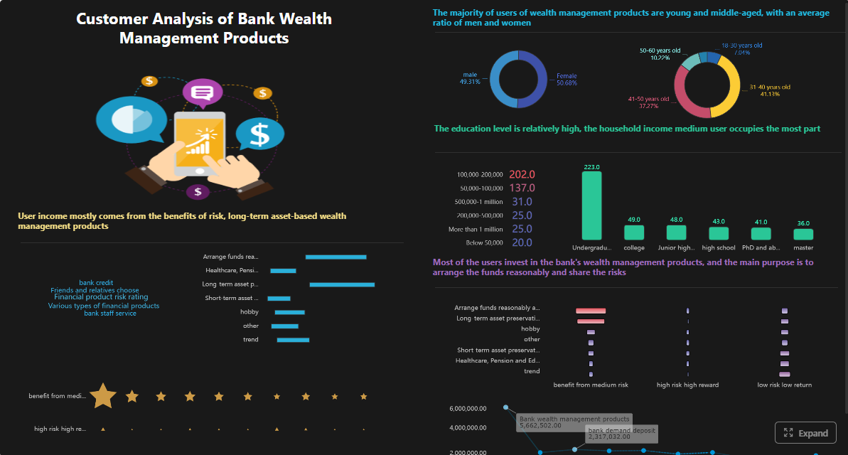
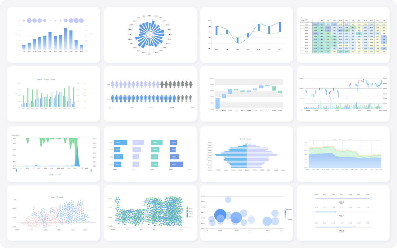
Get Ready-to-Use Dashboard and Report Templates in Fine Gallery
For teams comparing automation options in 2026, FineReport is not the default answer for every scenario. If you only need lightweight dashboard subscriptions, simpler BI tools may be enough. But if your reporting requirements include formal layouts, recurring operational reporting, scheduling, distribution, and workflow integration, it is worth putting FineReport on the shortlist.
An automated reporting tool pulls data from source systems, refreshes metrics, generates reports on a schedule, and delivers them to stakeholders with less manual work. It helps teams standardize recurring reporting and reduce copy-paste workflows.
Start by identifying whether your main need is dashboarding, pixel-perfect reports, paginated outputs, or scheduled delivery. The best choice depends on your team, data stack, reporting format, and governance requirements.
Key features include data integration, transformation, dashboard creation, report scheduling, permissions, and multi-channel distribution. Teams with operational or finance use cases may also need printable reports, parameterized queries, and form-based workflows.
BI dashboards are mainly designed for interactive exploration and monitoring KPIs. Automated reporting covers the broader workflow of preparing data, generating recurring outputs, and distributing the right report to the right audience automatically.
FineReport is a strong fit when you need enterprise reporting, dashboards, scheduled distribution, pixel-perfect layouts, and form-based processes in one platform. It is especially relevant for operations, finance, manufacturing, and enterprise IT teams.
Product Trial
FineReport
Pixel-perfect reports · Interactive dashboards · Easy data entry · Digital twins



 Best fit: Teams that need more than dashboards, especially for enterprise and
 Best fit: Organizations standardized on Microsoft tools
 Best fit: Teams prioritizing interactive
  Best fit: Data-mature organizations that need governed metrics
 Best fit: Teams wanting associative exploration and guided analytics
 Best fit: SMBs, SaaS teams, and agencies sharing recurring KPI reports
 Best fit: Google-centric teams with lightweight reporting requirements
 Best fit: Small internal teams needing simple dashboards and recurring reporting
 Best fit: BI teams that already use Tableau, Power BI, Looker, or similar tools and need recurring slides or presentation outputs