When people search for power bi report vs dashboard, they are usually trying to solve a practical reporting design problem: should leadership get a fast, single-screen summary, or should users work from a more detailed analytical report? In most organizations, the answer depends less on the tool label and more on who needs the information, how quickly they need it, and what decision they are trying to make.
Executives typically want a concise monitoring layer that shows whether performance is on track. Analysts usually need an interactive environment where they can test assumptions, compare segments, and investigate what changed. In Power BI, reports and dashboards support these needs differently.
This article explains where each format fits, how to decide between them, and when to combine both for a better reporting experience.
Useful for monitored views and service-based consumption
Better for recurring analytical review, though formal scheduled reporting needs can become more complex
Enterprise deployment
Good for broad KPI access in Microsoft-centric environments
Strong for self-service and team analysis on a shared data model
Ease of use
Easier for viewers
Better for power users and analysts
Recommended users
Executives, department heads, operations leaders
Analysts, finance teams, business users who need drill-down detail
For most teams, the real choice is not “which is better?” but which experience matches the decision-making job. Dashboards are usually better for monitoring. Reports are usually better for investigation.
Power BI Report vs Dashboard: choosing the right view for executive monitoring and analyst deep dives
The business problem behind power bi report vs dashboard is simple: leaders need fast visibility, while analysts need flexible exploration. If both groups are given the same artifact, one of them usually ends up frustrated.
Executives do not want to click through five pages to understand whether revenue slipped, service levels dropped, or inventory risk increased. Analysts, on the other hand, cannot do serious root-cause work from a simplified KPI screen with only a handful of tiles.
A more useful way to make the decision is to define a few criteria upfront:
Audience: Is this for executives, managers, analysts, or mixed users?
Level of detail: Do users only need headline metrics, or do they need breakdowns?
Interactivity: Should they scan quickly, or filter and drill extensively?
Update needs: Is this a daily pulse, near-real-time monitor, or periodic analysis?
Actionability: Does the user need to detect an issue or explain it?
That framing helps set expectations. In practice:
Use a dashboard when one-screen visibility matters most.
Use a report when users must explore, validate, and explain performance.
Use both together when a summary should lead naturally into deeper analysis.
What executives usually need from a monitoring experience
Fast answers to high-level performance questions
Executive monitoring is about speed and clarity. Leadership teams are often reviewing business health in recurring meetings, daily check-ins, or mobile moments between decisions. They want the core signals immediately:
Revenue vs target
Margin trend
Pipeline status
Customer churn
Delivery or service exceptions
Regional or business-unit performance
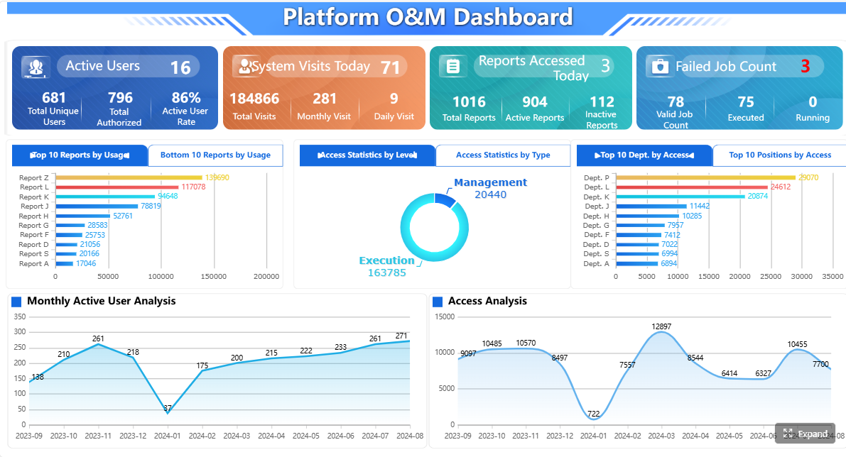
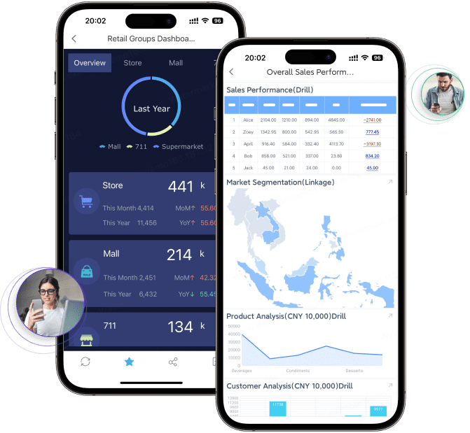
A dashboard supports this need by surfacing top KPIs, short-term trends, exception flags, and status indicators at a glance. That reduces the time spent navigating through details during leadership reviews.
Instead of asking users to interpret many visuals, the monitoring layer should answer questions such as:
Are we on track?
What changed since last period?
Where is performance off target?
Which area needs attention right now?
A simple view that supports quick decisions
Executives usually benefit from a focused experience, not a highly exploratory one. The goal is to keep attention on:
Strategic priorities
Thresholds and exceptions
Business outcomes
Areas needing follow-up
A useful monitoring view highlights what changed, why it matters, and where attention is needed now. It should not bury urgent signals under too many slicers, tabs, or low-level tables.
In Power BI, that often means using a dashboard or a tightly curated summary page to emphasize:
What analysts usually need from a deep-dive experience
Flexible exploration across dimensions and filters
Analysts work differently from executives. They are not just asking whether something happened. They are asking why it happened, where it happened, and what explains the variance.
That requires a more interactive analytical experience. A Power BI report is usually the better fit because it supports:
Slicing by region, product, period, segment, or owner
Comparing performance across categories
Drill-through into contributing records or subgroups
Following a question from summary to detail
For example, if revenue is down, an analyst may need to check:
Which products drove the decline
Whether the issue is regional or account-specific
Whether the trend is seasonal or unusual
Whether margin erosion came from discounting, mix, or cost increases
This is where a multi-page report becomes valuable. It allows users to move from KPI trends into category analysis, customer breakdowns, operational drivers, and detailed evidence.
Enough context to validate findings
Deep-dive analysis also needs context. A summary metric alone is rarely enough to support a credible conclusion. Analysts often need to see:
Supporting visuals
Detailed tables
Comparative periods
Related dimensions
Data relationships and definitions
A report makes it easier to test hypotheses before presenting conclusions to business stakeholders. Instead of saying “the number fell,” analysts can explain what moved, which segment was affected, and what likely caused it.
That is why reports are usually the analytical backbone of a Power BI environment, while dashboards act more as a curated front layer for quick consumption.
The clearest difference in power bi report vs dashboard is scope.
A monitoring view emphasizes:
Summary metrics
Top-level trends
Exceptions
Fast interpretation
A deep-dive view supports:
Multi-page analysis
Detailed breakdowns
Supporting evidence
Broader analytical context
If the business question is “How are we doing?” a dashboard often works. If the question is “Why are we performing this way?” a report is usually more appropriate.
Interactivity and navigation
A dashboard experience favors quick scanning and limited interaction. In Power BI, dashboards are generally designed for at-a-glance consumption. They may link users into more detailed reports, but the dashboard itself is not where full exploration happens.
Reports are built for filtering, drilling, cross-highlighting, and extended exploration. Users can navigate page to page, compare dimensions, and investigate anomalies independently.
This distinction matters because overloading a monitoring view with too much interactivity often weakens its clarity. At the same time, stripping too much interactivity from an analytical report limits its usefulness.
Data freshness and source coverage
Another factor is how information needs to be assembled and consumed.
A monitoring layer often works best as a consolidated snapshot of the most important metrics. In Power BI, dashboards can bring together pinned visuals from multiple reports and datasets for a single-screen view.
Reports, by contrast, usually sit on top of a more detailed analytical model and are better for structured exploration of that data.
You should also consider update frequency:
If leaders need a current pulse on rapidly changing metrics, a dashboard can be useful for monitoring.
If analysts need to investigate broader patterns and relationships, a report is the stronger format.
Sharing and consumption patterns
The final choice often comes down to usage patterns:
If the user needs a quick answer in a meeting, simplify. If the user needs to answer follow-up questions without rebuilding the analysis, provide a report.
Practical recommendations for choosing between dashboards and reports
Here are five recommendations an experienced reporting team would use when evaluating power bi report vs dashboard:
Start with the decision frequency
If the view supports daily or weekly monitoring, favor simplicity.
If it supports ongoing investigation, favor analytical depth.
Design for the least patient user
Executives rarely want to navigate a dense analytical report.
Analysts rarely want to work from a static summary.
Separate summary from explanation
Let dashboards answer “what is happening.”
Let reports answer “why it is happening.”
Create intentional drill paths
If a KPI matters, users should be able to move from summary to detail without confusion.
Evaluate reporting needs beyond visualization
Some business workflows need not just dashboards and analytical reports, but also scheduled distribution, printable reports, parameterized queries, or form-driven operational reporting.
When teams need more than Power BI dashboards and reports
Power BI is widely used for visualization, dashboarding, and interactive analysis. It is often a strong fit for teams already working in the Microsoft ecosystem and for users who need self-service exploration and KPI monitoring.
But some organizations eventually discover that dashboards and standard analytical reports are only part of the reporting landscape. In operational and enterprise environments, teams may also need:
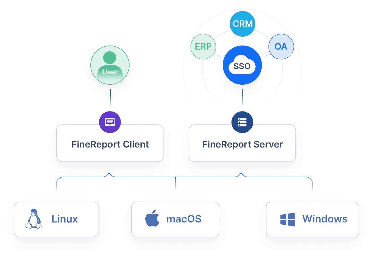
Tools like Power BI are widely used for BI analysis and visual monitoring, but teams with complex reporting workflows may also need a dedicated enterprise reporting platform like FineReport.
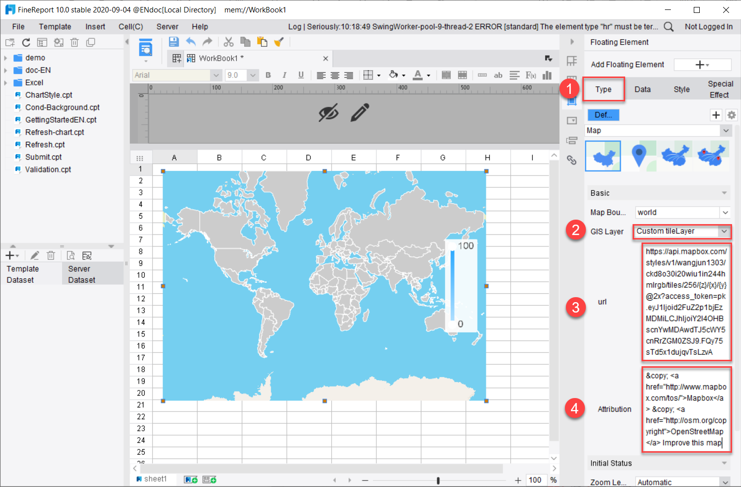
FineReport is especially relevant when the business requirement extends beyond interactive dashboards into structured enterprise reporting. Depending on the scenario, teams may value FineReport for:
Pixel-perfect report design for highly formatted business reports
Paginated and printable reports for finance, operations, and management use cases
Parameter queries that help users retrieve exactly the data they need
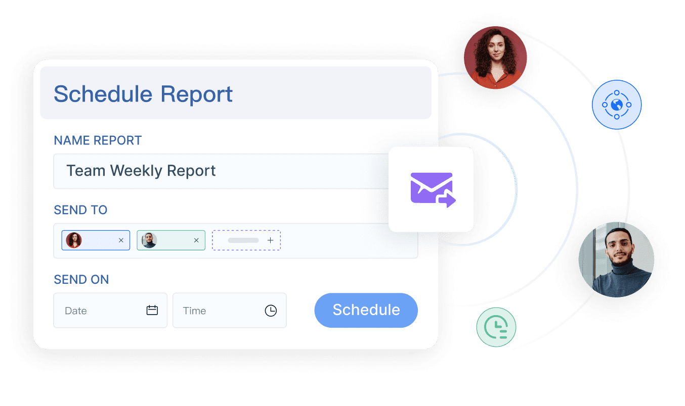
Report scheduling and automated distribution for recurring reporting processes
Dashboard and report integration within a broader reporting environment
Data entry and form workflows for operational processes where users need to submit or update information
For example, if leadership wants a dashboard but finance also needs recurring board packs, operations needs printable shift reports, and regional teams need parameterized query reports, a reporting stack may need more than a standard BI dashboard alone.
Get Ready-to-Use Dashboard and Report Templates in Fine Gallery
Final takeaway
The best answer to power bi report vs dashboard depends on the decision context.
Choose a dashboard when executives need a fast, focused monitoring experience.
Choose a report when analysts need detailed, flexible exploration.
Use both together when leadership needs a summary and analysts need a path to investigate the drivers behind it.
And if your organization also needs formalized reporting workflows such as printable reports, scheduled distribution, parameter queries, or operational data-entry processes, it may be worth evaluating a platform like FineReport alongside your BI tools.
A Power BI dashboard is a single-page view for tracking key metrics quickly, while a Power BI report is a multi-page, interactive experience for deeper analysis. Dashboards help users monitor performance, and reports help them investigate why results changed.
Executives should use a dashboard when they need a fast summary of KPIs, trends, and exceptions without digging through multiple pages. It works best for routine monitoring and quick decision support.
Reports give analysts filters, drill-down paths, and multiple pages to explore data from different angles. That makes them better for root-cause analysis, comparisons, and validating business questions.
Yes, many teams use a dashboard as the top-level monitoring layer and link it to reports for deeper investigation. This setup gives leaders a quick view while still supporting detailed analysis when something needs attention.
Dashboards are usually better for real-time or near-real-time KPI monitoring because they present the most important signals on one screen. Reports can also refresh frequently, but they are more suited to exploration than rapid scanning.
Product Trial
FineReport
Pixel-perfect reports · Interactive dashboards · Easy data entry · Digital twins