If you are searching for Qlik Sense, you are probably trying to understand what the platform does, how it differs from other BI tools, and whether it is a good fit for your team. In simple terms, Qlik Sense is a business intelligence and analytics platform that helps users connect data, explore it interactively, and turn it into dashboards, reports, and insights for decision-making.
For beginners, the key idea is this: Qlik Sense is built to help people move beyond static reports. Instead of reading a fixed dashboard, users can click, filter, compare, and drill into data to answer follow-up questions. That makes it useful for teams that need both governed analytics and self-service exploration.
Quick Comparison Table
Before going deeper, here is a practical way to think about Qlik Sense compared with other common BI options beginners may also be evaluating.
| Criteria | Qlik Sense | Tableau | Power BI | FineBI |
|---|---|---|---|---|
| Best for | Associative exploration, governed analytics, enterprise BI | Visual analytics and storytelling | Microsoft-centric BI and reporting | Self-service BI for business teams and enterprise dashboarding |
| Ease of use | Moderate learning curve | Moderate | Often approachable for Microsoft users | Designed for business-user-friendly analysis |
| Dashboard design | Interactive and flexible | Strong visual design focus | Broad dashboard and reporting capabilities | Drag-and-drop dashboards and interactive analysis |
| Data preparation | Strong data modeling and scripting options | Often paired with prep workflows | Good for modeling within Microsoft ecosystem | Supports business-friendly data analysis with enterprise connectivity |
| Enterprise reporting | Strong in governed environments | Common in enterprise analytics | Strong in enterprise reporting | Suitable for enterprise dashboard distribution and self-service use |
| Collaboration | Available through platform sharing and governed access | Common team sharing workflows | Strong within Microsoft environment | Dashboard sharing and collaborative analysis |
| Deployment | Cloud and client-managed options | Cloud and server options | Cloud and server/hybrid depending on setup | Enterprise deployment options depending on organizational needs |
| Learning curve | Moderate, especially for data modeling concepts | Moderate | Moderate | Often easier for business users to adopt |
| Recommended users | Analysts, BI teams, governed self-service environments | Analysts, data storytellers | Microsoft-based organizations | Business teams, analysts, enterprise BI teams seeking self-service adoption |
This is not a winner-takes-all comparison. Each platform fits different teams, data environments, and governance needs. For this article, the focus is helping you understand what Qlik Sense is and how to evaluate it clearly.
What Is Qlik Sense and how does it work?
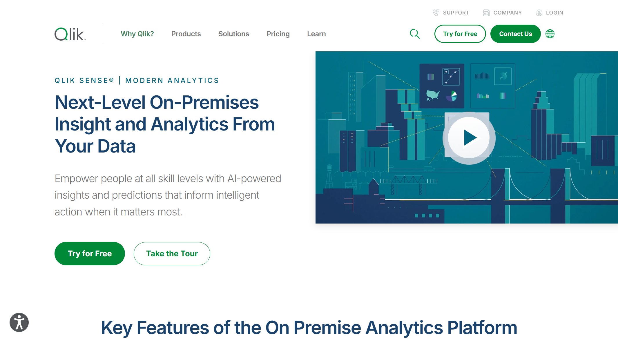
A simple definition of Qlik Sense for beginners
Qlik Sense is a self-service BI and analytics platform from Qlik. It allows users to connect to data from multiple sources, model and prepare that data, then build visual dashboards and perform interactive analysis.
At a beginner level, you can think of Qlik Sense as a tool with three main jobs:
- Bring data together from files, databases, and business systems.
- Organize that data so it can be explored meaningfully.
- Present insights visually through dashboards, filters, and guided analysis.
Unlike tools that focus only on fixed reporting, Qlik Sense is built to support both dashboard consumption and active data exploration.
The problem it solves in modern analytics and self-service BI
Modern teams usually face a familiar problem: data exists in many places, but answers are hard to get quickly. Finance may have one report, sales another, and operations a different spreadsheet altogether. Static reports often answer only the first question, not the second or third.
Qlik Sense helps solve this by giving users a way to:
- connect data from multiple systems
- explore relationships across datasets
- filter and drill into specific business questions
- reduce dependence on manually created static reports
- support governed analytics with reusable business logic
This matters in self-service BI because business users increasingly want to ask questions on their own without waiting for every dashboard change to come from IT or a central data team.
How it turns raw data into interactive dashboards and insights
A typical Qlik Sense workflow looks like this:
- Connect data from source systems or files.
- Load and model the data so fields relate correctly.
- Build visualizations such as bar charts, KPI cards, tables, maps, or trend charts.
- Organize them into sheets inside an app.
- Share and explore dashboards with filters, selections, and drill-down analysis.
One of the important ideas in Qlik Sense is that users can click on a value, such as a product category or a region, and the rest of the dashboard updates in context. That makes the experience more exploratory than simply viewing a fixed chart.
Core concepts of Qlik Sense every beginner should know
The associative engine in plain English
The phrase most often associated with Qlik Sense is the associative engine. For beginners, that term can sound technical, but the practical meaning is simple: Qlik Sense is designed to help users explore how data points are connected.
Instead of only returning a narrow query result, the platform keeps relationships between fields available for exploration. When you select one value, Qlik Sense can show what is associated, what is excluded, and what remains possible in the current context.
How connected data exploration differs from traditional query-based BI
In a more traditional query-based BI experience, a dashboard often shows the result of a predefined query. If users want a new angle, they may need a new report, a new SQL query, or a dashboard redesign.
Qlik Sense takes a more interactive approach. The system is meant to let users move through data associations dynamically. For example:
- click a region and see related sales, customers, and products
- select a date range and watch the rest of the dashboard adjust
- identify values that are linked or not linked to the current selection
This can feel more natural for exploratory analysis, especially when users are trying to answer evolving business questions.
Why selections, context, and relationships matter
For beginners, three ideas matter most:
- Selections: what you clicked or filtered
- Context: the current analytical view created by those selections
- Relationships: how fields across datasets connect
If these relationships are modeled well, exploration becomes powerful. If they are modeled poorly, analysis can become confusing. That is why data modeling is such an important part of getting value from Qlik Sense.
Apps, sheets, visualizations, and stories
Qlik Sense uses a few core building blocks that beginners should recognize quickly.
What each building block does inside the platform
- Apps: The main container for data, logic, and analysis content.
- Sheets: Individual dashboard pages inside an app.
- Visualizations: Charts, tables, KPIs, maps, and other analysis objects placed on sheets.
- Stories: Presentation-style outputs used to communicate insights from analysis.
An easy way to think about it is this: the app is the project, the sheet is the page, the visualization is the chart, and the story is the presentation layer.
How users move from data exploration to presentation
A common beginner journey inside Qlik Sense looks like:
- open an app
- use filters or selections
- explore a few sheets
- compare trends or segments
- capture findings
- turn results into a story or shared dashboard view
That progression matters because BI is not just about finding an answer. It is also about communicating the answer to a manager, team lead, or executive audience.
Data loading, modeling, and preparation basics
Qlik Sense is not just a charting tool. It also includes important work around loading and preparing data for analysis.
Where data comes from and how it is shaped for analysis
Data can come from many common sources, such as:
- spreadsheets
- cloud apps
- databases
- enterprise business systems
- prepared datasets from a data warehouse or lake
Once connected, the data usually needs shaping. That can include:
- renaming fields
- defining joins or associations
- cleaning formats
- standardizing dates and categories
- creating calculated measures
For beginners, this is often where the learning curve starts to rise. Qlik Sense can be very powerful, but good analytics still depends on clear data structure.
Common beginner terms you will see when getting started
Here are some terms you will likely encounter:
- Data model: how tables and fields relate
- Measures: calculated values like revenue, margin, or conversion rate
- Dimensions: categories like region, product, or department
- Load script: logic used to load and shape data
- Selections: user-applied filters that update context
- Master items: reusable dimensions and measures across visualizations
Understanding these basics early makes the platform much easier to navigate.
Common use cases for Qlik Sense
Business dashboards and KPI tracking
One of the most common uses of Qlik Sense is building dashboards for KPI tracking across departments. Teams use it to monitor performance and spot changes quickly.
Examples include:
- Sales dashboards: revenue, quota attainment, pipeline, regional trends
- Finance dashboards: budget vs actuals, margin, expense monitoring
- Operations dashboards: output, fulfillment, cycle times, service levels
- Executive dashboards: top-level performance summaries with drill-down access
The value here is not just seeing the number. It is being able to click into the number and understand what changed.
Self-service analysis for teams
Qlik Sense is also used for self-service analysis, where business users can explore data more independently rather than relying only on central reporting teams.
Typical team scenarios include:
- a sales manager checking why one region underperformed
- a finance analyst exploring cost anomalies
- an operations lead comparing plant or branch performance
- a marketing team analyzing campaign results by segment
This can reduce reporting bottlenecks when the data model is well governed and users are trained on how to work with the platform.
Embedded analytics and governed data exploration
In many organizations, flexibility must be balanced with control. Teams want freedom to explore, but leaders also need trusted metrics, secure access, and consistency.
Qlik Sense supports this type of environment by helping organizations combine:
- governed access to approved data
- shared business logic
- interactive exploration for end users
- dashboard distribution across teams
Some organizations also use Qlik capabilities in broader application or analytics workflows, especially when embedded or programmatic analytics experiences are needed.
Understanding Qlik products and deployment options
Qlik Sense in cloud and on-premise environments
One important beginner topic is that Qlik analytics can be deployed in different ways. In practice, teams may encounter cloud-based environments or client-managed/on-premise environments.
What deployment choices mean for administration, scalability, and access
The deployment model affects several practical issues:
- Administration: who manages infrastructure and updates
- Scalability: how usage grows across users and workloads
- Access: how internal and remote users log in and collaborate
- Governance: where data and security controls are handled
- IT involvement: how much internal support is required
Cloud environments may appeal to teams looking for easier centralized management and faster access. Client-managed environments may appeal to organizations with specific control, compliance, or infrastructure preferences.
How Qlik analytics connects with data integration and data quality
Qlik is not only associated with analytics dashboards. Its broader portfolio also connects analytics with data integration and data quality capabilities.
The role of pipeline readiness, trusted data, and end-to-end analytics workflows
This matters because dashboards are only as useful as the data behind them. Organizations often need more than visualization. They also need data to be:
- moved from source systems reliably
- prepared for analytics use
- kept current
- governed for consistency
- trusted across teams
For buyers evaluating Qlik Sense, this broader connection between analytics and data readiness can be part of the overall decision, especially in larger enterprise environments.
Plans, packaging, and what to evaluate before choosing
Qlik packaging can evolve over time, so beginners should focus less on product-label confusion and more on practical evaluation criteria.
Key factors such as users, features, governance, and budget
When evaluating Qlik Sense, ask about:
- number and type of users
- self-service needs vs centrally managed dashboards
- required governance controls
- cloud vs on-premise preferences
- data integration complexity
- collaboration and sharing expectations
- budget and total operating complexity
The right decision usually depends less on one feature and more on whether the platform matches the team’s operating model.
Getting started with Qlik Sense
First steps for new users
If you are opening Qlik Sense for the first time, do not start by trying to master everything at once. Start with the basics of navigation and exploration.
What to learn first when opening the product for the first time
A practical learning sequence looks like this:
- Learn how to open an app and move between sheets.
- Practice filtering and making selections.
- Understand the difference between dimensions and measures.
- Explore how one selection changes multiple charts.
- Review how the data model supports what you are seeing.
- Try editing or creating a simple visualization.
This approach helps you understand the user experience before diving into advanced modeling or scripting.
Helpful documentation, tutorials, and guided starting points
New users typically benefit from:
- official product documentation
- built-in tutorials or onboarding paths
- guided workshops
- sample apps and demo dashboards
- role-based learning for users, developers, and administrators
The most effective path is usually hands-on. Reading helps, but interacting with a sample app teaches the platform faster.
How to decide whether Qlik Sense is right for you
Qlik Sense can be a strong fit for some organizations, but not every team needs the same BI experience.
Questions to ask about your team, data maturity, and reporting needs
Ask these questions before deciding:
- Do users mainly consume fixed dashboards, or do they need exploratory analysis?
- Does your team have the skills to support data modeling and governance?
- Are you combining many related datasets across functions?
- Do you need both self-service flexibility and enterprise control?
- Will your BI environment be cloud-first, on-premise, or mixed?
These questions reveal whether Qlik Sense fits your real operating needs rather than just sounding good in a feature list.
When Qlik Sense may be a better fit than other BI tools
Qlik Sense may be especially appealing when:
- users need interactive associative exploration
- teams want governed self-service analytics
- organizations value strong data relationships in analysis
- enterprise environments require a broader analytics and data pipeline mindset
At the same time, some organizations may prefer alternatives if they prioritize a different user experience, a different ecosystem alignment, or simpler business-user onboarding.
Frequently asked beginner questions about Qlik Sense
Is Qlik Sense hard to learn?
Qlik Sense is not impossible for beginners, but it does have a moderate learning curve. Basic dashboard exploration is usually approachable. The more advanced parts, such as data modeling, scripting, and governed app design, take more time.
For most new users:
- viewing dashboards is easy
- filtering and exploring becomes intuitive fairly quickly
- building polished apps takes practice
- modeling data well requires deeper understanding
So the answer is: easy to start, harder to master.
What is the difference between Qlik Sense and other BI platforms?
The biggest difference often discussed is Qlik Sense’s associative approach to data exploration. That is what makes many users experience it differently from more conventional reporting or query-led workflows.
In practical terms:
- Qlik Sense is often associated with connected exploration across related data
- Tableau is often known for visual analytics and presentation-oriented dashboards
- Power BI is often favored in Microsoft-heavy environments
- FineBI is often considered by teams that want self-service BI with a business-user-friendly dashboard and analysis experience
The best tool depends on your users, governance model, and data environment.
Which teams benefit most from using it?
Qlik Sense is commonly useful for:
- BI teams
- analysts
- finance and operations teams
- sales performance teams
- enterprise analytics groups
- organizations needing governed self-service exploration
Teams that benefit most are usually the ones that want to go beyond static reporting without giving up control over trusted data.
What should you try first after sign-up or installation?
After sign-up or installation, try these first:
- Open a sample app.
- Click through filters and selections.
- Watch how charts change with context.
- Review how dimensions and measures are defined.
- Build one simple KPI dashboard or trend chart.
That gives you a realistic first impression of how Qlik Sense works in day-to-day analysis.
Practical recommendations before choosing a BI platform
If you are evaluating Qlik Sense or comparing it with other BI tools, here are a few consultant-style recommendations that can save time and cost later.
1. Evaluate the data model, not just the dashboard design
A polished chart demo can be misleading. The long-term success of a BI platform depends heavily on how well it supports trusted metrics, reusable logic, and scalable data relationships.
2. Test real user workflows, not only admin capabilities
Have actual business users try common tasks such as filtering, drilling down, comparing segments, and creating a simple analysis view. Adoption often depends more on day-to-day usability than feature depth.
3. Separate exploratory analytics needs from fixed reporting needs
Some teams mostly consume standard dashboards. Others constantly ask follow-up questions. Be clear about which use case matters more, because that affects tool fit.
4. Review governance and sharing early
Security, role-based access, metric consistency, and dashboard distribution are not side issues. They are central to enterprise BI success.
5. Consider how fast business teams can iterate
If every dashboard change requires technical intervention, self-service BI may remain limited in practice. Look for a platform that balances control with business-user agility.
A practical alternative for teams that want business-user-friendly self-service BI
Tools like Qlik Sense, Tableau, and Power BI are widely used in the BI market, but teams that need a more business-user-friendly, self-service BI platform may also consider FineBI.
FineBI is designed to help organizations build trusted dashboards and enable interactive analysis without making every business question dependent on technical teams. For companies evaluating Qlik Sense, FineBI can be relevant when the priority is:
- easier dashboard creation for business users
- drag-and-drop analysis experiences
- interactive drill-down and exploration
- enterprise data connectivity
- dashboard sharing across departments
- faster iteration for reporting and analytics teams
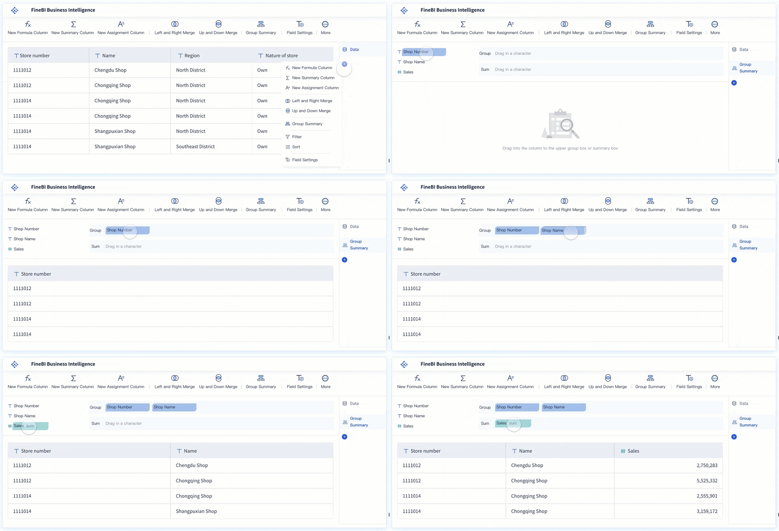 FineBI's Drag-and-drop Analysis
This does not mean FineBI replaces every Qlik use case. Rather, it is a practical option for organizations that want to expand self-service adoption while maintaining enterprise BI structure.
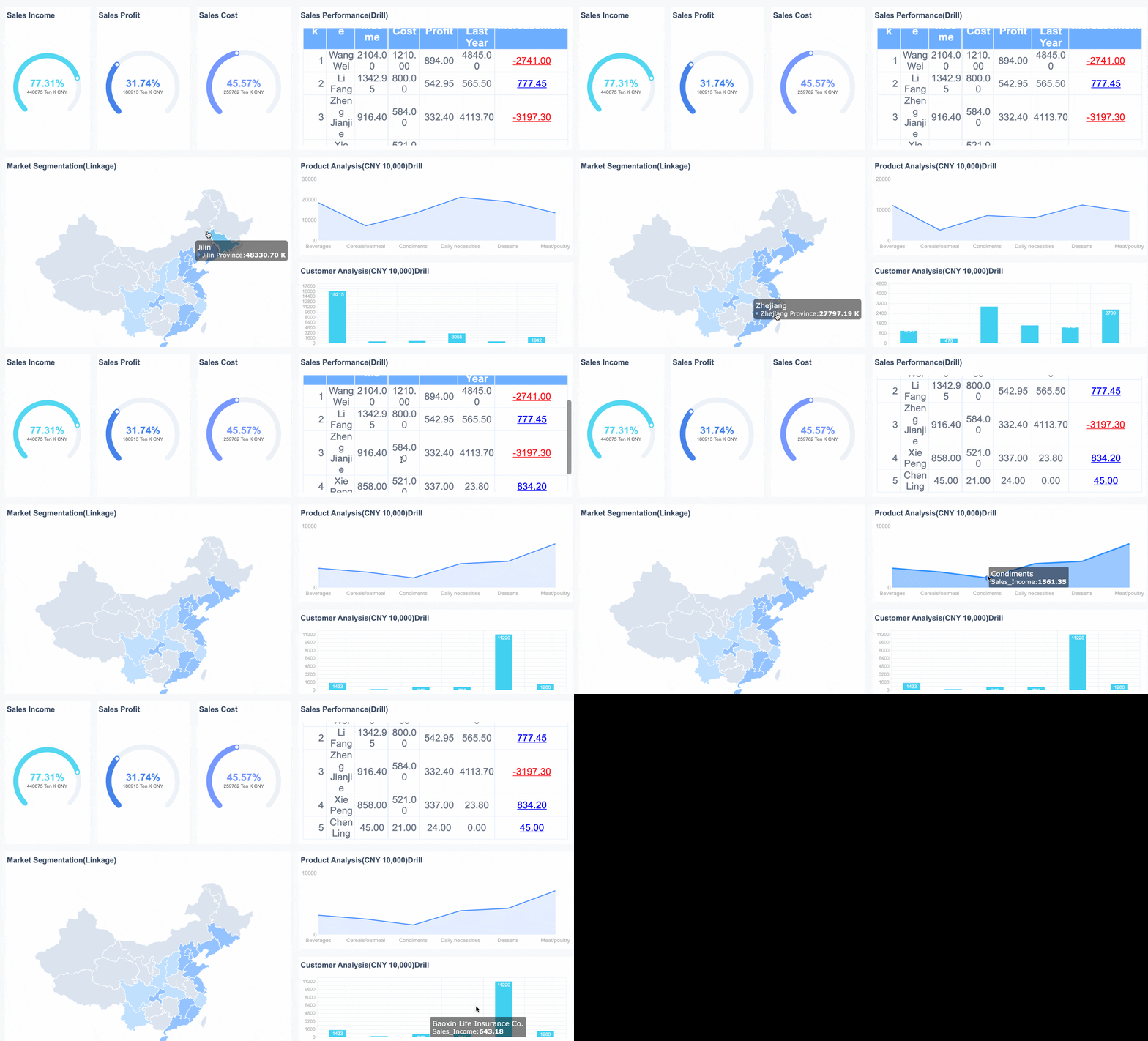 FineBI's Interactive Dashboard
Where Dora fits with FineBI
For enterprises thinking beyond dashboard consumption, Dora adds another layer. Dora is FanRuan’s enterprise Data Agent platform. It sits on top of FineBI and existing enterprise data assets to help organizations move from simply viewing dashboards to using Agentic BI workflows.
In this model:
- FineBI provides the trusted dashboard, metric, and semantic foundation
- Dora acts as an AI assistant or AI digital employee on top of that foundation
- users can interact through natural-language requests
- governed workflows help generate answers, charts, summaries, alerts, and follow-up actions
This is especially relevant for organizations that want analytics to become more proactive. Instead of only waiting for users to open dashboards, Dora can support scenario-based assistance such as:
- Data Analyst digital employee
- Report Researcher
- Daily Briefing Secretary
- Risk Alert Officer
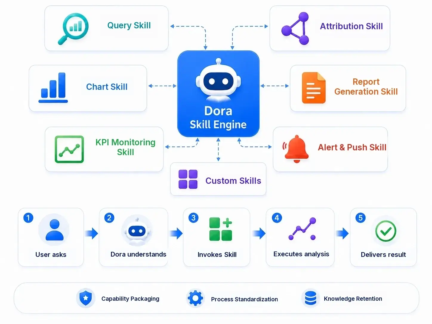 Dora is powered by skills.
The important point is that Dora is not positioned as a replacement for FineBI. It extends the value of trusted BI into governed AI-assisted workflows.
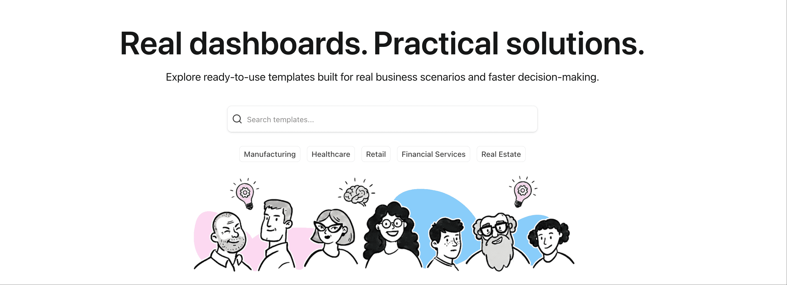
Get Ready-to-Use Dashboard Templates in Fine Gallery
Final thoughts
Qlik Sense is a modern analytics platform built for interactive, governed, and self-service BI. For beginners, the most important concepts are its associative exploration model, app-based structure, and balance between data preparation and dashboard analysis.
If your team needs strong exploratory analytics across connected data, Qlik Sense is worth serious consideration. If your priority is broader business-user adoption, faster dashboard creation, and practical self-service BI, FineBI is also worth evaluating. And if your organization wants to go a step further into governed AI-assisted analytics, the combination of FineBI + Dora offers a path from dashboards to enterprise Data Agent workflows.
FAQs
Qlik Sense is used for business intelligence, interactive dashboards, and self-service data analysis. It helps teams combine data from different sources and explore it to find insights for decision-making.