A good task dashboard shows your project team what needs to be done. It helps everyone see things clearly. You can talk better with your team. You can make smart choices using real data. Many teams see that a dashboard saves time. It helps you handle risks. It makes it easy to compare how you did or check old work. FineReport from FanRuan lets you see all this in one spot. This helps you focus on what is most important.
Enhanced transparency
Improved communication
Data-driven decision making
Time savings
Risk management
Performance benchmarking
Historical data analysis
Simplified reporting
Think about the biggest problems your team has today. What would happen if you had real-time information right away?
What Makes a Task Dashboard Effective
Key Features for Project Teams
A strong dashboard gives your team the tools to work better together. You want a project management dashboard that is simple to use and easy to read. Experts say you should focus on these important points:
Set clear goals for your dashboard. Make sure it matches your project’s needs and helps you reach your targets.
Keep the design simple. Too much information can confuse your team. A clean layout helps everyone find what they need fast.
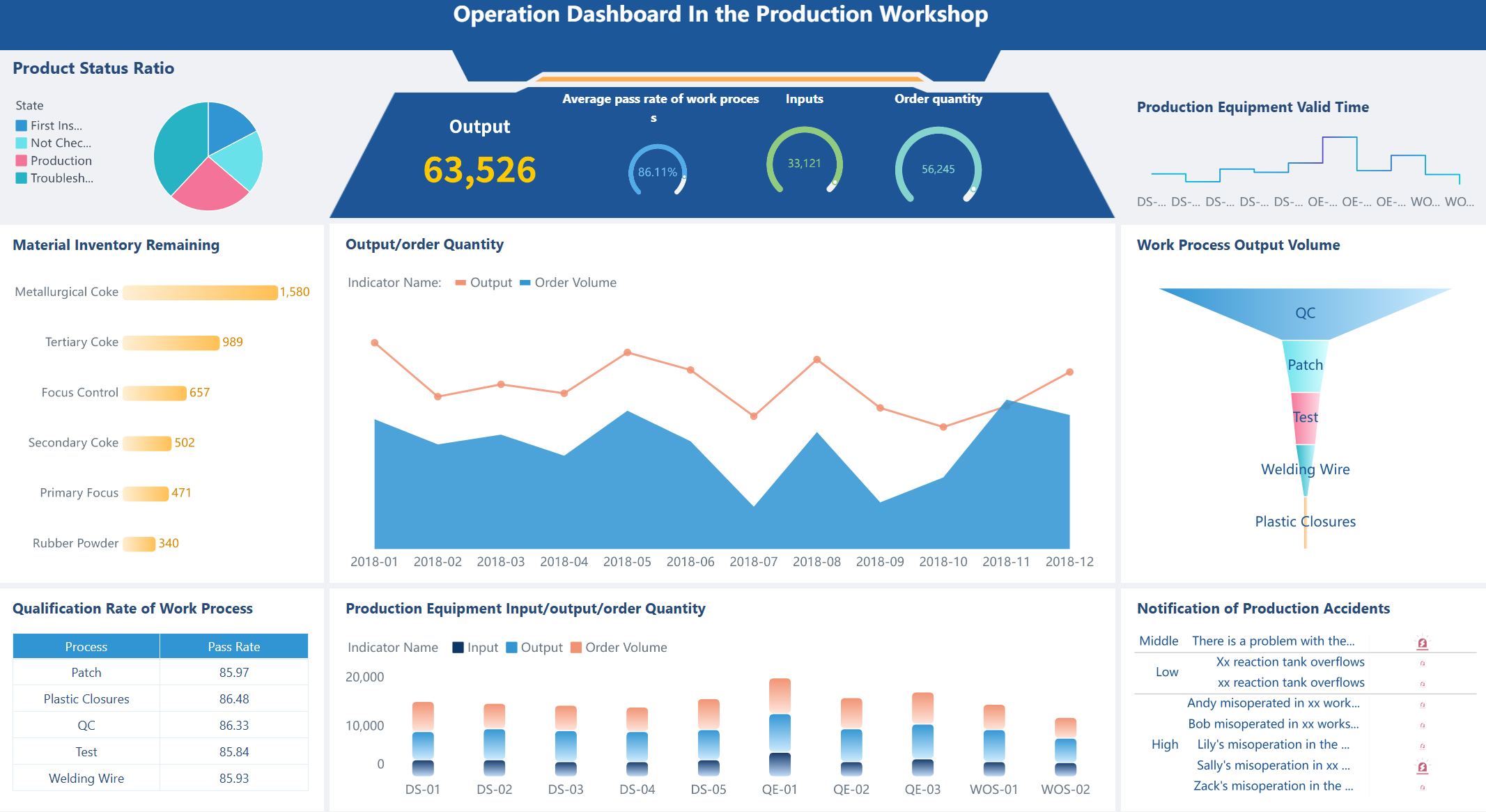
Use charts, graphs, and color codes. These tools help you see trends and spot problems quickly.
Connect your dashboard to live data. This keeps your project status up to date.
Let users change views or layouts. Customization helps each person focus on their tasks.
Add smart features like alerts or predictions. These can warn you about risks before they become big problems.
Project management professionals also highlight these features as essential:
Feature
Description
Task and Timeline Tracking
Shows what needs to be done and when.
Resource Management
Lets you see who is busy and who can help.
Real-Time Reporting and KPIs
Keeps everyone updated on progress and goals.
Collaboration Tools
Makes it easy to share files and messages.
Customizable Views
Lets you adjust the dashboard to fit your workflow.
Benefits of Real-Time Visibility
When you use a task dashboard with real-time updates, you help your team work faster and smarter. You can spot issues right away, like late tasks or equipment delays. This means you can fix problems before they slow you down. Studies show that teams with real-time dashboards finish projects on time more often. They also spend less time in meetings because everyone sees the same data.
You also get these benefits:
You see up-to-the-minute project status and can adjust plans quickly.
You manage resources better, so no one gets overloaded.
You track spending and compare it to your budget.
You spot risks early and take action before they grow.
You keep your project management dashboard as a single source of truth, which helps your team stay focused and aligned.
A good dashboard does more than show data. It helps your team make better choices, work together, and reach your goals.
Steps to Build a Task Dashboard
Define Purpose and Audience
First, think about why you need a dashboard and who will use it. This helps you focus on what your team needs most. Project management experts suggest these steps:
Figure out who will use the dashboard. Is it project managers, team members, or clients? Each group wants different things.
Pick KPIs that match your project goals. These KPIs help you see if you are doing well and keep everyone working together.
When you know your audience and goals, you can make a dashboard that fits your team.
Identify Metrics and Data Sources
Now, choose the right things to measure. The best dashboards show clear and helpful information. Here are some important things to track for a project team:
Metric
Description
Scope creep
Keeps the project on track and stops extra work.
Team productivity
Shows if the team is working well and finishing on time.
Task statuses and deadlines
Checks each task’s progress and makes sure nothing is late.
Resource availability and workloads
Helps you see who is busy and who can do more work.
Financial performance (planned vs. actual)
Compares what you wanted to spend with what you really spent.
Project milestones and timelines
Measures how far you are on your schedule.
Identified risks and solutions
Lets you find problems early and fix them fast.
Billable utilization
Checks if the team is using their time well.
Return on investment (ROI)
Shows if the project is worth the money.
Risk management effectiveness
Tells you how well your team handles risks.
You also need to know where your data comes from. Most dashboards use data from:
Project management tools that track tasks and milestones
Time tracking tools that record hours worked
Financial systems for costs and billing
CRM systems for customer and contract details
Resource planning tools for team capacity
FineReport lets you connect all these sources. You can see everything in one place, so you always know your project status.
Choose Tools Like FineReport
Picking the right tool is important. FineReport from FanRuan is special because it connects to over 500 data sources. It has an easy-to-use, Excel-like design, so your team can learn it fast. FineReport supports complex reports and has a mobile app, so you can check your dashboard anywhere.
Feature
FineReport
Other Dashboard Tools
Data Connectivity
Connects to over 500 data sources
Varies by tool
User Interface
Excel-like design for ease of use
Varies, some may be more complex
Target Users
Corporate IT, finance, operations
Varies, often broader audience
Customization
Limited for embedded analytics
Often more customizable
Mobile Support
Dedicated mobile app
Varies, not all have dedicated apps
FineReport also gives you real-time updates and can use data from many places. This means you always see the newest information, no matter where your data is.
A good dashboard is easy to read and use. Try these design ideas to help your team:
Make important information stand out with size, color, and layout.
Let users change their dashboard. They can move things, hide parts, and save their favorite views.
Keep the design neat. Use the same spacing, simple icons, and clear labels. Make sure colors help, not confuse.
Pick the right charts for your data. Use bar charts to compare things and line charts to show trends. Do not use hard-to-read 3D graphs. Make sure your dashboard works for everyone by using high-contrast colors and keyboard navigation.
Automate Data Updates
Automating updates keeps your dashboard correct and current. You can use tools like Python scripts or connect to live data sources like Google Sheets. FineReport lets you set up automatic reports and real-time data sync, so you always see the latest numbers.
Key Point
Impact on Accuracy and Timeliness
Real-time data availability
Decisions use the most current insights.
Less human error
Fewer mistakes from manual updates.
Continuous KPI tracking
Quick response to changes in trends.
Faster decision-making
Teams act on the latest data right away.
When you automate your dashboard, you spend less time updating and more time using the information.
Enable Team Collaboration
A dashboard should help your team work together. Look for features like:
Built-in messaging tools
File sharing
Task comments
Real-time notifications
FineReport’s platform gives your team one place to talk about tasks, share files, and stay updated. You can chat about tasks right in the dashboard, so everyone stays on track. This helps your team stay responsible and makes sure everyone knows what to do.
Review and Improve Regularly
Check your dashboard often to make sure it still works for your team. Use a cycle—review, get feedback, and make changes. Ask your team what works and what does not. Track things like team productivity, scope creep, delivery quality, client happiness, and resource use.
Review the dashboard when you set it up, after you start using it, and as your project grows.
Pick results that show if the dashboard meets your goals.
Make sure the dashboard is easy to use and looks good, so your team wants to use it.
A custom dashboard should grow with your team. Checking it often helps you keep it helpful and effective.
Best Practices for Task Dashboards with FineReport
Usability and Customization Tips
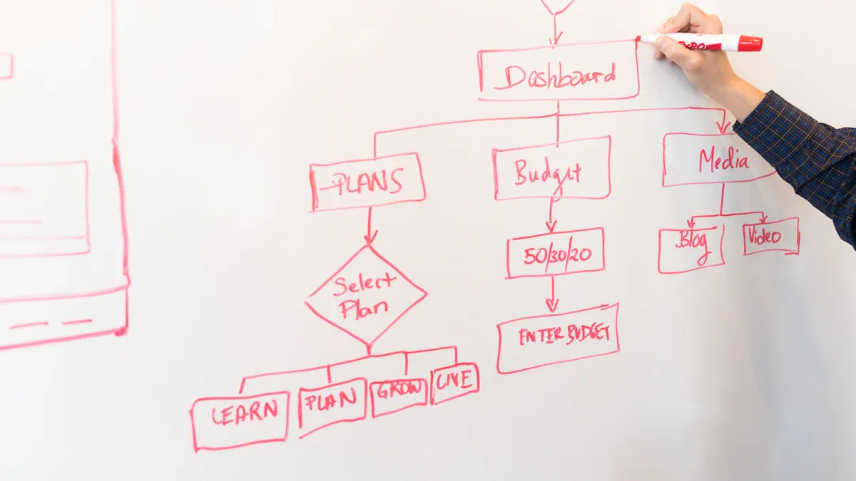
Your dashboard should be easy for your team to use. FineReport gives you tools to help with this. You can use drag-and-drop to build your dashboard fast. Just move charts, tables, or other parts where you want them. This makes it easy to change things or add new info as your project gets bigger.
Feature
Benefit
Drag-and-drop interface
Simplifies the integration of components and visualizations into dashboards
Canvas-style operation
Designed for large screens and mobile, enhancing usability
Multi-dimensional analysis
Facilitates comprehensive data analysis and display of business indicators
The canvas-style operation lets you design dashboards for big screens or phones. Your team can check updates anywhere they go. FineReport also lets you set who can see or change each dashboard. This keeps your project data safe and neat.
FineReport gives you extra help to use your dashboard well. You can find guides, watch training videos, or use plugins to add more features. These tools make it easier to learn and get better at using dashboards.
Common Pitfalls to Avoid
You might run into some problems when making a dashboard. Too much information can make things confusing. A messy layout can make it hard to find what you need. You can avoid these problems by following some simple rules.
Guideline
Description
Understand the audience
Design dashboards with the specific audience in mind, considering their familiarity with the subject.
Keep the design simple
Focus on simplicity to ensure the essential message is conveyed without distractions.
Use appropriate visuals
Select visuals that enhance understanding without overwhelming the viewer.
Ensure a logical layout
Create a practical layout that allows easy navigation and comprehension of the data presented.
Always think about who will use the dashboard. Use clear charts and keep the design simple. Make sure the layout helps users find important info fast. Do not add too many charts or colors, or people might miss the main point.
FanRuan gives you a resource center, training videos, and learning paths. You can earn certificates to show your skills. Many companies, like Kintetsu World Express, use FineReport to make dashboards. These dashboards help teams work together and make good choices. You can do the same by using these tips and support tools.
You can make a strong dashboard by taking a few easy steps. First, think about who will use it and what you want to achieve. Put the most important dashboard parts where people will notice them right away. Do not add too many charts, so it stays simple. FineReport from FanRuan helps you connect your data and see updates as they happen. Ask your team what they think and change things to keep your dashboard useful.
Product Trial
FineReport
Pixel-perfect reports · Interactive dashboards · Easy data entry · Digital twins
Access a wealth of case studies, industry insights, and solution guides to accelerate digital transformation.
FAQ
What is a task dashboard?
A task dashboard is a visual tool that shows your project’s key information in one place. You can track tasks, deadlines, and team progress. This helps you stay organized and make better decisions.
How often should I update my dashboard?
You should update your dashboard as often as your project changes. Many teams set up automatic updates. This way, you always see the latest data and never miss important changes.
Can I customize my dashboard for different team members?
Yes, you can customize your dashboard. FineReport lets you create different views for each user. This means everyone sees the information that matters most to them.
What data sources can I connect to my dashboard?
You can connect your dashboard to many data sources. FineReport supports databases, spreadsheets, and cloud services. This gives you a complete view of your project in one dashboard.