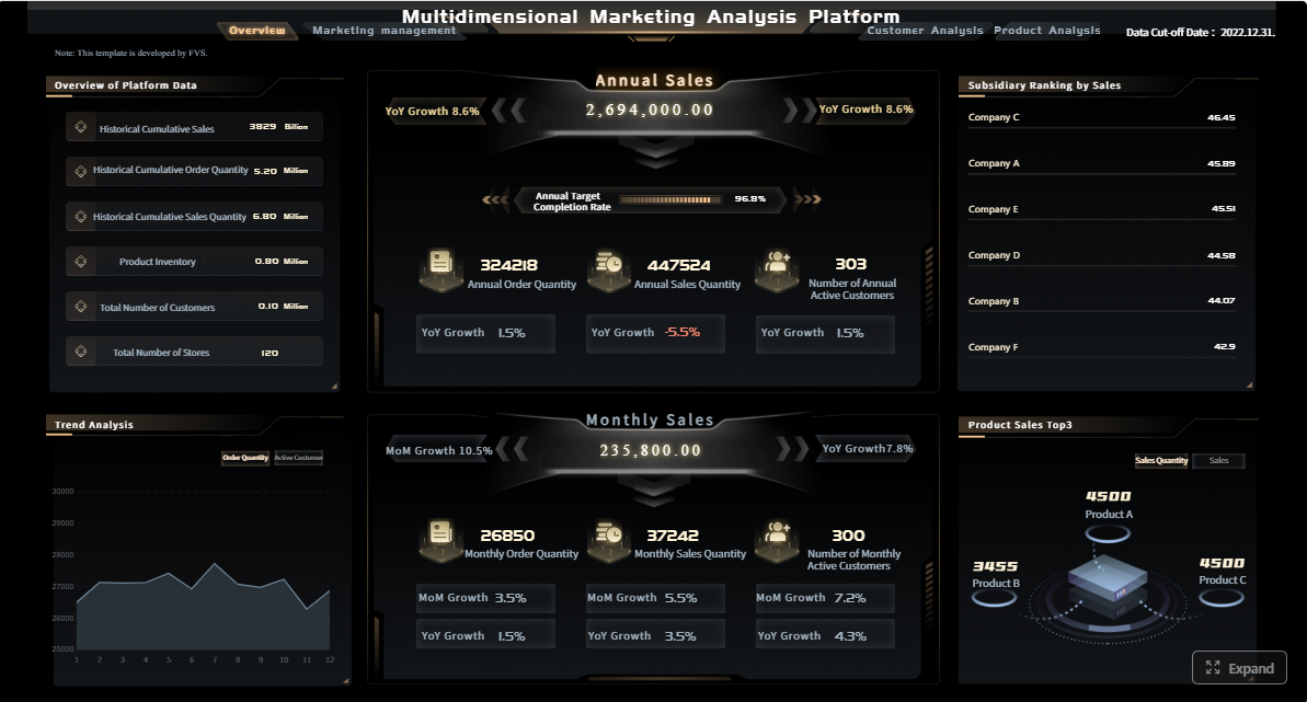
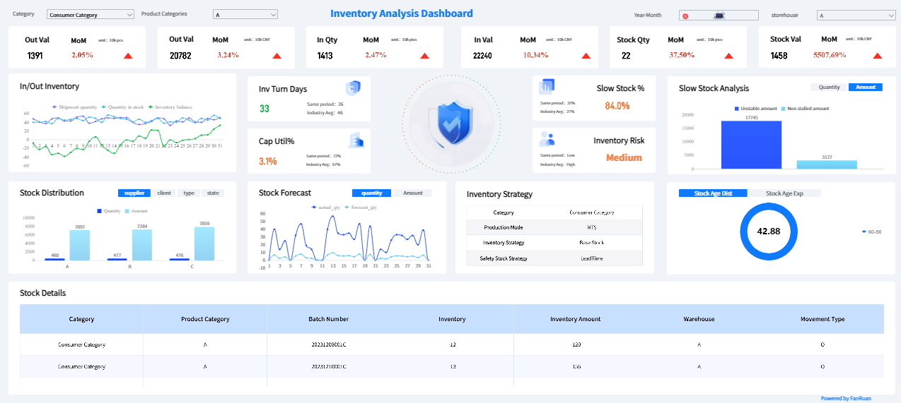
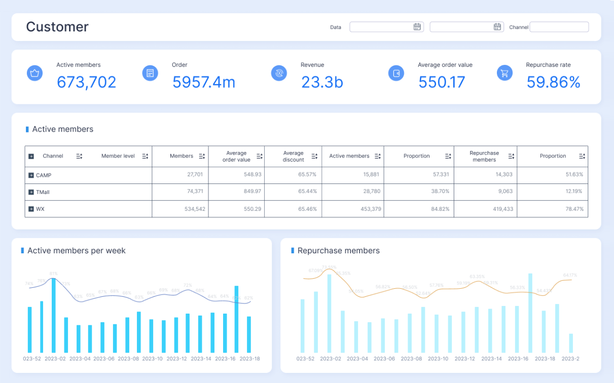
A strong marketing performance report template helps marketing leaders turn scattered channel data into decisions executives can make quickly. If you are reporting to a CMO, VP, CEO, or business unit leader, the report cannot read like a task log. It must show what changed, why it mattered, what risks exist, and what actions should happen next. For marketing managers, channel owners, and operations teams, the real pain point is not lack of data—it is lack of structure. Monthly reporting often becomes a mix of screenshots, platform exports, and vanity metrics that waste time and weaken credibility. A proper template fixes that by standardizing KPIs, aligning commentary to business goals, and making month-over-month performance easy to evaluate.
Click To Try The Dashboard
All reports in this article are built with FineReport
What a marketing performance report template should accomplish
A monthly report exists to support decisions at different levels of the business. Executives want to know whether marketing is contributing to growth. Managers want to know which levers to adjust. Channel owners want to know where performance is improving or slipping. Your template should serve all three audiences without becoming bloated.
Summarize business impact: Show how marketing affected pipeline, revenue, lead quality, efficiency, or growth.
Surface trends quickly: Make it easy to compare this month against prior months, targets, and forecasts.
Explain performance drivers: Identify what caused results, not just what happened.
Support action: End with recommendations, owners, and next steps.
The difference between activity reporting and performance reporting is critical. Activity reporting says what the team did: campaigns launched, emails sent, posts published, budget spent. Performance reporting shows outcomes: qualified leads generated, conversion rate changes, acquisition cost movement, revenue impact, and why those outcomes happened. Executives fund outcomes, not activity.
Consistency is what makes reporting credible. If one month uses platform-reported conversions and the next uses CRM-qualified leads, your month-over-month comparison breaks. If paid social spend is included in one report and excluded in another, trust erodes. A repeatable template ensures that definitions, date ranges, attribution logic, and commentary stay stable.
Key Metrics (KPIs) every monthly marketing report should define
Below is the structured KPI layer every executive-ready report should anchor to:
Leads: Total new leads generated during the reporting period.
MQLs / SQLs: Qualified leads that indicate marketing quality, not just volume.
Conversion Rate: Percentage of users, leads, or sessions that completed a desired action.
Pipeline Influenced: Opportunities or pipeline value tied to marketing activity.
Revenue Influenced or Sourced: Revenue attributed to or significantly impacted by marketing.
Customer Acquisition Cost (CAC): Total marketing and sales cost required to acquire a customer.
Return on Ad Spend (ROAS): Revenue generated relative to paid media spend.
Marketing ROI: Broader efficiency measure comparing return to total marketing investment.
Cost per Lead (CPL): Spend required to generate each lead.
Traffic by Source: Sessions or visits broken down by paid, organic, email, social, referral, and direct.
Engagement Rate: Meaningful interactions that show audience interest, especially for content and social.
Funnel Velocity: How quickly contacts move from lead to opportunity to customer.
Budget vs Actual Spend: Planned investment compared with real spend.
Goal Attainment: Progress against monthly, quarterly, or annual marketing targets.
The 11 must-have sections in an executive-ready monthly report
1. Executive summary
The executive summary should tell the full story in a few lines. This is the section many executives read first—and sometimes only. It should include the biggest wins, biggest losses, and the top priorities for next month.
A strong summary answers:
What improved?
What declined?
What needs attention now?
Keep it brief but commercial. For example, instead of saying “LinkedIn CTR improved,” say “Paid social efficiency improved 18%, helping lower CPL and increase qualified demo requests.”
This section connects monthly outcomes to strategic objectives. Your report should show whether marketing is tracking toward goals tied to growth, pipeline, revenue, customer acquisition, retention, or market expansion.
Best practice: show each KPI with:
Current month result
Previous month result
Target
Variance
Brief interpretation
This structure helps executives separate normal fluctuation from meaningful performance change.
3. Channel performance overview
This section gives leadership a high-level view across major channels such as paid media, organic search, email, social media, website, referral, and direct traffic. The goal is not to drown readers in channel detail. It is to show where performance is concentrated and where budget or strategic attention may need to shift.
A channel can perform well while individual campaigns underperform. That is why campaign-level analysis matters. This section should identify the campaigns that drove the best outcomes and those that fell short.
Include short commentary on why top campaigns succeeded. Was it audience targeting, creative, landing page alignment, offer quality, timing, or budget allocation?
5. Audience and traffic insights
This is where the report explains who engaged and how behavior changed. It should cover:
Executives do not need every analytics dimension. They need the few audience shifts that explain business movement. If branded traffic rose but non-branded organic traffic fell, that has strategic implications. If high-intent visitors increased while low-quality referral traffic dropped, that may actually be a positive signal.
This section should trace movement through the funnel. Reporting only top-of-funnel lead volume can hide serious quality problems. A more useful view shows:
Lead volume
MQLs
SQLs
Opportunity creation
Conversion rates between stages
Lead quality indicators
If lead volume increased 25% but MQL-to-SQL conversion dropped, leadership needs that context immediately. This section should help sales and marketing align on whether marketing is generating demand that actually moves.
7. Revenue and ROI impact
This is the section executives care about most. Tie marketing activity to commercial outcomes wherever your data maturity allows. Depending on your organization, that may include:
Sourced revenue
Influenced revenue
Pipeline created
ROAS
ROI
CAC trends
Payback efficiency
If attribution is imperfect, be transparent. It is better to explain assumptions clearly than to present weak precision as fact.
8. Budget and spend analysis
A monthly report should show how budget was allocated and whether spending tracked to plan. This section helps executives assess operational discipline as well as marketing effectiveness.
Include:
Planned budget vs actual spend
Spend by channel
Spend shifts vs prior month
Underinvestment or overspend areas
Efficiency movement such as CPL, CPA, or ROAS
If spend increased, explain whether it was intentional and productive. If spend undershot plan, explain whether performance risk exists due to delayed execution or limited scale.
9. Key insights and root causes
This is where the report becomes strategic. Raw data does not build confidence—interpretation does. Use this section to explain the story behind the numbers.
Examples of root-cause commentary:
Search conversions fell because branded demand softened after a campaign ended.
Paid social CPL improved because creative and landing pages were aligned to a stronger offer.
Email performance weakened due to list fatigue and lower deliverability in one segment.
Organic traffic grew because three high-intent pages improved rankings and click-through rate.
A good rule: every major change in the report should have a plausible reason attached to it.
10. Risks, issues, and blockers
Executive-ready reporting should not hide problems. It should frame them clearly and constructively. This section is where you flag delivery concerns, tracking gaps, market constraints, resource issues, or external events that affected performance.
Common items to include:
Attribution or tracking gaps
Delayed creative approvals
Landing page or CRM integration issues
Seasonal demand shifts
Budget constraints
Platform algorithm changes
Sales follow-up bottlenecks
Transparent reporting improves trust, especially when paired with corrective action.
11. Next-month action plan
This final section should convert analysis into action. Recommendations should be specific, prioritized, and assigned. Avoid generic statements such as “optimize campaigns” or “improve performance.”
A better action plan includes:
Action
Owner
Deadline
Expected impact
For example:
Reallocate 15% of paid social budget to branded search campaigns to improve lead efficiency.
Refresh email nurture creative for inactive segments to recover click-through rates.
Audit CRM-to-dashboard attribution logic to reduce reporting discrepancies.
Expand top-performing landing page format to two additional campaigns.
How to present monthly marketing results in a way executives will actually read
Even a strong template can fail if the presentation is dense, inconsistent, or too tactical. Executives scan first and read second. Your job is to make the report reviewable in minutes, with enough detail available for follow-up discussion.
Keep the structure concise and scannable
Use plain-language headings, short commentary blocks, and strong visual hierarchy. Keep every section purposeful. If a chart does not support a decision, remove it. If a table repeats what another visual already shows, simplify it.
A consultant’s rule of thumb: one page or one panel should answer one management question.
Focus on trends, not isolated numbers
Single-month values are rarely enough. Show current performance against:
Last month
Quarter-to-date or year-to-date
Target
Forecast
Relevant benchmark
This is what turns reporting into management insight.
Translate metrics into business impact
Executives do not want more acronyms. They want to know what changed, why it matters, and what should happen next. If website traffic rose, did qualified demand rise too? If spend increased, did efficiency improve or deteriorate? If social engagement climbed, did it influence pipeline?
Translate operational metrics into commercial meaning.
Separate insights from data dumps
Detailed exports still have value, but they should live in appendices, tabs, or linked dashboards—not in the core executive readout. The monthly report should be the narrative layer. Supporting data should be available, but not competing for attention.
Common mistakes that weaken monthly marketing reporting templates
Many monthly reports fail not because the team lacks effort, but because the structure encourages noise over clarity. Watch for these common problems:
Overloading the report with vanity metrics: Impressions, likes, and clicks are not enough unless tied to funnel or revenue outcomes.
Reporting data without context: Numbers alone do not tell leaders what action to take.
Using inconsistent definitions: Changes in attribution, date range, or KPI logic destroy trust.
Hiding poor performance: Weak months happen. What matters is explaining the cause and response.
Creating channel silos: Executives want an integrated view, not five disconnected mini-reports.
Overcommenting on minor fluctuations: Save attention for movements large enough to matter.
How to customize the template for teams, agencies, and digital channels
Not every organization needs the same reporting emphasis. The core structure should stay consistent, but the framing can be adapted to fit the audience.
For in-house marketing teams
In-house teams should emphasize alignment to company goals and cross-functional execution. That means reporting should clearly connect marketing results to pipeline, revenue, product launches, sales alignment, and strategic initiatives.
Useful additions include:
Business unit performance views
Sales feedback on lead quality
Launch or initiative-level impact
Internal owner accountability
For agencies and client reporting
Agencies need to prove value while showing strategic control. A client-facing report should emphasize outcomes, insights, efficiency, and recommended next steps. Clients want confidence that the agency is not just managing platforms, but improving results.
Important agency reporting elements:
Goal pacing
Clear budget accountability
Strategic commentary by channel
Priority recommendations for approval
For digital marketing reporting
Digital-specific reporting often needs platform-level detail, but it should still ladder up to executive outcomes. Include tailored views for:
Paid media
SEO
Email
Website performance
Social
Conversion funnel behavior
The trick is layering detail. Keep the executive layer simple, then allow drill-down where needed.
For downloadable or printable formats
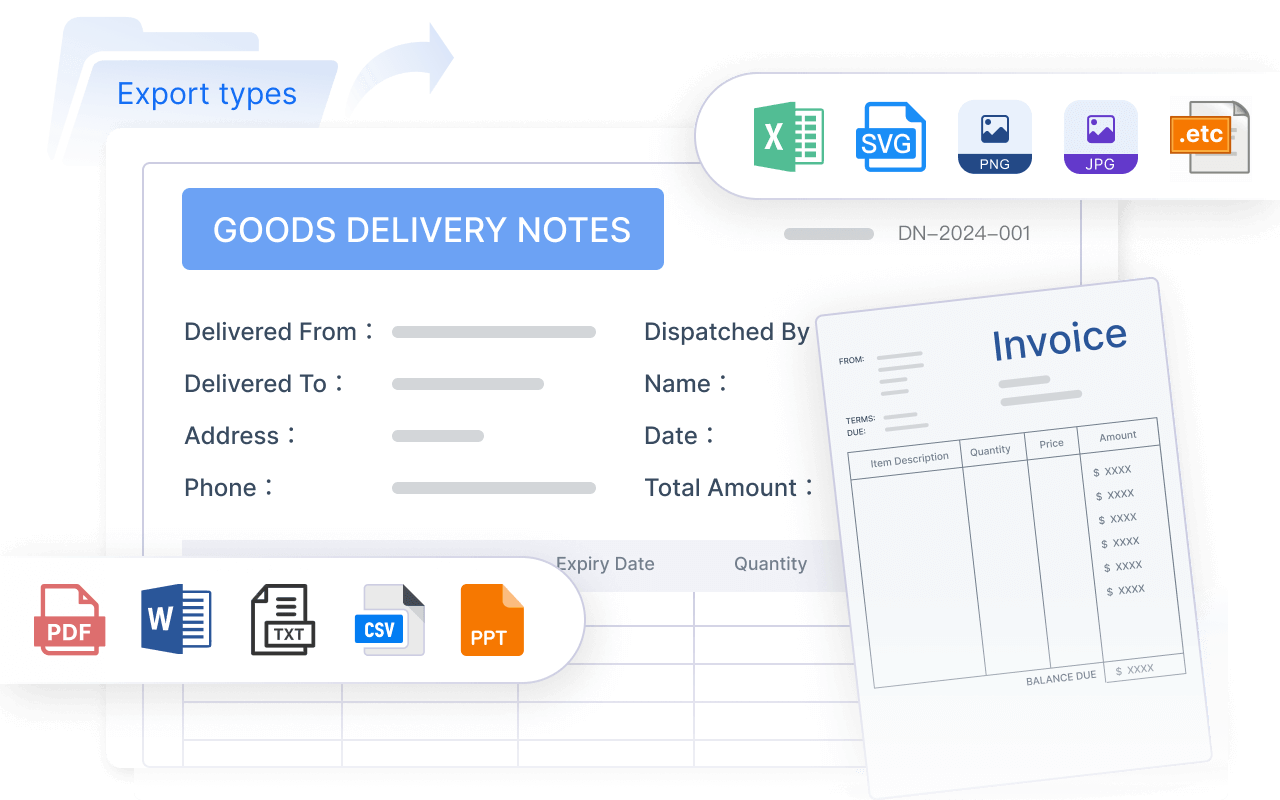
Some stakeholders prefer slides. Others want a PDF or live dashboard. Your template should adapt across formats without changing KPI logic.
Practical format guidelines:
Slides: Best for executive reviews and board-style summaries.
Documents/PDFs: Best for monthly archives and formal commentary.
Dashboards: Best for interactive drill-down and self-service access.
Printable summaries: Best for concise meeting packs and offline review.
Actionable best practices for implementing a marketing performance report template
A good template is not just designed. It is operationalized. Here is how experienced teams make monthly reporting reliable and scalable.
1. Standardize KPI definitions before designing visuals
Start with a reporting dictionary. Define every KPI, data source, owner, date logic, and attribution rule. Resolve conflicts between marketing automation, CRM, analytics, and ad platforms before the first executive review.
Without this step, your report becomes visually polished but analytically fragile.
2. Build the report around executive questions, not platform exports
Identify the five to seven questions leadership asks every month, such as:
Are we on track to target?
Which channels are driving qualified demand?
Where are we overspending or underinvesting?
What risks could affect next month?
What actions do you recommend?
Then structure the template to answer those questions in order.
3. Use a tiered reporting model
Create three layers:
Executive summary layer
Management analysis layer
Detailed supporting dashboard layer
This lets executives scan quickly while analysts and channel owners still access depth.
4. Automate recurring data pulls and variance calculations
Manual monthly reporting creates errors, delays, and version control issues. Automate source refreshes, KPI calculations, target comparisons, and recurring visual layouts wherever possible. Teams that automate reporting reclaim time for analysis—the part executives actually value.
5. End every report with decisions and owners
The report should conclude with what happens next. If no owner, deadline, and expected impact are listed, the report is informing but not managing. Reporting is most valuable when it directly shapes next-month execution.
A strong monthly report should include an executive summary, goals and KPI tracking, channel performance, budget versus actual spend, performance drivers, risks, and clear next steps. The goal is to show what changed, why it matters, and what action should follow.
The most useful executive KPIs usually include leads, MQLs or SQLs, conversion rate, pipeline influenced, revenue influenced, CAC, CPL, ROAS, and budget pacing. The right mix depends on business goals, but every metric should connect back to growth or efficiency.
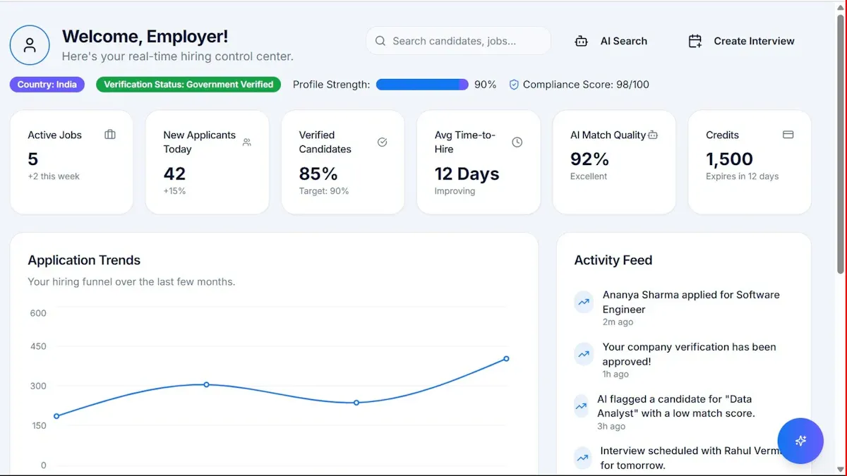
A dashboard is mainly for monitoring current performance in real time, while a report explains results over a defined period such as a month. A marketing performance report adds context, interpretation, and recommendations so leaders can make decisions.
Most teams create it monthly because that cadence gives enough data to spot trends without overwhelming stakeholders. Weekly views can support campaign optimization, but monthly reporting is usually best for executive review.
A template standardizes KPI definitions, date ranges, attribution rules, and commentary structure across reporting periods. That makes month over month comparisons more reliable and helps build trust with executives and cross-functional teams.
Product Trial
FineReport
Pixel-perfect reports · Interactive dashboards · Easy data entry · Digital twins