An effective analytics report template turns messy performance data into decisions. For marketing leaders, operations directors, analysts, and IT managers, the real challenge is not collecting data—it is presenting the right metrics, context, and actions in a format stakeholders can trust and use quickly. A strong template reduces reporting time, standardizes interpretation, and helps every recurring report answer the same critical business questions: What changed, why did it change, and what should happen next?
All reports in this article are built with FineReport.
A reusable analytics report template gives teams a structured way to communicate performance without rebuilding the story each reporting cycle. Instead of exporting screenshots from dashboards and adding commentary manually, teams can follow a repeatable framework that aligns data with business decisions.
For executives, the report needs to surface outcomes and risks. For managers, it should reveal where to optimize spend, processes, or campaigns. For analysts, it must preserve metric definitions, time periods, and methodology. When those needs are baked into the template, reporting becomes faster and more credible.
A consistent template also improves cross-functional clarity. Weekly, monthly, or quarterly reports often involve multiple sources, owners, and audiences. If one team reports traffic growth while another emphasizes lead quality or retention, leadership may see conflicting narratives. A standard format solves this by creating one reporting language.
Here is the key distinction:
Raw dashboards show live data but often lack interpretation and business context.
One-off analyses answer a specific question but are not efficient for recurring use.
An analytics report template combines structure, metrics, visuals, commentary, and action items into a repeatable decision-making asset.
Core Elements Every Analytics Report Template Should Support
To work well at scale, the template should consistently include:
Business objective: The outcome the report is meant to evaluate.
Reporting period: The exact date range and comparison window.
Primary KPIs: The metrics that directly reflect performance.
Benchmarks: Targets, prior period values, or external standards.
Visual summaries: Charts and scorecards that make trends easy to scan.
Interpretation: Plain-language explanation of what changed and why.
Recommended actions: Next steps tied to findings and ownership.
The 12 Must-Have Elements in an Analytics Report Template
The best analytics reports are not just data containers. They are operational tools. Below are the 12 essential sections every high-performing analytics report template should include.
1. Executive summary
The executive summary is the report’s top layer. It should communicate the most important outcomes in under a minute. This is where leadership sees whether performance improved, missed target, or shifted unexpectedly.
Include:
Top-line results
Major changes versus prior period
Biggest win
Biggest risk
Immediate takeaway
A strong summary avoids metric overload. It highlights only what matters most.
2. Goals and reporting period
Every report needs scope. Without clear goals and time boundaries, even accurate metrics can be misleading.
Document:
Business objective
Campaign or operational scope
Date range
Comparison period
Relevant context such as product launches, seasonality, or budget shifts
This section prevents stakeholders from comparing numbers out of context.
3. Core performance metrics
This is the operational center of the report. Your analytics report template should include only the KPIs that map directly to business outcomes.
Key Metrics (KPIs)
Traffic: The number of visits, sessions, or users entering the funnel.
Engagement rate: The percentage of users interacting meaningfully with content or features.
Conversion rate: The share of users who complete a target action.
Revenue: Total income generated within the reporting period.
Average order value (AOV): Revenue divided by total orders.
Return on investment (ROI): Profitability relative to spend.
Retention rate: The percentage of customers who stay active over time.
Churn rate: The percentage of customers lost during the period.
Lead volume: Number of qualified or total leads generated.
Pipeline contribution: Revenue opportunity created by campaigns or channels.
Customer lifetime value (CLV): Expected long-term value of a customer relationship.
The right mix depends on the audience. Executives usually want revenue, efficiency, and risk signals. Channel managers often need traffic, conversion, and cost metrics.
4. Trend visuals and comparisons
Numbers alone do not show momentum. Trend visuals help readers see direction, volatility, and inflection points quickly.
Useful visual choices include:
Line charts for time-based performance
Scorecards for headline KPIs
Variance charts for actual versus target
Before-versus-after comparisons for campaign or process changes
These visuals should answer practical questions such as:
Aggregate performance can hide important differences. A report template should break out results by source, platform, campaign, region, product line, or audience segment where relevant.
This section helps identify:
Which channels drive the most efficient conversions
Which campaigns produce volume but low quality
Which segments outperform benchmarks
Where budget should increase or decrease
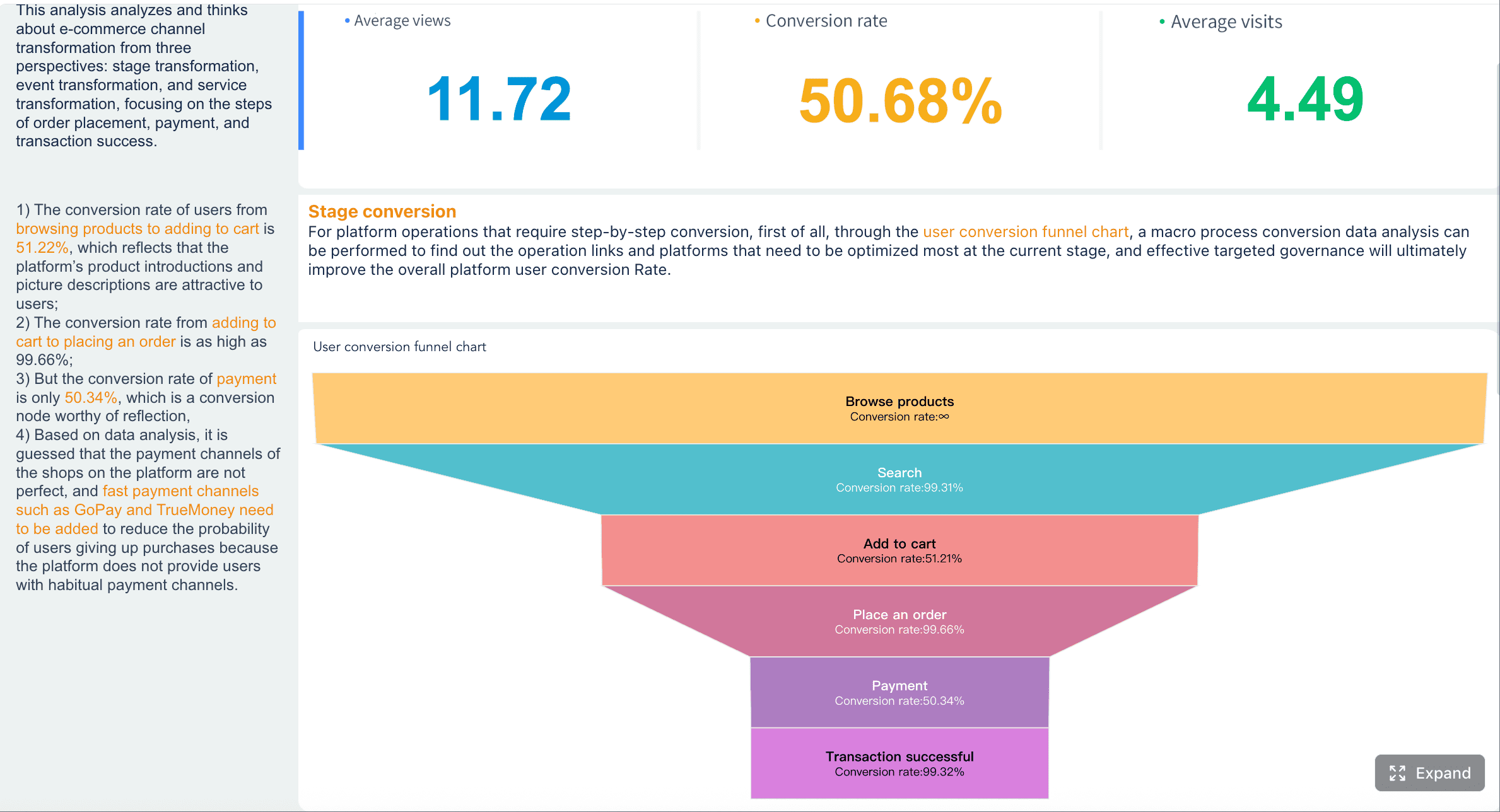
6. Conversion and funnel insights
A strong report does not stop at top-line conversion rate. It should show where users move forward, stall, or drop off.
A conversion and funnel section can include:
Visits to lead conversion
Lead to opportunity conversion
Cart to checkout completion
Trial to paid activation
Step-by-step abandonment rates
This section is especially valuable for diagnosing operational friction. A healthy top funnel with weak bottom-funnel movement often signals qualification issues, UX friction, pricing resistance, or poor handoff between teams.
7. Benchmarks and targets
Performance without a comparison point is incomplete. A professional analytics report template should always show how current results compare to something meaningful.
Common benchmark types include:
Prior week, month, quarter, or year
Budget or internal target
Forecast
Team baseline
Industry benchmark where credible and relevant
The purpose is not to overload the page with comparisons. It is to help the reader judge whether current performance is strong, weak, or normal.
8. Audience insights
Results improve when teams understand who is engaging and converting. Audience insights provide the human layer behind the KPIs.
Useful dimensions include:
Demographics
Geography
Device type
Customer cohort
New versus returning users
Behavioral segments
Purchase frequency or lifecycle stage
This section is useful for refining targeting, personalization, retention strategy, and product messaging.
9. Top content, pages, or assets
Good reports surface what is working and what is underperforming. This section should rank high-impact assets by measurable outcomes, not just views.
Examples include:
Highest-converting landing pages
Best-performing blog posts
Ads with strongest click-through and ROI
Email campaigns with strongest downstream conversion
Pages with high exits or bounce behavior
A simple top-and-bottom table often works well here.
10. Data quality notes and methodology
Trust in analytics depends on transparency. This section protects the report from misinterpretation by documenting the rules behind the numbers.
Include notes on:
Attribution model used
Known tracking gaps
Filter or segmentation logic
Bot exclusions
Data refresh timing
Definition changes
Anomalies such as outages or implementation issues
For enterprise teams, this is not optional. It is the difference between a report people glance at and a report people act on confidently.
11. Key insights and interpretation
This is where reporting becomes strategic. The report should explain not just what happened, but why it matters.
Strong interpretation often includes:
The primary driver behind the change
Whether the shift is likely temporary or structural
Which audience, product, or channel contributed most
Whether the result supports or weakens current strategy
This commentary should be concise and evidence-based. Avoid vague phrases like “engagement improved significantly” without clarifying the source, period, and likely cause.
12. Recommended action items
Every report should end with decisions. If the report does not drive action, it is incomplete.
Use a simple action framework:
Action Item
Priority
Owner
Deadline
Expected Impact
Shift budget to highest-converting channels
High
Marketing Manager
Next reporting cycle
Improve ROI
Fix drop-off on checkout step
High
Product Team
2 weeks
Increase conversion rate
Retarget high-engagement non-converters
Medium
Performance Team
1 week
Lift assisted conversions
Validate tracking anomaly in email data
Medium
Analytics Team
3 days
Improve data trust
This section should be practical and assigned. General recommendations without owners rarely get executed.
How to Present Metrics, Visuals, and Benchmarks in an Analytics Report Template Clearly
Even the best metrics fail if the report is hard to interpret. Presentation quality directly affects decision speed.
Match visuals to the question
Choose the chart type based on what the reader needs to understand.
Use line charts for trend analysis over time
Use bar charts for comparing channels, campaigns, or segments
Use tables when precise values and rankings matter
Use funnel charts for step-based conversion flow
Use scorecards for headline metrics and variances
If the wrong visual is used, stakeholders spend time decoding the chart instead of absorbing the message.
Keep benchmarks meaningful
Not every benchmark helps. The most useful comparisons are realistic and decision-oriented.
Best practice is to compare against:
Prior period for momentum
Target for accountability
Baseline for operational consistency
Peer or industry benchmark for external perspective
Avoid weak comparisons that inflate success or exaggerate failure. Benchmarking should sharpen decisions, not create noise.
Make the report easy to scan
Decision-makers do not read reports line by line. They scan first.
Keeping page layouts predictable across reporting cycles
A useful rule: every chart should answer one question clearly.
Common Mistakes to Avoid in an Analytics Report Template
Many reports fail not because the data is wrong, but because the structure is weak. These are the most common issues I see in enterprise reporting workflows.
Including too many metrics
Reporting everything is not the same as reporting well. Too many metrics dilute attention and make the decision path unclear.
Instead:
Prioritize KPIs linked to objectives
Move secondary detail to appendix views or drill-down dashboards
Limit executive-facing pages to what truly changes decisions
Missing context behind performance changes
A drop in traffic or spike in conversion rate can mean very different things depending on what changed operationally.
Always pair metrics with context such as:
Seasonality
Budget increases or cuts
Creative refreshes
Site outages
Pricing changes
Tracking fixes
Sales process changes
Without context, stakeholders may react to noise instead of actual signals.
Ending without action
This is the most expensive reporting mistake. Teams invest hours into analysis, then stop at observation.
Your analytics report template should force the final question: what should we do next?
A good rule is to close every report with:
Priority actions
Assigned owners
Deadlines
Expected business effect
Where to Find Useful Examples of Analytics Report Template
If you are building a report from scratch, examples can accelerate your design process. The key is to borrow structure, not blindly copy layouts.
Useful places to look include:
Printable and editable marketing report formats for recurring stakeholder updates
Social media reporting templates when platform-level reporting is required
When reviewing examples, evaluate them against these criteria:
Do they align with a specific audience?
Do they include interpretation, not just charts?
Do they show benchmarks clearly?
Do they end with action items?
Can the structure be reused across reporting cycles?
In practice, the best example is one that can be adapted to your reporting cadence, data stack, and approval workflow.
Final Checklist for Building a Strong Analytics Report Template
Before you finalize your template, run through this checklist to ensure it is decision-ready.
Confirm the audience, objective, and reporting frequency
Include only the metrics that support the business decision
Add clear visuals for trends, comparisons, and funnel movement
Use meaningful benchmarks such as targets, prior periods, or internal baselines
Explain changes with concise interpretation
Document methodology, anomalies, and tracking limitations
Highlight top-performing and underperforming assets
End with prioritized action items and owners
4 Best Practices for Implementing an Analytics Report Template
If you want the template to work consistently across teams, follow these field-tested practices.
1. Start with stakeholder questions, not available data
Build the report around the questions leadership asks repeatedly:
Are we hitting target?
Which channels are improving efficiency?
Where are users dropping off?
What action should we take next?
This keeps the report outcome-focused.
2. Standardize definitions before automating
Do not automate unstable metrics. First align teams on:
Metric definitions
Attribution rules
Reporting windows
Segment logic
Ownership of data quality checks
This prevents recurring disputes later.
3. Separate summary, diagnostics, and detail
A high-performing report usually has three layers:
Summary for executives
Diagnostic views for managers
Detailed tables for analysts
This structure keeps the report useful for multiple audiences without clutter.
4. Review the template quarterly
Business priorities change. A report built for acquisition may need retention metrics six months later. Review your template regularly and remove sections nobody uses.
Build a Smarter Analytics Report Template with FineReport
Building this manually is complex; use FineReport to utilize ready-made templates and automate this entire workflow.
For many teams, the problem is not knowing what should go into an analytics report template. The problem is assembling it repeatedly across fragmented systems, spreadsheets, dashboards, and presentation slides. That manual process creates version-control issues, inconsistent logic, and wasted analyst time.
Drill from summary metrics into operational detail when needed
For enterprise decision-makers, that means faster reporting cycles, stronger governance, and more confident action. Instead of spending time formatting exports and rewriting commentary every month, teams can focus on analysis and optimization.
A strong analytics report is not just a document. It is a reporting system. And the right platform makes that system scalable.
A strong analytics report template should include the business objective, reporting period, core KPIs, benchmarks, trend visuals, plain-language insights, and clear action items. These elements help stakeholders understand what changed, why it changed, and what to do next.
The most important metrics depend on your goal, but common priorities include traffic, conversion rate, revenue, CPA, ROI, retention, and lead volume. Focus on KPIs that directly reflect business performance rather than adding every available metric.
A dashboard shows live data, while an analytics report template adds context, interpretation, benchmarks, and recommendations. Reports are better for recurring stakeholder updates because they turn metrics into a decision-ready narrative.
Most teams update analytics reports weekly, monthly, or quarterly depending on the pace of the business and the audience. The best schedule is one that supports timely decisions without overwhelming stakeholders with unnecessary detail.
Benchmarks show whether results are good, poor, or simply normal for the period, while visuals make trends and outliers easier to spot. Together, they help readers interpret performance faster and with more confidence.
Product Trial
FineReport
Pixel-perfect reports · Interactive dashboards · Easy data entry · Digital twins