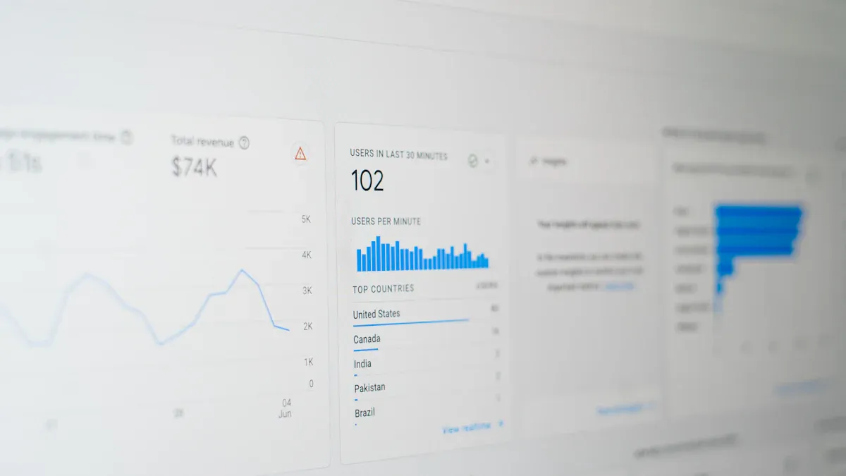
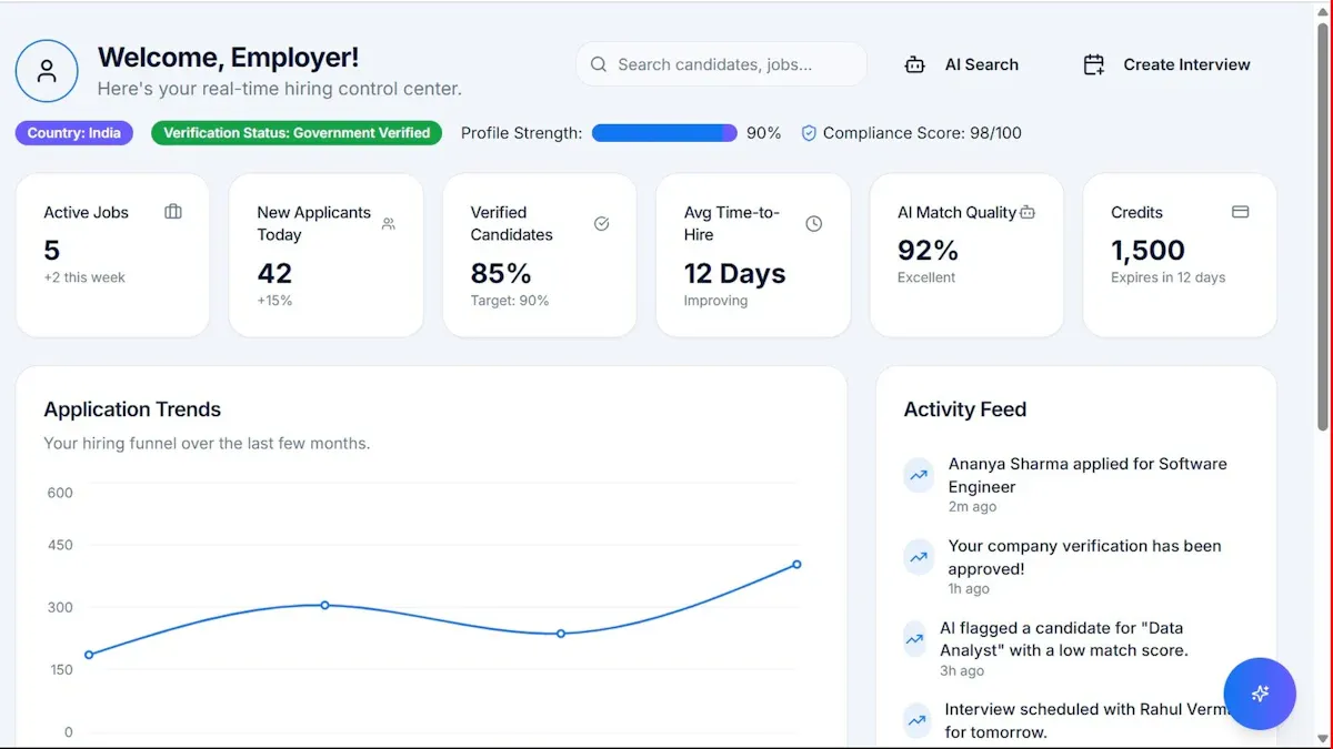
An analytics report turns raw marketing and business data into decisions. For marketing managers, operations leaders, and analysts, the challenge is rarely a lack of data—it is knowing which numbers matter, how to structure them, and how to present findings clearly enough that stakeholders can act. A strong analytics report helps teams identify what changed, why it changed, and what should happen next across campaigns, websites, products, and revenue pipelines.
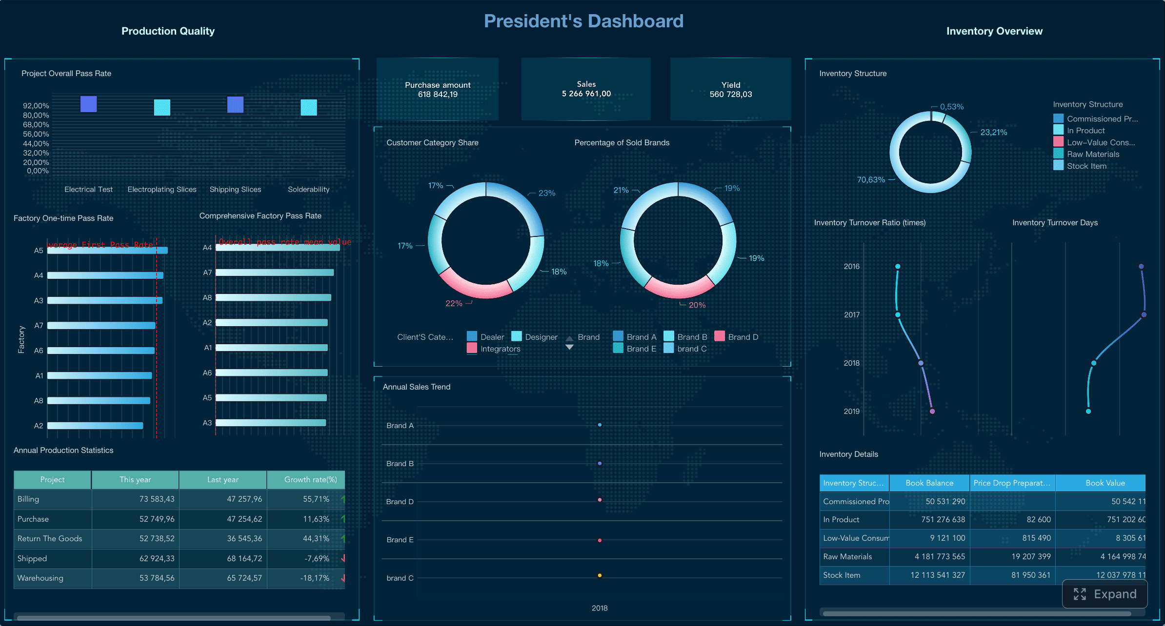
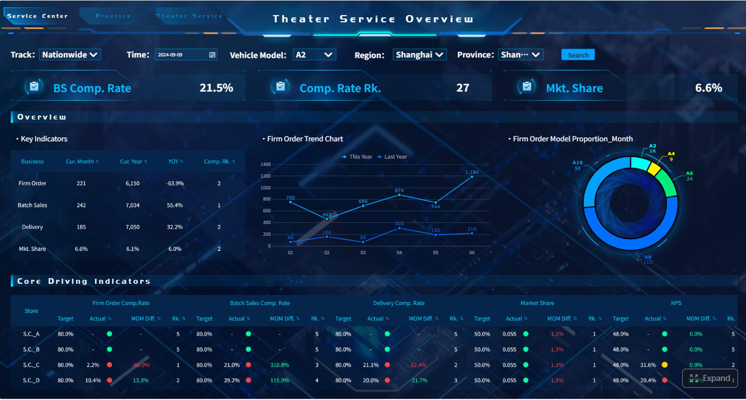
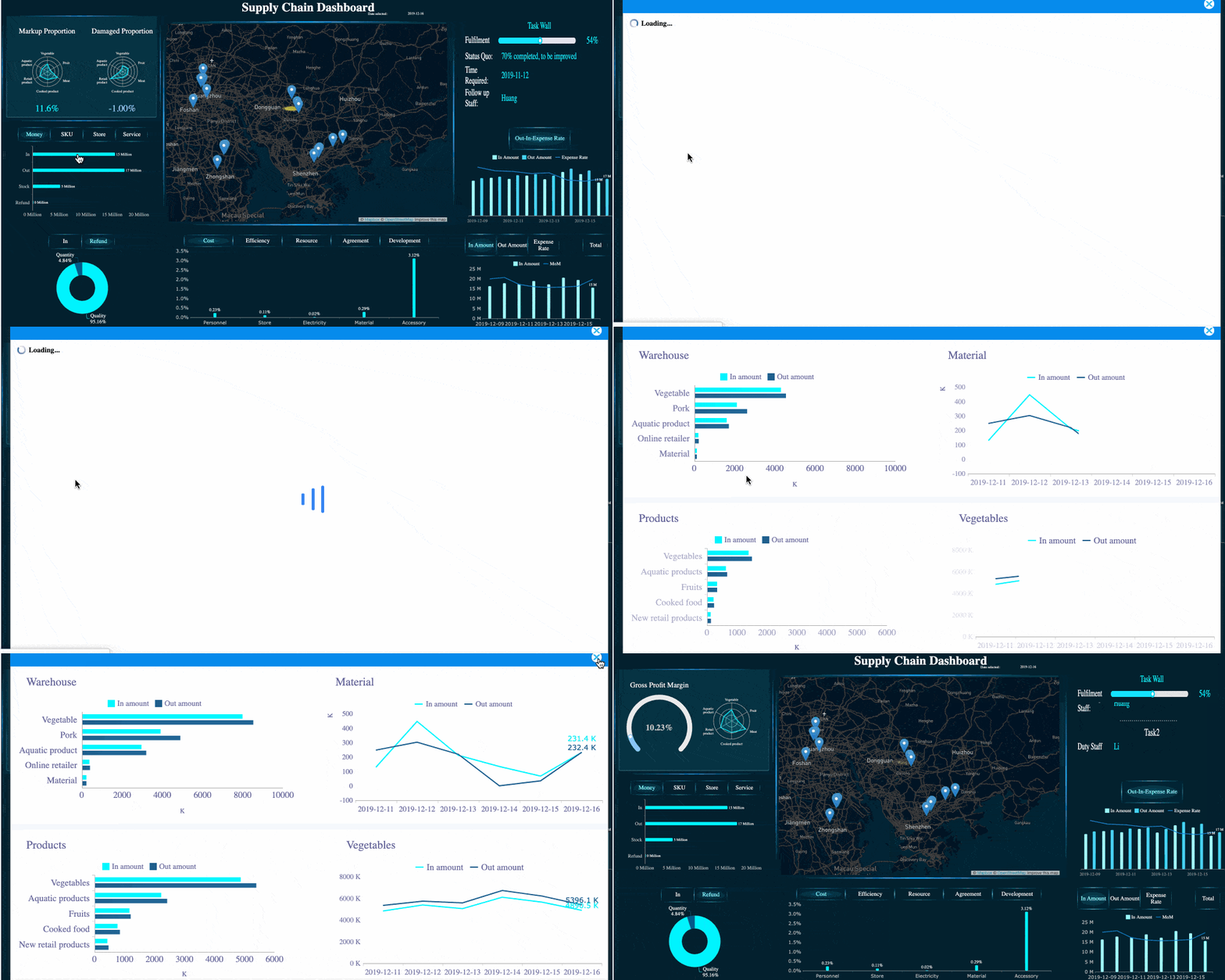
All reports in this article are built with FineReport.
An analytics report is a structured summary of performance data designed to support business decisions. In marketing, it often measures traffic, engagement, leads, conversions, and revenue. In broader business settings, it can track product adoption, retention, operations efficiency, or customer behavior.
The purpose is not to display every available metric. It is to answer the right business questions for the right audience. A CMO may need high-level ROI and channel contribution. A campaign manager may need daily pacing, conversion trends, and landing page performance. An ecommerce director may need product-level revenue, cart abandonment, and repeat purchase data.
A good report should define:
Who it is for: executives, managers, analysts, clients, or cross-functional teams
What decisions it supports: budget allocation, campaign optimization, product improvements, funnel fixes
How often it is reviewed: daily for operational monitoring, weekly for performance management, monthly or quarterly for strategy
It is also important to separate three related activities:
Collecting data: gathering inputs from analytics platforms, ad tools, CRM systems, ecommerce platforms, and social channels
Reporting findings: packaging the most relevant insights, visuals, and recommendations into a format stakeholders can understand quickly
If your report only exports numbers, it is incomplete. If it only gives opinions without evidence, it lacks credibility. The best analytics report does both: it proves performance and explains what to do next.
Set goals before building the analytics report
Before you choose charts or export any data, define the report goal. This is where many teams fail. They start with dashboards and metrics instead of business objectives.
A better sequence is:
Start with the business objective
Convert that objective into measurable reporting goals
Define the questions the report must answer
Set the scope of the report
For example, if the business objective is to increase ecommerce revenue, the reporting goal may be to track which channels generate the highest-converting traffic and where drop-offs occur in the checkout funnel.
Common stakeholder questions include:
Which channels are driving qualified traffic?
Why did conversion rate drop this month?
Which campaigns produced the strongest ROI?
Are new users returning and becoming customers?
Which landing pages contribute most to revenue?
Next, define the scope. Your analytics report can focus on:
A single channel: SEO, paid search, email, social, referral
A campaign: launch performance, lead generation, seasonal promotions
A product: product page views, add-to-cart, purchase rate, repeat purchase
A website: traffic quality, behavior flow, conversion paths
A full funnel: awareness, engagement, lead generation, sales, retention
The narrower the scope, the more diagnostic the report can be. The broader the scope, the more important prioritization becomes.
Analytics vs. reporting: key differences and examples
Analytics and reporting are closely related, but they are not the same.
Analytics is the process of interpreting data to discover patterns, causes, risks, and opportunities. Reporting is the process of communicating the results in a structured, digestible way.
A simple way to think about it:
Analytics asks: Why is this happening?
Reporting answers: What happened, why it matters, and what we should do
Examples:
A dashboard is most useful for ongoing monitoring. It helps teams check KPIs quickly and spot shifts in performance.
A summary report is best for executives who need concise business outcomes, trend direction, and recommendations.
A deep-dive report is ideal when performance drops, attribution is unclear, or a major campaign needs root-cause analysis.
If website conversions fall by 18%, analytics might reveal that mobile traffic increased while page load speed worsened on key landing pages. Reporting would communicate that finding clearly, show the supporting metrics, and recommend performance fixes.
Choose KPIs and metrics that match your analytics report goals
The fastest way to ruin an analytics report is to overload it with metrics. A better approach is to separate primary KPIs from supporting metrics.
Primary KPIs show whether the business goal is being achieved
Supporting metrics explain the drivers behind KPI movement
For example, if your goal is lead generation:
Primary KPI: leads or conversion rate
Supporting metrics: sessions, CTR, landing page bounce rate, form completion rate, cost per lead
Key Metrics (KPIs)
Below is a practical KPI structure for most analytics report scenarios:
Traffic: The volume of users or sessions visiting your website or landing pages
Conversion Rate: The percentage of users who complete a desired action
Revenue: Total sales value generated in the reporting period
Retention Rate: The percentage of users or customers who return over time
Engagement Rate: A measure of interaction quality, such as engaged sessions, time on site, scroll depth, or social engagement
Cost per Acquisition (CPA): The average cost required to generate a customer or lead
Return on Ad Spend (ROAS): Revenue generated for every unit of advertising spend
Average Order Value (AOV): Average revenue per transaction
Bounce or Exit Indicators: Signals that users leave without progressing
Lead Quality or Sales Qualification Rate: The share of leads that meet downstream sales criteria
A strong analytics report usually includes a mix of leading indicators and lagging indicators.
Leading indicators predict future performance, such as CTR, engaged sessions, product views, or add-to-cart rate
Lagging indicators confirm outcomes, such as revenue, closed deals, churn, or retention
Use leading indicators for optimization. Use lagging indicators for accountability.
Overview of Google Analytics reports
Google Analytics remains one of the most common sources for website and app reporting. Its standard report areas help answer a wide range of performance questions.
The main report categories typically include:
Acquisition reports: Show where users come from, including channels, source/medium, campaigns, and traffic quality
Engagement reports: Show how users behave on the site, including page performance, events, session quality, and content interaction
Monetization reports: Show revenue, purchases, product performance, and ecommerce trends
Retention reports: Show whether users return and continue engaging over time
Conversion-focused reports: Show how users complete key actions such as purchases, form submissions, or sign-ups
These report areas help answer questions like:
Which marketing channels drive the most valuable traffic?
Which pages attract users but fail to convert?
Which products generate revenue but suffer from abandonment?
Are new users returning or disappearing after one visit?
For many teams, Google Analytics is a foundation—but not the full reporting stack. It often works best when paired with advertising data, CRM outcomes, and BI visualization tools.
7+ Google Analytics reports for marketers
Marketers usually rely on a recurring set of report views. These are the report categories worth prioritizing in an analytics report:
Traffic acquisition report
Best for understanding which channels, campaigns, and sources bring users in.
Landing page report
Best for evaluating entry-point performance, bounce tendencies, and page-level conversion efficiency.
Conversion report
Best for tracking form fills, sign-ups, purchases, or other defined business actions.
Campaign performance report
Best for comparing UTM-tagged campaigns, creative themes, audience segments, and spend efficiency.
Audience or user attribute report
Best for breaking down performance by device, geography, user type, or demographic segments.
Engagement or event report
Best for understanding how users interact with content, buttons, videos, downloads, and product pages.
Monetization or ecommerce report
Best for analyzing product sales, transaction value, cart-to-purchase flow, and revenue contribution.
Retention report
Best for subscription, app, SaaS, or repeat-purchase businesses that need to understand long-term value.
Standard reports are enough when your questions are routine and the tracking setup is mature. Use custom exploration or a BI layer when you need multi-source reporting, advanced segmentation, funnel breakdowns, or executive-ready visualization.
Gather data from the right tools and sources for your analytics report
An analytics report is only as strong as the data behind it. Most teams need to combine inputs from several systems, not just one.
Spreadsheets are fine for lightweight reporting, but they become fragile as data volume, refresh frequency, and stakeholder expectations grow.
Dashboards are stronger for operational reporting because they update faster and reduce manual work. BI tools are better when you need role-based access, centralized modeling, drill-down logic, and enterprise distribution.
This is where FineReport fits naturally for organizations that need flexible, enterprise-grade analytics reporting. It supports complex dashboard design, cross-source integration, scheduled reporting, and highly tailored visual layouts without forcing teams into one-size-fits-all templates.
Google Analytics is excellent for measuring website and app behavior, but it should not be treated as the entire truth layer for business reporting.
A broader reporting stack often looks like this:
Google Analytics for user acquisition, behavior, events, and web conversions
Ad platforms for spend, impressions, clicks, and platform-native attribution
CRM systems for lead quality, pipeline movement, and closed revenue
Visualization tools for stakeholder-friendly dashboards and recurring reports
This combination matters because website conversions alone do not reveal downstream business value. A campaign may generate many leads in Google Analytics but few qualified opportunities in the CRM.
Watch for these common limitations:
Tracking setup gaps can distort event counts and conversion paths
Attribution models differ between Google Analytics and ad platforms
Cookie consent and browser restrictions can reduce visibility
Non-technical stakeholders may misread assisted versus last-click results
Your analytics report should acknowledge these realities clearly. Decision-makers trust reports more when limitations are explained upfront.
Visualize the data of your analytics report so insights are easy to understand
Visualization determines whether a report gets used or ignored. Good visuals reduce cognitive load. Bad visuals force stakeholders to interpret the story themselves.
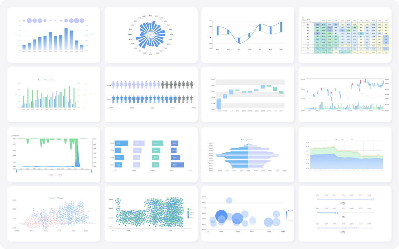
Choose charts based on the question you are answering:
Line charts for trends over time
Bar charts for comparisons across channels, campaigns, or products
Stacked bars or area charts for composition changes
Pie charts sparingly, only for simple part-to-whole views
Funnel charts for conversion stages and drop-off analysis
Tables with conditional formatting for detailed rankings and diagnostics
Scatter plots for identifying outliers or efficiency relationships such as spend versus return
Always add context:
Clear labels
Benchmarks or targets
Period comparisons
Annotations for campaign launches, outages, or seasonal spikes
Insights section: what changed and the likely reasons
Recommendations section: what to test, fix, scale, or stop
Best practices from a consultant’s perspective:
Annotate major changes so charts tell a full story
Segment data by device, audience, geography, or channel when averages hide important differences
Write concise takeaways under each visual
Compare against targets, not only prior periods
Avoid vanity metrics unless they clearly connect to outcomes
Social media analytics report: how to build and present it
A social media analytics report differs from a website analytics report because the goals are often broader than direct conversion. Social reporting may focus on brand reach, audience engagement, community growth, traffic generation, or assisted conversions.
Common sections in a social media analytics report include:
Reach and impressions: how many users saw the content
Audience growth: followers, subscribers, or community changes
Content performance: top posts by engagement or conversion contribution
Traffic and conversion impact: sessions, leads, or revenue driven from social
Paid versus organic comparison: efficiency and outcome differences
When presenting social results, adjust the report to the audience:
Executives want business impact and directional trends
Content teams want post-level insights and creative patterns
Paid media teams want spend efficiency, CTR, CPA, and audience response
The mistake many teams make is presenting social metrics without tying them to objectives. High reach is useful only if awareness is the goal. High engagement matters only if it supports community strength, traffic, or conversion outcomes.
Turn findings of your analytics report into recommendations and next steps
A report becomes valuable when it drives action. That means every reporting cycle should end with a clear recommendation set.
The structure is simple:
What changed
Why it likely happened
What should happen next
For example:
Organic traffic increased 22%, but conversion rate fell 9%
The increase came largely from top-of-funnel blog traffic with weaker purchase intent
Next step: improve internal linking to product pages and test stronger CTAs on high-traffic content
Actionable best practices for building a high-impact analytics report
Here are five field-tested best practices for implementation:
Begin with a decision, not a metric
Identify what stakeholders need to decide before choosing KPIs. This prevents bloated reports and keeps the analytics report decision-ready.
Create a KPI hierarchy
Put 3 to 5 primary KPIs at the top, then add supporting diagnostics below. This makes the report readable for executives and useful for managers.
Standardize definitions before automation
Align naming conventions, attribution windows, date logic, and conversion rules before connecting data sources. Otherwise, automation only scales confusion.
Design for scanning, then drill-down
Build a clean summary layer first, then allow deeper views for channel managers or analysts. This is especially important in enterprise reporting environments.
End every report with prioritized actions
Rank recommendations by impact, effort, and confidence. That makes the report operational, not just informational.
A simple prioritization model works well:
Recommendation
Expected Impact
Effort
Confidence
Priority
Improve mobile landing page speed
High
Medium
High
1
Reallocate budget from low-ROAS campaigns
High
Low
High
2
Test new CTA copy on top blog pages
Medium
Low
Medium
3
Expand paid social audience segments
Medium
Medium
Medium
4
If your team wants to move from static reporting to interactive, role-specific analytics dashboards, this is the point where a purpose-built reporting platform adds real value.
Finally, create a repeatable review process. The best analytics report is not a one-time document. It is part of a reporting rhythm:
Review KPI movement
Validate data quality
Diagnose major changes
Prioritize actions
Assign owners
Track results in the next reporting cycle
That closed loop is what turns reporting into performance improvement.
An effective analytics report should be clear, scoped, visual, and action-oriented. Set goals first, choose KPIs carefully, pull data from the right systems, visualize the story simply, and always convert findings into next steps. Done well, reporting becomes more than measurement—it becomes a management system.
An effective analytics report includes a clear goal, a small set of primary KPIs, supporting metrics, trend visuals, and a short explanation of what changed and what action to take next.
Start with the business objective, then pick KPIs that directly measure success. Use supporting metrics only to explain why the main KPI moved.
Analytics focuses on finding patterns, causes, and opportunities in the data. Reporting turns those findings into a clear format stakeholders can review and act on quickly.
It depends on the decision it supports. Operational teams may review reports daily or weekly, while executive and strategic reports are often monthly or quarterly.
Choose visuals that make trends and comparisons easy to understand, such as line charts for changes over time and funnel views for conversion stages. Keep layouts simple so the main insight is obvious at a glance.
Product Trial
FineReport
Pixel-perfect reports · Interactive dashboards · Easy data entry · Digital twins