

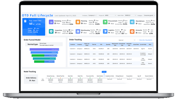
What Is a Digital Dashboard?
Digital Dashboard vs. BI Dashboard
People use the word "dashboard" broadly, but the terms do not always mean the same thing. Understanding the differences helps you choose the right tool and avoid building a screen that looks useful but does not support decisions.
- A digital dashboard is a dashboard delivered through a digital interface, usually connected to live or regularly refreshed data. It focuses on accessibility, interaction, and timely visibility.
- A BI dashboard is usually part of a business intelligence platform. It supports governed datasets, self-service analysis, permissions, sharing, and deeper exploration.
A simple way to think about it: every BI dashboard can be a digital dashboard, but not every digital dashboard is a full BI dashboard. A web page showing daily website traffic is a digital dashboard. A governed analytics workspace that lets sales, finance, and operations teams explore shared metrics is closer to a BI dashboard.
Why a Digital Dashboard Matters
Business teams rarely suffer from a lack of data. The real problem is scattered data, unclear definitions, delayed reports, and dashboards that answer yesterday's question.
Here are the practical problems a well-designed digital dashboard should solve:
- Too many data sources: Sales data may live in CRM, marketing spend in ad platforms, revenue in ERP, and customer feedback in support tools. A digital dashboard brings these signals into one view.
- Slow reporting cycles: When every update depends on manual exports, decision-makers wait. A digital dashboard can refresh by schedule or near real time, depending on the use case.
- Metric confusion: Different teams may calculate revenue, conversion rate, churn, or fulfillment rate differently. A governed dashboard helps align definitions.
- Low data literacy: A well-designed dashboard translates raw tables into visual context, trend direction, thresholds, and next-step questions.
- No action path: A number alone is not enough. The dashboard should show whether performance is normal, where the variance is coming from, and what needs attention.
For teams building a broader analytics content system, this page works as the digital dashboard spoke inside a larger hub. Use the main dashboard page for the category overview, dashboard examples for inspiration, dashboard design for layout principles, and the KPI dashboard, sales dashboard, marketing dashboard, and HR dashboard pages for department-specific paths.
Don't just collect data. Build a digital dashboard that shows what matters.
Download the KPI Dashboard Guide to learn:
- How to turn digital dashboard goals into measurable KPIs
- 10 essential steps to build effective KPI dashboards
- How to choose the right charts and avoid visual clutter
- 15 top-notch dashboard templates for 2026

Digital Dashboard Types
Digital dashboards are not one-size-fits-all. A dashboard for an executive meeting should not look like one for a dispatch team, and a dashboard for root-cause analysis should not behave like a public performance screen. Start with the decision context, then choose the type.
Strategic digital dashboard
A strategic digital dashboard gives leaders a high-level view of company performance. It usually includes revenue, profit, growth, customer health, operational risk, and progress toward annual or quarterly goals. The main job is to show whether the business is on track and where leadership should focus — not to support detailed drill-down on the first screen.
Common metrics included:
- revenue growth
- gross margin
- customer acquisition cost
- customer retention
- market share
- operating expense ratio
- strategic project progress.
Operational digital dashboard
An operational digital dashboard tracks what is happening now. It is useful for teams that need to detect delays, bottlenecks, abnormal values, and workload changes during the day. Compared with a strategic dashboard, an operational dashboard updates more frequently and uses stronger status signals such as alerts, thresholds, and exception lists.
Common metrics included:
- current workload
- open tickets or orders
- SLA status
- machine utilization
- stock levels
- delivery progress
- exception counts
Analytical digital dashboard
An analytical digital dashboard helps users investigate patterns, compare segments, and understand causes. It is useful when the first question is not "Are we on target?" but "Why did this change?" A strong analytics dashboard supports filtering, drill-down, cross-filtering, time comparison, and flexible exploration without breaking metric definitions.
Common metrics included:
- segment-level performance
- period-over-period change
- product or region contribution
- funnel conversion
- cohort behavior
- cost drivers
- variance by category
Department digital dashboard
A department digital dashboard translates shared business goals into the language of a specific team. Finance needs cash flow, budget variance, and margin. Sales needs pipeline, quota attainment, and win rate. HR needs headcount, turnover, hiring progress, and engagement.
Good department dashboards still connect to the bigger picture. A financial dashboard should not isolate finance from operations. A sales dashboard should link pipeline health with revenue targets. A marketing dashboard should connect campaign activity with qualified demand and business outcomes.
Digital Dashboard Examples
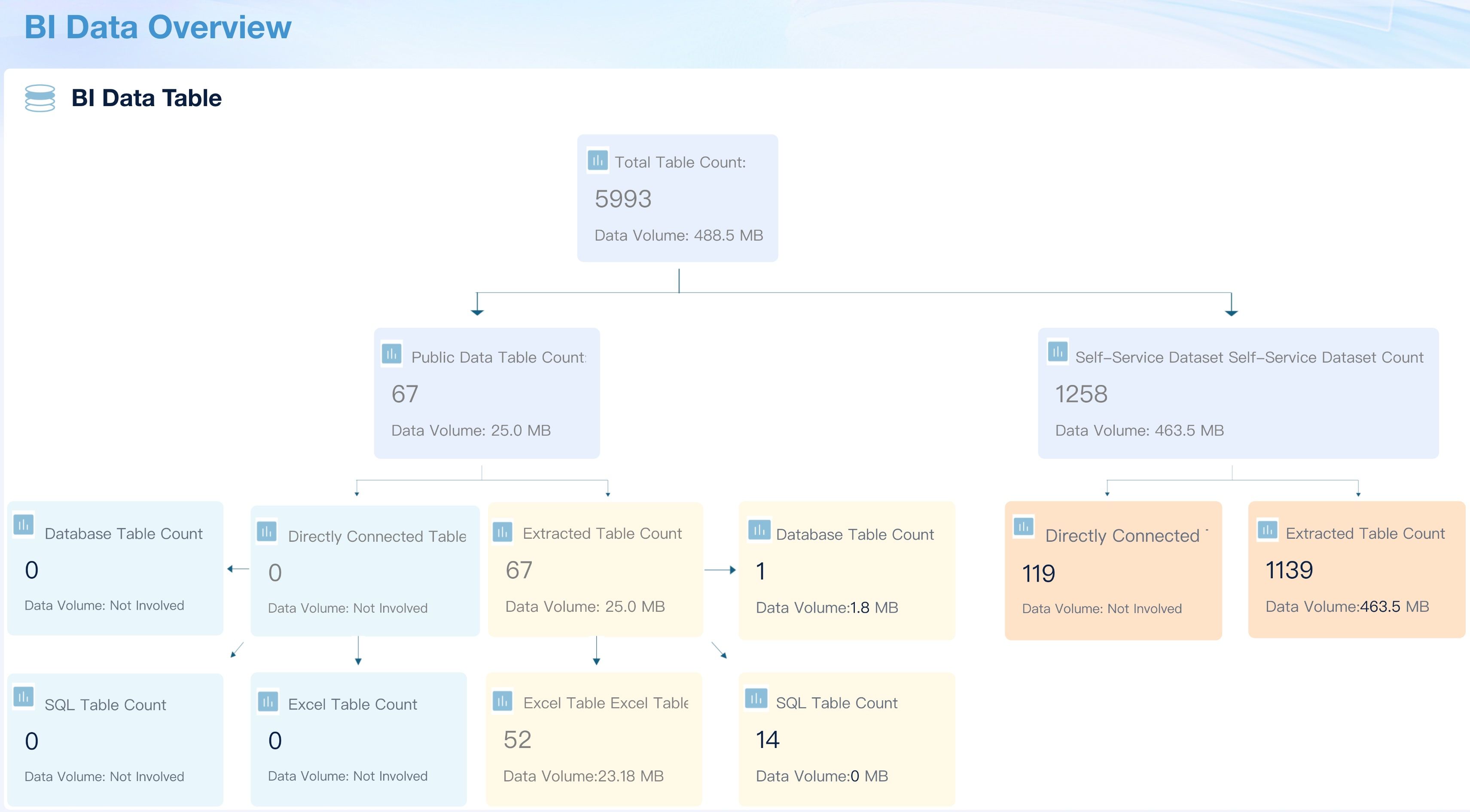
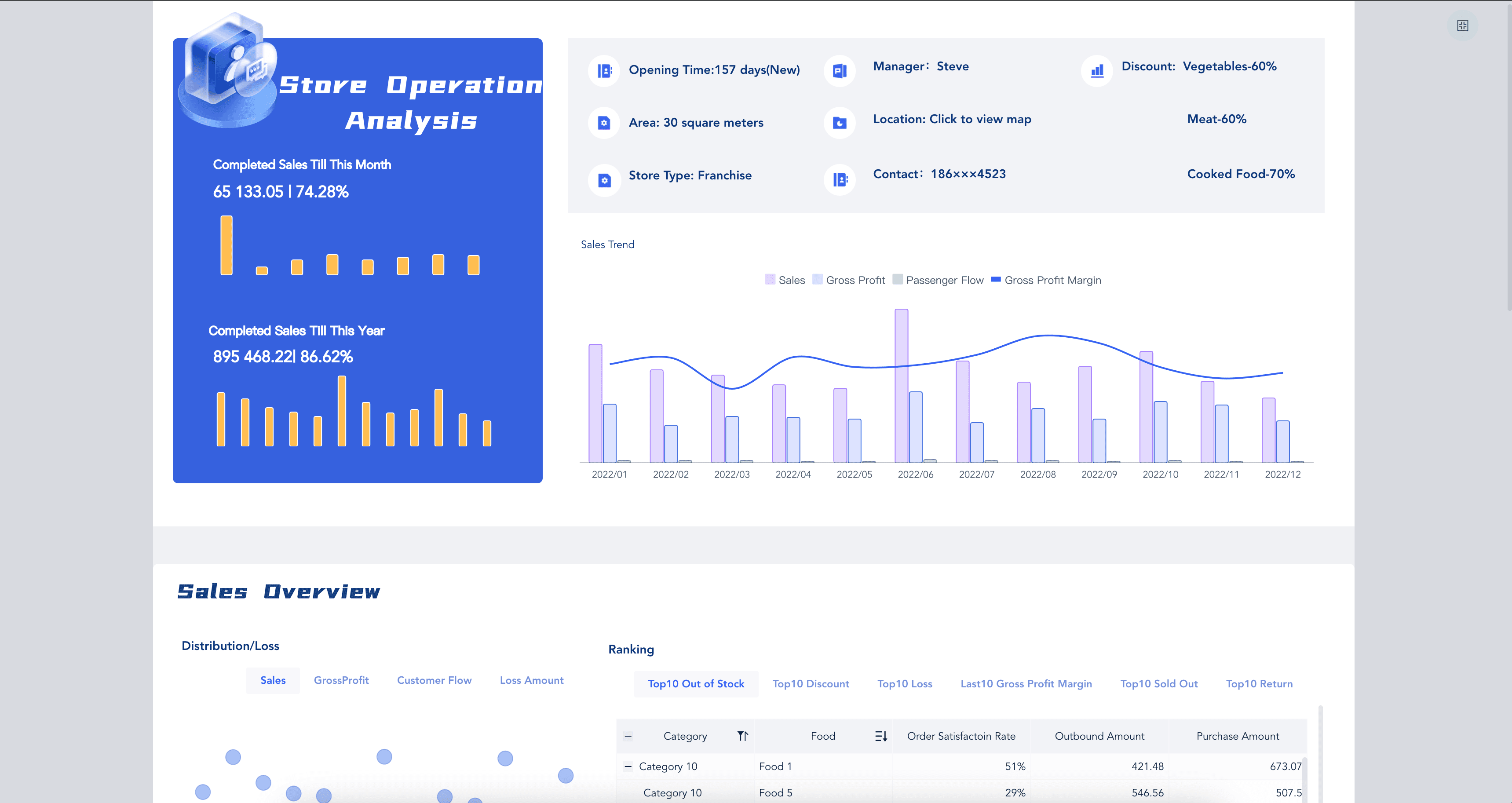
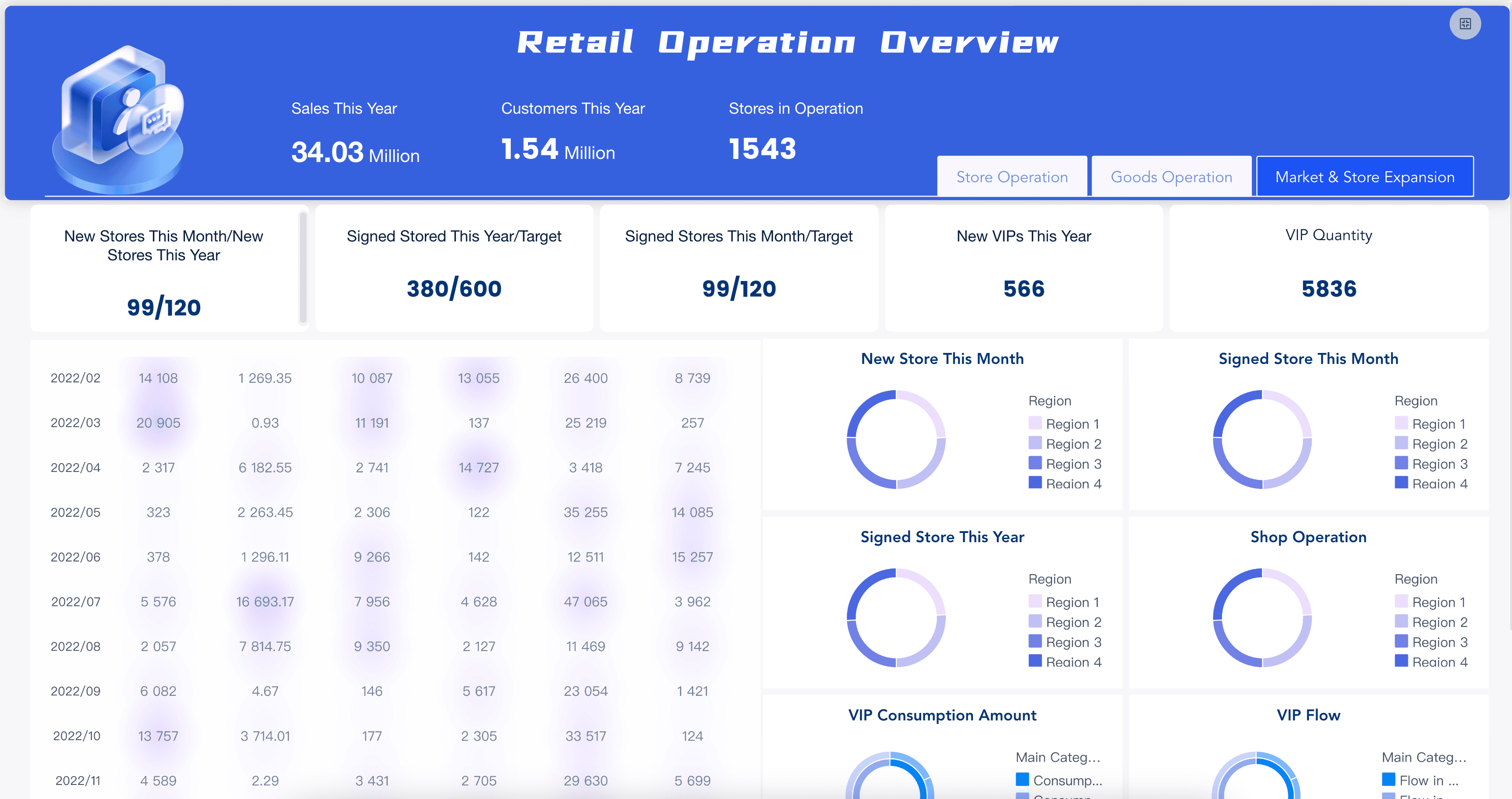
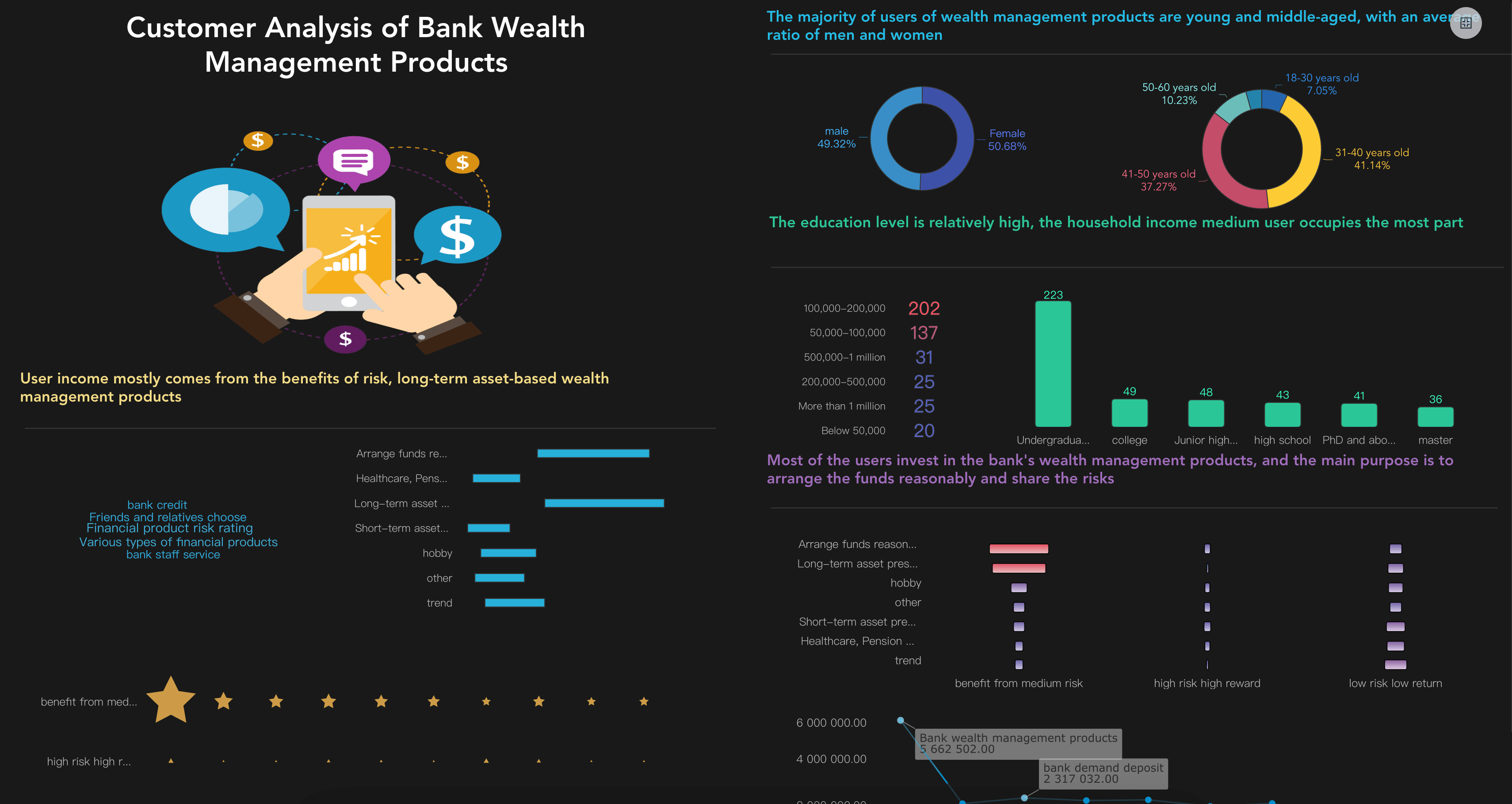
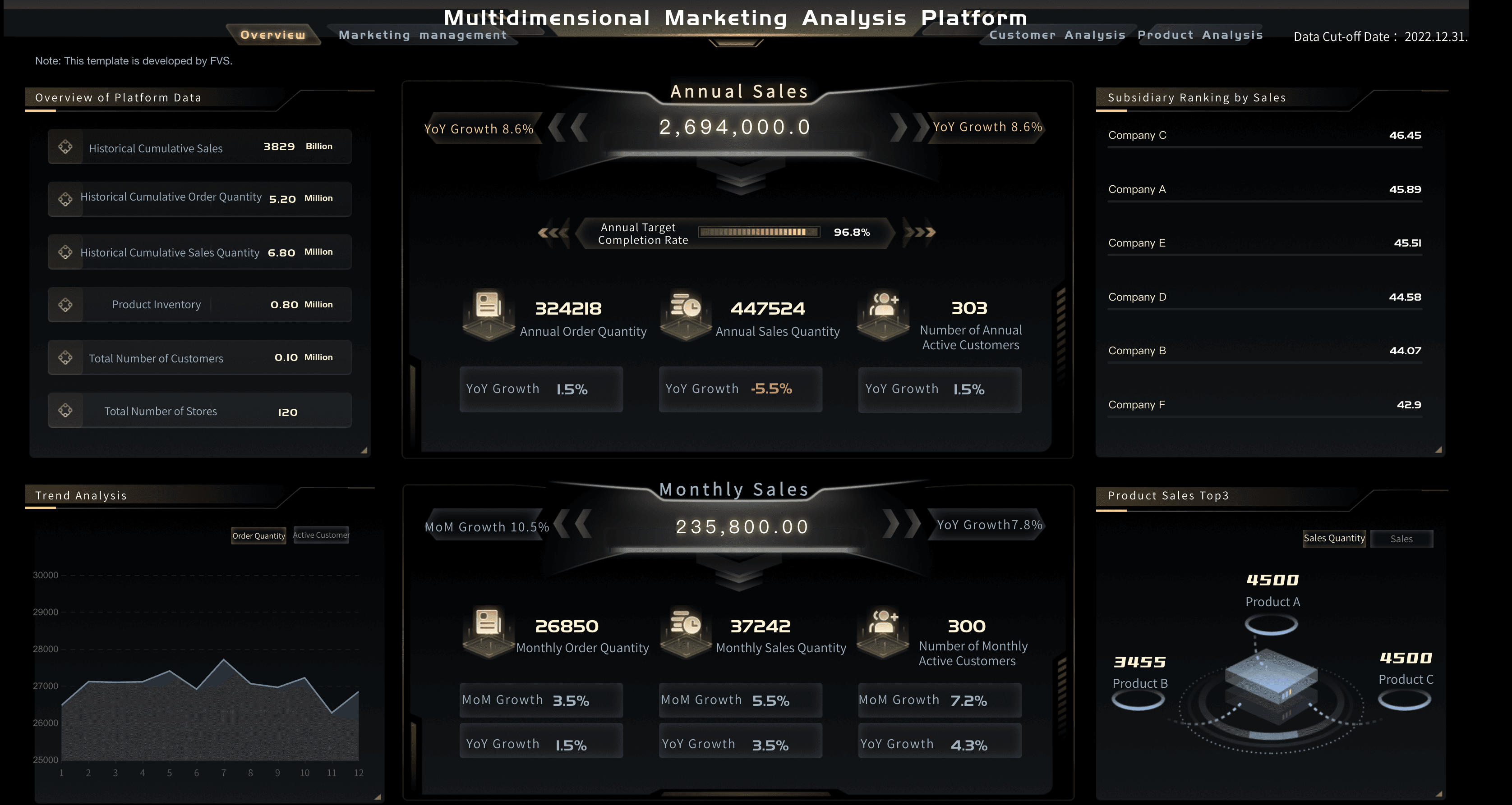
The best way to understand a digital dashboard is to look at real situations. The examples below are not meant to be copied directly. Use them to ask better questions about audience, refresh frequency, metric hierarchy, and action paths.
Business performance
A business performance dashboard gives managers a shared view of revenue, cost, customer activity, and operational progress. It often functions as a performance dashboard, combining top-level KPIs with drill-down views by region, product, channel, or team.
Useful questions: Are we ahead of or behind target? Which region or product changed the most? Is the change driven by volume, price, cost, or mix?
Manufacturing and operations
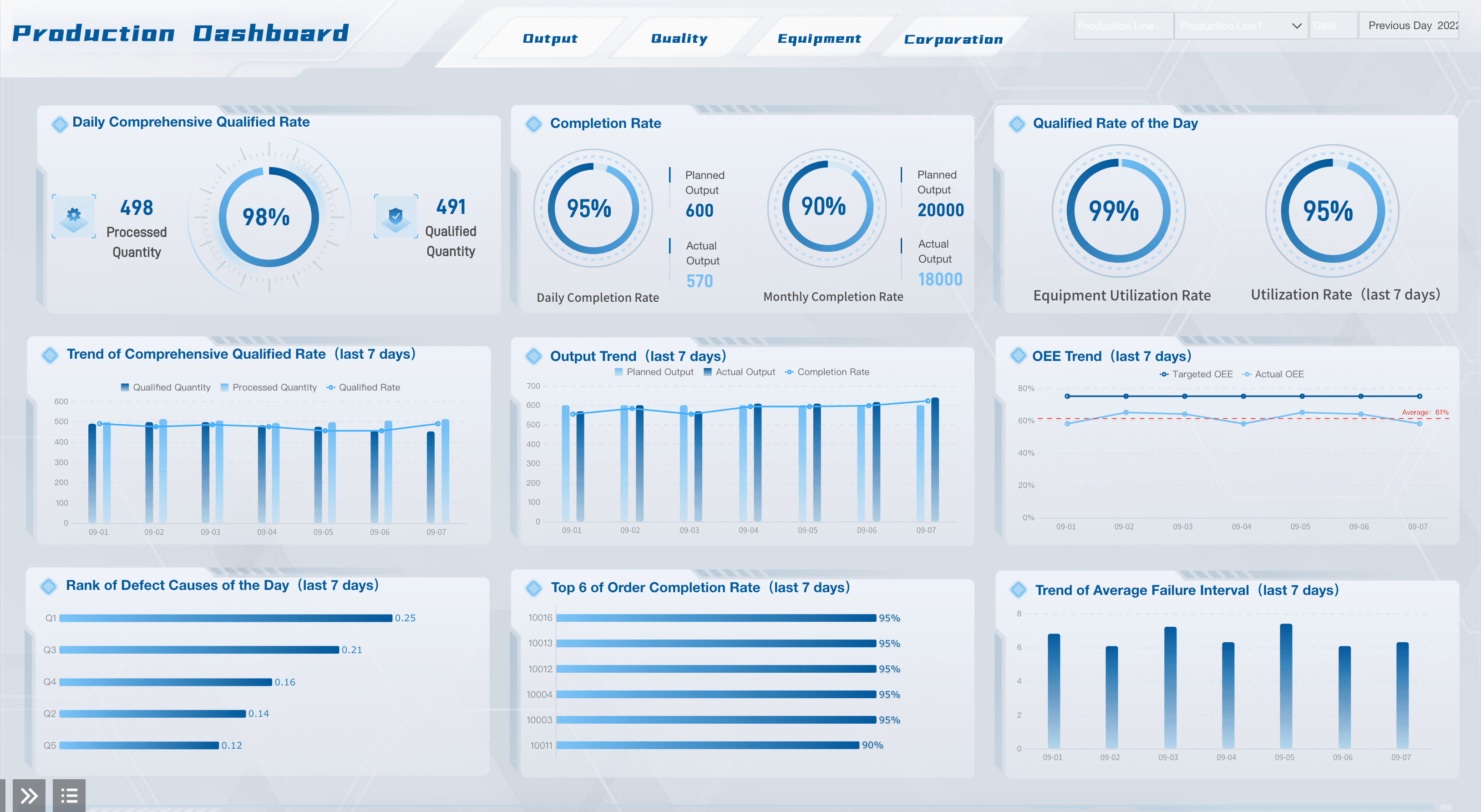
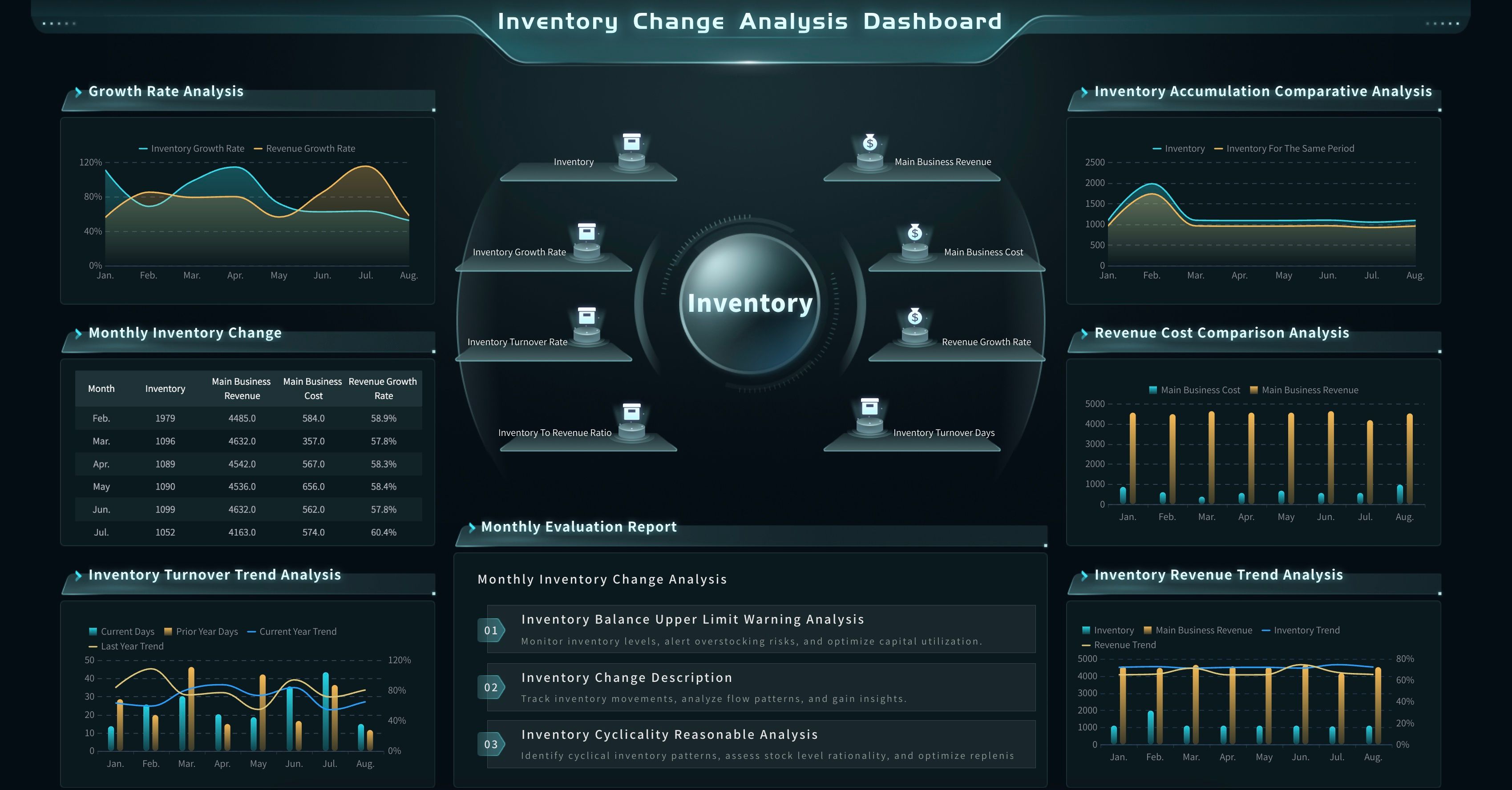
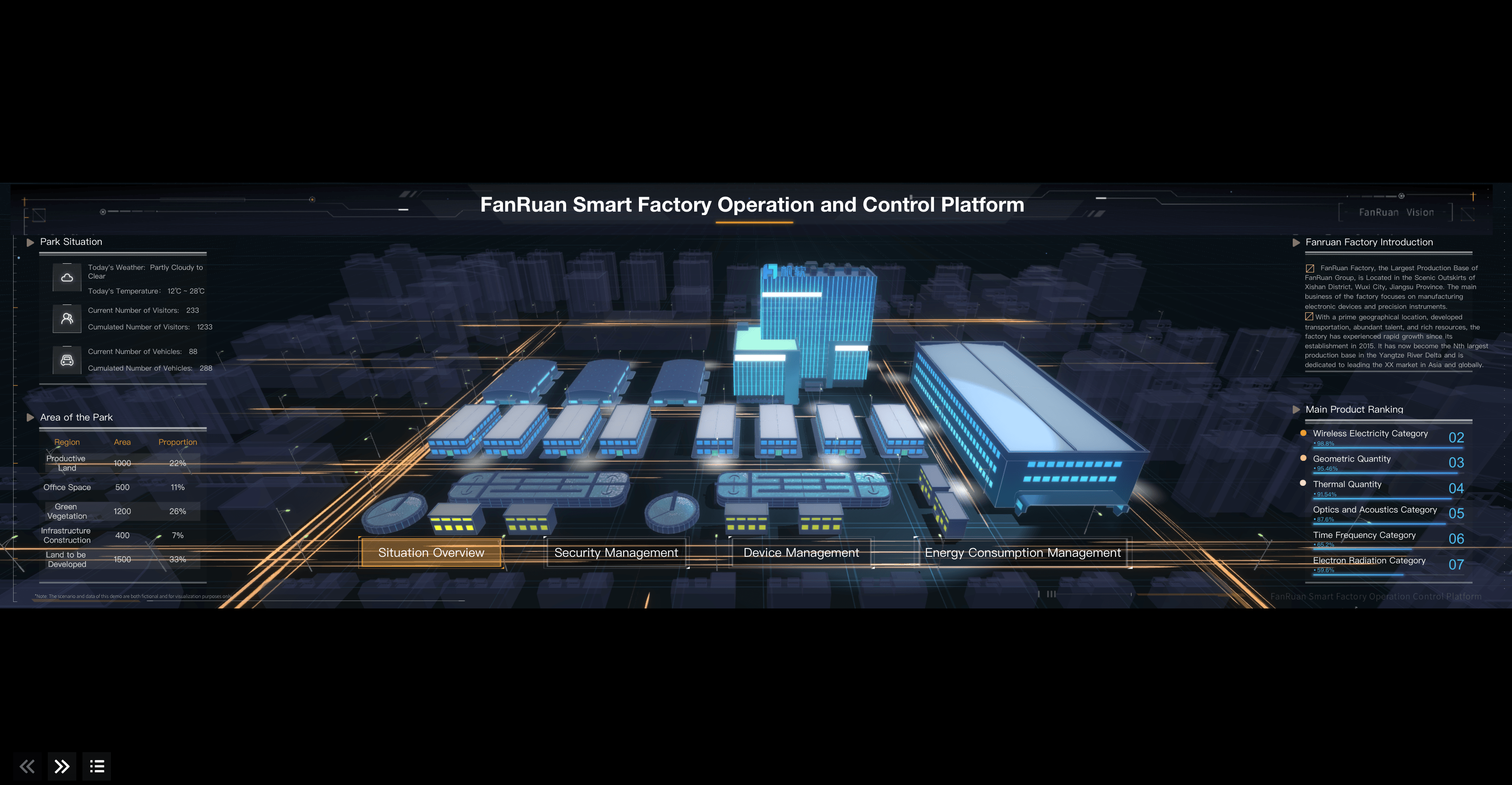
A manufacturing digital dashboard tracks production plan completion, equipment status, OEE, quality inspection, inventory movement, and delivery risk. The goal is not to show every machine reading — it is to surface the signals that help teams prevent downtime, reduce waste, and respond to exceptions quickly.
Useful questions: Which production line is below target? Where are delays or quality issues concentrated? Which exception should be handled first?
Customer and marketing analytics
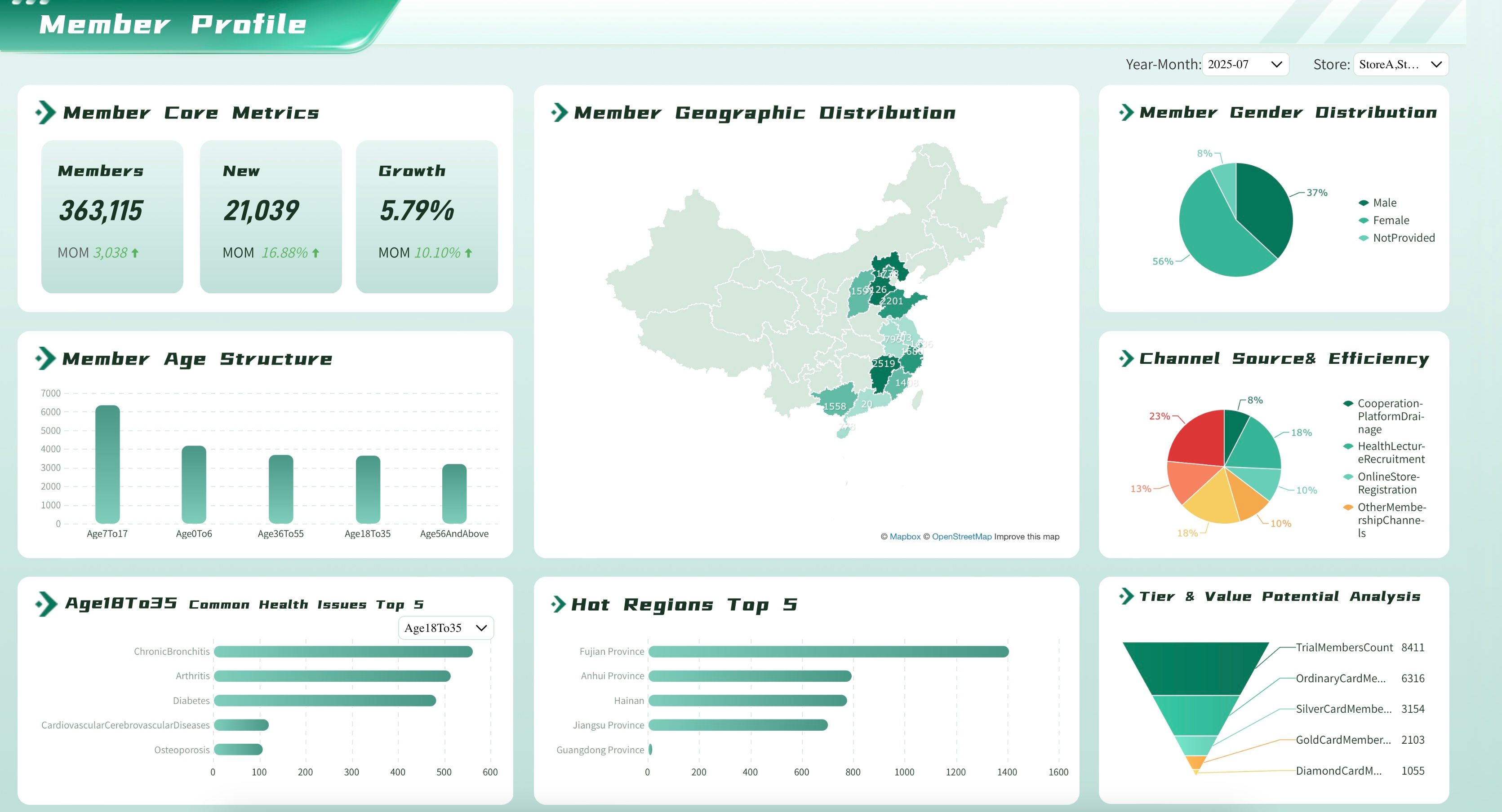
A customer or marketing digital dashboard tracks acquisition, conversion, retention, customer value, campaign spend, and channel performance. Clicks are only useful when the dashboard also shows lead quality, conversion rate, revenue contribution, or retention.
Useful questions: Which channel produces qualified demand? Where does the funnel lose users? Which campaign should receive more budget?
How to Build a Digital Dashboard
Building a digital dashboard is less about placing charts on a page and more about designing a decision system. Work through the steps below before choosing colors, chart types, or layouts.
Step 1: Define the audience
Start with the people who will use the dashboard. A CEO, sales manager, analyst, warehouse supervisor, and marketing specialist may all need "performance data," but they need different levels of detail.
Ask: Who will open this dashboard regularly? What decision should they make faster? What data literacy level should the dashboard assume? Will they use it on desktop, mobile, wall screen, or embedded portal?
Step 2: Choose the decision scope
A strong digital dashboard has clear boundaries. If a dashboard tries to answer everything, users will not know where to look. Decide whether the dashboard is for monitoring, diagnosing, planning, or reporting.
- Monitoring: Show status, thresholds, and exceptions.
- Diagnosing: Show filters, drill-down paths, and comparisons.
- Planning: Show forecasts, scenarios, targets, and capacity.
- Reporting: Show consistent summaries for review and communication.
If you are comparing digital dashboard software, use this scope before comparing feature lists. The right software depends on whether your dashboard needs governed BI, real-time monitoring, embedded analytics, mobile access, or natural-language exploration.
Step 3: Map the data sources
List every source needed to answer the dashboard questions: ERP, CRM, marketing platforms, finance systems, production systems, spreadsheets, data warehouses, or APIs. Then decide which fields are trusted, which need cleansing, and which require agreed definitions.
This is where many dashboard projects fail. If "active customer," "gross margin," "qualified lead," and "on-time delivery" each mean different things to different teams, the dashboard may look finished but still generate debate.
Step 4: Select the metrics
Do not start with every available measure. Start with the few that explain performance and support action. A metrics dashboard works best when it separates primary indicators from diagnostic ones.
Use this structure:
- North-star metric: The main outcome the audience cares about.
- Primary KPIs: 3 to 7 metrics that explain progress toward that outcome.
- Diagnostic metrics: Supporting measures for drill-down.
- Guardrail metrics: Measures that prevent unhealthy tradeoffs.
- Context metrics: Targets, benchmarks, historical averages, and period comparisons.
Step 5: Design the layout
Place the most important signal where the eye lands first. Group related metrics together. Use consistent chart types, colors, and labels. A good layout often follows this order: top-level status and target progress, trend over time, breakdown by segment or region, exceptions and alerts, then drill-down detail.
Step 6: Validate with real users
Before launch, show the dashboard to actual users and ask them to complete realistic tasks. Do not ask only whether they like it. Ask what they would do after seeing it.
Useful prompts: What changed since last period? Which metric needs attention first? What would you investigate next? Is any label unclear? Is anything missing?
Digital Dashboard Design Best Practices
Good dashboard design reduces cognitive load and helps users act with confidence. These principles apply regardless of the tool you use.
- Lead with the decision: Put the most important question at the top of the screen.
- Use visual hierarchy: Large numbers, trend lines, and alert colors should reflect business priority, not decoration.
- Keep chart types familiar: Bar charts, line charts, tables, scorecards, maps, and scatter plots cover most needs.
- Use color with rules: Reserve strong colors for status, warnings, or categories that need clear distinction.
- Show context: A number without target, history, or comparison can mislead users.
- Design for scanning: Clear section titles, aligned grids, consistent labels, and predictable spacing help users move quickly.
- Prevent metric overload: If everything is a KPI, nothing is a KPI.
- Support drill-down: Let users move from summary to detail without opening another spreadsheet.
- Keep customization purposeful: A custom dashboard should reflect the team's workflow, not add widgets for their own sake.
- Respect permissions: Different users may need different views of the same governed data.
- Plan for maintenance: A dashboard that cannot be maintained will lose trust, even if the first version looks polished.
Digital Dashboard Metrics by Business Area
The right metrics depend on audience and use case, but most digital dashboards combine outcome metrics, driver metrics, and diagnostic metrics. Use the table below to decide what belongs on the first screen and what belongs in drill-down views.
When you choose metrics, include context. A 12% conversion rate may be good or bad depending on the audience, channel, period, and target. The dashboard should answer "compared with what?" before users ask.
FineBI + Dora for Digital Dashboard Learning
A practical way to use FineBI and Dora together is to treat the dashboard as a learning workspace, not just a finished screen. FineBI handles the structured work; Dora helps users ask better questions about what they see.
FineBI is well suited for the foundational layer: connecting and modeling data from multiple systems, building reusable datasets and metric definitions, creating interactive dashboards with filters and drill-down, and managing sharing and access control.
Dora supports the exploration layer around the dashboard. It can help users phrase follow-up questions in plain language, explain metric changes in an approachable way, suggest dimensions to explore when a KPI moves, and help new users learn how to read a dashboard without memorizing every field.
This matters because digital dashboard success depends on adoption. A dashboard that only analysts understand will not change how the business operates. A dashboard paired with guided explanation, shared definitions, and practical examples becomes a learning tool for the whole team.
A simple learning workflow:
- Define the dashboard goal: what decision should be easier?
- Use FineBI to connect trusted data and build the first view.
- Document metric definitions, refresh frequency, and owner for each KPI.
- Use Dora to help users explore why a metric changed and what to check next.
- Collect questions from users and turn them into dashboard improvements.
Want more dashboard resources?
FAQs
A digital dashboard is an interactive visual workspace that displays important business metrics, charts, and alerts in one place. It helps teams monitor performance, explore data, and make decisions without switching between spreadsheets, reports, and separate systems.
A digital dashboard should include a clear audience, a focused goal, trusted data sources, primary KPIs, supporting diagnostic metrics, context such as targets or historical comparisons, and a layout that helps users move from summary to detail.
A digital dashboard is the broader digital interface for monitoring and analyzing data. A KPI dashboard is a specific type built around key performance indicators tied to business goals. Many digital dashboards include KPI sections, but they may also include operational alerts, detailed tables, maps, forecasts, or exploratory analysis.
A digital dashboard is usually interactive and designed for ongoing monitoring or analysis. A reporting dashboard may be more structured, periodic, and communication-focused. In practice, a reporting dashboard can be part of a digital dashboard system when teams need consistent summaries and scheduled reviews.
Most dashboards work better with a small set of primary KPIs and a larger set of supporting drill-down metrics. A good rule is to keep the first screen focused on the 3 to 7 signals that matter most to the audience.
Refresh frequency should match the decision cycle. A production monitoring dashboard may need near real-time updates. An executive dashboard may only need daily or weekly refreshes. More frequent refresh is not automatically better if the business cannot act on the change.
An effective digital dashboard is clear, trusted, focused, and actionable. Users should understand what changed, whether it matters, where to investigate, and what action may be needed. Governed metrics and user validation matter more than adding more charts.
A digital dashboard can replace many recurring Excel reports, especially when the same data is exported and reformatted every week. Excel may still be useful for ad hoc calculations, but governed dashboards are better for shared metrics, repeatable reporting, and cross-team visibility.
