A KPI reporting tool is software used to track, visualize, distribute, and manage key performance indicators across teams and leadership levels. If you are comparing KPI reporting tools, you are probably trying to solve one or more practical problems: building executive dashboards, automating weekly or monthly KPI reports, standardizing reporting across departments, or supporting approval and follow-up workflows around business performance.
For IT managers, operations leaders, finance teams, analysts, and reporting owners, the right tool is not just about attractive charts. It also needs to fit your reporting cadence, data model, governance standards, and the way decisions actually happen inside your organization.
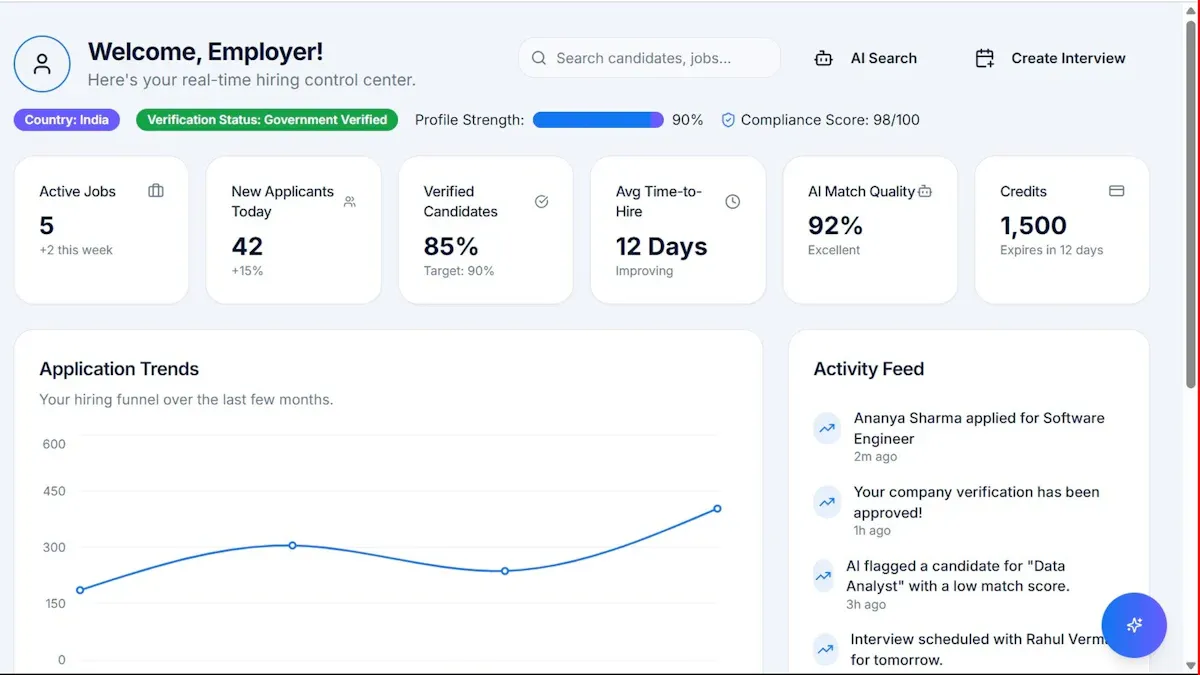
Clear KPI visibility: Stakeholders should see status, trend, target, and variance quickly.
Reliable data access: The platform should connect to business data sources and refresh consistently.
Flexible dashboarding: Teams need summaries for leaders and drill-down views for analysts.
Scheduled reporting: Weekly, monthly, and board-level KPI reports should be automated.
Role-based access: Users should only see the metrics and reports relevant to them.
Action-oriented workflows: Alerts, comments, approvals, or follow-up steps help teams act on results.
Scalable governance: As reporting expands, the tool should support standardization and control.
How to choose a KPI reporting tool for dashboards, scheduled reports, and workflow needs
Before comparing vendors, define what kind of KPI reporting your organization really depends on. Many teams buy a dashboard tool and later realize they also need formal reports, printable management packs, or workflow support.
Clarify whether your team primarily needs executive dashboards, recurring KPI reports, or cross-functional approval workflows
Start with the reporting job, not the feature list.
Executive dashboards are best for at-a-glance visibility, monitoring trends, and spotting exceptions.
Recurring KPI reports are better when leadership expects weekly summaries, monthly review packs, or standardized departmental reporting.
Cross-functional workflows matter when KPI reporting triggers approvals, comments, corrective actions, or data submission from multiple teams.
If your process includes monthly close reviews, plant performance reporting, regional scorecards, or management meeting packs, dashboarding alone may not be enough.
Compare ease of setup, data integrations, automation, permissions, and total cost before shortlisting platforms
A KPI reporting tool may look strong in demos but become harder to manage at scale. Evaluate:
This keeps your shortlist grounded in business needs rather than feature overload.
10 KPI reporting tool options compared for 2026
Below is a balanced look at 10 widely considered KPI reporting tool options. Each one can support KPI visibility in different ways, but they vary significantly in reporting depth, workflow support, and enterprise readiness.
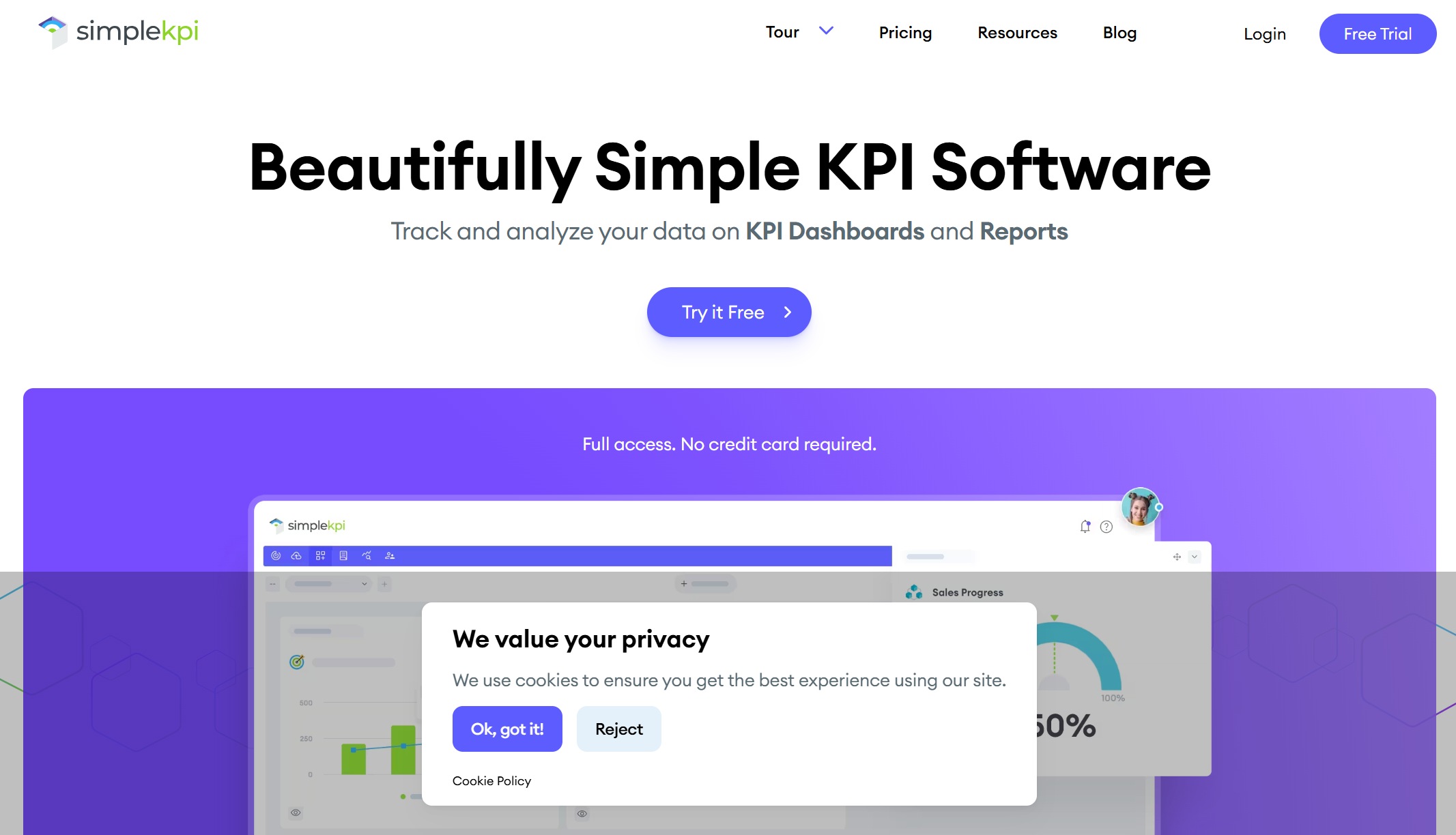
SimpleKPI is best for teams that want fast dashboard creation and straightforward scheduled reporting. It is designed to make KPI tracking approachable without heavy technical setup.
Strengths
Simple dashboard creation
KPI-focused interface
Useful for straightforward scorecards and summaries
Limited depth for advanced governance or formal workflow requirements
May not be the best fit for organizations needing highly customized operational reports
Best fit
Small businesses
Department heads
Teams moving from spreadsheets to basic KPI dashboards and reports
2) Microsoft Power BI
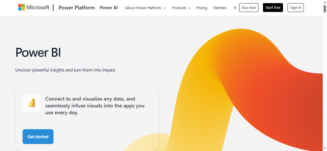
Power BI is a strong choice for businesses that need flexible KPI dashboards, robust data modeling, and alignment with the Microsoft ecosystem. It is widely used for analytics, self-service reporting, and interactive dashboards.
Strengths
Strong visualization and dashboard capabilities
Deep integration with Microsoft tools and services
Powerful semantic modeling and analytics
Broad enterprise adoption
Trade-offs
Governance can require careful setup
Business users may face a learning curve depending on model complexity
Formal paginated reporting and operational reporting may require additional planning or separate report design approaches
Best fit
Organizations already using Microsoft technologies
Formal printable reporting needs may require extra workarounds or companion tools
Advanced use can require experienced authors
Best fit
Data analysts
Strategy teams
Organizations prioritizing exploratory analytics and executive storytelling
4) Looker Studio
Looker Studio is best for lightweight reporting and accessible dashboard sharing. It is often used when teams need a low-barrier way to create and distribute dashboards.
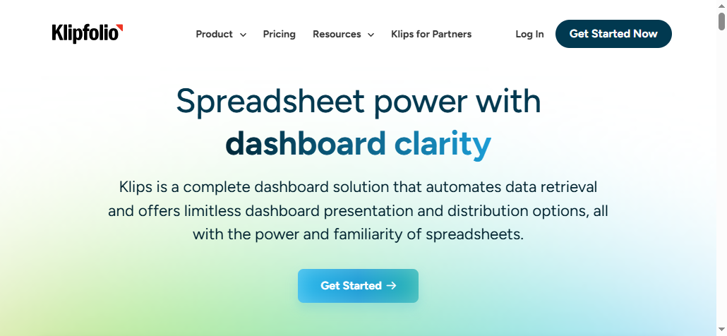
Klipfolio is best for KPI tracking across marketing, sales, and operations data sources. It is known for multi-source dashboarding and KPI-centric monitoring.
Scalability and governance should be evaluated carefully for larger environments
Formal reporting needs may outgrow dashboard-first designs
Best fit
Mid-sized teams
Agencies
Commercial and operations reporting teams
6) Databox
Databox is best for fast setup, mobile-friendly dashboards, and performance snapshots. It appeals to teams that want quick visibility with minimal complexity.
Workflow depth and formal report standardization can be limited
Better for monitoring than for highly structured reporting packs
Best fit
Smaller teams
Growth-stage businesses
Sales and marketing leaders
7) Geckoboard
Geckoboard is best for live KPI visibility on office screens and simple team reporting. It is often used for operational display scenarios where visibility matters more than deep analysis.
Strengths
Clear live dashboard visibility
Useful for shared team screens
Easy to deploy for basic KPI monitoring
Supports simple communication of team performance
Trade-offs
Not designed for complex governance-heavy reporting
Less suitable when stakeholders need detailed drill-through and structured business review materials
Best fit
Support centers
Sales floors
Operations teams needing visible live metrics
8) Domo
Domo is best for enterprise-scale dashboards, alerts, and broad data connectivity. It is often considered by organizations with larger scale and broad reporting ambitions.
Budget implications can be significant depending on scope
Teams should evaluate long-term administration and adoption needs
Reporting teams with highly formatted document outputs should verify fit carefully
Best fit
Large enterprises
Cross-functional KPI programs
Teams requiring broad connectivity and centralized visibility
9) Qlik Sense
Qlik Sense is best for organizations that need interactive exploration alongside KPI monitoring. It is often chosen where associative analysis is part of the decision-making process.
Strengths
Strong interactive analysis
Good balance between monitoring and exploration
Supports discovery-oriented KPI investigation
Enterprise-capable deployment
Trade-offs
Adoption may depend on user training and data literacy
Formal paginated reporting scenarios should be validated separately
Can be more complex than simpler KPI tools
Best fit
Data-driven enterprises
Analytics teams
Organizations wanting exploratory KPI analysis
10) Zoho Analytics
Zoho Analytics is best for cost-conscious teams that want reporting, dashboards, and business app integrations. It is often appealing to growing companies looking for broad utility at a practical price point.
Strengths
Accessible reporting and dashboarding
Good fit for business app ecosystems
Practical for teams balancing capability and budget
Useful for SMB reporting use cases
Trade-offs
Enterprise workflow depth may be limited compared with heavier platforms
Standardization needs should be reviewed for larger rollouts
Advanced governance requirements may need closer evaluation
Best fit
SMBs
Zoho ecosystem users
Teams needing broad reporting value without major complexity
What makes the best platform stand out
The best KPI reporting tool is not always the one with the most features. It is the one that helps your organization deliver the right information, to the right audience, in the right format, at the right time.
Dashboard usability and KPI visibility
Leaders should be able to answer basic questions immediately:
If dashboards are visually impressive but hard to interpret quickly, adoption will suffer.
Scheduled reports and delivery automation
A dashboard alone does not solve recurring reporting. Many organizations still rely on weekly and monthly KPI packs delivered to stakeholders.
Compare each platform on:
Email scheduling
Export formats such as PDF or Excel
Snapshot consistency
Support for standardized recurring reports
Distribution controls by audience or region
If leaders expect a Monday morning KPI digest or a month-end management pack, reporting automation becomes a core requirement.
Enterprise workflows, governance, and collaboration
As KPI reporting matures, governance becomes more important. Reporting processes often include comments, approvals, exception handling, and cross-team coordination.
The goal is not to show every available metric. The goal is to support decisions.
Common reporting mistakes to avoid
Avoid these common issues:
Too many KPIs in one report
Inconsistent metric definitions across departments
Outdated or delayed data
Reports with no owner or follow-up process
Dashboards that look polished but do not guide action
Mixing executive summaries with excessive operational detail
The most common KPI reporting problem is not lack of data. It is lack of clarity.
Matching the tool to your reporting maturity
Your reporting maturity should influence your tool choice.
Early-stage teams
Usually benefit from simplicity, fast setup, and a small set of core metrics
Growing companies
Often need stronger automation, better integrations, and more structured distribution
Enterprise teams
Typically need permissions, standardized reporting, formal workflows, and scalable governance
Practical recommendations for selecting a KPI reporting tool
Here are five practical ways to make the decision more successful.
Map reports to stakeholder types.
Executives, department leaders, analysts, and frontline managers often need different KPI formats. Choose a tool that supports both summary and detail.
Test one real reporting cycle before rollout.
Run a weekly or monthly reporting process end to end, including refresh, review, export, and distribution.
Evaluate reporting beyond dashboard creation.
Ask how the tool handles printable reports, scheduled delivery, permissions, and recurring management packs.
Standardize KPI definitions early.
A strong tool cannot compensate for inconsistent business logic across teams.
Plan for scale from the start.
Even if your current use case is simple, consider what happens when finance, operations, regional teams, and executives all need governed access.
When FineReport is a good fit as a KPI reporting tool
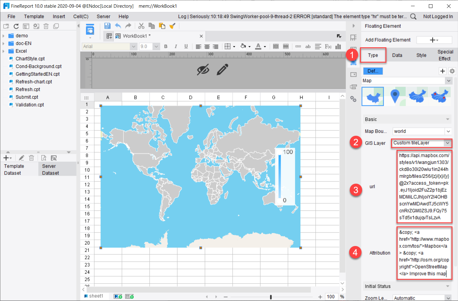
Tools like Tableau, Power BI, and Qlik Sense are widely used for visualization and BI analysis, but teams with more complex reporting workflows may also need a dedicated enterprise reporting platform like FineReport.
FineReport is especially relevant when KPI reporting goes beyond interactive dashboards and starts to require:
That makes FineReport a practical option for organizations that need KPI dashboards and structured operational reporting in the same environment.
For example, a finance or operations team may want:
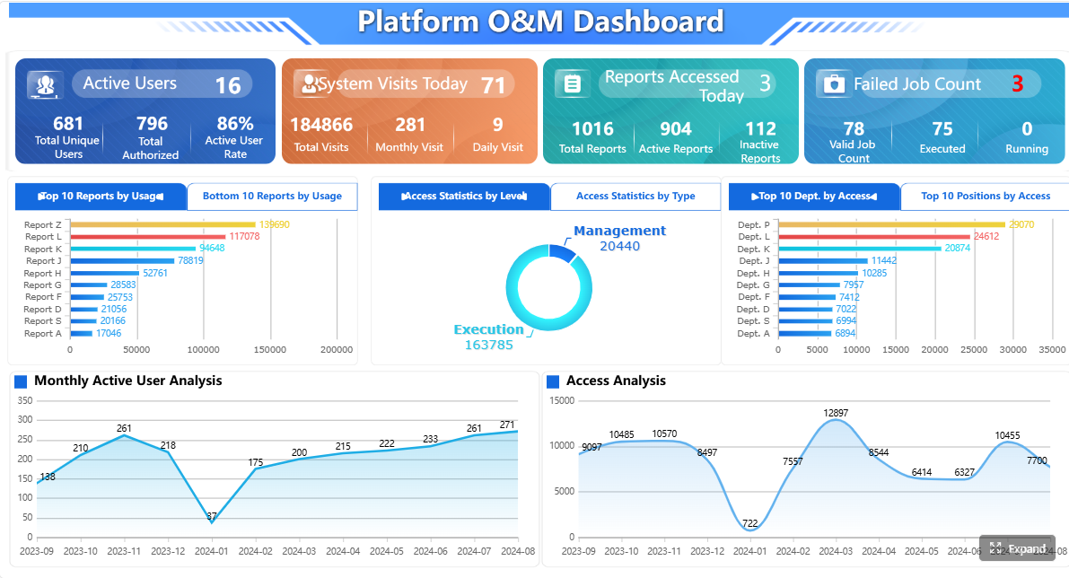
a dashboard for daily KPI monitoring,
a monthly formatted report for leadership review,
and a workflow where users submit explanations or corrective action data.
This is the kind of reporting environment where FineReport becomes particularly relevant.
Get Ready-to-Use Dashboard and Report Templates in Fine Gallery
Why FineReport stands out for enterprise KPI reporting workflows
FineReport is not just a dashboard layer. It is designed to support a broader reporting lifecycle, including report design, query interaction, scheduled generation, and business-facing distribution.
If your shortlist includes tools that are strong for visual exploration but lighter on formal reporting operations, FineReport is worth evaluating as a reporting-focused alternative or complement.
Final verdict: how to pick the right option for your team in 2026
The right kpi reporting tool depends on your reporting complexity, stakeholder expectations, and internal resources.
Choose SimpleKPI, Databox, or Geckoboard if speed and simplicity matter most.
Choose Power BI, Tableau, or Qlik Sense if you need stronger analytics and interactive dashboarding.
Choose Domo if enterprise-scale connectivity and broad dashboard deployment are central priorities.
Choose Zoho Analytics or Looker Studio if budget and accessibility are key factors.
Consider FineReport if your KPI reporting needs include dashboards, scheduled reports, printable management outputs, parameterized queries, or workflow-oriented enterprise reporting.
In 2026, the smartest decision is not to chase the longest feature list. It is to prioritize adoption, consistency, and the reporting processes your business actually relies on.
A KPI reporting tool helps teams track performance metrics, visualize progress, and share updates through dashboards and reports. It is commonly used for executive visibility, recurring performance reviews, and decision-making across departments.
Start by identifying whether you need live dashboards, scheduled reports, printable management packs, or workflow support. Then compare data integrations, permissions, automation, ease of setup, and total cost against your must-have requirements.
The most important features usually include dashboard customization, reliable data refresh, scheduled delivery, drill-down analysis, role-based access, and export options like PDF or Excel. For larger organizations, governance and workflow capabilities also become important.
Not always. Dashboards are great for at-a-glance monitoring, but monthly business reviews and board reporting often require structured, paginated, and printable reports with consistent formatting.
Yes, many KPI reporting tools can automatically send weekly or monthly reports by email and trigger alerts when metrics change. Some platforms also support comments, approvals, and follow-up actions so teams can respond faster to performance issues.
Product Trial
FineReport
Pixel-perfect reports · Interactive dashboards · Easy data entry · Digital twins


 SimpleKPI is best for teams that want fast dashboard creation and straightforward scheduled reporting. It is designed to make
  Power BI is a strong choice for businesses that need flexible KPI dashboards, robust
  Looker Studio is best for lightweight reporting and accessible dashboard sharing. It is often used when teams need a low-barrier way to create and distribute dashboards.
 Klipfolio is best for
 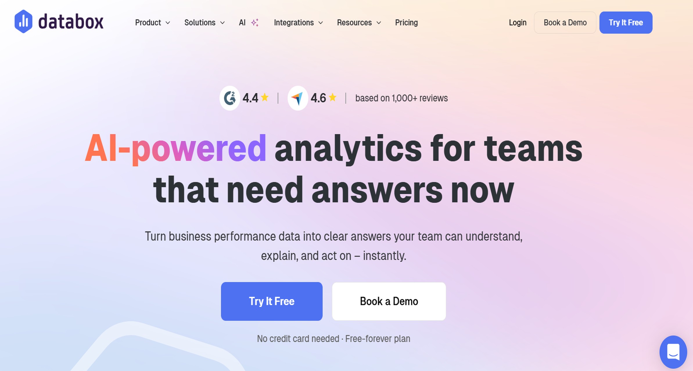 Databox is best for fast setup, mobile-friendly dashboards, and performance snapshots. It appeals to teams that want quick visibility with minimal complexity.
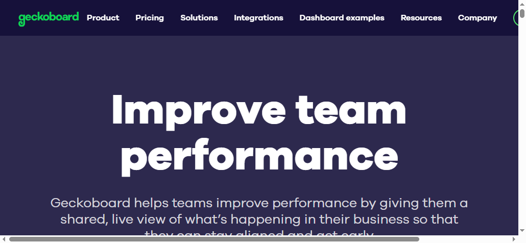 Geckoboard is best for live KPI visibility on office screens and simple team reporting. It is often used for operational display scenarios where visibility matters more than deep analysis.
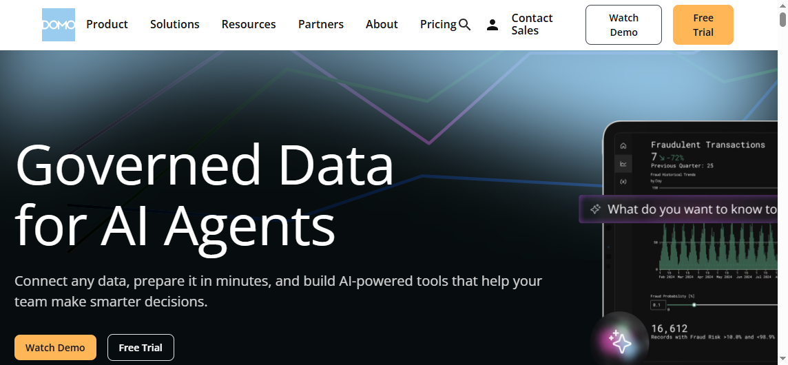 Domo is best for enterprise-scale dashboards, alerts, and broad
 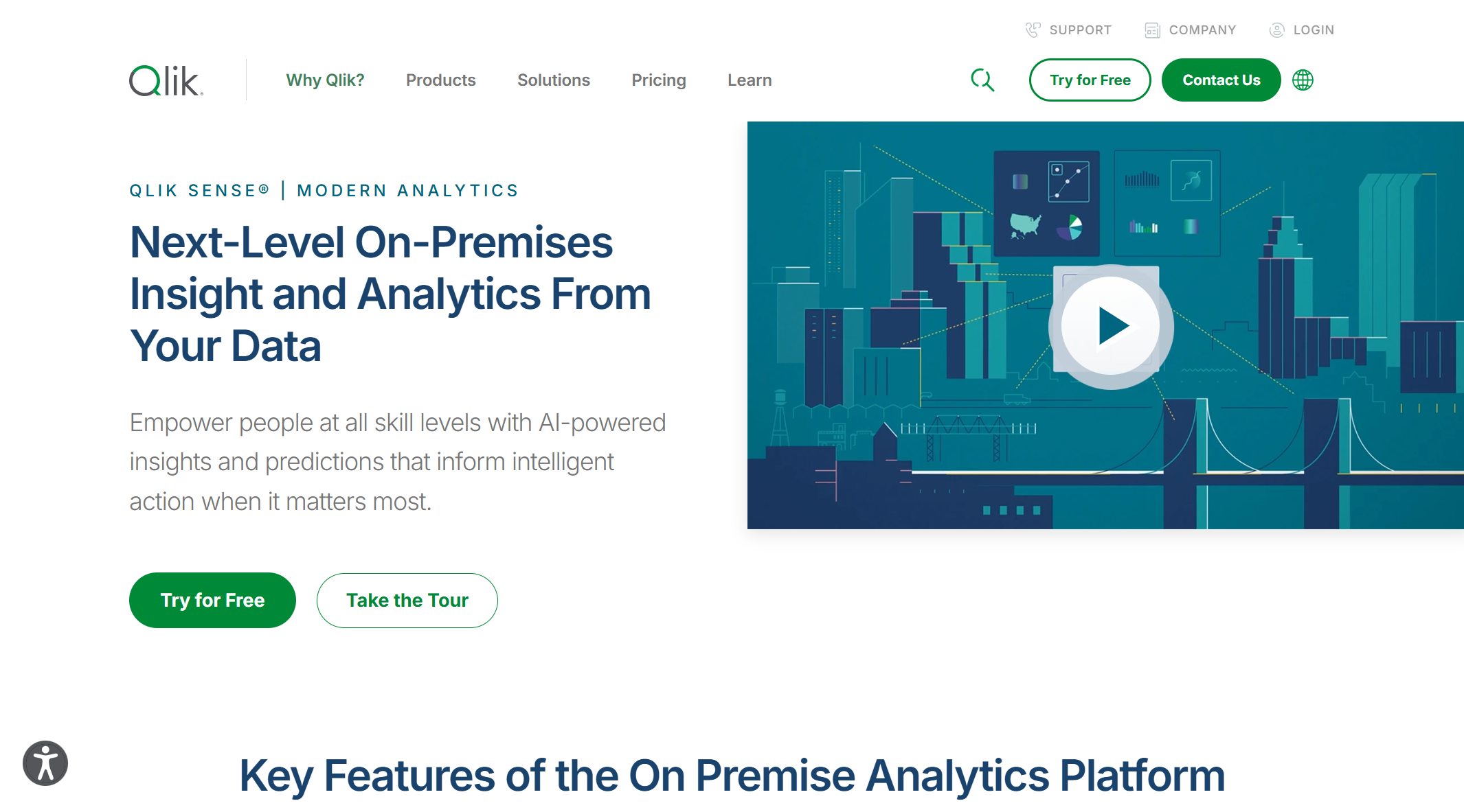 Qlik Sense is best for organizations that need interactive exploration alongside KPI monitoring. It is often chosen where associative analysis is part of the decision-making process.
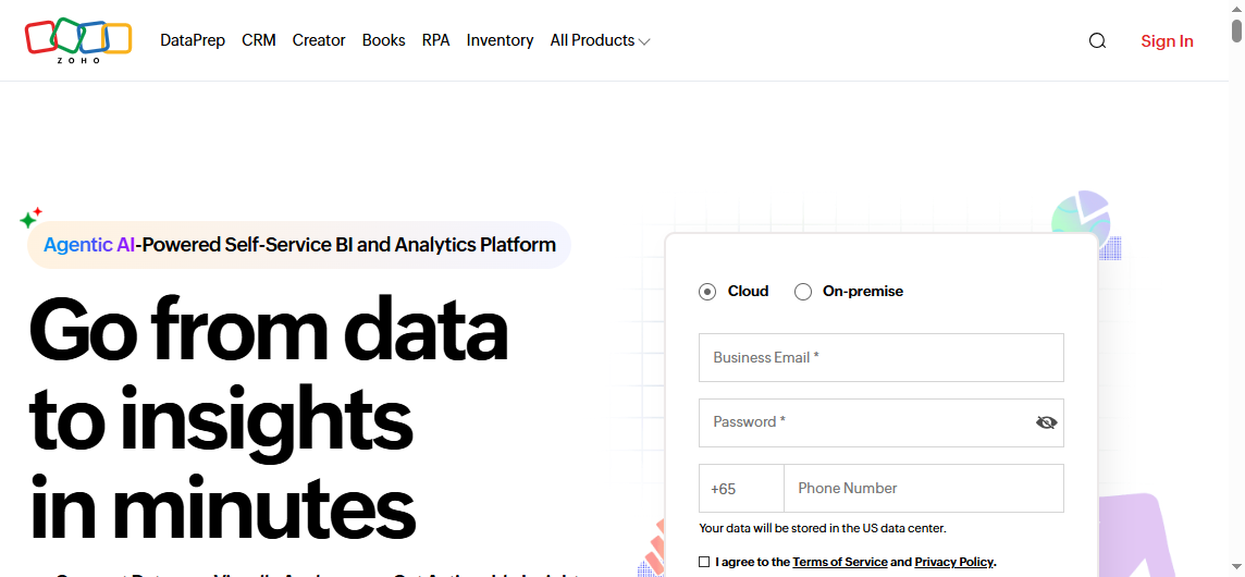 Zoho Analytics is best for cost-conscious teams that want reporting, dashboards, and business app integrations. It is often appealing to growing companies looking for broad utility at a practical price point.